Chapterبەش 4 · Lectureوانە 4.3
CSS Grid: Rows and Columns TogetherCSS Grid: ڕیز و ستوون پێکەوە
CSS Grid places boxes in rows and columns at once: the grid container and its tracks, the fr unit, repeat() and gap, placing items on numbered lines (line 1 is on the right in a Kurdish page), named areas and a new map for phones, the implicit grid and minmax(), auto-fit columns without media queries, alignment, subgrid, and when to choose grid or flexbox.
سندووقەکان لە ڕیز و ستووندا پێکەوە دادەنێت: و ، ، repeat() و gap، دانانی دانەکان لەسەر هێڵی ژمارەکراو (لە لاپەڕەیەکی کوردیدا هێڵی 1 لە لای ڕاستە)، ناونراو و نەخشەیەکی نوێ بۆ مۆبایل، و minmax()، ستوونی auto-fit بێ ، ، و کەی grid یان هەڵبژێریت.
What you will learnچی فێر دەبیت
- Make a grid container and size its tracks with
grid-template-columnsand-rows,fr,repeat(),minmax()andgap. - Place items on numbered lines and in named areas, in English and in Kurdish (right-to-left) pages.
- Build card grids that fit any screen with
repeat(auto-fit, minmax(…, 1fr)), and explain the implicit grid. - Align items and whole grids, line up nested cards with
subgrid, and choose between grid and flexbox.
- دروست بکەیت و قەبارەی ڕێچکەکانی بە
grid-template-columnsو-rows،fr،repeat()،minmax()وgapدیاری بکەیت. - دانەکان لەسەر هێڵی ژمارەکراو و لە ناوچەی ناونراودا دابنێیت، لە لاپەڕەی ئینگلیزی و کوردیدا ().
- gridـی دروست بکەیت کە بە
repeat(auto-fit, minmax(…, 1fr))لەگەڵ هەر شاشەیەکدا بگونجێت و ڕوون بکەیتەوە. - دانەکان و هەموو grid ڕێک بخەیت، ناوەکییەکان بە
subgridڕێک بکەیت و لە نێوان grid و هەڵبژێریت.
Grid: rows and columns togetherCSS Grid: ڕیز و ستوون پێکەوە
lines boxes up in one direction. works in two at once. display: grid on a parent makes it a , and its direct children become . grid-template-columns lists the columns. The unit fr means "one share of the free space": 1fr 1fr 1fr (or repeat(3, 1fr)) is three equal columns, and 200px 1fr is a 200px column plus one that takes the rest. gap sets the space between the rows and the columns.
سندووقەکان بە یەک ئاڕاستە ڕیز دەکات. بە دوو ئاڕاستە پێکەوە کار دەکات. display: grid لەسەر باوانێک دەیکات بە و منداڵە ڕاستەوخۆکانی دەبنە . grid-template-columns ستوونەکان دەنووسێت. یەکەی fr واتە «بەشێک لە بۆشاییە بەتاڵەکە»: 1fr 1fr 1fr (یان repeat(3, 1fr)) سێ ستوونی یەکسانە و 200px 1fr ستوونێکی 200px و ستوونێکە کە باقییەکەی دەگرێت. gap بۆشایی نێوان ڕیز و ستوونەکان دیاری دەکات.
The picture names the parts you will meet in this lesson: numbered , (whole columns or rows), and .
وێنەکە ئەو بەشانە ناو دەبات کە لەم وانەیەدا دەیانبینیت: ژمارەکراو، (ستوون یان ڕیزی تەواو)، و .
<!DOCTYPE html>
<html lang="en">
<head>
  <meta charset="utf-8">
  <meta name="viewport" content="width=device-width, initial-scale=1">
  <title>Grid</title>
  <style>
    body { font-family: Arial, sans-serif; }
    .gallery {
      display: grid;
      grid-template-columns: repeat(3, 1fr);   /* three equal columns */
      gap: 12px;
      margin-bottom: 16px;
    }
    .gallery div { padding: 16px; background-color: #eaf1fb; text-align: center; }
    .two-col {
      display: grid;
      grid-template-columns: 200px 1fr;
      gap: 12px;
    }
    .two-col nav  { background-color: #fdf3e1; padding: 8px; }
    .two-col main { background-color: #dcefeb; padding: 8px; }
  </style>
</head>
<body>
  <div class="gallery">
    <div>1</div><div>2</div><div>3</div>
    <div>4</div><div>5</div><div>6</div>
  </div>
  <div class="two-col">
    <nav>Menu: 200 px</nav>
    <main>Content: 1fr, the rest of the width</main>
  </div>
</body>
</html>HTML sent to the browserئەو HTMLـەی دەنێردرێت بۆ تۆڕگەڕ
<!DOCTYPE html>
<html lang="en">
<head>
  <meta charset="utf-8">
  <meta name="viewport" content="width=device-width, initial-scale=1">
  <title>Grid</title>
  <style>
    body { font-family: Arial, sans-serif; }
    .gallery {
      display: grid;
      grid-template-columns: repeat(3, 1fr);   /* three equal columns */
      gap: 12px;
      margin-bottom: 16px;
    }
    .gallery div { padding: 16px; background-color: #eaf1fb; text-align: center; }
    .two-col {
      display: grid;
      grid-template-columns: 200px 1fr;
      gap: 12px;
    }
    .two-col nav  { background-color: #fdf3e1; padding: 8px; }
    .two-col main { background-color: #dcefeb; padding: 8px; }
  </style>
</head>
<body>
  <div class="gallery">
    <div>1</div><div>2</div><div>3</div>
    <div>4</div><div>5</div><div>6</div>
  </div>
  <div class="two-col">
    <nav>Menu: 200 px</nav>
    <main>Content: 1fr, the rest of the width</main>
  </div>
</body>
</html>In Sorani Kurdish, part 1 of 3 on CSS Grid: rows and columns on a diagram, then a grid built in code.
بە کوردیی سۆرانی، بەشی 1 لە 3: — ڕیز و ستوون لەسەر وێنەیەک، پاشان grid بە کۆد دروست دەکرێت.
In Sorani, plays 0:00–15:40 (2020; grid has not changed since).
بە سۆرانی، لە 0:00 تا 15:40 پەخش دەبێت (ساڵی 2020؛ grid لەو کاتەوە نەگۆڕاوە).
Tracks and the fr unitڕێچکەکانی grid و یەکەی fr
Each value of grid-template-columns makes one column, which is a ; grid-template-rows does the same for rows, though you often leave rows out and let them grow with their content. A track can be a length (200px, 15rem, 30%), auto (as wide as its content needs) or a share of the free space in the .
هەر grid-template-columns ستوونێک دروست دەکات، کە ؛ grid-template-rows هەمان کار بۆ ڕیزەکان دەکات، هەرچەندە زۆرجار ڕیزەکان نانووسیت و دەهێڵیت لەگەڵ ناوەڕۆکەکەیاندا گەورە ببن. ڕێچکەیەک دەتوانێت درێژییەک بێت (200px، 15rem، 30%)، auto (بەقەد ئەوەی ناوەڕۆکەکەی پێویستی پێیەتی) یان بەشێک لە بۆشاییە بەتاڵەکە بە .
fr shares the free space: the browser first takes the fixed tracks and the gaps, then divides what is left. repeat(4, 1fr) writes four equal tracks, and repeat(2, 100px 1fr) repeats a pattern of two.
fr بۆشاییە بەتاڵەکە بەش دەکات: سەرەتا ڕێچکە جێگیرەکان و gapـەکان دەبات، پاشان ئەوەی دەمێنێتەوە دابەش دەکات. repeat(4, 1fr) چوار ڕێچکەی یەکسان دەنووسێت و repeat(2, 100px 1fr) نەخشەیەکی دوو ڕێچکەیی دووپاتە دەکاتەوە.
<!DOCTYPE html>
<html lang="en">
<head>
  <meta charset="utf-8">
  <meta name="viewport" content="width=device-width, initial-scale=1">
  <title>Tracks and fr</title>
  <style>
    * { box-sizing: border-box; }
    body { font-family: Arial, sans-serif; }
    .news {
      display: grid;
      grid-template-columns: 1fr 2fr 1fr;   /* 1 share, 2 shares, 1 share */
      gap: 20px;                            /* the gaps are taken first */
      max-width: 920px;
    }
    .news section { padding: 10px; background-color: #eaf1fb; }
    .news h2 { margin: 0 0 6px; font-size: 1rem; }
    .news p { margin: 0; }
  </style>
</head>
<body>
  <h1>Today</h1>
  <div class="news">
    <section><h2>Latest</h2><p>Short news.</p></section>
    <section><h2>Main story</h2><p>The middle column gets two shares of the free space.</p></section>
    <section><h2>Weather</h2><p>Erbil 31°</p></section>
  </div>
</body>
</html>HTML sent to the browserئەو HTMLـەی دەنێردرێت بۆ تۆڕگەڕ
<!DOCTYPE html>
<html lang="en">
<head>
  <meta charset="utf-8">
  <meta name="viewport" content="width=device-width, initial-scale=1">
  <title>Tracks and fr</title>
  <style>
    * { box-sizing: border-box; }
    body { font-family: Arial, sans-serif; }
    .news {
      display: grid;
      grid-template-columns: 1fr 2fr 1fr;   /* 1 share, 2 shares, 1 share */
      gap: 20px;                            /* the gaps are taken first */
      max-width: 920px;
    }
    .news section { padding: 10px; background-color: #eaf1fb; }
    .news h2 { margin: 0 0 6px; font-size: 1rem; }
    .news p { margin: 0; }
  </style>
</head>
<body>
  <h1>Today</h1>
  <div class="news">
    <section><h2>Latest</h2><p>Short news.</p></section>
    <section><h2>Main story</h2><p>The middle column gets two shares of the free space.</p></section>
    <section><h2>Weather</h2><p>Erbil 31°</p></section>
  </div>
</body>
</html>Placing items on grid linesدانانی دانەکان لەسەر هێڵەکانی grid
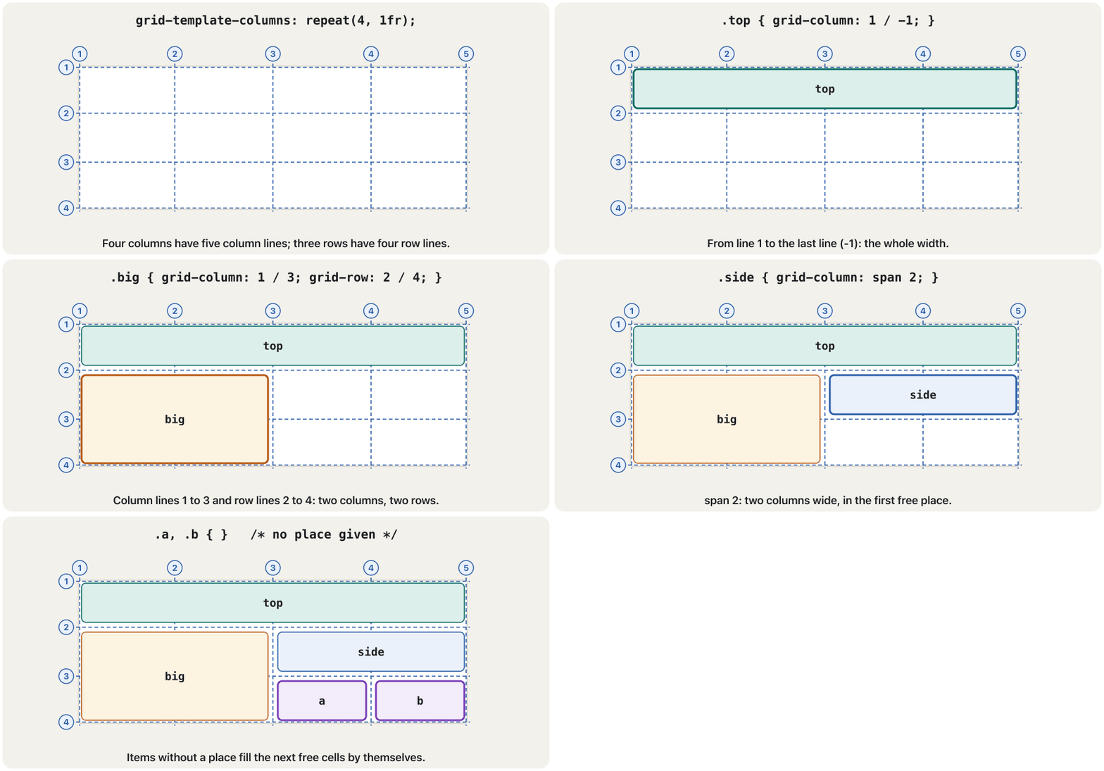
The lines between the tracks are numbered from 1, so four columns have five column lines. grid-column: 1 / 3 stretches an item from line 1 to line 3: two columns. grid-row: 2 / 4 does the same for rows. span 2 means "two tracks wide, wherever it lands", and -1 is the last line of the , so grid-column: 1 / -1 is the full width.
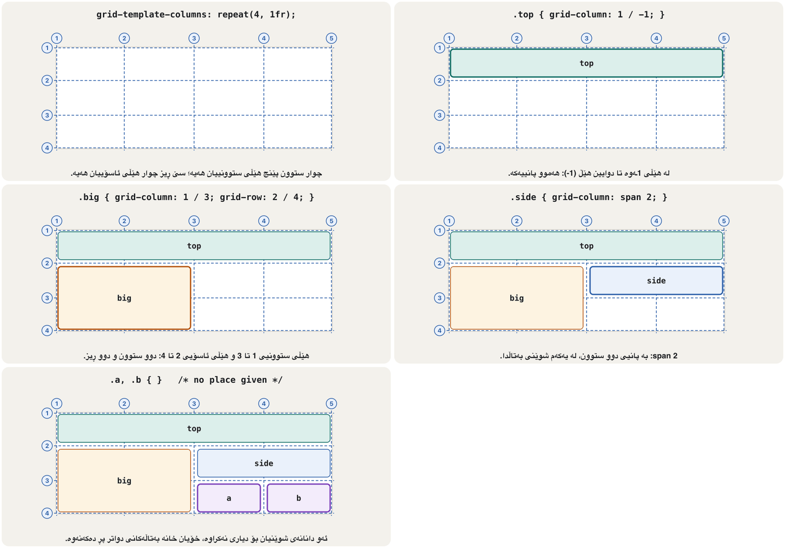
ئەو هێڵانەی نێوان ڕێچکەکان لە 1ـەوە ژمارە دەکرێن، بۆیە چوار ستوون پێنج هێڵی ستوونییان هەیە. grid-column: 1 / 3 دانەیەک لە هێڵی 1ـەوە تا هێڵی 3 درێژ دەکاتەوە: دوو ستوون. grid-row: 2 / 4 هەمان کار بۆ ڕیزەکان دەکات. span 2 واتە «بە پانیی دوو ڕێچکە، لە هەر شوێنێک دابنرێت»، هەروەها -1 دوایین هێڵی ، بۆیە grid-column: 1 / -1 هەموو پانییەکەیە.
Items you do not place fill the next free cells by themselves (auto-placement). Items placed on the same cells overlap (z-index).
ئەو دانانەی شوێنیان بۆ دیاری ناکەیت، خۆیان خانە بەتاڵەکانی دواتر پڕ دەکەنەوە (دانانی خۆکار). ئەو دانانەی لەسەر هەمان خانەکان دادەنرێن دەکەونە سەر یەک (z-index).
Think of a car park with numbered lines painted on the ground. A car stops between line 2 and line 3. A minibus needs two bays, so it stops between line 1 and line 3 — that is grid-column: 1 / 3, or span 2. Cars that arrive without a plan simply take the next free bay.
بیر لە پارکینگێک بکەرەوە کە هێڵی ژمارەکراوی لەسەر زەوی کێشراوە. ئۆتۆمبێلێک لە نێوان هێڵی 2 و هێڵی 3ـدا ڕادەوەستێت. مینیبەسێک دوو شوێنی پێویستە، بۆیە لە نێوان هێڵی 1 و هێڵی 3ـدا ڕادەوەستێت — ئەمە grid-column: 1 / 3ـە، یان span 2. ئەو ئۆتۆمبێلانەی بێ پلان دێن، یەکەم شوێنی بەتاڵ دەگرن.
Where the analogy stops workingسنووری ئەم نموونەیە
A car park keeps its numbers; in a Kurdish page the grid counts its lines from the right.
پارکینگ ژمارەکانی خۆی دەپارێزێت؛ لە لاپەڕەیەکی کوردیدا grid هێڵەکانی لە ڕاستەوە دەژمێرێت.
<!DOCTYPE html>
<html lang="en">
<head>
  <meta charset="utf-8">
  <meta name="viewport" content="width=device-width, initial-scale=1">
  <title>Placing items on lines</title>
  <style>
    body { font-family: Arial, sans-serif; }
    .paper {
      display: grid;
      grid-template-columns: repeat(4, 1fr);   /* 4 columns = 5 column lines */
      grid-template-rows: repeat(3, 70px);      /* 3 rows = 4 row lines */
      gap: 8px;
    }
    .paper div { padding: 6px; background-color: #eaf1fb; border: 1px solid #2b5ea8; }
    .top  { grid-column: 1 / -1; }              /* line 1 to the last line */
    .big  { grid-column: 1 / 3; grid-row: 2 / 4; }
    .side { grid-column: span 2; }              /* two columns, wherever it fits */
  </style>
</head>
<body>
  <div class="paper">
    <div class="top">top</div>
    <div class="big">big</div>
    <div class="side">side</div>
    <div>a</div>
    <div>b</div>
  </div>
</body>
</html>HTML sent to the browserئەو HTMLـەی دەنێردرێت بۆ تۆڕگەڕ
<!DOCTYPE html>
<html lang="en">
<head>
  <meta charset="utf-8">
  <meta name="viewport" content="width=device-width, initial-scale=1">
  <title>Placing items on lines</title>
  <style>
    body { font-family: Arial, sans-serif; }
    .paper {
      display: grid;
      grid-template-columns: repeat(4, 1fr);   /* 4 columns = 5 column lines */
      grid-template-rows: repeat(3, 70px);      /* 3 rows = 4 row lines */
      gap: 8px;
    }
    .paper div { padding: 6px; background-color: #eaf1fb; border: 1px solid #2b5ea8; }
    .top  { grid-column: 1 / -1; }              /* line 1 to the last line */
    .big  { grid-column: 1 / 3; grid-row: 2 / 4; }
    .side { grid-column: span 2; }              /* two columns, wherever it fits */
  </style>
</head>
<body>
  <div class="paper">
    <div class="top">top</div>
    <div class="big">big</div>
    <div class="side">side</div>
    <div>a</div>
    <div>b</div>
  </div>
</body>
</html>Placing items on grid linesدانانی دانەکان لەسەر هێڵەکانی grid
Lines in a Kurdish page: line 1 is on the rightهێڵەکانی grid لە لاپەڕەیەکی کوردیدا: هێڵی 1 لە لای ڕاستە
Grid lines follow the writing direction. In a page with dir="rtl", column line 1 is on the right, so grid-column: 1 / 3 puts an item at the right, and the items without a place fill each row from right to left. Rows still count from the top. You change nothing in the CSS: the whole layout mirrors by itself.
شوێن ئاڕاستەی نووسین دەکەون. لە لاپەڕەیەکدا کە dir="rtl"ـی هەیە، هێڵی ستوونیی 1 لە لای ڕاستە، بۆیە grid-column: 1 / 3 دانەیەک لە لای ڕاست دادەنێت و ئەو دانانەی شوێنیان بۆ دیاری نەکراوە هەر ڕیزێک لە ڕاستەوە بۆ چەپ پڕ دەکەنەوە. ڕیزەکان هێشتا لە سەرەوە دەژمێردرێن. لە هیچ ناگۆڕیت: هەموو خۆی پێچەوانە دەبێتەوە.
Named areas mirror too: "nav main aside" puts nav on the right in Kurdish. Around the grid, avoid left and right and use logical properties such as margin-inline-start (Layouts in Kurdish).
ناونراویش پێچەوانە دەبنەوە: "nav main aside" لە کوردیدا nav لە لای ڕاست دادەنێت. لە دەوروبەری gridـەکەدا left و right بەکار مەهێنە و وەک margin-inline-start بەکاربهێنە (ڕێکخستنی لاپەڕە بە کوردی).
<!DOCTYPE html>
<html lang="ckb" dir="rtl">
<head>
  <meta charset="utf-8">
  <meta name="viewport" content="width=device-width, initial-scale=1">
  <title>ڕۆژنامە</title>
  <style>
    body { font-family: Tahoma, Arial, sans-serif; }
    .paper {
      display: grid;
      grid-template-columns: repeat(4, 1fr);
      grid-template-rows: repeat(3, 70px);
      gap: 8px;
    }
    .paper div { padding: 6px; background-color: #eaf1fb; border: 1px solid #2b5ea8; }
    .top  { grid-column: 1 / -1; }
    .big  { grid-column: 1 / 3; grid-row: 2 / 4; }   /* the same CSS: now on the right */
    .side { grid-column: span 2; }
  </style>
</head>
<body>
  <div class="paper">
    <div class="top">سەرەوە</div>
    <div class="big">هەواڵی گەورە</div>
    <div class="side">لاتەنیشت</div>
    <div>ئ</div>
    <div>ب</div>
  </div>
</body>
</html>HTML sent to the browserئەو HTMLـەی دەنێردرێت بۆ تۆڕگەڕ
<!DOCTYPE html>
<html lang="ckb" dir="rtl">
<head>
  <meta charset="utf-8">
  <meta name="viewport" content="width=device-width, initial-scale=1">
  <title>ڕۆژنامە</title>
  <style>
    body { font-family: Tahoma, Arial, sans-serif; }
    .paper {
      display: grid;
      grid-template-columns: repeat(4, 1fr);
      grid-template-rows: repeat(3, 70px);
      gap: 8px;
    }
    .paper div { padding: 6px; background-color: #eaf1fb; border: 1px solid #2b5ea8; }
    .top  { grid-column: 1 / -1; }
    .big  { grid-column: 1 / 3; grid-row: 2 / 4; }   /* the same CSS: now on the right */
    .side { grid-column: span 2; }
  </style>
</head>
<body>
  <div class="paper">
    <div class="top">سەرەوە</div>
    <div class="big">هەواڵی گەورە</div>
    <div class="side">لاتەنیشت</div>
    <div>ئ</div>
    <div>ب</div>
  </div>
</body>
</html>Placing items on grid linesدانانی دانەکان لەسەر هێڵەکانی grid
See the lines in the developer toolsبینینی هێڵەکان لە ئامرازەکانی گەشەپێدەردا
Open the developer tools (F12, or right-click → Inspect) and find the grid container in the Elements panel (See the box model in the browser).
بکەرەوە (F12، یان کرتەی ڕاست ← Inspect) و لە پانێڵی Elementsـدا بدۆزەرەوە (بینینی مۆدێلی سندووق لە تۆڕگەڕدا).
Click the small
gridbadge next to it. The browser draws the tracks, hatches the gaps and numbers the lines: from the start (1, 2, 3…) and from the end (-1,-2…).کرتە لەسەر نیشانە بچووکەکەی
gridبکە کە لە تەنیشتیەتی. ڕێچکەکان دەکێشێت، gapـەکان هێڵکاری دەکات و هێڵەکان ژمارە دەکات: لە سەرەتاوە (1، 2، 3…) و لە کۆتاییەوە (-1،-2…).In the Layout pane you can also show track sizes and area names, and outline several grids at once.
لە پانێڵی Layoutـدا دەتوانیت قەبارەی ڕێچکەکان و ناوی ناوچەکانیش پیشان بدەیت و چەند gridـێک پێکەوە دیار بکەیت.
The three-column page, rebuilt with grid areasلاپەڕە سێ ستوونییەکە، بە ناوچەکانی grid دووپاتە دروستکراو
Now the three-column float page again (A three-column page with floats). This time the parts are the meaning-based elements from The modern way — header, nav, main, aside, footer — and the layout is drawn as a little map with grid-template-areas. Each child names its area with grid-area. No floats, no clear, no fixed heights: the three columns are always the same height, and the middle one takes all the free width.
ئێستا دووپاتە لاپەڕە سێ ستوونییە floatـییەکە (لاپەڕەیەکی سێ ستوونی بە float). ئەمجارە بەشەکان ئەو واتادارانەن کە لە ڕێگە نوێیەکە هاتوون — header، nav، main، aside، footer — و وەک نەخشەیەکی بچووک بە grid-template-areas دەکێشرێت. هەر منداڵێک ناوچەکەی خۆی بە grid-area ناو دەبات. بێ float، بێ clear، بێ بەرزیی جێگیر: سێ ستوونەکە هەمیشە هاوبەرزن و ستوونی ناوەڕاست هەموو پانییە بەتاڵەکە دەگرێت.
<!DOCTYPE html>
<html lang="en">
<head>
<meta charset="utf-8">
<meta name="viewport" content="width=device-width, initial-scale=1">
<title>Grid layout</title>
<style>
* { box-sizing: border-box; }
body { font-family: Arial, sans-serif; margin: 8px; }
h1, h2 { margin: 0; }
h2 { font-size: 1rem; }
.page {
display: grid;
grid-template-columns: 150px 1fr 150px;
grid-template-areas:
"header header header"
"nav main aside"
"footer footer footer";
gap: 8px;
}
header { grid-area: header; background-color: #b5dcb3; padding: 8px; }
nav { grid-area: nav; background-color: #aaaaaa; padding: 8px; }
main { grid-area: main; background-color: #eeeeee; padding: 8px; min-height: 200px; }
aside { grid-area: aside; background-color: #aaaaaa; padding: 8px; }
footer { grid-area: footer; background-color: #b5dcb3; text-align: center; }
</style>
</head>
<body>
<div class="page">
<header><h1>This is Web Page</h1></header>
<nav>
<h2>Main Menu</h2>
<ul><li>HTML</li><li>CSS</li><li>JavaScript</li><li>PHP</li><li>MySQL</li></ul>
</nav>
<main><p>Department of Information Technology</p></main>
<aside>
<h2>Second Stage</h2>
<ul><li>Web Design</li><li>Network</li><li>Database</li></ul>
</aside>
<footer><p>Copyright © 2017 IT Dept</p></footer>
</div>
</body>
</html>HTML sent to the browserئەو HTMLـەی دەنێردرێت بۆ تۆڕگەڕ
<!DOCTYPE html>
<html lang="en">
<head>
<meta charset="utf-8">
<meta name="viewport" content="width=device-width, initial-scale=1">
<title>Grid layout</title>
<style>
* { box-sizing: border-box; }
body { font-family: Arial, sans-serif; margin: 8px; }
h1, h2 { margin: 0; }
h2 { font-size: 1rem; }
.page {
display: grid;
grid-template-columns: 150px 1fr 150px;
grid-template-areas:
"header header header"
"nav main aside"
"footer footer footer";
gap: 8px;
}
header { grid-area: header; background-color: #b5dcb3; padding: 8px; }
nav { grid-area: nav; background-color: #aaaaaa; padding: 8px; }
main { grid-area: main; background-color: #eeeeee; padding: 8px; min-height: 200px; }
aside { grid-area: aside; background-color: #aaaaaa; padding: 8px; }
footer { grid-area: footer; background-color: #b5dcb3; text-align: center; }
</style>
</head>
<body>
<div class="page">
<header><h1>This is Web Page</h1></header>
<nav>
<h2>Main Menu</h2>
<ul><li>HTML</li><li>CSS</li><li>JavaScript</li><li>PHP</li><li>MySQL</li></ul>
</nav>
<main><p>Department of Information Technology</p></main>
<aside>
<h2>Second Stage</h2>
<ul><li>Web Design</li><li>Network</li><li>Database</li></ul>
</aside>
<footer><p>Copyright © 2017 IT Dept</p></footer>
</div>
</body>
</html>- Every row of the map has the same number of cells.
- An area must be a rectangle; repeat its name to make it bigger.
- A
.leaves a cell empty. - Break one of these rules and the whole
grid-template-areasdeclaration is ignored. - In a Kurdish page the map is read from the right: the first name is the right-hand column.
- هەموو ڕیزێکی نەخشەکە هەمان ژمارەی خانەی هەیە.
- ناوچەیەک دەبێت لاکێشە بێت؛ ناوەکەی دووپاتە بکەرەوە تا گەورەتر ببێت.
.خانەیەک بەتاڵ دەهێڵێتەوە.- ئەگەر یەکێک لەم ڕێسایانە بشکێنیت، هەموو
grid-template-areasپشتگوێ دەخرێت. - لە لاپەڕەیەکی کوردیدا نەخشەکە لە ڕاستەوە دەخوێنرێتەوە: یەکەم ناو ستوونی لای ڕاستە.
The three-column page, rebuilt with grid areasلاپەڕە سێ ستوونییەکە، بە ناوچەکانی grid دووپاتە دروستکراو
A new map for phonesنەخشەیەکی نوێ بۆ مۆبایل
Because the layout is a map in the CSS, a can swap it for another map. Phones get one column; from 700px wide the three columns come back. The HTML does not change (One media query).
لەبەر ئەوەی نەخشەیەکە لەناو ، دەتوانێت بیگۆڕێت بە نەخشەیەکی تر. مۆبایل یەک ستوون وەردەگرێت؛ لە پانیی 700pxـەوە سێ ستوونەکە دەگەڕێنەوە. ناگۆڕێت (یەک پرسی میدیا).
.page {
  display: grid;
  gap: 8px;
  grid-template-areas:          /* phones: one column */
    "header"
    "nav"
    "main"
    "aside"
    "footer";
}
@media (min-width: 700px) {
  .page {
    grid-template-columns: 150px 1fr 150px;
    grid-template-areas:
      "header header header"
      "nav    main   aside"
      "footer footer footer";
  }
}
Keep the HTML in a sensible reading order — header, menu, main text, side box, footer. The map only moves boxes on the screen; screen readers and the Tab key still follow the HTML, as with order in flexbox (Changing the order).
بە ڕیزبەندییەکی ژیرانەی خوێندنەوە بهێڵەوە — ، ، دەقی سەرەکی، سندووقی لاتەنیشت، . نەخشەکە تەنیا سندووقەکان لەسەر شاشە دەجووڵێنێت؛ و Tab هێشتا شوێن دەکەون، هەر وەک order لە (گۆڕینی ڕیزبەندی).
Extra rows by themselves: the implicit gridڕیزی زیادە بە خۆیان: gridـی خۆکار
The tracks you write with grid-template-columns and grid-template-rows form the . When there are more items than cells, the browser adds rows by itself: the . Those rows are auto sized, as tall as their content, unless you size them with grid-auto-rows.
ئەو ڕێچکانەی بە grid-template-columns و grid-template-rows دەیاننووسیت پێکدەهێنن. کاتێک دانەکان لە خانەکان زیاترن، خۆی ڕیز زیاد دەکات: . ئەو ڕیزانە قەبارەیان autoـە، بەقەد ناوەڕۆکەکەیان بەرزن، مەگەر بە grid-auto-rows قەبارەیان بۆ دابنێیت.
minmax(min, max) gives a track a range: grid-auto-rows: minmax(50px, auto) makes every extra row at least 50px tall, and taller when a long caption needs it. With grid-auto-flow: column the extra tracks become columns instead. grid-auto-flow: dense fills earlier holes with later items, but that changes the visual order, so the reading-order rule applies here too.
minmax(min, max) مەودایەک دەداتە ڕێچکەیەک: grid-auto-rows: minmax(50px, auto) وا دەکات هەموو ڕیزێکی زیادە لانیکەم 50px بەرز بێت و کاتێک دەقێکی درێژ پێویستی پێی بێت، بەرزتر ببێت. بە grid-auto-flow: column ڕێچکە زیادەکان لەبری ڕیز دەبنە ستوون. grid-auto-flow: dense کونە پێشووەکان بە دانەکانی دواتر پڕ دەکاتەوە، بەڵام ئەمە ڕیزبەندیی بینراو دەگۆڕێت، بۆیە ڕێسای ڕیزبەندیی خوێندنەوە لێرەشدا ڕاستە.
<!DOCTYPE html>
<html lang="en">
<head>
  <meta charset="utf-8">
  <meta name="viewport" content="width=device-width, initial-scale=1">
  <title>The implicit grid</title>
  <style>
    body { font-family: Arial, sans-serif; }
    .photos {
      display: grid;
      grid-template-columns: repeat(3, 1fr);
      grid-template-rows: 90px;              /* explicit: one row */
      grid-auto-rows: minmax(50px, auto);    /* implicit rows: 50px or more */
      gap: 8px;
    }
    .photos div { padding: 6px; background-color: #dcefeb; }
  </style>
</head>
<body>
  <div class="photos">
    <div>1</div><div>2</div><div>3</div>
    <div>4</div><div>5</div>
    <div>6: a long caption makes this implicit row taller than 50px, because minmax(50px, auto) lets it grow</div>
    <div>7</div>
  </div>
</body>
</html>HTML sent to the browserئەو HTMLـەی دەنێردرێت بۆ تۆڕگەڕ
<!DOCTYPE html>
<html lang="en">
<head>
  <meta charset="utf-8">
  <meta name="viewport" content="width=device-width, initial-scale=1">
  <title>The implicit grid</title>
  <style>
    body { font-family: Arial, sans-serif; }
    .photos {
      display: grid;
      grid-template-columns: repeat(3, 1fr);
      grid-template-rows: 90px;              /* explicit: one row */
      grid-auto-rows: minmax(50px, auto);    /* implicit rows: 50px or more */
      gap: 8px;
    }
    .photos div { padding: 6px; background-color: #dcefeb; }
  </style>
</head>
<body>
  <div class="photos">
    <div>1</div><div>2</div><div>3</div>
    <div>4</div><div>5</div>
    <div>6: a long caption makes this implicit row taller than 50px, because minmax(50px, auto) lets it grow</div>
    <div>7</div>
  </div>
</body>
</html>As many columns as fit: repeat(auto-fit, minmax())هێندەی جێگە هەبێت ستوون: repeat(auto-fit, minmax())
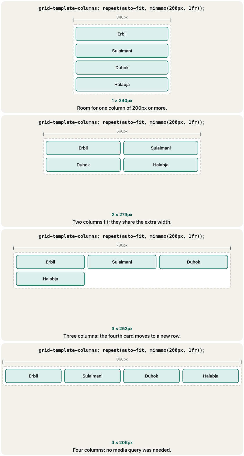
repeat(auto-fit, minmax(200px, 1fr)) asks for as many columns as fit, each at least 200px wide. The free width is then shared, so the columns end up a little wider than 200px. As the screen widens, columns appear one by one — a responsive gallery without a single media query.
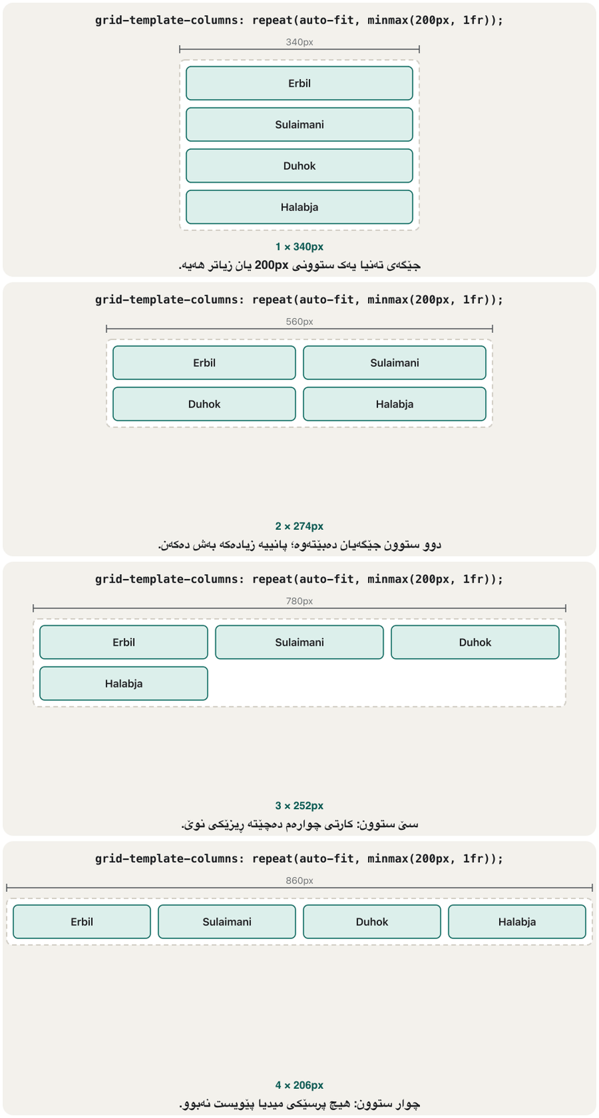
repeat(auto-fit, minmax(200px, 1fr)) داوای هێندە ستوون دەکات کە جێگەیان دەبێتەوە، هەریەکەیان لانیکەم 200px پان. پاشان پانییە بەتاڵەکە بەش دەکرێت، بۆیە ستوونەکان کەمێک لە 200px پانتر دەبن. کاتێک شاشەکە پانتر دەبێت، ستوونەکان یەک لە دوای یەک دەردەکەون — ڕێسپۆنسیڤ بێ تاکە .
<!DOCTYPE html>
<html lang="en">
<head>
  <meta charset="utf-8">
  <meta name="viewport" content="width=device-width, initial-scale=1">
  <title>auto-fit</title>
  <style>
    * { box-sizing: border-box; }
    body { font-family: Arial, sans-serif; }
    .cards {
      display: grid;
      grid-template-columns: repeat(auto-fit, minmax(180px, 1fr));
      gap: 16px;
    }
    .card { padding: 12px; border: 1px solid #d3cfc6; border-radius: 10px; }
    .card h2 { margin: 0 0 4px; font-size: 1.05rem; }
    .card p { margin: 0; }
  </style>
</head>
<body>
  <h1>Places to visit</h1>
  <div class="cards">
    <article class="card"><h2>Erbil</h2><p>Citadel tours</p></article>
    <article class="card"><h2>Sulaimani</h2><p>Book bazaar</p></article>
    <article class="card"><h2>Duhok</h2><p>Mountain walks</p></article>
    <article class="card"><h2>Halabja</h2><p>Spring flowers</p></article>
  </div>
</body>
</html>HTML sent to the browserئەو HTMLـەی دەنێردرێت بۆ تۆڕگەڕ
<!DOCTYPE html>
<html lang="en">
<head>
  <meta charset="utf-8">
  <meta name="viewport" content="width=device-width, initial-scale=1">
  <title>auto-fit</title>
  <style>
    * { box-sizing: border-box; }
    body { font-family: Arial, sans-serif; }
    .cards {
      display: grid;
      grid-template-columns: repeat(auto-fit, minmax(180px, 1fr));
      gap: 16px;
    }
    .card { padding: 12px; border: 1px solid #d3cfc6; border-radius: 10px; }
    .card h2 { margin: 0 0 4px; font-size: 1.05rem; }
    .card p { margin: 0; }
  </style>
</head>
<body>
  <h1>Places to visit</h1>
  <div class="cards">
    <article class="card"><h2>Erbil</h2><p>Citadel tours</p></article>
    <article class="card"><h2>Sulaimani</h2><p>Book bazaar</p></article>
    <article class="card"><h2>Duhok</h2><p>Mountain walks</p></article>
    <article class="card"><h2>Halabja</h2><p>Spring flowers</p></article>
  </div>
</body>
</html>As many columns as fit: repeat(auto-fit, minmax())هێندەی جێگە هەبێت ستوون: repeat(auto-fit, minmax())
auto-fill or auto-fit?auto-fill یان auto-fit؟
The two words differ only when there are fewer items than columns that fit. auto-fill keeps the empty columns, so the items stay narrow and line up with a full row below. auto-fit collapses the empty columns to 0, so the items stretch across the whole width. When the grid is full, both look the same.
ئەم دوو وشەیە تەنیا ئەو کاتە جیاوازن کە دانەکان لەو ستوونانە کەمترن کە جێگەیان دەبێتەوە. auto-fill ستوونە بەتاڵەکان دەهێڵێتەوە، بۆیە دانەکان تەسک دەمێننەوە و لەگەڵ ڕیزێکی پڕی خوارەوەدا ڕێک دەبن. auto-fit ستوونە بەتاڵەکان دەکات بە 0، بۆیە دانەکان بە هەموو پانییەکەدا درێژ دەبنەوە. کاتێک gridـەکە پڕە، هەردووکیان وەک یەکن.
auto-fill ستوونی بەتاڵ دەهێڵێتەوە، auto-fit ڕێگە دەدات دانەکان درێژ ببنەوە.CêIT<!DOCTYPE html>
<html lang="en">
<head>
<meta charset="utf-8">
<meta name="viewport" content="width=device-width, initial-scale=1">
<title>auto-fill or auto-fit</title>
<style>
body { font-family: Arial, sans-serif; }
.fill, .fit { display: grid; gap: 8px; margin-bottom: 12px; padding: 6px; background-color: #f3f1ec; }
.fill { grid-template-columns: repeat(auto-fill, minmax(120px, 1fr)); }
.fit { grid-template-columns: repeat(auto-fit, minmax(120px, 1fr)); }
.fill div, .fit div { padding: 8px; background-color: #f3ecfb; border: 1px solid #7a3db8; }
</style>
</head>
<body>
<p>auto-fill: the empty columns stay</p>
<div class="fill"><div>1</div><div>2</div></div>
<p>auto-fit: the empty columns collapse</p>
<div class="fit"><div>1</div><div>2</div></div>
</body>
</html>HTML sent to the browserئەو HTMLـەی دەنێردرێت بۆ تۆڕگەڕ
<!DOCTYPE html>
<html lang="en">
<head>
  <meta charset="utf-8">
  <meta name="viewport" content="width=device-width, initial-scale=1">
  <title>auto-fill or auto-fit</title>
  <style>
    body { font-family: Arial, sans-serif; }
    .fill, .fit { display: grid; gap: 8px; margin-bottom: 12px; padding: 6px; background-color: #f3f1ec; }
    .fill { grid-template-columns: repeat(auto-fill, minmax(120px, 1fr)); }
    .fit  { grid-template-columns: repeat(auto-fit, minmax(120px, 1fr)); }
    .fill div, .fit div { padding: 8px; background-color: #f3ecfb; border: 1px solid #7a3db8; }
  </style>
</head>
<body>
  <p>auto-fill: the empty columns stay</p>
  <div class="fill"><div>1</div><div>2</div></div>
  <p>auto-fit: the empty columns collapse</p>
  <div class="fit"><div>1</div><div>2</div></div>
</body>
</html>Aligning in grid: justify, align and placeڕێکخستنی شوێن لە gridـدا: justify، align و place
Grid aligns in two directions. Properties that start with justify- work along the row, the : left to right in English, right to left in Kurdish. Properties that start with align- work down the column, the .
grid بە دوو ئاڕاستە ڕێک دەخات. ئەو بە justify- دەست پێدەکەن بە درێژایی ڕیز کار دەکەن، واتە : لە چەپەوە بۆ ڕاست لە ئینگلیزیدا، لە ڕاستەوە بۆ چەپ لە کوردیدا. ئەوانەی بە align- دەست پێدەکەن بە درێژایی ستوون کار دەکەن، واتە .
justify-itemsandalign-items: where every item sits inside its cell. The defaultstretchfills the cell;start,centerandendshrink the item to its content.place-items: centersets both at once: the shortest way to centre something in a box.justify-selfandalign-self: the same, for one item.justify-contentandalign-content: where the whole grid sits when its tracks are smaller than the container, for example fixed 70px columns.
justify-itemsوalign-items: شوێنی هەموو دانەیەک لەناو خانەکەیدا.stretchـی بنەڕەت خانەکە پڕ دەکاتەوە؛start،centerوendدانەکە بچووک دەکەنەوە بۆ قەبارەی ناوەڕۆکەکەی.place-items: centerهەردووکیان پێکەوە دادەنێت: ئاسانترین ڕێگە بۆ ناوەڕاستکردنی شتێک لەناو سندووقێکدا.justify-selfوalign-self: هەمان شت، بۆ یەک دانە.justify-contentوalign-content: شوێنی هەموو gridـەکە کاتێک ڕێچکەکانی لە کۆنتەینەرەکە بچووکترن، بۆ نموونە ستوونی جێگیری 70px.
<!DOCTYPE html>
<html lang="en">
<head>
  <meta charset="utf-8">
  <meta name="viewport" content="width=device-width, initial-scale=1">
  <title>Alignment in grid</title>
  <style>
    body { font-family: Arial, sans-serif; }
    .hero {
      display: grid;
      place-items: center;          /* centre in both directions */
      height: 110px;
      margin-bottom: 12px;
      background-color: #eaf1fb;
    }
    .board {
      display: grid;
      grid-template-columns: repeat(3, 70px);
      grid-auto-rows: 70px;
      gap: 6px;
      justify-content: center;      /* the whole grid in the middle */
      padding: 6px;
      background-color: #f3f1ec;
    }
    .board div { background-color: #dcefeb; }
    .board .dot {
      justify-self: end;            /* one item: at the end of its cell */
      align-self: start;            /* and at the top */
      width: 24px;
      height: 24px;
      background-color: #b4530f;
    }
  </style>
</head>
<body>
  <div class="hero"><p>Centred with place-items</p></div>
  <div class="board">
    <div></div><div class="dot"></div><div></div>
    <div></div><div></div><div></div>
  </div>
</body>
</html>HTML sent to the browserئەو HTMLـەی دەنێردرێت بۆ تۆڕگەڕ
<!DOCTYPE html>
<html lang="en">
<head>
  <meta charset="utf-8">
  <meta name="viewport" content="width=device-width, initial-scale=1">
  <title>Alignment in grid</title>
  <style>
    body { font-family: Arial, sans-serif; }
    .hero {
      display: grid;
      place-items: center;          /* centre in both directions */
      height: 110px;
      margin-bottom: 12px;
      background-color: #eaf1fb;
    }
    .board {
      display: grid;
      grid-template-columns: repeat(3, 70px);
      grid-auto-rows: 70px;
      gap: 6px;
      justify-content: center;      /* the whole grid in the middle */
      padding: 6px;
      background-color: #f3f1ec;
    }
    .board div { background-color: #dcefeb; }
    .board .dot {
      justify-self: end;            /* one item: at the end of its cell */
      align-self: start;            /* and at the top */
      width: 24px;
      height: 24px;
      background-color: #b4530f;
    }
  </style>
</head>
<body>
  <div class="hero"><p>Centred with place-items</p></div>
  <div class="board">
    <div></div><div class="dot"></div><div></div>
    <div></div><div></div><div></div>
  </div>
</body>
</html>Lining up nested grids: subgridڕێککردنی gridـی ناوەکی: subgrid
A grid item can be a grid container itself, but its tracks are then independent. In a row of cards, each card sizes its own title, text and link, so the links end up at different heights. fixes this: the card spans three rows of the parent (grid-row: span 3) and says grid-template-rows: subgrid. Its title, text and link then sit in the parent's rows, which are as tall as the tallest title and text in that row.
دەتوانێت خۆی بێت، بەڵام ئەوکات ڕێچکەکانی سەربەخۆن. لە ڕیزێک ، هەر قەبارەی ناونیشان، دەق و خۆی دیاری دەکات، بۆیە لە بەرزیی جیاوازدا دەوەستن. ئەمە چاک دەکات: سێ ڕیزی باوانەکە دەگرێت (grid-row: span 3) و دەڵێت grid-template-rows: subgrid. ئیتر ناونیشان، دەق و لەناو ڕیزەکانی باواندا دادەنیشن، کە بەقەد بەرزترین ناونیشان و دەقی ئەو ڕیزە بەرزن.
A subgrid takes the parent's gap (you can override it), and its own line numbers start again from 1. Subgrid works in Chrome, Edge, Firefox and Safari since September 2023 ( widely available since March 2026).
gapـی باوانەکە وەردەگرێت (دەتوانیت بیگۆڕیت) و ژمارەی خۆی دووپاتە لە 1ـەوە دەست پێدەکات. لە ئەیلوولی 2023ـەوە لە Chrome، Edge، Firefox و Safariـدا کار دەکات (، لە ئازاری 2026ـەوە بە فراوانی بەردەست).
<!DOCTYPE html>
<html lang="en">
<head>
  <meta charset="utf-8">
  <meta name="viewport" content="width=device-width, initial-scale=1">
  <title>Subgrid</title>
  <style>
    * { box-sizing: border-box; }
    body { font-family: Arial, sans-serif; }
    .cards {
      display: grid;
      grid-template-columns: repeat(auto-fit, minmax(170px, 1fr));
      gap: 16px;
    }
    .card {
      display: grid;
      grid-row: span 3;               /* title, text, link: three rows */
      grid-template-rows: subgrid;    /* use the rows of .cards */
      gap: 8px;
      padding: 12px;
      border: 1px solid #d3cfc6;
      border-radius: 10px;
    }
    .card h2 { margin: 0; font-size: 1.05rem; }
    .card p { margin: 0; }
  </style>
</head>
<body>
  <h1>Our menu</h1>
  <div class="cards">
    <article class="card">
      <h2>Tea</h2>
      <p>Black tea in a small glass.</p>
      <a href="#tea">Order tea</a>
    </article>
    <article class="card">
      <h2>Coffee with cardamom and milk</h2>
      <p>Strong coffee.</p>
      <a href="#coffee">Order coffee</a>
    </article>
    <article class="card">
      <h2>Kulicha</h2>
      <p>Date cookies, baked fresh every morning in our own oven.</p>
      <a href="#kulicha">Order kulicha</a>
    </article>
  </div>
</body>
</html>HTML sent to the browserئەو HTMLـەی دەنێردرێت بۆ تۆڕگەڕ
<!DOCTYPE html>
<html lang="en">
<head>
  <meta charset="utf-8">
  <meta name="viewport" content="width=device-width, initial-scale=1">
  <title>Subgrid</title>
  <style>
    * { box-sizing: border-box; }
    body { font-family: Arial, sans-serif; }
    .cards {
      display: grid;
      grid-template-columns: repeat(auto-fit, minmax(170px, 1fr));
      gap: 16px;
    }
    .card {
      display: grid;
      grid-row: span 3;               /* title, text, link: three rows */
      grid-template-rows: subgrid;    /* use the rows of .cards */
      gap: 8px;
      padding: 12px;
      border: 1px solid #d3cfc6;
      border-radius: 10px;
    }
    .card h2 { margin: 0; font-size: 1.05rem; }
    .card p { margin: 0; }
  </style>
</head>
<body>
  <h1>Our menu</h1>
  <div class="cards">
    <article class="card">
      <h2>Tea</h2>
      <p>Black tea in a small glass.</p>
      <a href="#tea">Order tea</a>
    </article>
    <article class="card">
      <h2>Coffee with cardamom and milk</h2>
      <p>Strong coffee.</p>
      <a href="#coffee">Order coffee</a>
    </article>
    <article class="card">
      <h2>Kulicha</h2>
      <p>Date cookies, baked fresh every morning in our own oven.</p>
      <a href="#kulicha">Order kulicha</a>
    </article>
  </div>
</body>
</html>Grid or flexbox?grid یان Flexbox؟
Ask two questions. Do you control the layout by row or by column? Use flexbox: a menu, a toolbar, a row of buttons, items whose size comes from their content. Do you need rows and columns to line up? Use grid: a page, a gallery, a dashboard, a form with its labels in one column.
دوو پرسیار بکە. ئایا بە ڕیز یان بە ستوون کۆنترۆڵ دەکەیت؟ بەکاربهێنە: ، ، ڕیزێک ، دانە کە قەبارەیان لە ناوەڕۆکەکەیانەوە دێت. ئایا پێویستت بەوەیە ڕیز و ستوون پێکەوە ڕێک بن؟ grid بەکاربهێنە: لاپەڕەیەک، ، ، کە لە یەک ستووندان.
- Flexbox works from the content out: each wrapped line shares its own space.
- Grid works from the layout in: you draw the tracks, then put the items in them.
- Most pages use both: grid for the page, flexbox inside the header, the menu and the cards.
- لە ناوەڕۆکەوە بەرەو دەرەوە کار دەکات: هەر دێڕێکی نوێ بۆشایی خۆی بەش دەکات.
- grid لە بەرەو ناوەوە کار دەکات: ڕێچکەکان دەکێشیت، پاشان دانەکانیان تێدا دادەنێیت.
- زۆربەی لاپەڕەکان هەردووکیان بەکار دەهێنن: grid بۆ لاپەڕەکە، لەناو ، و .
.page { display: grid; grid-template-columns: 220px 1fr; gap: 16px; }   /* two directions: the page */
.menu { display: flex; flex-wrap: wrap; gap: 8px; } /* one direction: the menu */Common mistakesهەڵە باوەکان
| Mistakeهەڵە | What happensچی ڕوودەدات | Fixچارەسەر |
|---|---|---|
Rows of grid-template-areas with different cell counts, or an L-shaped areaژمارەی جیاوازی خانە لە ڕیزەکانی grid-template-areas، یان ناوچەیەکی L شێوە | The whole declaration is ignoredهەموو پشتگوێ دەخرێت | The same number of cells in every row; rectangles onlyهەمان ژمارەی خانە لە هەموو ڕیزێکدا؛ تەنیا لاکێشە |
A typo in a grid-area nameهەڵەی نووسین لە ناوی grid-area | The item drops into the next free cellدانەکە دەکەوێتە خانەی بەتاڵی دواتر | Check the names in the grid overlayناوی ناوچەکان لە ڕووپۆشی gridـدا بپشکنە |
Counting columns, not lines: grid-column: 1 / 2 for two columnsژماردنی ستوون لەبری هێڵ: grid-column: 1 / 2 بۆ دوو ستوون | The item covers one columnدانەکە یەک ستوون دەگرێتەوە | columns need lines 1 to : 1 / 3 ستوون هێڵی 1 تا ـیان پێویستە: 1 / 3 |
-1 to reach the last implicit row-1 بۆ گەیشتن بە دوایین ڕیزی خۆکار | It stops at the end of the explicit gridلە کۆتایی دەوەستێت | Write the rows in grid-template-rows, or use spanڕیزەکان لە grid-template-rowsـدا بنووسە، یان span بەکاربهێنە |
A long word, URL or <pre> in a 1fr columnوشە، URL یان <pre>ـێکی درێژ لە ستوونێکی 1frـدا | The column grows and the page scrolls sidewaysستوونەکە گەورە دەبێت و لاپەڕەکە بە ئاسۆیی دەجووڵێت | minmax(0, 1fr) instead of 1frminmax(0, 1fr) لەبری 1fr |
Fixed columns such as repeat(4, 250px)ستوونی جێگیری وەک repeat(4, 250px) | Too wide for phonesبۆ مۆبایل زۆر پانە | repeat(auto-fit, minmax(…, 1fr)) or a media queryrepeat(auto-fit, minmax(…, 1fr)) یان |
Areas, order or dense to change the reading orderناوچە، order یان dense بۆ گۆڕینی ڕیزبەندیی خوێندنەوە | Screen readers and Tab still follow the HTML و Tab هێشتا شوێن HTML دەکەون | Change the HTML orderڕیزبەندیی HTMLـەکە بگۆڕە |
Why minmax(0, 1fr)? 1fr means minmax(auto, 1fr); like a flex item (When an item will not shrink), the column never gets narrower than its longest word. minmax(0, 1fr) removes that minimum; overflow-wrap: break-word then breaks the word.
بۆچی minmax(0, 1fr)؟ 1fr واتە minmax(auto, 1fr): وەک (کاتێک دانەیەک بچووک نابێتەوە)، ستوونەکە هەرگیز لە درێژترین وشەکەی تەسکتر نابێت. minmax(0, 1fr) ئەم کەمترینە لادەبات و پاشان overflow-wrap: break-word وشەکە دەشکێنێت.
Exercisesڕاهێنانەکان
A photo gallery should show as many 200 px (or wider) columns as fit: four on a big screen, two on a tablet, one on a phone — without writing any media query.
وێنە دەبێت هێندە ستوونی 200px (یان پانتر) پیشان بدات کە جێگەیان دەبێتەوە: چوار لەسەر شاشەی گەورە، دوو لەسەر ، یەک لەسەر مۆبایل — بێ نووسینی هیچ .
Show answerوەڵامەکە پیشان بدە
.gallery {
  display: grid;
  grid-template-columns: repeat(auto-fit, minmax(200px, 1fr));
  gap: 12px;
}
.gallery img {
  max-width: 100%;
  height: auto;
}
repeat(auto-fit, minmax(200px, 1fr)) makes as many columns of at least 200 px as fit, and shares the rest of the width among them. Grid decides the number of columns by itself.
repeat(auto-fit, minmax(200px, 1fr)) ئەوەندە ستوونی لانیکەم 200px دروست دەکات کە جێگەیان دەبێتەوە و باقیی پانییەکە بەسەریاندا دابەش دەکات. grid خۆی ژمارەی ستوونەکان دیاری دەکات.
Many design systems use 12 columns. Build a page on repeat(12, 1fr): a header and a footer across all 12 columns, a menu 3 columns wide beside a main text 9 columns wide, and three cards of 4 columns each below them. Use span, not line numbers, so the page still works when you move a part.
زۆرێک لە 12 ستوون بەکار دەهێنن. لاپەڕەیەک لەسەر repeat(12, 1fr) دروست بکە: و بە درێژایی هەر 12 ستوونەکە، بە پانیی 3 ستوون لە تەنیشت دەقێکی سەرەکی بە پانیی 9 ستوون و سێ لە ژێریاندا کە هەریەکەیان 4 ستوونە. span بەکاربهێنە، نەک ژمارەی هێڵ، بۆ ئەوەی کاتێک بەشێک دەجووڵێنیت لاپەڕەکە هەر کار بکات.
Hintئاماژە
Use header, footer { grid-column: 1 / -1; }.
header, footer { grid-column: 1 / -1; } بەکاربهێنە.
Show answerوەڵامەکە پیشان بدە
<!DOCTYPE html>
<html lang="en">
<head>
  <meta charset="utf-8">
  <meta name="viewport" content="width=device-width, initial-scale=1">
  <title>A 12-column page</title>
  <style>
    * { box-sizing: border-box; }
    body { font-family: Arial, sans-serif; }
    .page { display: grid; grid-template-columns: repeat(12, 1fr); gap: 8px; }
    .page > * { margin: 0; padding: 8px; background-color: #eaf1fb; }
    header, footer { grid-column: 1 / -1; }   /* all 12 columns */
    nav  { grid-column: span 3; }
    main { grid-column: span 9; }
    .card { grid-column: span 4; background-color: #dcefeb; }
    h1 { margin: 0; font-size: 1.2rem; }
  </style>
</head>
<body>
  <div class="page">
    <header><h1>Hana's travel blog</h1></header>
    <nav>Menu</nav>
    <main>Main text</main>
    <div class="card">Erbil</div>
    <div class="card">Duhok</div>
    <div class="card">Halabja</div>
    <footer>Footer</footer>
  </div>
</body>
</html>HTML sent to the browserئەو HTMLـەی دەنێردرێت بۆ تۆڕگەڕ
<!DOCTYPE html>
<html lang="en">
<head>
  <meta charset="utf-8">
  <meta name="viewport" content="width=device-width, initial-scale=1">
  <title>A 12-column page</title>
  <style>
    * { box-sizing: border-box; }
    body { font-family: Arial, sans-serif; }
    .page { display: grid; grid-template-columns: repeat(12, 1fr); gap: 8px; }
    .page > * { margin: 0; padding: 8px; background-color: #eaf1fb; }
    header, footer { grid-column: 1 / -1; }   /* all 12 columns */
    nav  { grid-column: span 3; }
    main { grid-column: span 9; }
    .card { grid-column: span 4; background-color: #dcefeb; }
    h1 { margin: 0; font-size: 1.2rem; }
  </style>
</head>
<body>
  <div class="page">
    <header><h1>Hana's travel blog</h1></header>
    <nav>Menu</nav>
    <main>Main text</main>
    <div class="card">Erbil</div>
    <div class="card">Duhok</div>
    <div class="card">Halabja</div>
    <footer>Footer</footer>
  </div>
</body>
</html>fills the second row and the third, so auto-placement puts every part in the right row.
ڕیزی دووەم پڕ دەکاتەوە و ڕیزی سێیەم، بۆیە دانانی خۆکار هەموو بەشێک لە ڕیزی دروستدا دادەنێت.
Build the dashboard in the picture with grid-template-areas: a top bar across the page; a side menu 150px wide down the left; sales and users boxes side by side; a chart under them. Then say what one change makes it a single column on phones.
ئەو لە وێنەکەدایە بە grid-template-areas دروست بکە: شریتێکی سەرەوە بە درێژایی لاپەڕەکە؛ لاتەنیشتی 150px بە درێژایی لای چەپ؛ سندووقی sales و users لە تەنیشت یەک؛ لە ژێریاندا. پاشان بڵێ کام گۆڕانکاری وای لێدەکات لەسەر مۆبایل ببێتە یەک ستوون.
Show answerوەڵامەکە پیشان بدە
<!DOCTYPE html>
<html lang="en">
<head>
  <meta charset="utf-8">
  <meta name="viewport" content="width=device-width, initial-scale=1">
  <title>Dashboard</title>
  <style>
    * { box-sizing: border-box; }
    body { margin: 8px; font-family: Arial, sans-serif; }
    .dash {
      display: grid;
      grid-template-columns: 150px 1fr 1fr;
      grid-template-rows: auto 1fr 1fr;
      grid-template-areas:
        "top  top   top"
        "side sales users"
        "side chart chart";
      gap: 10px;
      min-height: 320px;
    }
    .dash > * { margin: 0; padding: 10px; border-radius: 8px; background-color: #eaf1fb; }
    .top   { grid-area: top; background-color: #0d6b62; color: white; }
    .side  { grid-area: side; background-color: #f3f1ec; }
    .sales { grid-area: sales; }
    .users { grid-area: users; }
    .chart { grid-area: chart; background-color: #fdf3e1; }
    h1 { margin: 0; font-size: 1.1rem; }
  </style>
</head>
<body>
  <div class="dash">
    <header class="top"><h1>Shop dashboard</h1></header>
    <nav class="side">Menu</nav>
    <div class="sales">Sales today: 42</div>
    <div class="users">Visitors: 310</div>
    <div class="chart">Chart of the week</div>
  </div>
</body>
</html>HTML sent to the browserئەو HTMLـەی دەنێردرێت بۆ تۆڕگەڕ
<!DOCTYPE html>
<html lang="en">
<head>
  <meta charset="utf-8">
  <meta name="viewport" content="width=device-width, initial-scale=1">
  <title>Dashboard</title>
  <style>
    * { box-sizing: border-box; }
    body { margin: 8px; font-family: Arial, sans-serif; }
    .dash {
      display: grid;
      grid-template-columns: 150px 1fr 1fr;
      grid-template-rows: auto 1fr 1fr;
      grid-template-areas:
        "top  top   top"
        "side sales users"
        "side chart chart";
      gap: 10px;
      min-height: 320px;
    }
    .dash > * { margin: 0; padding: 10px; border-radius: 8px; background-color: #eaf1fb; }
    .top   { grid-area: top; background-color: #0d6b62; color: white; }
    .side  { grid-area: side; background-color: #f3f1ec; }
    .sales { grid-area: sales; }
    .users { grid-area: users; }
    .chart { grid-area: chart; background-color: #fdf3e1; }
    h1 { margin: 0; font-size: 1.1rem; }
  </style>
</head>
<body>
  <div class="dash">
    <header class="top"><h1>Shop dashboard</h1></header>
    <nav class="side">Menu</nav>
    <div class="sales">Sales today: 42</div>
    <div class="users">Visitors: 310</div>
    <div class="chart">Chart of the week</div>
  </div>
</body>
</html>
For phones, put a one-column map first ("top" "side" "sales" "users" "chart" with one column) and move the three-column map into @media (min-width: 700px), as in A new map for phones.
بۆ مۆبایل، سەرەتا نەخشەیەکی یەک ستوونی دابنێ ("top" "side" "sales" "users" "chart" بە یەک ستوون) و نەخشە سێ ستوونییەکە بگوازەرەوە بۆ ناو @media (min-width: 700px)، وەک لە نەخشەیەکی نوێ بۆ مۆبایل.
In grid-template-columns: repeat(4, 1fr), which columns do these cover? (1) grid-column: 2 / 4, (2) grid-column: 3 / -1, (3) grid-column: span 2 on the first item, (4) the same three in a Kurdish page.
لە grid-template-columns: repeat(4, 1fr)ـدا، ئەمانە کام ستوونەکان دەگرنەوە؟ (1) grid-column: 2 / 4، (2) grid-column: 3 / -1، (3) grid-column: span 2 لەسەر یەکەم دانە، (4) هەمان سێیان لە لاپەڕەیەکی کوردیدا.
Show answerوەڵامەکە پیشان بدە
- (1) Columns 2 and 3 (lines 2 to 4).
- (2) Columns 3 and 4:
-1is line 5. - (3) Columns 1 and 2: the first free place, two tracks wide.
- (4) The same columns, counted from the right: (1) is then the second and third column from the right.
- (1) ستوونەکانی 2 و 3 (هێڵەکانی 2 تا 4).
- (2) ستوونەکانی 3 و 4:
-1هێڵی 5ـە. - (3) ستوونەکانی 1 و 2: یەکەم شوێنی بەتاڵ، بە پانیی دوو ڕێچکە.
- (4) هەمان ستوونەکان، بەڵام لە ڕاستەوە دەژمێردرێن: (1) ئەوکات ستوونی دووەم و سێیەمە لە لای ڕاستەوە.
Summaryپوختە
display: gridandgrid-template-columns(and-rows) make the tracks;frshares the free space after the fixed tracks and the gaps;repeat()writes patterns.- Items sit on numbered lines (
grid-column: 1 / 3,span 2,1 / -1); in a Kurdish page line 1 is on the right. grid-template-areasdraws the page as a map, and a media query can swap the map.- Extra items create the implicit grid: size it with
grid-auto-rows: minmax(…). repeat(auto-fit, minmax(200px, 1fr))gives responsive columns without media queries.place-items: centercentres;subgridlines up nested cards.- Flexbox for one direction, grid for two — usually both.
display: gridوgrid-template-columns(و-rows) ڕێچکەکان دروست دەکەن؛frبۆشاییە بەتاڵەکە دوای ڕێچکە جێگیرەکان و gapـەکان بەش دەکات؛repeat()نەخشە دەنووسێت.- دانەکان لەسەر هێڵی ژمارەکراو دادەنیشن (
grid-column: 1 / 3،span 2،1 / -1)؛ لە لاپەڕەیەکی کوردیدا هێڵی 1 لە لای ڕاستە. grid-template-areasلاپەڕەکە وەک نەخشەیەک دەکێشێت و دەتوانێت نەخشەکە بگۆڕێت.- دانە زیادەکان دروست دەکەن: قەبارەی بە
grid-auto-rows: minmax(…)دیاری بکە. repeat(auto-fit, minmax(200px, 1fr))ستوونی ڕێسپۆنسیڤ بێ دەدات.place-items: centerناوەڕاست دەکات؛subgridناوەکییەکان ڕێک دەخات.- بۆ یەک ئاڕاستە، grid بۆ دوو — زۆرجار هەردووکیان.
Flexbox or grid for a page with header, two side columns and a footer?Flexbox یان grid بۆ لاپەڕەیەک بە سەرپەڕە، دوو ستوونی لاتەنیشت و ژێرپەڕە؟
Grid: it places boxes in rows and columns at once; flexbox is best for one row, like a menu.
: سندووقەکان لە ڕیز و ستووندا پێکەوە دادەنێت؛ بۆ یەک ڕیز باشترە، وەک .
Next: Responsive Design makes a page like this fit every screen, from a phone to a wide monitor.
دواتر: دیزاینی ڕێسپۆنسیڤ وا دەکات لاپەڕەیەکی لەم جۆرە لەگەڵ هەموو شاشەیەکدا بگونجێت، لە مۆبایلەوە تا پان.
Lesson complete!وانەکە تەواو بوو!
Well done. Review the key terms, then go on to the next lesson.دەستخۆش. سەیرێکی زاراوە سەرەکییەکان بکەرەوە، پاشان بڕۆ بۆ وانەی داهاتوو.
Key termsزاراوە سەرەکییەکان
Responsive Design: Viewport, Media Queries and Mobile-Firstدیزاینی ڕێسپۆنسیڤ: ناوچەی بینین، پرسەکانی میدیا و مۆبایل لە پێشدا
Related lecturesوانە پەیوەندیدارەکان
- Normal Flow, Floats and Positioningڕەوتی ئاسایی، float و شوێندانان
- HTML Basics: Documents, Links and Tablesبنەماکانی HTML: بەڵگەنامە، بەستەرەکان و خشتەکان
- The CSS Box Model: Margin, Border and Paddingمۆدێلی سندووقی CSS: پەراوێز، سنوور و بۆشایی ناوەوە
- Responsive Design: Viewport, Media Queries and Mobile-Firstدیزاینی ڕێسپۆنسیڤ: ناوچەی بینین، پرسەکانی میدیا و مۆبایل لە پێشدا
- Kurdish and Bilingual Websites: Right to Leftتۆڕگەکانی کوردی و دووزمانە: ڕاست بۆ چەپ
- Project: Building and Styling Pagesپڕۆژە: دروستکردن و ڕازاندنەوەی لاپەڕە
References and further readingسەرچاوەکان و خوێندنەوەی زیاتر
This lecture is a first edition. The Kurdish text and terminology are waiting for review by Kurdish IT teachers.ئەم وانەیە چاپی یەکەمە. دەقە کوردییەکە و زاراوەکانی چاوەڕێی پێداچوونەوەی مامۆستایانی کوردی بواری IT ن.