Chapterبەش 8 · Lectureوانە 8.1
Final Project: Your Portfolio Websiteپڕۆژەی کۆتایی: پۆرتفۆلیۆی ئۆنلاینی خۆت
Plan, design, build, test and publish your own portfolio website: the brief and its success criteria, a SMART goal and a site map, hand-written CSS or a framework (Bootstrap 5.3, Tailwind CSS 4) or a CMS (WordPress), wireframes and a style tile, the HTML structure, a mobile-first layout, one small JavaScript touch, layered tests and GitHub Pages — with a complete model site for a student, Shilan, and a rubric to score your own.
خۆت پلان بکە، دیزاینی بکە، دروستی بکە، تاقی بکەرەوە و بڵاوی بکەرەوە: ئەرکەکە و مەرجەکانی سەرکەوتن، و ، بە دەست نووسراو یان (Bootstrap 5.3، Tailwind CSS 4) یان (WordPress)، و ، پێکهاتەی ، ، کەمێک ، تاقیکردنەوەی چین بە چین و GitHub Pages — لەگەڵ نموونەیی تەواو بۆ قوتابییەک بە ناوی شیلان و خشتەیەکی هەڵسەنگاندن بۆ نرخاندنی خۆت.
What you will learnچی فێر دەبیت
- Write a brief with testable success criteria, a SMART goal, the audience, user tasks and a site map for a portfolio.
- Choose between hand-written CSS, a CSS framework and a CMS or site builder, and explain what each still needs from you.
- Turn phone and desktop wireframes into a style tile kept as CSS custom properties.
- Build a bilingual site in layers: semantic HTML, mobile-first CSS with logical properties and one small progressive-enhancement script.
- Test the site in layers, fix what fails, publish it and score it with a rubric.
- بۆ ئەرکێک بە مەرجی تاقیکراوەی سەرکەوتن، ، بینەر، کارەکانی و بنووسیت.
- لە نێوان بە دەست نووسراو، CSS و یان هەڵبژێریت و ڕوون بکەیتەوە هەریەکەیان هێشتا چی لە تۆ دەوێت.
- مۆبایل و بکەیت بە کە وەک هەڵدەگیرێت.
- دووزمانە چین بە چین دروست بکەیت: ، بە و بچووکی .
- چین بە چین تاقی بکەیتەوە، ئەوەی دەرناچێت چاکی بکەیت، بڵاوی بکەیتەوە و بە خشتەیەکی هەڵسەنگاندن بینرخێنیت.
The brief: build your own portfolioئەرکەکە: پۆرتفۆلیۆی ئۆنلاینی خۆت دروست بکە
This last project joins the whole course into one website: your own . Choose a showcase portfolio (only your best work) or a reflective one (each project with a note on what you learned) — Online portfolios. Give it three to five pages — Home, Projects, About and Contact — in Kurdish, English or both (Bilingual sites). The site is also your best evidence: whoever opens it sees at once what you can build.
ئەم پڕۆژەی کۆتاییە هەموو کۆرسەکە لە یەک کۆ دەکاتەوە: خۆت. پۆرتفۆلیۆی پیشاندان هەڵبژێرە (تەنیا باشترین کارەکانت) یان پۆرتفۆلیۆی بیرکردنەوە (هەر پڕۆژەیەک بە تێبینییەک لەبارەی ئەوەی فێری بوویت) — پۆرتفۆلیۆ ئۆنلاینەکان. سێ تا پێنج لاپەڕەی هەبێت — سەرەکی، پڕۆژەکان، لەبارە و پەیوەندی — بە کوردی، ئینگلیزی یان هەردووکیان (تۆڕگەکان دووزمانە). خۆی باشترین بەڵگەشتە: هەر کەسێک بیکاتەوە یەکسەر دەبینێت چی دەتوانیت دروست بکەیت.
The brief: build your own portfolioئەرکەکە: پۆرتفۆلیۆی ئۆنلاینی خۆت دروست بکە
Success criteria: when is it finished?مەرجەکانی تەواوبوون: کەی تەواو دەبێت؟
Before you start, write down how you will know that the site is finished. Shilan's list — use it, or add your own:
پێش ئەوەی دەست پێ بکەیت، بینووسە چۆن دەزانیت تەواو بووە. لیستەکەی شیلان — بەکاری بهێنە یان هی خۆتی بۆ زیاد بکە:
- Three to five pages with one shared header, menu and footer; every link works.
- Valid code: no errors in the W3C HTML and CSS checkers.
- It works from a 320 px phone to a wide screen without sideways scrolling.
- It can be used with the keyboard alone, and the focus is always visible.
- Text contrast is at least 4.5 : 1, and every picture has fitting alt text.
- Every page has its own
<title>, a description and the rightlang(withdir="rtl"on Kurdish pages). - Each project says what you did and what you learned.
- It is published at an
https://address that you can share.
- سێ تا پێنج لاپەڕە بە یەک ، و هاوبەش؛ هەموو کار دەکات.
- کۆدی دروست: هیچ هەڵەیەک لە پشکنەرەکانی و نییە.
- لە مۆبایلێکی 320 pxـەوە تا شاشەیەکی پان کار دەکات، بێ ئەوەی بە لادا بڕوات.
- تەنیا بە بەکار دەهێنرێت و هەمیشە دیارە.
- دەق لانیکەم ـە و هەموو وێنەیەک گونجاوی هەیە.
- هەموو لاپەڕەیەک
<title>، پێناسە وlangـی دروستی خۆی هەیە (لەگەڵdir="rtl"لە لاپەڕە کوردییەکاندا). - هەر پڕۆژەیەک دەڵێت چیت کرد و چیت فێر بوو.
- لەسەر ناونیشانێکی
https://بڵاو کراوەتەوە کە دەتوانیت بینێریت.
Plan: goal, audience and a site mapپلان: ئامانج، بینەر و نەخشەی تۆڕگە
Plan before you open the editor, as in the planning phase of the life cycle. Shilan wrote three short answers:
پێش کردنەوەی پلان دابنێ، وەک قۆناغی پلاندانان لە . شیلان سێ وەڵامی کورتی نووسی:
- Goal (SMART): publish a four-page portfolio with three projects, in Kurdish and English, by 15 January 2027, and send its link with three internship applications.
- Audience: web companies and teachers in the Kurdistan Region. They open links on their phones, read Kurdish and English, and decide within a minute.
- Tasks (user tasks and the site map): see her best work quickly, read what she can do, and write to her.
- ئامانج (SMART): تا 15ی کانوونی دووەمی 2027 چوار لاپەڕەیی بە سێ پڕۆژە، بە کوردی و ئینگلیزی، بڵاو بکاتەوە و لەگەڵ سێ داواکاریی ڕاهێنان بنێرێت.
- بینەر: کۆمپانیاکانی وێب و مامۆستایان لە هەرێمی کوردستان. لەسەر مۆبایلەکانیان دەکەنەوە، کوردی و ئینگلیزی دەخوێننەوە و لە ماوەی یەک خولەکدا بڕیار دەدەن.
- کارەکان (کارەکانی بەکارهێنەر و نەخشەی تۆڕگە): بە خێرایی باشترین کارەکانی ببینن، بخوێننەوە چی دەتوانێت بکات و نامەی بۆ بنووسن.
Plan: goal, audience and a site mapپلان: ئامانج، بینەر و نەخشەی تۆڕگە
Gather the content firstسەرەتا ناوەڕۆکەکە کۆ بکەرەوە
Write the words before the code: real text shows what the layout must hold. For every project collect a title, one sentence about it, what you did, what you learned, the tools, one picture, and links to the live page and to the code.
پێش کۆد وشەکان بنووسە: دەقی ڕاستەقینە پیشان دەدات دەبێت چی لەخۆ بگرێت. بۆ هەر پڕۆژەیەک ئەمانە کۆ بکەرەوە: ناونیشانێک، یەک ڕستە لەبارەی، چیت کرد، چیت فێر بوو، ئامرازەکان، یەک وێنە و بۆ لاپەڕە زیندووەکە و بۆ کۆدەکە.
Use your own screenshots and drawings, or free-licensed photos with a credit line under each (Pictures you may use), and export each picture at the size it is shown (Export at the size you show). Keep private data off a public site: no home address, no ID numbers, no photos of other people without their permission — an e-mail address is enough.
و وێنەکێشانی خۆت بەکاربهێنە، یان وێنەی مۆڵەتی ئازاد بە دێڕێکی ناوی خاوەنەکەی لە ژێر هەریەکەیاندا (ئەو وێنانەی دەتوانیت بەکاریان بهێنیت) و هەر وێنەیەک بەو قەبارەیە هەناردە بکە کە پیشان دەدرێت (بەو قەبارەیە هەناردەی بکە کە پیشانی دەدەیت). لە گشتیدا دامەنێ: نە ناونیشانی ماڵ، نە ژمارەی ناسنامە، نە وێنەی کەسانی تر بەبێ ئەوەی ڕازی بن — بەسە.
Choose your tools: by hand, a framework or a CMSئامرازەکانت هەڵبژێرە: بە دەست، فرەیموۆرک یان سیستەمی بەڕێوەبردنی ناوەڕۆک
There are three ways to build the same site. By hand: you write every line of HTML and CSS — slower at first, but you learn the most, and the code is small and yours. With a CSS : you still write the HTML, and add ready-made classes and parts. With a or a : you fill in forms and pick a , without writing code. The University of Michigan's web design capstone offers students the same choice: from scratch, from a template or with a framework.
سێ ڕێگە هەیە بۆ دروستکردنی هەمان . بە دەست: هەموو دێڕێکی و خۆت دەنووسیت — سەرەتا هێواشترە، بەڵام زۆرترین شت فێر دەبیت و کۆدەکە بچووک و هی خۆتە. بە CSS: هێشتا خۆت دەنووسیت و کلاس و پارچەی ئامادەی بۆ زیاد دەکەیت. بە یان : پڕ دەکەیتەوە و هەڵدەبژێریت، بێ نووسینی کۆد. پڕۆژەی کۆتایی کۆرسی زانکۆی میشیگان هەمان هەڵبژاردن دەداتە قوتابیان: لە سفرەوە، لە یان بە .
Choose your tools: by hand, a framework or a CMSئامرازەکانت هەڵبژێرە: بە دەست، فرەیموۆرک یان سیستەمی بەڕێوەبردنی ناوەڕۆک
What a CSS framework gives — and what it does notفرەیموۆرکێکی CSS چی دەدات — و چی نادات
Two CSS frameworks are common in 2026. Bootstrap (stable version 5.3.8; a version 6 is in alpha testing) gives ready components — a menu bar, cards, buttons, a 12-column grid — that you switch on with classes such as btn btn-primary; you link its CSS file and, for menus and dialogs, its JavaScript. Tailwind CSS (version 4.3) is utility-first: many small classes, each doing one job — flex, p-4, text-center — written in your HTML. A build step then keeps only the CSS you really used; its CDN script is for trying things out, not for a real site.
دوو CSS لە ساڵی 2026ـدا باون. Bootstrap (وەشانی جێگیر 5.3.8؛ وەشانی 6 لە تاقیکردنەوەی alphaـدایە) پارچەی ئامادە دەدات — شریتی ، ، ، grid بە 12 ستوون — کە بە کلاسی وەک btn btn-primary کارایان دەکەیت؛ CSSـەکەی دەبەستیتەوە و بۆ و ، . Tailwind CSS (وەشانی 4.3) شێوازی utility-firstـی هەیە: زۆر کلاسی بچووک کە هەریەکەیان یەک کار دەکات — flex، p-4، text-center — لە ناو دەنووسرێن. پاشان هەنگاوێکی دروستکردن تەنیا ئەو CSSـە دەهێڵێتەوە کە بەڕاستی بەکارت هێناوە؛ CDNـەکەی بۆ تاقیکردنەوەیە، نەک بۆ ڕاستەقینە.
Choose your tools: by hand, a framework or a CMSئامرازەکانت هەڵبژێرە: بە دەست، فرەیموۆرک یان سیستەمی بەڕێوەبردنی ناوەڕۆک
A CMS or a site builderسیستەمی بەڕێوەبردنی ناوەڕۆک یان دروستکەری تۆڕگە
WordPress is the best-known : free, open-source software (GPLv2) written in PHP. It keeps your pages in a MySQL or MariaDB database and builds each page when someone asks for it — so it needs PHP hosting, not a static host such as GitHub Pages (Static hosting or PHP hosting?). On 4 November 2026 the survey site W3Techs found it on 39.5 % of all websites. A is an online service instead: you drag blocks onto a , and the company hosts the site for you.
WordPress ناسراوترین : بێبەرانبەر و (GPLv2) کە بە نووسراوە. لاپەڕەکانت لە MySQL یان MariaDBـدا هەڵدەگرێت و هەر لاپەڕەیەک کاتێک کەسێک داوای دەکات دروست دەکات — بۆیە پێویستی بە هەیە، نەک وەک GitHub Pages (هۆستینگی لاپەڕەتۆڕی نەگۆڕ یان هۆستینگی PHP؟). لە 4ی تشرینی دووەمی 2026ـدا ڕاپرسیی W3Techs لەسەر 39.5 %ـی هەموو دۆزییەوە. لە بری ئەوە خزمەتگوزارییەکی ئۆنلاینە: بلۆکەکان ڕادەکێشیت بۆ سەر و کۆمپانیاکە بۆت هۆست دەکات.
| Questionپرسیار | By handبە دەست | CSS framework CSS | CMS or builder یان دروستکەر |
|---|---|---|---|
| You writeتۆ دەینووسیت | All the HTML and CSSهەموو و | The HTML, with ready classes، بە کلاسی ئامادە | Text in forms; no codeدەق لە ناو ؛ بێ کۆد |
| Controlکۆنترۆڵ | Fullتەواو | Highزۆر | Low to mediumکەم تا مامناوەند |
| Best forباشترین بۆ | Learning; a small personal siteفێربوون؛ کەسیی بچووک | Fast work in a teamکاری خێرا لە تیمێکدا | Owners who update content oftenئەو خاوەنانەی ناوەڕۆک زۆرجار نوێ دەکەنەوە |
| Hosting | Free static hosting بێبەرانبەر | Free static hosting بێبەرانبەر | PHP hosting, or the builder's own ، یان هی خودی دروستکەرەکە |
| Upkeepچاودێری | Your own code onlyتەنیا کۆدی خۆت | Framework updatesنوێکردنەوەی | Updates for the CMS, theme and pluginsنوێکردنەوەی ، تێم و |
Wireframes: the phone first, then the wide screenوایەرفرەیمەکان: سەرەتا مۆبایل، پاشان شاشەی پان
Sketch every page on paper before you style anything (Wireframes: boxes before colours). Draw the phone first — one column — then the wide screen, and write the real headings and button words. Shilan's home page: her name and a Menu button, a big hello, one button that leads to the projects, then three project cards — stacked on a phone, side by side on a laptop.
پێش ئەوەی هیچ شتێک بڕازێنیتەوە، هەموو لاپەڕەیەک لەسەر کاغەز بکێشە (وایەرفرەیمەکان: سندووق پێش ڕەنگ). سەرەتا مۆبایل بکێشە — یەک ستوون — پاشان شاشەی پان و و وشەکانی ڕاستەقینە بنووسە. شیلان: ناوەکەی و Menu، سڵاوێکی گەورە، یەک کە دەچێت بۆ پڕۆژەکان، پاشان سێ پڕۆژە — لەسەر مۆبایل لە ژێر یەکتر، لەسەر لاپتۆپ لە تەنیشت یەکتر.
Wireframes: the phone first, then the wide screenوایەرفرەیمەکان: سەرەتا مۆبایل، پاشان شاشەی پان
A style tile: colours, type and spacing on one pageتەختەی شێواز: ڕەنگ، فۆنت و بۆشایی لە یەک لاپەڕەدا
One page that shows the look of a site before its pages are designed: the colours with their jobs and contrast, the fonts and the , the spacing, and a sample button, link and card. It is quicker to make than a full , and its values become the site's and, later, its .
یەک لاپەڕەیە کە شێوەی پیشان دەدات پێش ئەوەی لاپەڕەکانی دیزاین بکرێن: ڕەنگەکان لەگەڵ ئەرک و کۆنتراستیان، و ، بۆشاییەکان و نموونەی ، و . لە تەواو خێراتر دروست دەکرێت و بەهاکانی دەبنە و دواتر ئەو.
Shilan chose a warm paper colour, near-black ink and one brand colour for links and buttons, and checked every pair (The contrast ratio). She took a 1.25 type scale (A type scale) and the six spacing steps of White space and a spacing scale. Vazirmatn, self-hosted, carries the Kurdish text (@font-face).
شیلان ڕەنگێکی گەرمی کاغەز، مەرەکەبێکی نزیک لە ڕەش و یەک ڕەنگی براندی بۆ و هەڵبژارد و هەموو جووتێکی پشکنی (ڕێژەی کۆنتراست). 1.25ـی وەرگرت (پەیژەی قەبارەی فۆنت) و شەش پلە بۆشاییەکەی شوێنی بەتاڵ و پەیژەی بۆشایی. Vazirmatn، کە لەسەر خۆی هەڵگیراوە، دەقە کوردییەکە هەڵدەگرێت (@font-face).
:root {
  --paper: #fdfbf7;
  --card: #ffffff;
  --ink: #1f2328;
  --muted: #5b6168;
  --brand: #8a3a57;
  --brand-dark: #6f2c45;
  --on-brand: #ffffff;
  --soft: #f4e9ee;
  --line: #e2dcd3;

  --step-0: 1rem;
  --step-1: 1.25rem;
  --step-2: 1.563rem;
  --step-3: 1.953rem;
  --step-4: 2.441rem;

  --space-1: 0.25rem;
  --space-2: 0.5rem;
  --space-3: 1rem;
  --space-4: 1.5rem;
  --space-5: 2rem;
  --space-6: 3rem;

  --radius: 0.75rem;
  --font: system-ui, "Segoe UI", Roboto, sans-serif;
  color-scheme: light dark;
}
Explain the codeڕوونکردنەوەی کۆدەکە
- Lineدێڕی 2-10
Each colour has a job, not just a name: paper, card, ink, muted, brand.
هەر ڕەنگێک ئەرکێکی هەیە، نەک تەنیا ناوێک: کاغەز، ، مەرەکەب، کاڵ، براند.
- Lineدێڕی 12-16
The type scale: each step is 1.25 times the one before.
: هەر پلەیەک 1.25 هێندەی پلەی پێشووە.
- Lineدێڕی 18-23
The spacing scale in rem, so it grows when the reader enlarges the text.
بە rem، بۆ ئەوەی گەورە ببێت کاتێک خوێنەر دەقەکە گەورە دەکات.
Build step 1: the HTML structureهەنگاوی یەکەمی دروستکردن: پێکهاتەی HTML
Write all four pages in HTML only, with no CSS yet. Put a skip link first; then the landmarks — a header with the menu, one main and a footer, the same on every page; aria-current="page" on the link of the page you are on (Navigation menus); one h1; and alt, width and height on every picture (Width and height). The page is plain, but complete: it already works.
هەر چوار لاپەڕەکە تەنیا بە بنووسە، هێشتا بێ . سەرەتا بەستەری بازدانێک دابنێ؛ پاشان ناوچە نیشانەدارەکان — لەگەڵ ، یەک main و ، لە هەموو لاپەڕەیەکدا وەک یەک؛ aria-current="page" لەسەر ئەو لاپەڕەیەی لەسەریت (لیستە ڕێنیشاندەرەکان)؛ یەک h1؛ و alt، width و height لەسەر هەموو وێنەیەک (پانی و بەرزی). لاپەڕەکە سادەیە، بەڵام تەواوە: ئێستاش کار دەکات.
<a class="skip-link" href="#main">Skip to main content</a>
<header class="site-header">
  <div class="wrapper">
    <a class="logo" href="index.html">Shilan</a>
    <nav id="site-nav" class="site-nav" aria-label="Main">
      <ul>
        <li><a href="index.html" aria-current="page">Home</a></li>
        <li><a href="projects.html">Projects</a></li>
        <li><a href="about.html">About</a></li>
        <li><a href="contact.html">Contact</a></li>
      </ul>
    </nav>
    <nav class="lang-switch" aria-label="Language">
      <ul>
        <li><a href="index.html" hreflang="en" lang="en" aria-current="page">English</a></li>
        <li><a href="ckb/index.html" hreflang="ckb" lang="ckb">کوردی</a></li>
      </ul>
    </nav>
  </div>
</header>
Explain the codeڕوونکردنەوەی کۆدەکە
- Lineدێڕی 1
The skip link comes first, so a keyboard user can jump past the menu.
یەکەم شتە، بۆ ئەوەی بەکارهێنەری بتوانێت بە سەر باز بدات.
- Lineدێڕی 5-12
The main menu, with aria-current on the page you are on.
سەرەکی، بە aria-current لەسەر ئەو لاپەڕەیەی لەسەریت.
- Lineدێڕی 13-18
A second, named nav for the language switch: each link in its own language.
nav-ێکی دووەمی ناونراو بۆ گۆڕینی زمان: هەر بە زمانی خۆی.
Build step 1: the HTML structureهەنگاوی یەکەمی دروستکردن: پێکهاتەی HTML
Each project card is an articleهەر کارتێکی پڕۆژە <article>ـێکە
A project card makes sense on its own, so it is an <article> (article, section or div?). Its heading is a link whose words name the project (Link text that makes sense alone), and its picture has alt text that says what the picture shows (Alt text).
پڕۆژە بە تەنیا خۆی واتای هەیە، بۆیە <article>ـێکە (article، section یان div؟). کە وشەکانی ناوی پڕۆژەکە دەڵێن (دەقی بەستەر کە بە تەنیا واتای هەبێت) و وێنەکەی هەیە کە دەڵێت وێنەکە چی پیشان دەدات (دەقی جێگرەوە).
<article class="card">
      <img src="images/bakery.svg" alt="The bakery site in a browser: a brown header, a loaf of bread and an Order button." width="480" height="300">
      <h3><a href="projects.html#bakery">Shilan's Bakery</a></h3>
      <p>A four-page site for my family's bakery, built mobile-first and published on GitHub Pages.</p>
</article>HTML sent to the browserئەو HTMLـەی دەنێردرێت بۆ تۆڕگەڕ
<!DOCTYPE html>
<html lang="en">
<head>
<meta charset="utf-8">
<meta name="viewport" content="width=device-width, initial-scale=1">
<title>One project card</title>
<style>
*, *::before, *::after { box-sizing: border-box; }
body { margin: 1rem; font-family: system-ui, "Segoe UI", Roboto, sans-serif; line-height: 1.6; color: #1f2328; background-color: #fdfbf7; }
img { display: block; max-width: 100%; height: auto; border-radius: 0.375rem; }
a { color: #8a3a57; text-underline-offset: 0.2em; }
h2 { font-size: 1.563rem; line-height: 1.25; margin-block: 0 1rem; }
h3 { font-size: 1.25rem; line-height: 1.25; margin-block: 1rem 0.5rem; }
p { margin-block: 0 0.5rem; }
.cards { display: grid; gap: 1.5rem; }
.card { padding: 1rem; border: 1px solid #e2dcd3; border-radius: 0.75rem; background-color: #ffffff; }
.card { max-width: 22rem; }
</style>
</head>
<body>
<article class="card">
  <img src="data:image/svg+xml;base64,PHN2ZyB4bWxucz0iaHR0cDovL3d3dy53My5vcmcvMjAwMC9zdmciIHZpZXdCb3g9IjAgMCA0ODAgMzAwIj4KICA8cmVjdCB3aWR0aD0iNDgwIiBoZWlnaHQ9IjMwMCIgZmlsbD0iI2Y2ZWFkYiIvPgogIDxyZWN0IHg9IjQwIiB5PSIyOCIgd2lkdGg9IjQwMCIgaGVpZ2h0PSIyNDQiIHJ4PSIxMCIgZmlsbD0iI2ZmZmZmZiIgc3Ryb2tlPSIjZDljOWI0IiBzdHJva2Utd2lkdGg9IjIiLz4KICA8cGF0aCBkPSJNNDAgMzhhMTAgMTAgMCAwIDEgMTAtMTBoMzgwYTEwIDEwIDAgMCAxIDEwIDEwdjE0SDQweiIgZmlsbD0iI2VmZTNkMyIvPgogIDxjaXJjbGUgY3g9IjU4IiBjeT0iNDAiIHI9IjQiIGZpbGw9IiNjOWI0OWIiLz48Y2lyY2xlIGN4PSI3MiIgY3k9IjQwIiByPSI0IiBmaWxsPSIjYzliNDliIi8+PGNpcmNsZSBjeD0iODYiIGN5PSI0MCIgcj0iNCIgZmlsbD0iI2M5YjQ5YiIvPgogIDxyZWN0IHg9IjQxIiB5PSI1MiIgd2lkdGg9IjM5OCIgaGVpZ2h0PSIzNCIgZmlsbD0iIzZiM2YxZiIvPgogIDxyZWN0IHg9IjYwIiB5PSI2MyIgd2lkdGg9IjkwIiBoZWlnaHQ9IjEyIiByeD0iNiIgZmlsbD0iI2Y2ZWFkYiIvPgogIDxyZWN0IHg9IjMwMCIgeT0iNjUiIHdpZHRoPSIzNCIgaGVpZ2h0PSI4IiByeD0iNCIgZmlsbD0iI2U3Y2ZiMiIvPjxyZWN0IHg9IjM0MiIgeT0iNjUiIHdpZHRoPSIzNCIgaGVpZ2h0PSI4IiByeD0iNCIgZmlsbD0iI2U3Y2ZiMiIvPjxyZWN0IHg9IjM4NCIgeT0iNjUiIHdpZHRoPSIzNCIgaGVpZ2h0PSI4IiByeD0iNCIgZmlsbD0iI2U3Y2ZiMiIvPgogIDxyZWN0IHg9IjY0IiB5PSIxMTIiIHdpZHRoPSIxNTAiIGhlaWdodD0iMTQiIHJ4PSI3IiBmaWxsPSIjM2EyYTFlIi8+CiAgPHJlY3QgeD0iNjQiIHk9IjEzNiIgd2lkdGg9IjE3MCIgaGVpZ2h0PSI4IiByeD0iNCIgZmlsbD0iI2I5YWE5OSIvPjxyZWN0IHg9IjY0IiB5PSIxNTIiIHdpZHRoPSIxNTAiIGhlaWdodD0iOCIgcng9IjQiIGZpbGw9IiNiOWFhOTkiLz48cmVjdCB4PSI2NCIgeT0iMTY4IiB3aWR0aD0iMTYwIiBoZWlnaHQ9IjgiIHJ4PSI0IiBmaWxsPSIjYjlhYTk5Ii8+CiAgPHJlY3QgeD0iNjQiIHk9IjE5NiIgd2lkdGg9Ijk2IiBoZWlnaHQ9IjMwIiByeD0iOCIgZmlsbD0iI2I0NTMwZiIvPgogIDxlbGxpcHNlIGN4PSIzNDAiIGN5PSIxNzgiIHJ4PSI3OCIgcnk9IjQ0IiBmaWxsPSIjZDA4YzRhIi8+CiAgPGVsbGlwc2UgY3g9IjM0MCIgY3k9IjE3MCIgcng9IjcwIiByeT0iMzQiIGZpbGw9IiNlM2E4NjYiLz4KICA8cGF0aCBkPSJNMjk2IDE2MHExMiAxNCAyMiAwTTMyNiAxNTZxMTIgMTQgMjIgME0zNTYgMTYwcTEyIDE0IDIyIDAiIGZpbGw9Im5vbmUiIHN0cm9rZT0iI2E4NjQyYyIgc3Ryb2tlLXdpZHRoPSI1IiBzdHJva2UtbGluZWNhcD0icm91bmQiLz4KPC9zdmc+" alt="The bakery site in a browser: a brown header, a loaf of bread and an Order button." width="480" height="300">
  <h3><a href="#bakery">Shilan's Bakery</a></h3>
  <p>A four-page site for my family's bakery, built mobile-first and published on GitHub Pages.</p>
</article>
</body>
</html>
In the preview the picture is built into the page, so the frame needs no image file.
لە پێشبینینەکەدا وێنەکە لە ناو لاپەڕەکەدایە، بۆیە چوارچێوەکە پێویستی بە وێنە نییە.
Build step 2: CSS, mobile-firstهەنگاوی دووەمی دروستکردن: CSS، مۆبایل لە پێشدا
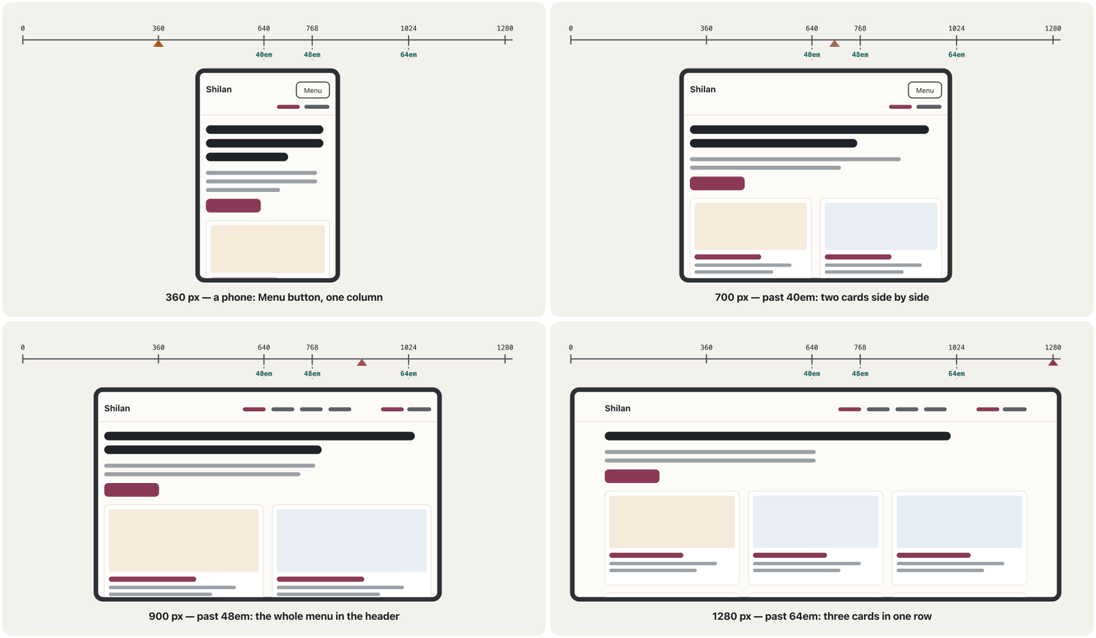
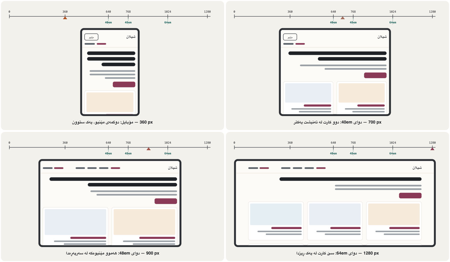
One style sheet serves all nine pages. Its base rules make one column for phones; media queries add columns when there is room (Mobile-first): two cards side by side from 40em (640 px), three from 64em (1024 px), and from 48em the menu opens on its own. Logical properties such as margin-inline-start let the same file work for the Kurdish twins (Logical properties).
یەک خزمەتی هەر نۆ لاپەڕەکە دەکات. ڕێسا بنەڕەتییەکانی یەک ستوون بۆ مۆبایل دروست دەکەن؛ کاتێک شوێن هەبێت ستوون زیاد دەکەن (مۆبایل لە پێشدا): لە 40emـەوە (640 px) دوو لە تەنیشت یەکتر، لە 64emـەوە (1024 px) سێ. لە 48emـەوەش خۆی دەکرێتەوە. وەک margin-inline-start وا دەکەن هەمان بۆ جمکە کوردییەکانیش کار بکات (تایبەتمەندییە لۆجیکییەکان).
.cards {
  display: grid;
  gap: var(--space-4);
}

.card {
  padding: var(--space-3);
  border: 1px solid var(--line);
  border-radius: var(--radius);
  background-color: var(--card);
}

@media (width >= 40em) {
  .cards {
    grid-template-columns: repeat(2, 1fr);
  }
}

@media (width >= 64em) {
  .cards {
    grid-template-columns: repeat(3, 1fr);
  }
}HTML sent to the browserئەو HTMLـەی دەنێردرێت بۆ تۆڕگەڕ
<!DOCTYPE html>
<html lang="en">
<head>
<meta charset="utf-8">
<meta name="viewport" content="width=device-width, initial-scale=1">
<title>Three project cards</title>
<style>
*, *::before, *::after { box-sizing: border-box; }
body { margin: 1rem; font-family: system-ui, "Segoe UI", Roboto, sans-serif; line-height: 1.6; color: #1f2328; background-color: #fdfbf7; }
img { display: block; max-width: 100%; height: auto; border-radius: 0.375rem; }
a { color: #8a3a57; text-underline-offset: 0.2em; }
h2 { font-size: 1.563rem; line-height: 1.25; margin-block: 0 1rem; }
h3 { font-size: 1.25rem; line-height: 1.25; margin-block: 1rem 0.5rem; }
p { margin-block: 0 0.5rem; }
.cards { display: grid; gap: 1.5rem; }
.card { padding: 1rem; border: 1px solid #e2dcd3; border-radius: 0.75rem; background-color: #ffffff; }

@media (width >= 40em) {
  .cards { grid-template-columns: repeat(2, 1fr); }
}
@media (width >= 64em) {
  .cards { grid-template-columns: repeat(3, 1fr); }
}
</style>
</head>
<body>
<h2>Featured projects</h2>
<div class="cards">
<article class="card">
  <img src="data:image/svg+xml;base64,PHN2ZyB4bWxucz0iaHR0cDovL3d3dy53My5vcmcvMjAwMC9zdmciIHZpZXdCb3g9IjAgMCA0ODAgMzAwIj4KICA8cmVjdCB3aWR0aD0iNDgwIiBoZWlnaHQ9IjMwMCIgZmlsbD0iI2Y2ZWFkYiIvPgogIDxyZWN0IHg9IjQwIiB5PSIyOCIgd2lkdGg9IjQwMCIgaGVpZ2h0PSIyNDQiIHJ4PSIxMCIgZmlsbD0iI2ZmZmZmZiIgc3Ryb2tlPSIjZDljOWI0IiBzdHJva2Utd2lkdGg9IjIiLz4KICA8cGF0aCBkPSJNNDAgMzhhMTAgMTAgMCAwIDEgMTAtMTBoMzgwYTEwIDEwIDAgMCAxIDEwIDEwdjE0SDQweiIgZmlsbD0iI2VmZTNkMyIvPgogIDxjaXJjbGUgY3g9IjU4IiBjeT0iNDAiIHI9IjQiIGZpbGw9IiNjOWI0OWIiLz48Y2lyY2xlIGN4PSI3MiIgY3k9IjQwIiByPSI0IiBmaWxsPSIjYzliNDliIi8+PGNpcmNsZSBjeD0iODYiIGN5PSI0MCIgcj0iNCIgZmlsbD0iI2M5YjQ5YiIvPgogIDxyZWN0IHg9IjQxIiB5PSI1MiIgd2lkdGg9IjM5OCIgaGVpZ2h0PSIzNCIgZmlsbD0iIzZiM2YxZiIvPgogIDxyZWN0IHg9IjYwIiB5PSI2MyIgd2lkdGg9IjkwIiBoZWlnaHQ9IjEyIiByeD0iNiIgZmlsbD0iI2Y2ZWFkYiIvPgogIDxyZWN0IHg9IjMwMCIgeT0iNjUiIHdpZHRoPSIzNCIgaGVpZ2h0PSI4IiByeD0iNCIgZmlsbD0iI2U3Y2ZiMiIvPjxyZWN0IHg9IjM0MiIgeT0iNjUiIHdpZHRoPSIzNCIgaGVpZ2h0PSI4IiByeD0iNCIgZmlsbD0iI2U3Y2ZiMiIvPjxyZWN0IHg9IjM4NCIgeT0iNjUiIHdpZHRoPSIzNCIgaGVpZ2h0PSI4IiByeD0iNCIgZmlsbD0iI2U3Y2ZiMiIvPgogIDxyZWN0IHg9IjY0IiB5PSIxMTIiIHdpZHRoPSIxNTAiIGhlaWdodD0iMTQiIHJ4PSI3IiBmaWxsPSIjM2EyYTFlIi8+CiAgPHJlY3QgeD0iNjQiIHk9IjEzNiIgd2lkdGg9IjE3MCIgaGVpZ2h0PSI4IiByeD0iNCIgZmlsbD0iI2I5YWE5OSIvPjxyZWN0IHg9IjY0IiB5PSIxNTIiIHdpZHRoPSIxNTAiIGhlaWdodD0iOCIgcng9IjQiIGZpbGw9IiNiOWFhOTkiLz48cmVjdCB4PSI2NCIgeT0iMTY4IiB3aWR0aD0iMTYwIiBoZWlnaHQ9IjgiIHJ4PSI0IiBmaWxsPSIjYjlhYTk5Ii8+CiAgPHJlY3QgeD0iNjQiIHk9IjE5NiIgd2lkdGg9Ijk2IiBoZWlnaHQ9IjMwIiByeD0iOCIgZmlsbD0iI2I0NTMwZiIvPgogIDxlbGxpcHNlIGN4PSIzNDAiIGN5PSIxNzgiIHJ4PSI3OCIgcnk9IjQ0IiBmaWxsPSIjZDA4YzRhIi8+CiAgPGVsbGlwc2UgY3g9IjM0MCIgY3k9IjE3MCIgcng9IjcwIiByeT0iMzQiIGZpbGw9IiNlM2E4NjYiLz4KICA8cGF0aCBkPSJNMjk2IDE2MHExMiAxNCAyMiAwTTMyNiAxNTZxMTIgMTQgMjIgME0zNTYgMTYwcTEyIDE0IDIyIDAiIGZpbGw9Im5vbmUiIHN0cm9rZT0iI2E4NjQyYyIgc3Ryb2tlLXdpZHRoPSI1IiBzdHJva2UtbGluZWNhcD0icm91bmQiLz4KPC9zdmc+" alt="The bakery site in a browser: a brown header, a loaf of bread and an Order button." width="480" height="300">
  <h3><a href="#bakery">Shilan's Bakery</a></h3>
  <p>A four-page site for my family's bakery, built mobile-first and published on GitHub Pages.</p>
</article>
<article class="card">
  <img src="data:image/svg+xml;base64,PHN2ZyB4bWxucz0iaHR0cDovL3d3dy53My5vcmcvMjAwMC9zdmciIHZpZXdCb3g9IjAgMCA0ODAgMzAwIj4KICA8cmVjdCB3aWR0aD0iNDgwIiBoZWlnaHQ9IjMwMCIgZmlsbD0iI2U5ZWVmNSIvPgogIDxyZWN0IHg9IjExMCIgeT0iMjAiIHdpZHRoPSIyNjAiIGhlaWdodD0iMjYyIiByeD0iMTIiIGZpbGw9IiNmZmZmZmYiIHN0cm9rZT0iI2M0Y2RkOCIgc3Ryb2tlLXdpZHRoPSIyIi8+CiAgPHJlY3QgeD0iMTQwIiB5PSI0NCIgd2lkdGg9IjE1MCIgaGVpZ2h0PSIxNCIgcng9IjciIGZpbGw9IiMxZjJhMzciLz4KICA8cmVjdCB4PSIxNDAiIHk9Ijc4IiB3aWR0aD0iNzAiIGhlaWdodD0iOCIgcng9IjQiIGZpbGw9IiMzZDRhNTkiLz48cmVjdCB4PSIxNDAiIHk9IjkyIiB3aWR0aD0iMjAwIiBoZWlnaHQ9IjMwIiByeD0iNiIgZmlsbD0iI2ZmZmZmZiIgc3Ryb2tlPSIjNmI3Nzg1IiBzdHJva2Utd2lkdGg9IjIiLz4KICA8cmVjdCB4PSIxNDAiIHk9IjEzNiIgd2lkdGg9IjkwIiBoZWlnaHQ9IjgiIHJ4PSI0IiBmaWxsPSIjM2Q0YTU5Ii8+PHJlY3QgeD0iMTQwIiB5PSIxNTAiIHdpZHRoPSIyMDAiIGhlaWdodD0iMzAiIHJ4PSI2IiBmaWxsPSIjZmZmZmZmIiBzdHJva2U9IiM2Yjc3ODUiIHN0cm9rZS13aWR0aD0iMiIvPgogIDxyZWN0IHg9IjE0MCIgeT0iMTk0IiB3aWR0aD0iODAiIGhlaWdodD0iOCIgcng9IjQiIGZpbGw9IiMzZDRhNTkiLz48cmVjdCB4PSIxNDAiIHk9IjIwOCIgd2lkdGg9IjIwMCIgaGVpZ2h0PSIzMCIgcng9IjYiIGZpbGw9IiNmZmZmZmYiIHN0cm9rZT0iIzBkNmI2MiIgc3Ryb2tlLXdpZHRoPSIzIi8+CiAgPHJlY3QgeD0iMTQwIiB5PSIyNTAiIHdpZHRoPSIxMjAiIGhlaWdodD0iMjIiIHJ4PSI3IiBmaWxsPSIjMGQ2YjYyIi8+Cjwvc3ZnPg==" alt="A sign-up form with three labelled fields and a Create account button." width="480" height="300">
  <h3><a href="#form">A friendlier sign-up form</a></h3>
  <p>A registration form redesigned with labels above the fields, the right phone keyboards and clear error messages.</p>
</article>
<article class="card">
  <img src="data:image/svg+xml;base64,PHN2ZyB4bWxucz0iaHR0cDovL3d3dy53My5vcmcvMjAwMC9zdmciIHZpZXdCb3g9IjAgMCA0ODAgMzAwIj4KICA8ZGVmcz4KICAgIDxjbGlwUGF0aCBpZD0idHJhdmVsLWxlZnQiPjxyZWN0IHg9IjMwIiB5PSI0MCIgd2lkdGg9IjIwMCIgaGVpZ2h0PSIyMjAiIHJ4PSIxMCIvPjwvY2xpcFBhdGg+CiAgICA8Y2xpcFBhdGggaWQ9InRyYXZlbC1yaWdodCI+PHJlY3QgeD0iMjUwIiB5PSI0MCIgd2lkdGg9IjIwMCIgaGVpZ2h0PSIyMjAiIHJ4PSIxMCIvPjwvY2xpcFBhdGg+CiAgPC9kZWZzPgogIDxyZWN0IHdpZHRoPSI0ODAiIGhlaWdodD0iMzAwIiBmaWxsPSIjZTVlZWYzIi8+CiAgPGcgY2xpcC1wYXRoPSJ1cmwoI3RyYXZlbC1sZWZ0KSI+CiAgICA8cmVjdCB4PSIzMCIgeT0iNDAiIHdpZHRoPSIyMDAiIGhlaWdodD0iMjIwIiBmaWxsPSIjY2ZlNGYyIi8+CiAgICA8ZWxsaXBzZSBjeD0iMTMwIiBjeT0iMjYyIiByeD0iMTIwIiByeT0iNjQiIGZpbGw9IiNjOTlhNWIiLz4KICAgIDxwYXRoIGQ9Ik02MCAyMTBWMTY4aDE0di0xMGgxMnYxMGgxNHYtMTBoMTJ2MTBoMTR2LTEwaDEydjEwaDE0di0xMGgxMnYxMGgxNHY0MnoiIGZpbGw9IiNiMDdhM2MiLz4KICAgIDxwYXRoIGQ9Ik0xMjAgMjEwdi0yMmExMCAxMCAwIDAgMSAyMCAwdjIyeiIgZmlsbD0iIzZiNGEyNSIvPgogICAgPHJlY3QgeD0iMzAiIHk9IjIzNiIgd2lkdGg9IjIwMCIgaGVpZ2h0PSIyNCIgZmlsbD0iI2E3N2I0NSIvPgogIDwvZz4KICA8ZyBjbGlwLXBhdGg9InVybCgjdHJhdmVsLXJpZ2h0KSI+CiAgICA8cmVjdCB4PSIyNTAiIHk9IjQwIiB3aWR0aD0iMjAwIiBoZWlnaHQ9IjIyMCIgZmlsbD0iI2NkZTdkNiIvPgogICAgPHBhdGggZD0iTTI1MCA0MHEyNCA0MCAxOCAyMjBoLTE4eiIgZmlsbD0iIzNmNmI0YSIvPjxwYXRoIGQ9Ik00NTAgNDBxLTI4IDUwLTMwIDIyMGgzMHoiIGZpbGw9IiMzZjZiNGEiLz4KICAgIDxwYXRoIGQ9Ik0zMzAgNTJoMzZsLTQgMTYwaC0yOHoiIGZpbGw9IiM1YzhhNmEiLz4KICAgIDxwYXRoIGQ9Ik0zMzggNjJ2MTQ4TTM0OCA2MnYxNDhNMzU4IDYydjE0OCIgc3Ryb2tlPSIjZmZmZmZmIiBzdHJva2Utd2lkdGg9IjUiIHN0cm9rZS1saW5lY2FwPSJyb3VuZCIvPgogICAgPGVsbGlwc2UgY3g9IjM1MCIgY3k9IjIyNiIgcng9Ijc0IiByeT0iMTgiIGZpbGw9IiM5ZmQwZTgiLz4KICAgIDxwYXRoIGQ9Ik0zMTAgMjI0cTQwIC0xMiA4MCAwIiBmaWxsPSJub25lIiBzdHJva2U9IiNmZmZmZmYiIHN0cm9rZS13aWR0aD0iNCIgc3Ryb2tlLWxpbmVjYXA9InJvdW5kIi8+CiAgPC9nPgo8L3N2Zz4=" alt="A travel page with two pictures: a citadel on a hill and a waterfall in a gorge." width="480" height="300">
  <h3><a href="#travel">Kurdistan in pictures</a></h3>
  <p>A one-page travel guide to Erbil Citadel and Gali Ali Beg, in Kurdish and English.</p>
</article>
</div>
</body>
</html>
Make the window narrower or wider: the preview frame changes from one to two (or three) columns at the same widths.
پەنجەرەکە تەسکتر یان پانتر بکە: چوارچێوەی پێشبینینەکە لە هەمان پانیدا لە یەک ستوونەوە دەبێت بە دوو (یان سێ).
Explain the codeڕوونکردنەوەی کۆدەکە
- Lineدێڕی 1-4
Phones: one column — no media query needed.
مۆبایل: یەک ستوون — هیچ پێویست نییە.
- Lineدێڕی 13-23
Wider screens add columns.
شاشەی پانتر ستوون زیاد دەکەن.
Build step 3: one small JavaScript touchهەنگاوی سێیەمی دروستکردن: کەمێک JavaScript
Shilan added a single script: the phone Menu button from the JavaScript lesson, with one change. The button sits in the header of every page, right after the name, and the base CSS hides it. The script puts the class js on <html>, and the CSS shows the button and folds the menu only when that class is there and the screen is narrow. If the script never runs, every link simply shows (Progressive enhancement).
شیلان تەنیا یەک زیاد کرد: Menu بۆ مۆبایل لە وانەی JavaScript، بە یەک گۆڕانکارییەوە. لە هەموو لاپەڕەیەکدا، ڕێک دوای ناوەکە دادەنرێت و بنەڕەتی دەیشارێتەوە. کلاسی js دەخاتە سەر <html> و تەنیا کاتێک پیشان دەدات و دەپێچێتەوە کە ئەو کلاسە هەبێت و شاشەکە تەسک بێت. ئەگەر هەرگیز کار نەکات، هەموو بە سادەیی دەردەکەوێت (باشترکردنی پلەبەپلە).
<a class="logo" href="index.html">Shilan</a>
<button type="button" class="menu-button" aria-expanded="false" aria-controls="site-nav">Menu</button>
<nav id="site-nav" class="site-nav" aria-label="Main">…</nav>
Explain the codeڕوونکردنەوەی کۆدەکە
- Lineدێڕی 2
A real button: aria-expanded is false at the start (the menu is closed), and aria-controls names the menu it opens.
ڕاستەقینە: لە سەرەتادا
aria-expandedبریتییە لەfalse( داخراوە) وaria-controlsناوی ئەو دەبات کە دەیکاتەوە.
// The Menu button for phones. Without JavaScript, every link simply shows.
document.documentElement.classList.add("js");

const menuButton = document.querySelector(".menu-button");
const siteNav = document.querySelector("#site-nav");

menuButton.addEventListener("click", () => {
  const isOpen = siteNav.classList.toggle("is-open");
  menuButton.setAttribute("aria-expanded", isOpen);
});
Explain the codeڕوونکردنەوەی کۆدەکە
- Lineدێڕی 2
Tell the CSS that JavaScript works.
بە بڵێ کە کار دەکات.
- Lineدێڕی 7-10
Open or close the menu, and keep aria-expanded in step.
بکەرەوە یان دابخە و aria-expanded هاوکات بهێڵەوە.
/* Without JavaScript the Menu button stays hidden */
.menu-button {
  display: none;
}

/* With JavaScript, phones get a Menu button and a folded menu */
.js .menu-button {
  display: inline-block;
}

.js .site-nav {
  display: none;
  flex-basis: 100%;
}

.js .site-nav.is-open {
  display: block;
}

.js .site-nav.is-open ul {
  flex-direction: column;
}

@media (width >= 48em) {
  .js .menu-button {
    display: none;
  }

  .js .site-nav {
    display: block;
    flex-basis: auto;
  }
}
Explain the codeڕوونکردنەوەی کۆدەکە
- Lineدێڕی 2-4
The base rule: no script, no button.
ڕێسای بنەڕەتی: بێ ، بێ .
- Lineدێڕی 7-9
With the js class, phones get the button.
بە کلاسی
js، مۆبایل وەردەگرێت.
Test it like your visitorsوەک سەردانیکەرەکانت تاقی بکەرەوە
Test every page in layers, as in Testing: tools, keyboard, screen reader, people and the checklist before you publish:
هەموو لاپەڕەیەک چین بە چین تاقی بکەرەوە، وەک تاقیکردنەوە: ئامراز، کیبۆرد، خوێنەرەوەی شاشە، خەڵک و لیستی پشکنین پێش بڵاوکردنەوە:
- Code: every page in the Nu HTML Checker and the style sheet in the W3C CSS validator — no errors.
- The W3C Easy Checks: page title, alt text, headings, contrast, skip link, visible focus, language, zoom.
- Keyboard only: Tab, Shift+Tab and Enter through every page; the focus is always visible.
- Zoom to 400 %: on a 1280 px window that is a 320 px layout (WCAG 1.4.10 Reflow); nothing may scroll sideways.
- Real devices: your phone, and at least two different browsers.
- An audit: Lighthouse in the developer tools, then read the page aloud for typos and wrong links.
- کۆد: هەموو لاپەڕەیەک لە پشکنەری Nu HTML و لە پشکنەری CSSـی — بێ هەڵە.
- Easy Checksـی : ناونیشانی لاپەڕە، ، ، کۆنتراست، ، ، زمان، .
- تەنیا : Tab، Shift+Tab و Enter بە هەموو لاپەڕەیەکدا؛ هەمیشە دیارە.
- بۆ 400 %: لە پەنجەرەیەکی 1280 pxـدا ئەوە 320 pxـە ( 1.4.10 Reflow)؛ هیچ شتێک نابێت بە لادا بڕوات.
- ئامێری ڕاستەقینە: مۆبایلەکەت و لانیکەم دوو جیاواز.
- پشکنینێکی خۆکار: Lighthouse لە ، پاشان لاپەڕەکە بە دەنگی بەرز بخوێنەرەوە بۆ هەڵەی نووسین و هەڵە.
Test it like your visitorsوەک سەردانیکەرەکانت تاقی بکەرەوە
Fix, then test againچاکی بکە، پاشان دووپاتە تاقی بکەرەوە
Shilan's first version failed three of the tests. Each fix was small, and after each one she ran the same test again:
یەکەم وەشانی شیلان لە سێ تاقیکردنەوەدا دەرنەچوو. هەر چاککردنێک بچووک بوو و دوای هەریەکەیان هەمان تاقیکردنەوەی دووپاتە کردەوە:
| Testتاقیکردنەوە | What went wrongچی هەڵە بوو | Fixچاککردن |
|---|---|---|
| Nu HTML Checkerپشکنەری Nu HTML | "An img element must have an alt attribute" (index.html, line 47)«An img element must have an alt attribute» (index.html، دێڕی 47) | Alt text for the bakery picture بۆ وێنەی نانەواخانەکە |
| Contrast in the developer toolsکۆنتراست لە | Footer text #9a948b on #fdfbf7: 2.9 : 1دەقی #9a948b لەسەر #fdfbf7: | --muted: #5b6168 gives 6.05 : 1--muted: #5b6168 دەدات |
| 400 % zoom (320 px) 400 % (320 px) | The long e-mail address made the contact page 431 px wide درێژەکە لاپەڕەی پەیوەندیی 431 px پان کرد | overflow-wrap: anywhere on .emailoverflow-wrap: anywhere لەسەر .email |
Publish it and share the linkبڵاوی بکەرەوە و بەستەرەکە بنێرە
Put the folder on GitHub Pages as in GitHub Pages step by step; the free plans and their limits are in Free static hosting. Check the folder first: index.html at the top level, lowercase names without spaces, and a 404.html (A friendly 404 page). Then open the live address on your phone, run the tests there again (After publishing), and put the link in your CV and your e-mails.
بخە سەر GitHub Pages وەک GitHub Pages هەنگاو بە هەنگاو؛ پلانە بێبەرانبەرەکان و سنوورەکانیان لە هۆستینگی لاپەڕەتۆڕی نەگۆڕی بێبەرانبەرـدان. سەرەتا بپشکنە: index.html لە ئاستی سەرەوە، ناوی پیتی بچووک بێ بۆشایی و 404.htmlـێک (لاپەڕەیەکی 404ـی دۆستانە). پاشان ناونیشانە زیندووەکە لەسەر مۆبایلەکەت بکەرەوە، تاقیکردنەوەکان لەوێ دووپاتە بکەرەوە (دوای بڵاوکردنەوە) و بخە ناو CVـەکەت و ئیمەیڵەکانتەوە.
The model: Shilan's portfolioنموونەکە: پۆرتفۆلیۆی ئۆنلاینی شیلان
Here is the finished model for a fictional student, Shilan: four pages in English and the same four in Kurdish, one style sheet, one small script, three pictures drawn as SVG and a 404 page. All nine pages pass the Nu HTML Checker and the style sheet passes the W3C CSS validator. These screenshots were taken in Chrome at 1280 px wide. Find the style tile in them: the brand colour on the current menu item, the button and the links, and the 1.25 type scale from the hello down to the card text.
ئەمە نموونە تەواوکراوەکەیە بۆ قوتابییەکی خەیاڵی بە ناوی شیلان: چوار لاپەڕە بە ئینگلیزی و هەمان چوار بە کوردی، یەک ، یەک بچووک، سێ وێنەی کێشراو بە و لاپەڕەیەکی 404. هەر نۆ لاپەڕەکە لە پشکنەری Nu HTMLـدا دەردەچن و لە پشکنەری CSSـی دەردەچێت. ئەم لە Chromeـدا بە پانیی 1280 px گیراون. تێیاندا بدۆزەرەوە: ڕەنگی براند لەسەر بڕگەی ئێستای ، و . هەروەها 1.25 لە سڵاوەکەوە تا دەقی ببینە.
The model: Shilan's portfolioنموونەکە: پۆرتفۆلیۆی ئۆنلاینی شیلان
The model on a phone, by day and by nightنموونەکە لەسەر مۆبایل، بە ڕۆژ و بە شەو
On a 390 px phone every page has one column. The first phone shows the projects page, where each project says what Shilan did and what she learned; the second, the contact page, whose long address now wraps; the third, the home page at night. Because her colours live in custom properties, the dark theme is only new values inside prefers-color-scheme: dark — not one other rule changes (A dark theme).
لەسەر مۆبایلێکی 390 px هەموو لاپەڕەیەک یەک ستوونی هەیە. یەکەم مۆبایل لاپەڕەی پڕۆژەکان پیشان دەدات، کە هەر پڕۆژەیەک دەڵێت شیلان چی کرد و چی فێر بوو؛ دووەم، لاپەڕەی پەیوەندی، کە ناونیشانە درێژەکەی ئێستا دەچێتە دێڕی دواتر؛ سێیەم، بە شەو. چونکە ڕەنگەکانی لە ، تەنیا نوێیە لە ناو prefers-color-scheme: darkـدا — هیچ ڕێسایەکی تر ناگۆڕێت (دۆخی تاریک).
@media (prefers-color-scheme: dark) {
  :root {
    --paper: #17191c;
    --card: #202327;
    --ink: #ecebe8;
    --muted: #b4b0aa;
    --brand: #f0a8c0;
    --brand-dark: #f6c6d6;
    --on-brand: #17191c;
    --soft: #33262c;
    --line: #3a3d42;
  }
}
Explain the codeڕوونکردنەوەی کۆدەکە
- Lineدێڕی 1
Runs only when the visitor's system is set to dark.
تەنیا کاتێک کار دەکات کە سیستەمی سەردانیکەرەکە لەسەر تاریک دانرابێت.
- Lineدێڕی 7-9
The brand colour gets lighter and the text on it dark, so links and buttons keep their contrast (9.28 : 1) on the dark paper.
ڕەنگی براند ڕووناکتر دەبێت و دەقی سەری تاریک، بۆ ئەوەی و لەسەر کاغەزە تاریکەکە کۆنتراستیان بمێنێت ().
The rubric: score your own siteخشتەی هەڵسەنگاندن: تۆڕگەکەی خۆت بنرخێنە
Score your site on these six rows. Be honest: "Not yet" only means "next on my list". Then ask a classmate to score it too — another person finds what you no longer see.
لەسەر ئەم شەش ڕیزە بنرخێنە. ڕاستگۆ بە: «هێشتا نا» تەنیا واتە «دواتر لە لیستەکەمدا». پاشان داوا لە هاوپۆلێک بکە ئەویش بینرخێنێت — کەسێکی تر ئەوە دەدۆزێتەوە کە تۆ چیتر نایبینیت.
| Rowڕیز | Not yetهێشتا نا | Goodباش | Excellentنایاب |
|---|---|---|---|
| Structureپێکهاتە | Div soup, skipped headingsتەنیا div، بازداو | Landmarks, one h1, valid HTML، یەک h1، دروست | …and a skip link, aria-current, the same layout on every page…و ، aria-current، هەمان لە هەموو لاپەڕەیەکدا |
| Designدیزاین | Random colours and sizesڕەنگ و قەبارەی هەڕەمەکی | A palette and a type scale; text contrast ≥ 4.5 : 1 و ؛ کۆنتراستی دەق ≥ | …and a spacing scale, the same cards and buttons everywhere, a style tile…و ، هەمان و لە هەموو شوێنێک، |
| Responsiveڕێسپۆنسیڤ | The page scrolls sideways on a phoneلاپەڕەکە لەسەر مۆبایل بە لادا دەڕوات | One column on phones, more on wide screensیەک ستوون لەسەر مۆبایل، زیاتر لەسەر شاشەی پان | …and works at 320 px (400 % zoom), tested on a real phone…و لە 320 px (زوومی 400 %) کار دەکات، لەسەر مۆبایلی ڕاستەقینە تاقیکراوەتەوە |
| Accessibleدەستڕاگەیشتوو | Mouse only; pictures without altتەنیا ماوس؛ وێنە بێ alt | Keyboard works, visible focus, alt text, the right lang کار دەکات، ، ، langـی دروست | …and the Easy Checks and a screen-reader pass…و Easy Checks و تاقیکردنەوەیەک بە |
| Contentناوەڕۆک | Dummy text; no projectsدەقی ساختە؛ بێ پڕۆژە | Three projects with titles and descriptionsسێ پڕۆژە بە ناونیشان و وەسفەوە | …and what you did, what you learned, links to the live work and its code…و چیت کرد، چیت فێر بوو، بۆ کارە زیندووەکە و کۆدەکەی |
| Publishedبڵاوکراوە | Only on your laptopتەنیا لەسەر لاپتۆپەکەت | Live at an https:// addressزیندوو لەسەر ناونیشانێکی https:// | …and checked on the live address, a 404 page, the link shared…و لەسەر ناونیشانە زیندووەکە پشکنراوە، لاپەڕەی 404، نێردراوە |
Use the rubric on Shilan's model from the last screens. For each row write a score and one piece of evidence.
خشتەکە لەسەر نموونەکەی شیلان لە شاشەکانی پێشوو بەکاربهێنە. بۆ هەر ڕیزێک نمرەیەک و یەک بەڵگە بنووسە.
Show answerوەڵامەکە پیشان بدە
| Rowڕیز | Scoreنمرە | Evidenceبەڵگە |
|---|---|---|
| Structureپێکهاتە | Excellentنایاب | Skip link, landmarks, one h1, aria-current; the Nu checker finds no errors on all nine pages، ، یەک h1، aria-current؛ پشکنەری Nu لە هەر نۆ لاپەڕەکەدا هیچ هەڵەیەک نادۆزێتەوە |
| Designدیزاین | Excellentنایاب | A style tile in custom properties: palette, 1.25 type scale, six spacing steps; contrast 6.05 : 1 or more لە : ، 1.25، شەش پلە بۆشایی؛ کۆنتراست یان زیاتر |
| Responsiveڕێسپۆنسیڤ | Excellentنایاب | One to three columns; the 320 px test passed after the e-mail fixیەک تا سێ ستوون؛ تاقیکردنەوەی 320 px دوای چاککردنی ئیمەیڵەکە دەرچوو |
| Accessibleدەستڕاگەیشتوو | Goodباش | Keyboard, visible focus, alt text, lang and dir — but no screen-reader pass yet، ، ، lang و dir — بەڵام هێشتا تاقیکردنەوەی نەکراوە |
| Contentناوەڕۆک | Goodباش | Three projects with what she did and learned — but no links yet to the live projects and their codeسێ پڕۆژە بە ئەوەی کردی و فێری بوو — بەڵام هێشتا بۆ پڕۆژە زیندووەکان و کۆدەکەیان نییە |
| Publishedبڵاوکراوە | Not yetهێشتا نا | Tested on a computer; publishing and the live-address checks come nextلەسەر تاقیکراوەتەوە؛ و پشکنینی ناونیشانە زیندووەکە دێنە دواتر |
So the model is not perfect, and that is the point of a rubric: it shows Shilan's next three tasks — a screen-reader pass, links to the live projects, and publishing.
کەواتە نموونەکە تەواو نییە و ئەمە مەبەستی خشتەی هەڵسەنگاندنە: سێ ئەرکی داهاتووی شیلان پیشان دەدات — تاقیکردنەوەیەک بە ، بۆ پڕۆژە زیندووەکان و .
Common mistakesهەڵە باوەکان
- Dummy text left online — fake Latin filler or "Coming soon". Publish only finished pages.
- Photos straight from the phone camera, 4,000 pixels wide. Export each at the size it is shown.
- A contact form on a static host. GitHub Pages cannot receive or store what a form sends, so the form does nothing. Use an e-mail link; forms that save data come with PHP (GET and POST).
- A Kurdish twin without
lang="ckb" dir="rtl", or a language switch that jumps to the other home page (A language switch that keeps the page). - A downloaded template or theme used as it is. Check its licence, make it your own design, and test it like your own code.
- Private data on a public page: a home address, a phone number, ID numbers, other people's photos.
- Tested only on your own laptop, in one browser. Use a real phone, a second browser and the keyboard.
- دەقی ساختە لەسەر ئینتەرنێت ماوەتەوە — دەقی پڕکەرەوەی لاتینیی درۆیینە یان «بەم زووانە». تەنیا لاپەڕەی تەواوکراو بڵاو بکەرەوە.
- وێنە ڕاستەوخۆ لە کامێرای مۆبایلەوە، 4,000 پیکسڵ پان. هەریەکەیان بەو قەبارەیە هەناردە بکە کە پیشان دەدرێت.
- پەیوەندی لەسەر . GitHub Pages ناتوانێت ئەوەی دەینێرێت وەری بگرێت یان هەڵی بگرێت، بۆیە هیچ ناکات. بەکاربهێنە؛ ئەو پاشەکەوت دەکەن لەگەڵ دێن (GET و POST).
- جمکێکی کوردی بێ
lang="ckb" dir="rtl"، یان گۆڕینی زمانێک کە باز دەدات بۆ زمانەکەی تر (گۆڕینی زمان کە لاپەڕەکە دەهێڵێتەوە). - یان تێمێکی دابارکراو وەک خۆی بەکار هاتووە. مۆڵەتەکەی بپشکنە، بیکە بە دیزاینی خۆت و وەک کۆدی خۆت تاقی بکەرەوە.
- لە لاپەڕەیەکی گشتیدا: ناونیشانی ماڵ، ژمارەی تەلەفۆن، ژمارەی ناسنامە، وێنەی کەسانی تر.
- تەنیا لەسەر لاپتۆپی خۆت و لە یەک تاقیکراوەتەوە. مۆبایلێکی ڕاستەقینە، دووەم و بەکاربهێنە.
Exercisesڕاهێنانەکان
Write your own SMART goal, your audience, three user tasks and your site map (as a tree, like Shilan's).
خۆت، بینەرەکەت، سێ کاری و بنووسە (وەک دارێک، وەک ئەوەی شیلان).
Show answerوەڵامەکە پیشان بدە
Compare yours with this example from another student, Aram:
هی خۆت لەگەڵ ئەم نموونەیەی قوتابییەکی تر، ئارام، بەراورد بکە:
Goal:     Publish a three-page portfolio with two projects by 1 March 2027
          and use it to apply for the IT club's web team.
Audience: the club's leaders; they read English on laptops.
Tasks:    see my two projects; check that I can write HTML and CSS;
          find my e-mail address.

Home (index.html)
├── Projects (projects.html)   #weather  #club-page
└── Contact (contact.html)
Check: is the goal measurable (three pages, two projects) and does it have a date? Is every task something a visitor does? Does every task have a page in the site map?
بپشکنە: ئایا ئامانجەکە پێوانەکراوە (سێ لاپەڕە، دوو پڕۆژە) و ڕێکەوتی هەیە؟ ئایا هەموو کارێک شتێکە کە سەردانیکەر دەیکات؟ ئایا هەموو کارێک لاپەڕەیەکی لە هەیە؟
Shilan made a ten-question HTML quiz for her classmates. Write its <article> for projects.html, in the same pattern as the other three: picture, heading, what she did, what she learned, tools.
شیلان تاقیکردنەوەیەکی دە پرسیاریی بۆ هاوپۆلەکانی دروست کرد. <article>ـەکەی بۆ projects.html بنووسە، بە هەمان شێوازی سێ پڕۆژەکەی تر: وێنە، ، چی کرد، چی فێر بوو، ئامرازەکان.
Show answerوەڵامەکە پیشان بدە
<article class="project" id="quiz">
  <img src="images/quiz.svg" alt="A phone showing one quiz question about HTML with four answer buttons." width="480" height="300" loading="lazy">
  <div>
    <h2>A ten-question HTML quiz</h2>
    <p>A small quiz page for my classmates, with one question on each screen.</p>
    <h3>What I did</h3>
    <p>I wrote the questions in a form with radio buttons and a fieldset, and used JavaScript only to show the score.</p>
    <h3>What I learned</h3>
    <p>Radio buttons need the same name to work as one group.</p>
    <p class="tools"><strong>Tools:</strong> HTML forms · CSS · a little JavaScript</p>
  </div>
</article>HTML sent to the browserئەو HTMLـەی دەنێردرێت بۆ تۆڕگەڕ
<!DOCTYPE html>
<html lang="en">
<head>
<meta charset="utf-8">
<meta name="viewport" content="width=device-width, initial-scale=1">
<title>A fourth project</title>
<style>
*, *::before, *::after { box-sizing: border-box; }
body { margin: 1rem; font-family: system-ui, "Segoe UI", Roboto, sans-serif; line-height: 1.6; color: #1f2328; background-color: #fdfbf7; }
img { display: block; max-width: 100%; height: auto; border-radius: 0.375rem; }
a { color: #8a3a57; text-underline-offset: 0.2em; }
h2 { font-size: 1.563rem; line-height: 1.25; margin-block: 0 1rem; }
h3 { font-size: 1.25rem; line-height: 1.25; margin-block: 1rem 0.5rem; }
p { margin-block: 0 0.5rem; }
.cards { display: grid; gap: 1.5rem; }
.card { padding: 1rem; border: 1px solid #e2dcd3; border-radius: 0.75rem; background-color: #ffffff; }

.project { display: grid; gap: 1rem 2rem; padding-block: 1rem; }
.project h2 { margin-block-start: 0; }
.tools { color: #5b6168; }
@media (width >= 48em) {
  .project { grid-template-columns: 2fr 3fr; align-items: start; }
}
</style>
</head>
<body>
<article class="project" id="quiz">
  <img src="data:image/svg+xml;base64,PHN2ZyB4bWxucz0iaHR0cDovL3d3dy53My5vcmcvMjAwMC9zdmciIHZpZXdCb3g9IjAgMCA0ODAgMzAwIj4KICA8cmVjdCB3aWR0aD0iNDgwIiBoZWlnaHQ9IjMwMCIgZmlsbD0iI2U5ZWVmNSIvPgogIDxyZWN0IHg9IjExMCIgeT0iMjAiIHdpZHRoPSIyNjAiIGhlaWdodD0iMjYyIiByeD0iMTIiIGZpbGw9IiNmZmZmZmYiIHN0cm9rZT0iI2M0Y2RkOCIgc3Ryb2tlLXdpZHRoPSIyIi8+CiAgPHJlY3QgeD0iMTQwIiB5PSI0NCIgd2lkdGg9IjE1MCIgaGVpZ2h0PSIxNCIgcng9IjciIGZpbGw9IiMxZjJhMzciLz4KICA8cmVjdCB4PSIxNDAiIHk9Ijc4IiB3aWR0aD0iNzAiIGhlaWdodD0iOCIgcng9IjQiIGZpbGw9IiMzZDRhNTkiLz48cmVjdCB4PSIxNDAiIHk9IjkyIiB3aWR0aD0iMjAwIiBoZWlnaHQ9IjMwIiByeD0iNiIgZmlsbD0iI2ZmZmZmZiIgc3Ryb2tlPSIjNmI3Nzg1IiBzdHJva2Utd2lkdGg9IjIiLz4KICA8cmVjdCB4PSIxNDAiIHk9IjEzNiIgd2lkdGg9IjkwIiBoZWlnaHQ9IjgiIHJ4PSI0IiBmaWxsPSIjM2Q0YTU5Ii8+PHJlY3QgeD0iMTQwIiB5PSIxNTAiIHdpZHRoPSIyMDAiIGhlaWdodD0iMzAiIHJ4PSI2IiBmaWxsPSIjZmZmZmZmIiBzdHJva2U9IiM2Yjc3ODUiIHN0cm9rZS13aWR0aD0iMiIvPgogIDxyZWN0IHg9IjE0MCIgeT0iMTk0IiB3aWR0aD0iODAiIGhlaWdodD0iOCIgcng9IjQiIGZpbGw9IiMzZDRhNTkiLz48cmVjdCB4PSIxNDAiIHk9IjIwOCIgd2lkdGg9IjIwMCIgaGVpZ2h0PSIzMCIgcng9IjYiIGZpbGw9IiNmZmZmZmYiIHN0cm9rZT0iIzBkNmI2MiIgc3Ryb2tlLXdpZHRoPSIzIi8+CiAgPHJlY3QgeD0iMTQwIiB5PSIyNTAiIHdpZHRoPSIxMjAiIGhlaWdodD0iMjIiIHJ4PSI3IiBmaWxsPSIjMGQ2YjYyIi8+Cjwvc3ZnPg==" alt="A phone showing one quiz question about HTML with four answer buttons." width="480" height="300" loading="lazy">
  <div>
    <h2>A ten-question HTML quiz</h2>
    <p>A small quiz page for my classmates, with one question on each screen.</p>
    <h3>What I did</h3>
    <p>I wrote the questions in a form with radio buttons and a fieldset, and used JavaScript only to show the score.</p>
    <h3>What I learned</h3>
    <p>Radio buttons need the same name to work as one group.</p>
    <p class="tools"><strong>Tools:</strong> HTML forms · CSS · a little JavaScript</p>
  </div>
</article>
</body>
</html>
The preview borrows the form picture; on the real page Shilan would draw or capture images/quiz.svg.
پێشبینینەکە وێنەی بە قەرز وەردەگرێت؛ لە لاپەڕە ڕاستەقینەکەدا شیلان images/quiz.svg دەکێشێت یان دەیگرێت.
loading="lazy" fits here because the fourth project is far down the page; the first picture of a page never gets it (Lazy loading).
loading="lazy" لێرەدا دەگونجێت چونکە پڕۆژەی چوارەم لە خوارەوەی لاپەڕەکەیە؛ یەکەم وێنەی لاپەڕەیەک هەرگیز ئەمەی پێ نادرێت (بارکردنی دواخراو).
Rewrite .cards so that the columns appear by themselves, as many as fit, each at least 16rem wide. What changes compared with Shilan's two media queries?
.cards دووپاتە بنووسەوە بۆ ئەوەی ستوونەکان خۆیان دەربکەون، هێندەی جێیان دەبێتەوە، هەریەکە لانیکەم 16rem پان. بە بەراورد بە دوو شیلان چی دەگۆڕێت؟
Show answerوەڵامەکە پیشان بدە
.cards {
  display: grid;
  grid-template-columns: repeat(auto-fit, minmax(16rem, 1fr));
  gap: var(--space-4);
}HTML sent to the browserئەو HTMLـەی دەنێردرێت بۆ تۆڕگەڕ
<!DOCTYPE html>
<html lang="en">
<head>
<meta charset="utf-8">
<meta name="viewport" content="width=device-width, initial-scale=1">
<title>Cards with auto-fit</title>
<style>
*, *::before, *::after { box-sizing: border-box; }
body { margin: 1rem; font-family: system-ui, "Segoe UI", Roboto, sans-serif; line-height: 1.6; color: #1f2328; background-color: #fdfbf7; }
img { display: block; max-width: 100%; height: auto; border-radius: 0.375rem; }
a { color: #8a3a57; text-underline-offset: 0.2em; }
h2 { font-size: 1.563rem; line-height: 1.25; margin-block: 0 1rem; }
h3 { font-size: 1.25rem; line-height: 1.25; margin-block: 1rem 0.5rem; }
p { margin-block: 0 0.5rem; }
.cards { display: grid; grid-template-columns: repeat(auto-fit, minmax(16rem, 1fr)); gap: 1.5rem; }
.card { padding: 1rem; border: 1px solid #e2dcd3; border-radius: 0.75rem; background-color: #ffffff; }
</style>
</head>
<body>
<h2>Featured projects</h2>
<div class="cards">
<article class="card">
  <img src="data:image/svg+xml;base64,PHN2ZyB4bWxucz0iaHR0cDovL3d3dy53My5vcmcvMjAwMC9zdmciIHZpZXdCb3g9IjAgMCA0ODAgMzAwIj4KICA8cmVjdCB3aWR0aD0iNDgwIiBoZWlnaHQ9IjMwMCIgZmlsbD0iI2Y2ZWFkYiIvPgogIDxyZWN0IHg9IjQwIiB5PSIyOCIgd2lkdGg9IjQwMCIgaGVpZ2h0PSIyNDQiIHJ4PSIxMCIgZmlsbD0iI2ZmZmZmZiIgc3Ryb2tlPSIjZDljOWI0IiBzdHJva2Utd2lkdGg9IjIiLz4KICA8cGF0aCBkPSJNNDAgMzhhMTAgMTAgMCAwIDEgMTAtMTBoMzgwYTEwIDEwIDAgMCAxIDEwIDEwdjE0SDQweiIgZmlsbD0iI2VmZTNkMyIvPgogIDxjaXJjbGUgY3g9IjU4IiBjeT0iNDAiIHI9IjQiIGZpbGw9IiNjOWI0OWIiLz48Y2lyY2xlIGN4PSI3MiIgY3k9IjQwIiByPSI0IiBmaWxsPSIjYzliNDliIi8+PGNpcmNsZSBjeD0iODYiIGN5PSI0MCIgcj0iNCIgZmlsbD0iI2M5YjQ5YiIvPgogIDxyZWN0IHg9IjQxIiB5PSI1MiIgd2lkdGg9IjM5OCIgaGVpZ2h0PSIzNCIgZmlsbD0iIzZiM2YxZiIvPgogIDxyZWN0IHg9IjYwIiB5PSI2MyIgd2lkdGg9IjkwIiBoZWlnaHQ9IjEyIiByeD0iNiIgZmlsbD0iI2Y2ZWFkYiIvPgogIDxyZWN0IHg9IjMwMCIgeT0iNjUiIHdpZHRoPSIzNCIgaGVpZ2h0PSI4IiByeD0iNCIgZmlsbD0iI2U3Y2ZiMiIvPjxyZWN0IHg9IjM0MiIgeT0iNjUiIHdpZHRoPSIzNCIgaGVpZ2h0PSI4IiByeD0iNCIgZmlsbD0iI2U3Y2ZiMiIvPjxyZWN0IHg9IjM4NCIgeT0iNjUiIHdpZHRoPSIzNCIgaGVpZ2h0PSI4IiByeD0iNCIgZmlsbD0iI2U3Y2ZiMiIvPgogIDxyZWN0IHg9IjY0IiB5PSIxMTIiIHdpZHRoPSIxNTAiIGhlaWdodD0iMTQiIHJ4PSI3IiBmaWxsPSIjM2EyYTFlIi8+CiAgPHJlY3QgeD0iNjQiIHk9IjEzNiIgd2lkdGg9IjE3MCIgaGVpZ2h0PSI4IiByeD0iNCIgZmlsbD0iI2I5YWE5OSIvPjxyZWN0IHg9IjY0IiB5PSIxNTIiIHdpZHRoPSIxNTAiIGhlaWdodD0iOCIgcng9IjQiIGZpbGw9IiNiOWFhOTkiLz48cmVjdCB4PSI2NCIgeT0iMTY4IiB3aWR0aD0iMTYwIiBoZWlnaHQ9IjgiIHJ4PSI0IiBmaWxsPSIjYjlhYTk5Ii8+CiAgPHJlY3QgeD0iNjQiIHk9IjE5NiIgd2lkdGg9Ijk2IiBoZWlnaHQ9IjMwIiByeD0iOCIgZmlsbD0iI2I0NTMwZiIvPgogIDxlbGxpcHNlIGN4PSIzNDAiIGN5PSIxNzgiIHJ4PSI3OCIgcnk9IjQ0IiBmaWxsPSIjZDA4YzRhIi8+CiAgPGVsbGlwc2UgY3g9IjM0MCIgY3k9IjE3MCIgcng9IjcwIiByeT0iMzQiIGZpbGw9IiNlM2E4NjYiLz4KICA8cGF0aCBkPSJNMjk2IDE2MHExMiAxNCAyMiAwTTMyNiAxNTZxMTIgMTQgMjIgME0zNTYgMTYwcTEyIDE0IDIyIDAiIGZpbGw9Im5vbmUiIHN0cm9rZT0iI2E4NjQyYyIgc3Ryb2tlLXdpZHRoPSI1IiBzdHJva2UtbGluZWNhcD0icm91bmQiLz4KPC9zdmc+" alt="The bakery site in a browser: a brown header, a loaf of bread and an Order button." width="480" height="300">
  <h3><a href="#bakery">Shilan's Bakery</a></h3>
  <p>A four-page site for my family's bakery, built mobile-first and published on GitHub Pages.</p>
</article>
<article class="card">
  <img src="data:image/svg+xml;base64,PHN2ZyB4bWxucz0iaHR0cDovL3d3dy53My5vcmcvMjAwMC9zdmciIHZpZXdCb3g9IjAgMCA0ODAgMzAwIj4KICA8cmVjdCB3aWR0aD0iNDgwIiBoZWlnaHQ9IjMwMCIgZmlsbD0iI2U5ZWVmNSIvPgogIDxyZWN0IHg9IjExMCIgeT0iMjAiIHdpZHRoPSIyNjAiIGhlaWdodD0iMjYyIiByeD0iMTIiIGZpbGw9IiNmZmZmZmYiIHN0cm9rZT0iI2M0Y2RkOCIgc3Ryb2tlLXdpZHRoPSIyIi8+CiAgPHJlY3QgeD0iMTQwIiB5PSI0NCIgd2lkdGg9IjE1MCIgaGVpZ2h0PSIxNCIgcng9IjciIGZpbGw9IiMxZjJhMzciLz4KICA8cmVjdCB4PSIxNDAiIHk9Ijc4IiB3aWR0aD0iNzAiIGhlaWdodD0iOCIgcng9IjQiIGZpbGw9IiMzZDRhNTkiLz48cmVjdCB4PSIxNDAiIHk9IjkyIiB3aWR0aD0iMjAwIiBoZWlnaHQ9IjMwIiByeD0iNiIgZmlsbD0iI2ZmZmZmZiIgc3Ryb2tlPSIjNmI3Nzg1IiBzdHJva2Utd2lkdGg9IjIiLz4KICA8cmVjdCB4PSIxNDAiIHk9IjEzNiIgd2lkdGg9IjkwIiBoZWlnaHQ9IjgiIHJ4PSI0IiBmaWxsPSIjM2Q0YTU5Ii8+PHJlY3QgeD0iMTQwIiB5PSIxNTAiIHdpZHRoPSIyMDAiIGhlaWdodD0iMzAiIHJ4PSI2IiBmaWxsPSIjZmZmZmZmIiBzdHJva2U9IiM2Yjc3ODUiIHN0cm9rZS13aWR0aD0iMiIvPgogIDxyZWN0IHg9IjE0MCIgeT0iMTk0IiB3aWR0aD0iODAiIGhlaWdodD0iOCIgcng9IjQiIGZpbGw9IiMzZDRhNTkiLz48cmVjdCB4PSIxNDAiIHk9IjIwOCIgd2lkdGg9IjIwMCIgaGVpZ2h0PSIzMCIgcng9IjYiIGZpbGw9IiNmZmZmZmYiIHN0cm9rZT0iIzBkNmI2MiIgc3Ryb2tlLXdpZHRoPSIzIi8+CiAgPHJlY3QgeD0iMTQwIiB5PSIyNTAiIHdpZHRoPSIxMjAiIGhlaWdodD0iMjIiIHJ4PSI3IiBmaWxsPSIjMGQ2YjYyIi8+Cjwvc3ZnPg==" alt="A sign-up form with three labelled fields and a Create account button." width="480" height="300">
  <h3><a href="#form">A friendlier sign-up form</a></h3>
  <p>A registration form redesigned with labels above the fields, the right phone keyboards and clear error messages.</p>
</article>
<article class="card">
  <img src="data:image/svg+xml;base64,PHN2ZyB4bWxucz0iaHR0cDovL3d3dy53My5vcmcvMjAwMC9zdmciIHZpZXdCb3g9IjAgMCA0ODAgMzAwIj4KICA8ZGVmcz4KICAgIDxjbGlwUGF0aCBpZD0idHJhdmVsLWxlZnQiPjxyZWN0IHg9IjMwIiB5PSI0MCIgd2lkdGg9IjIwMCIgaGVpZ2h0PSIyMjAiIHJ4PSIxMCIvPjwvY2xpcFBhdGg+CiAgICA8Y2xpcFBhdGggaWQ9InRyYXZlbC1yaWdodCI+PHJlY3QgeD0iMjUwIiB5PSI0MCIgd2lkdGg9IjIwMCIgaGVpZ2h0PSIyMjAiIHJ4PSIxMCIvPjwvY2xpcFBhdGg+CiAgPC9kZWZzPgogIDxyZWN0IHdpZHRoPSI0ODAiIGhlaWdodD0iMzAwIiBmaWxsPSIjZTVlZWYzIi8+CiAgPGcgY2xpcC1wYXRoPSJ1cmwoI3RyYXZlbC1sZWZ0KSI+CiAgICA8cmVjdCB4PSIzMCIgeT0iNDAiIHdpZHRoPSIyMDAiIGhlaWdodD0iMjIwIiBmaWxsPSIjY2ZlNGYyIi8+CiAgICA8ZWxsaXBzZSBjeD0iMTMwIiBjeT0iMjYyIiByeD0iMTIwIiByeT0iNjQiIGZpbGw9IiNjOTlhNWIiLz4KICAgIDxwYXRoIGQ9Ik02MCAyMTBWMTY4aDE0di0xMGgxMnYxMGgxNHYtMTBoMTJ2MTBoMTR2LTEwaDEydjEwaDE0di0xMGgxMnYxMGgxNHY0MnoiIGZpbGw9IiNiMDdhM2MiLz4KICAgIDxwYXRoIGQ9Ik0xMjAgMjEwdi0yMmExMCAxMCAwIDAgMSAyMCAwdjIyeiIgZmlsbD0iIzZiNGEyNSIvPgogICAgPHJlY3QgeD0iMzAiIHk9IjIzNiIgd2lkdGg9IjIwMCIgaGVpZ2h0PSIyNCIgZmlsbD0iI2E3N2I0NSIvPgogIDwvZz4KICA8ZyBjbGlwLXBhdGg9InVybCgjdHJhdmVsLXJpZ2h0KSI+CiAgICA8cmVjdCB4PSIyNTAiIHk9IjQwIiB3aWR0aD0iMjAwIiBoZWlnaHQ9IjIyMCIgZmlsbD0iI2NkZTdkNiIvPgogICAgPHBhdGggZD0iTTI1MCA0MHEyNCA0MCAxOCAyMjBoLTE4eiIgZmlsbD0iIzNmNmI0YSIvPjxwYXRoIGQ9Ik00NTAgNDBxLTI4IDUwLTMwIDIyMGgzMHoiIGZpbGw9IiMzZjZiNGEiLz4KICAgIDxwYXRoIGQ9Ik0zMzAgNTJoMzZsLTQgMTYwaC0yOHoiIGZpbGw9IiM1YzhhNmEiLz4KICAgIDxwYXRoIGQ9Ik0zMzggNjJ2MTQ4TTM0OCA2MnYxNDhNMzU4IDYydjE0OCIgc3Ryb2tlPSIjZmZmZmZmIiBzdHJva2Utd2lkdGg9IjUiIHN0cm9rZS1saW5lY2FwPSJyb3VuZCIvPgogICAgPGVsbGlwc2UgY3g9IjM1MCIgY3k9IjIyNiIgcng9Ijc0IiByeT0iMTgiIGZpbGw9IiM5ZmQwZTgiLz4KICAgIDxwYXRoIGQ9Ik0zMTAgMjI0cTQwIC0xMiA4MCAwIiBmaWxsPSJub25lIiBzdHJva2U9IiNmZmZmZmYiIHN0cm9rZS13aWR0aD0iNCIgc3Ryb2tlLWxpbmVjYXA9InJvdW5kIi8+CiAgPC9nPgo8L3N2Zz4=" alt="A travel page with two pictures: a citadel on a hill and a waterfall in a gorge." width="480" height="300">
  <h3><a href="#travel">Kurdistan in pictures</a></h3>
  <p>A one-page travel guide to Erbil Citadel and Gali Ali Beg, in Kurdish and English.</p>
</article>
</div>
</body>
</html>
One rule replaces the base rule and both media queries (As many columns as fit). The columns now change where the cards need it — about every 16rem plus the gap — not at widths you chose; with three cards you get one, two or three columns. Shilan's media queries are easier to predict; auto-fit is shorter. Both are correct.
یەک ڕێسا جێگەی ڕێسا بنەڕەتییەکە و هەردوو دەگرێتەوە (هێندەی جێیان دەبێتەوە ستوون). ستوونەکان ئێستا لەو شوێنەدا دەگۆڕێن کە پێویستیان پێیەتی — نزیکەی هەر 16rem و بۆشاییەکە — نەک لەو پانییانەی خۆت هەڵتبژاردوون؛ بە سێ یەک، دوو یان سێ ستوون دەبینیت. شیلان ئاسانتر پێشبینی دەکرێن؛ auto-fit کورتترە. هەردووکیان دروستن.
List everything that changes when you copy contact.html into ckb/contact.html. Then write the Kurdish page's <head>.
هەموو ئەو شتانە بنووسە کە دەگۆڕێن کاتێک contact.html کۆپی دەکەیت بۆ ckb/contact.html. پاشان <head>ـی لاپەڕە کوردییەکە بنووسە.
Show answerوەڵامەکە پیشان بدە
<html lang="ckb" dir="rtl">instead oflang="en".- A Kurdish
<title>and description, and Kurdish alt texts. - Every shared file one folder up:
../css/style.css,../js/menu.js,../images/…. - The same hreflang lines as the English page, and
aria-current="page"moves to کوردی in the language switch. - Nothing in the CSS: the logical properties turn the layout round by themselves.
<html lang="ckb" dir="rtl">لە بریlang="en".<title>و پێناسەی کوردی و کوردی.- هەموو هاوبەش یەک بەرزتر:
../css/style.css،../js/menu.js،../images/…. - هەمان دێڕەکانی hreflang وەک لاپەڕە ئینگلیزییەکە و
aria-current="page"لە گۆڕینی زماندا دەچێتە سەر کوردی. - هیچ شتێک لە : خۆیان وەردەگەڕێنن.
<!DOCTYPE html>
<html lang="ckb" dir="rtl">
<head>
  <meta charset="utf-8">
  <meta name="viewport" content="width=device-width, initial-scale=1">
  <title>پەیوەندی – شیلان، پۆرتفۆلیۆی دیزاینی وێب</title>
  <meta name="description" content="چۆن پەیوەندی بە شیلانەوە بکەیت بۆ ڕاهێنانی هاوینە یان تۆڕگەیەکی بچووک.">
  <link rel="alternate" hreflang="en" href="https://username.github.io/contact.html">
  <link rel="alternate" hreflang="ckb" href="https://username.github.io/ckb/contact.html">
  <link rel="alternate" hreflang="x-default" href="https://username.github.io/contact.html">
  <link rel="icon" href="../images/favicon.svg" type="image/svg+xml">
  <link rel="stylesheet" href="../css/style.css">
  <script src="../js/menu.js" defer></script>
</head>Summaryپوختە
- A portfolio project follows the whole life cycle: plan → design → build → test → publish.
- Write testable success criteria, a SMART goal, the audience, user tasks and a site map before any code.
- By hand, with a CSS framework (Bootstrap 5.3, Tailwind CSS 4) or with a CMS (WordPress) — a framework still needs your HTML, contrast and keyboard checks; WordPress needs PHP hosting.
- Wireframes phone-first, then a style tile kept as custom properties.
- Build in layers: semantic HTML that works alone, mobile-first CSS with logical properties, then one small script.
- Test in layers — validators, Easy Checks, keyboard, 400 % zoom, real phones — fix, and test again.
- Publish on a static host, check the live address, share the link, and score your site with the rubric.
- پڕۆژەی هەموو دەگرێتەوە: پلان ← دیزاین ← دروستکردن ← تاقیکردنەوە ← .
- پێش هەر کۆدێک مەرجی تاقیکراوەی سەرکەوتن، ، بینەر، کارەکانی و بنووسە.
- بە دەست، بە CSS (Bootstrap 5.3، Tailwind CSS 4) یان بە (WordPress) — هێشتا پێویستی بە ، پشکنینی کۆنتراست و خۆتە؛ WordPress پێویستی بە هەیە.
- بە شێوازی ، پاشان کە وەک هەڵدەگیرێت.
- چین بە چین دروستی بکە: کە بە تەنیا کار دەکات، بە ، پاشان بچووک.
- چین بە چین تاقی بکەرەوە — پشکنەرەکان، Easy Checks، ، 400 %، مۆبایلی ڕاستەقینە — چاکی بکە و دووپاتە تاقی بکەرەوە.
- لەسەر بڵاوی بکەرەوە، ناونیشانە زیندووەکە بپشکنە، بنێرە و بە خشتەی هەڵسەنگاندن بنرخێنە.
Next: Web Design Review and Exam Practice goes back over all eight chapters.
دواتر: پێداچوونەوەی دیزاینی وێب و ڕاهێنان بۆ تاقیکردنەوە بە سەر هەر هەشت بەشەکەدا دەچێتەوە.
Lesson complete!وانەکە تەواو بوو!
Well done. Review the key terms, then go on to the next lesson.دەستخۆش. سەیرێکی زاراوە سەرەکییەکان بکەرەوە، پاشان بڕۆ بۆ وانەی داهاتوو.
Key termsزاراوە سەرەکییەکان
Web Design Review and Exam Practiceپێداچوونەوەی دیزاینی وێب و ڕاهێنان بۆ تاقیکردنەوە
Related lecturesوانە پەیوەندیدارەکان
- Static and Dynamic Websites and Website Typesلاپەڕەتۆڕە نەگۆڕەکان، لاپەڕەتۆڕە داینامیکەکان و جۆرەکانی تۆڕگە
- User Experience: Users, Wireframes and Prototypesئەزموونی بەکارهێنەر: بەکارهێنەران، وایەرفرەیمەکان و نموونە سەرەتاییەکان
- Colour for the Web: Palettes, Contrast and Themesڕەنگ بۆ وێب: پالێتی ڕەنگ، کۆنتراست و تێمەکان
- Typography and Web Fontsتایپۆگرافی و فۆنتەکانی وێب
- Design Principles: Hierarchy, Alignment, Contrast and White Spaceبنەماکانی دیزاین: پلەبەندیی بینراو، ڕێکبوون، کۆنتراست و شوێنی بەتاڵ
- Semantic HTML: Page Structure and LandmarksHTMLـی واتایی: پێکهاتەی لاپەڕە و ناوچە نیشانەدارەکان
- Links and Navigation Menusبەستەرەکان و لیستە ڕێنیشاندەرەکان
- Images for the Web: Formats, Size and Responsive Imagesوێنە بۆ وێب: جۆرەکانی فایل، قەبارە و وێنە ڕێسپۆنسیڤەکان
- CSS Grid: Rows and Columns TogetherCSS Grid: ڕیز و ستوون پێکەوە
- Kurdish and Bilingual Websites: Right to Leftتۆڕگەکانی کوردی و دووزمانە: ڕاست بۆ چەپ
- A First Look at JavaScript: Making Pages Interactiveسەرەتایەک بۆ JavaScript: لاپەڕەی کارلێککار
- Project: Building and Styling Pagesپڕۆژە: دروستکردن و ڕازاندنەوەی لاپەڕە
- Web Design Review and Exam Practiceپێداچوونەوەی دیزاینی وێب و ڕاهێنان بۆ تاقیکردنەوە
References and further readingسەرچاوەکان و خوێندنەوەی زیاتر
- University of Michigan (Coursera): Web Design for Everybody Capstone
- University of Michigan (Coursera): Web Design for Everybody specialization
- MDN: Your first website
- MDN: What will your website look like?
- Bootstrap (home page: v5.3 latest, v6.0.0-alpha.1)
- Bootstrap 5.3 docs: Get started
- Bootstrap 5.3 docs: Accessibility
- Tailwind CSS (v4.3)
- Tailwind CSS docs: Installing with Vite
- Tailwind CSS docs: Play CDN
- WordPress.org: About
- WordPress.org: Download (7.1.4)
- W3Techs: Usage statistics of WordPress (4 November 2026)
- W3C WAI: Understanding SC 1.4.10 Reflow
- W3C WAI: Easy Checks – A First Review of Web Accessibility
- W3C Nu HTML Checker
- W3C CSS Validation Service
This lecture is a first edition. The Kurdish text and terminology are waiting for review by Kurdish IT teachers.ئەم وانەیە چاپی یەکەمە. دەقە کوردییەکە و زاراوەکانی چاوەڕێی پێداچوونەوەی مامۆستایانی کوردی بواری IT ن.