Chapterبەش 6 · Lectureوانە 6.1
User Experience: Users, Wireframes and Prototypesئەزموونی بەکارهێنەر: بەکارهێنەران، وایەرفرەیمەکان و نموونە سەرەتاییەکان
Design for the people who will really use your site: UX and UI, the user-centred design cycle, learning about users with interviews, observation, surveys and analytics, personas and journey maps, paper wireframes, mock-ups and low- and high-fidelity prototypes (paper, Penpot, Figma or HTML), Nielsen's ten usability heuristics, usability tests with about five users, and common UI patterns.
دیزاین بۆ ئەو کەسانە بکە کە بەڕاستی بەکاردەهێنن: و ، سووڕی ، ناسینی بەکارهێنەران بە چاوپێکەوتن، سەیرکردن، ڕاپرسی و ، و نەخشەی ، سەر کاغەز، و بە وردیی کەم و زۆر (کاغەز، Penpot، Figma یان HTML)، دە پێوەرەکەی Nielsen بۆ ، لەگەڵ نزیکەی پێنج بەکارهێنەر، هەروەها شێوازە باوەکانی .
What you will learnچی فێر دەبیت
- Tell user experience (UX) from user interface (UI) and judge usability with everyday examples.
- Follow the user-centred design cycle and choose research methods: interviews, observation, surveys and analytics.
- Build a persona and a journey map from research, not from imagination.
- Sketch wireframes, make mock-ups and low- and high-fidelity prototypes, and pick a tool.
- Check a design against Nielsen's ten usability heuristics.
- Plan and run a small usability test with about five users, and explain why five is enough for each round.
- لە جیا بکەیتەوە و بە نموونەی ڕۆژانە هەڵبسەنگێنیت.
- سووڕی بگریتەبەر و ڕێگەکانی هەڵبژێریت: چاوپێکەوتن، سەیرکردن، ڕاپرسی و .
- و نەخشەی لە توێژینەوەوە دروست بکەیت، نەک لە خەیاڵەوە.
- بکێشیت، و بە وردیی کەم و زۆر دروست بکەیت و ئامرازێک هەڵبژێریت.
- دیزاینێک بەپێی دە پێوەرەکەی Nielsen بۆ بپشکنیت.
- تاقیکردنەوەیەکی بچووکی لەگەڵ نزیکەی پێنج بەکارهێنەر پلان بکەیت و ئەنجامی بدەیت و ڕوونی بکەیتەوە بۆچی پێنج کەس بۆ هەر خولێک بەسە.
UX and UI: the whole trip and the screensئەزموونی بەکارهێنەر و نێوبەستەی بەکارهێنەر: هەموو گەشتەکە و شاشەکان
Everything a person meets and feels while using a product to do a task — finding it, understanding it, finishing the task and how they feel afterwards. UX design plans that whole journey; design is the part about screens and controls.
هەموو ئەو شتانەیە کە کەسێک لە کاتی بەکارهێنانی بەرهەمێکدا بۆ ئەنجامدانی کارێک ڕووبەڕووی دەبێتەوە و هەستی پێدەکات — دۆزینەوەی، تێگەیشتن لێی، تەواوکردنی کارەکە و هەستی دوای ئەوە. دیزاینی UX هەموو ئەو گەشتە پلان دەکات؛ دیزاینی ئەو بەشەیە کە پەیوەندی بە شاشە و کۆنترۆڵەکانەوە هەیە.
User experience (UX) is the whole trip: how people find your site, understand it, finish their task and feel afterwards. User interface (UI) is the part they see and touch on the screen — layout, words, buttons and menus. UI is a big part of UX, but not all of it: a beautiful page that hides the bus times still gives a bad experience.
(بە کورتی UX) هەموو گەشتەکەیە: خەڵک چۆن دەدۆزنەوە، چۆن تێی دەگەن، چۆن کارەکەیان تەواو دەکەن و دواتر چ هەستێکیان هەیە. (UI) ئەو بەشەیە کە لەسەر شاشە دەیبینن و دەستی لێدەدەن — ، وشە، و . بەشێکی گەورەی ، بەڵام هەمووی نییە: لاپەڕەیەکی جوان کە کاتی پاسەکان دەشارێتەوە هەر ئەزموونێکی خراپ دەدات.
Usability is how easily people reach their goal: can they do it, how fast, with how many mistakes, and do they like it? Two everyday checks: can a visitor find the next bus from Erbil to Sulaimani in ten seconds on a phone? Can someone top up a mobile line without phoning a friend for help?
ئەوەیە خەڵک چەند بە ئاسانی دەگەنە ئامانجەکەیان: دەتوانن بیکەن؟ چەند خێرا؟ بە چەند هەڵە؟ پێی دڵخۆشن؟ دوو پشکنینی ڕۆژانە: ئایا سەردانکەرێک دەتوانێت لە دە چرکەدا لەسەر مۆبایل پاسی داهاتووی هەولێر بۆ سلێمانی بدۆزێتەوە؟ ئایا کەسێک دەتوانێت باڵانسی هێڵی مۆبایلەکەی پڕ بکاتەوە بێ ئەوەی تەلەفۆن بۆ هاوڕێیەک بکات بۆ یارمەتی؟
User-centred design: a cycle, not a straight lineدیزاینی بەکارهێنەرتەوەر: سووڕێک، نەک هێڵێکی ڕاست
A way of designing in which real users are at the centre of every step: understand them and their situation, write down what they need, design, test with them, then improve and repeat. ISO 9241-210 describes it as a cycle.
شێوازێکی دیزاینکردنە کە تێیدا ڕاستەقینە لە ناوەندی هەموو هەنگاوێکدان: تێگەیشتن لە خۆیان و بارودۆخیان، نووسینی ، دیزاینکردن، تاقیکردنەوە لەگەڵیان، پاشان باشترکردن و دووپاتەکردنەوە. ISO 9241-210 وەک سووڕێک وەسفی دەکات.
The international standard ISO 9241-210 describes four activities that repeat: understand the context (who the users are, what task, where and on which device), specify the requirements (what the site must let them do), design solutions (sketches, wireframes, prototypes) and evaluate them with real users. What you learn sends you round the circle again until the design meets the requirements.
ستانداردی نێودەوڵەتیی ISO 9241-210 چوار چالاکی وەسف دەکات کە دووپاتە دەبنەوە: تێگەیشتن لە بارودۆخەکە (بەکارهێنەران کێن، چ کارێک، لە کوێ و بە چ ئامێرێک)، دیاریکردنی ( دەبێت ڕێگەی چییان پێبدات)، دیزاینکردنی چارەسەر (سکێچەکان، ، ) و هەڵسەنگاندنیان لەگەڵ بەکارهێنەرانی ڕاستەقینە. ئەوەی فێری دەبیت دووپاتە بە دەوری بازنەکەدا دەتباتەوە تا دیزاینەکە پڕ دەکاتەوە.
In the website development life cycle this circle lives inside planning, analysis and design: go round it several times, cheaply, before the expensive coding starts. A problem found on paper costs minutes; the same problem found after launch costs days.
لە سووڕی ژیانی گەشەپێدانی تۆڕگەدا ئەم بازنەیە لە ناو پلاندانان، شیکردنەوە و دیزایندا دەژی: چەند جارێک بە کەمخەرجی بە دەوریدا بسووڕێوە، پێش ئەوەی گران دەست پێبکات. کێشەیەک کە لەسەر کاغەز بدۆزرێتەوە چەند خولەکێک تێدەچێت؛ هەمان کێشە دوای بڵاوکردنەوە چەند ڕۆژێک.
Finding out who your users areناسینی بەکارهێنەرانت
Finding out who the users of a product are, what they need and how they do things now: interviews, watching people at work, surveys and site statistics. Ask for consent and keep no personal data you do not need.
دۆزینەوەی ئەوەیە کە بەرهەمێک کێن، چییان پێویستە و ئێستا کارەکان چۆن دەکەن: چاوپێکەوتن، سەیرکردنی خەڵک لە کاتی کاردا، ڕاپرسی و ئاماری . داوای بکە و هیچ هەڵمەگرە کە پێویستت پێی نییە.
You are not your user: you know the site too well, and your friends think like you. So ask and watch the people who will really use it:
تۆ بەکارهێنەری خۆت نیت: زۆر باش دەناسیت و هاوڕێکانیشت وەک تۆ بیر دەکەنەوە. بۆیە پرسیار لەو کەسانە بکە و سەیری ئەوانە بکە کە بەڕاستی بەکاری دەهێنن:
- Interviews — one person, open questions: “Tell me about the last time you bought a bus ticket.”
- Observation — watch people do the real task where they really do it: at the bus station, in the canteen queue.
- Surveys — the same short questions to many people: good for “how many?”, weak for “why?”.
- Analytics — numbers from a site that already exists: which pages people open and where they leave a form.
- چاوپێکەوتن — یەک کەس، پرسیاری کراوە: «باسی دوایین جار بکە کە بلیتی پاست کڕی.»
- سەیرکردنی ڕاستەوخۆ — سەیری خەڵک بکە کاتێک کارە ڕاستەقینەکە دەکەن لەو شوێنەی بەڕاستی تێیدا دەیکەن: لە گەراجی پاس، لە ڕیزی کافتریادا.
- ڕاپرسی — هەمان پرسیاری کورت بۆ زۆر کەس: باشە بۆ «چەند؟»، لاوازە بۆ «بۆچی؟».
- — ژمارە لە هەنووکەیی: خەڵک کام لاپەڕانە دەکەنەوە و لە کوێی وازی لێدەهێنن.
What people say and what they do often differ, so mix a say method with a do method (Nielsen Norman Group). Ask for consent, say why you take notes, and keep names, phone numbers and recordings out of your notes or store them safely (Consent and the lawful bases).
ئەوەی خەڵک دەیڵێن و ئەوەی دەیکەن زۆرجار جیاوازن، بۆیە ڕێگەیەکی وتن لەگەڵ ڕێگەیەکی کردن تێکەڵ بکە (Nielsen Norman Group). داوای بکە، بڵێ بۆچی تێبینی دەنووسیت و ناو، ژمارەی تەلەفۆن و تۆمارەکان لە تێبینییەکانت دوور بخەرەوە یان بە سەلامەتی هەڵیانبگرە (ڕەزامەندی لە GDPRـدا).
Personas: one typical user with a nameپێرسۆناکان: یەک بەکارهێنەری نموونەیی بە ناوێکەوە
A short, believable description of one typical user, built from : a name, a goal, a situation and what frustrates them, for example “Hana, second-year student, phone only, slow data”. Designers then ask: would this work for Hana?
وەسفێکی کورت و باوەڕپێکراوی یەک بەکارهێنەری نموونەییە کە لە دروست دەکرێت: ناوێک، ئامانجێک، بارودۆخێک و ئەوەی بێزاری دەکات، بۆ نموونە «هانا، قوتابیی قۆناغی دووەم، تەنیا مۆبایل، هێواش». پاشان دیزاینەران دەپرسن: ئایا ئەمە بۆ هانا کار دەکات؟
After the research, sum up what you learned in one or more personas. A persona is built from real interviews and observations, never from imagination or from your own taste. It needs a goal, a situation, the devices and the frustrations — not a real photo: an icon is enough, and a stranger's face from the internet is not yours to use.
دوای توێژینەوەکە، ئەوەی فێری بوویت لە یەک یان چەند کورت بکەرەوە. لە چاوپێکەوتن و سەیرکردنی ڕاستەقینەوە دروست دەکرێت، هەرگیز لە خەیاڵ یان لە سەلیقەی خۆتەوە نا. پێویستی بە ئامانج، بارودۆخ، ئامێرەکان و ئەوەی بێزاری دەکات هەیە — نەک وێنەیەکی ڕاستەقینە: بەسە و ڕووخساری کەسێکی نەناسراو لە بۆ تۆ نییە بەکاری بهێنیت.
Then, in every meeting, ask: would this work for Hana? A slow 2 MB photo, a form that clears itself after an error and tiny buttons all fail her, so the question stops arguments about personal taste.
پاشان لە هەموو کۆبوونەوەیەکدا بپرسە: ئایا ئەمە بۆ هانا کار دەکات؟ وێنەیەکی ٢ مێگابایتیی هێواش، کە دوای هەڵەیەک خۆی بەتاڵ دەکاتەوە و زۆر بچووک هەموویان بۆ هانا شکست دەهێنن، بۆیە ئەم پرسیارە کۆتایی بە مشتومڕ لەسەر سەلیقەی کەسی دەهێنێت.
Personas: one typical user with a nameپێرسۆناکان: یەک بەکارهێنەری نموونەیی بە ناوێکەوە
A journey map: steps, feelings and pain pointsنەخشەی گەشتی بەکارهێنەر: هەنگاو، هەست و خاڵەکانی ئازار
The steps a user goes through to reach a goal with a product — for example find the site, choose a ticket, pay, get the ticket — often drawn as a map of what they do, think and feel at each step and where the problems are.
ئەو هەنگاوانەیە کە پێیاندا تێدەپەڕێت تا لەگەڵ بەرهەمێکدا بگاتە ئامانجێک — بۆ نموونە دۆزینەوەی ، هەڵبژاردنی بلیت، پارەدان، وەرگرتنی بلیتەکە — زۆرجار وەک نەخشەیەک دەکێشرێت کە لە هەر هەنگاوێکدا چی دەکات، بیر لە چی دەکاتەوە و چ هەستێکی هەیە و کێشەکان لە کوێن.
A journey map follows one persona through one task, step by step: what she does, thinks and feels at each step. The low points — the pain points — show you where to improve, and every step tells you which page or part of a page you need: the task list and the site map of the life cycle come from such journeys.
نەخشەی یەک لە یەک کاردا هەنگاو بە هەنگاو دەگرێتە بەر: لە هەر هەنگاوێکدا چی دەکات، بیر لە چی دەکاتەوە و چ هەستێکی هەیە. خاڵە نزمەکان — خاڵەکانی ئازار — پیشانت دەدەن لە کوێ باشتری بکەیت و هەر هەنگاوێک پێت دەڵێت پێویستت بە کام لاپەڕە یان کام بەشی لاپەڕەیەکە: لیستی کارەکان و نەخشەی تۆڕگەی لە گەشتی لەم شێوەیەوە دێن.
Wireframes: boxes before coloursوایەرفرەیمەکان: چوارگۆشە پێش ڕەنگ
A simple line drawing of one page that shows where each part goes — , , content, — without colours, pictures or real text.
وێنەیەکی هێڵکاریی سادەی یەک لاپەڕەیە کە پیشان دەدات هەر بەشێک لە کوێ دادەنرێت — ، ، ناوەڕۆک، — بێ ڕەنگ، وێنە یان دەقی ڕاستەقینە.
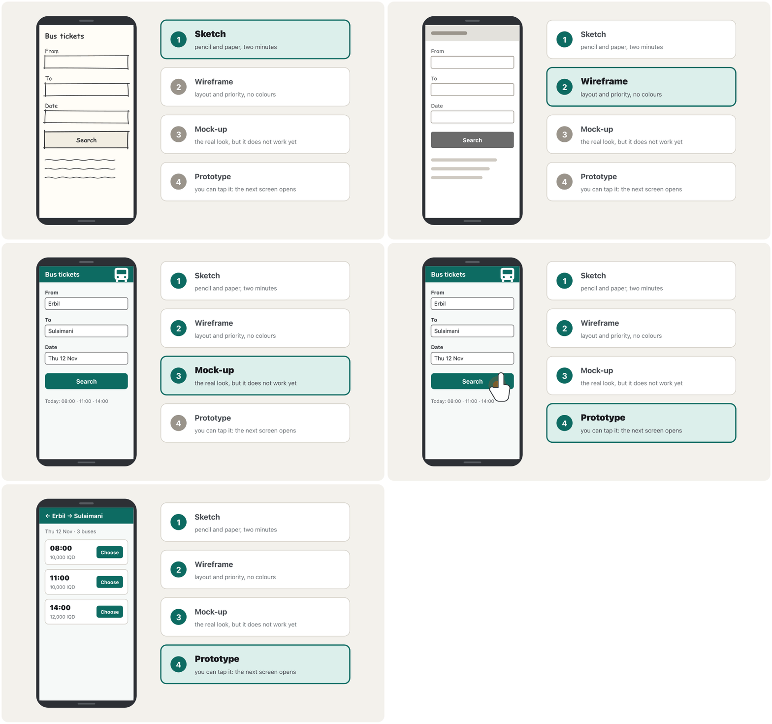
A wireframe answers two questions: what goes where, and what matters most. Start on paper: a pencil sketch takes a minute, you can throw it away, and nobody argues about colours yet. Draw the phone screen first — most visitors use one — then the wide screen. Use a box with a cross for a picture and wavy lines for text, but write the real headings and button words: the words matter.
وەڵامی دوو پرسیار دەداتەوە: چی لە کوێ دادەنرێت و چی لە هەمووی گرنگترە. لەسەر کاغەز دەست پێبکە: سکێچێک بە قەڵەمی ڕەساس خولەکێک دەخایەنێت، دەتوانیت فڕێی بدەیت و هێشتا کەس لەسەر ڕەنگ مشتومڕ ناکات. سەرەتا شاشەی مۆبایل بکێشە — زۆربەی سەردانکەران مۆبایل بەکاردەهێنن — پاشان شاشەی پان. بۆ وێنە چوارگۆشەیەک بە خاچێکەوە و بۆ دەق هێڵی شەپۆلی بەکاربهێنە، بەڵام سەردێڕ و وشەی ڕاستەقینە بنووسە: وشەکان گرنگن.
The six common page layouts of the life cycle are wireframes too (Page parts and six wireframes); here a wireframe plans one task. In the final project you wireframe your own portfolio the same way (Wireframes: the phone first).
ئەو شەش باوەی (بەشەکانی لاپەڕە و شەش وایەرفرەیم)؛ لێرەدا پلانی یەک کار دادەنێت. لە پرۆژەی کۆتاییدا بە هەمان شێوە بۆ خۆت دەکێشیت (وایەرفرەیمەکان: سەرەتا مۆبایل).
Mock-ups and prototypesمۆکئەپەکان و نموونە سەرەتاییەکان
A mock-up shows the real look — colours, fonts, pictures and real text — but does not work. A prototype works enough to try: buttons lead to the next screen, even if nothing real happens behind them. Make one as soon as you want to watch someone use a design. In software projects, the spiral model uses prototypes to reduce risk: see The Development Life Cycle.
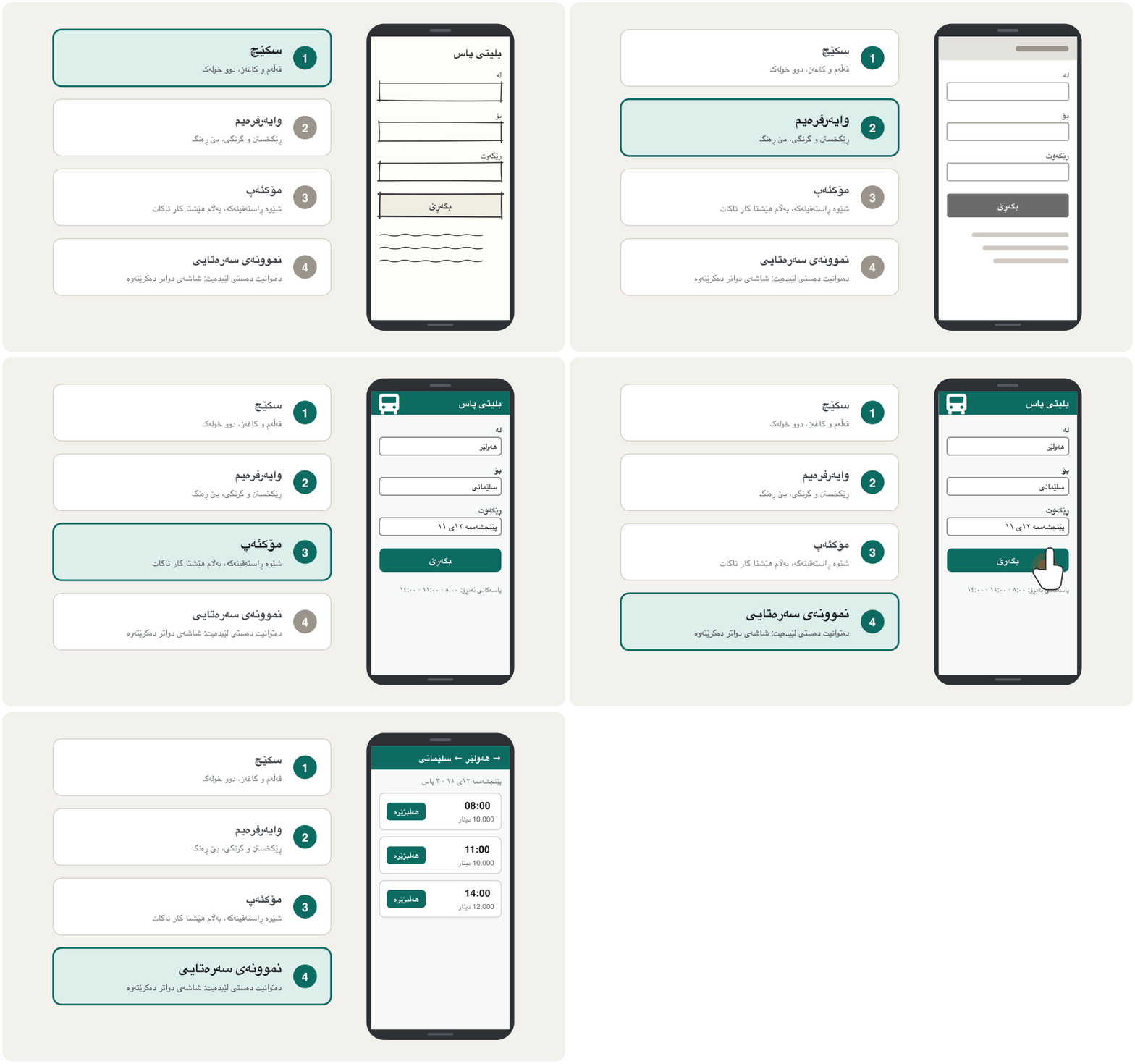
شێوە ڕاستەقینەکە پیشان دەدات — ڕەنگ، ، وێنە و دەقی ڕاستەقینە — بەڵام کار ناکات. ئەوەندە کار دەکات کە تاقی بکرێتەوە: دەتبەن بۆ شاشەی دواتر، تەنانەت ئەگەر هیچ شتێکی ڕاستەقینە لە پشتیانەوە ڕوو نەدات. هەر کاتێک ویستت سەیری بەکارهێنانی دیزاینێک لەلایەن کەسێکەوە بکەیت، یەکێک دروست بکە. لە پڕۆژەکانی ، بەکار دەهێنێت بۆ کەمکردنەوەی : بڕوانە سووڕی ژیانی گەشەپێدانی نەرمەواڵە.
Mock-ups and prototypesمۆکئەپەکان و نموونە سەرەتاییەکان
Low or high fidelity?وردیی کەم یان وردیی زۆر؟
Fidelity means how close a prototype is to the real site, in three ways: how much it reacts (interactivity), how real it looks (visuals) and how real its text is (content). A paper prototype is low in all three; a clickable one made in a design tool can be high in all three (Nielsen Norman Group).
وردی واتە چەند لە ڕاستەقینە نزیکە، بە سێ شێوە: چەند وەڵام دەداتەوە (کارلێک)، چەند ڕاستەقینە دەردەکەوێت (شێوە) و دەقەکەی چەند ڕاستەقینەیە (ناوەڕۆک). کاغەزی لە هەر سێکیاندا کەمە؛ ئەوەی بە ئامرازێکی دیزاین دروست دەکرێت و کلیک دەکرێت دەتوانێت لە هەر سێکیاندا زۆر بێت (Nielsen Norman Group).
- Low fidelity is quick and cheap, can change even during a test, and people criticise it freely because it looks unfinished — best for the steps and the structure.
- High fidelity behaves like the real site, so people act more naturally — best for wording, menus, small controls and the visual details.
- وردیی کەم خێرا و هەرزانە، تەنانەت لە کاتی تاقیکردنەوەدا دەگۆڕدرێت و خەڵک بە ئازادی ڕەخنەی لێدەگرن چونکە تەواونەکراو دەردەکەوێت — باشترینە بۆ هەنگاوەکان و پێکهاتەکە.
- وردیی زۆر وەک ڕاستەقینە ڕەفتار دەکات، بۆیە خەڵک سروشتیتر هەڵسوکەوت دەکەن — باشترینە بۆ وشەکان، ، کۆنترۆڵە بچووکەکان و وردەکارییە بینراوەکان.
Mock-ups and prototypesمۆکئەپەکان و نموونە سەرەتاییەکان
Tools for prototypesئامرازەکانی نموونەی سەرەتایی
Paper and a pencil: one person plays the computer and lays down the next paper screen when the tester taps. Penpot is a free, open-source design and prototyping tool that runs in the browser and can even run on your own server. Figma has a free Starter plan with limits and is free for verified students and teachers (as of November 2026). Developers later turn such a design into code; one exercise does it in Flutter (Review exercises in the Mobile App Development course). Or build a quick HTML and CSS prototype with the skills of this course — two screens joined by fragment links:
کاغەز و قەڵەمی ڕەساس: کەسێک ڕۆڵی کۆمپیوتەر دەبینێت و کاتێک تاقیکەرەوەکە دەستی لێدەدات شاشە کاغەزییەکەی دواتر دادەنێت. Penpot ئامرازێکی بێبەرانبەرە بۆ دیزاین و ، ، لە کار دەکات و تەنانەت دەتوانێت لەسەر خۆت کار بکات. Figma پلانێکی بێبەرانبەری Starterـی هەیە بە سنوورەوە و بۆ قوتابی و مامۆستای پشتڕاستکراوە بێبەرانبەرە (لە نۆڤەمبەری 2026دا). دواتر دیزاینی وا دەکەن بە کۆد؛ ڕاهێنانێک ئەمە بە Flutter دەکات (ڕاهێنانەکانی پێداچوونەوە لە کۆرسی پەرەپێدانی مۆبایلدا). یان بە کارامەییەکانی ئەم کۆرسە خێرای HTML و CSS دروست بکە — دوو شاشە کە بە بەیەکەوە بەستراون:
<style>
.screen { display: none; }
.screen:target, #search:not(:has(~ .screen:target)) { display: block; }
</style>

<section id="search" class="screen">
  <h1>Bus tickets</h1>
  <p>From: Erbil · To: Sulaimani · Thursday</p>
  <a class="button" href="#results">Search</a>
</section>
<section id="results" class="screen">
  <h1>3 buses on Thursday</h1>
  <ul>
    <li>08:00 — 10,000 IQD</li>
    <li>11:00 — 10,000 IQD</li>
    <li>14:00 — 12,000 IQD</li>
  </ul>
  <a href="#search">Back</a>
</section>HTML sent to the browserئەو HTMLـەی دەنێردرێت بۆ تۆڕگەڕ
<!DOCTYPE html>
<html lang="en">
<head>
<meta charset="utf-8">
<meta name="viewport" content="width=device-width, initial-scale=1">
<title>Bus tickets: clickable prototype</title>
<style>
.screen { display: none; }
.screen:target, #search:not(:has(~ .screen:target)) { display: block; }

body { font-family: system-ui, sans-serif; margin: 0; padding: 1rem; max-width: 22rem; }
h1 { font-size: 1.25rem; margin: 0 0 0.5rem; }
.button { display: inline-block; padding: 0.6rem 1.2rem; background: #0d6b62; color: #ffffff; border-radius: 0.5rem; text-decoration: none; font-weight: 700; }
a:focus-visible { outline: 3px solid #b4530f; outline-offset: 2px; }
li { margin-block: 0.25rem; }
</style>
</head>
<body>
<section id="search" class="screen">
  <h1>Bus tickets</h1>
  <p>From: Erbil · To: Sulaimani · Thursday</p>
  <a class="button" href="#results">Search</a>
</section>
<section id="results" class="screen">
  <h1>3 buses on Thursday</h1>
  <ul>
    <li>08:00 — 10,000 IQD</li>
    <li>11:00 — 10,000 IQD</li>
    <li>14:00 — 12,000 IQD</li>
  </ul>
  <a href="#search">Back</a>
</section>
</body>
</html>
Press Search, then Back. :target shows the section whose id is in the address; :has() shows the first screen when no section is targeted (Baseline 2023).
Search دابگرە، پاشان Back. :target ئەو بەشە پیشان دەدات کە idـەکەی لە ناونیشانەکەدایە؛ :has() شاشەی یەکەم پیشان دەدات کاتێک هیچ بەشێک نیشانە نەکراوە ( 2023).
Explain the codeڕوونکردنەوەی کۆدەکە
- Lineدێڕی 2
Every screen is hidden at first.
سەرەتا هەموو شاشەیەک شاراوەیە.
- Lineدێڕی 3
Show the screen named after # in the URL, or the search screen when none is named.
ئەو شاشەیە پیشان بدە کە ناوەکەی دوای # لە URLـدایە، یان شاشەی گەڕان کاتێک هیچ ناوێک نییە.
- Lineدێڕی 9
A link that looks like a button moves to the next screen.
کە وەک دەردەکەوێت دەتباتە شاشەی دواتر.
Ten usability heuristicsدە پێوەری ئاسانیی بەکارهێنان
A broad rule of thumb for checking a design, such as Jakob Nielsen's ten heuristics (1994, examples updated in 2024): visible system status, match with the real world, user control and freedom, consistency, error prevention, recognition rather than recall, flexibility, minimalist design, help with errors, and help and documentation. Checking a design against them is called a heuristic evaluation.
ڕێسایەکی گشتیی ئەزموونییە بۆ پشکنینی دیزاینێک، وەک دە پێوەرەکەی Jakob Nielsen (1994، نموونەکانی لە 2024 نوێکرانەوە): دەرخستنی دۆخی سیستەم، گونجان لەگەڵ جیهانی ڕاستەقینە، کۆنترۆڵ و ئازادیی ، یەکدەستی، ڕێگرتن لە ، ناسینەوە لەجیاتی بیرهێنانەوە، نەرمی، دیزاینی سادە، یارمەتی لە و ڕێنمایی. پشکنینی دیزاینێک بەپێی ئەمانە پێی دەوترێت هەڵسەنگاندنی پێوەری.
Jakob Nielsen wrote these ten rules of thumb in 1994, after earlier work with Rolf Molich in 1990. They are not laws but a checklist of what makes interfaces easy, and the Nielsen Norman Group still uses them (the article was last reviewed in 2024).
Jakob Nielsen ئەم دە ڕێسا ئەزموونییەی لە ساڵی 1994 نووسی، دوای کاری پێشووتری لەگەڵ Rolf Molich لە ساڵی 1990. یاسا نین، بەڵکو لیستێکی پشکنینن بۆ ئەوەی ئاسان دەکات و Nielsen Norman Group هێشتا بەکاریان دەهێنێت (وتارەکە دوایین جار لە 2024 پێداچوونەوەی بۆ کراوە).
Ten usability heuristicsدە پێوەری ئاسانیی بەکارهێنان
The heuristics on a website, and a heuristic evaluationپێوەرەکان لە تۆڕگەیەکدا و هەڵسەنگاندن بە پێوەرەکان
| Heuristicپێوەر | On a websiteلە |
|---|---|
| 1 Visibility of system status١ دەرخستنی دۆخی سیستەم | “Sending…” then “Order received”; “Step 2 of 3”«دەنێردرێت…» پاشان «داواکارییەکە گەیشت»؛ «هەنگاوی ٢ لە ٣» |
| 2 Match with the real world٢ گونجان لەگەڵ جیهانی ڕاستەقینە | “Departure time”, not “dep_t”; prices in dinars«کاتی ڕۆیشتن»، نەک «dep_t»؛ نرخ بە دینار |
| 3 User control and freedom٣ کۆنترۆڵ و ئازادیی | A Back link, Undo after deleting, a basket you can change Back، Undo دوای سڕینەوە، سەبەتەیەک کە دەتوانیت بیگۆڕیت |
| 4 Consistency and standards٤ یەکدەستی و ستانداردەکان | The logo goes home; links look like links; one word for one thingلۆگۆ دەتباتەوە ؛ وەک بەستەر دەردەکەون؛ یەک وشە بۆ یەک شت |
| 5 Error prevention٥ ڕێگرتن لە | A date picker that greys out past days; “Delete this order?”هەڵبژێرەری ڕێکەوت کە ڕۆژە ڕابردووەکان خۆڵەمێشی دەکات؛ «ئەم داواکارییە بسڕیتەوە؟» |
| 6 Recognition rather than recall٦ ناسینەوە لەجیاتی بیرهێنانەوە | Recent searches shown; options visible, not codes to rememberگەڕانە تازەکان پیشان دەدرێن؛ هەڵبژاردەکان دیارن، نەک کۆد بۆ لەبەرکردن |
| 7 Flexibility and efficiency٧ نەرمی و کارایی | Autofill; “Book the same trip again”؛ «بلیتی هەمان گەشت دووپاتە ببڕە» |
| 8 Aesthetic and minimalist design٨ دیزاینی جوان و سادە | Only what this step needs; no banners around the formتەنیا ئەوەی ئەم هەنگاوە پێویستی پێیەتی؛ بێ ڕیکلام لە دەوری |
| 9 Help users recover from errors٩ یارمەتی بۆ چاککردنەوەی | “Enter all 16 digits of the card number”, not “Error 402”«هەر ١٦ ژمارەی کارتەکە بنووسە»، نەک «Error 402» |
| 10 Help and documentation١٠ یارمەتی و ڕێنمایی | A short, searchable help next to the taskیارمەتییەکی کورت و گەڕانپێکراو لە تەنیشت کارەکەوە |
In a heuristic evaluation, three to five people each check the design alone against the ten heuristics, write down every problem and the heuristic it breaks, and only then compare their lists. It is quick and cheap, but it complements watching real users — it does not replace it (Nielsen Norman Group, 2023).
لە هەڵسەنگاندن بە دا، سێ تا پێنج کەس هەریەکەیان بە تەنیا دیزاینەکە بەپێی دە پێوەرەکە دەپشکنن، هەموو کێشەیەک و ئەو پێوەرەی دەیشکێنێت دەنووسن و تەنیا دواتر لیستەکانیان بەراورد دەکەن. خێرا و هەرزانە، بەڵام تەواوکەری سەیرکردنی بەکارهێنەرانی ڕاستەقینەیە — جێگەی ناگرێتەوە (Nielsen Norman Group، 2023).
Usability testing: watch, do not helpتاقیکردنەوەی ئاسانیی بەکارهێنان: سەیر بکە، یارمەتی مەدە
Watching real users try to do real tasks with a design while they think aloud, without helping them, to see where they get stuck. Testing with about five users finds most of the big problems; fix them and test again.
سەیرکردنی ڕاستەقینەیە کاتێک هەوڵ دەدەن کاری ڕاستەقینە بە دیزاینێک بکەن و بە دەنگی بەرز بیر دەکەنەوە، بێ ئەوەی یارمەتییان بدەیت، بۆ ئەوەی ببینیت لە کوێدا گیر دەخۆن. تاقیکردنەوە لەگەڵ نزیکەی پێنج زۆربەی کێشە گەورەکان دەدۆزێتەوە؛ چاکیان بکە و دووپاتە تاقی بکەرەوە.
Give a task, not instructions: “Buy a ticket from Erbil to Sulaimani for Thursday afternoon” — never “Click Search”. Ask the person to think aloud: to say what they look at, expect and feel. Tell them, “We are testing the site, not you.” Then stay quiet: do not help, explain or defend the design. If they get stuck, that is your finding. A facilitator gives the tasks, a note-taker writes down what happens, and with a video call and screen sharing you can test with someone in another city.
کارێک بدە، نەک ڕێنمایی: «بلیتێک لە هەولێرەوە بۆ سلێمانی بۆ پێنجشەممە ئێوارە بکڕە» — هەرگیز «کلیک لە Search بکە». داوا لە کەسەکە بکە بە دەنگی بەرز بیر بکاتەوە: بڵێت سەیری چی دەکات، چاوەڕێی چییە و چ هەستێکی هەیە. پێی بڵێ: «ئێمە تاقی دەکەینەوە، نەک تۆ.» پاشان بێدەنگ بە: یارمەتی مەدە، ڕوونی مەکەرەوە و بەرگری لە دیزاینەکە مەکە. ئەگەر گیری خوارد، ئەوە دۆزینەوەکەتە. بەڕێوەبەری تاقیکردنەوە کارەکان دەدات، تێبینینووس ئەوەی ڕوودەدات دەنووسێت و بە و هاوبەشکردنی شاشە دەتوانیت لەگەڵ کەسێک لە شارێکی تر تاقی بکەیتەوە.
Usability testing: watch, do not helpتاقیکردنەوەی ئاسانیی بەکارهێنان: سەیر بکە، یارمەتی مەدە
Why about five users are enough for each roundبۆچی نزیکەی پێنج بەکارهێنەر بۆ هەر خولێک بەسە
Each new tester shows you fewer new problems, because many problems are the same for everybody. Nielsen and Landauer's model says that with testers you find about of the problems, where — about 31 % in their studies — is the share one tester finds:
هەر تاقیکەرەوەیەکی نوێ کێشەی نوێی کەمتر پیشان دەدات، چونکە زۆربەی کێشەکان بۆ هەمووان وەک یەکن. مۆدێلی Nielsen و Landauer دەڵێت بە تاقیکەرەوە نزیکەی ـی کێشەکان دەدۆزیتەوە، کە — نزیکەی ٣١٪ لە توێژینەوەکانیاندا — ئەو بەشەیە کە یەک تاقیکەرەوە دەیدۆزێتەوە:
Five testers find about 85 % of the problems one study can show.
پێنج تاقیکەرەوە نزیکەی ٨٥٪ـی ئەو کێشانە دەدۆزنەوە کە یەک توێژینەوە دەتوانێت پیشانیان بدات.
So, instead of one big test with 15 people, run three small tests with five: test, fix, test again — each round also checks whether your fixes worked (Nielsen, 2000). If your site has groups that use it very differently — students who order and cooks who prepare the food — test three or four people from each group.
بۆیە، لەجیاتی یەک تاقیکردنەوەی گەورە بە ١٥ کەس، سێ تاقیکردنەوەی بچووک بە پێنج کەس ئەنجام بدە: تاقی بکەرەوە، چاکی بکە، دووپاتە تاقی بکەرەوە — هەر خولێک ئەوەش دەپشکنێت کە ئایا چاککردنەکانت سەرکەوتوو بوون (Nielsen، 2000). ئەگەر گرووپی وای هەیە کە زۆر جیاواز بەکاری دەهێنن — قوتابیان کە داوا دەکەن و چێشتلێنەرەکان کە خواردنەکە ئامادە دەکەن — لە هەر گرووپێک سێ یان چوار کەس تاقی بکەرەوە.
Common UI patternsشێوازە باوەکانی نێوبەستەی بەکارهێنەر
Visitors bring habits from other sites, so familiar patterns let them use your page without thinking (heuristic 4). Some you will meet often:
سەردانکەران خووی تر لەگەڵ خۆیان دەهێنن، بۆیە شێوازە ناسراوەکان ڕێگەیان پێدەدەن بێ بیرکردنەوە لاپەڕەکەت بەکاربهێنن (پێوەری ٤). هەندێکیان کە زۆر دەیانبینیت:
- Cards — a picture, a title and a short text that link to more: good for browsing different items, poor for comparing a list.
- Tabs — several panels in one place, one visible at a time, like the tabs of a paper folder.
- Accordions — questions that open and close (details and summary).
- Breadcrumbs — where am I in a big site? (Breadcrumbs).
- Modal dialogs — a box that blocks the page until you answer; HTML has
<dialog>, which Esc closes. Use them rarely: they interrupt. - Progressive disclosure — the main options first, the rare ones behind “More options”.
- Form steps — a long form in steps with “Step 2 of 3” (Designing Usable Forms).
- Dark mode — a dark theme people can choose (A dark theme).
- — وێنە، ناونیشان و دەقێکی کورت کە بۆ زیاتر دەتبەن: باشن بۆ گەڕان بە ناو شتی جۆراوجۆردا، لاوازن بۆ بەراوردکردنی لیستێک.
- تابەکان — چەند پانێڵێک لە یەک شوێندا، لە یەک کاتدا یەکێکیان دیارە، وەک تابەکانی فایلێکی کاغەزی.
- — پرسیار کە دەکرێنەوە و دادەخرێن (details و summary).
- — لە گەورەدا لە کوێم؟ (ڕێڕەوی لاپەڕە).
- مۆداڵ — چوارچێوەیەک کە تا وەڵام نەدەیتەوە لاپەڕەکە دادەخات؛ توخمی
<dialog>ـی هەیە کە Esc دای دەخات. کەم بەکاریان بهێنە: کار دەپچڕێنن. - — سەرەتا هەڵبژاردە سەرەکییەکان، دەگمەنەکان لە پشت «هەڵبژاردەی زیاتر».
- بە هەنگاو — درێژ بە هەنگاو لەگەڵ «هەنگاوی ٢ لە ٣» (دیزاینکردنی فۆرمی ئاسان بۆ پڕکردنەوە).
- — تاریک کە خەڵک دەتوانن هەڵیبژێرن (دۆخی تاریک).
Common mistakesهەڵە باوەکان
| Mistakeهەڵە | Betterباشتر |
|---|---|
| Designing for yourself: “I would understand it”دیزاین بۆ خۆت: «من تێی دەگەم» | Research real users — you are not your userتوێژینەوە لەسەر بەکارهێنەرانی ڕاستەقینە بکە — تۆ بەکارهێنەری خۆت نیت |
| Personas made up at a desk کە لەسەر مێز داتاشراون | Personas built from interviews and observation کە لە چاوپێکەوتن و سەیرکردنەوە دروستکراون |
| A pixel-perfect mock-up before the steps work بێخەوش پێش ئەوەی هەنگاوەکان کار بکەن | Paper and wireframes first; polish laterسەرەتا کاغەز و ؛ جوانکاری دواتر |
| Testing with your team or your friendsتاقیکردنەوە لەگەڵ تیمەکەت یان هاوڕێکانت | Testing with people like your real usersتاقیکردنەوە لەگەڵ کەسانی وەک بەکارهێنەرە ڕاستەقینەکانت |
| Helping or explaining during a testیارمەتیدان یان ڕوونکردنەوە لە کاتی تاقیکردنەوەدا | Stay quiet; where people struggle is the findingبێدەنگ بە؛ ئەو شوێنەی خەڵک تێیدا ماندوو دەبن دۆزینەوەکەیە |
| Leading questions: “Isn't this easy?”پرسیاری ئاڕاستەکەر: «ئەمە ئاسان نییە؟» | Neutral tasks and open questionsکاری بێلایەن و پرسیاری کراوە |
| One big test just before launchیەک تاقیکردنەوەی گەورە پێش بڵاوکردنەوە | Small tests with about five people, early and oftenتاقیکردنەوەی بچووک لەگەڵ نزیکەی پێنج کەس، زوو و زۆرجار |
| Recording people without asking; names in your notesتۆمارکردنی خەڵک بێ پرسیار؛ ناو لە تێبینییەکانتدا | Ask for consent; keep personal data out of your notesداوای بکە؛ لە تێبینییەکانت دوور بخەرەوە |
Exercisesڕاهێنانەکان
A school wants a website where students order lunch before the 10:30 break and collect it at the canteen. Imagine you interviewed five students and the cook. Write one persona for a student and a five-step journey map with one pain point and its fix.
قوتابخانەیەک دەوێت کە قوتابیان پێش پشووی ١٠:٣٠ نانی نیوەڕۆ داوا بکەن و لە کافتریاکە وەریبگرن. وا دابنێ چاوپێکەوتنت لەگەڵ پێنج قوتابی و چێشتلێنەرەکە کردووە. بۆ قوتابییەک و نەخشەی پێنج هەنگاوی بە یەک خاڵی ئازار و چارەسەرەکەی بنووسە.
Show answerوەڵامەکە پیشان بدە
Persona — Rebin, 16, grade 11. Goal: order lunch in the five minutes between two lessons and skip the queue. Devices: his own Android phone, school Wi-Fi that is often slow. Frustrations: menus that are only a photo of a paper list, paying cash and waiting for change, forgetting his order number. Quote: “If it takes more than a minute, I just queue.”
— ڕێبین، ١٦ ساڵ، پۆلی ١١. ئامانج: لە پێنج خولەکی نێوان دوو وانەدا نانی نیوەڕۆ داوا بکات و لە ڕیز ڕزگاری بێت. ئامێرەکان: مۆبایلی ئەندرۆیدی خۆی، قوتابخانە کە زۆرجار هێواشە. ئەوەی بێزاری دەکات: کە تەنیا وێنەی لیستێکی کاغەزین، پارەدانی نەقد و چاوەڕوانی بۆ گەڕاندنەوەی پارە، لەبیرچوونی ژمارەی داواکارییەکەی. وتە: «ئەگەر لە خولەکێک زیاتری خایاند، هەر دەچمە ناو ڕیزەکە.»
| Stepهەنگاو | Doing and feelingکردن و هەست | Pain point and fixخاڵی ئازار و چارەسەر |
|---|---|---|
| 1 Open the site١ کردنەوەی | Taps the bookmark; the page is slow on school Wi-Fi — impatientلە نیشانەکراوەکە دەدات؛ لاپەڕەکە لەسەر قوتابخانە هێواشە — بێتاقەت | Small pictures, light pageوێنەی بچووک، لاپەڕەی سووک |
| 2 Choose a meal٢ هەڵبژاردنی خواردن | Reads today's lunch — fineنانی نیوەڕۆی ئەمڕۆ دەخوێنێتەوە — باشە | — |
| 3 Pay٣ پارەدان | Must create an account first — annoyed (pain point)دەبێت سەرەتا هەژمارێک دروست بکات — بێزار (خاڵی ئازار) | Pay with the student card number; no accountپارەدان بە ژمارەی کارتی قوتابی؛ بێ هەژمار |
| 4 Get a number٤ وەرگرتنی ژمارە | Sees “Order 47, ready at 10:30” — relieved«داواکاریی ٤٧، لە ١٠:٣٠ ئامادەیە» دەبینێت — ئاسوودە | Keep the number on the screenژمارەکە لەسەر شاشە بهێڵەرەوە |
| 5 Collect٥ وەرگرتن | Shows the number at the counter — happyژمارەکە لە پێشخانەکە پیشان دەدات — دڵخۆش | — |
Sketch the phone version of the canteen home page on paper. What must be at the top, and what can wait?
وەشانی مۆبایلی کافتریاکە لەسەر کاغەز بکێشە. چی دەبێت لە سەرەوە بێت و چی دەتوانێت چاوەڕێ بکات؟
Show answerوەڵامەکە پیشان بدە
+----------------------------------+
| [LOGO]  School canteen   [Menu]  |
+----------------------------------+
| Today's lunch (order by 10:00)   |
| +------------------------------+ |
| | [X picture] Rice and beans   | |
| | 2,000 IQD      [ Add ]       | |
| +------------------------------+ |
| | [X picture] Chicken wrap     | |
| | 2,500 IQD      [ Add ]       | |
| +------------------------------+ |
| Your order: 1 item - 2,000 IQD   |
| [      Pay and get a number    ] |
+----------------------------------+
| Opening hours - Help - Contact   |
+----------------------------------+
Today's meals and the order deadline come first, because that is the task; each meal is a card with one big Add button; the order total and the main button stay together; opening hours and help go to the bottom.
خواردنەکانی ئەمڕۆ و دوایین کاتی داواکردن یەکەم دێن، چونکە کارەکە ئەوەیە؛ هەر خواردنێک بە یەک گەورەی Add؛ کۆی داواکارییەکە و سەرەکییەکە پێکەوە دەمێننەوە؛ کاتەکانی کار و یارمەتی دەچنە خوارەوە.
Write three tasks for five students who test a paper prototype of the canteen site, one sentence you say at the start, and what you will write down.
سێ کار بۆ پێنج قوتابی بنووسە کە کاغەزیی کافتریاکە تاقی دەکەنەوە، یەک ڕستە کە لە سەرەتادا دەیڵێیت و ئەوەی دەینووسیت.
Show answerوەڵامەکە پیشان بدە
- Task 1: “You are hungry and have 3,000 dinars. Order a lunch for today.”
- Task 2: “You chose the wrong meal. Change it before you pay.”
- Task 3: “Find out until when you can order today.”
- At the start: “We are testing the site, not you. Please say aloud what you think while you try.”
- Write down: whether each task was finished, the time, where the person hesitated or went wrong, and their words — no names: use “Student 1 … 5”.
- کار ١: «برسیتە و ٣٠٠٠ دینارت هەیە. نانی نیوەڕۆی ئەمڕۆ داوا بکە.»
- کار ٢: «خواردنێکی هەڵەت هەڵبژارد. پێش پارەدان بیگۆڕە.»
- کار ٣: «بزانە ئەمڕۆ تا کەی دەتوانیت داوا بکەیت.»
- لە سەرەتادا: «ئێمە تاقی دەکەینەوە، نەک تۆ. تکایە ئەوەی بیری لێدەکەیتەوە لە کاتی هەوڵداندا بە دەنگی بەرز بڵێ.»
- بینووسە: ئایا هەر کارێک تەواو بوو، کاتەکە، ئەو شوێنەی کەسەکە دوودڵ بوو یان هەڵەی کرد و وشەکانی — بێ ناو: «قوتابیی ١ … ٥» بەکاربهێنە.
Summaryپوختە
- UX is the whole trip of a task; UI is what people see and touch; usability is how easily they reach their goal.
- User-centred design repeats four steps: understand the context, specify the requirements, design, evaluate (ISO 9241-210).
- Research real users — interviews, observation, surveys, analytics — with consent and without needless personal data.
- A persona sums up the research; a journey map shows steps, feelings and pain points.
- Sketch → wireframe → mock-up → prototype: from cheap and rough to real-looking and clickable; low fidelity for the flow, high fidelity for the details.
- Check designs with Nielsen's ten heuristics, and test them with real users: about five per round, test → fix → test again.
- Use familiar UI patterns: cards, tabs, accordions, breadcrumbs, dialogs, progressive disclosure, form steps, dark mode.
- هەموو گەشتی کارێکە؛ ئەوەیە کە خەڵک دەیبینن و دەستی لێدەدەن؛ ئەوەیە چەند بە ئاسانی دەگەنە ئامانجەکەیان.
- چوار هەنگاو دووپاتە دەکاتەوە: تێگەیشتن لە بارودۆخ، دیاریکردنی ، دیزاین، هەڵسەنگاندن (ISO 9241-210).
- توێژینەوە لەسەر بەکارهێنەرانی ڕاستەقینە بکە — چاوپێکەوتن، سەیرکردن، ڕاپرسی، — بە و بێ نەپێویست.
- پوختەی توێژینەوەکەیە؛ نەخشەی هەنگاو، هەست و خاڵەکانی ئازار پیشان دەدات.
- سکێچ ← ← ← : لە هەرزان و سەرەتاییەوە بۆ ڕاستەقینە و کلیکپێکراو؛ وردیی کەم بۆ ڕەوتەکە، وردیی زۆر بۆ وردەکارییەکان.
- دیزاینەکان بە دە پێوەرەکەی Nielsen بۆ بپشکنە و لەگەڵ بەکارهێنەرانی ڕاستەقینە تاقییان بکەرەوە: نزیکەی پێنج کەس بۆ هەر خولێک، تاقی بکەرەوە ← چاکی بکە ← دووپاتە تاقی بکەرەوە.
- شێوازە ناسراوەکانی بەکاربهێنە: ، تابەکان، ، ، ، ، بە هەنگاو، .
Lesson complete!وانەکە تەواو بوو!
Well done. Review the key terms, then go on to the next lesson.دەستخۆش. سەیرێکی زاراوە سەرەکییەکان بکەرەوە، پاشان بڕۆ بۆ وانەی داهاتوو.
Key termsزاراوە سەرەکییەکان
Web Accessibility: WCAG 2.2 in Practiceدەستڕاگەیشتنی وێب: WCAG 2.2 لە کرداردا
Related lecturesوانە پەیوەندیدارەکان
- The Website Development Life Cycleسووڕی ژیانی گەشەپێدانی تۆڕگە
- Web Accessibility: WCAG 2.2 in Practiceدەستڕاگەیشتنی وێب: WCAG 2.2 لە کرداردا
- Designing Usable Formsدیزاینکردنی فۆرمی ئاسان بۆ پڕکردنەوە
- Semantic HTML: Page Structure and LandmarksHTMLـی واتایی: پێکهاتەی لاپەڕە و ناوچە نیشانەدارەکان
- Links and Navigation Menusبەستەرەکان و لیستە ڕێنیشاندەرەکان
- Colour for the Web: Palettes, Contrast and Themesڕەنگ بۆ وێب: پالێتی ڕەنگ، کۆنتراست و تێمەکان
- Europe's GDPR: Rights, Breach Notification and FinesGDPRـی ئەوروپا: ماف، ئاگادارکردنەوەی دزەکردنی دراوە و سزای دارایی
- Final Project: Your Portfolio Websiteپڕۆژەی کۆتایی: پۆرتفۆلیۆی ئۆنلاینی خۆت
References and further readingسەرچاوەکان و خوێندنەوەی زیاتر
- Interaction Design Foundation: User-Centered Design (quotes ISO 9241-210:2019)
- GOV.UK Service Manual: User research
- Nielsen Norman Group: When to Use Which User-Experience Research Methods
- Nielsen Norman Group: Personas
- Nielsen Norman Group: Journey Mapping 101
- Nielsen Norman Group: UX Prototypes — Low Fidelity vs. High Fidelity
- Nielsen Norman Group: 10 Usability Heuristics for User Interface Design
- Nielsen Norman Group: How to Conduct a Heuristic Evaluation
- Nielsen Norman Group: Thinking Aloud — the #1 Usability Tool
- Nielsen Norman Group: Why You Only Need to Test with 5 Users
- Nielsen Norman Group: Cards — UI-Component Definition
- Nielsen Norman Group: Progressive Disclosure
- MDN: <dialog> element
- Penpot: plans and pricing
- Penpot on GitHub (MPL-2.0 licence)
- Figma: pricing
- Figma for Education
This lecture is a first edition. The Kurdish text and terminology are waiting for review by Kurdish IT teachers.ئەم وانەیە چاپی یەکەمە. دەقە کوردییەکە و زاراوەکانی چاوەڕێی پێداچوونەوەی مامۆستایانی کوردی بواری IT ن.