Chapterبەش 4 · Lectureوانە 4.4
Responsive Design: Viewport, Media Queries and Mobile-Firstدیزاینی ڕێسپۆنسیڤ: ناوچەی بینین، پرسەکانی میدیا و مۆبایل لە پێشدا
One page for every screen, from a phone to a wide monitor: the viewport meta tag (and why zoom must stay on), fluid layouts with relative units and the new svh and dvh units, pictures and media that never stick out, media queries written mobile-first with breakpoints chosen by the content, media features for touch, dark mode, reduced motion and print, container queries, and testing with device mode, zoom and a real phone.
یەک لاپەڕە بۆ هەموو شاشەیەک، لە مۆبایلەوە تا پان: metaـی (و بۆچی دەبێت کار بکات)، بە و یەکە نوێیەکانی svh و dvh، وێنە و میدیا کە هەرگیز دەرناچن، بە شێوازی و کە ناوەڕۆکەکە هەڵیان دەبژێرێت، بۆ دەستلێدان، ، و چاپ، و تاقیکردنەوە بە دۆخی ئامێر، و مۆبایلێکی ڕاستەقینە.
What you will learnچی فێر دەبیت
- Add the viewport meta tag, explain what a phone does without it, and keep zoom working.
- Build a fluid layout: a centred container with
min()andmargin-inline: auto, relative units,svh, and media that never stick out. - Write media queries mobile-first with
width >=(ormin-width) and choose breakpoints where the content needs them. - Use media features for touch, dark mode, reduced motion and print, and a container query for a reusable card.
- Test a page in device mode, at 200 % and 400 % zoom, on a slow network and on a real phone.
- metaـی زیاد بکەیت، ڕوونی بکەیتەوە مۆبایل بەبێ ئەو چی دەکات و بە کارکردوویی بهێڵیتەوە.
- دروست بکەیت: کۆنتەینەرێکی ناوەڕاست بە
min()وmargin-inline: auto، ،svhو میدیایەک کە هەرگیز دەرناچێت. - بە شێوازی بە
width >=(یانmin-width) بنووسیت و لەو شوێنانەدا هەڵبژێریت کە ناوەڕۆکەکە پێویستی پێیانە. - بۆ دەستلێدان، ، و چاپ بەکاربهێنیت، لەگەڵ بۆ کە دووپاتە بەکاردێتەوە.
- لاپەڕەیەک لە دۆخی ئامێردا، لە ٢٠٠٪ و ٤٠٠٪دا، لەسەر خاو و لەسەر مۆبایلێکی ڕاستەقینە تاقی بکەیتەوە.
One page for every screenیەک لاپەڕە بۆ هەموو شاشەیەک
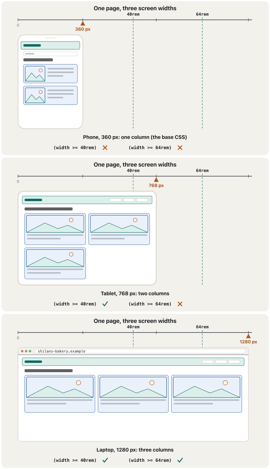
A changes its layout to fit the screen: one column on a phone, two on a tablet, three on a laptop — one page made from one HTML file. Phones matter most: in October 2026 about 91 % of the web pages viewed in Iraq were viewed on a phone, against 60 % worldwide (StatCounter).
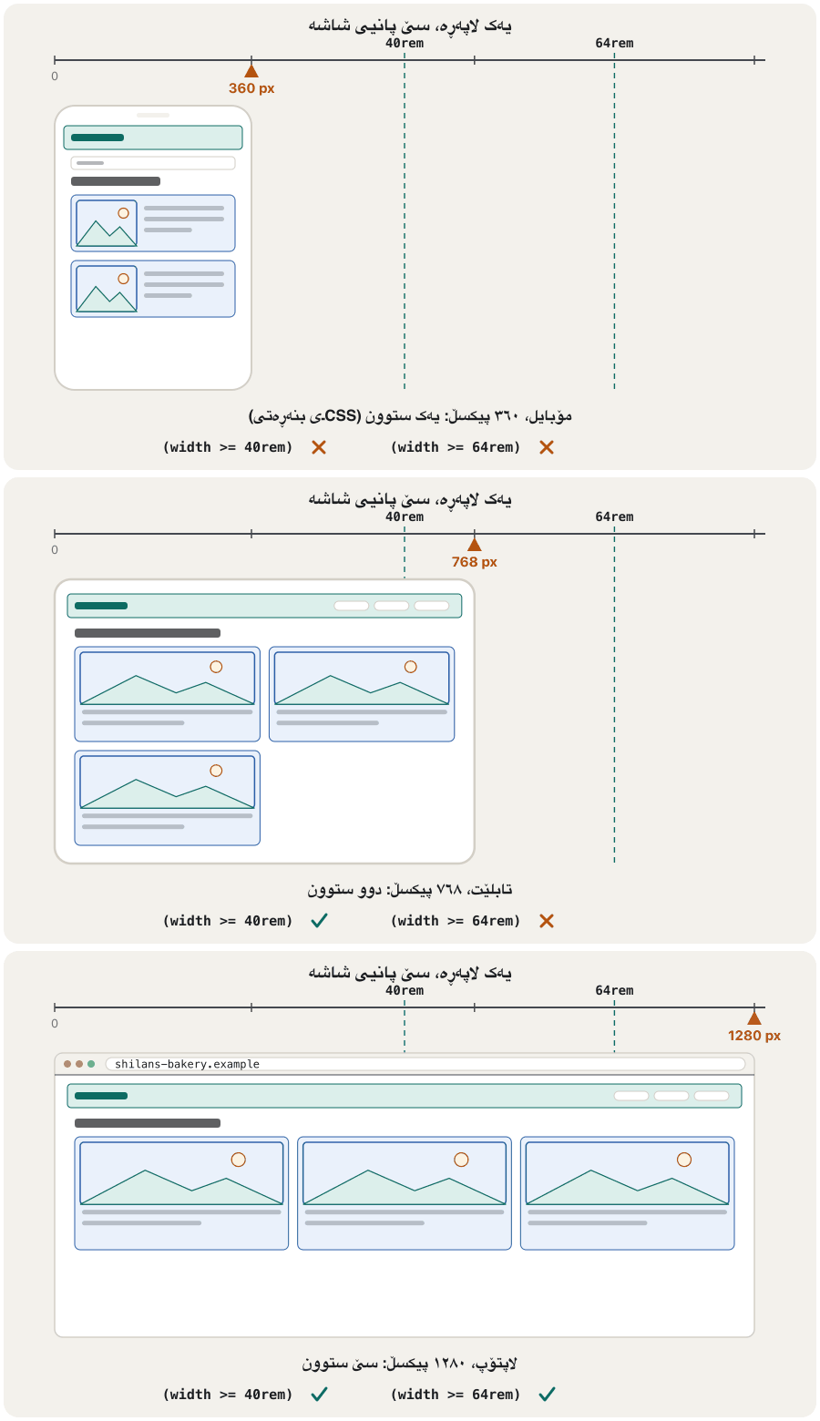
دەگۆڕێت تا لەگەڵ شاشەکەدا بگونجێت: یەک ستوون لەسەر مۆبایل، دوو ستوون لەسەر ، سێ ستوون لەسەر — یەک لاپەڕە کە لە یەک دروست دەبێت. مۆبایل لە هەمووی گرنگترە: لە تشرینی یەکەمی ٢٠٢٦دا نزیکەی ٩١٪ی ئەو لاپەڕانەی لە عێراقدا سەیر کران لەسەر مۆبایل بوون، بەرامبەر بە ٦٠٪ لە هەموو جیهاندا (StatCounter).
The name and the idea come from Ethan Marcotte's 2010 article Responsive Web Design. It named three ingredients — , flexible images and — and this lesson teaches all three, plus the one line of HTML that makes phones play along. A site that works on every screen is one of the marks of a good website (What makes a good website?).
ناو و بیرۆکەکە لە وتارێکی ئیتان مارکۆتەوە (Ethan Marcotte) هاتووە بە ناوی Responsive Web Design (ساڵی ٢٠١٠). سێ پێکهاتەی دیاری کرد: ، وێنەی نەرم و . ئەم وانەیە هەر سێکیان فێر دەکات، لەگەڵ ئەو یەک دێڕەی کە وا لە مۆبایل دەکات هاوکار بێت. کە لەسەر هەموو شاشەیەک کار بکات یەکێکە لە نیشانەکانی باش (چی تۆڕگەیەک باش دەکات؟).
The viewport meta tagتاگی metaـی ناوچەی بینین
Without help, a phone pretends to be a desktop screen about 980 px wide: it lays the page out at that width and then shrinks everything to fit. The text is tiny, and your media queries never switch, because the page believes it is wide. One line in the <head> tells the phone to use its real width — every full example in these lessons has it:
بەبێ یارمەتی، مۆبایل وا دەکات وەک ئەوەی شاشەی بێت بە پانیی نزیکەی ٩٨٠ : لاپەڕەکە بەو پانییە ڕێک دەخات و پاشان هەمووی بچووک دەکاتەوە تا جێی ببێتەوە. دەقەکە زۆر وردە و هەرگیز ناگۆڕێن، چونکە لاپەڕەکە وا دەزانێت پانە. یەک دێڕ لە <head>ـدا بە مۆبایلەکە دەڵێت پانیی ڕاستەقینەی خۆی بەکاربهێنێت — هەموو نموونەیەکی تەواو لەم وانانەدا ئەمەی تێدایە:
<meta name="viewport" content="width=device-width, initial-scale=1">width=device-width— lay the page out as wide as the screen, in CSS pixels (between about 360 and 430 on most phones).initial-scale=1— start at 100 %, with no zooming in or out.
width=device-width— لاپەڕەکە بەقەد پانیی شاشەکە ڕێک بخە، بە CSS (لەسەر زۆربەی مۆبایلەکان نزیکەی نێوان ٣٦٠ و ٤٣٠).initial-scale=1— بە ١٠٠٪ دەست پێبکە، بێ گەورەکردن و بچووککردنەوە.
<head>ـدا بڕیار دەدات مۆبایل بە چ پانییەک لاپەڕەکەت ڕێک بخات.CêITFluid layouts: widths that stretchڕێکخستنی ڕەوان: پانییەک کە پان و تەسک دەبێتەوە
A has no fixed widths: its boxes stretch and shrink with the window, like water taking the shape of its glass. Two habits make one:
هیچ پانییەکی جێگیری نییە: سندووقەکانی لەگەڵ پەنجەرەکەدا پان و تەسک دەبنەوە، وەک ئاو کە شێوەی پەرداخەکەی وەردەگرێت. دوو خوو ئەمە دروست دەکەن:
- A centred container with a maximum width.
width: min(100% - 2rem, 70rem)is the whole width minus 1 rem on each side on a phone, and never more than 70 rem on a big screen;margin-inline: autocentres it. - Let flex and grid share the space. A wrapping flex row (Wrapping onto new lines) and
repeat(auto-fit, minmax(…))(As many columns as fit) change their number of columns by themselves. The test: nothing may make the page scroll sideways.
- کۆنتەینەرێکی ناوەڕاست کە پانییەکەی سنووری هەیە.
width: min(100% - 2rem, 70rem)لەسەر مۆبایل هەموو پانییەکەیە کەم1remلە هەر لایەک و لەسەر شاشەی گەورە هەرگیز لە70remپانتر نابێت؛margin-inline: autoدەیخاتە ناوەڕاست. - با flex و grid بۆشاییەکە دابەش بکەن. ڕیزێکی flex کە دەچێتە دێڕی نوێ (چوونە دێڕی نوێ) و
repeat(auto-fit, minmax(…))(هێندەی جێگە هەبێت ستوون) خۆیان ژمارەی ستوونەکانیان دەگۆڕن. تاقیکردنەوەکە: هیچ شتێک نابێت وا بکات لاپەڕەکە بە ئاسۆیی بجووڵێت.
<!DOCTYPE html>
<html lang="en">
<head>
  <meta charset="utf-8">
  <meta name="viewport" content="width=device-width, initial-scale=1">
  <title>A fluid page</title>
  <style>
    * { box-sizing: border-box; }
    body { margin: 0; font-family: Arial, sans-serif; line-height: 1.5; background-color: #f3f1ec; }
    .container {
      width: min(100% - 2rem, 70rem);   /* full width minus 1rem on each side, at most 70rem */
      margin-inline: auto;               /* centred */
      padding-block: clamp(1rem, 4vw, 3rem);
    }
    .cards {
      display: grid;
      grid-template-columns: repeat(auto-fit, minmax(min(12rem, 100%), 1fr));
      gap: 1rem;
    }
    .card { padding: 1rem; border-radius: 0.5rem; background-color: #ffffff; }
    .card h2 { margin: 0 0 0.25rem; font-size: 1.1rem; }
    .card p { margin: 0; }
  </style>
</head>
<body>
  <main class="container">
    <h1>Places to visit</h1>
    <div class="cards">
      <article class="card"><h2>Erbil Citadel</h2><p>A World Heritage Site on a hill in the city centre.</p></article>
      <article class="card"><h2>Gali Ali Beg</h2><p>A waterfall between high mountains.</p></article>
      <article class="card"><h2>Lake Dukan</h2><p>A large lake for a spring picnic.</p></article>
    </div>
  </main>
</body>
</html>HTML sent to the browserئەو HTMLـەی دەنێردرێت بۆ تۆڕگەڕ
<!DOCTYPE html>
<html lang="en">
<head>
  <meta charset="utf-8">
  <meta name="viewport" content="width=device-width, initial-scale=1">
  <title>A fluid page</title>
  <style>
    * { box-sizing: border-box; }
    body { margin: 0; font-family: Arial, sans-serif; line-height: 1.5; background-color: #f3f1ec; }
    .container {
      width: min(100% - 2rem, 70rem);   /* full width minus 1rem on each side, at most 70rem */
      margin-inline: auto;               /* centred */
      padding-block: clamp(1rem, 4vw, 3rem);
    }
    .cards {
      display: grid;
      grid-template-columns: repeat(auto-fit, minmax(min(12rem, 100%), 1fr));
      gap: 1rem;
    }
    .card { padding: 1rem; border-radius: 0.5rem; background-color: #ffffff; }
    .card h2 { margin: 0 0 0.25rem; font-size: 1.1rem; }
    .card p { margin: 0; }
  </style>
</head>
<body>
  <main class="container">
    <h1>Places to visit</h1>
    <div class="cards">
      <article class="card"><h2>Erbil Citadel</h2><p>A World Heritage Site on a hill in the city centre.</p></article>
      <article class="card"><h2>Gali Ali Beg</h2><p>A waterfall between high mountains.</p></article>
      <article class="card"><h2>Lake Dukan</h2><p>A large lake for a spring picnic.</p></article>
    </div>
  </main>
</body>
</html>
Make the window narrower: the cards go from three columns to one, and the container keeps 1 rem from the edges.
پەنجەرەکە تەسکتر بکە: لە سێ ستوونەوە دەبنە یەک ستوون و کۆنتەینەرەکە 1rem لە لێوارەکان دوور دەمێنێتەوە.
Fluid layouts: widths that stretchڕێکخستنی ڕەوان: پانییەک کە پان و تەسک دەبێتەوە
Relative units and the new svh, lvh and dvhیەکە ڕێژەییەکان و svh، lvh و dvhـی نوێ
A takes its size from something else: % from the parent box, rem from the root font size, vw and vh from the viewport (1 % of its width or height). Relative units grow with the screen and with the reader's font settings; px does not. clamp(1rem, 4vw, 3rem) keeps a value between a minimum and a maximum — the same idea as Fluid headings with clamp().
قەبارەکەی لە شتێکی ترەوە وەردەگرێت: % لە سندووقی باوانەوە، rem لە قەبارەی ڕەگەوە، vw و vh لە (١٪ی پانی یان بەرزییەکەی). لەگەڵ شاشەکە و ڕێکخستنی خوێنەردا گەورە دەبن؛ px گەورە نابێت. clamp(1rem, 4vw, 3rem) بەهایەک لە نێوان کەمترین و زۆرتریندا دەهێڵێتەوە — هەمان بیرۆکەی سەردێڕەکانی ڕەوان بە clamp().
On phones 100vh hides a trap. The address bar and the toolbar slide away while you move down the page, and vh is measured as if they were always hidden. A 'full-screen' first section with height: 100vh is then taller than what you see, and its button disappears under the toolbar. Three newer units say which height you mean ( widely available since June 2025):
لەسەر مۆبایل 100vh تەڵەیەکی تێدایە: و کاتێک بە لاپەڕەکەدا دەچیتە خوارەوە لادەچن و vh وەک ئەوەی هەمیشە شاراوە بن دەپێورێت. بۆیە یەکەم بەشێکی «پڕ بە شاشە» بە height: 100vh لەوەی دەیبینیت بەرزترە و دەچێتە ژێر . سێ یەکەی نوێتر دەڵێن مەبەستت کام بەرزییە ( لە حوزەیرانی ٢٠٢٥ەوە بە فراوانی بەردەستە):
svh— the small viewport: the height while the bars are showing. The safe choice for a first section.lvh— the large viewport: the height with the bars hidden (whatvhmeans today).dvh— the dynamic viewport: it follows the bars as they move. Content can jump while you scroll, so use it sparingly.
svh— بچووک: بەرزییەکە کاتێک شریتەکان دیارن. هەڵبژاردنی بێمەترسی بۆ یەکەم بەشی لاپەڕە.lvh— گەورە: بەرزییەکە کاتێک شریتەکان شاراونەتەوە (ئەوەی ئەمڕۆvhواتای دەدات).dvh— گۆڕاو: شوێن شریتەکان دەکەوێت کاتێک دەجووڵێن. لەوانەیە ناوەڕۆک لە کاتی جووڵاندنی لاپەڕەکەدا باز بدات، بۆیە کەم بەکاری بهێنە.
.hero {
  min-height: 100svh;   /* min-height, not height: long text can still make it taller */
}Pictures that shrink: max-width: 100%وێنەی نەرم: max-width: 100%
A photo 1200 px wide sticks out of a 360 px phone screen. One rule fixes every picture on the site: it may never be wider than its container, and height: auto keeps its proportions. Keep the width and height attributes in the HTML (Width, height and the old align and border): the browser then reserves the right space while the picture loads. Shrinking a big file still downloads the big file: srcset lets a phone download a smaller one (srcset: let the browser choose the file).
وێنەیەکی ١٢٠٠ پان لە شاشەی مۆبایلێکی ٣٦٠ دەردەچێت. یەک ڕێسا هەموو وێنەیەکی چاک دەکات: هەرگیز لە سندووقی دەرەوەی پانتر نابێت و height: auto دەپارێزێت. width و height لە بهێڵەوە (width، height و align و borderـی کۆن): ئیتر شوێنی دروست بۆ وێنەکە دەهێڵێتەوە تا باردەبێت. بچووککردنەوەی گەورە هێشتا دادەبەزێنێت: srcset ڕێگە دەدات مۆبایل بچووکتر داببەزێنێت (srcset: با تۆڕگەڕەکە فایلەکە هەڵبژێرێت).
img {
  max-width: 100%;   /* never wider than its container */
  height: auto;      /* keep the proportions */
}Video, maps and wide tablesڤیدیۆ، نەخشە و خشتەکانی پان
Other wide things need the same care, or they push the page sideways:
شتە پانەکانی تریش هەمان ئاگاداریان پێویستە، دەنا لاپەڕەکە بە ئاسۆیی دەجووڵێنن:
- Video:
video { max-width: 100%; height: auto; }, like pictures. - Embedded players and maps (
<iframe>):width: 100%; height: auto; aspect-ratio: 16 / 9;keeps their shape on every screen (iframe: a window into another page). - Wide tables: put the table in a wrapper with
overflow-x: auto, so only the table moves sideways, not the whole page (When content does not fit). - Long words and links can push a column wider:
overflow-wrap: break-wordlets them break.
- ڤیدیۆ:
video { max-width: 100%; height: auto; }، وەک وێنە. - لێدەر و نەخشەی تێخراو (
<iframe>):width: 100%; height: auto; aspect-ratio: 16 / 9;شێوەیان لەسەر هەموو شاشەیەک دەپارێزێت (iframe: پەنجەرەیەک بۆ لاپەڕەیەکی تر). - پان: بخەرە ناو سندووقێکی دەرەوە بە
overflow-x: auto، بۆ ئەوەی تەنیا بە ئاسۆیی بجووڵێت، نەک هەموو لاپەڕەکە (کاتێک ناوەڕۆک جێی نابێتەوە). - وشە و درێژ دەتوانن ستوونێک پانتر بکەن:
overflow-wrap: break-wordڕێگەیان دەدات بشکێن.
img, video { max-width: 100%; height: auto; }
iframe { width: 100%; height: auto; aspect-ratio: 16 / 9; }
.table-wrap { overflow-x: auto; }
p, li { overflow-wrap: break-word; }Media queries: CSS with a conditionپرسەکانی میدیا: CSS بە مەرجەوە
A applies a group of rules only while a condition is true. It has up to four parts:
کۆمەڵێک ڕێسا تەنیا کاتێک جێبەجێ دەکات کە ڕاست بێت. تا چوار بەشی هەیە:
Join conditions with and; a comma means or (print, (width < 30rem)); not turns a query round. The range syntax (width >= 40rem) reads like maths and means the same as the older (min-width: 40rem); (40rem <= width < 64rem) is a band between two widths. It has been widely available since September 2025, so you can use it today (Can I use it? Baseline).
مەرجەکان بە and پێکەوە ببەستە؛ کۆما واتە یان (print, (width < 30rem))؛ not پێچەوانە دەکاتەوە. شێوازی بەراورد (range syntax) (width >= 40rem) وەک بیرکاری دەخوێنرێتەوە و هەمان واتای (min-width: 40rem)ـی کۆنی هەیە؛ (40rem <= width < 64rem) پانییەکانی نێوان دوو سنوور دەگرێتەوە. لە ئەیلوولی ٢٠٢٥ەوە بە فراوانی بەردەستە، بۆیە ئەمڕۆ دەتوانیت بەکاری بهێنیت (دەتوانم بەکاری بهێنم؟ Baseline).
Media queries: CSS with a conditionپرسەکانی میدیا: CSS بە مەرجەوە
Worked example: one column, then threeنموونەی کارپێکراو: یەک ستوون، پاشان سێ
Here is the three-column grid page again (The three-column page, rebuilt with grid areas), now responsive. Phones get the simple one-column map; @media (min-width: 700px) { … } adds the three columns only when the window is at least 700 px wide (A new map for phones).
ئەمە دووپاتە لاپەڕە سێ ستوونییەکەی gridـە (لاپەڕە سێ ستوونییەکە، بە ناوچەکانی grid دووپاتە دروستکراو)، ئێستا ڕێسپۆنسیڤ. مۆبایل نەخشە سادە یەک ستوونییەکە وەردەگرێت؛ @media (min-width: 700px) { … } سێ ستوونەکە تەنیا کاتێک زیاد دەکات کە پانیی پەنجەرەکە لانیکەم ٧٠٠ بێت (نەخشەیەکی نوێ بۆ مۆبایل).
<!DOCTYPE html>
<html lang="en">
<head>
<meta charset="utf-8">
<meta name="viewport" content="width=device-width, initial-scale=1">
<title>Responsive layout</title>
<style>
* { box-sizing: border-box; }
body { font-family: Arial, sans-serif; margin: 8px; }
h1, h2 { margin: 0; }
h2 { font-size: 1rem; }
img { max-width: 100%; height: auto; }
/* Phones first: one column, in the order of the HTML */
.page {
display: grid;
gap: 8px;
grid-template-areas: "header" "nav" "main" "aside" "footer";
}
/* Wider screens: three columns */
@media (min-width: 700px) {
.page {
grid-template-columns: 150px 1fr 150px;
grid-template-areas:
"header header header"
"nav main aside"
"footer footer footer";
}
}
header { grid-area: header; background-color: #b5dcb3; padding: 8px; }
nav { grid-area: nav; background-color: #aaaaaa; padding: 8px; }
main { grid-area: main; background-color: #eeeeee; padding: 8px; min-height: 120px; }
aside { grid-area: aside; background-color: #aaaaaa; padding: 8px; }
footer { grid-area: footer; background-color: #b5dcb3; text-align: center; }
</style>
</head>
<body>
<div class="page">
<header><h1>This is Web Page</h1></header>
<nav>
<h2>Main Menu</h2>
<ul><li>HTML</li><li>CSS</li><li>JavaScript</li><li>PHP</li><li>MySQL</li></ul>
</nav>
<main><p>Department of Information Technology</p></main>
<aside>
<h2>Second Stage</h2>
<ul><li>Web Design</li><li>Network</li><li>Database</li></ul>
</aside>
<footer><p>Copyright © 2017 IT Dept</p></footer>
</div>
</body>
</html>HTML sent to the browserئەو HTMLـەی دەنێردرێت بۆ تۆڕگەڕ
<!DOCTYPE html>
<html lang="en">
<head>
<meta charset="utf-8">
<meta name="viewport" content="width=device-width, initial-scale=1">
<title>Responsive layout</title>
<style>
* { box-sizing: border-box; }
body { font-family: Arial, sans-serif; margin: 8px; }
h1, h2 { margin: 0; }
h2 { font-size: 1rem; }
img { max-width: 100%; height: auto; }
/* Phones first: one column, in the order of the HTML */
.page {
display: grid;
gap: 8px;
grid-template-areas: "header" "nav" "main" "aside" "footer";
}
/* Wider screens: three columns */
@media (min-width: 700px) {
.page {
grid-template-columns: 150px 1fr 150px;
grid-template-areas:
"header header header"
"nav main aside"
"footer footer footer";
}
}
header { grid-area: header; background-color: #b5dcb3; padding: 8px; }
nav { grid-area: nav; background-color: #aaaaaa; padding: 8px; }
main { grid-area: main; background-color: #eeeeee; padding: 8px; min-height: 120px; }
aside { grid-area: aside; background-color: #aaaaaa; padding: 8px; }
footer { grid-area: footer; background-color: #b5dcb3; text-align: center; }
</style>
</head>
<body>
<div class="page">
<header><h1>This is Web Page</h1></header>
<nav>
<h2>Main Menu</h2>
<ul><li>HTML</li><li>CSS</li><li>JavaScript</li><li>PHP</li><li>MySQL</li></ul>
</nav>
<main><p>Department of Information Technology</p></main>
<aside>
<h2>Second Stage</h2>
<ul><li>Web Design</li><li>Network</li><li>Database</li></ul>
</aside>
<footer><p>Copyright © 2017 IT Dept</p></footer>
</div>
</body>
</html>Make the window narrower than 700 px (or use the device mode) to see the single column.
پەنجەرەکە لە ٧٠٠ تەسکتر بکە (یان دۆخی ئامێر بەکاربهێنە) تا یەک ستوونەکە ببینیت.
Mobile-first: start small, then addمۆبایل لە پێشدا: بە بچووک دەست پێبکە، پاشان زیاد بکە
means writing the CSS for the smallest screen first — usually one column in the order of the HTML — and then adding columns and details with width >= (or min-width) queries as the screen grows. The opposite, desktop-first, starts with the wide layout and takes it apart again with max-width queries. Mobile-first is the usual way today:
واتە یەکەم جار بۆ بچووکترین شاشە بنووسیت — زۆرجار یەک ستوون بە ڕیزبەندیی — پاشان کاتێک شاشەکە گەورە دەبێت ستوون و وردەکاری بە width >= (یان min-width) زیاد بکەیت. پێچەوانەکەی، desktop-first، بە پان دەست پێدەکات و پاشان بە max-width هەڵیدەوەشێنێتەوە. ئەمڕۆ ڕێگە باوەکەیە:
- the phone layout is the simplest — often just ;
- phones, often the slowest devices, read the fewest rules;
- each query only adds, so the rules do not fight each other.
- مۆبایل سادەترینە — زۆرجار تەنیا ؛
- مۆبایلەکان، کە زۆرجار خاوترین ئامێرن، کەمترین ڕێسا دەخوێننەوە؛
- هەر تەنیا زیاد دەکات، بۆیە ڕێساکان دژی یەک ناوەستن.
/* Base: phones, one column */
.cards { display: grid; gap: 1rem; }

/* From 40rem (640px): two columns */
@media (width >= 40rem) {
  .cards { grid-template-columns: 1fr 1fr; }
}

/* From 64rem (1024px): three columns */
@media (width >= 64rem) {
  .cards { grid-template-columns: repeat(3, 1fr); }
}Mobile-first: start small, then addمۆبایل لە پێشدا: بە بچووک دەست پێبکە، پاشان زیاد بکە
Where to put a breakpoint? Let the content decideخاڵی گۆڕان لە کوێ دابنێین؟ با ناوەڕۆکەکە بڕیار بدات
A is a width where the layout changes. Do not copy a list of phone sizes — new phones appear every year (web.dev). Start narrow, widen the window slowly and add a breakpoint where the content starts to look wrong: lines of text longer than about 75 characters, cards so wide that they look empty, a menu that no longer fits.
ئەو پانییەیە کە تێیدا دەگۆڕێت. لیستی قەبارەی مۆبایلەکان کۆپی مەکە — هەموو ساڵێک مۆبایلی نوێ دێن (web.dev). بە پەنجەرەیەکی تەسک دەست پێبکە، هێواش پانی بکەرەوە و لەو شوێنەدا زیاد بکە کە ناوەڕۆکەکە خراپ دەردەکەوێت: دێڕی دەق درێژتر لە نزیکەی ٧٥ ، هێندە پان کە بەتاڵ دەردەکەون، کە ئیتر جێی نابێتەوە.
Write breakpoints in em or rem. In a media query they are measured on the browser's default font size, usually 16 px, so 40em = 640 px. When a reader chooses a bigger default font, the breakpoint moves with it, and the layout changes before the lines get squeezed.
بە em یان rem بنووسە. لە بە قەبارەی بنەڕەتیی دەپێورێن، کە زۆرجار ١٦ ، بۆیە 40em = ٦٤٠ . کاتێک خوێنەرێک بنەڕەتیی گەورەتر هەڵدەبژێرێت، لەگەڵیدا دەجووڵێت و پێش ئەوەی دێڕەکان تەنگ ببن دەگۆڕێت.
Media features: more than the widthتایبەتمەندییەکانی میدیا: زیاتر لە پانی
A media query can ask about more than the width. describe the device and the reader's own settings:
دەتوانێت پرسیار لە شتی تر جگە لە پانی بکات. ئامێرەکە و ڕێکخستنەکانی خودی خوێنەر وەسف دەکەن:
| Media feature | True when…کەی ڕاستە | Use it to…بۆ چی بەکاردێت |
|---|---|---|
(orientation: landscape) | the screen is wider than it is tallشاشەکە لە بەرزییەکەی پانترە | use the width of a phone turned sidewaysسوود لە پانیی مۆبایلێکی سووڕێنراو وەربگرە |
(prefers-color-scheme: dark) | the reader chose dark modeخوێنەر هەڵبژاردووە | give the page dark colours (A dark theme)ڕەنگی تاریک بدە بە لاپەڕەکە (دۆخی تاریک) |
(prefers-reduced-motion: reduce) | the reader asked for less motionخوێنەر جووڵەی کەمتری داوا کردووە | switch off big animations (Respect reduced motion) گەورە بکوژێنەوە (ڕێزگرتن لە جووڵەی کەمکراو) |
print | the page is printed (a media type)لاپەڕەکە چاپ دەکرێت (جۆرێکی میدیا) | hide menus and buttons, print black text on white و بشارەوە، دەقی ڕەش لەسەر سپی چاپ بکە |
@media (prefers-reduced-motion: reduce) {
  * { animation: none; transition: none; }
}

@media print {
  nav, .menu-button { display: none; }
  body { color: black; background-color: white; }
  a::after { content: " (" attr(href) ")"; }   /* print the link addresses */
}
CêIT uses one in its own <head>: <meta name="theme-color" content="#121417" media="(prefers-color-scheme: dark)"> makes the phone's address bar dark when you read in dark mode.
CêIT خۆی یەکێکیان لە <head>ـی خۆیدا بەکاردەهێنێت: <meta name="theme-color" content="#121417" media="(prefers-color-scheme: dark)"> کاتێک بە دەخوێنیتەوە مۆبایلەکە تاریک دەکات.
Media features: more than the widthتایبەتمەندییەکانی میدیا: زیاتر لە پانی
Fingers and mice: pointer, hover and target sizeپەنجە و ماوس: pointer، hover و قەبارەی ناوچەی دەستلێدان
A finger is less exact than a mouse, and a touch screen cannot hover. Two media features tell you what the reader points with:
پەنجە لە کەمتر وردە و ناتوانێت hover بکات. دوو پێت دەڵێن خوێنەر بە چی ئاماژە دەکات:
(pointer: coarse)— the main pointer is a finger;(pointer: fine)— a mouse, a touchpad or a pen.(hover: hover)— the device can hover. Never hide a menu or an important button behind:hoveralone: on a phone nobody can see it.
(pointer: coarse)— ئامرازی سەرەکیی ئاماژەکردن پەنجەیە؛(pointer: fine)— ، یان قەڵەم.(hover: hover)— ئامێرەکە دەتوانێت hover بکات. هەرگیز یان گرنگ تەنیا لە پشت:hoverمەشارەوە: لەسەر مۆبایل کەس نایبینێت.
Make every link and button easy to hit. A of at least 24 × 24 CSS pixels is the minimum of 2.2 (level AA, 2.5.8), 44 × 44 is the stricter AAA level (2.5.5), and web.dev advises about 48 px on phones, because a finger pad is about 9 mm wide. The full rule, with its exceptions, is in Targets big enough to hit.
با هەموو و بە ئاسانی بکەوێتە ژێر پەنجە. بە لانیکەم ٢٤ × ٢٤ CSS ئەو کەمترینەیە کە 2.2 داوای دەکات (ئاستی AA، 2.5.8)، ٤٤ × ٤٤ ئاستە توندترەکەی AAAـە (2.5.5) و web.dev نزیکەی ٤٨ بۆ مۆبایل پێشنیار دەکات، چونکە سەری پەنجە نزیکەی ٩ ملیمەتر پانە. ڕێسا تەواوەکە و بەدەرەکانی: ئامانجی بەس گەورە بۆ لێدان.
.button { min-height: 2.75rem; padding: 0.5rem 1rem; }   /* 44px tall */

@media (pointer: coarse) {
  nav a { padding-block: 0.75rem; }   /* more room for fingers */
}Container queries: a card that fits its boxپرسەکانی کۆنتەینەر: کارتێک کە لەگەڵ سندووقەکەیدا دەگونجێت
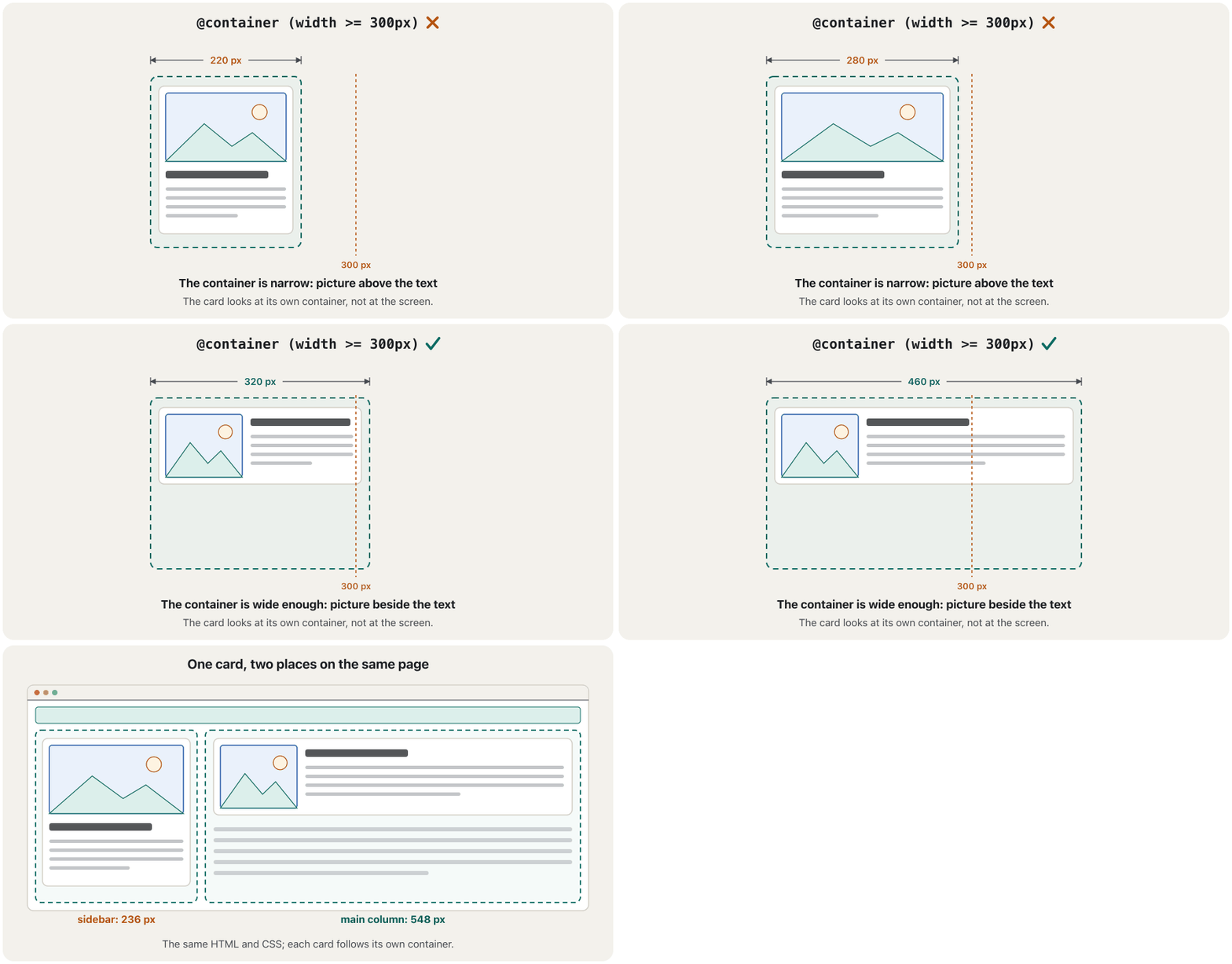
A media query asks about the whole window. But one card may sit in a narrow sidebar on one page and in a wide main column on another: the window is the same, the space is not. A asks about the card's own container instead ( widely available since August 2025):
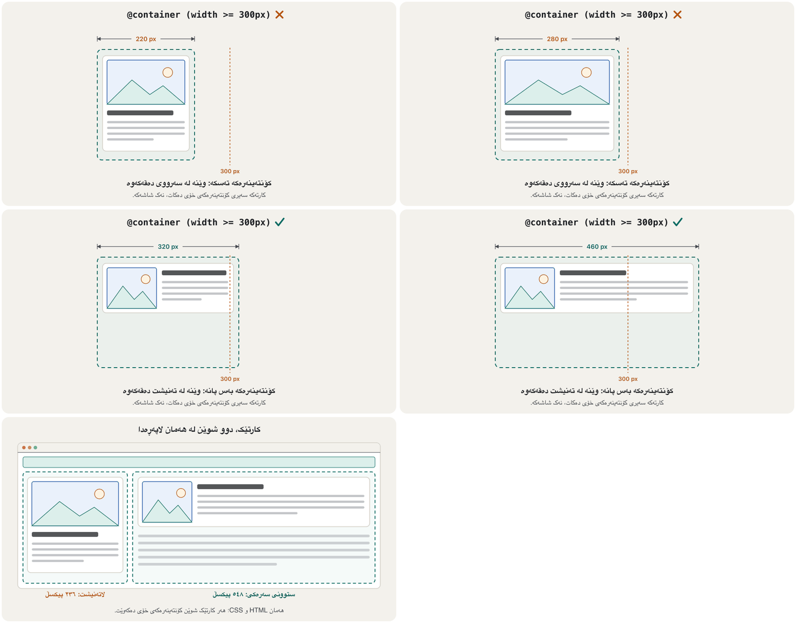
پرسیار لەبارەی هەموو پەنجەرەکە دەکات. بەڵام هەمان لەوانەیە لە لاپەڕەیەکدا لە ستوونێکی لاتەنیشتی تەسکدا بێت و لە لاپەڕەیەکی تردا لە ستوونی سەرەکیی پاندا: پەنجەرەکە هەمانە، بەڵام شوێنەکە نا. لەبری ئەوە لەبارەی کۆنتەینەری خودی دەپرسێت ( لە ئابی ٢٠٢٥ەوە بە فراوانی بەردەستە):
.slot { container-type: inline-size; }   /* the sidebar and the main column */

.card { display: grid; gap: 0.5rem; }      /* narrow: picture above the text */

@container (width >= 300px) {
  .card { grid-template-columns: 8rem 1fr; }   /* wide: picture beside the text */
}
container-type: inline-sizeturns an element into a container that can be asked about its width.@container (…)styles the elements inside it; an element never asks about itself, only about the nearest container above it.- Use media queries for the page layout and container queries for parts you reuse, such as cards.
container-type: inline-sizeدەکات بە کۆنتەینەرێک کە دەتوانرێت لەبارەی پانییەکەی بپرسرێت.@container (…)شێوازی ئەو دیاری دەکات کە لەناو کۆنتەینەرەکەدان؛ هەرگیز لەبارەی خۆی ناپرسێت، تەنیا لەبارەی نزیکترین کۆنتەینەری سەرووی خۆی.- بۆ بەکاربهێنە و بۆ ئەو بەشانەی دووپاتە بەکاریان دەهێنیتەوە، وەک .
Testing: device mode, zoom and a real phoneتاقیکردنەوە: دۆخی ئامێر، زووم و مۆبایلێکی ڕاستەقینە
Check every page in four ways before publishing it (Today's checks, Fix, then test again):
پێش بڵاوکردنەوە هەموو لاپەڕەیەک بە چوار ڕێگە بپشکنە (پشکنینەکانی ئەمڕۆ، چاکی بکە، پاشان دووپاتە تاقی بکەرەوە):
- Device modeدۆخی ئامێر
Open the (Browsers and developer tools) and switch on the device toolbar: Ctrl+Shift+M (Cmd+Shift+M on a Mac) in Chrome and Edge, Ctrl+Shift+M (Cmd+Option+M on a Mac) for Firefox's Responsive Design Mode. Pick a phone, or drag the edge slowly from 320 px to 1440 px and watch every breakpoint.
بکەرەوە (تۆڕگەڕەکان و ئامرازەکانی گەشەپێدەر) و ئامێر (Device toolbar) هەڵبکە: لە Chrome و Edgeـدا Ctrl+Shift+M (لەسەر Mac، Cmd+Shift+M)، بۆ دۆخی Responsive Designـی Firefox، Ctrl+Shift+M (لەسەر Mac، Cmd+Option+M). مۆبایلێک هەڵبژێرە، یان لێوارەکە هێواش لە ٣٢٠ تا ١٤٤٠ ڕابکێشە و سەیری هەموو بکە.
- Zoomزووم
Press Ctrl and + (Cmd and + on a Mac) up to 200 %: all text must grow and nothing may be cut off ( 1.4.4). At 400 % a 1280 px window is only 320 CSS pixels wide: the page must still fit in one column with no sideways scrolling (1.4.10, reflow).
Ctrl و + (لەسەر Mac، Cmd و +) تا ٢٠٠٪ داگرە: هەموو دەقێک دەبێت گەورە بێت و هیچ شتێک نەبڕدرێت ( 1.4.4). لە ٤٠٠٪دا پەنجەرەیەکی ١٢٨٠ تەنیا ٣٢٠ CSS پانە: لاپەڕەکە دەبێت هێشتا لە یەک ستووندا جێی ببێتەوە، بێ جووڵاندنی ئاسۆیی (1.4.10، reflow).
- A slow networkڕایەڵەیەکی خاو
In the Network panel choose a slow profile such as Slow 4G and reload: does the text appear quickly, and do the pictures arrive in a sensible order?
لە پانێڵی Networkـدا پرۆفایلێکی خاو وەک Slow 4G هەڵبژێرە و لاپەڕەکە نوێ بکەرەوە: دەقەکە زوو دەردەکەوێت و وێنەکان بە ڕیزبەندییەکی ژیرانە دەگەن؟
- A real phoneمۆبایلێکی ڕاستەقینە
Device mode copies the size, not the finger, the toolbars or the speed. Open the page on a real phone too, upright and turned sideways.
دۆخی ئامێر قەبارەکە لاسایی دەکاتەوە، نەک پەنجە، یان خێرایی. لاپەڕەکە لەسەر مۆبایلێکی ڕاستەقینەش بکەرەوە، بە ستوونی و بە ئاسۆیی.
Common mistakesهەڵە باوەکان
| Mistakeهەڵە | What happensچی ڕوودەدات | Fixچارەسەر |
|---|---|---|
| Fixed pixel widths for columnsپانیی جێگیر بۆ ستوونەکان | Too wide for phones.بۆ مۆبایل زۆر پانە. | fr, %, max-width and a media query.fr، %، max-width و . |
| No viewport meta tag metaـی نییە | Tiny page on phones; media queries ignored.لاپەڕەی وردیلە لەسەر مۆبایل؛ پشتگوێ دەخرێن. | <meta name="viewport" content="width=device-width, initial-scale=1"> |
user-scalable=no or maximum-scale=1 in the viewport taguser-scalable=no یان maximum-scale=1 لە | People with weak eyesight cannot zoom in.ئەو کەسانەی چاویان لاوازە ناتوانن بکەن. | Only width=device-width, initial-scale=1.تەنیا width=device-width, initial-scale=1. |
Desktop-first: a wide layout undone with piles of max-width rulesDesktop-first: پان کە بە کۆمەڵێک ڕێسای max-width هەڵدەوەشێنرێتەوە | The rules fight each other; phones read the most CSS.ڕێساکان دژی یەک دەوەستن؛ مۆبایل زۆرترین دەخوێنێتەوە. | Mobile-first: a simple base, then width >= queries.: بنەڕەتێکی سادە، پاشان width >=. |
| Breakpoints copied from phone models (390 px, 412 px…) کە لە مۆدێلی مۆبایلەکانەوە کۆپی کراون (٣٩٠، ٤١٢ …) | The layout breaks on next year's phones. لەسەر مۆبایلەکانی ساڵی داهاتوو تێک دەچێت. | Breakpoints where the content needs them, in em or rem. لەو شوێنانەی ناوەڕۆکەکە پێویستی پێیانە، بە em یان rem. |
Hiding content on phones with display: noneشاردنەوەی ناوەڕۆک لەسەر مۆبایل بە display: none | Phone readers lose what they came for.خوێنەرانی مۆبایل ئەوە لەدەست دەدەن کە بۆی هاتوون. | Keep the content; change only the layout.ناوەڕۆکەکە بهێڵەوە؛ تەنیا بگۆڕە. |
height: 100vh on a full-screen sectionheight: 100vh بۆ بەشێکی پڕ بە شاشە | On phones its bottom hides under the toolbar.لەسەر مۆبایل خوارەوەکەی دەچێتە ژێر . | min-height: 100svh |
A menu that opens only on :hover کە تەنیا بە :hover دەکرێتەوە | Touch screens cannot hover. ناتوانن hover بکەن. | Open it with a tap: a button or <details> (Menus on phones).بە دەستلێدان بیکەرەوە: یان <details> (مێنیوەکان لەسەر مۆبایل). |
Font sizes in vw aloneقەبارەی تەنیا بە vw | Text does not grow when the reader zooms.دەق گەورە نابێت کاتێک خوێنەر دەکات. | clamp() with rem + vw (Fluid headings with clamp()).clamp() بە rem + vw (سەردێڕەکانی ڕەوان بە clamp()). |
| Testing only in device modeتاقیکردنەوە تەنیا لە دۆخی ئامێردا | Fingers, toolbars and speed are never tested.پەنجە، و خێرایی هەرگیز تاقی ناکرێنەوە. | Test on a real phone too.لەسەر مۆبایلێکی ڕاستەقینەش تاقی بکەرەوە. |
Exercisesڕاهێنانەکان
Take the bakery home page (Worked example: a bakery home page). Put everything in a <div class="page"> and write the CSS mobile-first: (1) on phones, one centred column no wider than 70rem, with menu links that are easy to tap; (2) from 40rem, the header in one row and the two breads side by side; (3) from 64rem, the opening hours beside the main content. Test it at 360, 700 and 1100 px.
نانەواخانەکە وەربگرە (نموونەی کارپێکراو: لاپەڕەی سەرەکیی نانەواخانەیەک). هەموو شتێک بخەرە ناو <div class="page"> و بە شێوازی بنووسە: (١) لەسەر مۆبایل، یەک ستوونی ناوەڕاست کە لە 70rem پانتر نەبێت، بە کە بە ئاسانی دەستیان لێ بدرێت؛ (٢) لە 40remـەوە، لە یەک ڕیزدا و دوو نانەکە لە تەنیشت یەک؛ (٣) لە 64remـەوە، کاتەکانی کارکردن لە تەنیشت ناوەڕۆکی سەرەکییەوە. لە ٣٦٠، ٧٠٠ و ١١٠٠ تاقی بکەرەوە.
Hintئاماژە
Use width: min(100% - 2rem, 70rem) and margin-inline: auto for the column; at 64rem make .page a grid with 3fr 1fr and let the header and footer span both columns.
بۆ ستوونەکە width: min(100% - 2rem, 70rem) و margin-inline: auto بەکاربهێنە؛ لە 64remـدا .page بکە بە gridـێک بە 3fr 1fr و با و هەردوو ستوونەکە بگرنەوە.
Show answerوەڵامەکە پیشان بدە
<!DOCTYPE html>
<html lang="en">
<head>
  <meta charset="utf-8">
  <meta name="viewport" content="width=device-width, initial-scale=1">
  <title>Shilan's Bakery – fresh bread in Erbil</title>
  <style>
    * { box-sizing: border-box; }
    body { margin: 0; font-family: Arial, sans-serif; line-height: 1.5; }
    img { max-width: 100%; height: auto; }
    /* Phones first: one column in the order of the HTML */
    .page { width: min(100% - 2rem, 70rem); margin-inline: auto; }
    nav ul { display: flex; flex-wrap: wrap; gap: 0 1rem; padding: 0; list-style: none; }
    nav a { display: inline-block; padding-block: 0.6rem; }   /* bigger touch targets */
    article { padding: 0.75rem; margin-block-end: 0.75rem; border: 1px solid #d3cfc6; border-radius: 8px; }
    aside { padding: 0.75rem; margin-block: 1rem; background-color: #f3f1ec; border-radius: 8px; }

    /* From 40rem: header in one row, the breads side by side */
    @media (width >= 40rem) {
      header { display: flex; justify-content: space-between; align-items: center; }
      .breads { display: grid; grid-template-columns: 1fr 1fr; gap: 0.75rem; }
      .breads article { margin: 0; }
    }

    /* From 64rem: opening hours beside the main content */
    @media (width >= 64rem) {
      .page { display: grid; grid-template-columns: 3fr 1fr; gap: 0 2rem; }
      header, footer { grid-column: 1 / -1; }
    }
  </style>
</head>
<body>
  <div class="page">
    <header>
      <p><a href="index.html">Shilan's Bakery</a></p>
      <nav aria-label="Main">
        <ul>
          <li><a href="index.html">Home</a></li>
          <li><a href="bread.html">Our bread</a></li>
          <li><a href="contact.html">Contact</a></li>
        </ul>
      </nav>
    </header>

    <main>
      <h1>Fresh bread in Erbil</h1>
      <section>
        <h2>Today's bread</h2>
        <div class="breads">
          <article>
            <h3>Samoon</h3>
            <p>Light bread from the stone oven. 250 dinars.</p>
          </article>
          <article>
            <h3>Kulicha</h3>
            <p>Date pastries for Eid. 1,000 dinars a box.</p>
          </article>
        </div>
      </section>
    </main>

    <aside>
      <h2>Opening hours</h2>
      <p>Every day, <time datetime="06:00">6:00</time>–<time datetime="14:00">14:00</time>.</p>
    </aside>

    <footer>
      <p><small>© 2026 Shilan's Bakery</small></p>
    </footer>
  </div>
</body>
</html>HTML sent to the browserئەو HTMLـەی دەنێردرێت بۆ تۆڕگەڕ
<!DOCTYPE html>
<html lang="en">
<head>
  <meta charset="utf-8">
  <meta name="viewport" content="width=device-width, initial-scale=1">
  <title>Shilan's Bakery – fresh bread in Erbil</title>
  <style>
    * { box-sizing: border-box; }
    body { margin: 0; font-family: Arial, sans-serif; line-height: 1.5; }
    img { max-width: 100%; height: auto; }
    /* Phones first: one column in the order of the HTML */
    .page { width: min(100% - 2rem, 70rem); margin-inline: auto; }
    nav ul { display: flex; flex-wrap: wrap; gap: 0 1rem; padding: 0; list-style: none; }
    nav a { display: inline-block; padding-block: 0.6rem; }   /* bigger touch targets */
    article { padding: 0.75rem; margin-block-end: 0.75rem; border: 1px solid #d3cfc6; border-radius: 8px; }
    aside { padding: 0.75rem; margin-block: 1rem; background-color: #f3f1ec; border-radius: 8px; }

    /* From 40rem: header in one row, the breads side by side */
    @media (width >= 40rem) {
      header { display: flex; justify-content: space-between; align-items: center; }
      .breads { display: grid; grid-template-columns: 1fr 1fr; gap: 0.75rem; }
      .breads article { margin: 0; }
    }

    /* From 64rem: opening hours beside the main content */
    @media (width >= 64rem) {
      .page { display: grid; grid-template-columns: 3fr 1fr; gap: 0 2rem; }
      header, footer { grid-column: 1 / -1; }
    }
  </style>
</head>
<body>
  <div class="page">
    <header>
      <p><a href="index.html">Shilan's Bakery</a></p>
      <nav aria-label="Main">
        <ul>
          <li><a href="index.html">Home</a></li>
          <li><a href="bread.html">Our bread</a></li>
          <li><a href="contact.html">Contact</a></li>
        </ul>
      </nav>
    </header>

    <main>
      <h1>Fresh bread in Erbil</h1>
      <section>
        <h2>Today's bread</h2>
        <div class="breads">
          <article>
            <h3>Samoon</h3>
            <p>Light bread from the stone oven. 250 dinars.</p>
          </article>
          <article>
            <h3>Kulicha</h3>
            <p>Date pastries for Eid. 1,000 dinars a box.</p>
          </article>
        </div>
      </section>
    </main>

    <aside>
      <h2>Opening hours</h2>
      <p>Every day, <time datetime="06:00">6:00</time>–<time datetime="14:00">14:00</time>.</p>
    </aside>

    <footer>
      <p><small>© 2026 Shilan's Bakery</small></p>
    </footer>
  </div>
</body>
</html>
Make the window narrower and wider to see all three layouts.
پەنجەرەکە تەسک و پان بکەرەوە تا هەر سێ ببینیت.
At 360 px everything is one column in the order of the HTML. The 40rem query makes the header a flex row and the breads a two-column grid; the 64rem query makes the whole page a grid in which main and aside fall into the two columns of the second row by themselves, while the header and the footer span both columns.
لە ٣٦٠ هەموو شتێک یەک ستوونە بە ڕیزبەندیی . 40rem دەکات بە ڕیزێکی flex و نانەکان دەکات بە gridـێکی دوو ستوونی؛ 64rem هەموو لاپەڕەکە دەکات بە grid، کە تێیدا main و aside خۆیان دەکەونە دوو ستوونەکەی ڕیزی دووەمەوە، لە کاتێکدا و هەردوو ستوونەکە دەگرنەوە.
Build a page with a narrow sidebar (1fr) and a wide main column (2fr) that both hold the same card: a picture and a short text. With a container query, put the picture beside the text only when the card's container is at least 300 px wide. Which card changes when you make the window narrower?
لاپەڕەیەک دروست بکە بە ستوونێکی لاتەنیشتی تەسک (1fr) و ستوونێکی سەرەکیی پان (2fr) کە هەردووکیان هەمان لەخۆ دەگرن: وێنەیەک و دەقێکی کورت. بە ، وێنەکە تەنیا کاتێک بخەرە تەنیشت دەقەکەوە کە پانیی کۆنتەینەری لانیکەم ٣٠٠ بێت. کاتێک پەنجەرەکە تەسکتر دەکەیت کام دەگۆڕێت؟
Show answerوەڵامەکە پیشان بدە
<!DOCTYPE html>
<html lang="en">
<head>
  <meta charset="utf-8">
  <meta name="viewport" content="width=device-width, initial-scale=1">
  <title>One card, two places</title>
  <style>
    * { box-sizing: border-box; }
    body { margin: 0.5rem; font-family: Arial, sans-serif; line-height: 1.4; }
    .layout { display: grid; grid-template-columns: 1fr 2fr; gap: 0.75rem; }
    .slot { container-type: inline-size; }   /* each column is a container */
    .card {
      display: grid;
      gap: 0.5rem;
      padding: 0.5rem;
      border: 1px solid #d3cfc6;
      border-radius: 8px;
    }
    .card .pic { aspect-ratio: 4 / 3; border-radius: 6px; background-color: #dcefeb; }
    .card h2 { margin: 0; font-size: 1rem; }
    .card p { margin: 0; }
    /* Only when the card's own container is at least 300px wide */
    @container (width >= 300px) {
      .card { grid-template-columns: 8rem 1fr; }
    }
  </style>
</head>
<body>
  <div class="layout">
    <aside class="slot">
      <article class="card">
        <div class="pic"></div>
        <div><h2>Erbil Citadel</h2><p>A World Heritage Site.</p></div>
      </article>
    </aside>
    <main class="slot">
      <article class="card">
        <div class="pic"></div>
        <div><h2>Erbil Citadel</h2><p>A World Heritage Site.</p></div>
      </article>
    </main>
  </div>
</body>
</html>HTML sent to the browserئەو HTMLـەی دەنێردرێت بۆ تۆڕگەڕ
<!DOCTYPE html>
<html lang="en">
<head>
  <meta charset="utf-8">
  <meta name="viewport" content="width=device-width, initial-scale=1">
  <title>One card, two places</title>
  <style>
    * { box-sizing: border-box; }
    body { margin: 0.5rem; font-family: Arial, sans-serif; line-height: 1.4; }
    .layout { display: grid; grid-template-columns: 1fr 2fr; gap: 0.75rem; }
    .slot { container-type: inline-size; }   /* each column is a container */
    .card {
      display: grid;
      gap: 0.5rem;
      padding: 0.5rem;
      border: 1px solid #d3cfc6;
      border-radius: 8px;
    }
    .card .pic { aspect-ratio: 4 / 3; border-radius: 6px; background-color: #dcefeb; }
    .card h2 { margin: 0; font-size: 1rem; }
    .card p { margin: 0; }
    /* Only when the card's own container is at least 300px wide */
    @container (width >= 300px) {
      .card { grid-template-columns: 8rem 1fr; }
    }
  </style>
</head>
<body>
  <div class="layout">
    <aside class="slot">
      <article class="card">
        <div class="pic"></div>
        <div><h2>Erbil Citadel</h2><p>A World Heritage Site.</p></div>
      </article>
    </aside>
    <main class="slot">
      <article class="card">
        <div class="pic"></div>
        <div><h2>Erbil Citadel</h2><p>A World Heritage Site.</p></div>
      </article>
    </main>
  </div>
</body>
</html>
Each column is a container (container-type: inline-size). In a 700 px window the sidebar is about 230 px, so its card stays stacked, and the main column is about 460 px, so its card shows the picture beside the text. Make the window narrower and the main card stacks too; the sidebar card never changes.
هەر ستوونێک کۆنتەینەرێکە (container-type: inline-size). لە پەنجەرەیەکی ٧٠٠ ستوونی لاتەنیشت نزیکەی ٢٣٠ ، بۆیە لەسەریەک دەمێنێتەوە و ستوونی سەرەکی نزیکەی ٤٦٠ ، بۆیە وێنەکە لە تەنیشت دەقەکەوە پیشان دەدات. پەنجەرەکە تەسکتر بکە، سەرەکیش لەسەریەک دەبێت؛ ستوونی لاتەنیشت هەرگیز ناگۆڕێت.
This page looks fine on a laptop but not on phones. Find six mistakes and fix them.
ئەم لاپەڕەیە لەسەر باشە، بەڵام لەسەر مۆبایل نا. شەش هەڵە بدۆزەرەوە و چاکیان بکە.
<meta name="viewport" content="width=device-width, initial-scale=1, user-scalable=no">
<style>
  .page { width: 1100px; margin: 0 auto; }
  .hero { height: 100vh; }
  .menu .sub { display: none; }
  .menu:hover .sub { display: block; }
  @media (max-width: 1024px) { .cols { grid-template-columns: 1fr 1fr; } }
  @media (max-width: 640px) { .cols { grid-template-columns: 1fr; } .news { display: none; } }
  .cols { display: grid; grid-template-columns: 1fr 1fr 1fr; }
</style>Hintئاماژە
Look at the viewport tag, the fixed sizes, :hover, the order of the rules and what is hidden.
سەیری ، قەبارە جێگیرەکان، :hover، ڕیزبەندیی ڕێساکان و ئەوەی شاراوەتەوە بکە.
Show answerوەڵامەکە پیشان بدە
user-scalable=noblocks zoom: remove it.width: 1100pxis wider than every phone: usewidth: min(100% - 2rem, 70rem).height: 100vhhides the bottom of the section under the toolbar: usemin-height: 100svh.- The sub-menu opens only on
:hover, which a touch screen cannot do: show it, or open it with a tap. - The base rule
.cols { … 1fr 1fr 1fr }comes after the media queries, so by source order it wins at every width: write the base first and the queries after it — mobile-first withwidth >=. .news { display: none; }hides content from phone readers: keep it.
user-scalable=noڕێگە لە دەگرێت: لایببە.width: 1100pxلە هەموو مۆبایلێک پانترە:width: min(100% - 2rem, 70rem)بەکاربهێنە.height: 100vhخوارەوەی بەشەکە دەخاتە ژێر :min-height: 100svhبەکاربهێنە.- ژێر تەنیا بە
:hoverدەکرێتەوە، کە ناتوانێت بیکات: پیشانی بدە، یان بە دەستلێدان بیکەرەوە. - ڕێسا بنەڕەتییەکەی
.cols { … 1fr 1fr 1fr }دوای هاتووە، بۆیە بەپێی ڕیزبەندیی سەرچاوە لە هەموو پانییەکدا دەباتەوە: یەکەم بنەڕەتەکە بنووسە و پاشان — بە شێوازی بەwidth >=. .news { display: none; }ناوەڕۆک لە خوێنەرانی مۆبایل دەشارێتەوە: بیهێڵەوە.
<meta name="viewport" content="width=device-width, initial-scale=1">
<style>
  .page { width: min(100% - 2rem, 70rem); margin-inline: auto; }
  .hero { min-height: 100svh; }
  .menu .sub { display: block; }   /* or a button or <details> that opens with a tap */
  .cols { display: grid; gap: 1rem; }   /* phones first: one column */
  @media (width >= 40rem) { .cols { grid-template-columns: 1fr 1fr; } }
  @media (width >= 64rem) { .cols { grid-template-columns: 1fr 1fr 1fr; } }
  /* .news stays visible on phones */
</style>Summaryپوختە
- Add
<meta name="viewport" content="width=device-width, initial-scale=1">and never switch off zoom. - Fluid layouts: a container with
width: min(100% - 2rem, 70rem)andmargin-inline: auto, flex and grid, relative units andclamp();min-height: 100svhinstead of100vh. - Media never sticks out:
max-width: 100%,aspect-ratiofor iframes,overflow-x: autoaround wide tables. - Media queries mobile-first: a simple base, then
@media (width >= …), with breakpoints where the content needs them, inemorrem. - Media features:
orientation,pointer,hover,prefers-color-scheme,prefers-reduced-motionandprint; touch targets of at least 24 × 24 px, better 44–48 px. - Container queries let a component follow its own box.
- Test in device mode, at 200 % and 400 % zoom, on a slow network and on a real phone.
<meta name="viewport" content="width=device-width, initial-scale=1">زیاد بکە و هەرگیز مەکوژێنەوە.- : کۆنتەینەرێک بە
width: min(100% - 2rem, 70rem)وmargin-inline: auto، flex و grid، وclamp()؛min-height: 100svhلەبری100vh. - میدیا هەرگیز دەرناچێت:
max-width: 100%،aspect-ratioبۆ iframe،overflow-x: autoلە دەوری پان. - بە شێوازی : بنەڕەتێکی سادە، پاشان
@media (width >= …)، بە لەو شوێنانەی ناوەڕۆکەکە پێویستی پێیانە، بەemیانrem. - :
orientation،pointer،hover،prefers-color-scheme،prefers-reduced-motionوprint؛ بە لانیکەم ٢٤ × ٢٤ ، باشتر ٤٤ تا ٤٨ . - ڕێگە دەدەن بەشێک شوێن سندووقی خۆی بکەوێت.
- لە دۆخی ئامێردا، لە ٢٠٠٪ و ٤٠٠٪دا، لەسەر خاو و لەسەر مۆبایلێکی ڕاستەقینە تاقی بکەرەوە.
Next: Kurdish and Bilingual Websites makes the same layouts work right to left.
دواتر: تۆڕگەکانی کوردی و دووزمانە وا دەکات هەمان بە کار بکات.
Lesson complete!وانەکە تەواو بوو!
Well done. Review the key terms, then go on to the next lesson.دەستخۆش. سەیرێکی زاراوە سەرەکییەکان بکەرەوە، پاشان بڕۆ بۆ وانەی داهاتوو.
Key termsزاراوە سەرەکییەکان
Kurdish and Bilingual Websites: Right to Leftتۆڕگەکانی کوردی و دووزمانە: ڕاست بۆ چەپ
Related lecturesوانە پەیوەندیدارەکان
- Flexbox: Layout in One DirectionFlexbox: ڕێکخستن بە یەک ئاڕاستە
- The CSS Box Model: Margin, Border and Paddingمۆدێلی سندووقی CSS: پەراوێز، سنوور و بۆشایی ناوەوە
- Typography and Web Fontsتایپۆگرافی و فۆنتەکانی وێب
- Images for the Web: Formats, Size and Responsive Imagesوێنە بۆ وێب: جۆرەکانی فایل، قەبارە و وێنە ڕێسپۆنسیڤەکان
- Audio, Video and Embedded Contentدەنگ، ڤیدیۆ و ناوەڕۆکی چەسپێنراو
- Links and Navigation Menusبەستەرەکان و لیستە ڕێنیشاندەرەکان
- Kurdish and Bilingual Websites: Right to Leftتۆڕگەکانی کوردی و دووزمانە: ڕاست بۆ چەپ
- Colour for the Web: Palettes, Contrast and Themesڕەنگ بۆ وێب: پالێتی ڕەنگ، کۆنتراست و تێمەکان
- Effects, Transitions and Animationsکاریگەرییەکان، گۆڕانە نەرمەکان و ئەنیمەیشنەکان
- Web Accessibility: WCAG 2.2 in Practiceدەستڕاگەیشتنی وێب: WCAG 2.2 لە کرداردا
- HTML Text, Images and Listsدەق، وێنە و لیست لە HTMLـدا
- Websites and Web Developmentتۆڕگەکان و دروستکردنیان
- Native, Web, Hybrid and Cross-Platform Appsئەپی ڕەسەن، بەرنامەی وێب، ئەپی تێکەڵ و ئەپەکانی فرەسەکۆ
- The Website Development Life Cycleسووڕی ژیانی گەشەپێدانی تۆڕگە
References and further readingسەرچاوەکان و خوێندنەوەی زیاتر
- MDN Learn: Responsive design
- Ethan Marcotte: Responsive Web Design (A List Apart, 25 May 2010)
- MDN: <meta name="viewport">
- web.dev Learn Responsive Design: Introduction
- web.dev Learn Responsive Design: Media queries
- MDN: Using media queries
- MDN: CSS container queries
- MDN: <length> (viewport-percentage units: small, large, dynamic)
- MDN: prefers-reduced-motion
- MDN: pointer
- web.dev: Accessible tap targets
- W3C WAI: Understanding SC 1.4.10 Reflow
- W3C WAI: Understanding SC 2.5.8 Target Size (Minimum)
- web-features: container queries (Baseline dates)
- web-features: media query range syntax (Baseline dates)
- web-features: viewport unit variants (Baseline dates)
- StatCounter: Desktop vs Mobile vs Tablet market share in Iraq
- StatCounter: Desktop vs Mobile vs Tablet market share worldwide
This lecture is a first edition. The Kurdish text and terminology are waiting for review by Kurdish IT teachers.ئەم وانەیە چاپی یەکەمە. دەقە کوردییەکە و زاراوەکانی چاوەڕێی پێداچوونەوەی مامۆستایانی کوردی بواری IT ن.