Chapterبەش 5 · Lectureوانە 5.2
Colour for the Web: Palettes, Contrast and Themesڕەنگ بۆ وێب: پالێتی ڕەنگ، کۆنتراست و تێمەکان
Colour as a designer uses it: hue, saturation and lightness on the colour wheel, colour schemes and the 60-30-10 rule, what colours mean, oklch() and why it helps, a palette in CSS custom properties, the WCAG contrast ratio computed step by step, contrast for icons and borders, never colour alone, colour blindness, a dark theme with prefers-color-scheme and light-dark(), and building a palette from one brand colour.
ڕەنگ وەک دیزاینەرێک بەکاری دەهێنێت: ، و لەسەر ، و یاسای 60-30-10، ڕەنگەکان چی دەگەیەنن، oklch() و بۆچی یارمەتی دەدات، لە ، ڕێژەی هەنگاو بە هەنگاو، کۆنتراست بۆ و چوارچێوە، هەرگیز تەنیا ڕەنگ نا، ، بە prefers-color-scheme و light-dark()، هەروەها دروستکردنی لە یەک ڕەنگی براندەوە.
What you will learnچی فێر دەبیت
- Describe colours by hue, saturation and lightness and choose a colour scheme with neutrals and one accent.
- Write colours as hex, rgb(), hsl() and oklch(), and explain why oklch() makes even palettes.
- Keep a palette in CSS custom properties and use var(), fallbacks and scope.
- Compute a WCAG contrast ratio and apply 4.5 : 1, 3 : 1 and the non-text 3 : 1 rule.
- Never use colour alone, and test a page for colour blindness.
- Build a dark theme with prefers-color-scheme, color-scheme and light-dark(), checking contrast in both themes.
- ڕەنگەکان بە ، و وەسف بکەیت و بە ڕەنگی بێلایەن و یەک ڕەنگی سەرنجڕاکێش هەڵبژێریت.
- ڕەنگ بە hex،
rgb()،hsl()وoklch()بنووسیت و ڕوون بکەیتەوە بۆچیoklch()هاوسەنگ دروست دەکات. - لە هەڵبگریت و
var()، و بەکاربهێنیت. - ڕێژەی بژمێریت و یاساکانی 4.5 : 1، 3 : 1 و 3 : 1ـی ناوەڕۆکی نادەقی جێبەجێ بکەیت.
- هەرگیز تەنیا ڕەنگ بەکار نەهێنیت و لاپەڕەیەک بۆ تاقی بکەیتەوە.
- بە
prefers-color-scheme،color-schemeوlight-dark()دروست بکەیت و کۆنتراست لە هەردوو بپشکنیت.
Hue, saturation and lightnessجۆری ڕەنگ، تێریی ڕەنگ و ڕووناکیی ڕەنگ
Designers describe a colour with three questions. Which colour is it? — its , a place on the measured as an angle: 0° red, 60° yellow, 120° green, 180° cyan, 240° blue, 300° magenta. How strong is it? — its , from grey (0 %) to full colour (100 %). How light is it? — its , from black (0 %) to white (100 %). The CSS hsl() function uses exactly these three numbers; its syntax is in rgb() and hsl().
دیزاینەران ڕەنگێک بە سێ پرسیار وەسف دەکەن. کام ڕەنگە؟ — ، شوێنێک لەسەر کە وەک گۆشە دەپێورێت: 0° سوور، 60° زەرد، 120° سەوز، 180° شینی ئاسمانی، 240° شین، 300° مۆری ئاڵ. چەند بەهێزە؟ — ، لە خۆڵەمێشییەوە (0٪) بۆ ڕەنگی تەواو (100٪). چەند ڕووناکە؟ — ، لە ڕەشەوە (0٪) بۆ سپی (100٪). فەنکشنی hsl()ـی ڕێک ئەم سێ ژمارەیە بەکاردەهێنێت؛ ڕێنووسەکەی لە rgb() و hsl()ـدایە.
Half of the wheel feels warm — reds, oranges and yellows seem near and lively — and half feels cool — greens, blues and violets seem calm and distant. That is why sale banners are often warm and banks and hospitals often cool.
نیوەی بازنەکە گەرم دەردەکەوێت — سوور، پرتەقاڵی و زەرد نزیک و چالاک دەردەکەون — و نیوەکەی تر سارد — سەوز، شین و مۆر ئارام و دوور دەردەکەون. هەر بۆیە بانەری داشکاندن زۆرجار گەرمە و بانک و نەخۆشخانە زۆرجار ساردن.
Colour schemesپلانەکانی ڕەنگ
A is a set of colours chosen by their places on the wheel. Four classic schemes:
کۆمەڵە ڕەنگێکە کە بەپێی شوێنیان لەسەر بازنەکە هەڵبژێردراون. چوار پلانی کلاسیکی:
- Monochromatic: one hue in several lightnesses — the safest, always calm.
- Analogous: neighbours on the wheel (about 30° apart) — calm and natural.
- Complementary: two opposite hues (180° apart) — strong; use one as a small accent.
- Triadic: three hues 120° apart — lively but hard to balance; let one dominate.
- یەکڕەنگ: یەک بە چەند پلەیەکی — سەلامەتترینیان، هەمیشە ئارام.
- هاوسێ: دراوسێکانی سەر بازنەکە (نزیکەی 30° لە یەکەوە دوور) — ئارام و سروشتی.
- تەواوکەر: دوو بەرامبەر (180° دووری) — بەهێز؛ یەکێکیان وەک ڕەنگێکی سەرنجڕاکێشی بچووک بەکاربهێنە.
- سێڕەنگی: سێ بە 120° دووری — زیندوو بەڵام هاوسەنگکردنی قورسە؛ با یەکێکیان زاڵ بێت.
Most good websites use something simpler: neutrals (off-white, greys, a dark text colour) plus one brand or accent colour. The wheel tells you which hues go together; it says nothing about readability — that depends on lightness (contrast).
زۆربەی باش شتێکی سادەتر بەکاردەهێنن: ڕەنگی بێلایەن (سپیی کاڵ، خۆڵەمێشی، ڕەنگێکی تۆخ بۆ دەق) لەگەڵ یەک ڕەنگی براند یان سەرنجڕاکێش. بازنەکە پێت دەڵێت کام پێکەوە دەگونجێن؛ هیچ لەبارەی خوێندنەوە ناڵێت — ئەوە بە بەستراوەتەوە (کۆنتراست).
Colour schemesپلانەکانی ڕەنگ
The 60-30-10 rule of thumbیاسای ئەزموونیی 60-30-10
Interior designers share colour out roughly as 60 % a main colour (walls), 30 % a second colour (furniture) and 10 % an accent (cushions). On a web page that becomes: 60 % a calm background, 30 % a second colour for the header, footer and card edges, and 10 % an accent kept for what you want people to do — buttons and links. It is a rule of thumb, not a law; its real lesson is that the accent works only because it is rare.
دیزاینەرانی ناوەوەی خانوو ڕەنگ نزیکەی بەم شێوەیە دابەش دەکەن: 60٪ ڕەنگێکی سەرەکی (دیوار)، 30٪ ڕەنگێکی دووەم (کەلوپەل) و 10٪ ڕەنگێکی سەرنجڕاکێش (سەرین). لە لاپەڕەی وێبدا دەبێتە: 60٪ پاشبنەمایەکی ئارام، 30٪ ڕەنگێکی دووەم بۆ ، و لێواری ، هەروەها 10٪ ڕەنگێکی سەرنجڕاکێش کە بۆ ئەو شتانە دەهێڵدرێتەوە کە دەتەوێت خەڵک بیکەن — و . یاسایەکی ئەزموونییە، نەک یاسایەکی توند؛ وانە ڕاستەقینەکەی ئەوەیە کە ڕەنگی سەرنجڕاکێش تەنیا لەبەر کەمییەکەی کار دەکات.
What colours meanڕەنگەکان چی دەگەیەنن
Colours carry meaning, but the meaning depends on culture and context. Red is an error in a form, yet it also means luck and celebration in China — and in Chinese share markets a rising price is shown in red, the opposite of Europe and America. White is for weddings in many countries and for mourning in parts of East Asia. Green means “go” on a traffic light, nature, and the spring of Newroz.
ڕەنگەکان واتا هەڵدەگرن، بەڵام واتاکە بە کولتوور و دۆخ بەستراوەتەوە. سوور لە هەڵەیە، بەڵام لە چین واتای بەخت و ئاهەنگیش دەدات — هەروەها لە بازاڕی پشکی چیندا نرخی بەرزبووەوە بە سوور پیشان دەدرێت، پێچەوانەی ئەوروپا و ئەمریکا. سپی لە زۆر وڵاتدا بۆ زەماوەندە و لە هەندێک بەشی ڕۆژهەڵاتی ئاسیادا بۆ پرسە. سەوز واتای «بڕۆ» لە گڵۆپی هاتوچۆدا، سروشت و بەهاری نەورۆز دەگەیەنێت.
- Use colour meanings your readers share, and use them the same way on every page (red only for errors, green only for success).
- A brand colour is part of a name: use it the same way everywhere.
- Colour is never the only signal: words and icons carry the meaning for everyone (not colour alone).
- ئەو واتایانەی ڕەنگ بەکاربهێنە کە خوێنەرەکانت لەسەری هاوڕان و لە هەموو لاپەڕەیەکدا بە هەمان شێوە بەکاریان بهێنە (سوور تەنیا بۆ هەڵە، سەوز تەنیا بۆ سەرکەوتن).
- ڕەنگی براند بەشێکە لە ناوێک: لە هەموو شوێنێک بە هەمان شێوە بەکاری بهێنە.
- ڕەنگ هەرگیز تاکە نیشانە نییە: وشە و واتاکە بۆ هەمووان دەگەیەنن (هەرگیز تەنیا ڕەنگ نا).
Writing colours: hex, rgb(), hsl() and oklch()نووسینی ڕەنگ: hex، rgb()، hsl() و oklch()
You already know hex codes, rgb() and hsl() (Hexadecimal colours). They all describe the same screen colours, but none of them matches how bright a colour looks. In hsl(), yellow and blue at “50 % lightness” are far apart: the yellow looks almost white, the blue dark.
پێشتر کۆدی hex، rgb() و hsl() دەناسیت (ڕەنگی شانزەیی). هەموویان هەمان ڕەنگەکانی شاشە وەسف دەکەن، بەڵام هیچیان لەگەڵ ئەوەدا ناگونجێت کە ڕەنگێک چەند ڕووناک دەردەکەوێت. لە hsl()ـدا زەرد و شین لە « 50٪»دا زۆر لە یەک دوورن: زەردەکە نزیکەی سپی دەردەکەوێت و شینەکە تاریک.
oklch() fixes that. L is the lightness as the eye sees it (0 %–100 %), C the chroma or strength (0 = grey; on an ordinary screen even the most vivid colours stay below about 0.33) and H the hue angle (its angles differ a little from hsl(): blue is about 250). The same L really looks equally light, so tints, shades and contrast become predictable. It can also describe the extra colours of wide-gamut screens; a screen that cannot show a colour gets the closest one. oklch() has worked in all current browsers since May 2023 (Baseline 2023) and has been Baseline widely available since November 2025.
oklch() ئەمە چاک دەکاتەوە. L وەک چاو دەیبینێت (0٪ تا 100٪)، C کرۆمایە یان هێزی ڕەنگ (0 = خۆڵەمێشی؛ لەسەر شاشەی ئاسایی تەنانەت گەشترین ڕەنگەکانیش لە نزیکەی 0.33 کەمترن) و H گۆشەی (گۆشەکانی کەمێک لە hsl() جیاوازن: شین نزیکەی 250ـە). هەمان L بەڕاستی بە یەکسانی ڕووناک دەردەکەوێت، بۆیە ڕەنگی کاڵ و تۆخ و کۆنتراست پێشبینیکراو دەبن. هەروەها دەتوانێت ڕەنگە زیادەکانی شاشەی فراوانڕەنگ وەسف بکات؛ شاشەیەک کە ناتوانێت ڕەنگێک پیشان بدات نزیکترینەکەی وەردەگرێت. oklch() لە ئایاری 2023ـەوە لە هەموو نوێکاندا کار دەکات ( 2023) و لە تشرینی دووەمی 2025ـەوە بە فراوانی بەردەستە.
oklch()ـدا بە یەکسانی ڕووناک دەردەکەوێت؛ یەکسان لە hsl()ـدا نا.CêIT.a { background: #1f5f99; } /* hex */
.b { background: rgb(31 95 153); } /* red, green, blue */
.c { background: hsl(209 66% 36%); } /* hue, saturation, lightness */
.d { background: oklch(47.5% 0.113 250); } /* lightness, chroma, hue */HTML sent to the browserئەو HTMLـەی دەنێردرێت بۆ تۆڕگەڕ
<!DOCTYPE html>
<html lang="en">
<head>
<meta charset="utf-8">
<meta name="viewport" content="width=device-width, initial-scale=1">
<title>Colour notations</title>
<style>
.a { background: #1f5f99; }                 /* hex */
.b { background: rgb(31 95 153); }          /* red, green, blue */
.c { background: hsl(209 66% 36%); }        /* hue, saturation, lightness */
.d { background: oklch(47.5% 0.113 250); }  /* lightness, chroma, hue */
body { font-family: ui-monospace, Menlo, Consolas, monospace; padding: 1rem; display: grid; grid-template-columns: repeat(auto-fit, minmax(9rem, 1fr)); gap: 0.5rem; }
div { color: #fff; padding: 1.25rem 0.75rem; border-radius: 0.5rem; font-size: 0.85rem; }
</style>
</head>
<body>
<div class="a">#1f5f99</div>
<div class="b">rgb(31 95 153)</div>
<div class="c">hsl(209 66% 36%)</div>
<div class="d">oklch(47.5% 0.113 250)</div>
</body>
</html>The hsl() and oklch() values are rounded, so they differ from #1f5f99 by about one step out of 255 — too little to see.
نرخەکانی hsl() و oklch() خڕکراونەتەوە، بۆیە نزیکەی یەک پلە لە 255 پلە لە #1f5f99 جیاوازن — هێندە کەم کە نابینرێت.
A palette in CSS custom propertiesپالێتی ڕەنگ لە تایبەتمەندییە دڵخوازەکاندا
A value that you name yourself in CSS and reuse. You write it with two dashes, --brand: #7a4a21;, usually on :root, and use it with var(--brand). Change it in one place and every rule that uses it changes; it is inherited like other properties, so a dark theme can redefine it.
کە خۆت لە ناوی لێ دەنێیت و دووپاتە بەکاری دەهێنیتەوە. بە دوو هێڵی کورت دەینووسیت، --brand: #7a4a21;، زۆرجار لەسەر :root. پاشان بە var(--brand) بەکاری دەهێنیت. لە یەک شوێندا بیگۆڕە، هەموو ئەو ڕێسایانەی بەکاری دەهێنن دەگۆڕێن؛ وەک تر بە دەگوازرێتەوە، بۆیە دەتوانێت دووپاتە پێناسەی بکاتەوە.
Write each colour once, give it a name and use the name everywhere. A name starts with two dashes and is case-sensitive (--Brand is not --brand). Declared on :root (the <html> element) it is available on the whole page; var(--color-primary) reads it. A second value is a fallback for a name that is not defined: var(--color-accent, #b4530f).
هەر ڕەنگێک یەکجار بنووسە، ناوێکی لێ بنێ و لە هەموو شوێنێک ناوەکە بەکاربهێنە. ناو بە دوو هێڵی کورت دەست پێدەکات و پیتە گەورە و بچووکەکانی جیاوازن (--Brand هەمان --brand نییە). کاتێک لەسەر :root ( <html>) دەنووسرێت، لە هەموو لاپەڕەکەدا بەردەستە؛ var(--color-primary) دەیخوێنێتەوە. دووەم جێگرەوەیە بۆ ناوێک کە پێناسە نەکراوە: var(--color-accent, #b4530f).
Custom properties are inherited like color (inheritance). Redefine one inside an element and it changes for that element and everything inside it — its scope. That is how one card turns red without new rules, and how a whole dark theme works.
وەک color بە دەگوازرێنەوە (بۆماوە). یەکێکیان لە ناو دووپاتە پێناسە بکەرەوە، بۆ ئەو و هەموو ئەوەی لە ناویدایە دەگۆڕێت — ئەمە . بەم شێوەیە بەبێ ڕێسای نوێ سوور دەبێت و هەموو دۆخی تاریک کار دەکات.
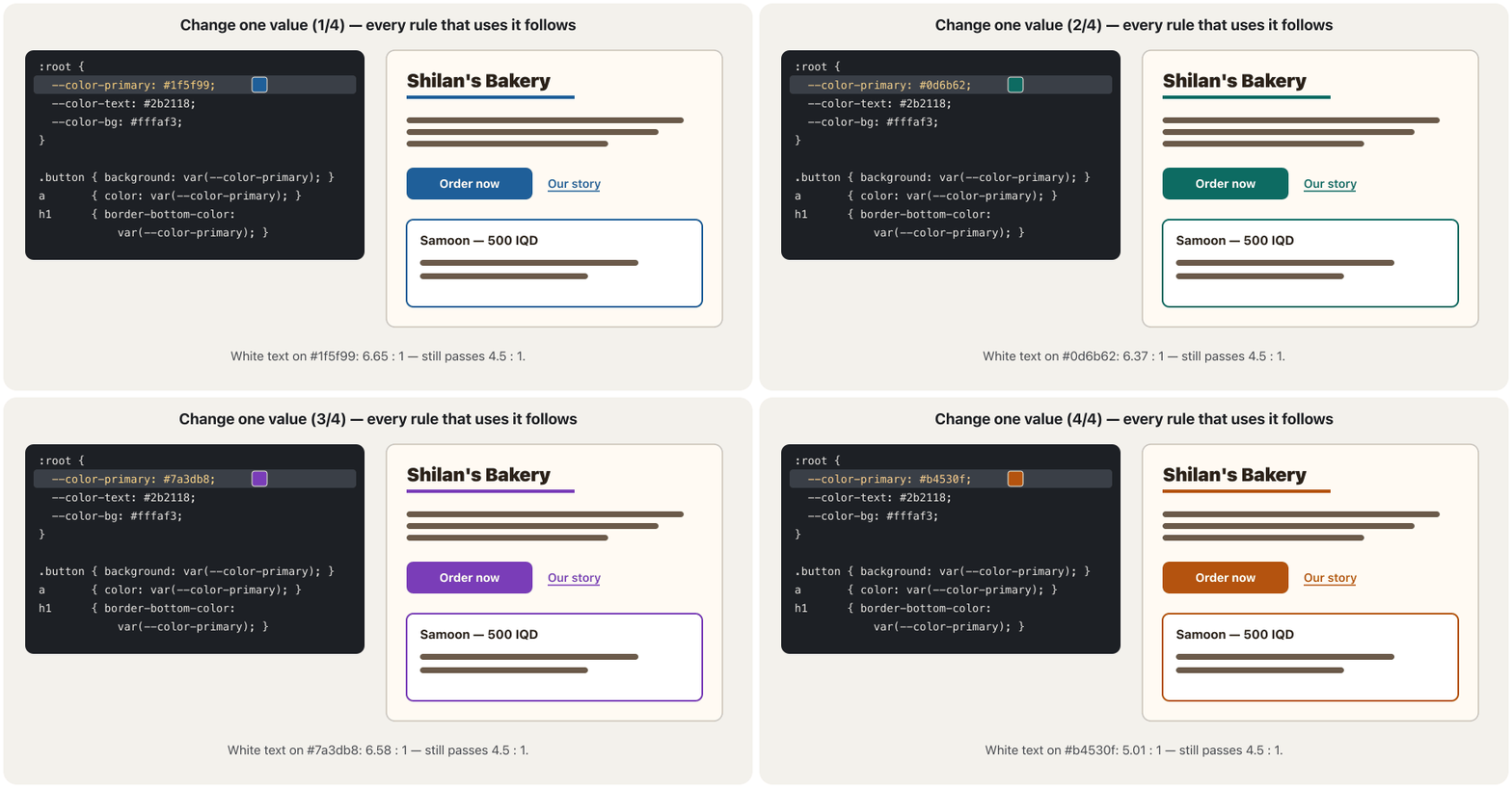
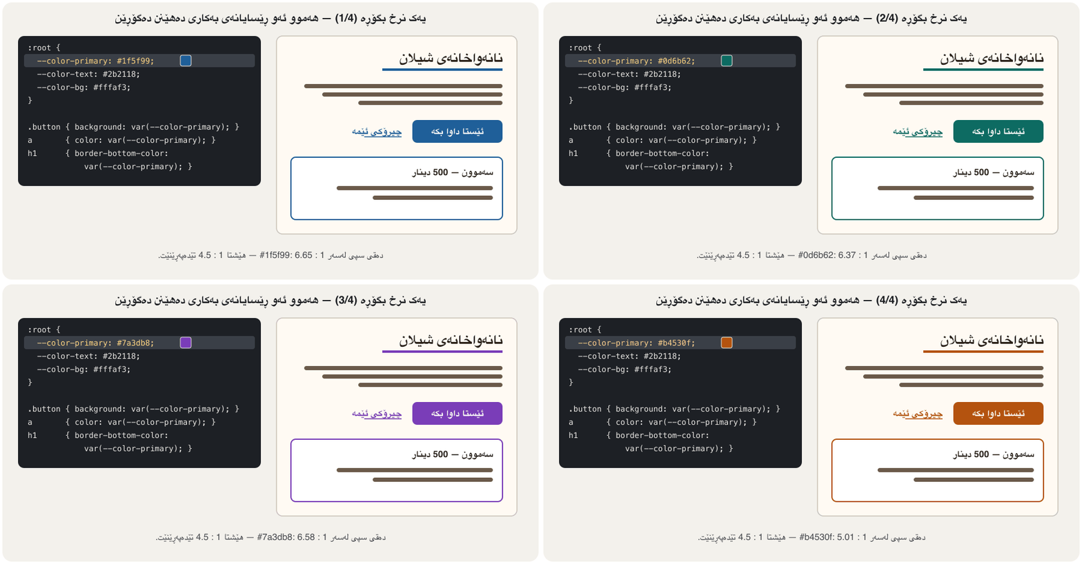
:root {
  /* the palette: one place for every colour */
  --color-bg: #fffaf3;
  --color-text: #2b2118;
  --color-muted: #6b5a4a;
  --color-primary: #1f5f99;
  --color-on-primary: #ffffff;
}
body    { background: var(--color-bg); color: var(--color-text); }
.button { background: var(--color-primary); color: var(--color-on-primary); }
a       { color: var(--color-primary); }
.note   { color: var(--color-accent, #b4530f); }  /* fallback: --color-accent is not defined */
.sale { --color-primary: #b3261e; } /* scope: red only inside .sale */HTML sent to the browserئەو HTMLـەی دەنێردرێت بۆ تۆڕگەڕ
<!DOCTYPE html>
<html lang="en">
<head>
<meta charset="utf-8">
<meta name="viewport" content="width=device-width, initial-scale=1">
<title>Palette</title>
<style>
:root {
  /* the palette: one place for every colour */
  --color-bg: #fffaf3;
  --color-text: #2b2118;
  --color-muted: #6b5a4a;
  --color-primary: #1f5f99;
  --color-on-primary: #ffffff;
}
body    { background: var(--color-bg); color: var(--color-text); }
.button { background: var(--color-primary); color: var(--color-on-primary); }
a       { color: var(--color-primary); }
.note   { color: var(--color-accent, #b4530f); }  /* fallback: --color-accent is not defined */
.sale   { --color-primary: #b3261e; }            /* scope: red only inside .sale */

body { font-family: system-ui, sans-serif; padding: 1rem; }
.button { display: inline-block; padding: 0.5rem 1rem; border-radius: 0.5rem; text-decoration: none; font-weight: 700; }
.card { border: 1px solid #d8d0c4; border-radius: 0.5rem; padding: 1rem; margin-block: 0.75rem; max-width: 24rem; }
.card p { margin: 0 0 0.75rem; }
</style>
</head>
<body>
<div class="card">
  <p>Fresh samoon every morning. <a href="#menu">See the menu</a></p>
  <a class="button" href="#order">Order</a>
  <p class="note">Note: closed on Fridays.</p>
</div>
<div class="card sale">
  <p>Newroz offer: kulicha boxes. <a href="#offer">Details</a></p>
  <a class="button" href="#buy">Buy now</a>
</div>
</body>
</html>
Explain the codeڕوونکردنەوەی کۆدەکە
- Lineدێڕی 10
--color-accentis not defined, so the fallback#b4530fis used.--color-accentپێناسە نەکراوە، بۆیە جێگرەوەکە#b4530fبەکاردێت.- Lineدێڕی 11
Inside
.salethe primary colour is red: its button and link change, nothing else.لە ناو
.saleـدا ڕەنگی سەرەکی سوورە: و دەگۆڕێن، هیچی تر.
The contrast ratio, step by stepڕێژەی کۆنتراستی ڕەنگ، هەنگاو بە هەنگاو
CSS basics gave the rule: normal text needs a ratio of at least 4.5 : 1, large text (about 24 px, or about 18.66 px bold) at least 3 : 1 (WCAG 2.2, 1.4.3, level AA; level AAA asks 7 : 1). Here is where the number comes from. First each colour gets a L, from 0 (black) to 1 (white). Every channel is divided by 255 and made linear, because screens store light on a curve:
بنەماکانی CSS یاساکەی دا: دەقی ئاسایی پێویستی بە ڕێژەی لانیکەم 4.5 : 1 هەیە و دەقی گەورە (نزیکەی 24 ، یان نزیکەی 18.66 بە تۆخ) لانیکەم 3 : 1 ( 2.2، 1.4.3، ئاستی AA؛ ئاستی AAA داوای 7 : 1 دەکات). لێرەدا دەبینیت ژمارەکە لە کوێوە دێت. سەرەتا هەر ڕەنگێک L وەردەگرێت، لە 0 (ڕەش) تا 1 (سپی). هەر کەناڵێک دابەشی 255 دەکرێت و پاشان دەگۆڕدرێت بۆ ڕووناکیی هێڵی، چونکە شاشەکان ڕووناکی لەسەر کەوانەیەک هەڵدەگرن:
C is one channel — red, green or blue — divided by 255, so it is a number from 0 to 1.
C یەک کەناڵە — سوور، سەوز یان شین — دابەشی 255 کراو، بۆیە ژمارەیەکە لە نێوان 0 و 1دا.
Green counts most and blue least, because our eyes are most sensitive to green light.
سەوز زۆرترین کێش و شین کەمترین کێشی هەیە، چونکە چاومان زیاتر لە هەموو بە ڕووناکیی سەوز هەستیارە.
This is the contrast ratio: is the luminance of the lighter colour, that of the darker one. The 0.05 stands for the light that a screen reflects even when it shows black.
ئەمە ڕێژەی کۆنتراستەکەیە: ڕووناکیی ڕەنگە ڕووناکترەکەیە و هی ڕەنگە تاریکترەکە. 0.05ـەکە نوێنەری ئەو ڕووناکییەیە کە شاشە دەیداتەوە تەنانەت کاتێک ڕەش پیشان دەدات.
Worked example: white text on #1f5f99
نموونەی کارپێکراو: دەقی سپی لەسەر #1f5f99
White has L = 1. The ratio 6.6558… is well above 4.5, so white text on this blue passes for any size.
سپی L = 1ـی هەیە. ڕێژەی 6.6558… زۆر لە 4.5 سەرترە، بۆیە دەقی سپی لەسەر ئەم شینە بۆ هەموو قەبارەیەک تێدەپەڕێت.
The ratio is never rounded up: #777777 looks the same as #767676 but fails. And #767676 itself gives only 4.37 : 1 on the cream #fffaf3 — always check the real background.
ڕێژەکە هەرگیز بۆ سەرەوە خڕ ناکرێتەوە: #777777 وەک #767676 دەردەکەوێت بەڵام تێناپەڕێت. هەروەها #767676 خۆی لەسەر کرێمیی #fffaf3 تەنیا 4.37 : 1 دەدات — هەمیشە پاشبنەمای ڕاستەقینە بپشکنە.
The contrast ratio, step by stepڕێژەی کۆنتراستی ڕەنگ، هەنگاو بە هەنگاو
Contrast for icons, borders and focusکۆنتراست بۆ ئایکۆن، چوارچێوە و فۆکەس
Text is not the only thing people need to see. WCAG 2.2 success criterion 1.4.11, Non-text Contrast (level AA), asks for at least 3 : 1 against the colours next to them for the parts of controls that you need to find a control or its state — an input's border, a checkbox, the arrow of a drop-down — for the , and for the parts of icons and charts that carry meaning. Disabled controls, untouched browser defaults and logos are exempt.
دەق تاکە شت نییە کە خەڵک پێویستە ببینن. 1.4.11ـی 2.2، کۆنتراستی ناوەڕۆکی نادەقی (ئاستی AA)، لانیکەم 3 : 1 لە بەرامبەر ڕەنگەکانی تەنیشتیاندا داوا دەکات بۆ ئەو بەشانەی کۆنترۆڵەکان کە بۆ دۆزینەوەی کۆنترۆڵێک یان دۆخەکەی پێویستن — چوارچێوەی ، ، تیری — بۆ و بۆ ئەو بەشانەی و کە واتا هەڵدەگرن. کۆنترۆڵی ناچالاک، شێوەی بنەڕەتیی دەستلێنەدراوی و لۆگۆ بەدەرن.
Never colour aloneهەرگیز تەنیا ڕەنگ نا
WCAG 1.4.1, Use of Color (level A), says colour must never be the only way to show information, ask for an action or mark an element. People with colour blindness, people on a black-and-white screen or in bright sun would miss it. Add a second signal:
1.4.1، بەکارهێنانی ڕەنگ (ئاستی A)، دەڵێت ڕەنگ هەرگیز نابێت تاکە ڕێگە بێت بۆ پیشاندانی زانیاری، داواکردنی کارێک یان نیشانەکردنی . ئەو کەسانەی هەیانە، یان لەسەر شاشەی ڕەش و سپی یان لە ژێر خۆری بەهێزدان، لێی بێئاگا دەبن. نیشانەیەکی دووەم زیاد بکە:
- Errors: a red border plus an icon and words that say what is wrong.
- Links in text: keep the underline. A link colour without an underline needs at least 3 : 1 against the surrounding text and another cue on hover and focus — our blue #1f5f99 gives only 2.36 : 1 against the text colour #2b2118, so it must stay underlined.
- Charts: labels on the lines, different markers or dash patterns, not only a coloured legend.
- Required fields and states: a word or a symbol, not only a colour.
- هەڵە: چوارچێوەی سوور لەگەڵ و وشەگەلێک کە دەڵێن چی هەڵەیە.
- لە ناو دەقدا: هێڵی ژێرەوە بهێڵەرەوە. ڕەنگی بەبێ هێڵی ژێرەوە پێویستی بە لانیکەم 3 : 1 هەیە لە بەرامبەر دەقی دەوروبەردا و نیشانەیەکی تر لە کاتی hover و — شینەکەمان #1f5f99 لە بەرامبەر ڕەنگی دەقی #2b2118 تەنیا 2.36 : 1 دەدات، بۆیە دەبێت هێڵی ژێرەوەی بمێنێت.
- : ناو لەسەر هێڵەکان، نیشانە یان شێوەی هێڵی پچڕاوی جیاواز، نەک تەنیا کە بە ڕەنگ کار دەکات.
- خانەی پێویست و دۆخەکان: وشەیەک یان هێمایەک، نەک تەنیا ڕەنگێک.
<!DOCTYPE html>
<html lang="en">
<head>
<meta charset="utf-8">
<meta name="viewport" content="width=device-width, initial-scale=1">
<title>Error message</title>
<style>
input[aria-invalid="true"] { border: 2px solid #b3261e; }   /* colour… */
.error { color: #b3261e; font-weight: 600; }                /* …plus icon and words */
.error::before { content: "⚠ "; }
a { color: #1f5f99; text-decoration: underline; }            /* links stay underlined */

body { font-family: system-ui, sans-serif; padding: 1rem; max-width: 24rem; }
label { display: block; font-weight: 600; margin-block-end: 0.25rem; }
input { font: inherit; width: 100%; box-sizing: border-box; padding: 0.5rem; border: 1px solid #767676; border-radius: 4px; }
.error { margin-block: 0.4rem 1rem; }
</style>
</head>
<body>
<form action="#" method="post">
  <label for="phone">Phone</label>
  <input id="phone" name="phone" type="tel" value="0750 12" aria-invalid="true" aria-describedby="phone-error">
  <p class="error" id="phone-error">Error: enter all 11 digits, starting with 07.</p>
  <p>Read our <a href="#terms">delivery terms</a> before you pay.</p>
</form>
</body>
</html>HTML sent to the browserئەو HTMLـەی دەنێردرێت بۆ تۆڕگەڕ
<!DOCTYPE html>
<html lang="en">
<head>
<meta charset="utf-8">
<meta name="viewport" content="width=device-width, initial-scale=1">
<title>Error message</title>
<style>
input[aria-invalid="true"] { border: 2px solid #b3261e; }   /* colour… */
.error { color: #b3261e; font-weight: 600; }                /* …plus icon and words */
.error::before { content: "⚠ "; }
a { color: #1f5f99; text-decoration: underline; }            /* links stay underlined */

body { font-family: system-ui, sans-serif; padding: 1rem; max-width: 24rem; }
label { display: block; font-weight: 600; margin-block-end: 0.25rem; }
input { font: inherit; width: 100%; box-sizing: border-box; padding: 0.5rem; border: 1px solid #767676; border-radius: 4px; }
.error { margin-block: 0.4rem 1rem; }
</style>
</head>
<body>
<form action="#" method="post">
  <label for="phone">Phone</label>
  <input id="phone" name="phone" type="tel" value="0750 12" aria-invalid="true" aria-describedby="phone-error">
  <p class="error" id="phone-error">Error: enter all 11 digits, starting with 07.</p>
  <p>Read our <a href="#terms">delivery terms</a> before you pay.</p>
</form>
</body>
</html>
aria-describedby connects the message to the field, so a screen reader reads both; more in Form design.
aria-describedby پەیامەکە بە خانەکەوە دەبەستێتەوە، بۆیە هەردووکیان دەخوێنێتەوە؛ زیاتر لە دیزاینی .
Colour blindnessڕەنگکوێری
About 1 in 12 men and 1 in 200 women have — about 300 million people worldwide (Colour Blind Awareness). Most of them see red and green as similar, because their green-sensitive cones (the most common case) or their red-sensitive cones are weak or missing; the strongest forms are called deuteranopia and protanopia. Tritanopia (blue–yellow) is rare, and seeing no colour at all is very rare. In a class of 30 boys, two or three are likely to be colour blind.
نزیکەی ١ لە ١٢ پیاو و ١ لە ٢٠٠ ئافرەت هەیانە — نزیکەی ٣٠٠ ملیۆن کەس لە جیهاندا (Colour Blind Awareness). زۆربەیان سوور و سەوز لە یەک دەچوێنن، چونکە ئەو خانانەی چاویان کە بە سەوز هەستیارن (کە باوترینە) یان ئەوانەی بە سوور هەستیارن لاوازن یان نین؛ توندترین جۆرەکانیان پێیان دەوترێت دیوتەرانۆپیا و پرۆتانۆپیا. تریتانۆپیا (شین–زەرد) کەمە و نەبینینی هیچ ڕەنگێک زۆر کەمە. لە پۆلێکی ٣٠ کوڕدا، لەوانەیە دوو یان سێیان ڕەنگکوێر بن.
Test your own pages: in Chrome or Edge open the developer tools, choose ⋮ → More tools → Rendering, and pick a type under Emulate vision deficiencies (blurred vision, reduced contrast, protanopia, deuteranopia, tritanopia, achromatopsia). Safer colour pairs differ in lightness too, such as blue and orange, and every line or slice gets a label.
لاپەڕەکانی خۆت تاقی بکەرەوە: لە Chrome یان Edge بکەرەوە، لە ⋮ More tools و پاشان Rendering هەڵبژێرە و لە ژێر Emulate vision deficiencies جۆرێک هەڵبژێرە (بینینی لێڵ، کۆنتراستی کەم، پرۆتانۆپیا، دیوتەرانۆپیا، تریتانۆپیا، ئەکرۆماتۆپسیا). جووتە ڕەنگی سەلامەتتر لە جیاوازن، وەک شین و پرتەقاڵی، هەروەها هەموو هێڵێک یان پارچەیەک ناوێکی پێ دەدرێت.
A dark themeدۆخی تاریک
Many readers turn on on their phone or computer. CSS sees that setting through the prefers-color-scheme (media features). With a palette in custom properties, a dark theme is short: keep every rule, and redefine only the colour values inside @media (prefers-color-scheme: dark). Add color-scheme: light dark too, so the browser's own parts — form controls, scrollbars, the default background — switch with you; <meta name="color-scheme" content="light dark"> in the <head> does the same before the CSS has loaded.
زۆر خوێنەر لەسەر مۆبایل یان کۆمپیوتەرەکەیان هەڵدەکەن. ئەم ڕێکخستنە لە ڕێگەی prefers-color-schemeـەوە دەبینێت (تایبەتمەندییەکانی میدیا). کاتێک لە ، کورتە: هەموو ڕێساکان بهێڵەرەوە و تەنیا نرخی ڕەنگەکان لە ناو @media (prefers-color-scheme: dark)ـدا دووپاتە پێناسە بکەرەوە. color-scheme: light darkـیش زیاد بکە، بۆ ئەوەی بەشەکانی خودی — کۆنترۆڵەکانی ، شریتی سکڕۆڵ، پاشبنەمای بنەڕەتی — لەگەڵتدا بگۆڕێن؛ <meta name="color-scheme" content="light dark"> لە <head>ـدا هەمان کار دەکات پێش ئەوەی بار ببێت.
:root {
  color-scheme: light dark;      /* form controls and scrollbars follow too */
  --color-bg: #fffaf3;
  --color-surface: #ffffff;
  --color-text: #2b2118;
  --color-muted: #6b5a4a;
  --color-primary: #1f5f99;
  --color-on-primary: #ffffff;
}
@media (prefers-color-scheme: dark) {
  :root {
    --color-bg: #121417;
    --color-surface: #1d2025;
    --color-text: #e8e6e3;
    --color-muted: #b9b4ad;
    --color-primary: #7fb2e5;    /* #1f5f99 would give only 2.77 : 1 here */
    --color-on-primary: #121417;
  }
}
body    { background: var(--color-bg); color: var(--color-text); }
.card   { background: var(--color-surface); }
.muted  { color: var(--color-muted); }
.button { background: var(--color-primary); color: var(--color-on-primary); }
a { color: var(--color-primary); }HTML sent to the browserئەو HTMLـەی دەنێردرێت بۆ تۆڕگەڕ
<!DOCTYPE html>
<html lang="en">
<head>
<meta charset="utf-8">
<meta name="viewport" content="width=device-width, initial-scale=1">
<title>Dark theme</title>
<style>
:root {
  color-scheme: light dark;      /* form controls and scrollbars follow too */
  --color-bg: #fffaf3;
  --color-surface: #ffffff;
  --color-text: #2b2118;
  --color-muted: #6b5a4a;
  --color-primary: #1f5f99;
  --color-on-primary: #ffffff;
}
@media (prefers-color-scheme: dark) {
  :root {
    --color-bg: #121417;
    --color-surface: #1d2025;
    --color-text: #e8e6e3;
    --color-muted: #b9b4ad;
    --color-primary: #7fb2e5;    /* #1f5f99 would give only 2.77 : 1 here */
    --color-on-primary: #121417;
  }
}
body    { background: var(--color-bg); color: var(--color-text); }
.card   { background: var(--color-surface); }
.muted  { color: var(--color-muted); }
.button { background: var(--color-primary); color: var(--color-on-primary); }
a       { color: var(--color-primary); }

body { font-family: system-ui, sans-serif; padding: 1rem; margin: 0; }
.card { border-radius: 0.5rem; padding: 1rem; max-width: 24rem; }
.card h2 { margin: 0 0 0.5rem; font-size: 1.2rem; }
.button { display: inline-block; padding: 0.5rem 1rem; border-radius: 0.5rem; text-decoration: none; font-weight: 700; margin-inline-end: 0.75rem; }
</style>
</head>
<body>
<div class="card">
  <h2>Samoon</h2>
  <p class="muted">Open 6:00–14:00</p>
  <a class="button" href="#order">Order</a><a href="#details">Details</a>
</div>
</body>
</html>
To see the dark version, switch your system to dark mode, or open the developer tools → Rendering → Emulate CSS media feature prefers-color-scheme: dark.
بۆ بینینی وەشانە تاریکەکە، سیستەمەکەت بگۆڕە بۆ ، یان ← Rendering ← Emulate CSS media feature prefers-color-scheme: dark بکەرەوە.
A dark themeدۆخی تاریک
A shorter way: light-dark()ڕێگەیەکی کورتتر: light-dark()
light-dark(light, dark) picks the first colour in a light scheme and the second in a dark one, so you can write both in one place. It only works when color-scheme allows both (light dark). It has worked in all current browsers since May 2024 (Baseline 2024), so it becomes Baseline widely available in November 2026; for older browsers keep the @media version. A bonus: a light/dark switch on your own site then only has to change color-scheme on the root element — a theme button made with JavaScript comes in Example: a dark-mode button.
light-dark(light, dark) لە دۆخی ڕووناکدا ڕەنگی یەکەم و لە دۆخی تاریکدا ڕەنگی دووەم هەڵدەبژێرێت، بۆیە دەتوانیت هەردووکیان لە یەک شوێندا بنووسیت. تەنیا کاتێک کار دەکات کە color-scheme ڕێگە بە هەردووکیان بدات (light dark). لە ئایاری 2024ـەوە لە هەموو نوێکاندا کار دەکات ( 2024)، بۆیە لە تشرینی دووەمی 2026دا بە فراوانیش بەردەست دەبێت؛ بۆ کۆنتر وەشانی @media بهێڵەرەوە. سوودێکی زیاتر: سویچێکی ڕووناک/تاریک لە خۆتدا ئەو کاتە تەنیا پێویستە color-schemeـی بگۆڕێت — سویچێکی وا بە لە نموونە: دوگمەیەکی دۆخی تاریک دروست دەکرێت.
:root { color-scheme: light dark; }        /* needed by light-dark() */
body {
  background: light-dark(#fffaf3, #121417);
  color: light-dark(#2b2118, #e8e6e3);
}
a { color: light-dark(#1f5f99, #7fb2e5); }

/* a theme switch on the site only has to change color-scheme */
:root[data-theme="light"] { color-scheme: light; }
:root[data-theme="dark"] { color-scheme: dark; }HTML sent to the browserئەو HTMLـەی دەنێردرێت بۆ تۆڕگەڕ
<!DOCTYPE html>
<html lang="en">
<head>
<meta charset="utf-8">
<meta name="viewport" content="width=device-width, initial-scale=1">
<title>light-dark()</title>
<style>
:root { color-scheme: light dark; }        /* needed by light-dark() */
body {
  background: light-dark(#fffaf3, #121417);
  color: light-dark(#2b2118, #e8e6e3);
}
a { color: light-dark(#1f5f99, #7fb2e5); }

/* a theme switch on the site only has to change color-scheme */
:root[data-theme="light"] { color-scheme: light; }
:root[data-theme="dark"]  { color-scheme: dark; }

body { font-family: system-ui, sans-serif; padding: 1rem; }
</style>
</head>
<body>
<p>The page follows the reader's light or dark setting. <a href="#more">Read more</a></p>
</body>
</html>Choosing a palette from one brand colourهەڵبژاردنی پالێتێکی ڕەنگ لە یەک ڕەنگی براندەوە
Start from one brand colour, for example the bakery's blue #1f5f99 — about oklch(47.5% 0.113 250).
لە یەک ڕەنگی براندەوە دەست پێبکە، بۆ نموونە شینی نانەواخانەکە #1f5f99 — نزیکەی oklch(47.5% 0.113 250).
Make lighter and darker steps by changing only L in oklch(). Lower C a little for the very light and very dark steps, where strong colour does not exist.
پلەی ڕووناکتر و تاریکتر دروست بکە بە گۆڕینی تەنیا L لە
oklch()ـدا. C بۆ پلە زۆر ڕووناک و زۆر تاریکەکان کەمێک کەم بکەرەوە، چونکە لەوێدا ڕەنگی بەهێز بوونی نییە.Give each step a job: background, light fills, the brand colour for buttons and links, a dark step for text. Add neutrals and one colour each for error and success.
ئەرکێک بدە بە هەر پلەیەک: پاشبنەما، ڕووبەری کاڵ، ڕەنگی براند بۆ و ، پلەیەکی تاریک بۆ دەق. ڕەنگی بێلایەن و ڕەنگێک بۆ هەڵە و یەکێک بۆ سەرکەوتن زیاد بکە.
Check every pair you really use, in both themes: in the developer tools click the colour square next to
colorand open Contrast ratio — it shows the ratio and lines for AA and AAA.هەموو ئەو جووتانەی بەڕاستی بەکاریان دەهێنیت بپشکنە، لە هەردوو : لە کلیک لەسەر چوارگۆشە ڕەنگەکەی تەنیشت
colorبکە و Contrast ratio بکەرەوە — ڕێژەکە و هێڵەکانی AA و AAA پیشان دەدات.
oklch()ـداCSSRuns in the browserلە ناو تۆڕگەڕ کار دەکات:root {
--brand-97: oklch(97% 0.013 250); /* page background */
--brand-84: oklch(84% 0.078 250); /* light fills, decorative lines */
--brand-47: oklch(47.5% 0.113 250); /* the brand colour: buttons, links */
--brand-27: oklch(27% 0.073 250); /* headings and body text */
}
body { background: var(--brand-97); color: var(--brand-27); }
.badge { background: var(--brand-84); color: var(--brand-27); }
.button { background: var(--brand-47); color: #ffffff; }HTML sent to the browserئەو HTMLـەی دەنێردرێت بۆ تۆڕگەڕ
<!DOCTYPE html>
<html lang="en">
<head>
<meta charset="utf-8">
<meta name="viewport" content="width=device-width, initial-scale=1">
<title>Brand steps</title>
<style>
:root {
  --brand-97: oklch(97% 0.013 250);    /* page background */
  --brand-84: oklch(84% 0.078 250);    /* light fills, decorative lines */
  --brand-47: oklch(47.5% 0.113 250);  /* the brand colour: buttons, links */
  --brand-27: oklch(27% 0.073 250);    /* headings and body text */
}
body   { background: var(--brand-97); color: var(--brand-27); }
.badge { background: var(--brand-84); color: var(--brand-27); }
.button { background: var(--brand-47); color: #ffffff; }
body { font-family: system-ui, sans-serif; padding: 1rem; }
.badge { display: inline-block; padding: 0.2rem 0.6rem; border-radius: 1rem; font-size: 0.9rem; }
.button { display: inline-block; padding: 0.5rem 1rem; border-radius: 0.5rem; text-decoration: none; font-weight: 700; }
</style>
</head>
<body>
<h1>Shilan's Bakery</h1>
<p><span class="badge">New</span> Walnut kulicha, baked every Thursday.</p>
<a class="button" href="#order">Order</a>
</body>
</html>Common mistakesهەڵە باوەکان
| Mistakeهەڵە | Fixچارەسەر |
|---|---|
| Light grey text because it looks “clean”دەقی خۆڵەمێشیی کاڵ چونکە «پاک» دەردەکەوێت | At least 4.5 : 1 — #767676 on white is the lightest grey that passesلانیکەم 4.5 : 1 — #767676 لەسەر سپی کاڵترین خۆڵەمێشییە کە تێدەپەڕێت |
| Red and green as the only differenceسوور و سەوز وەک تاکە جیاوازی | Add words, icons, labels and patternsوشە، ، ناو و شێوە زیاد بکە |
| Too many coloursڕەنگی زۆر | Neutrals plus one accent; 60-30-10 as a guideڕەنگی بێلایەن لەگەڵ یەک ڕەنگی سەرنجڕاکێش؛ 60-30-10 وەک ڕێنما |
| The same hex code typed in 40 placesهەمان کۆدی hex لە ٤٠ شوێندا نووسراوە | One custom property, used everywhereیەک ، لە هەموو شوێنێک بەکارهاتوو |
| “Dark mode = invert”« = پێچەوانەکردنەوە» | Redefine each colour and check the contrast againهەموو ڕەنگێک دووپاتە پێناسە بکەرەوە و کۆنتراست دووپاتە بپشکنە |
| Pure black on pure white, or the reverse, for long textڕەشی تەواو لەسەر سپیی تەواو، یان پێچەوانەکەی، بۆ دەقی درێژ | A very dark grey and an off-white are calmerخۆڵەمێشییەکی زۆر تاریک و سپییەکی کاڵ ئارامترن |
| Pale input borders and focus ringsچوارچێوەی خانە و کاڵ | 3 : 1 for every part people need to see3 : 1 بۆ هەموو بەشێک کە خەڵک پێویستیان بە بینینیەتی |
| Checking contrast on white when the page is creamپشکنینی کۆنتراست لەسەر سپی کاتێک لاپەڕەکە کرێمییە | Check against the real backgroundلە بەرامبەر پاشبنەمای ڕاستەقینەدا بپشکنە |
Exercisesڕاهێنانەکان
Write a palette for Shilan's Bakery as custom properties on :root: a background, a text colour, a muted text colour, a brand colour and an accent, plus an error colour. Name them by their job and check every text pair with a contrast checker.
بۆ نانەواخانەی شیلان وەک لەسەر :root بنووسە: پاشبنەما، ڕەنگی دەق، ڕەنگی دەقی کاڵتر، ڕەنگی براند و ڕەنگێکی سەرنجڕاکێش، لەگەڵ ڕەنگێک بۆ هەڵە. بەپێی ئەرکیان ناویان لێ بنێ و هەموو جووتێکی دەق بە پشکنەری کۆنتراست بپشکنە.
Hintئاماژە
Start from the bakery palette of this lesson and change the brand hue.
لە نانەواخانەکەی ئەم وانەیەوە دەست پێبکە و براندەکە بگۆڕە.
Show answerوەڵامەکە پیشان بدە
:root {
  --color-bg: #fffaf3;       /* main colour (60 %) */
  --color-text: #2b2118;     /* 15.16 : 1 on --color-bg */
  --color-muted: #6b5a4a;    /*  6.34 : 1 on --color-bg */
  --color-brand: #7a4a21;    /* second colour (30 %): header, footer */
  --color-accent: #1f5f99;   /* accent (10 %): white text on it 6.65 : 1 */
  --color-error: #b3261e;    /*  6.29 : 1 on --color-bg, always with words */
}HTML sent to the browserئەو HTMLـەی دەنێردرێت بۆ تۆڕگەڕ
<!DOCTYPE html>
<html lang="en">
<head>
<meta charset="utf-8">
<meta name="viewport" content="width=device-width, initial-scale=1">
<title>Palette answer</title>
<style>
:root {
  --color-bg: #fffaf3;       /* main colour (60 %) */
  --color-text: #2b2118;     /* 15.16 : 1 on --color-bg */
  --color-muted: #6b5a4a;    /*  6.34 : 1 on --color-bg */
  --color-brand: #7a4a21;    /* second colour (30 %): header, footer */
  --color-accent: #1f5f99;   /* accent (10 %): white text on it 6.65 : 1 */
  --color-error: #b3261e;    /*  6.29 : 1 on --color-bg, always with words */
}

body { background: var(--color-bg); color: var(--color-text); font-family: system-ui, sans-serif; padding: 1rem; }
.muted { color: var(--color-muted); }
.error { color: var(--color-error); }
a { color: var(--color-accent); }
</style>
</head>
<body>
<p>Fresh bread every morning. <a href="#menu">Menu</a></p>
<p class="muted">Open 6:00–14:00</p>
<p class="error">Error: choose a delivery time.</p>
</body>
</html>
All ratios were computed with the WCAG formula; the brand brown #7a4a21 is used for large areas and headings (7.14 : 1 on the background), so it may also carry text.
هەموو ڕێژەکان بە هاوکێشەی ژمێردراون؛ قاوەیی براندەکە #7a4a21 بۆ ڕووبەری گەورە و بەکاردێت (7.14 : 1 لەسەر پاشبنەماکە)، بۆیە دەتوانێت دەقیش هەڵبگرێت.
Add a dark theme to your palette with prefers-color-scheme. Which values must change, and which pair is most likely to fail?
بە prefers-color-scheme بۆ زیاد بکە. کام نرخەکان دەبێت بگۆڕێن و کام جووت زیاتر لەوانەیە تێنەپەڕێت؟
Show answerوەڵامەکە پیشان بدە
Redefine every colour inside @media (prefers-color-scheme: dark) { :root { … } } and add color-scheme: light dark. The accent is most likely to fail: a mid-blue such as #1f5f99 gives only 2.77 : 1 on #121417, so use a lighter step such as #7fb2e5 (8.26 : 1) and dark text on its buttons. The error red needs a lighter version too (for example #ffb4ab, 10.86 : 1 on #121417).
هەموو ڕەنگێک لە ناو @media (prefers-color-scheme: dark) { :root { … } }ـدا دووپاتە پێناسە بکەرەوە و color-scheme: light dark زیاد بکە. ڕەنگە سەرنجڕاکێشەکە زیاتر لەوانەیە تێنەپەڕێت: شینێکی ناوەند وەک #1f5f99 لەسەر #121417 تەنیا 2.77 : 1 دەدات، بۆیە پلەیەکی ڕووناکتر وەک #7fb2e5 (8.26 : 1) بەکاربهێنە و دەقی تاریک لەسەر . سووری هەڵەش پێویستی بە وەشانێکی ڕووناکتر هەیە (بۆ نموونە #ffb4ab، 10.86 : 1 لەسەر #121417).
A form marks wrong fields only by turning their border red. Rewrite the CSS (and say what to add to the HTML) so that it meets WCAG 1.4.1.
خانە هەڵەکان تەنیا بە سوورکردنی چوارچێوەکەیان نیشانە دەکات. دووپاتە بنووسەوە (و بڵێ چی بۆ زیاد بکرێت) بۆ ئەوەی 1.4.1 جێبەجێ بکات.
Show answerوەڵامەکە پیشان بدە
.field-error input { border: 2px solid var(--color-error); }
.field-error .message { color: var(--color-error); font-weight: 600; }
.field-error .message::before { content: "⚠ "; }   /* icon */
/* and in the HTML: <p class="message">Error: …</p> — the words */
Add a message element after each wrong field with words that say what is wrong and how to fix it, and connect it to the field with aria-describedby (Form design).
دوای هەر خانەیەکی هەڵە پەیام زیاد بکە بە وشەگەلێک کە دەڵێن چی هەڵەیە و چۆن چاک دەکرێتەوە. پاشان بە aria-describedby بە خانەکەوە بیبەستەرەوە (دیزاینی فۆرم).
Summaryپوختە
- A colour = hue (angle on the wheel) + saturation + lightness; warm colours feel near, cool ones calm.
- Schemes: monochromatic, analogous, complementary, triadic — most sites use neutrals plus one accent; 60-30-10 is a rule of thumb.
- Colour meaning depends on culture; colour is never the only signal (WCAG 1.4.1).
- oklch() (Baseline 2023): L is lightness as the eye sees it, so palettes stay even.
- Custom properties:
--nameon:root, read withvar(--name, fallback), inherited and redefinable in a scope. - Contrast: relative luminance → ; text 4.5 : 1, large text 3 : 1, icons, borders and focus 3 : 1; never round up.
- About 1 in 12 men are colour blind: test with Rendering → Emulate vision deficiencies.
- Dark theme:
prefers-color-scheme+ new values for the same custom properties +color-scheme: light dark;light-dark()(Baseline 2024) is the short form; check contrast in both themes.
- ڕەنگێک = (گۆشە لەسەر بازنەکە) + + ؛ ڕەنگی گەرم نزیک دەردەکەوێت، ڕەنگی سارد ئارام.
- : یەکڕەنگ، هاوسێ، تەواوکەر، سێڕەنگی — زۆربەی ڕەنگی بێلایەن لەگەڵ یەک ڕەنگی سەرنجڕاکێش بەکاردەهێنن؛ 60-30-10 یاسایەکی ئەزموونییە.
- واتای ڕەنگ بە کولتوورەوە بەستراوەتەوە؛ ڕەنگ هەرگیز تاکە نیشانە نییە ( 1.4.1).
oklch()( 2023): L ئەو کە چاو دەیبینێت، بۆیە هاوسەنگ دەمێننەوە.- :
--nameلەسەر:root، بەvar(--name, fallback)دەخوێنرێتەوە، بە دەگوازرێتەوە و لە دووپاتە پێناسە دەکرێتەوە. - کۆنتراست: ← ؛ دەق 4.5 : 1، دەقی گەورە 3 : 1، ، چوارچێوە و 3 : 1؛ هەرگیز بۆ سەرەوە خڕی مەکەرەوە.
- نزیکەی ١ لە ١٢ پیاو ڕەنگکوێرن: لە Rendering بە Emulate vision deficiencies تاقی بکەرەوە.
- :
prefers-color-scheme+ نرخی نوێ بۆ هەمان +color-scheme: light dark؛light-dark()( 2024) شێوە کورتەکەیە؛ کۆنتراست لە هەردوو بپشکنە.
Lesson complete!وانەکە تەواو بوو!
Well done. Review the key terms, then go on to the next lesson.دەستخۆش. سەیرێکی زاراوە سەرەکییەکان بکەرەوە، پاشان بڕۆ بۆ وانەی داهاتوو.
Key termsزاراوە سەرەکییەکان
Effects, Transitions and Animationsکاریگەرییەکان، گۆڕانە نەرمەکان و ئەنیمەیشنەکان
Related lecturesوانە پەیوەندیدارەکان
- Styling Text, Backgrounds, Lists and Tablesڕازاندنەوەی دەق، باکگراوند، لیست و خشتەکان
- Responsive Design: Viewport, Media Queries and Mobile-Firstدیزاینی ڕێسپۆنسیڤ: ناوچەی بینین، پرسەکانی میدیا و مۆبایل لە پێشدا
- Typography and Web Fontsتایپۆگرافی و فۆنتەکانی وێب
- Effects, Transitions and Animationsکاریگەرییەکان، گۆڕانە نەرمەکان و ئەنیمەیشنەکان
- Web Accessibility: WCAG 2.2 in Practiceدەستڕاگەیشتنی وێب: WCAG 2.2 لە کرداردا
- Designing Usable Formsدیزاینکردنی فۆرمی ئاسان بۆ پڕکردنەوە
- Kurdish and Bilingual Websites: Right to Leftتۆڕگەکانی کوردی و دووزمانە: ڕاست بۆ چەپ
- Websites and Web Developmentتۆڕگەکان و دروستکردنیان
References and further readingسەرچاوەکان و خوێندنەوەی زیاتر
- W3C: Understanding WCAG 2.2 — 1.4.3 Contrast (Minimum)
- W3C: Understanding WCAG 2.2 — 1.4.11 Non-text Contrast
- W3C: Understanding WCAG 2.2 — 1.4.1 Use of Color
- W3C: Web Content Accessibility Guidelines (WCAG) 2.2
- MDN: Using CSS custom properties (variables)
- MDN: prefers-color-scheme
- MDN: color-scheme
- MDN: light-dark()
- MDN: oklch()
- web.dev: Learn CSS — Color
- Colour Blind Awareness: Colour blindness
- Chrome for Developers: Make your website more readable (contrast in DevTools)
- Chrome for Developers: Apply effects — emulate vision deficiencies
This lecture is a first edition. The Kurdish text and terminology are waiting for review by Kurdish IT teachers.ئەم وانەیە چاپی یەکەمە. دەقە کوردییەکە و زاراوەکانی چاوەڕێی پێداچوونەوەی مامۆستایانی کوردی بواری IT ن.