Chapterبەش 4 · Lectureوانە 4.2
Flexbox: Layout in One DirectionFlexbox: ڕێکخستن بە یەک ئاڕاستە
Flexbox lines boxes up in one direction, a row or a column: the flex container and its items, the main and cross axes (and how a row starts on the right in a Kurdish page), justify-content, align-items, align-self and align-content, wrapping with gap, sharing space with flex-grow, flex-shrink and flex-basis (flex: 1), the min-width: 0 trap, order and accessibility, a navigation bar and four everyday patterns.
سندووقەکان بە یەک ئاڕاستە ڕیز دەکات، لە ڕیزێک یان ستوونێکدا: و ، و (و چۆن ڕیزێک لە لاپەڕەیەکی کوردیدا لە ڕاستەوە دەست پێدەکات)، justify-content، align-items، align-self و align-content، چوونە دێڕی نوێ بە gap، دابەشکردنی بۆشایی بە flex-grow، flex-shrink و flex-basis (flex: 1)، تەڵەی min-width: 0، order و ، و چوار نەخشەی ڕۆژانە.
What you will learnچی فێر دەبیت
- Make a flex container, say which boxes become flex items, and find the main and cross axes for any
flex-direction, in English and in Kurdish pages. - Place items with
justify-content,align-items,align-selfandalign-content, and space them withgapandflex-wrap. - Predict the sizes that
flex-grow,flex-shrink,flex-basisand theflexshorthand give, and fix an item that will not shrink withmin-width: 0. - Keep the visual order the same as the HTML order, and build a menu, centred content, a wrapping row of cards, a footer at the bottom and a media object.
- دروست بکەیت، بڵێیت کام سندووقانە دەبنە و و بۆ هەر
flex-directionـێک بدۆزیتەوە، لە لاپەڕەی ئینگلیزی و کوردیدا. - دانەکان بە
justify-content،align-items،align-selfوalign-contentدابنێیت و بەgapوflex-wrapبۆشاییان پێبدەیت. - ئەو قەبارانە پێشبینی بکەیت کە
flex-grow،flex-shrink،flex-basisو کورتکراوەیflexدەیدەن و دانەیەک کە بچووک نابێتەوە بەmin-width: 0چاک بکەیت. - ڕیزبەندیی بینراو وەک ڕیزبەندیی بهێڵیتەوە و ، ناوەڕۆکی ناوەڕاستکراو، ڕیزێک کە دەچێتە دێڕی نوێ، لە خوارەوە و وێنە و دەق لە تەنیشت یەک دروست بکەیت.
Flexbox: boxes in a row or a columnFlexbox: سندووق لە ڕیزێک یان ستوونێکدا
Put display: flex on a parent box and it becomes a . Its direct children become and line up in a row. You do not style each child to make them sit side by side: the parent decides. Only the direct children take part; their own children stay in , unless they are flex containers too.
display: flex بخەرە سەر سندووقێکی باوان و دەبێتە . منداڵە ڕاستەوخۆکانی دەبنە و لە ڕیزێکدا ڕیز دەبن. پێویست ناکات هەر منداڵێک جیا بڕازێنیتەوە تا لە تەنیشت یەک دابنیشن: باوانەکە بڕیار دەدات. تەنیا منداڵە ڕاستەوخۆکان بەشدارن؛ منداڵەکانی ئەوان لە دەمێننەوە، مەگەر ئەوانیش بن.
<!DOCTYPE html>
<html lang="en">
<head>
  <meta charset="utf-8">
  <meta name="viewport" content="width=device-width, initial-scale=1">
  <title>Flexbox</title>
  <style>
    body { font-family: Arial, sans-serif; }
    .row {
      display: flex;           /* the children become flex items */
      gap: 12px;               /* space between the items */
      padding: 8px;
      background-color: #f3f1ec;
    }
    .card { flex: 1; padding: 12px; background-color: #dcefeb; }
    .wide { flex: 2; }         /* takes twice as much of the free space */
  </style>
</head>
<body>
  <div class="row">
    <div class="card">Erbil</div>
    <div class="card">Sulaimani<br>and Halabja</div>
    <div class="card wide">Duhok</div>
  </div>
</body>
</html>HTML sent to the browserئەو HTMLـەی دەنێردرێت بۆ تۆڕگەڕ
<!DOCTYPE html>
<html lang="en">
<head>
  <meta charset="utf-8">
  <meta name="viewport" content="width=device-width, initial-scale=1">
  <title>Flexbox</title>
  <style>
    body { font-family: Arial, sans-serif; }
    .row {
      display: flex;           /* the children become flex items */
      gap: 12px;               /* space between the items */
      padding: 8px;
      background-color: #f3f1ec;
    }
    .card { flex: 1; padding: 12px; background-color: #dcefeb; }
    .wide { flex: 2; }         /* takes twice as much of the free space */
  </style>
</head>
<body>
  <div class="row">
    <div class="card">Erbil</div>
    <div class="card">Sulaimani<br>and Halabja</div>
    <div class="card wide">Duhok</div>
  </div>
</body>
</html>gapputs the same space between the items, and none at the outer edges.flex: 1on every item shares the free space equally; an item withflex: 2gets twice as much (Sharing the space).- The items are as tall as the tallest one: by default flexbox stretches them along the .
gapهەمان بۆشایی دەخاتە نێوان و هیچ بۆشاییەک ناخاتە لێوارەکانی دەرەوە.flex: 1لەسەر هەموو دانەیەک بۆشاییە بەتاڵەکە بە یەکسانی دابەش دەکات؛ دانەیەک بەflex: 2دوو هێندە وەردەگرێت (دابەشکردنی بۆشایی).- دانەکان بەقەد بەرزترینیان بەرزن: بە شێوەی بنەڕەتی بە درێژایی دەیانکێشێت.
In Sorani Kurdish, part 1 of 3 on Flexbox: the flex container and its items, first on a diagram, then in code.
بە کوردیی سۆرانی، بەشی 1 لە 3: — کۆنتەینەری flex و بڕگەکانی، سەرەتا لەسەر وێنەیەک، پاشان بە کۆد.
In Sorani, the whole of part 1 (13:19, 2020). Parts 2 and 3 on the same channel go further.
بە سۆرانی، هەموو بەشی 1 (13:19، ساڵی 2020). بەشەکانی 2 و 3 لە هەمان کەناڵدا زیاتر دەڕۆن.
Main axis and cross axis: flex-directionتەوەرەی سەرەکی و تەوەرەی ئاوەڵ: flex-direction
A flex container works along two axes. The is the direction in which the items line up; you choose it with flex-direction. The runs across it, at a right angle. justify-content works along the main axis and align-items along the cross axis, so when you switch to a column their jobs turn round.
لەسەر دوو تەوەرە کار دەکات. ئەو ئاڕاستەیەیە کە دانەکان تێیدا ڕیز دەبن؛ بە flex-direction هەڵیدەبژێریت. بە پانیدا دەڕوات، بە گۆشەی ڕاست. justify-content بە درێژایی کار دەکات و align-items بە درێژایی ، بۆیە کاتێک دەیکەیت بە ستوون، کارەکانیان دەگۆڕدرێنەوە.
row(the default): along the line of text — left to right in English, right to left in Kurdish.column: from top to bottom. The cross axis then runs along the line of text.row-reverseandcolumn-reverse: the same directions, started from the other end.flex-flow: row wrapsetsflex-directionandflex-wrapin one line.
row(بنەڕەت): بە ئاڕاستەی دێڕی دەق — لە چەپەوە بۆ ڕاست لە ئینگلیزیدا، لە ڕاستەوە بۆ چەپ لە کوردیدا.column: لە سەرەوە بۆ خوارەوە. ئەوکات بە ئاڕاستەی دێڕی دەق دەڕوات.row-reverseوcolumn-reverse: هەمان ئاڕاستە، بەڵام لە سەرەکەی ترەوە دەست پێدەکەن.flex-flow: row wrapهەردووflex-directionوflex-wrapلە یەک دێڕدا دیاری دەکات.
Lining items up: justify-content and align-itemsڕیزکردنی دانەکان: justify-content و align-items
justify-content shares the free space along the main axis; align-items places the items across it. The animation shows the same three items with each value of justify-content. In a Kurdish page the picture is mirrored: flex-start is the right edge.
justify-content بۆشاییە بەتاڵەکە بە درێژایی دابەش دەکات؛ align-items دانەکان بە پانیی ئەو تەوەرەیە دادەنێت. هەمان سێ دانە بە هەر justify-content پیشان دەدات. لە لاپەڕەیەکی کوردیدا وێنەکە پێچەوانە دەبێتەوە: flex-start لێواری ڕاستە.
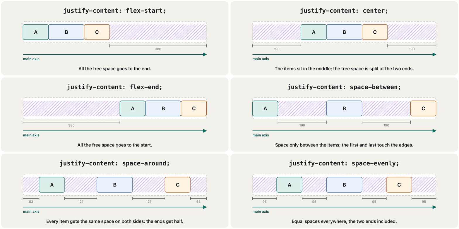
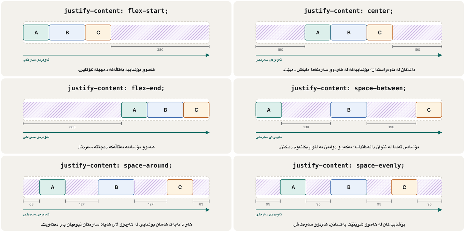
justify-content بڕیار دەدات بۆشاییە بەتاڵەکە لەسەر بچێتە کوێ.CêIT| Property | Axisتەوەرە | Common values |
|---|---|---|
justify-content | Main axis (along the row) (بە درێژایی ڕیزەکە) | flex-start · center · flex-end · space-between · space-around · space-evenly |
align-items | Cross axis (across the row) (بە پانیی ڕیزەکە) | stretch · center · flex-start · flex-end · baseline |
flex-wrap | Main axis | nowrap (default: one line) · wrap (go to the next line)nowrap (بنەڕەت: یەک دێڕ) · wrap (چوونە دێڕی دواتر) |
<!DOCTYPE html>
<html lang="en">
<head>
  <meta charset="utf-8">
  <meta name="viewport" content="width=device-width, initial-scale=1">
  <title>Flex alignment</title>
  <style>
    body { font-family: Arial, sans-serif; }
    .row { display: flex; gap: 8px; margin-bottom: 10px; padding: 6px; background-color: #f3f1ec; }
    .row span { padding: 6px 14px; background-color: #8cb6c0; }
    .start   { justify-content: flex-start; }      /* the default */
    .center  { justify-content: center; }
    .between { justify-content: space-between; }
    .middle  { align-items: center; height: 70px; }  /* cross axis */
    .row .big { padding: 20px 14px; }   /* a taller B */
  </style>
</head>
<body>
  <div class="row start"><span>A</span><span>B</span><span>C</span></div>
  <div class="row center"><span>A</span><span>B</span><span>C</span></div>
  <div class="row between"><span>A</span><span>B</span><span>C</span></div>
  <div class="row middle"><span>A</span><span class="big">B</span><span>C</span></div>
</body>
</html>HTML sent to the browserئەو HTMLـەی دەنێردرێت بۆ تۆڕگەڕ
<!DOCTYPE html>
<html lang="en">
<head>
  <meta charset="utf-8">
  <meta name="viewport" content="width=device-width, initial-scale=1">
  <title>Flex alignment</title>
  <style>
    body { font-family: Arial, sans-serif; }
    .row { display: flex; gap: 8px; margin-bottom: 10px; padding: 6px; background-color: #f3f1ec; }
    .row span { padding: 6px 14px; background-color: #8cb6c0; }
    .start   { justify-content: flex-start; }      /* the default */
    .center  { justify-content: center; }
    .between { justify-content: space-between; }
    .middle  { align-items: center; height: 70px; }  /* cross axis */
    .row .big { padding: 20px 14px; }   /* a taller B */
  </style>
</head>
<body>
  <div class="row start"><span>A</span><span>B</span><span>C</span></div>
  <div class="row center"><span>A</span><span>B</span><span>C</span></div>
  <div class="row between"><span>A</span><span>B</span><span>C</span></div>
  <div class="row middle"><span>A</span><span class="big">B</span><span>C</span></div>
</body>
</html>
Explain the codeڕوونکردنەوەی کۆدەکە
- Lineدێڕی 15
Written
.row .big, not.big: the rule.row spanon line 10 is more specific, so a plain.bigwould lose and B would not grow (Specificity). In the last row,align-items: centerputs the short A and C in the middle of the tall B.بە
.row .bigنووسراوە، نەک.big: ڕێسای.row spanـی دێڕی 10 زیاترە، بۆیە.bigـی تەنیا دەدۆڕێت و B گەورە نابێت (وردیی هەڵبژێر). لە دوایین ڕیزداalign-items: centerA و Cـی کورت دەخاتە ناوەڕاستی Bـی بەرز.
One item and wrapped lines: align-self and align-contentیەک دانە و دێڕە نوێیەکان: align-self و align-content
align-items on the container places every item on the cross axis: stretch (the default), flex-start, center, flex-end, or baseline, where the text of all the items sits on one . Two more properties finish the job:
align-items لەسەر شوێنی هەموو دانەکان لەسەر دیاری دەکات: stretch (بنەڕەت)، flex-start، center، flex-end، یان baseline، کە دەقی هەموو دانەکان لەسەر یەک دادەنیشێت. دوو تر کارەکە تەواو دەکەن:
align-selfgoes on one item and overridesalign-itemsfor that item alone. It takes the same values, plusauto(back to the container's value).align-contentmoves the lines of a container that wraps (flex-wrap: wrap) when there is spare height:flex-start,center,space-betweenand so on. On a one-line container (nowrap) it does nothing.
align-selfدەخرێتە سەر یەک دانە و تەنیا بۆ ئەو دانەیەalign-itemsدەگۆڕێت. هەمان وەردەگرێت، لەگەڵauto(گەڕانەوە بۆ ).align-contentدێڕەکانی کۆنتەینەرێک دەجووڵێنێت کە دەچێتە دێڕی نوێ (flex-wrap: wrap)، کاتێک بەرزیی زیادە هەیە:flex-start،center،space-betweenو هتد. لەسەر بە یەک دێڕ (nowrap) هیچ ناکات.
align-items بۆ هەموو دانەکان، align-self بۆ یەک دانە، align-content بۆ دێڕەکان.CêIT<!DOCTYPE html>
<html lang="en">
<head>
<meta charset="utf-8">
<meta name="viewport" content="width=device-width, initial-scale=1">
<title>Chat</title>
<style>
body { font-family: Arial, sans-serif; }
.chat {
display: flex;
flex-direction: column; /* main axis: down; cross axis: across */
align-items: flex-start; /* all messages at the start */
gap: 8px;
max-width: 360px;
padding: 10px;
background-color: #f3f1ec;
}
.msg { margin: 0; padding: 8px 12px; border-radius: 12px; background-color: #ffffff; }
.me { align-self: flex-end; background-color: #dcefeb; } /* only my messages */
</style>
</head>
<body>
<div class="chat">
<p class="msg">Hi Aram! Is the tea house open today?</p>
<p class="msg me">Yes, until 11 pm.</p>
<p class="msg">Great, see you at 8.</p>
<p class="msg me">See you!</p>
</div>
</body>
</html>HTML sent to the browserئەو HTMLـەی دەنێردرێت بۆ تۆڕگەڕ
<!DOCTYPE html>
<html lang="en">
<head>
  <meta charset="utf-8">
  <meta name="viewport" content="width=device-width, initial-scale=1">
  <title>Chat</title>
  <style>
    body { font-family: Arial, sans-serif; }
    .chat {
      display: flex;
      flex-direction: column;     /* main axis: down; cross axis: across */
      align-items: flex-start;    /* all messages at the start */
      gap: 8px;
      max-width: 360px;
      padding: 10px;
      background-color: #f3f1ec;
    }
    .msg { margin: 0; padding: 8px 12px; border-radius: 12px; background-color: #ffffff; }
    .me  { align-self: flex-end; background-color: #dcefeb; }   /* only my messages */
  </style>
</head>
<body>
  <div class="chat">
    <p class="msg">Hi Aram! Is the tea house open today?</p>
    <p class="msg me">Yes, until 11 pm.</p>
    <p class="msg">Great, see you at 8.</p>
    <p class="msg me">See you!</p>
  </div>
</body>
</html>Explain the codeڕوونکردنەوەی کۆدەکە
- Lineدێڕی 11-12
A column: the main axis runs down and the cross axis runs along the line of text. Every message starts at the start.
ستوونێک: بەرەو خوارەوە دەڕوات و بە ئاڕاستەی دێڕی دەق. هەموو نامەیەک لە سەرەتاوە دەست پێدەکات.
- Lineدێڕی 19
align-self: flex-endmoves only my messages to the end: the right in English, the left in a Kurdish page — as chat apps do.align-self: flex-endتەنیا نامەکانی من دەباتە کۆتایی: لای ڕاست لە ئینگلیزیدا، لای چەپ لە لاپەڕەیەکی کوردیدا، هەر وەک بەرنامەکانی چات.
Wrapping onto new lines: flex-wrap and gapچوونە دێڕی نوێ: flex-wrap و gap
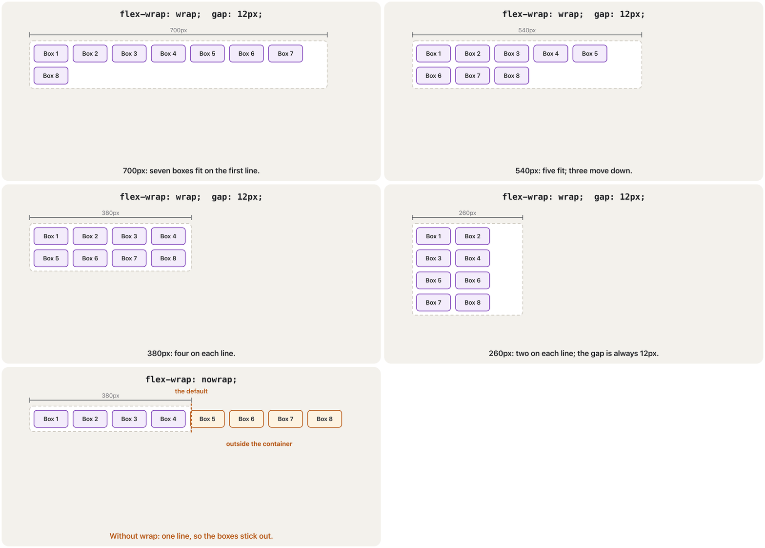
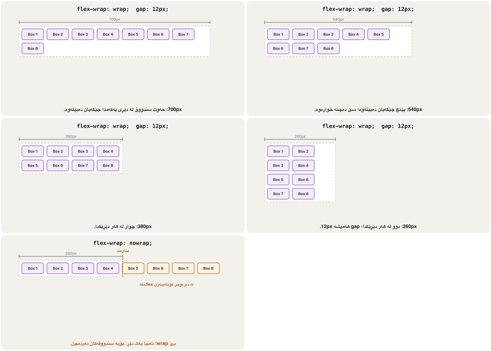
By default (flex-wrap: nowrap) a flex container keeps all its items on one line. They shrink to fit, and when they cannot shrink any more they stick out. flex-wrap: wrap lets them move to a new line instead.
بە شێوەی بنەڕەتی (flex-wrap: nowrap) هەموو دانەکانی لەسەر یەک دێڕ دەهێڵێتەوە. بچووک دەبنەوە تا جێگەیان ببێتەوە و کاتێک ئیتر ناتوانن بچووکتر ببنەوە، دەردەچن. flex-wrap: wrap لەبری ئەوە ڕێگەیان دەدات بچنە دێڕی نوێ.
gap sets the space between the items and between the lines: gap: 16px; or two values, first for the rows and then for the columns (gap: 20px 8px); or row-gap and column-gap alone. gap in flexbox works in every current browser ( widely available since 2023), so you no longer need a margin on every item.
gap بۆشایی نێوان دانەکان و نێوان دێڕەکان دیاری دەکات: gap: 16px؛ یان دوو ، یەکەم بۆ ڕیزەکان و دووەم بۆ ستوونەکان (gap: 20px 8px)؛ یان row-gap و column-gap بە جیا. gap لە لە هەموو ئەمڕۆدا کار دەکات (، لە 2023ـەوە بە فراوانی بەردەست)، بۆیە ئیتر پێویستت بە لەسەر هەموو دانەیەک نییە.
A wrapping flex row is like a bookcase. When a shelf is full, the next book goes onto the shelf below, and gap is the small space you leave between the books and between the shelves. Each shelf is arranged on its own, so the books do not line up in columns with the shelf above — for that you need grid (Grid or flexbox?).
ڕیزێکی flex کە دەچێتە دێڕی نوێ وەک دۆڵابی کتێبە. کاتێک ڕەفەیەک پڕ دەبێت، کتێبی دواتر دەچێتە سەر ڕەفەی خوارەوە و gap ئەو بۆشاییە بچووکەیە کە لە نێوان کتێبەکان و لە نێوان ڕەفەکاندا دەیهێڵیتەوە. هەر ڕەفەیەک بە جیا ڕێک دەخرێت، بۆیە کتێبەکان لەگەڵ ڕەفەی سەرەوەدا وەک ستوون ڕێک نابن — بۆ ئەوە پێویستت بە gridـە (grid یان Flexbox؟).
Where the analogy stops workingسنووری ئەم نموونەیە
Books keep their size. Flex items can also grow and shrink to fill a line (flex-grow, flex-shrink).
کتێب قەبارەی خۆی دەپارێزێت. دەتوانن گەورە و بچووکیش ببن تا دێڕێک پڕ بکەنەوە (flex-grow، flex-shrink).
<!DOCTYPE html>
<html lang="en">
<head>
  <meta charset="utf-8">
  <meta name="viewport" content="width=device-width, initial-scale=1">
  <title>Tags</title>
  <style>
    body { font-family: Arial, sans-serif; }
    .tags {
      display: flex;
      flex-wrap: wrap;    /* go to the next line when the line is full */
      gap: 10px 6px;      /* 10px between lines, 6px between tags */
      max-width: 340px;
      padding: 0;
      list-style: none;
    }
    .tags li { padding: 4px 12px; border-radius: 999px; background-color: #eaf1fb; }
  </style>
</head>
<body>
  <ul class="tags">
    <li>HTML</li><li>CSS</li><li>Flexbox</li><li>Grid</li><li>Responsive design</li>
    <li>Accessibility</li><li>Colour</li><li>Fonts</li><li>Kurdish pages</li>
  </ul>
</body>
</html>HTML sent to the browserئەو HTMLـەی دەنێردرێت بۆ تۆڕگەڕ
<!DOCTYPE html>
<html lang="en">
<head>
  <meta charset="utf-8">
  <meta name="viewport" content="width=device-width, initial-scale=1">
  <title>Tags</title>
  <style>
    body { font-family: Arial, sans-serif; }
    .tags {
      display: flex;
      flex-wrap: wrap;    /* go to the next line when the line is full */
      gap: 10px 6px;      /* 10px between lines, 6px between tags */
      max-width: 340px;
      padding: 0;
      list-style: none;
    }
    .tags li { padding: 4px 12px; border-radius: 999px; background-color: #eaf1fb; }
  </style>
</head>
<body>
  <ul class="tags">
    <li>HTML</li><li>CSS</li><li>Flexbox</li><li>Grid</li><li>Responsive design</li>
    <li>Accessibility</li><li>Colour</li><li>Fonts</li><li>Kurdish pages</li>
  </ul>
</body>
</html>
Explain the codeڕوونکردنەوەی کۆدەکە
- Lineدێڕی 12
Two values: 10px between the lines (row gap), 6px between the tags on a line (column gap).
دوو : 10px لە نێوان دێڕەکاندا (row gap)، 6px لە نێوان تاگەکانی سەر یەک دێڕدا (column gap).
Wrapping onto new lines: flex-wrap and gapچوونە دێڕی نوێ: flex-wrap و gap
Worked example: sixteen boxes in rowsنموونەی کارپێکراو: شازدە سندووق لە ڕیزدا
This practice page has sixteen divs labelled "Header 1" to "Header 16", each with a purple background, padding and display: inline-flex. Like inline-block, inline-flex makes the block boxes sit side by side and wrap to the next line like words. The universal selector * gives every element a 50 px font.
ئەم لاپەڕەی ڕاهێنانە شازدە divـی هەیە بە ناونیشانی «Header 1» تا «Header 16»، هەریەکەیان باکگراوندی مۆر، و display: inline-flexـی هەیە. وەک inline-block، inline-flex وا دەکات سندووقە بلۆکەکان لە تەنیشت یەک دابنیشن و وەک وشە بچنە دێڕی دواتر. گشتی * 50pxـی دەداتە هەموو .
div {
  border: 1px black solid;
  background-color: blueviolet;
  margin-bottom: 14px;
  color: white;
  padding: 15px;
  padding-left: 25px;
  padding-right: 25px;
  text-align: center;
  display: inline-flex;
}

* {
  font-size: 50px;
}
It works, but the gaps between the boxes come from the spaces between the tags in the HTML, so they change with the font; the vertical space comes only from margin-bottom; and div and * style every element of the site, not only these boxes. Today one flex container does the job:
کار دەکات، بەڵام بۆشایی نێوان سندووقەکان لە بۆشایی نێوان دێت، بۆیە لەگەڵ دەگۆڕێت؛ بۆشایی ستوونی تەنیا لە margin-bottomـەوە دێت؛ هەروەها div و * هەموو دەڕازێننەوە، نەک تەنیا ئەم سندووقانە. ئەمڕۆ یەک ئەم کارە دەکات:
<!DOCTYPE html>
<html lang="en">
<head>
  <meta charset="utf-8">
  <meta name="viewport" content="width=device-width, initial-scale=1">
  <title>Lab 4</title>
  <style>
    body { font-family: Arial, sans-serif; }
    .boxes {
      display: flex;
      flex-wrap: wrap;         /* boxes move to the next line when full */
      gap: 14px;               /* the same space everywhere */
    }
    .box {
      padding: 15px 25px;
      background-color: blueviolet;
      color: white;
      font-size: 1.5rem;
      border: 1px solid black;
    }
  </style>
</head>
<body>
  <div class="boxes">
    <div class="box">Box 1</div>
    <div class="box">Box 2</div>
    <div class="box">Box 3</div>
    <div class="box">Box 4</div>
    <div class="box">Box 5</div>
    <div class="box">Box 6</div>
    <div class="box">Box 7</div>
    <div class="box">Box 8</div>
  </div>
</body>
</html>HTML sent to the browserئەو HTMLـەی دەنێردرێت بۆ تۆڕگەڕ
<!DOCTYPE html>
<html lang="en">
<head>
  <meta charset="utf-8">
  <meta name="viewport" content="width=device-width, initial-scale=1">
  <title>Lab 4</title>
  <style>
    body { font-family: Arial, sans-serif; }
    .boxes {
      display: flex;
      flex-wrap: wrap;         /* boxes move to the next line when full */
      gap: 14px;               /* the same space everywhere */
    }
    .box {
      padding: 15px 25px;
      background-color: blueviolet;
      color: white;
      font-size: 1.5rem;
      border: 1px solid black;
    }
  </style>
</head>
<body>
  <div class="boxes">
    <div class="box">Box 1</div>
    <div class="box">Box 2</div>
    <div class="box">Box 3</div>
    <div class="box">Box 4</div>
    <div class="box">Box 5</div>
    <div class="box">Box 6</div>
    <div class="box">Box 7</div>
    <div class="box">Box 8</div>
  </div>
</body>
</html>In the developer tools, click the flex badge next to .boxes: the browser hatches the gaps and the free space (See the box model in the browser).
لە کرتە لەسەر نیشانەی flex بکە کە لە تەنیشت .boxesـە: gapـەکان و بۆشاییە بەتاڵەکە هێڵکاری دەکات (بینینی مۆدێلی سندووق لە تۆڕگەڕدا).
Sharing the space: flex-grow, flex-shrink and flex-basisدابەشکردنی بۆشایی: flex-grow، flex-shrink و flex-basis
Three properties on the items decide their size along the main axis:
سێ لەسەر دانەکان قەبارەیان بە درێژایی دیاری دەکەن:
flex-basis— the starting size.automeans the item'swidth, or the size of its content.flex-grow— how many shares of the free space the item takes. The default0means "do not grow".flex-shrink— how much the item gives back when the items are too wide. The default1lets every item shrink and0stops it. Big items shrink more, because the shrinking is shared out by size.
flex-basis— قەبارەی دەستپێک.autoواتەwidthـی دانەکە، یان قەبارەی ناوەڕۆکەکەی.flex-grow— دانەکە چەند بەش لە بۆشاییە بەتاڵەکە وەردەگرێت. بنەڕەتی0واتە «گەورە مەبە».flex-shrink— کاتێک دانەکان زۆر پانن، دانەکە چەندە دەداتەوە. بنەڕەتی1ڕێگە دەدات هەموو دانەیەک بچووک ببێتەوە و0ڕێی لێ دەگرێت. دانە گەورەکان زیاتر بچووک دەبنەوە، چونکە بچووکبوونەوەکە بەپێی قەبارە دابەش دەکرێت.
The free space is what is left: the container's width minus the bases and the gaps. In the animation the container is 600px, three items start at 100px, and flex-grow 1, 1 and 2 share the 300px left over.
بۆشاییە بەتاڵەکە ئەوەیە کە دەمێنێتەوە: پانیی بە کەمکردنەوەی بنەماکان (basis) و gapـەکان. لە کۆنتەینەرەکە 600pxـە، سێ دانە لە 100pxـەوە دەست پێدەکەن و flex-growـی 1، 1 و 2 ئەو 300pxـە بەش دەکەن کە دەمێنێتەوە.
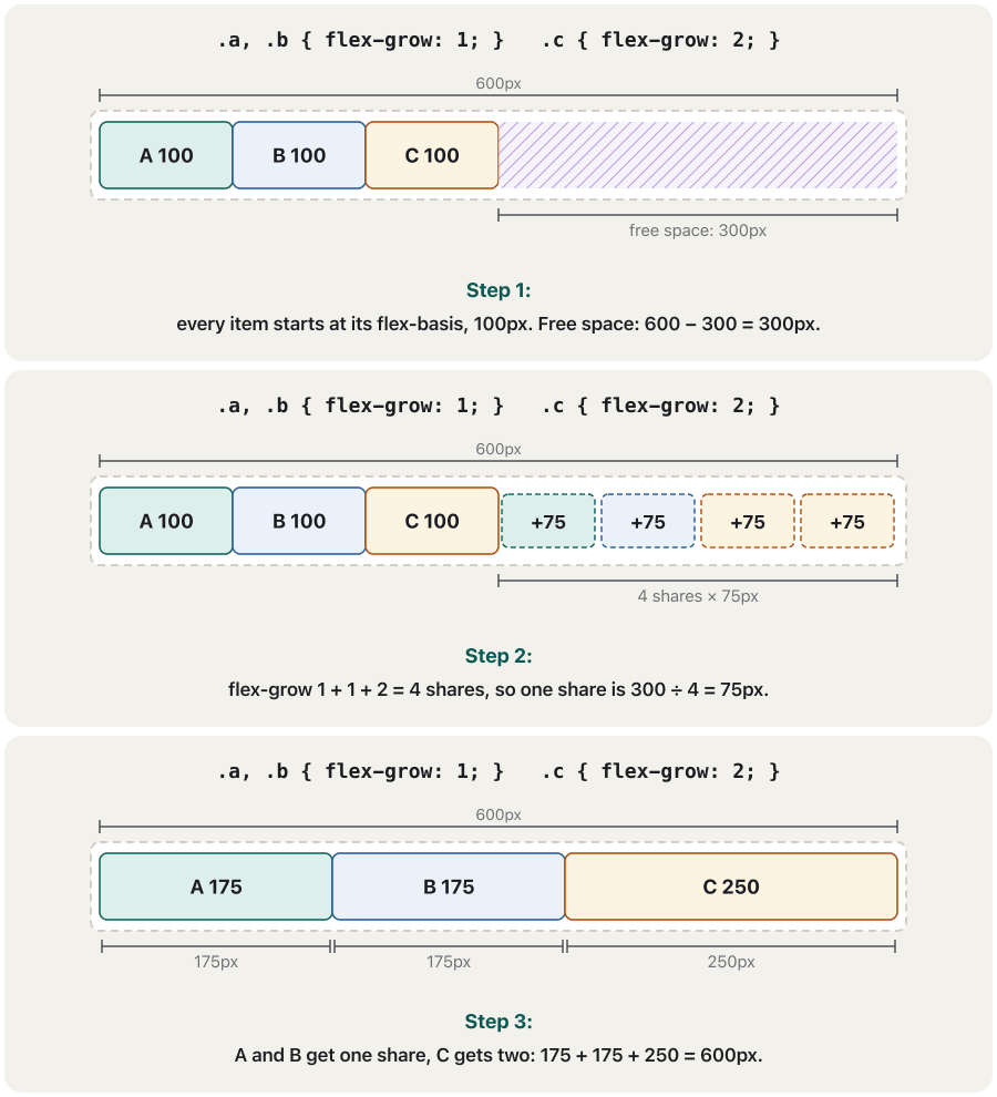
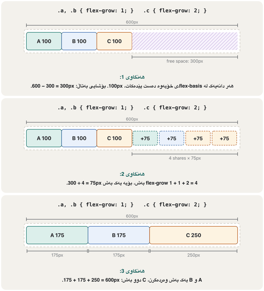
flex-grow تەنیا بۆشاییە بەتاڵەکە بەش دەکات، بەپێی ژمارەکان.CêIT<!DOCTYPE html>
<html lang="en">
<head>
<meta charset="utf-8">
<meta name="viewport" content="width=device-width, initial-scale=1">
<title>flex-grow</title>
<style>
* { box-sizing: border-box; }
body { font-family: Arial, sans-serif; }
.bar { display: flex; width: 600px; max-width: 100%; background-color: #f3f1ec; }
.bar div {
flex-basis: 100px; /* every item starts at 100px */
padding: 8px 0;
text-align: center;
background-color: #dcefeb;
border: 1px solid #0d6b62;
}
.a, .b { flex-grow: 1; } /* one share each */
.c { flex-grow: 2; } /* two shares */
</style>
</head>
<body>
<div class="bar">
<div class="a">A: 1</div>
<div class="b">B: 1</div>
<div class="c">C: 2</div>
</div>
</body>
</html>HTML sent to the browserئەو HTMLـەی دەنێردرێت بۆ تۆڕگەڕ
<!DOCTYPE html>
<html lang="en">
<head>
  <meta charset="utf-8">
  <meta name="viewport" content="width=device-width, initial-scale=1">
  <title>flex-grow</title>
  <style>
    * { box-sizing: border-box; }
    body { font-family: Arial, sans-serif; }
    .bar { display: flex; width: 600px; max-width: 100%; background-color: #f3f1ec; }
    .bar div {
      flex-basis: 100px;          /* every item starts at 100px */
      padding: 8px 0;
      text-align: center;
      background-color: #dcefeb;
      border: 1px solid #0d6b62;
    }
    .a, .b { flex-grow: 1; }      /* one share each */
    .c     { flex-grow: 2; }      /* two shares */
  </style>
</head>
<body>
  <div class="bar">
    <div class="a">A: 1</div>
    <div class="b">B: 1</div>
    <div class="c">C: 2</div>
  </div>
</body>
</html>Sharing the space: flex-grow, flex-shrink and flex-basisدابەشکردنی بۆشایی: flex-grow، flex-shrink و flex-basis
The flex shorthand: flex: 1, auto and noneکورتکراوەی flex: flex: 1، auto و none
Write the three as one shorthand: flex: <grow> <shrink> <basis>. MDN advises using the shorthand, because it gives sensible values to the parts you leave out. These values cover almost every layout:
هەر سێکیان وەک یەک کورتکراوە بنووسە: flex: <grow> <shrink> <basis>. MDN ئامۆژگاری دەکات کورتکراوەکە بەکاربهێنیت، چونکە گونجاو دەداتە ئەو بەشانەی نایاننووسیت. ئەم نزیکەی هەموو دەگرنەوە:
| Value | Meansواتا | Use it forبۆ چی |
|---|---|---|
flex: initial | 0 1 auto — the default: content size, no growing, may shrink0 1 auto — بنەڕەت: قەبارەی ناوەڕۆک، گەورە نابێت، دەتوانێت بچووک ببێتەوە | most itemsزۆربەی دانەکان |
flex: auto | 1 1 auto — start at the content size, then share the free space1 1 auto — لە قەبارەی ناوەڕۆکەوە دەست پێدەکات، پاشان بۆشاییە بەتاڵەکە بەش دەکات | menu items that fill a barبەندەکانی کە شریتێک پڕ دەکەنەوە |
flex: 1 | 1 1 0% — start at 0: equal shares, whatever the content1 1 0% — لە 0ـەوە دەست پێدەکات: بەشی یەکسان، هەر ناوەڕۆکێک بێت | equal columns and cardsستوون و یەکسان |
flex: 2 | 2 1 0% — twice the share of a flex: 1 item2 1 0% — دوو هێندەی بەشی دانەیەکی flex: 1 | a wider main columnستوونێکی سەرەکیی پانتر |
flex: none | 0 0 auto — keep the content size: never grow or shrink0 0 auto — قەبارەی ناوەڕۆک بپارێزە: هەرگیز گەورە یان بچووک نابێت | icons, logos, pictures، لۆگۆ، وێنە |
flex: 1 200px | 1 1 200px — start at 200px, then grow1 1 200px — لە 200pxـەوە دەست پێدەکات، پاشان گەورە دەبێت | cards that wrap کە دەچنە دێڕی نوێ |
<!DOCTYPE html>
<html lang="en">
<head>
  <meta charset="utf-8">
  <meta name="viewport" content="width=device-width, initial-scale=1">
  <title>The flex shorthand</title>
  <style>
    body { font-family: Arial, sans-serif; }
    .row { display: flex; gap: 6px; margin-bottom: 12px; padding: 6px; background-color: #f3f1ec; }
    .row span { padding: 6px 8px; background-color: #eaf1fb; border: 1px solid #2b5ea8; }
    .auto span { flex: auto; }    /* 1 1 auto: grow from the content size */
    .one  span { flex: 1; }       /* 1 1 0%: equal widths */
    .none span { flex: none; }    /* 0 0 auto: never grow or shrink */
  </style>
</head>
<body>
  <p>flex: auto</p>
  <div class="row auto"><span>Tea</span><span>Coffee with milk</span><span>Kulicha</span></div>
  <p>flex: 1</p>
  <div class="row one"><span>Tea</span><span>Coffee with milk</span><span>Kulicha</span></div>
  <p>flex: none</p>
  <div class="row none"><span>Tea</span><span>Coffee with milk</span><span>Kulicha</span></div>
</body>
</html>HTML sent to the browserئەو HTMLـەی دەنێردرێت بۆ تۆڕگەڕ
<!DOCTYPE html>
<html lang="en">
<head>
  <meta charset="utf-8">
  <meta name="viewport" content="width=device-width, initial-scale=1">
  <title>The flex shorthand</title>
  <style>
    body { font-family: Arial, sans-serif; }
    .row { display: flex; gap: 6px; margin-bottom: 12px; padding: 6px; background-color: #f3f1ec; }
    .row span { padding: 6px 8px; background-color: #eaf1fb; border: 1px solid #2b5ea8; }
    .auto span { flex: auto; }    /* 1 1 auto: grow from the content size */
    .one  span { flex: 1; }       /* 1 1 0%: equal widths */
    .none span { flex: none; }    /* 0 0 auto: never grow or shrink */
  </style>
</head>
<body>
  <p>flex: auto</p>
  <div class="row auto"><span>Tea</span><span>Coffee with milk</span><span>Kulicha</span></div>
  <p>flex: 1</p>
  <div class="row one"><span>Tea</span><span>Coffee with milk</span><span>Kulicha</span></div>
  <p>flex: none</p>
  <div class="row none"><span>Tea</span><span>Coffee with milk</span><span>Kulicha</span></div>
</body>
</html>Sharing the space: flex-grow, flex-shrink and flex-basisدابەشکردنی بۆشایی: flex-grow، flex-shrink و flex-basis
When an item will not shrink: min-width: 0کاتێک دانەیەک بچووک نابێتەوە: min-width: 0
A flex item never becomes narrower than its longest word, picture or line of code: its min-width is auto, which means "not smaller than my content". A long address or file name then makes the item too wide, and on a phone the whole page scrolls sideways.
هەرگیز لە درێژترین وشە، وێنە یان دێڕی کۆدەکەی تەسکتر نابێت: min-widthـەکەی autoـە، واتە «لە ناوەڕۆکەکەم بچووکتر نابم». ئەوکات ناونیشانێکی درێژ یان ناوی دانەکە زۆر پان دەکات و لەسەر مۆبایل هەموو لاپەڕەکە بە ئاسۆیی دەجووڵێت.
The fix is two declarations on the item: min-width: 0 lets it shrink, and overflow-wrap: break-word then breaks the long word inside it. For a wide picture use max-width: 100%; for a wide table or code, overflow-x: auto (When content does not fit). Grid columns have the same trap (CSS Grid: common mistakes).
چارەسەرەکە دوو لەسەر دانەکە: min-width: 0 ڕێگەی دەدات بچووک ببێتەوە و پاشان overflow-wrap: break-word وشە درێژەکە لەناویدا دەشکێنێت. بۆ وێنەیەکی پان max-width: 100% بەکاربهێنە؛ بۆ یان کۆدێکی پان overflow-x: auto (کاتێک ناوەڕۆک جێگەی نابێتەوە). ستوونەکانی gridـیش هەمان تەڵەیان هەیە (CSS Grid: هەڵە باوەکان).
min-width: 0 ڕێگە دەدات لە درێژترین وشەکەی بچووکتر ببێتەوە.CêIT<!DOCTYPE html>
<html lang="en">
<head>
<meta charset="utf-8">
<meta name="viewport" content="width=device-width, initial-scale=1">
<title>min-width: 0</title>
<style>
* { box-sizing: border-box; }
body { font-family: Arial, sans-serif; }
.box { display: flex; gap: 8px; width: 280px; margin-bottom: 14px; padding: 6px; border: 2px dashed #b4530f; }
.icon { flex: none; width: 40px; height: 40px; background-color: #fdf3e1; }
.text { flex: 1; margin: 0; }
.fixed .text { min-width: 0; overflow-wrap: break-word; } /* the fix */
</style>
</head>
<body>
<div class="box">
<div class="icon"></div>
<p class="text">Get it here: https://www.example.com/kurdish_fonts_2026.zip</p>
</div>
<div class="box fixed">
<div class="icon"></div>
<p class="text">Get it here: https://www.example.com/kurdish_fonts_2026.zip</p>
</div>
</body>
</html>HTML sent to the browserئەو HTMLـەی دەنێردرێت بۆ تۆڕگەڕ
<!DOCTYPE html>
<html lang="en">
<head>
  <meta charset="utf-8">
  <meta name="viewport" content="width=device-width, initial-scale=1">
  <title>min-width: 0</title>
  <style>
    * { box-sizing: border-box; }
    body { font-family: Arial, sans-serif; }
    .box { display: flex; gap: 8px; width: 280px; margin-bottom: 14px; padding: 6px; border: 2px dashed #b4530f; }
    .icon { flex: none; width: 40px; height: 40px; background-color: #fdf3e1; }
    .text { flex: 1; margin: 0; }
    .fixed .text { min-width: 0; overflow-wrap: break-word; }   /* the fix */
  </style>
</head>
<body>
  <div class="box">
    <div class="icon"></div>
    <p class="text">Get it here: https://www.example.com/kurdish_fonts_2026.zip</p>
  </div>
  <div class="box fixed">
    <div class="icon"></div>
    <p class="text">Get it here: https://www.example.com/kurdish_fonts_2026.zip</p>
  </div>
</body>
</html>Changing the order with order — carefullyگۆڕینی ڕیزبەندی بە order — بە ئاگاییەوە
order changes where an item is drawn. Every item starts at order: 0. Smaller numbers come first and equal numbers keep their HTML order, so order: -1 moves an item to the start. flex-direction: row-reverse and column-reverse also reverse the picture.
order شوێنی کێشانی دانەیەک دەگۆڕێت. هەموو دانەیەک بە order: 0 دەست پێدەکات. ژمارەی بچووکتر یەکەم دێت و ژمارە یەکسانەکان ڕیزبەندیی دەپارێزن، بۆیە order: -1 دانەیەک دەباتە سەرەتا. flex-direction: row-reverse و column-reverseیش وێنەکە پێچەوانە دەکەنەوە.
But only the picture changes. read the items in the HTML order, and the Tab key moves the in the HTML order too. When the two orders differ, the jumps around the screen. That can fail 1.3.2 (Meaningful Sequence) and 2.4.3 (Focus Order) (Focus order follows the HTML).
بەڵام تەنیا وێنەکە دەگۆڕێت. دانەکان بە ڕیزبەندیی دەخوێننەوە و Tabـیش بە هەمان ڕیزبەندیی HTML دەگوازێتەوە. کاتێک ئەم دوو ڕیزبەندییە جیاواز بن، بەسەر شاشەکەدا باز دەدات. ئەمە دەتوانێت دوو بشکێنێت: 1.3.2 (ڕیزبەندیی واتادار) و 2.4.3 () (ڕیزبەندیی فۆکەس شوێن HTML دەکەوێت).
- Write the HTML in the right reading order first; then lay it out.
- Use
orderonly when the new place does not change the meaning or the Tab order. - Test with the Tab key: the focus should move in the order your eyes read.
- سەرەتا بە ڕیزبەندیی دروستی خوێندنەوە بنووسە؛ پاشان ڕێکی بخە.
orderتەنیا ئەو کاتە بەکاربهێنە کە شوێنە نوێیەکە واتا یان ڕیزبەندیی Tab ناگۆڕێت.- بە Tab تاقی بکەرەوە: دەبێت بە هەمان ڕیزبەندیی خوێندنەوەی چاوەکانت بجووڵێت.
order وێنەکە دەجووڵێنێت، نەک ڕیزبەندیی خوێندنەوە و Tab.CêIT<!DOCTYPE html>
<html lang="en">
<head>
<meta charset="utf-8">
<meta name="viewport" content="width=device-width, initial-scale=1">
<title>order and the Tab key</title>
<style>
body { font-family: Arial, sans-serif; }
.menu { display: flex; gap: 8px; }
.menu a { padding: 8px 14px; background-color: #eaf1fb; color: #1b1d20; }
.menu a:focus { outline: 3px solid #b4530f; }
.contact { order: -1; } /* drawn first, but still third in the HTML */
</style>
</head>
<body>
<p>Click this sentence, then press Tab three times.</p>
<nav class="menu">
<a href="#home">1 Home</a>
<a href="#prices">2 Prices</a>
<a href="#contact" class="contact">3 Contact</a>
</nav>
</body>
</html>HTML sent to the browserئەو HTMLـەی دەنێردرێت بۆ تۆڕگەڕ
<!DOCTYPE html>
<html lang="en">
<head>
  <meta charset="utf-8">
  <meta name="viewport" content="width=device-width, initial-scale=1">
  <title>order and the Tab key</title>
  <style>
    body { font-family: Arial, sans-serif; }
    .menu { display: flex; gap: 8px; }
    .menu a { padding: 8px 14px; background-color: #eaf1fb; color: #1b1d20; }
    .menu a:focus { outline: 3px solid #b4530f; }
    .contact { order: -1; }   /* drawn first, but still third in the HTML */
  </style>
</head>
<body>
  <p>Click this sentence, then press Tab three times.</p>
  <nav class="menu">
    <a href="#home">1 Home</a>
    <a href="#prices">2 Prices</a>
    <a href="#contact" class="contact">3 Contact</a>
  </nav>
</body>
</html>Four everyday patternsچوار نەخشەی ڕۆژانە
Most flex layouts are one of these four, and each needs only a few lines:
زۆربەی ئەو شتانەی بە flex ڕێکیان دەخەیت یەکێکن لەم چوارە و هەریەکەیان تەنیا چەند دێڕێکی پێویستە:
- Centre anything:
display: flex; justify-content: center; align-items: center;on the parent — ormargin: autoon a single item. - A row of cards that wraps:
flex-wrap: wrapon the parent andflex: 1 1 200pxon the cards. They start at 200px, grow to fill the line and wrap when there is no room (Exercises). - A footer at the bottom: make the
bodya column withmin-height: 100vhand writemain { flex: 1; }. On a short pagemaintakes the free height and the footer sits at the bottom of the window. - Picture and text side by side:
flex: noneon the picture keeps its size;flex: 1; min-width: 0;lets the text take the rest.
- ناوەڕاستکردنی هەر شتێک:
display: flex; justify-content: center; align-items: center;لەسەر باوانەکە — یانmargin: autoلەسەر تاکە دانەیەک. - ڕیزێک کە دەچێتە دێڕی نوێ:
flex-wrap: wrapلەسەر باوان وflex: 1 1 200pxلەسەر . لە 200pxـەوە دەست پێدەکەن، گەورە دەبن تا دێڕەکە پڕ بکەنەوە و کاتێک جێگە نییە دەچنە دێڕی نوێ (ڕاهێنانەکان). - لە خوارەوە:
bodyبکە بە ستوونێک بەmin-height: 100vhوmain { flex: 1; }بنووسە. لە لاپەڕەیەکی کورتداmainبەرزییە بەتاڵەکە دەگرێت و لە خوارەوەی پەنجەرەکەدا دادەنیشێت. - وێنە و دەق لە تەنیشت یەک:
flex: noneلەسەر وێنەکە قەبارەکەی دەپارێزێت؛flex: 1; min-width: 0;ڕێگە دەدات دەقەکە باقییەکە بگرێت.
<!DOCTYPE html>
<html lang="en">
<head>
  <meta charset="utf-8">
  <meta name="viewport" content="width=device-width, initial-scale=1">
  <title>Flexbox patterns</title>
  <style>
    * { box-sizing: border-box; }
    body {
      display: flex;              /* sticky footer: the body is a column */
      flex-direction: column;
      min-height: 100vh;
      margin: 0;
      font-family: Arial, sans-serif;
    }
    main { flex: 1; padding: 12px; }   /* main takes the free height */
    footer { padding: 8px 12px; background-color: #dcefeb; }
    .hero {
      display: flex;              /* centring */
      justify-content: center;
      align-items: center;
      height: 120px;
      background-color: #eaf1fb;
    }
    .hero h1 { margin: 0; font-size: 1.2rem; }
    .media { display: flex; align-items: flex-start; gap: 12px; margin-top: 12px; }
    .media .pic { flex: none; width: 64px; height: 64px; border-radius: 8px; background-color: #fdf3e1; }
    .media .text { flex: 1; min-width: 0; }
    .media h2 { margin: 0; font-size: 1.1rem; }
    .media p { margin: 4px 0 0; }
  </style>
</head>
<body>
  <main>
    <div class="hero"><h1>Centred in both directions</h1></div>
    <article class="media">
      <div class="pic"></div>
      <div class="text">
        <h2>Dilan's bakery</h2>
        <p>Fresh bread every morning. The picture keeps its size; the text takes the rest.</p>
      </div>
    </article>
  </main>
  <footer>The footer stays at the bottom, even on a short page.</footer>
</body>
</html>HTML sent to the browserئەو HTMLـەی دەنێردرێت بۆ تۆڕگەڕ
<!DOCTYPE html>
<html lang="en">
<head>
  <meta charset="utf-8">
  <meta name="viewport" content="width=device-width, initial-scale=1">
  <title>Flexbox patterns</title>
  <style>
    * { box-sizing: border-box; }
    body {
      display: flex;              /* sticky footer: the body is a column */
      flex-direction: column;
      min-height: 100vh;
      margin: 0;
      font-family: Arial, sans-serif;
    }
    main { flex: 1; padding: 12px; }   /* main takes the free height */
    footer { padding: 8px 12px; background-color: #dcefeb; }
    .hero {
      display: flex;              /* centring */
      justify-content: center;
      align-items: center;
      height: 120px;
      background-color: #eaf1fb;
    }
    .hero h1 { margin: 0; font-size: 1.2rem; }
    .media { display: flex; align-items: flex-start; gap: 12px; margin-top: 12px; }
    .media .pic { flex: none; width: 64px; height: 64px; border-radius: 8px; background-color: #fdf3e1; }
    .media .text { flex: 1; min-width: 0; }
    .media h2 { margin: 0; font-size: 1.1rem; }
    .media p { margin: 4px 0 0; }
  </style>
</head>
<body>
  <main>
    <div class="hero"><h1>Centred in both directions</h1></div>
    <article class="media">
      <div class="pic"></div>
      <div class="text">
        <h2>Dilan's bakery</h2>
        <p>Fresh bread every morning. The picture keeps its size; the text takes the rest.</p>
      </div>
    </article>
  </main>
  <footer>The footer stays at the bottom, even on a short page.</footer>
</body>
</html>Common mistakesهەڵە باوەکان
| Mistakeهەڵە | What happensچی ڕوودەدات | Fixچارەسەر |
|---|---|---|
display: flex on the children instead of the parentdisplay: flex لەسەر منداڵەکان لەبری باوان | The children do not line up; their own contents doمنداڵەکان ڕیز نابن؛ ناوەڕۆکی خۆیان ڕیز دەبێت | Put it on the parentبیخەرە سەر باوانەکە |
justify-content: center to centre verticallyjustify-content: center بۆ ناوەڕاستکردنی ستوونی | It works along the main axis: side to side in a rowبە درێژایی کار دەکات: لە لایەکەوە بۆ لایەکی تر لە ڕیزێکدا | align-items: center for the cross axisalign-items: center بۆ |
No flex-wrap on a long rowهیچ flex-wrapـێک لەسەر ڕیزێکی درێژ | Items squeeze, then stick out on phonesدانەکان پەستێنراو دەبن، پاشان لەسەر مۆبایل دەردەچن | flex-wrap: wrapflex-wrap: wrap |
| A margin on every item for spacing لەسەر هەموو دانەیەک بۆ بۆشایی | Extra space at the ends; the wrong side in Kurdishبۆشایی زیادە لە سەرەکاندا؛ لای هەڵە لە کوردیدا | gap on the containergap لەسەر کۆنتەینەرەکە |
align-content on a one-line containeralign-content لەسەر کۆنتەینەرێکی یەک دێڕی | No effectهیچ کاریگەرییەکی نییە | align-items, or add flex-wrap: wrapalign-items، یان flex-wrap: wrap زیاد بکە |
margin-left: auto or float: right to push an itemmargin-left: auto یان float: right بۆ پاڵنانی دانەیەک | Wrong side in Kurdish; floats are ignored in flexلای هەڵە لە کوردیدا؛ float لە flexـدا پشتگوێ دەخرێت | margin-inline-start: automargin-inline-start: auto |
order or row-reverse to fix the HTML orderorder یان row-reverse بۆ چاککردنی ڕیزبەندیی HTML | Tab and screen readers follow the HTML: the focus jumpsTab و شوێن HTML دەکەون: باز دەدات | Change the HTML orderڕیزبەندیی HTMLـەکە بگۆڕە |
| A long word or URL in an itemوشە یان URLـێکی درێژ لە دانەیەکدا | The item will not shrink: the page scrolls sidewaysدانەکە بچووک نابێتەوە: لاپەڕەکە بە ئاسۆیی دەجووڵێت | min-width: 0 and overflow-wrap: break-wordmin-width: 0 و overflow-wrap: break-word |
flex: auto or flex-grow: 1 for equal columnsflex: auto یان flex-grow: 1 بۆ ستوونی یەکسان | Longer content stays widerناوەڕۆکی درێژتر پانتر دەمێنێتەوە | flex: 1 (basis 0)flex: 1 (basisـی 0) |
Exercisesڕاهێنانەکان
Make a row of three price cards (tea, coffee, kulicha) that share the width equally on a laptop and wrap under each other on a narrow phone. Use flexbox.
ڕیزێک لە سێ نرخ (چا، قاوە، کولێچە) دروست بکە کە لەسەر پانییەکە بە یەکسانی دابەش دەکەن و لەسەر مۆبایلێکی تەسک دەچنە ژێر یەکتر. بەکاربهێنە.
Show answerوەڵامەکە پیشان بدە
<!DOCTYPE html>
<html lang="en">
<head>
  <meta charset="utf-8">
  <meta name="viewport" content="width=device-width, initial-scale=1">
  <title>Cards</title>
  <style>
    * { box-sizing: border-box; }
    body { font-family: Arial, sans-serif; }
    .cards {
      display: flex;
      flex-wrap: wrap;
      gap: 16px;
    }
    .card {
      flex: 1 1 200px;         /* grow, shrink, start at 200 px */
      padding: 16px;
      border: 1px solid #d3cfc6;
      border-radius: 10px;
    }
  </style>
</head>
<body>
  <h1>Prices</h1>
  <div class="cards">
    <article class="card"><h2>Tea</h2><p>1,000 IQD</p></article>
    <article class="card"><h2>Coffee</h2><p>2,000 IQD</p></article>
    <article class="card"><h2>Kulicha</h2><p>500 IQD</p></article>
  </div>
</body>
</html>HTML sent to the browserئەو HTMLـەی دەنێردرێت بۆ تۆڕگەڕ
<!DOCTYPE html>
<html lang="en">
<head>
  <meta charset="utf-8">
  <meta name="viewport" content="width=device-width, initial-scale=1">
  <title>Cards</title>
  <style>
    * { box-sizing: border-box; }
    body { font-family: Arial, sans-serif; }
    .cards {
      display: flex;
      flex-wrap: wrap;
      gap: 16px;
    }
    .card {
      flex: 1 1 200px;         /* grow, shrink, start at 200 px */
      padding: 16px;
      border: 1px solid #d3cfc6;
      border-radius: 10px;
    }
  </style>
</head>
<body>
  <h1>Prices</h1>
  <div class="cards">
    <article class="card"><h2>Tea</h2><p>1,000 IQD</p></article>
    <article class="card"><h2>Coffee</h2><p>2,000 IQD</p></article>
    <article class="card"><h2>Kulicha</h2><p>500 IQD</p></article>
  </div>
</body>
</html>
flex: 1 1 200px lets each card start at 200 px, grow to share the extra space, and shrink; with flex-wrap: wrap, cards that do not fit move to the next line.
flex: 1 1 200px ڕێگە دەدات هەر لە 200pxـەوە دەست پێبکات، گەورە ببێت بۆ بەشداریکردن لە بۆشاییە زیادەکە و بچووک ببێتەوە؛ بە flex-wrap: wrap ئەو جێگەیان نابێتەوە دەچنە دێڕی دواتر.
A flex container is 800px wide, with no gap. Item A has flex: 1 0 100px, B has flex: 2 0 100px and C has flex: 1 0 200px. How wide is each item? Work it out before you look.
800px پانە، بێ gap. دانەی A flex: 1 0 100px، B flex: 2 0 100px و C flex: 1 0 200pxـی هەیە. هەر دانەیەک چەند پانە؟ پێش ئەوەی سەیری وەڵامەکە بکەیت، بیدۆزەرەوە.
Hintئاماژە
Free space first: 800 minus the three bases.
یەکەم بۆشایی بەتاڵ: 800 کەم سێ بنەماکە.
Show answerوەڵامەکە پیشان بدە
- Bases: px, so the free space is px.
- Shares: , so one share is px.
- A: px, B: px, C: px.
- بنەماکان: px، بۆیە بۆشایی بەتاڵ pxـە.
- بەشەکان: ، بۆیە یەک بەش pxـە.
- A: px، B: px، C: px.
Build a site header with the bakery name at the start and a three-link menu at the far end. It must wrap on a narrow phone, and a Kurdish copy of the same header (lang="ckb" dir="rtl") must mirror by itself, with no extra CSS.
بۆ دروست بکە کە ناوی نانەواخانەکە لە سەرەتادا بێت و بە سێ لە سەرەکەی تردا. دەبێت لەسەر مۆبایلێکی تەسک بچێتە دێڕی نوێ و کۆپییەکی کوردیی هەمان (lang="ckb" dir="rtl") دەبێت خۆی پێچەوانە ببێتەوە، بێ هیچ CSSـێکی زیادە.
Hintئاماژە
A logical margin, not margin-left.
لۆجیکی، نەک margin-left.
Show answerوەڵامەکە پیشان بدە
<!DOCTYPE html>
<html lang="en">
<head>
  <meta charset="utf-8">
  <meta name="viewport" content="width=device-width, initial-scale=1">
  <title>One header, two languages</title>
  <style>
    body { font-family: Arial, sans-serif; }
    .bar {
      display: flex;
      flex-wrap: wrap;
      align-items: center;
      gap: 8px 16px;
      margin-bottom: 12px;
      padding: 8px 12px;
      background-color: #0d6b62;
      color: white;
    }
    .logo { font-weight: bold; }
    .bar nav { margin-inline-start: auto; }   /* the menu goes to the far end */
    .bar ul { display: flex; gap: 12px; margin: 0; padding: 0; list-style: none; }
    .bar a { color: white; }
  </style>
</head>
<body>
  <div class="bar">
    <span class="logo">Shilan's Bakery</span>
    <nav aria-label="Main menu">
      <ul><li><a href="#bread">Bread</a></li><li><a href="#cakes">Cakes</a></li><li><a href="#contact">Contact</a></li></ul>
    </nav>
  </div>
  <div class="bar" lang="ckb" dir="rtl">
    <span class="logo">نانەواخانەی شیلان</span>
    <nav aria-label="مێنیوی سەرەکی">
      <ul><li><a href="#bread">نان</a></li><li><a href="#cakes">کێک</a></li><li><a href="#contact">پەیوەندی</a></li></ul>
    </nav>
  </div>
</body>
</html>HTML sent to the browserئەو HTMLـەی دەنێردرێت بۆ تۆڕگەڕ
<!DOCTYPE html>
<html lang="en">
<head>
  <meta charset="utf-8">
  <meta name="viewport" content="width=device-width, initial-scale=1">
  <title>One header, two languages</title>
  <style>
    body { font-family: Arial, sans-serif; }
    .bar {
      display: flex;
      flex-wrap: wrap;
      align-items: center;
      gap: 8px 16px;
      margin-bottom: 12px;
      padding: 8px 12px;
      background-color: #0d6b62;
      color: white;
    }
    .logo { font-weight: bold; }
    .bar nav { margin-inline-start: auto; }   /* the menu goes to the far end */
    .bar ul { display: flex; gap: 12px; margin: 0; padding: 0; list-style: none; }
    .bar a { color: white; }
  </style>
</head>
<body>
  <div class="bar">
    <span class="logo">Shilan's Bakery</span>
    <nav aria-label="Main menu">
      <ul><li><a href="#bread">Bread</a></li><li><a href="#cakes">Cakes</a></li><li><a href="#contact">Contact</a></li></ul>
    </nav>
  </div>
  <div class="bar" lang="ckb" dir="rtl">
    <span class="logo">نانەواخانەی شیلان</span>
    <nav aria-label="مێنیوی سەرەکی">
      <ul><li><a href="#bread">نان</a></li><li><a href="#cakes">کێک</a></li><li><a href="#contact">پەیوەندی</a></li></ul>
    </nav>
  </div>
</body>
</html>
margin-inline-start: auto on the nav takes all the free space before the menu: on the right in English, on the left in Kurdish. With margin-left: auto the Kurdish menu would end up next to the name.
margin-inline-start: auto لەسەر nav هەموو بۆشاییە بەتاڵەکەی پێش دەگرێت: لە لای ڕاست لە ئینگلیزیدا، لە لای چەپ لە کوردیدا. بە margin-left: auto لە تەنیشت ناوەکەوە دەمایەوە.
This toolbar should show its buttons in one row, centred from top to bottom, with 12px between them and the Help button at the far end, in English and in Kurdish. Find the four mistakes.
ئەم دەبێت لە یەک ڕیزدا پیشان بدات، لە سەرەوە بۆ خوارەوە لە ناوەڕاستدا، بە 12px لە نێوانیاندا و Help لە سەرەکەی تردا، لە ئینگلیزی و کوردیدا. چوار هەڵەکە بدۆزەرەوە.
.toolbar button { display: flex; margin-right: 12px; }
.toolbar { justify-content: center; height: 60px; }
.toolbar .help { margin-left: auto; order: 99; }
Show answerوەڵامەکە پیشان بدە
.toolbar { display: flex; align-items: center; gap: 12px; height: 60px; }
.toolbar .help { margin-inline-start: auto; }   /* and move Help to the end of the HTML */
display: flexwas on the buttons; it belongs on.toolbar, the parent.justify-content: centercentres along the row; top-to-bottom centring isalign-items: center.margin-right: 12pxon every button →gap: 12px(no extra space at the end, right in both languages).margin-left: autopushes the wrong way in Kurdish →margin-inline-start: auto; andorder: 99only moves the picture, so put Help last in the HTML instead.
display: flexلەسەر بوو؛ جێگەی لەسەر.toolbarـە، باوانەکە.justify-content: centerبە درێژایی ڕیزەکە ناوەڕاست دەکات؛ ناوەڕاستکردن لە سەرەوە بۆ خوارەوەalign-items: centerـە.margin-right: 12pxلەسەر هەموو ←gap: 12px(بێ بۆشایی زیادە لە کۆتاییدا، دروست لە هەردوو زماندا).margin-left: autoلە کوردیدا بە ئاڕاستەی هەڵە پاڵ دەنێت ←margin-inline-start: auto؛ هەروەهاorder: 99تەنیا وێنەکە دەجووڵێنێت، بۆیە لەبری ئەوە Help لە کۆتایی HTMLـەکەدا دابنێ.
Summaryپوختە
display: flexmakes a flex container; its direct children become the flex items.flex-directionsets the main axis (row or column); the cross axis runs across it. A row starts on the right in a Kurdish page.justify-contentshares the free space on the main axis;align-items(all items) andalign-self(one item) place them on the cross axis;align-contentmoves wrapped lines.flex-wrap: wrapandgapmake rows that wrap;gapworks in flexbox in every current browser.flex: 1gives equal shares,flex: autogrows from the content,flex: nonekeeps the size; addmin-width: 0when a long word will not shrink.orderchanges only the picture: keep the HTML in reading order.
display: flexدروست دەکات؛ منداڵە ڕاستەوخۆکانی دەبنە .flex-directionدیاری دەکات (ڕیز یان ستوون)؛ بە پانیدا دەڕوات. ڕیزێک لە لاپەڕەیەکی کوردیدا لە ڕاستەوە دەست پێدەکات.justify-contentبۆشاییە بەتاڵەکە لەسەر دابەش دەکات؛align-items(هەموو دانەکان) وalign-self(یەک دانە) لەسەر دایاندەنێن؛align-contentدێڕە نوێیەکان دەجووڵێنێت.flex-wrap: wrapوgapڕیزی وا دروست دەکەن کە دەچنە دێڕی نوێ؛gapلە لە هەموو ئەمڕۆدا کار دەکات.flex: 1بەشی یەکسان دەدات،flex: autoلە ناوەڕۆکەوە گەورە دەبێت،flex: noneقەبارە دەپارێزێت؛ کاتێک وشەیەکی درێژ بچووک نابێتەوەmin-width: 0زیاد بکە.orderتەنیا وێنەکە دەگۆڕێت: بە ڕیزبەندیی خوێندنەوە بهێڵەوە.
Next: CSS Grid — layout in two directions at once, rows and columns.
دواتر: CSS Grid — بە دوو ئاڕاستە پێکەوە، ڕیز و ستوون.
Lesson complete!وانەکە تەواو بوو!
Well done. Review the key terms, then go on to the next lesson.دەستخۆش. سەیرێکی زاراوە سەرەکییەکان بکەرەوە، پاشان بڕۆ بۆ وانەی داهاتوو.
Key termsزاراوە سەرەکییەکان
CSS Grid: Rows and Columns TogetherCSS Grid: ڕیز و ستوون پێکەوە
Related lecturesوانە پەیوەندیدارەکان
- CSS Grid: Rows and Columns TogetherCSS Grid: ڕیز و ستوون پێکەوە
- The CSS Box Model: Margin, Border and Paddingمۆدێلی سندووقی CSS: پەراوێز، سنوور و بۆشایی ناوەوە
- CSS Selectors, Pseudo-classes and Pseudo-elementsهەڵبژێرەکانی CSS، نیمچەکلاسەکان و نیمچەتوخمەکان
- Responsive Design: Viewport, Media Queries and Mobile-Firstدیزاینی ڕێسپۆنسیڤ: ناوچەی بینین، پرسەکانی میدیا و مۆبایل لە پێشدا
- Kurdish and Bilingual Websites: Right to Leftتۆڕگەکانی کوردی و دووزمانە: ڕاست بۆ چەپ
- Links and Navigation Menusبەستەرەکان و لیستە ڕێنیشاندەرەکان
- Web Accessibility: WCAG 2.2 in Practiceدەستڕاگەیشتنی وێب: WCAG 2.2 لە کرداردا
- Row and ColumnRow و Column
- Main-Axis and Cross-Axis Alignmentڕێکخستنی شوێن لەسەر تەوەرەی سەرەکی و تەوەرەی ئاوەڵ
References and further readingسەرچاوەکان و خوێندنەوەی زیاتر
- MDN Learn: Flexbox
- MDN: Aligning items in a flex container
- MDN: Controlling ratios of flex items along the main axis
- MDN: Typical use cases of flexbox
- MDN: flex
- MDN: order (accessibility)
- MDN: align-content
- MDN: gap
- web.dev Learn CSS: Flexbox
- W3C: CSS Flexible Box Layout Module Level 1
- web-features: Flexbox gap (Baseline dates)
- web-features: reading-flow (browser support)
- W3C WAI: Understanding SC 2.4.3 Focus Order
- W3Schools: CSS Flexbox (topic list)
This lecture is a first edition. The Kurdish text and terminology are waiting for review by Kurdish IT teachers.ئەم وانەیە چاپی یەکەمە. دەقە کوردییەکە و زاراوەکانی چاوەڕێی پێداچوونەوەی مامۆستایانی کوردی بواری IT ن.