Chapterبەش 5 · Lectureوانە 5.3
Effects, Transitions and Animationsکاریگەرییەکان، گۆڕانە نەرمەکان و ئەنیمەیشنەکان
Make a page feel alive without making it slow or sickening: shadows, rounded corners, gradients, opacity and filters; transforms; transitions and timing functions; which properties are cheap to animate; @keyframes animations and their properties; three everyday examples; reduced motion and the WCAG rules on movement and flashing; and motion with a purpose.
لاپەڕەیەک زیندوو بکە بەبێ ئەوەی هێواش یان نەخۆشکەر بێت: سێبەر، گۆشەی خڕ، ، ناڕوونی و ؛ ؛ و ؛ کام جووڵاندنیان هەرزانە؛ بە @keyframes و تایبەتمەندییەکانیان؛ سێ نموونەی ڕۆژانە؛ و یاساکانی لەبارەی جووڵە و درەوشانەوە؛ هەروەها جووڵە بە مەبەست.
What you will learnچی فێر دەبیت
- Add depth with box-shadow, rounded corners, gradients, opacity and filter.
- Move, turn and resize elements with transform and transform-origin without changing the layout.
- Animate state changes with transition and choose a timing function that fits.
- Animate transform and opacity instead of layout properties.
- Write @keyframes animations and use the animation properties and shorthand.
- Respect prefers-reduced-motion and the WCAG rules on moving and flashing content.
- قووڵی بە
box-shadow، گۆشەی خڕ، ،opacityوfilterزیاد بکەیت. - بە
transformوtransform-originبجووڵێنیت، بسووڕێنیت و قەبارەیان بگۆڕیت بەبێ گۆڕینی . - گۆڕانی دۆخ بە
transitionبجووڵێنیت و گونجاو هەڵبژێریت. transformوopacityبجووڵێنیت لە جیاتی .- بە
@keyframesبنووسیت وanimationو کورتکراوەکەی بەکاربهێنیت. - ڕێز لە
prefers-reduced-motionو یاساکانی لەبارەی ناوەڕۆکی جووڵاو و درەوشاوە بگریت.
Shadows: box-shadowسێبەر: box-shadow
A shadow lifts a card or a button off the page, as if light came from above. box-shadow takes up to five parts: the x offset and y offset (how far the shadow moves right and down), the blur (0 = sharp edge), the spread (grows or shrinks the shadow) and a colour, best a see-through black. inset puts the shadow inside the box, so it looks pressed in. Several shadows are separated by commas, and the first is drawn on top — a small dark one plus a big soft one looks natural. For shadows behind letters use text-shadow (text-shadow).
سێبەر یان لە لاپەڕەکە بەرز دەکاتەوە، وەک ئەوەی ڕووناکی لە سەرەوە بێت. box-shadow تا پێنج بەش وەردەگرێت: لادانی x و لادانی y (سێبەرەکە چەند بەرەو ڕاست و خوارەوە دەڕوات)، لێڵی (0 = لێواری تیژ)، بڵاوبوونەوە (سێبەرەکە گەورە یان بچووک دەکات) و ڕەنگ، باشترینیان ڕەشێکی نیمچەڕوون. inset سێبەرەکە دەخاتە ناو سندووقەکە، بۆیە وەک دابەزێنراو دەردەکەوێت. چەند سێبەرێک بە کۆما لە یەکتر جیا دەکرێنەوە و یەکەمیان لە سەرەوە دەکێشرێت — سێبەرێکی بچووکی تاریک لەگەڵ یەکێکی گەورەی نەرم سروشتی دەردەکەوێت. بۆ سێبەری پشت پیتەکان text-shadow بەکاربهێنە (text-shadow).
.soft  { box-shadow: 0 1px 2px rgb(0 0 0 / 18%), 0 8px 20px rgb(0 0 0 / 14%); }  /* two layers */
.inset { box-shadow: inset 0 3px 8px rgb(0 0 0 / 30%); }                         /* pressed in */
.hard { box-shadow: 6px 6px 0 #1f5f99; } /* no blur */HTML sent to the browserئەو HTMLـەی دەنێردرێت بۆ تۆڕگەڕ
<!DOCTYPE html>
<html lang="en">
<head>
<meta charset="utf-8">
<meta name="viewport" content="width=device-width, initial-scale=1">
<title>Shadows</title>
<style>
body { font-family: system-ui, sans-serif; padding: 1rem; background: #fffaf3; color: #2b2118; }

.soft  { box-shadow: 0 1px 2px rgb(0 0 0 / 18%), 0 8px 20px rgb(0 0 0 / 14%); }  /* two layers */
.inset { box-shadow: inset 0 3px 8px rgb(0 0 0 / 30%); }                         /* pressed in */
.hard  { box-shadow: 6px 6px 0 #1f5f99; }                                         /* no blur */

.box { display: inline-block; width: 9rem; padding: 1.25rem 1rem; margin: 0.75rem; border-radius: 0.6rem; background: #fff; }
.inset { background: #ece6dc; }
.hard { border: 2px solid #1b1d20; }
</style>
</head>
<body>
<div class="box soft">Soft, layered</div>
<div class="box inset">Inset</div>
<div class="box hard">Hard</div>
</body>
</html>Shadows: box-shadowسێبەر: box-shadow
Rounded corners, gradients, opacity and filtersگۆشەی خڕ، ڕەنگی تێکەڵ، ناڕوونی و فلتەرەکان
Rounded corners come from border-radius (rounded corners) and gradients from linear-gradient() and radial-gradient() (gradients). Two more effects change how an element is drawn:
گۆشەی خڕ لە border-radiusـەوە دێت (گۆشەی خڕ) و لە linear-gradient() و radial-gradient()ـەوە (ڕەنگی تێکەڵ). دوو کاریگەریی تر شێوەی کێشانی دەگۆڕن:
opacity: 0.5makes the whole element half see-through — its text and children too. To fade only a background, use a see-through colour such asrgb(31 95 153 / 50%)(alpha).filterapplies photo effects:blur(),grayscale(),brightness(),contrast(),saturate(),sepia(),hue-rotate(),invert()anddrop-shadow(). Several can be combined:filter: grayscale(100%) blur(2px);.drop-shadow()follows the shape of a transparent picture (a PNG or SVG icon);box-shadowalways follows the box.
opacity: 0.5هەموو نیوەڕوون دەکات — دەق و منداڵەکانیشی. بۆ کاڵکردنەوەی تەنیا پاشبنەما، ڕەنگێکی نیمچەڕوون بەکاربهێنە وەکrgb(31 95 153 / 50%)(ئەلفا).filterکاریگەریی وێنە جێبەجێ دەکات:blur()،grayscale()،brightness()،contrast()،saturate()،sepia()،hue-rotate()،invert()وdrop-shadow(). دەکرێت چەندێکیان پێکەوە بنووسرێن:filter: grayscale(100%) blur(2px);.drop-shadow()شێوەی وێنەیەکی ڕوون دەگرێتەوە ( PNG یان SVG)؛box-shadowهەمیشە شێوەی سندووقەکە دەگرێتەوە.
opacity و ڕەنگێکی نیمچەڕوونCSSRuns in the browserلە ناو تۆڕگەڕ کار دەکات.pic { filter: none; }
.blurred { filter: blur(3px); }
.grey { filter: grayscale(100%); }
.bright { filter: brightness(140%); }
.faded { opacity: 0.5; } /* the whole element, text too */
.see-through { background-color: rgb(31 95 153 / 50%); } /* only this colour */HTML sent to the browserئەو HTMLـەی دەنێردرێت بۆ تۆڕگەڕ
<!DOCTYPE html>
<html lang="en">
<head>
<meta charset="utf-8">
<meta name="viewport" content="width=device-width, initial-scale=1">
<title>Filters</title>
<style>
body { font-family: system-ui, sans-serif; padding: 1rem; background: #fffaf3; color: #2b2118; }
.pic        { filter: none; }
.blurred    { filter: blur(3px); }
.grey       { filter: grayscale(100%); }
.bright     { filter: brightness(140%); }
.faded      { opacity: 0.5; }                       /* the whole element, text too */
.see-through { background-color: rgb(31 95 153 / 50%); } /* only this colour */
.pic { display: inline-block; width: 8rem; height: 5.5rem; margin: 0.4rem; border-radius: 0.5rem; vertical-align: top;
background: radial-gradient(circle at 80% 25%, #f7d36b 0 12%, transparent 13%), linear-gradient(#9cc9f0 65%, #7fb069 65%); }
.label { display: inline-block; width: 8rem; margin: 0.4rem; padding: 1rem 0.5rem; border-radius: 0.5rem; background: #1f5f99; color: #fff; text-align: center; font-weight: 700; }
.label.see-through { background-color: rgb(31 95 153 / 50%); }
</style>
</head>
<body>
<div class="pic"></div><div class="pic blurred"></div><div class="pic grey"></div><div class="pic bright"></div>
<p><span class="label faded">opacity: 0.5</span><span class="label see-through">rgb(… / 50%)</span></p>
</body>
</html>Transforms: move, turn, resizeشێوەگۆڕین: جووڵاندن، سووڕاندن، گۆڕینی قەبارە
A CSS effect that moves, turns, resizes or slants an element as it is drawn — transform: translate(…) rotate(…) scale(…) — around a point set by transform-origin. Other boxes do not move, and browsers can animate transforms cheaply.
کاریگەرییەکی کە لە کاتی کێشانیدا دەجوڵێنێت، دەسووڕێنێت، گەورە یان بچووک دەکات یان لاری دەکات — transform: translate(…) rotate(…) scale(…) — بە دەوری خاڵێکدا کە transform-origin دیاری دەکات. سندووقەکانی تر ناجووڵێن و بە ئاسانی شێوەگۆڕین دەجووڵێنن.
transform takes functions: translate(x, y) moves, rotate(20deg) turns, scale(1.3) resizes and skew() slants. They turn around the transform-origin, the centre unless you change it. The order matters: translate(…) rotate(…) is not the same as rotate(…) translate(…). Modern CSS also has separate translate, rotate and scale properties, which are easier to change one at a time (Baseline Widely available: in all main browsers since August 2022).
transform چەند فەنکشنێک وەردەگرێت: translate(x, y) دەجووڵێنێت، rotate(20deg) دەسووڕێنێت، scale(1.3) قەبارە دەگۆڕێت و skew() لار دەکاتەوە. بە دەوری transform-originـدا دەسووڕێن، کە ناوەڕاستە مەگەر بیگۆڕیت. ڕیزبەندی گرنگە: translate(…) rotate(…) هەمان rotate(…) translate(…) نییە. نوێ هەروەها جیای translate، rotate و scaleـی هەیە، کە گۆڕینی هەریەکەیان بە تەنیا ئاسانترە (، بە فراوانی بەردەستە: لە ئابی 2022ـەوە لە هەموو سەرەکییەکاندا).
A transform changes only how the box is drawn: the page layout stays as it was, so the boxes around it do not move — unlike a change of margin or width. Transforms are physical: translateX(20px) moves right on a Kurdish page too, so mirror direction arrows yourself (what to mirror). Flutter has the same idea with a pivot point (Transform in Flutter).
تەنیا شێوەی کێشانی سندووقەکە دەگۆڕێت: وەک خۆی دەمێنێتەوە، بۆیە سندووقەکانی دەوری ناجووڵێن — بە پێچەوانەی گۆڕینی margin یان width. فیزیکییە: translateX(20px) لە لاپەڕەی کوردیشدا بەرەو ڕاست دەجووڵێت، بۆیە تیرەکانی ئاڕاستە خۆت ئاوێنە بکە (چی ئاوێنە بکرێت). هەمان بیرۆکەی بە خاڵێکی سووڕانەوە هەیە (Transform لە Flutterـدا).
.move   { transform: translate(40px, 10px); }
.turn   { transform: rotate(20deg); }
.grow   { transform: scale(1.3); }
.corner { transform: rotate(20deg); transform-origin: top left; }
/* the same with the separate properties: */
.move-2 { translate: 40px 10px; }HTML sent to the browserئەو HTMLـەی دەنێردرێت بۆ تۆڕگەڕ
<!DOCTYPE html>
<html lang="en">
<head>
<meta charset="utf-8">
<meta name="viewport" content="width=device-width, initial-scale=1">
<title>Transforms</title>
<style>
body { font-family: system-ui, sans-serif; padding: 1rem; background: #fffaf3; color: #2b2118; }

.move   { transform: translate(40px, 10px); }
.turn   { transform: rotate(20deg); }
.grow   { transform: scale(1.3); }
.corner { transform: rotate(20deg); transform-origin: top left; }
/* the same with the separate properties: */
.move-2 { translate: 40px 10px; }

.row { display: flex; gap: 3rem; padding: 2rem 1rem; flex-wrap: wrap; }
.row div { width: 5rem; height: 3.5rem; background: #dcefeb; border: 2px solid #0d6b62; border-radius: 6px; display: grid; place-items: center; font-size: 0.8rem; }
</style>
</head>
<body>
<div class="row">
  <div class="move">move</div><div class="turn">turn</div><div class="grow">grow</div><div class="corner">corner</div><div>next box</div>
</div>
</body>
</html>Transitions: smooth changesگۆڕانە نەرمەکان: لە دۆخێکەوە بۆ دۆخێکی تر
A CSS effect that changes a property smoothly over a short time instead of at once, for example when a button gets :hover or :focus-visible: transition: background-color 0.2s ease-out;. You choose the property, the duration, the and a delay.
کاریگەرییەکی کە لە ماوەیەکی کورتدا بە نەرمی دەگۆڕێت نەک بە یەکجار، بۆ نموونە کاتێک :hover یان :focus-visible وەردەگرێت: transition: background-color 0.2s ease-out;. تایبەتمەندییەکە، ماوەکە، و دواخستنێک هەڵدەبژێریت.
Without a transition, a change such as a hover colour happens at once. transition: property duration timing-function delay lets it take time. The defaults are all, 0s, ease and 0s; in the shorthand the first time is the duration and the second the delay. Put the transition on the normal rule, not only on :hover, so it runs both ways — in and out. Keep it short: about 0.2 s is common for buttons; a whole second already feels slow.
بەبێ ، گۆڕانێک وەک ڕەنگی hover بە یەکجار ڕوودەدات. transition: property duration timing-function delay ڕێگە دەدات کات بخایەنێت. all، 0s، ease و 0sـن؛ لە کورتکراوەکەدا یەکەم کات ماوەکەیە و دووەم کات دواخستنەکە. لەسەر ڕێسا ئاساییەکە دابنێ، نەک تەنیا لەسەر :hover، بۆ ئەوەی بە هەردوو ئاڕاستەدا کار بکات — هەم کاتی هاتن و هەم کاتی گەڕانەوە. کورتی بهێڵەرەوە: نزیکەی 0.2 چرکە بۆ باوە؛ چرکەیەکی تەواو هێواش دەردەکەوێت.
What starts a transition? Any change of state: :hover, :focus-visible (focus), :checked, or a class added by JavaScript. Give hover effects to :focus-visible too, so keyboard users see them, and never hide anything important behind hover alone: touch screens cannot hover (fingers and mice).
چی دەست پێدەکات؟ هەر گۆڕانێکی دۆخ: :hover، :focus-visible (فۆکەس)، :checked، یان کلاسێک کە زیادی دەکات. کاریگەرییەکانی hover بە :focus-visibleـیش بدە، بۆ ئەوەی بەکارهێنەرانی ببیننیان، هەروەها هەرگیز شتێکی گرنگ تەنیا لە پشت hover مەشارەوە: ناتوانێت hover بکات (پەنجە و ماوس).
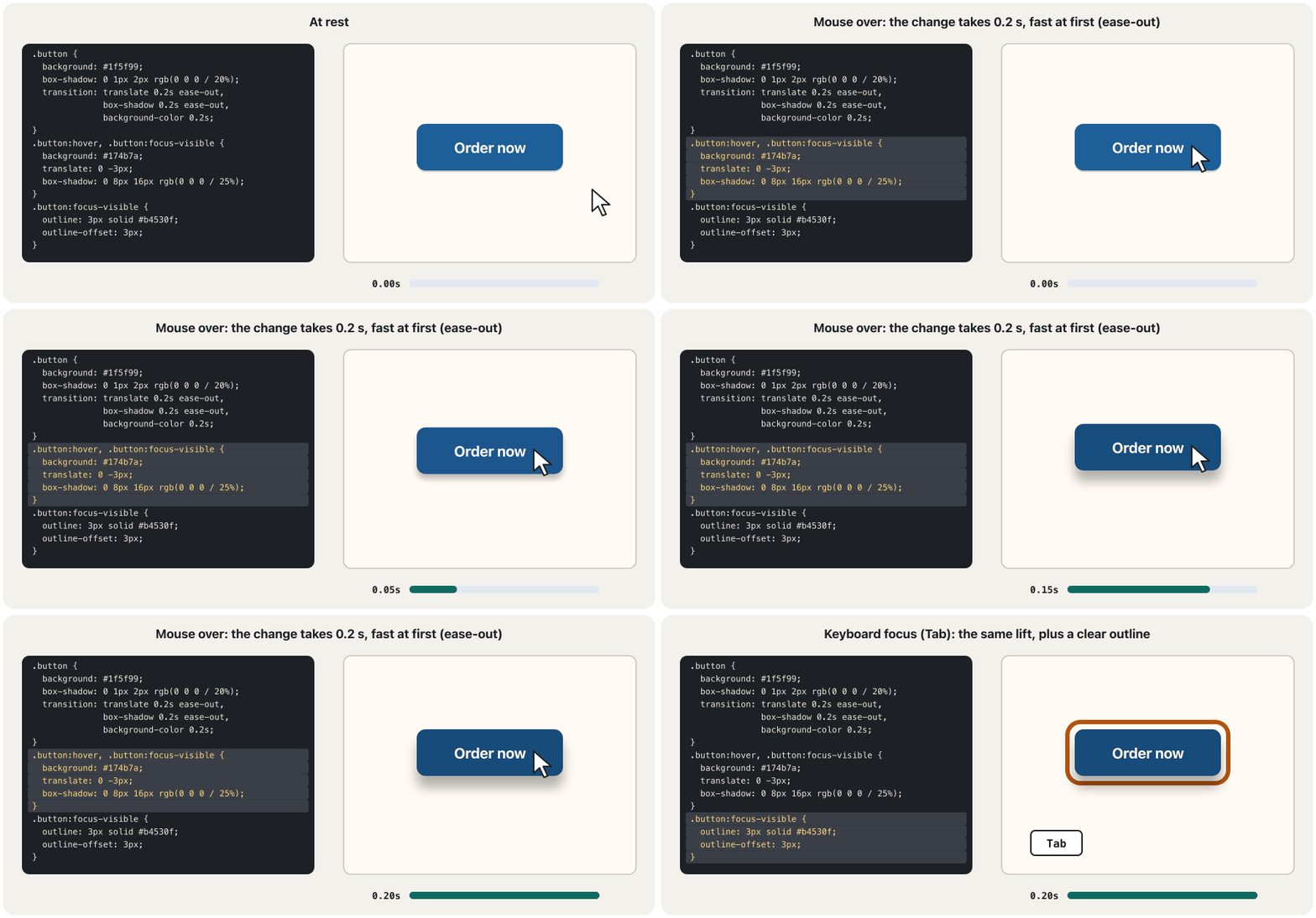
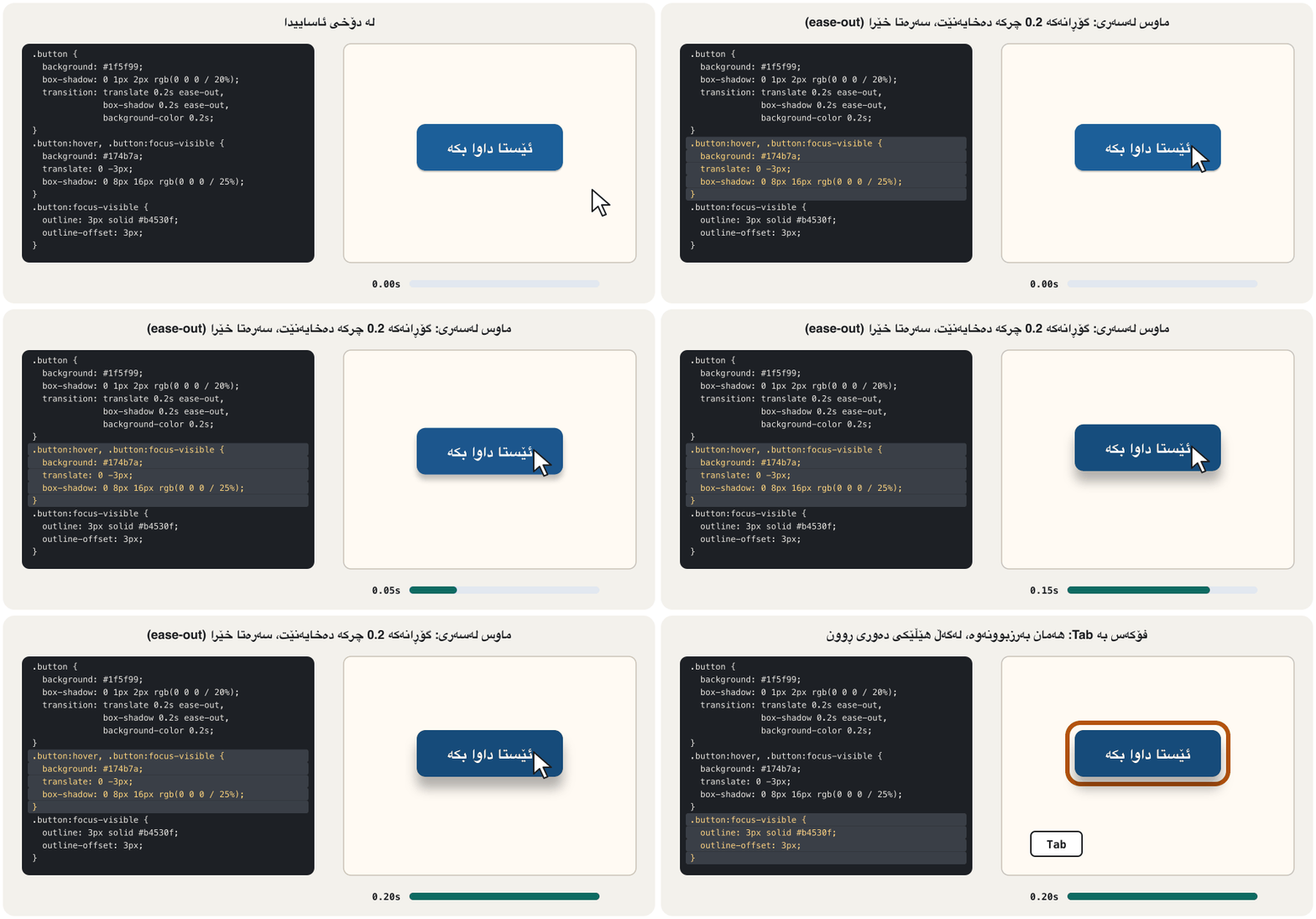
.button {
  background: #1f5f99;
  box-shadow: 0 1px 2px rgb(0 0 0 / 20%);
  transition: translate 0.2s ease-out,
              box-shadow 0.2s ease-out,
              background-color 0.2s;
}
.button:hover,
.button:focus-visible {          /* the same effect for the keyboard */
  background: #174b7a;
  translate: 0 -3px;
  box-shadow: 0 8px 16px rgb(0 0 0 / 25%);
}
.button:focus-visible {
  outline: 3px solid #b4530f;
  outline-offset: 3px;
}HTML sent to the browserئەو HTMLـەی دەنێردرێت بۆ تۆڕگەڕ
<!DOCTYPE html>
<html lang="en">
<head>
<meta charset="utf-8">
<meta name="viewport" content="width=device-width, initial-scale=1">
<title>Button transition</title>
<style>
body { font-family: system-ui, sans-serif; padding: 1rem; background: #fffaf3; color: #2b2118; }

.button {
  background: #1f5f99;
  box-shadow: 0 1px 2px rgb(0 0 0 / 20%);
  transition: translate 0.2s ease-out,
              box-shadow 0.2s ease-out,
              background-color 0.2s;
}
.button:hover,
.button:focus-visible {          /* the same effect for the keyboard */
  background: #174b7a;
  translate: 0 -3px;
  box-shadow: 0 8px 16px rgb(0 0 0 / 25%);
}
.button:focus-visible {
  outline: 3px solid #b4530f;
  outline-offset: 3px;
}

.button { display: inline-block; color: #fff; font: inherit; font-weight: 700; padding: 0.7rem 1.4rem; border: 0; border-radius: 0.6rem; cursor: pointer; margin: 1rem; }
</style>
</head>
<body>
<button class="button" type="button">Order now</button>
<p>Point at the button, or press Tab to focus it.</p>
</body>
</html>Transitions: smooth changesگۆڕانە نەرمەکان: لە دۆخێکەوە بۆ دۆخێکی تر
Timing functions: how motion feelsکردارەکانی کاتبەندی: جووڵە چۆن هەست پێدەکرێت
The rule for how fast a or an moves during its time: linear (even speed), ease-in (starts slowly), ease-out (ends slowly), ease-in-out, or your own curve with cubic-bezier() or steps with steps(). ease-out usually feels most natural for things that appear.
ئەو ڕێسایەیە کە دیاری دەکات یان لە ماوەی خۆیدا بە چ خێراییەک بجووڵێت: linear (خێرایی یەکسان)، ease-in (بە هێواشی دەست پێدەکات)، ease-out (بە هێواشی کۆتایی دێت)، ease-in-out، یان کەوانەیەکی خۆت بە cubic-bezier() یان پلە بە steps(). ease-out زۆرجار بۆ شتێک کە دەردەکەوێت سروشتیترە.
linear: the same speed all the time — good for spinners and progress, mechanical for everything else.ease(the default): a gentle start, a quick middle and a slow end.ease-out: starts fast, ends gently — feels responsive; good for things that appear or arrive.ease-in: starts slowly, ends fast — for things that leave the screen.ease-in-out: slow at both ends — for something that moves from one place to another.cubic-bezier(x1, y1, x2, y2): your own curve;easeitself iscubic-bezier(0.25, 0.1, 0.25, 1).steps(4)jumps in four steps, like a ticking clock.
linear: هەمان خێرایی هەموو کاتێک — بۆ سپینەر و پێشکەوتن باشە، بۆ هەموو شتێکی تر وەک ئامێر دەردەکەوێت.ease(بنەڕەتی): دەستپێکێکی نەرم، ناوەڕاستێکی خێرا و کۆتاییەکی هێواش.ease-out: خێرا دەست پێدەکات، بە نەرمی کۆتایی دێت — خێرا وەڵامدەرەوە دەردەکەوێت؛ بۆ شتێک کە دەردەکەوێت یان دەگات باشە.ease-in: هێواش دەست پێدەکات، خێرا کۆتایی دێت — بۆ شتێک کە شاشەکە جێدەهێڵێت.ease-in-out: لە هەردوو سەرەوە هێواش — بۆ شتێک کە لە شوێنێکەوە بۆ شوێنێکی تر دەڕوات.cubic-bezier(x1, y1, x2, y2): کەوانەی خۆت؛easeخۆیcubic-bezier(0.25, 0.1, 0.25, 1)ـە.steps(4)بە چوار هەنگاو باز دەدات، وەک کاتژمێرێکی تیکتیک.
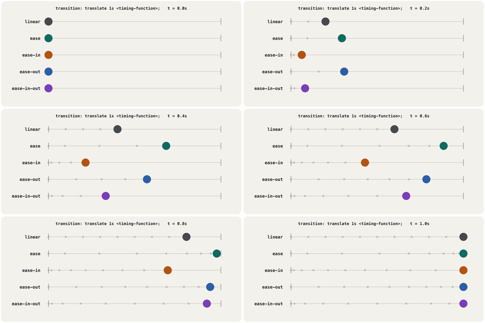
.ball { translate: 0 0; transition: translate 1s; }
.linear      { transition-timing-function: linear; }
.ease        { transition-timing-function: ease; }        /* the default */
.ease-in     { transition-timing-function: ease-in; }
.ease-out    { transition-timing-function: ease-out; }
.ease-in-out { transition-timing-function: ease-in-out; }
.race:hover .ball,
.race:focus .ball { translate: 14rem 0; }HTML sent to the browserئەو HTMLـەی دەنێردرێت بۆ تۆڕگەڕ
<!DOCTYPE html>
<html lang="en">
<head>
<meta charset="utf-8">
<meta name="viewport" content="width=device-width, initial-scale=1">
<title>Timing functions</title>
<style>
body { font-family: system-ui, sans-serif; padding: 1rem; background: #fffaf3; color: #2b2118; }

.ball { translate: 0 0; transition: translate 1s; }
.linear      { transition-timing-function: linear; }
.ease        { transition-timing-function: ease; }        /* the default */
.ease-in     { transition-timing-function: ease-in; }
.ease-out    { transition-timing-function: ease-out; }
.ease-in-out { transition-timing-function: ease-in-out; }
.race:hover .ball,
.race:focus .ball { translate: 14rem 0; }

.race { padding: 0.5rem; border: 2px dashed #9a948b; border-radius: 0.5rem; max-width: 20rem; }
.lane { display: flex; align-items: center; gap: 0.5rem; height: 2rem; font: 0.8rem ui-monospace, monospace; }
.lane span { width: 6rem; }
.ball { width: 1.2rem; height: 1.2rem; border-radius: 50%; background: #0d6b62; }
@media (prefers-reduced-motion: reduce) { .ball { transition: none; } }
</style>
</head>
<body>
<div class="race" tabindex="0">
  <div class="lane"><span>linear</span><div class="ball linear"></div></div>
  <div class="lane"><span>ease</span><div class="ball ease"></div></div>
  <div class="lane"><span>ease-in</span><div class="ball ease-in"></div></div>
  <div class="lane"><span>ease-out</span><div class="ball ease-out"></div></div>
  <div class="lane"><span>ease-in-out</span><div class="ball ease-in-out"></div></div>
</div>
<p>Point at the box (or tap it, or press Tab) to start the race.</p>
</body>
</html>What to animate: transform and opacityچی بجووڵێنیت: transform و opacity
For every frame of an animation the may redo up to four jobs: style (which rules apply), layout (where every box goes), paint (drawing the pixels) and composite (putting the painted layers together). A 60 Hz screen shows a new frame every 16.7 ms, so a frame that takes longer stutters. Changing width, height, top, left, margin or font-size forces layout again — for other boxes too. Colours and shadows need a new paint. transform and opacity usually need only the composite step, which often runs on the (web.dev).
بۆ هەر چوارچێوەیەکی ، لەوانەیە تا چوار کار سەرلەنوێ بکات: ستایل (کام ڕێسا جێبەجێ دەبن)، ڕێکخستن (هەر سندووقێک دەچێتە کوێ)، ڕەنگکردن (کێشانی ) و پێکەوەنان (پێکەوە دانانی چینە ڕەنگکراوەکان). شاشەیەکی 60 Hz هەر 16.7 ملیچرکە جارێک چوارچێوەیەکی نوێ پیشان دەدات، بۆیە چوارچێوەیەک کە زیاتر بخایەنێت دەپچڕێت. گۆڕینی width، height، top، left، margin یان font-size ڕێکخستن سەرلەنوێ ناچار دەکات — بۆ سندووقەکانی تریش. ڕەنگ و سێبەر پێویستیان بە ڕەنگکردنی نوێ هەیە. transform و opacity زۆرجار تەنیا پێویستیان بە هەنگاوی پێکەوەنان هەیە، کە زۆرجار لەسەر کار دەکات (web.dev).
- Animate
transform(ortranslate,scale,rotate) andopacity; fake a growing box withscale, a moving one withtranslate. - Avoid
transition: all: it animates every change, also ones you did not plan. Name the properties. - Avoid animating from or to
auto(for exampleheight: auto): browsers do not agree, and the result is unpredictable (MDN). The newerinterpolate-size: allow-keywordsallows it, but it is not Baseline yet (as of November 2026). will-change: transformasks for a separate layer in advance; use it only to fix a real problem, because every layer costs memory.
transform(یانtranslate،scale،rotate) وopacityبجووڵێنە؛ سندووقێکی گەورەبوو بەscaleو سندووقێکی جووڵاو بەtranslateنیشان بدە.- خۆت لە
transition: allبپارێزە: هەموو گۆڕانێک دەجووڵێنێت، ئەوانەش کە پلانت بۆ دانەناون. ناوی بنووسە. - خۆت لە جووڵاندن لە
autoـەوە یان بۆautoبپارێزە (بۆ نموونەheight: auto): لەسەری ڕێک نین و ئەنجامەکە پێشبینی ناکرێت (MDN).interpolate-size: allow-keywordsـی نوێتر ڕێگەی پێدەدات، بەڵام هێشتا نییە (تا تشرینی دووەمی 2026). will-change: transformپێشوەختە داوای چینێکی جیا دەکات؛ تەنیا بۆ چاککردنی کێشەیەکی ڕاستەقینە بەکاری بهێنە، چونکە هەر چینێک دەخوات.
/* slow: changing left makes the browser redo the layout in every frame */
.slow:hover { left: 120px; }
.slow       { position: relative; left: 0; transition: left 0.6s; }

/* fast: translate only moves the finished picture */
.fast:hover { translate: 120px 0; }
.fast { transition: translate 0.6s; }HTML sent to the browserئەو HTMLـەی دەنێردرێت بۆ تۆڕگەڕ
<!DOCTYPE html>
<html lang="en">
<head>
<meta charset="utf-8">
<meta name="viewport" content="width=device-width, initial-scale=1">
<title>Cheap animation</title>
<style>
body { font-family: system-ui, sans-serif; padding: 1rem; background: #fffaf3; color: #2b2118; }

/* slow: changing left makes the browser redo the layout in every frame */
.slow:hover { left: 120px; }
.slow       { position: relative; left: 0; transition: left 0.6s; }

/* fast: translate only moves the finished picture */
.fast:hover { translate: 120px 0; }
.fast       { transition: translate 0.6s; }

.slow, .fast { width: 9rem; padding: 0.75rem; margin: 0.75rem 0; background: #fff; border: 2px solid #0d6b62; border-radius: 0.5rem; }
@media (prefers-reduced-motion: reduce) { .slow, .fast { transition: none; } }
</style>
</head>
<body>
<div class="slow">left (slow)</div>
<div class="fast">translate (fast)</div>
</body>
</html>Animations with @keyframesئەنیمەیشنەکان بە @keyframes
A transition needs a trigger and goes between two states. An animation runs by itself — when the page loads, for example — can repeat and can have many steps. You describe the steps in @keyframes, each one a at a percentage of the time (from = 0 %, to = 100 %). The browser draws every frame in between. A missing 0 % or 100 % uses the element's own style. Then the animation property runs it: name, duration and the rest.
پێویستی بە هۆکارێکی دەستپێکردن هەیە و لە نێوان دوو دۆخدا دەڕوات. خۆی کار دەکات — بۆ نموونە کاتێک لاپەڕەکە بار دەبێت — دەتوانێت دووپاتە ببێتەوە و چەندین هەنگاوی هەبێت. هەنگاوەکان لە @keyframesـدا وەسف دەکەیت، هەریەکەیان لە ڕێژەیەکی کاتەکەدا (from = 0٪، to = 100٪). هەموو چوارچێوەکانی نێوانیان دەکێشێت. ئەگەر 0٪ یان 100٪ نەبێت، ستایلی خودی بەکاردێت. پاشان animation کاری پێدەکات: ناو، ماوە و ئەوانی تر.
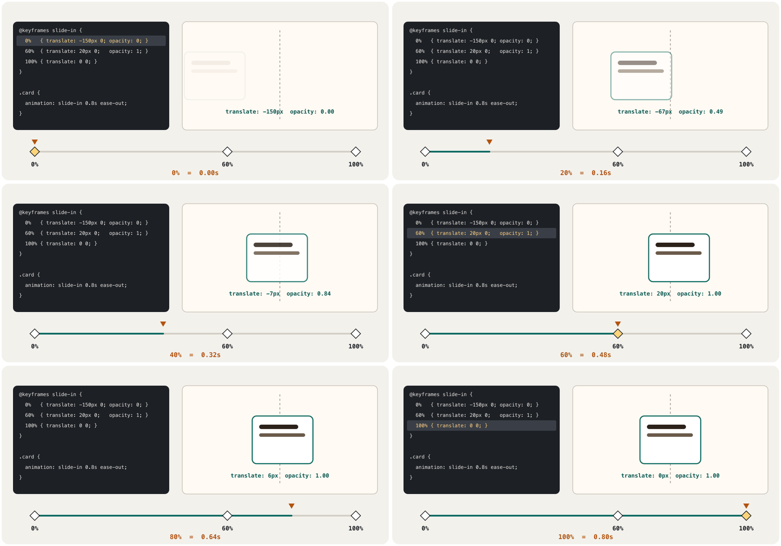
@keyframes slide-in {
  0%   { translate: -150px 0; opacity: 0; }
  60%  { translate: 20px 0;   opacity: 1; }
  100% { translate: 0 0; }
}
.card {
  animation: slide-in 0.8s ease-out;
}
@media (prefers-reduced-motion: reduce) {
  .card { animation: none; }
}HTML sent to the browserئەو HTMLـەی دەنێردرێت بۆ تۆڕگەڕ
<!DOCTYPE html>
<html lang="en">
<head>
<meta charset="utf-8">
<meta name="viewport" content="width=device-width, initial-scale=1">
<title>Keyframes</title>
<style>
body { font-family: system-ui, sans-serif; padding: 1rem; background: #fffaf3; color: #2b2118; }

@keyframes slide-in {
  0%   { translate: -150px 0; opacity: 0; }
  60%  { translate: 20px 0;   opacity: 1; }
  100% { translate: 0 0; }
}
.card {
  animation: slide-in 0.8s ease-out;
}
@media (prefers-reduced-motion: reduce) {
  .card { animation: none; }
}

.card { max-width: 16rem; padding: 1rem; background: #fff; border: 2px solid #0d6b62; border-radius: 0.6rem; }
</style>
</head>
<body>
<div class="card"><strong>Samoon</strong><br>Fresh every morning.</div>
<p>Reload the preview to see the card slide in again.</p>
</body>
</html>Animations with @keyframesئەنیمەیشنەکان بە @keyframes
The animation propertiesتایبەتمەندییەکانی animation
| Propertyتایبەتمەندی | What it setsچی دیاری دەکات | Defaultبنەڕەت |
|---|---|---|
animation-name | Which @keyframes to runکام @keyframes کار بکات | none |
animation-duration | The time of one cycleکاتی یەک خول | 0s |
animation-timing-function | The speed curve between keyframesکەوانەی خێرایی لە نێوان | ease |
animation-delay | Wait before starting (a negative value starts part-way)چاوەڕوانی پێش دەستپێکردن (نرخی نەرێنی لە ناوەڕاستەوە دەست پێدەکات) | 0s |
animation-iteration-count | How many cycles, or infiniteچەند خول، یان infinite | 1 |
animation-direction | normal, reverse, alternate (there and back), alternate-reversenormal، reverse، alternate (چوون و هاتنەوە)، alternate-reverse | normal |
animation-fill-mode | Styles before and after: forwards keeps the last keyframe, backwards, bothستایل پێش و دوای: forwards دوا دەهێڵێتەوە، backwards، both | none |
animation-play-state | running or pausedrunning یان paused | running |
The animation shorthand takes them in almost any order, with one rule to remember: the first time is the duration, the second the delay. The name must not be a keyword such as infinite or alternate.
کورتکراوەی animation نزیکەی بە هەر ڕیزبەندییەک وەریاندەگرێت، تەنیا یەک یاسا لەبیر بکە: یەکەم کات ماوەکەیە، دووەم کات دواخستنەکە. ناوەکە نابێت وشەیەکی تایبەتی وەک infinite یان alternate بێت.
Three everyday examplesسێ نموونەی ڕۆژانە
Most animations on real sites are small. Here are three, each with a reduced-motion version: a loading spinner (it turns at an even speed, so linear), a “new” badge that pulses three times and then rests, and a card that lifts on hover and when a link inside it has the focus (:focus-within).
زۆربەی لە ڕاستەقینەدا بچووکن. ئەمانە سێیانن، هەریەکە بە وەشانێکی : سپینەری بارکردن (بە خێراییەکی یەکسان دەسووڕێت، بۆیە linear)، نیشانەی «نوێ» کە سێ جار لێ دەدات و پاشان دەوەستێت، هەروەها کە بەرز دەبێتەوە لە کاتی hover و کاتێک ناوی وەردەگرێت (:focus-within).
/* 1. loading spinner */
@keyframes spin { to { rotate: 1turn; } }
.spinner {
  width: 2.5rem; height: 2.5rem; border-radius: 50%;
  border: 5px solid #e2e8f0; border-top-color: #1f5f99;
  animation: spin 1s linear infinite;
}
/* 2. a gentle "new" badge: three pulses, then it rests */
@keyframes pulse { 50% { scale: 1.08; } }
.badge { animation: pulse 2s ease-in-out 3; }

/* 3. a card that lifts on hover and on keyboard focus */
.card { transition: translate 0.2s ease-out, box-shadow 0.2s ease-out; }
.card:hover, .card:focus-within {
  translate: 0 -4px;
  box-shadow: 0 10px 20px rgb(0 0 0 / 18%);
}
@media (prefers-reduced-motion: reduce) {
  .spinner { animation-duration: 3s; }   /* slower, still shows activity */
  .badge   { animation: none; }
  .card    { transition: box-shadow 0.2s; }
  .card:hover, .card:focus-within { translate: none; }
}HTML sent to the browserئەو HTMLـەی دەنێردرێت بۆ تۆڕگەڕ
<!DOCTYPE html>
<html lang="en">
<head>
<meta charset="utf-8">
<meta name="viewport" content="width=device-width, initial-scale=1">
<title>Three examples</title>
<style>
body { font-family: system-ui, sans-serif; padding: 1rem; background: #fffaf3; color: #2b2118; }

/* 1. loading spinner */
@keyframes spin { to { rotate: 1turn; } }
.spinner {
  width: 2.5rem; height: 2.5rem; border-radius: 50%;
  border: 5px solid #e2e8f0; border-top-color: #1f5f99;
  animation: spin 1s linear infinite;
}
/* 2. a gentle "new" badge: three pulses, then it rests */
@keyframes pulse { 50% { scale: 1.08; } }
.badge { animation: pulse 2s ease-in-out 3; }

/* 3. a card that lifts on hover and on keyboard focus */
.card { transition: translate 0.2s ease-out, box-shadow 0.2s ease-out; }
.card:hover, .card:focus-within {
  translate: 0 -4px;
  box-shadow: 0 10px 20px rgb(0 0 0 / 18%);
}
@media (prefers-reduced-motion: reduce) {
  .spinner { animation-duration: 3s; }   /* slower, still shows activity */
  .badge   { animation: none; }
  .card    { transition: box-shadow 0.2s; }
  .card:hover, .card:focus-within { translate: none; }
}

.row { display: flex; gap: 2rem; align-items: center; flex-wrap: wrap; }
.badge { display: inline-block; background: #b4530f; color: #fff; font-weight: 800; padding: 0.3rem 0.9rem; border-radius: 1rem; }
.card { width: 11rem; padding: 1rem; background: #fff; border: 1px solid #c9c2b6; border-radius: 0.6rem; }
.card a { color: #1f5f99; }
</style>
</head>
<body>
<div class="row">
  <div class="spinner" role="status" aria-label="Loading"></div>
  <span class="badge">NEW</span>
  <div class="card"><strong>Kulicha</strong><br><a href="#kulicha">See the box</a></div>
</div>
</body>
</html>
Explain the codeڕوونکردنەوەی کۆدەکە
- Lineدێڕی 2
1turnis one full turn (360deg).1turnیەک سووڕانی تەواوە (360deg).- Lineدێڕی 10
3= three cycles; an endless pulse would distract.3= سێ خول؛ لێدانێکی بێکۆتا سەرنج پەرت دەکات.
Respect reduced motionڕێزگرتن لە جووڵەی کەمکراو
A setting on phones and computers for people whom moving pictures make dizzy or ill. CSS reads it with @media (prefers-reduced-motion: reduce), and a site should then turn off or soften its and .
ڕێکخستنێکی مۆبایل و کۆمپیوتەرە بۆ ئەو کەسانەی کە وێنەی جووڵاو سەریان دەسووڕێنێت یان نەخۆشیان دەکات. بە @media (prefers-reduced-motion: reduce) دەیخوێنێتەوە، پاشان دەبێت و خۆی بکوژێنێتەوە یان نەرمتریان بکات.
For some people, motion on a screen causes dizziness, nausea or headaches — for example people with disorders of the balance organ in the inner ear (vestibular disorders). They switch on Reduce motion: on iPhone in Settings → Accessibility → Motion, on Android 'Remove animations', on Windows 11 Accessibility → Visual effects → Animation effects, on a Mac Accessibility → Motion (or Display in older versions). CSS reads the setting with @media (prefers-reduced-motion: reduce), which every browser has supported since January 2020 (the is introduced in Media features).
بۆ هەندێک کەس، جووڵە لەسەر شاشە دەبێتە هۆی سەرسووڕان، دڵتێکەڵهاتن یان سەرئێشە — بۆ نموونە ئەو کەسانەی کێشەیان لە ئەندامی هاوسەنگیی ناو گوێی ناوەوەدا هەیە. ئەوان Reduce motion هەڵدەکەن: لە iPhone لە Settings → Accessibility → Motion، لە Android Remove animations، لە Windows 11 Accessibility → Visual effects → Animation effects، لە Mac Accessibility → Motion (یان Display لە وەشانە کۆنترەکاندا). ئەم ڕێکخستنە بە @media (prefers-reduced-motion: reduce) دەخوێنێتەوە، کە لە کانوونی دووەمی 2020ـەوە هەموو پشتگیریی دەکەن ( لە تایبەتمەندییەکانی میدیا ناسێنراوە).
“Reduce” does not have to mean “remove everything”: replace sliding, zooming and spinning with a short fade, slow a spinner down, and keep the content. Flutter apps read the same setting: see Loading States and Skeleton Screens.
«کەمکردنەوە» پێویست ناکات واتای «لابردنی هەموو شتێک» بێت: خلیسکان، گەورەکردن و سووڕانەوە بە کاڵبوونەوەیەکی کورت بگۆڕە، سپینەرێک هێواش بکە و ناوەڕۆکەکە بهێڵەرەوە. لە هەمان ڕێکخستن دەخوێنرێتەوە: بڕوانە دۆخەکانی بارکردن و شاشەکانی ئێسکەپەیکەر.
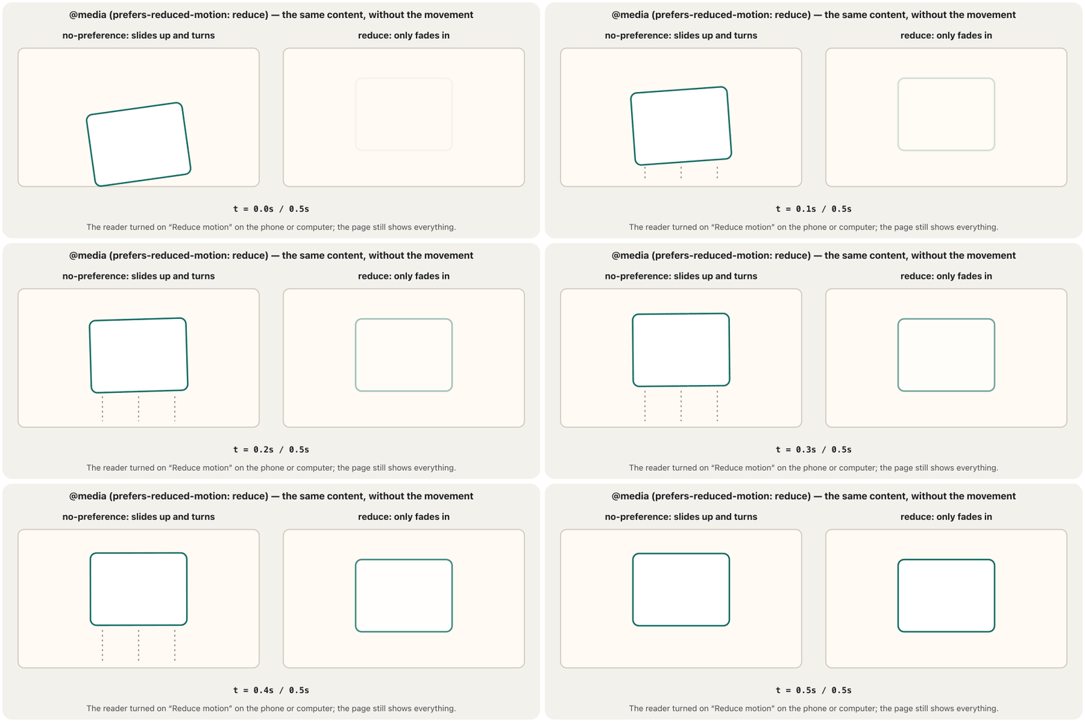
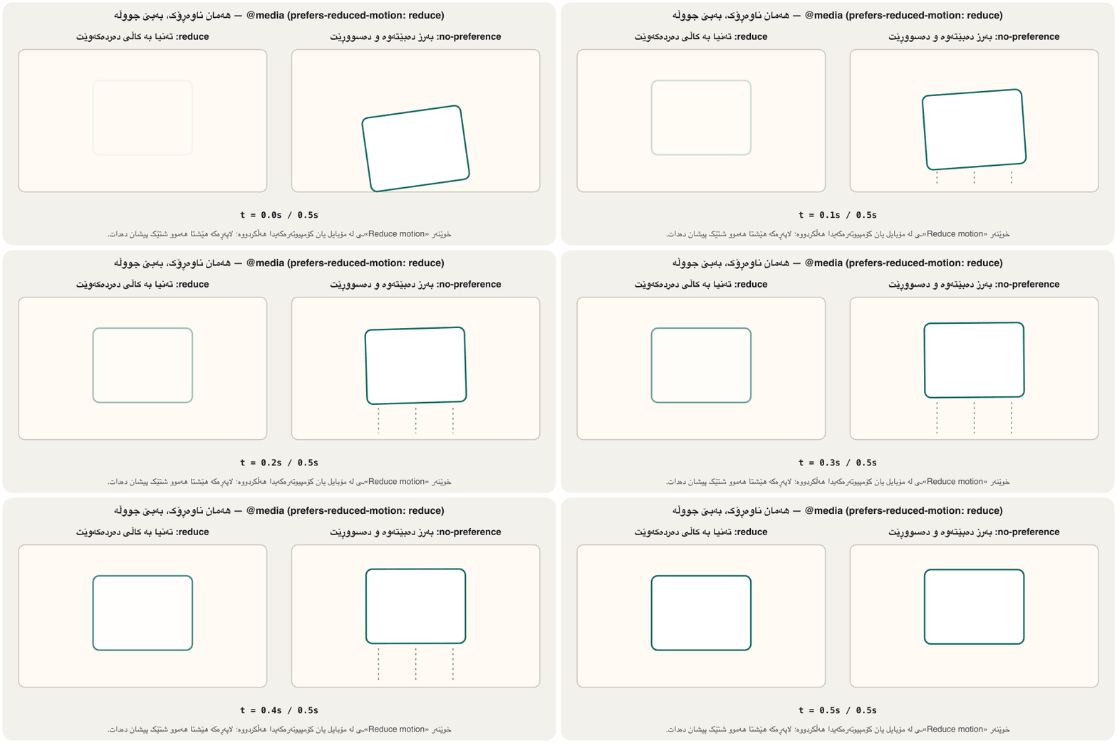
/* Pattern A: motion by default, softened when the reader asks */
.hero { animation: rise 0.6s ease-out; }
@keyframes rise { from { translate: 0 40px; opacity: 0; } }
@keyframes fade { from { opacity: 0; } }
@media (prefers-reduced-motion: reduce) {
  .hero { animation-name: fade; }        /* no movement, still a gentle fade */
}

/* Pattern B: add motion only when nobody asked for less */
@media (prefers-reduced-motion: no-preference) {
  .menu { transition: translate 0.3s ease-out; }
}HTML sent to the browserئەو HTMLـەی دەنێردرێت بۆ تۆڕگەڕ
<!DOCTYPE html>
<html lang="en">
<head>
<meta charset="utf-8">
<meta name="viewport" content="width=device-width, initial-scale=1">
<title>Reduced motion</title>
<style>
body { font-family: system-ui, sans-serif; padding: 1rem; background: #fffaf3; color: #2b2118; }

/* Pattern A: motion by default, softened when the reader asks */
.hero { animation: rise 0.6s ease-out; }
@keyframes rise { from { translate: 0 40px; opacity: 0; } }
@keyframes fade { from { opacity: 0; } }
@media (prefers-reduced-motion: reduce) {
  .hero { animation-name: fade; }        /* no movement, still a gentle fade */
}

/* Pattern B: add motion only when nobody asked for less */
@media (prefers-reduced-motion: no-preference) {
  .menu { transition: translate 0.3s ease-out; }
}

.hero { max-width: 18rem; padding: 1rem; background: #fff; border: 2px solid #0d6b62; border-radius: 0.6rem; }
</style>
</head>
<body>
<div class="hero">Fresh bread every morning</div>
<p>With Reduce motion switched on, the box only fades in.</p>
</body>
</html>
To test it, switch on Reduce motion, or open the developer tools → Rendering → Emulate CSS media feature prefers-reduced-motion: reduce.
بۆ تاقیکردنەوە، Reduce motion هەڵبکە، یان لە Rendering → Emulate CSS media feature prefers-reduced-motion: reduce هەڵبژێرە.
Respect reduced motionڕێزگرتن لە جووڵەی کەمکراو
The WCAG rules on motion and flashingیاساکانی WCAG بۆ جووڵە و درەوشانەوە
Three WCAG 2.2 rules apply to motion: 2.3.3 Animation from Interactions (AAA) — motion started by an interaction can be switched off unless it is essential; 2.2.2 Pause, Stop, Hide (A) — anything that moves, blinks or scrolls by itself for more than five seconds next to other content needs a way to pause, stop or hide it; 2.3.1 Three Flashes or Below Threshold (A) — nothing may flash more than three times in any one second (unless the flashes are very small and dim), because flashing can trigger seizures. Videos that start by themselves follow the same rules (autoplay).
سێ یاسای 2.2 بۆ جووڵە جێبەجێ دەبن: 2.3.3 جووڵە لە کارلێکەوە (AAA) — ئەو جووڵەیەی بە کارلێکێک دەست پێدەکات دەبێت بتوانرێت بکوژێنرێتەوە مەگەر پێویستییەکی بنەڕەتی بێت؛ 2.2.2 ڕاگرتن، وەستاندن، شاردنەوە (A) — هەر شتێک کە خۆی دەجووڵێت، دەترووسکێتەوە یان سکڕۆڵ دەکات بۆ زیاتر لە پێنج چرکە لە تەنیشت ناوەڕۆکی تردا، پێویستی بە ڕێگەیەک هەیە بۆ ڕاگرتن، وەستاندن یان شاردنەوەی؛ 2.3.1 سێ درەوشانەوە یان کەمتر لە سنووری مەترسی (A) — هیچ شتێک نابێت لە هیچ چرکەیەکدا زیاتر لە سێ جار بدرەوشێتەوە (مەگەر درەوشانەوەکە زۆر بچووک و کاڵ بێت)، چونکە درەوشانەوە دەتوانێت ببێتە هۆی فێ. ئەو ڤیدیۆیانەی خۆیان دەست پێدەکەن هەمان یاسا پەیڕەو دەکەن (لێدانی خۆکار).
Motion with a purposeجووڵە بە مەبەست
Good motion has a job. It gives feedback (a button reacts when you press it), shows where something comes from or goes (a menu slides out of its button, a removed item shrinks away) and draws attention once (a new message arrives). Motion that runs all the time only to decorate distracts readers and tires their eyes. It is the same rule as in a slide show: animate to explain, not to impress (Animations in PowerPoint).
جووڵەی باش ئەرکێکی هەیە. وەڵامدانەوە دەدات ( کاتێک دایدەگریت کاردانەوەی هەیە)، پیشان دەدات شتێک لە کوێوە دێت یان بۆ کوێ دەچێت ( لە دەخلیسکێتە دەرەوە، شتێکی لابراو بچووک دەبێتەوە و دەڕوات) و یەکجار سەرنج ڕادەکێشێت (پەیامێکی نوێ دەگات). ئەو جووڵەیەی هەموو کاتێک تەنیا بۆ ڕازاندنەوە کار دەکات، سەرنجی خوێنەر پەرت دەکات و چاویان ماندوو دەکات. هەمان یاسای پێشکەشکردنی سلایدە: بۆ ڕوونکردنەوە بجووڵێنە، نەک بۆ سەرسامکردن (ئەنیمەیشنەکان لە PowerPoint).
Common mistakesهەڵە باوەکان
| Mistakeهەڵە | Fixچارەسەر |
|---|---|
Effects only on :hoverکاریگەری تەنیا لەسەر :hover | Add :focus-visible (and :focus-within for cards); never hide content behind hover:focus-visible (و :focus-within بۆ ) زیاد بکە؛ هەرگیز ناوەڕۆک لە پشت hover مەشارەوە |
| Slow transitions (1–2 s) on buttons هێواش (1–2 چرکە) لەسەر | About 0.15–0.3 s for small changesنزیکەی 0.15–0.3 چرکە بۆ گۆڕانی بچووک |
transition: alltransition: all | Name the properties: transition: translate 0.2s, box-shadow 0.2sناوی بنووسە: transition: translate 0.2s, box-shadow 0.2s |
Animating width, left or marginجووڵاندنی width، left یان margin | Animate transform (translate, scale) and opacitytransform (translate، scale) و opacity بجووڵێنە |
| Endless animations بێکۆتا | A few cycles, or a pause button for anything longer than 5 s (WCAG 2.2.2)چەند خولێک، یان ڕاگرتن بۆ هەر شتێک لە 5 چرکە زیاتر ( 2.2.2) |
| Flashing or blinking fastدرەوشانەوە یان ترووسکانەوەی خێرا | Never more than three flashes in a second (WCAG 2.3.1)هەرگیز زیاتر لە سێ درەوشانەوە لە چرکەیەکدا ( 2.3.1) |
| Ignoring Reduce motionپشتگوێخستنی Reduce motion | @media (prefers-reduced-motion: reduce) with a calm version@media (prefers-reduced-motion: reduce) لەگەڵ وەشانێکی ئارام |
| The element jumps back after an animation دوای باز دەداتەوە | animation-fill-mode: forwardsanimation-fill-mode: forwards |
Exercisesڕاهێنانەکان
Style a “Send” button so that on hover and on keyboard focus it moves up 2 px, its shadow grows and its colour darkens over 0.2 s. Keyboard users must also see a clear outline.
«بنێرە» ستایل بکە بە شێوەیەک کە لە کاتی hover و 2 بەرز ببێتەوە، سێبەرەکەی گەورە ببێت و ڕەنگەکەی لە ماوەی 0.2 چرکەدا تاریکتر ببێت. بەکارهێنەرانی دەبێت هێڵێکی دەوری ڕوونیش ببینن.
Hintئاماژە
Start from the button example in this lesson.
لە نموونەی ئەم وانەیەوە دەست پێبکە.
Show answerوەڵامەکە پیشان بدە
.button {
  background: #1f5f99;
  box-shadow: 0 1px 2px rgb(0 0 0 / 20%);
  transition: translate 0.2s ease-out,
              box-shadow 0.2s ease-out,
              background-color 0.2s;
}
.button:hover,
.button:focus-visible {          /* the same effect for the keyboard */
  background: #174b7a;
  translate: 0 -2px;
  box-shadow: 0 8px 16px rgb(0 0 0 / 25%);
}
.button:focus-visible {
  outline: 3px solid #b4530f;
  outline-offset: 3px;
}
The transition sits on the normal .button rule, so it runs in both directions; :hover and :focus-visible share one rule; only cheap properties move.
لەسەر ڕێسای ئاسایی .buttonـە، بۆیە بە هەردوو ئاڕاستەدا کار دەکات؛ :hover و :focus-visible یەک ڕێسا بەش دەکەن؛ تەنیا دەجووڵێن.
Make a progress bar that fills from empty to full in 3 seconds when the page loads and stays full. Use a transform, not width. Make it fill from the right on a Kurdish page, and show the full bar at once for readers who asked for reduced motion.
شریتێکی پێشکەوتن دروست بکە کە کاتێک لاپەڕەکە بار دەبێت لە ماوەی 3 چرکەدا لە بەتاڵەوە بۆ پڕ پڕ ببێتەوە و پڕ بمێنێتەوە. بەکاربهێنە، نەک width. لە لاپەڕەی کوردیدا با لە ڕاستەوە پڕ ببێتەوە و بۆ ئەو خوێنەرانەی داوای کردووە، شریتە پڕەکە دەستبەجێ پیشان بدە.
Show answerوەڵامەکە پیشان بدە
@keyframes fill { from { scale: 0 1; } to { scale: 1 1; } }
.progress { height: 0.75rem; background: #e2e8f0; border-radius: 1rem; overflow: hidden; }
.progress-bar {
  height: 100%; background: #0d6b62;
  transform-origin: left;               /* grow from the start side */
  animation: fill 3s ease-out forwards;  /* keep the full bar at the end */
}
:dir(rtl) .progress-bar { transform-origin: right; }
@media (prefers-reduced-motion: reduce) {
  .progress-bar { animation: none; }    /* show the finished bar at once */
}HTML sent to the browserئەو HTMLـەی دەنێردرێت بۆ تۆڕگەڕ
<!DOCTYPE html>
<html lang="en">
<head>
<meta charset="utf-8">
<meta name="viewport" content="width=device-width, initial-scale=1">
<title>Progress bar</title>
<style>
body { font-family: system-ui, sans-serif; padding: 1rem; background: #fffaf3; color: #2b2118; }

@keyframes fill { from { scale: 0 1; } to { scale: 1 1; } }
.progress { height: 0.75rem; background: #e2e8f0; border-radius: 1rem; overflow: hidden; }
.progress-bar {
  height: 100%; background: #0d6b62;
  transform-origin: left;               /* grow from the start side */
  animation: fill 3s ease-out forwards;  /* keep the full bar at the end */
}
:dir(rtl) .progress-bar { transform-origin: right; }
@media (prefers-reduced-motion: reduce) {
  .progress-bar { animation: none; }    /* show the finished bar at once */
}
</style>
</head>
<body>
<div class="progress" role="progressbar" aria-label="Upload" aria-valuenow="100" aria-valuemin="0" aria-valuemax="100"><div class="progress-bar"></div></div>
</body>
</html>
scale: 0 1 → scale: 1 1 grows only the width, from the transform-origin; forwards keeps the last keyframe; :dir(rtl) moves the origin to the right on Kurdish pages.
scale: 0 1 ← scale: 1 1 تەنیا پانییەکە گەورە دەکات، لە transform-originـەوە؛ forwards دوا دەهێڵێتەوە؛ :dir(rtl) لە لاپەڕەی کوردیدا سەرچاوەکە دەباتە لای ڕاست.
What is wrong with this CSS, and how would you fix it?
چی لەم هەڵەیە و چۆن چاکی دەکەیت؟
.menu-link { transition: all 2s; }
.menu-link:hover { width: 12rem; color: red; }
.banner { animation: blink 0.2s infinite; }
@keyframes blink { 50% { opacity: 0; } }Hintئاماژە
Check speed, properties, keyboard and flashing.
خێرایی، ، و درەوشانەوە بپشکنە.
Show answerوەڵامەکە پیشان بدە
(1) transition: all 2s is far too slow and animates everything — name the properties and use about 0.2 s; (2) animating width forces layout in every frame — use translate or scale; (3) the effect is only on :hover — add :focus-visible; (4) blink 0.2s infinite flashes five times a second for ever — it breaks WCAG 2.3.1 and 2.2.2 and ignores reduced motion. A fixed version:
(١) transition: all 2s زۆر هێواشە و هەموو شتێک دەجووڵێنێت — ناوی بنووسە و نزیکەی 0.2 چرکە بەکاربهێنە؛ (٢) جووڵاندنی width لە هەموو چوارچێوەیەکدا ناچار دەکات — translate یان scale بەکاربهێنە؛ (٣) کاریگەرییەکە تەنیا لەسەر :hoverـە — :focus-visible زیاد بکە؛ (٤) blink 0.2s infinite بۆ هەمیشە چرکەی پێنج جار دەدرەوشێتەوە — 2.3.1 و 2.2.2 دەشکێنێت و پشتگوێ دەخات. وەشانێکی چاککراو:
.menu-link { transition: color 0.2s ease-out, translate 0.2s ease-out; }
.menu-link:hover,
.menu-link:focus-visible { color: #b3261e; translate: 0 -2px; }
.banner { animation: glow 2s ease-in-out 3; }   /* slow, then it stops */
@keyframes glow { 50% { box-shadow: 0 0 0 6px rgb(180 83 15 / 35%); } }
@media (prefers-reduced-motion: reduce) {
  .menu-link { transition: color 0.2s; }
  .menu-link:hover, .menu-link:focus-visible { translate: none; }
  .banner { animation: none; }
}Summaryپوختە
box-shadow: x, y, blur, spread, colour;inset; several shadows with commas.opacityfades everything, an alpha colour only one colour;filteradds photo effects.- Transforms (
translate,rotate,scale, aroundtransform-origin) change the drawing, not the layout. - Transitions: property, duration, timing function, delay — on the normal rule, triggered by
:hover,:focus-visibleor a class; about 0.2 s. - Timing functions:
ease-outfor arrivals,ease-infor exits,linearfor spinners,cubic-bezier()andsteps()for your own. - Animate transform and opacity; avoid
transition: all, layout properties andauto. - @keyframes +
animation(name, duration, timing, delay, count, direction, fill mode, play state); first time = duration. - Respect reduced motion; pause anything that moves longer than 5 s; never flash more than three times a second.
- Motion needs a purpose: feedback, orientation, attention once.
box-shadow: x، y، لێڵی، بڵاوبوونەوە، ڕەنگ؛inset؛ چەند سێبەرێک بە کۆما.opacityهەموو شتێک کاڵ دەکاتەوە، ڕەنگی ئەلفادار تەنیا یەک ڕەنگ؛filterکاریگەریی وێنە زیاد دەکات.- (
translate،rotate،scale، بە دەوریtransform-originـدا) وێنەکە دەگۆڕێت، نەک . - : تایبەتمەندی، ماوە، ، دواخستن — لەسەر ڕێسا ئاساییەکە، بە
:hover،:focus-visibleیان کلاسێک دەست پێدەکەن؛ نزیکەی 0.2 چرکە. - :
ease-outبۆ گەیشتن،ease-inبۆ دەرچوون،linearبۆ سپینەر،cubic-bezier()وsteps()بۆ ئەوەی خۆت. transformوopacityبجووڵێنە؛ خۆت لەtransition: all، ڕێکخستن وautoبپارێزە.@keyframes+animation(ناو، ماوە، کاتبەندی، دواخستن، ژمارە، ئاڕاستە، پڕکردنەوە، دۆخی کارکردن)؛ یەکەم کات = ماوە.- ڕێز لە بگرە؛ هەر شتێک کە لە 5 چرکە زیاتر دەجووڵێت ڕاگرە؛ هیچ شتێک نابێت لە چرکەیەکدا زیاتر لە سێ جار بدرەوشێتەوە.
- جووڵە پێویستی بە مەبەستە: وەڵامدانەوە، ئاڕاستەدان، یەکجار سەرنجڕاکێشان.
Lesson complete!وانەکە تەواو بوو!
Well done. Review the key terms, then go on to the next lesson.دەستخۆش. سەیرێکی زاراوە سەرەکییەکان بکەرەوە، پاشان بڕۆ بۆ وانەی داهاتوو.
Key termsزاراوە سەرەکییەکان
User Experience: Users, Wireframes and Prototypesئەزموونی بەکارهێنەر: بەکارهێنەران، وایەرفرەیمەکان و نموونە سەرەتاییەکان
Related lecturesوانە پەیوەندیدارەکان
- Colour for the Web: Palettes, Contrast and Themesڕەنگ بۆ وێب: پالێتی ڕەنگ، کۆنتراست و تێمەکان
- Design Principles: Hierarchy, Alignment, Contrast and White Spaceبنەماکانی دیزاین: پلەبەندیی بینراو، ڕێکبوون، کۆنتراست و شوێنی بەتاڵ
- Responsive Design: Viewport, Media Queries and Mobile-Firstدیزاینی ڕێسپۆنسیڤ: ناوچەی بینین، پرسەکانی میدیا و مۆبایل لە پێشدا
- Styling Text, Backgrounds, Lists and Tablesڕازاندنەوەی دەق، باکگراوند، لیست و خشتەکان
- Audio, Video and Embedded Contentدەنگ، ڤیدیۆ و ناوەڕۆکی چەسپێنراو
- Kurdish and Bilingual Websites: Right to Leftتۆڕگەکانی کوردی و دووزمانە: ڕاست بۆ چەپ
- Web Accessibility: WCAG 2.2 in Practiceدەستڕاگەیشتنی وێب: WCAG 2.2 لە کرداردا
- Decorating a Container: Border, Radius, Shadow, Transformڕازاندنەوەی Container: سنوور، گۆشەی خڕ، سێبەر، transform
- Animationsئەنیمەیشنەکان
References and further readingسەرچاوەکان و خوێندنەوەی زیاتر
- MDN: Using CSS transitions
- MDN: Using CSS animations
- MDN: prefers-reduced-motion
- web.dev: How to create high-performance CSS animations
- web.dev: Learn CSS
- web.dev: Same-document view transitions are now Baseline Newly available (2025)
- W3C: Understanding WCAG 2.2 — 2.3.3 Animation from Interactions
- W3C: Understanding WCAG 2.2 — 2.2.2 Pause, Stop, Hide
- W3C: Understanding WCAG 2.2 — 2.3.1 Three Flashes or Below Threshold
- MDN: View Transition API
This lecture is a first edition. The Kurdish text and terminology are waiting for review by Kurdish IT teachers.ئەم وانەیە چاپی یەکەمە. دەقە کوردییەکە و زاراوەکانی چاوەڕێی پێداچوونەوەی مامۆستایانی کوردی بواری IT ن.