Chapterبەش 8 · Lectureوانە 8.2
Web Design Review and Exam Practiceپێداچوونەوەی دیزاینی وێب و ڕاهێنان بۆ تاقیکردنەوە
Go back over the whole course before an exam, an interview or your own project: the course on one page, the key points of each chapter, the words and abbreviations to know, practice questions in the exam styles, a page to spot the problems in, three timed tasks with full model answers — build a page from a wireframe, fix an inaccessible form, make a fixed layout responsive — and where to go next.
پێش تاقیکردنەوە، چاوپێکەوتن یان پڕۆژەی خۆت بە سەر هەموو کۆرسەکەدا بچۆرەوە: کۆرسەکە لە یەک لاپەڕەدا، خاڵە سەرەکییەکانی هەر بەشێک، ئەو وشە و کە دەبێت بیانزانیت، پرسیاری ڕاهێنان بە شێوازەکانی تاقیکردنەوە، لاپەڕەیەک بۆ دۆزینەوەی کێشەکانی، سێ ئەرکی کاتدار بە وەڵامی نموونەیی تەواو — دروستکردنی لاپەڕەیەک لە ، چاککردنی نادەستڕاگەیشتوو، کردنی جێگیر بە ڕێسپۆنسیڤ — و دواتر بۆ کوێ بچیت.
What you will learnچی فێر دەبیت
- Recall the main ideas of all eight chapters and find the lesson that teaches each one.
- Explain the course's key terms and write out its abbreviations.
- Answer web-design questions in the exam styles.
- Find accessibility, design and layout problems on a page and say how to fix them.
- Under time pressure, build a page from a wireframe, repair an inaccessible form and make a fixed layout responsive.
- بیرۆکە سەرەکییەکانی هەر هەشت بەشەکە بهێنیتەوە بیر و ئەو وانەیە بدۆزیتەوە کە هەریەکەیان فێر دەکات.
- زاراوە سەرەکییەکانی کۆرسەکە ڕوون بکەیتەوە و بە تەواوی بنووسیت.
- وەڵامی پرسیارەکانی بە شێوازەکانی تاقیکردنەوە بدەیتەوە.
- کێشەکانی ، دیزاین و لە لاپەڕەیەکدا بدۆزیتەوە و بڵێیت چۆن چاک دەکرێن.
- لە ژێر فشاری کاتدا، لاپەڕەیەک لە دروست بکەیت، نادەستڕاگەیشتوو چاک بکەیتەوە و جێگیر بکەیت بە ڕێسپۆنسیڤ.
How to use this reviewچۆن ئەم پێداچوونەوەیە بەکاربهێنیت
This lesson goes back over all eight chapters before an exam, a job interview or your own project. For each chapter, try to recall the key points before you read them: trying to remember shows you what you really know. Follow the link of anything you miss, read that screen again, and come back another day. Then practise the exam styles and the three timed tasks.
ئەم وانەیە پێش تاقیکردنەوە، یان پڕۆژەی خۆت بە سەر هەر هەشت بەشەکەدا دەچێتەوە. بۆ هەر بەشێک، پێش خوێندنەوەی خاڵە سەرەکییەکان هەوڵ بدە بیانهێنیتەوە بیر: هەوڵدان بۆ بیرهاتنەوە پیشانت دەدات بەڕاستی چی دەزانیت. هەر شتێک کە نەتزانی بکەرەوە، ئەو شاشەیە دووپاتە بخوێنەوە و ڕۆژێکی تر بگەڕێوە. پاشان شێوازەکانی پرسیاری تاقیکردنەوە و سێ ئەرکە کاتدارەکە ڕاهێنان بکە.
How to use this reviewچۆن ئەم پێداچوونەوەیە بەکاربهێنیت
The whole course on one pageهەموو کۆرسەکە لە یەک لاپەڕەدا
| Chapterبەش | The big ideaبیرۆکە گەورەکە |
|---|---|
| 1 Start here1 لێرەوە دەست پێ بکە | HTML is the structure, CSS the presentation, JavaScript the behaviour; a site is a folder of files. پێکهاتەیە، شێوە و ڕەفتار؛ پڕ لە . |
| 2 HTML2 | Choose each element for its meaning; links, images, media and forms that work for everyone.هەر بۆ واتاکەی هەڵبژێرە؛ ، وێنە، میدیا و کە بۆ هەمووان کار بکەن. |
| 3 CSS3 | Rules, the cascade, selectors, text and type, and the box model.ڕێساکان، ، ، دەق و و . |
| 4 Layout4 | Flexbox for one direction, grid for two, mobile-first media queries, right-to-left pages.Flexbox بۆ یەک ئاڕاستە، grid بۆ دوو، ، لاپەڕەی . |
| 5 Visual design5 دیزاینی بینراو | Hierarchy, alignment, contrast, white space, colour and calm motion.، ڕێکخستن، کۆنتراست، ، ڕەنگ و جووڵەی هێمن. |
| 6 People6 مرۆڤ | Know your users, test with them, meet WCAG 2.2 and design forms people can finish.بەکارهێنەرەکانت بناسە، لەگەڵیان تاقی بکەرەوە، 2.2 جێبەجێ بکە و دیزاین بکە کە خەڵک بتوانن تەواوی بکەن. |
| 7 Live website7 زیندوو | A little JavaScript, website types, the life cycle and publishing with HTTPS.کەمێک ، جۆرەکانی ، و بە . |
| 8 Final project8 پڕۆژەی کۆتایی | Your own portfolio, planned, built, tested and published — and this review. خۆت، پلان کراو، دروستکراو، تاقیکراو و بڵاوکراو — و ئەم پێداچوونەوەیە. |
Chapter 2 — HTML: structure and contentبەشی 2 — HTML: پێکهاتە و ناوەڕۆک
Lessons: HTML Basics · Text, Images and Lists · Semantic HTML · Links and Navigation · Images for the Web · Audio, Video and Embeds · HTML Forms.
وانەکان: بنەماکانی HTML · دەق، وێنە و لیست · HTMLـی واتایی · بەستەرەکان و ڕێنیشاندان · وێنە بۆ وێب · دەنگ، ڤیدیۆ و ناوەڕۆکی چەسپاو · فۆرمەکانی HTML.
- Every page:
<!DOCTYPE html>, then<html lang>with a<head>(charset, viewport, title) and a<body>. Attributes go in the opening tag, in straight quotes. - Choose elements for their meaning: the landmarks
header,nav, onemain,aside,footer; oneh1and no skipped levels;articlestands alone,divmeans nothing. - Links: absolute, relative (
../),#fragment,mailto:andtel:; words that make sense alone;aria-current="page"in the menu; a skip link first. - Pictures:
altthat says what the picture shows (alt=""for decoration),widthandheight; SVG for logos and icons, AVIF/WebP with a JPEG fallback for photos;loading="lazy"below the first screen. - Media:
<video controls>with<source>s, captions from<track>and WebVTT, no autoplay with sound; every<iframe>has atitle. - Forms:
actionandmethod; anameon every field that is sent; a<label for>on every field; HTML5 types help, the server always checks again.
- هەموو لاپەڕەیەک:
<!DOCTYPE html>، پاشان<html lang>لەگەڵ<head>(charset، viewport، title) و<body>. دەچنە ناو کردنەوە، بە کەوانەی ڕاست. - بۆ واتاکەیان هەڵبژێرە:
header،nav، یەکmain،aside،footer؛ یەکh1و بێ بازدان بە سەر ئاستەکاندا؛articleبە تەنیا خۆی واتای هەیە،divهیچ واتایەکی نییە. - : ڕەها، ڕێژەیی (
../)،#fragment،mailto:وtel:؛ وشەی وا کە بە تەنیا واتایان هەبێت؛aria-current="page"لە ؛ لە سەرەتادا. - وێنە:
altکە دەڵێت وێنەکە چی پیشان دەدات (alt=""بۆ ڕازاندنەوە)،widthوheight؛ بۆ لۆگۆ و ، AVIF/WebP بە JPEGـێکی یەدەگ بۆ وێنەی فۆتۆ؛loading="lazy"لە خوارەوەی یەکەم شاشە. - میدیا:
<video controls>بە<source>ـەکانەوە، لە<track>و WebVTTـەوە، بێ بە دەنگەوە؛ هەموو<iframe>ـێکtitleـی هەیە. - :
actionوmethod؛nameلەسەر هەموو خانەیەک کە دەنێردرێت؛<label for>لەسەر هەموو خانەیەک؛ جۆرەکانی HTML5 یارمەتی دەدەن، هەمیشە دووپاتە دەپشکنێت.
Chapter 3 — CSS: styling pagesبەشی 3 — CSS: ڕازاندنەوەی لاپەڕەکان
Lessons: CSS Basics · Selectors · Styling Text, Backgrounds, Lists and Tables · Typography and Web Fonts · The Box Model.
وانەکان: بنەماکانی CSS · هەڵبژێرەکان · ڕازاندنەوەی دەق، باکگراوند، لیست و خشتە · تایپۆگرافی و فۆنتەکانی وێب · مۆدێلی سندووق.
- A rule is a selector and
{ property: value; }. Keep the CSS in one external file linked with<link rel="stylesheet">. - Which rule wins:
!important, then specificity (inline style > id > class > element), then the later rule. Text properties are inherited; box properties are not. - Selectors:
p,.class,#id, descendant (space) and child (>),[type="email"], states such as:hoverand:focus-visible, parts such as::before. - Colour as a name, hex,
rgb()orhsl(); text contrast at least 4.5 : 1. - Type: a font stack that ends in a generic family, a Kurdish font,
line-heightabout 1.5 for English and 1.8 for Kurdish, 45–75 characters a line, a type scale,@font-facewith WOFF2. - The box: content, padding, border, margin;
box-sizing: border-box;margin: 0 autocentres a box that has a width;displaydecides block or inline.
- ڕێسا و
{ property: value; }ـە. لە یەک دەرەکیدا هەڵبگرە کە بە<link rel="stylesheet">دەبەسترێتەوە. - کام ڕێسا دەباتەوە:
!important، پاشان (ستایلی ناو دێڕ لە id بەهێزترە، id لە class و class لە )، پاشان ڕێسای دواتر. تایبەتمەندییەکانی دەق بە دەگوازرێنەوە؛ هی سندووق نا. - :
p،.class،#id، نەوە (بۆشایی) و منداڵ (>)،[type="email"]، دۆخی وەک:hoverو:focus-visible، بەشی وەک::before. - ڕەنگ وەک ناو، hex،
rgb()یانhsl()؛ کۆنتراستی دەق لانیکەم . - : ڕیزێک کە بە خێزانێکی گشتی کۆتایی دێت، کوردی،
line-heightنزیکەی 1.5 بۆ ئینگلیزی و 1.8 بۆ کوردی، 45 تا 75 پیت لە دێڕێکدا، ،@font-faceبە WOFF2. - سندووق: ناوەڕۆک، ، ، ؛
box-sizing: border-box؛margin: 0 autoسندووقێک کە پانیی هەیە دەخاتە ناوەڕاست؛displayبڕیار دەدات block بێت یان inline.
Chapter 4 — Layout and responsive designبەشی 4 — ڕێکخستنی لاپەڕە و دیزاینی ڕێسپۆنسیڤ
Lessons: Normal Flow, Floats and Positioning · Flexbox · CSS Grid · Responsive Design · Kurdish and Bilingual Websites · Project: Building and Styling Pages.
وانەکان: ڕەوتی ئاسایی، float و شوێندانان · Flexbox · CSS Grid · دیزاینی ڕێسپۆنسیڤ · تۆڕگەکانی کوردی و دووزمانە · پڕۆژە: دروستکردن و ڕازاندنەوەی لاپەڕە.
- Normal flow first.
position: relative (moves from its own place), absolute (from the nearest positioned ancestor), fixed, sticky (needstop). Floats only for text around a picture. - Flexbox lines items up in one direction:
display: flexon the parent,justify-contentalong the main axis,align-itemsacross it,flex-wrapandgap. - Grid places items in rows and columns together:
grid-template-columnswithfrandrepeat(), numbered lines, named areas, andrepeat(auto-fit, minmax(…))without media queries. - Responsive design: the viewport meta tag, fluid widths,
max-width: 100%on media, mobile-firstmin-widthqueries with breakpoints where the content needs them; container queries for components. - Kurdish pages:
<html lang="ckb" dir="rtl">. Flexbox and grid followdir; left, right and floats do not — use logical properties. Isolate mixed text with<bdi>ordir="auto". - Test in device mode, at 400 % zoom and on a real phone.
- سەرەتا .
position: relative (لە شوێنی خۆیەوە دەجووڵێت)، absolute (لە نزیکترین باوانی شوێندانراوەوە)، fixed، sticky (topـی دەوێت). float تەنیا بۆ دەقی دەوری وێنەیەک. - Flexbox لە یەک ئاڕاستەدا ڕیز دەکات:
display: flexلەسەر باوان،justify-contentبە درێژایی ،align-itemsبە پانییدا،flex-wrapوgap. - Grid لە ڕیز و ستووندا پێکەوە دادەنێت:
grid-template-columnsبەfrوrepeat()، هێڵی ژمارەدار، ناوچەی ناونراو وrepeat(auto-fit, minmax(…))بەبێ . - : تاگی meta viewport، پانیی ڕەوان،
max-width: 100%لەسەر میدیا،min-widthـی بە لەو شوێنەی ناوەڕۆکەکە پێویستی پێیانە؛ بۆ پارچەکان. - لاپەڕەی کوردی:
<html lang="ckb" dir="rtl">. Flexbox و grid شوێنdirدەکەون؛ چەپ، ڕاست و float نا — بەکاربهێنە. دەقی تێکەڵ بە<bdi>یانdir="auto"جیا بکەرەوە. - لە دۆخی ئامێر، بە 400 % و لەسەر مۆبایلێکی ڕاستەقینە تاقی بکەرەوە.
Chapter 5 — Visual designبەشی 5 — دیزاینی بینراو
Lessons: Design Principles · Colour for the Web · Effects, Transitions and Animations.
وانەکان: بنەماکانی دیزاین · ڕەنگ بۆ وێب · کاریگەری، گۆڕانە نەرمەکان و ئەنیمەیشنەکان.
- Hierarchy: size, weight, colour, position and space decide what is seen first; one main action per screen; check it with the squint test.
- Alignment to one start line and a column grid; proximity groups what belongs together; the same job always looks the same; white space from a spacing scale.
- People scan text pages in an F and simple pages in a Z — both mirrored on Kurdish pages.
- Colour: hue, saturation, lightness; neutrals plus one accent; never colour alone; contrast = (L1 + 0.05) / (L2 + 0.05), text 4.5 : 1, large text, icons and borders 3 : 1.
- Custom properties hold the palette; a dark theme gives them new values inside
prefers-color-scheme: dark. - Motion: short transitions of
transformandopacity,@keyframesfor longer animations,prefers-reduced-motionrespected, nothing that flashes more than three times a second.
- : قەبارە، ئەستووری، ڕەنگ، شوێن و بۆشایی بڕیار دەدەن چی یەکەم دەبینرێت؛ یەک کرداری سەرەکی بۆ هەر شاشەیەک؛ بە تاقیکردنەوەی چاونووقاندن بیپشکنە.
- ڕێکخستن لەسەر یەک هێڵی سەرەتا و گریدێکی ستوونی؛ نزیکی ئەوانە کۆ دەکاتەوە کە پێکەوەن؛ هەمان ئەرک هەمیشە هەمان شێوەی هەیە؛ لە .
- خەڵک لاپەڕەی دەق بە شێوەی F و لاپەڕەی سادە بە شێوەی Z سەیر دەکەن — هەردووکیان لە لاپەڕەی کوردیدا بە ئاوێنەیی.
- ڕەنگ: ، ، ؛ ڕەنگی بێلایەن و یەک ڕەنگی جیاکەرەوە؛ هەرگیز تەنیا ڕەنگ نا؛ کۆنتراست = ، دەق ، دەقی گەورە، و .
- هەڵدەگرن؛ لە ناو
prefers-color-scheme: darkـدا نوێیان دەداتێ. - جووڵە: کورتی
transformوopacity،@keyframesبۆ درێژتر، ڕێزگرتن لەprefers-reduced-motion، هیچ شتێک کە لە چرکەیەکدا زیاتر لە سێ جار بترووسکێتەوە.
Chapter 6 — Designing for peopleبەشی 6 — دیزاین بۆ مرۆڤ
Lessons: User Experience · Web Accessibility · Designing Usable Forms.
وانەکان: ئەزموونی بەکارهێنەر · دەستڕاگەیشتنی وێب · دیزاینکردنی فۆرمەکانی ئاسان.
- UX is the whole trip of a task, UI the screens. User-centred design repeats: understand, specify, design, evaluate — with real users and their consent.
- A persona sums up the research; sketch → wireframe → mock-up → prototype; check with Nielsen's ten heuristics and test with about five users per round.
- WCAG 2.2: perceivable, operable, understandable, robust; levels A, AA and AAA, with AA the usual target.
- Native HTML first, ARIA only where HTML has no answer; everything works with the keyboard and the focus is always visible; targets at least 24 × 24 px.
- Test in layers: automated tools, the W3C Easy Checks, the keyboard, a screen reader, people.
- Forms: one column, visible labels above the fields, the right
typeandautocomplete, errors next to the field in words, buttons that say what happens.
- هەموو گەشتی کارێکە، شاشەکانە. دووپاتە دەکاتەوە: تێگەیشتن، دیاریکردن، دیزاینکردن، هەڵسەنگاندن — لەگەڵ ڕاستەقینە و .
- توێژینەوەکە کورت دەکاتەوە؛ وێنەکێشان ← ← ← ؛ بە دە پێوەرەکەی Nielsen بپشکنە و لە هەر خولێکدا لەگەڵ نزیکەی پێنج تاقی بکەرەوە.
- 2.2: هەستپێکراو، بەکارهێنراو، تێگەیشتراو، پتەو؛ ئاستەکانی A، AA و AAA، کە AA ئامانجی باوە.
- سەرەتا ڕەسەن، ARIA تەنیا لەو شوێنەی وەڵامی نییە؛ هەموو شتێک بە کار دەکات و هەمیشە دیارە؛ لانیکەم 24 × 24 px.
- چین بە چین تاقی بکەرەوە: ئامرازی خۆکار، Easy Checksـی ، ، ، خەڵک.
- : یەک ستوون، دیار لە سەرەوەی خانەکان،
typeوautocompleteـی گونجاو، لە تەنیشت خانەکە بە وشە، کە دەڵێن چی ڕوو دەدات.
Chapter 7 — From plan to live websiteبەشی 7 — لە پلانەوە تا تۆڕگە لەسەر ئینتەرنێت
Lessons: A First Look at JavaScript · Static and Dynamic Websites · The Website Development Life Cycle · Publishing Your Website.
وانەکان: یەکەم سەیرکردنی JavaScript · تۆڕگەکانی نەگۆڕ و داینامیک · سووڕی ژیانی گەشەپێدانی تۆڕگە · بڵاوکردنەوەی تۆڕگەکەت.
- JavaScript is the behaviour layer:
<script src="…" defer>,querySelector(),textContent,classListandaddEventListener(); keep ARIA in step; the page works with HTML alone first (progressive enhancement). - Static pages are sent as they are; dynamic pages are built on the server (PHP) or changed in the browser (JavaScript,
fetch()). - Websites by purpose: portals, information, business, e-commerce, educational, blogs, portfolios… A blog is a website; a CMS is the software behind it.
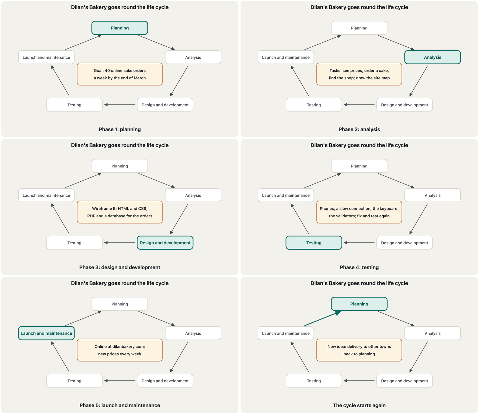
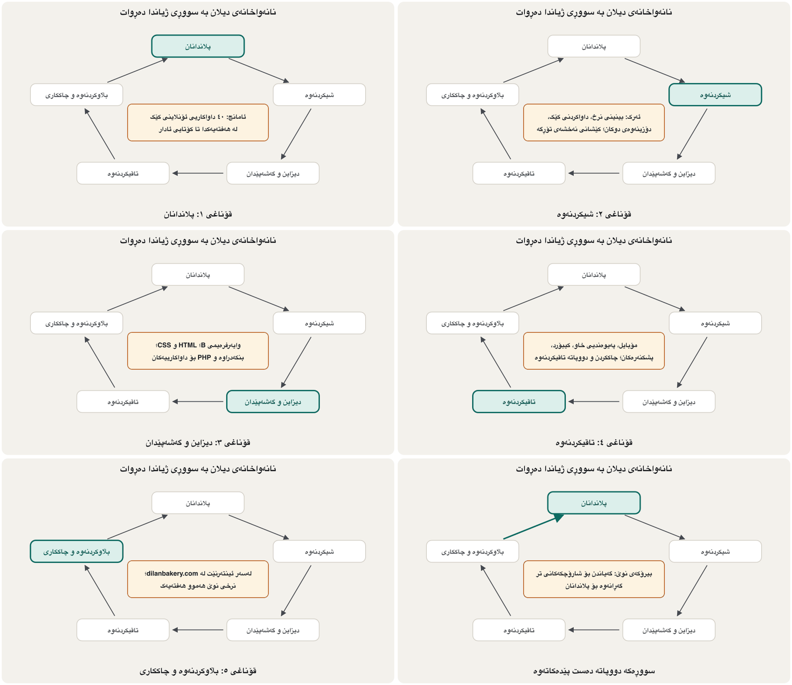
- The life cycle is a loop: planning, analysis, design and development, testing, launch and maintenance.
- Publishing: static hosting for HTML, CSS and JavaScript, PHP hosting for PHP; a domain from a registrar, pointed with DNS records; free HTTPS; then test the live address.
- چینی ڕەفتارە:
<script src="…" defer>،querySelector()،textContent،classListوaddEventListener()؛ ARIA هاوکات بهێڵەوە؛ لاپەڕەکە سەرەتا تەنیا بە کار دەکات (). - وەک خۆیان دەنێردرێن؛ لەسەر دروست دەکرێن () یان لە دەگۆڕێن (،
fetch()). - بەپێی ئامانج: دەروازە، زانیاری، بازرگانی، ، پەروەردەیی، ، … ؛ ئەو کە لە پشتییەتی.
- سووڕێکە: پلاندانان، شیکردنەوە، دیزاین و گەشەپێدان، تاقیکردنەوە، دەستپێکردن و چاککردنەوە.
- : بۆ ، و ، بۆ ؛ لە ، کە بە ئاڕاستە دەکرێت؛ بێبەرانبەر؛ پاشان ناونیشانە زیندووەکە تاقی بکەرەوە.
Words and abbreviations to knowوشە و کورتکراوەکان کە دەبێت بیانزانیت
The key terms of the course — tap one to see its definition and its Kurdish name. Exams often ask for them, and so do job interviews.
زاراوە سەرەکییەکانی کۆرسەکە — دەست لە یەکێکیان بدە بۆ بینینی پێناسە و ناوە کوردییەکەی. تاقیکردنەوەکان زۆرجار دەیانپرسن، .
Write the full words for HTML, CSS, JS, DOM, SVG, WCAG, UX, UI, RWD, DNS, URL and HTTPS, and say in a few words what each one is. The PHP and SQL abbreviations are drilled in Words that are easy to get wrong.
وشە تەواوەکان بنووسە بۆ HTML، CSS، JS، DOM، SVG، WCAG، UX، UI، RWD، DNS، URL و HTTPS و بە چەند وشەیەک بڵێ هەریەکەیان چییە. و SQL لە ئەو وشانەی بە ئاسانی هەڵەیان تێدا دەکرێت ڕاهێنانیان پێ دەکرێت.
Show answerوەڵامەکە پیشان بدە
| Lettersپیتەکان | Full wordsوشە تەواوەکان | In a few wordsبە چەند وشەیەک |
|---|---|---|
HTML | HyperText Markup Language | the structure of a page بۆ پێکهاتەی لاپەڕە |
CSS | Cascading Style Sheets | the look of a page; C is the cascadeشێوەی لاپەڕەکان؛ C بۆ |
JS | JavaScript | the behaviour layer in the browserزمانی ڕەفتار لە ناو |
DOM | Document Object Model | the page as a tree that JavaScript changesلاپەڕەکە وەک دارێک کە دەیگۆڕێت |
SVG | Scalable Vector Graphics | vector pictures that scale without blur کە بێ تێکچوون گەورە دەبێت |
WCAG | Web Content Accessibility Guidelines | the W3C's web accessibility guidelinesڕێنماییەکانی |
UX | User Experience | the whole trip of a task: هەموو گەشتەکە |
UI | User Interface | the screens and controls: شاشە و |
RWD | Responsive Web Design | one page for every screen: یەک لاپەڕە بۆ هەموو شاشەیەک |
DNS | Domain Name System | turns a domain name into an IP address دەکات بە |
URL | Uniform Resource Locator | the full address of a pageناونیشانی تەواوی لاپەڕەیەک |
HTTPS | HyperText Transfer Protocol Secure | HTTP made private with a certificate پارێزراو بە |
How exams ask: practice questionsتاقیکردنەوەکان چۆن دەپرسن: پرسیاری ڕاهێنان
Web exams ask in nine styles, and each wants a different kind of answer (How web exams ask: nine question styles). Seven of them are practised here, each with one web-design question. Answer on paper first, then open the model answer.
تاقیکردنەوەکانی وێب بە نۆ شێواز دەپرسن و هەریەکەیان جۆرێکی جیاوازی وەڵامی دەوێت (تاقیکردنەوەکانی وێب چۆن دەپرسن: نۆ شێوازی پرسیار). لێرەدا حەوت لەو شێوازانە هەن، هەریەکەیان بە یەک پرسیاری . سەرەتا لەسەر کاغەز وەڵام بدەرەوە، پاشان وەڵامە نموونەییەکە بکەرەوە.
Define semantic HTML and give one example.
پێناسە بکە و نموونەیەک بهێنەوە.
Show answerوەڵامەکە پیشان بدە
Semantic HTML means choosing each element for what the content is, not for how it looks, so that browsers, screen readers and search engines understand the page. Example: <nav> for the menu instead of <div class="menu">, and <h2> for a heading instead of bold text (Why semantic HTML?).
واتە هەڵبژاردنی هەر بۆ ئەوەی ناوەڕۆکەکە چییە، نەک بۆ شێوەکەی، بۆ ئەوەی ، و لە لاپەڕەکە تێبگەن. نموونە: <nav> بۆ لە بری <div class="menu"> و <h2> بۆ لە بری دەقی ئەستوور (بۆچی HTMLـی واتایی؟).
Why do many designers build mobile-first? Give two reasons.
بۆچی زۆر دیزاینەر بە شێوازی دروست دەکەن؟ دوو هۆکار بهێنەوە.
Show answerوەڵامەکە پیشان بدە
- The narrow screen forces you to decide what matters most, so the content comes first and the page stays simple.
- The base CSS is short and works on every phone;
min-widthmedia queries only add columns and details as the screen grows, which is easier than taking a wide layout apart. - Most visitors use phones, often on slow mobile data (Mobile-first).
- شاشەی تەسک ناچارت دەکات بڕیار بدەیت چی لە هەمووی گرنگترە، بۆیە ناوەڕۆک یەکەم دێت و لاپەڕەکە سادە دەمێنێتەوە.
- بنەڕەتی کورتە و لەسەر هەموو مۆبایلێک کار دەکات؛
min-widthتەنیا ستوون و وردەکاری زیاد دەکەن کاتێک شاشەکە گەورە دەبێت، کە لە هەڵوەشاندنەوەی پان ئاسانترە. - زۆربەی سەردانیکەران مۆبایل بەکار دەهێنن، زۆرجار بە دراوەی مۆبایلی هێواش (مۆبایل لە پێشدا).
Compare flexbox and grid.
flexbox و grid بەراورد بکە.
Show answerوەڵامەکە پیشان بدە
| Pointخاڵ | FlexboxFlexbox (یەک ئاڕاستە) | GridGrid (دوو ئاڕاستە) |
|---|---|---|
| Directionsئاڕاستەکان | One: a row or a columnیەک: ڕیزێک یان ستوونێک | Two: rows and columns togetherدوو: ڕیز و ستوون پێکەوە |
| Sizes come fromقەبارەکان لەوێوە دێن | The items' contentناوەڕۆکی | The tracks of the containerڕێچکەکانی کۆنتەینەرەکە |
| Lines up across rowsلە نێوان ڕیزەکاندا ڕێک دەبێت | No: each line is on its ownنا: هەر دێڕێک بە تەنیا خۆیەتی | Yes: the columns line upبەڵێ: ستوونەکان ڕێک دێن |
| Typical jobsکاری باو | Menu bars, button rows, the inside of a cardشریتی ، ڕیزی ، ناوەوەی | Page layouts, galleries, forms with a label column، گەلەری، بە ستوونێکی |
| Key propertiesتایبەتمەندییە سەرەکییەکان | justify-content, align-items, flex-wrap, gapjustify-content، align-items، flex-wrap، gap | grid-template-columns, fr, grid-template-areas, gapgrid-template-columns، fr، grid-template-areas، gap |
Both follow dir="rtl", and most pages use both: grid for the page, flexbox inside its parts (Grid or flexbox?).
هەردووکیان شوێن dir="rtl" دەکەون و زۆربەی لاپەڕەکان هەردووکیان بەکار دەهێنن: grid بۆ لاپەڕەکە، flexbox لە ناو بەشەکانیدا (Grid یان flexbox؟).
How exams ask: practice questionsتاقیکردنەوەکان چۆن دەپرسن: پرسیاری ڕاهێنان
Style 4: abbreviationsشێوازی 4: کورتکراوەکان
What do WCAG, RWD and SVG stand for?
WCAG، RWD و SVG کورتکراوەی چین؟
Show answerوەڵامەکە پیشان بدە
- WCAG: Web Content Accessibility Guidelines
- RWD: Responsive Web Design
- SVG: Scalable Vector Graphics
- WCAG: Web Content Accessibility Guidelines (ڕێنماییەکانی )
- RWD: Responsive Web Design ()
- SVG: Scalable Vector Graphics ()
Spell every word exactly; the full list is in the abbreviation drill.
هەموو وشەیەک بە وردی بنووسە؛ لیستە تەواوەکە لە ڕاهێنانی کورتکراوەکاندایە.
How exams ask: practice questionsتاقیکردنەوەکان چۆن دەپرسن: پرسیاری ڕاهێنان
Styles 7–9: true or false, match, write codeشێوازەکانی 7 تا 9: ڕاست یان هەڵە، بەیەکەوەبەستن، نووسینی کۆد
(a) A placeholder can replace a label. (b) alt="" is right for a picture that is only decoration. (c) Flexbox follows dir="rtl", but float: left does not. (d) GitHub Pages can run a PHP contact form.
(أ) placeholder دەتوانێت جێگەی بگرێتەوە. (ب) alt="" بۆ وێنەیەک کە تەنیا ڕازاندنەوەیە دروستە. (ج) Flexbox شوێن dir="rtl" دەکەوێت، بەڵام float: left نا. (د) GitHub Pages دەتوانێت پەیوەندیی کار پێبکات.
Show answerوەڵامەکە پیشان بدە
- (a) False: a placeholder disappears as soon as people type; every field needs a visible label (Labels, not placeholders).
- (b) True: an empty alt tells screen readers to skip the picture (Alt text).
- (c) True: flex and grid follow the direction; floats and left/right stay where they are (What flips by itself).
- (d) False: GitHub Pages only sends ready files; a form that saves data needs PHP hosting (Static hosting or PHP hosting?).
- (أ) هەڵە: placeholder هەر کە خەڵک دەست بە نووسین دەکەن ون دەبێت؛ هەموو خانەیەک دیاری پێویستە (لەیبڵ، نەک placeholder).
- (ب) ڕاست: altـی بەتاڵ بە دەڵێت بە سەر وێنەکەدا تێپەڕن (دەقی جێگرەوە).
- (ج) ڕاست: flex و grid شوێن ئاڕاستەکە دەکەون؛ float و چەپ/ڕاست لە شوێنی خۆیان دەمێننەوە (ئەوەی خۆی وەردەگەڕێت).
- (د) هەڵە: GitHub Pages تەنیا ئامادە دەنێرێت؛ کە پاشەکەوت دەکات پێویستی بە هەیە (هۆستینگی لاپەڕەتۆڕی نەگۆڕ یان هۆستینگی PHP؟).
Match each term with its meaning: 1 viewport, 2 breakpoint, 3 landmark, 4 custom property, 5 static hosting. a) a big region of a page, such as nav or main; b) the width at which the layout changes; c) a value you name with -- and read with var(); d) the part of the page you can see in the browser window; e) hosting that sends ready files exactly as they are.
هەر زاراوەیەک بە واتاکەیەوە ببەستەوە: 1 ، 2 ، 3 ، 4 ، 5 . أ) ناوچەیەکی گەورەی لاپەڕە، وەک nav یان main؛ ب) ئەو پانییەی تێدا دەگۆڕێت؛ ج) کە بە -- ناوی لێ دەنێیت و بە var() دەیخوێنیتەوە؛ د) ئەو بەشەی لاپەڕەکە کە لە پەنجەرەی دەیبینیت؛ ه) کە ئامادە ڕێک وەک خۆیان دەنێرێت.
Show answerوەڵامەکە پیشان بدە
1 → d, 2 → b, 3 → a, 4 → c, 5 → e.
1 ← د، 2 ← ب، 3 ← أ، 4 ← ج، 5 ← ه.
Write the HTML and CSS for three cards that sit in one column on a phone and side by side when there is room, with 1.5rem between them — without a media query.
و بنووسە بۆ سێ کە لەسەر مۆبایل لە یەک ستووندا بن و کاتێک شوێن هەبێت لە تەنیشت یەکتر، بە 1.5rem لە نێوانیاندا — بێ .
Show answerوەڵامەکە پیشان بدە
<div class="cards">
  <article class="card">
    <h3>Flexbox</h3>
    <p>Boxes in one row or one column.</p>
  </article>
  <article class="card">
    <h3>Grid</h3>
    <p>Rows and columns together.</p>
  </article>
  <article class="card">
    <h3>Media queries</h3>
    <p>CSS that applies from a width.</p>
  </article>
</div>.cards {
display: grid;
grid-template-columns: repeat(auto-fit, minmax(14rem, 1fr));
gap: 1.5rem;
}
.card {
padding: 1rem;
border: 1px solid #d3cfc6;
border-radius: 0.75rem;
}HTML sent to the browserئەو HTMLـەی دەنێردرێت بۆ تۆڕگەڕ
<!DOCTYPE html>
<html lang="en">
<head>
<meta charset="utf-8">
<meta name="viewport" content="width=device-width, initial-scale=1">
<title>Three responsive cards</title>
<style>
body { margin: 1rem; font-family: system-ui, sans-serif; line-height: 1.5; }
h3 { margin-block: 0 0.25rem; }
p { margin: 0; }
.cards {
  display: grid;
  grid-template-columns: repeat(auto-fit, minmax(14rem, 1fr));
  gap: 1.5rem;
}

.card {
  padding: 1rem;
  border: 1px solid #d3cfc6;
  border-radius: 0.75rem;
}
</style>
</head>
<body>
<div class="cards">
<article class="card">
<h3>Flexbox</h3>
<p>Boxes in one row or one column.</p>
</article>
<article class="card">
<h3>Grid</h3>
<p>Rows and columns together.</p>
</article>
<article class="card">
<h3>Media queries</h3>
<p>CSS that applies from a width.</p>
</article>
</div>
</body>
</html>Each card is at least 14rem wide; when three no longer fit, they wrap — no media query needed.
هەر لانیکەم 14rem پانە؛ کاتێک سێیان جێیان نابێتەوە، دەچنە ڕیزی دواتر — هیچ پێویست نییە.
Marks go to: article for each card, display: grid, repeat(auto-fit, minmax(…, 1fr)), gap, and straight quotes everywhere.
نمرە دەدرێت بۆ: article بۆ هەر ، display: grid، repeat(auto-fit, minmax(…, 1fr))، gap و کەوانەی ڕاست لە هەموو شوێنێک.
Spot the problemsکێشەکان بدۆزەرەوە
This café page breaks rules from almost every chapter. Find eight problems — and say how to fix each one — before you open the answer.
ئەم لاپەڕەی چایخانەیە ڕێساکانی نزیکەی هەموو بەشێک دەشکێنێت. پێش کردنەوەی وەڵامەکە هەشت کێشە بدۆزەرەوە — و بڵێ هەریەکەیان چۆن چاک دەکرێت.
List the problems you can see and how you would fix each one.
ئەو کێشانەی دەیانبینیت بنووسە و بڵێ هەریەکەیان چۆن چاک دەکەیت.
Show answerوەڵامەکە پیشان بدە
- Grey text on white (about 1.7 : 1): use dark text, at least 4.5 : 1 (The contrast ratio).
- White heading on a busy photo: put the text on a calm area or a solid panel behind it (Contrast for icons, borders and focus).
- A long paragraph centred: align body text to the start (Alignment).
- "Click here" links: write words that say where the link goes (Link text that makes sense alone).
- Placeholders instead of labels: a visible label above every field (Labels, not placeholders).
- An error shown only by a red border: add words that say what is wrong and how to fix it (Error messages that help).
- Tiny buttons close together: targets at least 24 × 24 px, better 44–48 px (Targets big enough to hit).
- The page is cut off on the phone: a fixed width with no viewport tag; use fluid widths and mobile-first media queries (Responsive design).
- دەقی خۆڵەمێشی لەسەر سپی (نزیکەی ): دەقی تاریک بەکاربهێنە، لانیکەم (ڕێژەی کۆنتراست).
- سپی لەسەر وێنەیەکی قەرەباڵغ: دەقەکە بخە سەر شوێنێکی هێمن یان پانێڵێکی یەکڕەنگ لە پشتییەوە (کۆنتراست بۆ ئایکۆن، سنوور و فۆکەس).
- بڕگەیەکی درێژ لە ناوەڕاستدا: دەقی سەرەکی بەرەو سەرەتا ڕێک بخە (ڕێکخستن).
- «لێرە کرتە بکە»: وشەی وا بنووسە کە بڵێن بۆ کوێ دەچێت (دەقی بەستەر کە بە تەنیا واتای هەبێت).
- placeholder لە بری : دیار لە سەرەوەی هەموو خانەیەک (لەیبڵ، نەک placeholder).
- هەڵەیەک کە تەنیا بە سوور پیشان دراوە: وشە زیاد بکە کە بڵێن چی هەڵەیە و چۆن چاک دەکرێت (هەڵەنامەکان کە یارمەتی دەدەن).
- زۆر بچووک لە نزیک یەکتر: لانیکەم 24 × 24 px، باشتر 44 تا 48 px (ناوچەکانی دەستلێدان هێندە گەورە کە لێیان بدرێت).
- لاپەڕەکە لەسەر مۆبایل بڕاوە: پانییەکی جێگیر بێ تاگی viewport؛ پانیی ڕەوان و بەکاربهێنە (دیزاینی ڕێسپۆنسیڤ).
Did you also see the pale OK button? White on #99cccc is only 1.77 : 1, and "OK" does not say what happens (Buttons that say what happens). Two more problems never show in a picture: check the HTML in the Nu checker and press Tab through the page — a picture cannot show a missing alt or a hidden focus.
OKـی کاڵیشت بینی؟ سپی لەسەر #99cccc تەنیا ـە و «OK» ناڵێت چی ڕوو دەدات (دوگمەکان کە دەڵێن چی ڕوو دەدات). دوو کێشەی تر هەرگیز لە وێنەدا دەرناکەون: لە پشکنەری Nuـدا بپشکنە و بە Tab بە لاپەڕەکەدا بڕۆ — وێنە ناتوانێت altـی ونبوو یان شاراوە پیشان بدات.
Timed task 1: from a wireframe to a page (30 minutes)ئەرکی کاتداری 1: لە وایەرفرەیمەوە بۆ لاپەڕە (30 خولەک)
Three tasks with a time limit. Set a timer, work without the lessons, then compare with the model answer — yours can look different and still be right. In task 1 you turn a wireframe into a finished page.
سێ ئەرک بە کاتی دیاریکراو. کاتژمێرێک دابنێ، بەبێ وانەکان کار بکە، پاشان لەگەڵ وەڵامە نموونەییەکە بەراوردی بکە — هی تۆ دەشێت جیاواز دەربکەوێت و هێشتا دروست بێت. لە ئەرکی 1ـدا دەکەیت بە لاپەڕەیەکی تەواو.
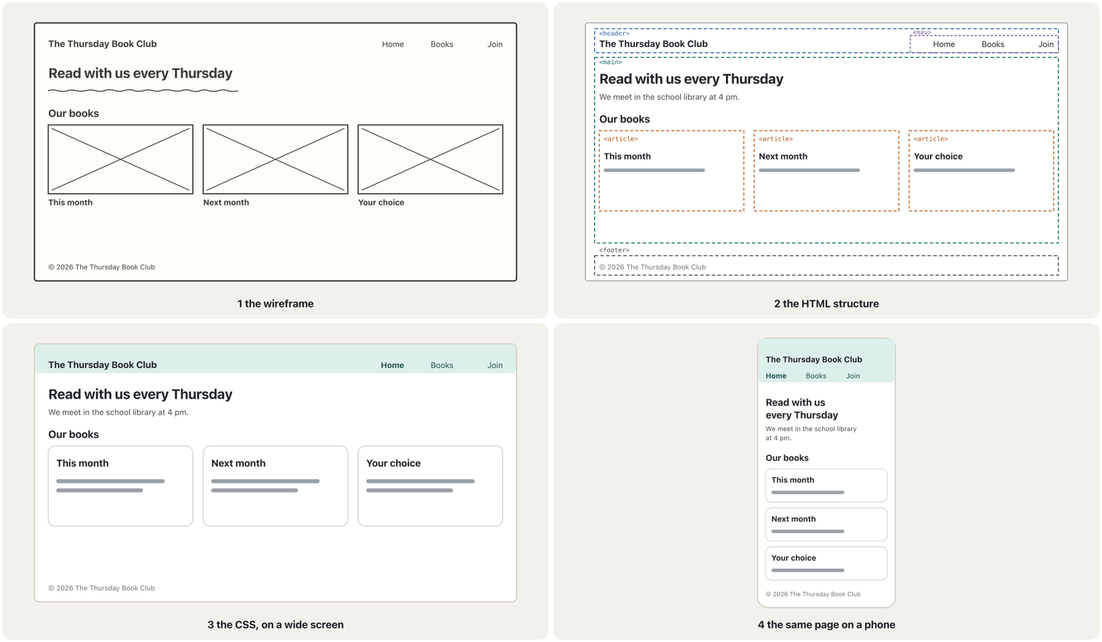
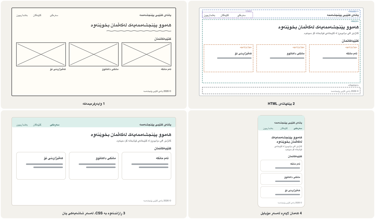
Build the page of the wireframe for "The Thursday Book Club": a header with the name and a menu (Home, Books, Join); a main area with a heading, one sentence and three book cards; a footer. One column on phones, three cards in a row from 48em. Use semantic elements and mark the current page in the menu.
لاپەڕەی بۆ «The Thursday Book Club» دروست بکە: بە ناوەکە و (Home، Books، Join)؛ ناوچەیەکی سەرەکی بە ، یەک ڕستە و سێ کتێب؛ . لەسەر مۆبایل یەک ستوون، لە 48emـەوە سێ لە ڕیزێکدا. واتایی بەکاربهێنە و لاپەڕەی ئێستا لە نیشانە بکە.
Show answerوەڵامەکە پیشان بدە
<!DOCTYPE html>
<html lang="en">
<head>
  <meta charset="utf-8">
  <meta name="viewport" content="width=device-width, initial-scale=1">
  <title>The Thursday Book Club</title>
  <link rel="stylesheet" href="style.css">
</head>
<body>
  <header class="site-header">
    <p class="logo">The Thursday Book Club</p>
    <nav aria-label="Main">
      <ul>
        <li><a href="index.html" aria-current="page">Home</a></li>
        <li><a href="books.html">Books</a></li>
        <li><a href="join.html">Join</a></li>
      </ul>
    </nav>
  </header>
  <main>
    <h1>Read with us every Thursday</h1>
    <p>We meet in the school library at 4 pm and talk about one book a month.</p>
    <section>
      <h2>Our books</h2>
      <div class="cards">
        <article class="card">
          <h3>This month</h3>
          <p>A short novel about a family in a mountain village.</p>
        </article>
        <article class="card">
          <h3>Next month</h3>
          <p>Poems by young writers from our city.</p>
        </article>
        <article class="card">
          <h3>Your choice</h3>
          <p>Vote for the book we read in the spring.</p>
        </article>
      </div>
    </section>
  </main>
  <footer>
    <p>© 2026 The Thursday Book Club</p>
  </footer>
</body>
</html>
Explain the codeڕوونکردنەوەی کۆدەکە
- Lineدێڕی 9-18
header and nav: the menu is a list, with aria-current on Home.
header و nav: لیستێکە، بە aria-current لەسەر Home.
- Lineدێڕی 19-40
One main, one h1, a section with a heading and three articles.
یەک main، یەک h1، sectionـێک بە و سێ article.
* {
  box-sizing: border-box;
}

body {
  margin: 0;
  font-family: system-ui, sans-serif;
  line-height: 1.6;
  color: #1f2328;
}

.site-header,
main,
footer {
  padding-inline: 1rem;
}

.site-header {
  display: flex;
  flex-wrap: wrap;
  align-items: center;
  justify-content: space-between;
  gap: 0.5rem 1.5rem;
  padding-block: 0.75rem;
  background-color: #dcefeb;
}

.logo {
  margin: 0;
  font-weight: 700;
}

nav ul {
  display: flex;
  gap: 1rem;
  margin: 0;
  padding: 0;
  list-style: none;
}

nav a {
  color: #0a5a52;
}

nav a[aria-current="page"] {
  font-weight: 700;
}

.cards {
  display: grid;
  gap: 1rem;
}

.card {
  padding: 1rem;
  border: 1px solid #d3cfc6;
  border-radius: 0.75rem;
}

@media (width >= 48em) {
  .cards {
    grid-template-columns: repeat(3, 1fr);
  }
}HTML sent to the browserئەو HTMLـەی دەنێردرێت بۆ تۆڕگەڕ
<!DOCTYPE html>
<html lang="en">
<head>
<meta charset="utf-8">
<meta name="viewport" content="width=device-width, initial-scale=1">
<title>The Thursday Book Club</title>
<style>
* {
  box-sizing: border-box;
}

body {
  margin: 0;
  font-family: system-ui, sans-serif;
  line-height: 1.6;
  color: #1f2328;
}

.site-header,
main,
footer {
  padding-inline: 1rem;
}

.site-header {
  display: flex;
  flex-wrap: wrap;
  align-items: center;
  justify-content: space-between;
  gap: 0.5rem 1.5rem;
  padding-block: 0.75rem;
  background-color: #dcefeb;
}

.logo {
  margin: 0;
  font-weight: 700;
}

nav ul {
  display: flex;
  gap: 1rem;
  margin: 0;
  padding: 0;
  list-style: none;
}

nav a {
  color: #0a5a52;
}

nav a[aria-current="page"] {
  font-weight: 700;
}

.cards {
  display: grid;
  gap: 1rem;
}

.card {
  padding: 1rem;
  border: 1px solid #d3cfc6;
  border-radius: 0.75rem;
}

@media (width >= 48em) {
  .cards {
    grid-template-columns: repeat(3, 1fr);
  }
}
</style>
</head>
<body>
<header class="site-header">
    <p class="logo">The Thursday Book Club</p>
    <nav aria-label="Main">
      <ul>
        <li><a href="index.html" aria-current="page">Home</a></li>
        <li><a href="books.html">Books</a></li>
        <li><a href="join.html">Join</a></li>
      </ul>
    </nav>
  </header>
  <main>
    <h1>Read with us every Thursday</h1>
    <p>We meet in the school library at 4 pm and talk about one book a month.</p>
    <section>
      <h2>Our books</h2>
      <div class="cards">
        <article class="card">
          <h3>This month</h3>
          <p>A short novel about a family in a mountain village.</p>
        </article>
        <article class="card">
          <h3>Next month</h3>
          <p>Poems by young writers from our city.</p>
        </article>
        <article class="card">
          <h3>Your choice</h3>
          <p>Vote for the book we read in the spring.</p>
        </article>
      </div>
    </section>
  </main>
  <footer>
    <p>© 2026 The Thursday Book Club</p>
  </footer>
</body>
</html>
The preview frame is narrow on a phone and wide on a computer: watch the cards change from one column to three.
چوارچێوەی پێشبینینەکە لەسەر مۆبایل تەسک و لەسەر کۆمپیوتەر پانە: سەیری بکە کە لە یەک ستوونەوە دەبن بە سێ.
Check your answer: valid HTML, landmarks and one h1, a list for the menu, aria-current, mobile-first CSS with one media query, gap rather than margins between the cards.
وەڵامەکەت بپشکنە: دروست، و یەک h1، لیستێک بۆ ، aria-current، بە یەک ، gap لە بری لە نێوان .
Timed task 1: from a wireframe to a page (30 minutes)ئەرکی کاتداری 1: لە وایەرفرەیمەوە بۆ لاپەڕە (30 خولەک)
Timed task 2: fix an inaccessible form (20 minutes)ئەرکی کاتداری 2: فۆرمێکی نادەستڕاگەیشتوو چاک بکە (20 خولەک)
This form passes the Nu checker with only a warning about the missing lang, yet many people cannot use it. Find what is wrong and rewrite it.
ئەم تەنیا بە ئاگادارکردنەوەیەک لەبارەی langـی ونبوو لە پشکنەری Nuـدا دەردەچێت، بەڵام زۆر کەس ناتوانن بەکاری بهێنن. بیدۆزەرەوە چی هەڵەیە و دووپاتە بینووسەوە.
Rewrite the form so that everyone can fill it in with a keyboard, a screen reader or a phone. Keep action="join.php" and method="post".
دووپاتە بنووسەوە بۆ ئەوەی هەمووان بتوانن بە ، یان مۆبایل پڕی بکەنەوە. action="join.php" و method="post" بهێڵەوە.
<!DOCTYPE html>
<html>
<head>
  <meta charset="utf-8">
  <title>Join</title>
  <style>
    body { font-family: Arial, sans-serif; }
    input { border: 1px solid #dddddd; padding: 4px; }
    input::placeholder { color: #bbbbbb; }
    .wrong { border-color: red; }
    :focus { outline: none; }
    .btn { display: inline-block; padding: 4px 8px; background-color: #99cccc; color: #ffffff; }
  </style>
</head>
<body>
  <h3>Join the club</h3>
  <form action="join.php" method="post">
    <input type="text" placeholder="Your name"><br>
    <input type="text" placeholder="E-mail" class="wrong"><br>
    <input type="text" placeholder="Phone"><br>
    <div class="btn" onclick="this.closest('form').submit()">OK</div>
  </form>
</body>
</html>HTML sent to the browserئەو HTMLـەی دەنێردرێت بۆ تۆڕگەڕ
<!DOCTYPE html>
<html lang="en">
<head>
<meta charset="utf-8">
<meta name="viewport" content="width=device-width, initial-scale=1">
<title>Join</title>
<style>
body { font-family: Arial, sans-serif; }
    input { border: 1px solid #dddddd; padding: 4px; }
    input::placeholder { color: #bbbbbb; }
    .wrong { border-color: red; }
    :focus { outline: none; }
    .btn { display: inline-block; padding: 4px 8px; background-color: #99cccc; color: #ffffff; }
</style>
</head>
<body>
<h3>Join the club</h3>
  <form action="join.php" method="post">
    <input type="text" placeholder="Your name"><br>
    <input type="text" placeholder="E-mail" class="wrong"><br>
    <input type="text" placeholder="Phone"><br>
    <div class="btn" onclick="this.closest('form').submit()">OK</div>
  </form>
</body>
</html>
Try to reach the OK box with Tab: you cannot.
هەوڵ بدە بە Tab بگەیتە سندووقی OK: ناتوانیت.
Show answerوەڵامەکە پیشان بدە
- No
langon<html>, and the first heading is anh3instead of anh1. - Placeholders instead of labels, and no
nameon any field — nothing would be sent. type="text"for the e-mail address and the phone number: no fitting phone keyboard, no autofill.- The error is only a red border, with no words.
:focus { outline: none; }hides where the keyboard is.- The "button" is a
divwithonclick: Tab never reaches it, and "OK" does not say what happens; white on #99cccc is only 1.77 : 1.
langلەسەر<html>نییە و یەکەم لە بریh1،h3ـە.- placeholder لە بری و هیچ خانەیەک
nameـی نییە — هیچ شتێک نانێردرێت. type="text"بۆ و ژمارەی تەلەفۆن: نە کیبۆردی گونجاوی مۆبایل، نە .- هەڵەکە تەنیا سوورە، بێ هیچ وشەیەک.
:focus { outline: none; }شوێنی دەشارێتەوە.- «»
divـێکە بەonclick: Tab هەرگیز ناگاتە سەری و «OK» ناڵێت چی ڕوو دەدات؛ سپی لەسەر #99cccc تەنیا ـە.
Compare your form with this one. Every change has a reason in chapters 2 and 6.
لەگەڵ ئەمەدا بەراورد بکە. هەر گۆڕانکارییەک هۆیەکی لە بەشەکانی 2 و 6ـدا هەیە.
Show answerوەڵامەکە پیشان بدە
<!DOCTYPE html>
<html lang="en">
<head>
  <meta charset="utf-8">
  <meta name="viewport" content="width=device-width, initial-scale=1">
  <title>Join the book club</title>
  <style>
    body { margin: 1rem; font-family: system-ui, sans-serif; line-height: 1.5; color: #1f2328; }
    .field { margin-block-end: 1rem; }
    label { display: block; margin-block-end: 0.25rem; font-weight: 700; }
    input { width: min(100%, 22rem); padding: 0.5rem; border: 2px solid #6b7078; border-radius: 0.375rem; font: inherit; }
    input[aria-invalid="true"] { border-color: #b3261e; }
    .error { margin-block: 0.25rem 0; color: #b3261e; font-weight: 700; }
    :focus-visible { outline: 3px solid #b4530f; outline-offset: 2px; }
    button { min-height: 2.75rem; padding: 0.5rem 1.25rem; border: 0; border-radius: 0.375rem;
             background-color: #0d6b62; color: #ffffff; font: inherit; font-weight: 700; }
  </style>
</head>
<body>
  <h1>Join the book club</h1>
  <form action="join.php" method="post">
    <div class="field">
      <label for="name">Full name</label>
      <input id="name" name="name" type="text" autocomplete="name" required>
    </div>
    <div class="field">
      <label for="email">E-mail address</label>
      <input id="email" name="email" type="email" autocomplete="email" required
             aria-invalid="true" aria-describedby="email-error">
      <p class="error" id="email-error">Error: enter an e-mail address with @, such as name@example.com</p>
    </div>
    <div class="field">
      <label for="phone">Phone number (optional)</label>
      <input id="phone" name="phone" type="tel" autocomplete="tel">
    </div>
    <button type="submit">Join the club</button>
  </form>
</body>
</html>HTML sent to the browserئەو HTMLـەی دەنێردرێت بۆ تۆڕگەڕ
<!DOCTYPE html>
<html lang="en">
<head>
<meta charset="utf-8">
<meta name="viewport" content="width=device-width, initial-scale=1">
<title>Join the book club</title>
<style>
body { margin: 1rem; font-family: system-ui, sans-serif; line-height: 1.5; color: #1f2328; }
    .field { margin-block-end: 1rem; }
    label { display: block; margin-block-end: 0.25rem; font-weight: 700; }
    input { width: min(100%, 22rem); padding: 0.5rem; border: 2px solid #6b7078; border-radius: 0.375rem; font: inherit; }
    input[aria-invalid="true"] { border-color: #b3261e; }
    .error { margin-block: 0.25rem 0; color: #b3261e; font-weight: 700; }
    :focus-visible { outline: 3px solid #b4530f; outline-offset: 2px; }
    button { min-height: 2.75rem; padding: 0.5rem 1.25rem; border: 0; border-radius: 0.375rem;
             background-color: #0d6b62; color: #ffffff; font: inherit; font-weight: 700; }
</style>
</head>
<body>
<h1>Join the book club</h1>
  <form action="join.php" method="post">
    <div class="field">
      <label for="name">Full name</label>
      <input id="name" name="name" type="text" autocomplete="name" required>
    </div>
    <div class="field">
      <label for="email">E-mail address</label>
      <input id="email" name="email" type="email" autocomplete="email" required
             aria-invalid="true" aria-describedby="email-error">
      <p class="error" id="email-error">Error: enter an e-mail address with @, such as name@example.com</p>
    </div>
    <div class="field">
      <label for="phone">Phone number (optional)</label>
      <input id="phone" name="phone" type="tel" autocomplete="tel">
    </div>
    <button type="submit">Join the club</button>
  </form>
</body>
</html>
The error message is shown here on purpose, to show its place; on a real page it appears only after a wrong answer.
لێرەدا بە مەبەست پیشان دراوە، بۆ ئەوەی شوێنەکەی دەربکەوێت؛ لە لاپەڕەیەکی ڕاستەقینەدا تەنیا دوای وەڵامێکی هەڵە دەردەکەوێت.
Contrast now: white on #0d6b62 is 6.37 : 1, the error red #b3261e on white 6.53 : 1, and the field borders #6b7078 4.98 : 1 (3 : 1 is needed). See Labels, not placeholders, Autofill, Error messages that help and Native HTML first.
ئێستا کۆنتراست: سپی لەسەر #0d6b62 ـە، سووری هەڵە #b3261e لەسەر سپی و خانەکان #6b7078 ( پێویستە). سەیری لەیبڵ، نەک placeholder، پڕکردنەوەی خۆکار، هەڵەنامەکان کە یارمەتی دەدەن و سەرەتا HTMLـی ڕەسەن بکە.
Timed task 1: from a wireframe to a page (30 minutes)ئەرکی کاتداری 1: لە وایەرفرەیمەوە بۆ لاپەڕە (30 خولەک)
Timed task 3: make a fixed layout responsive (25 minutes)ئەرکی کاتداری 3: ڕێکخستنی لاپەڕەیەکی جێگیر بکە بە ڕێسپۆنسیڤ (25 خولەک)
This page was built for one screen, 960 px wide. On a phone it is shrunk until the text is too small to read. Make it work from 320 px to a wide screen.
ئەم لاپەڕەیە بۆ یەک شاشە دروستکراوە، بە پانیی 960 px. لەسەر مۆبایل هێندە بچووک دەکرێتەوە کە دەقەکە ناخوێنرێتەوە. وای لێ بکە لە 320 pxـەوە تا شاشەیەکی پان کار بکات.
Rewrite the page so that it fits every screen. Keep the content; you may change the HTML elements.
لاپەڕەکە دووپاتە بنووسەوە بۆ ئەوەی لەگەڵ هەموو شاشەیەکدا بگونجێت. ناوەڕۆکەکە بهێڵەوە؛ دەتوانیت بگۆڕیت.
<!DOCTYPE html>
<html lang="en">
<head>
  <meta charset="utf-8">
  <title>The Book Swap</title>
  <style>
    body { margin: 0; font-family: Arial, sans-serif; }
    .page { width: 960px; margin: 0 auto; }
    .main { float: left; width: 640px; }
    .side { float: right; width: 300px; }
    .main img { width: 640px; height: 360px; }
    .footer { clear: both; }
  </style>
</head>
<body>
  <div class="page">
    <h1>The Book Swap</h1>
    <div class="main">
      <img src="swap.jpg" alt="Tables full of second-hand books in the school hall">
      <p>Bring a book you have read, and take home one you have not. Every Saturday in May.</p>
    </div>
    <div class="side">
      <h2>When and where</h2>
      <p>Saturdays, 10 am to 1 pm, in the school hall.</p>
    </div>
    <div class="footer">© 2026 The Book Swap</div>
  </div>
</body>
</html>HTML sent to the browserئەو HTMLـەی دەنێردرێت بۆ تۆڕگەڕ
<!DOCTYPE html>
<html lang="en">
<head>
<meta charset="utf-8">
<meta name="viewport" content="width=device-width, initial-scale=1">
<title>The Book Swap</title>
<style>
body { margin: 0; font-family: Arial, sans-serif; }
    .page { width: 960px; margin: 0 auto; }
    .main { float: left; width: 640px; }
    .side { float: right; width: 300px; }
    .main img { width: 640px; height: 360px; }
    .footer { clear: both; }
</style>
</head>
<body>
<div class="page">
    <h1>The Book Swap</h1>
    <div class="main">
      <img src="data:image/svg+xml;base64,PHN2ZyB4bWxucz0iaHR0cDovL3d3dy53My5vcmcvMjAwMC9zdmciIHZpZXdCb3g9IjAgMCA2NDAgMzYwIj48cmVjdCB3aWR0aD0iNjQwIiBoZWlnaHQ9IjM2MCIgZmlsbD0iI2U5ZWVmNSIvPjxyZWN0IHg9IjYwIiB5PSIyNTAiIHdpZHRoPSI1MjAiIGhlaWdodD0iMTYiIGZpbGw9IiM4YTZhNGEiLz48cmVjdCB4PSI5MCIgeT0iMTIwIiB3aWR0aD0iNDYiIGhlaWdodD0iMTMwIiBmaWxsPSIjMmI1ZWE4Ii8+PHJlY3QgeD0iMTQwIiB5PSIxMDAiIHdpZHRoPSI0MCIgaGVpZ2h0PSIxNTAiIGZpbGw9IiNiNDUzMGYiLz48cmVjdCB4PSIxODQiIHk9IjEzNCIgd2lkdGg9IjUyIiBoZWlnaHQ9IjExNiIgZmlsbD0iIzBkNmI2MiIvPjxyZWN0IHg9IjI0MCIgeT0iMTEwIiB3aWR0aD0iMzYiIGhlaWdodD0iMTQwIiBmaWxsPSIjN2EzZGI4Ii8+PHJlY3QgeD0iMzAwIiB5PSIxNTAiIHdpZHRoPSIxNDAiIGhlaWdodD0iMTAwIiByeD0iOCIgZmlsbD0iI2ZmZmZmZiIgc3Ryb2tlPSIjYzRjZGQ4IiBzdHJva2Utd2lkdGg9IjMiLz48cmVjdCB4PSIzMjAiIHk9IjE3MiIgd2lkdGg9IjEwMCIgaGVpZ2h0PSIxMCIgcng9IjUiIGZpbGw9IiM0NDQ4NGYiLz48cmVjdCB4PSIzMjAiIHk9IjE5MiIgd2lkdGg9IjgwIiBoZWlnaHQ9IjgiIHJ4PSI0IiBmaWxsPSIjOWFhMGE2Ii8+PHJlY3QgeD0iNDYwIiB5PSI5NiIgd2lkdGg9IjQ0IiBoZWlnaHQ9IjE1NCIgZmlsbD0iIzhhM2E1NyIvPjxyZWN0IHg9IjUwOCIgeT0iMTI2IiB3aWR0aD0iNDAiIGhlaWdodD0iMTI0IiBmaWxsPSIjZThhMzNkIi8+PC9zdmc+" alt="Tables full of second-hand books in the school hall">
      <p>Bring a book you have read, and take home one you have not. Every Saturday in May.</p>
    </div>
    <div class="side">
      <h2>When and where</h2>
      <p>Saturdays, 10 am to 1 pm, in the school hall.</p>
    </div>
    <div class="footer">© 2026 The Book Swap</div>
  </div>
</body>
</html>
Show answerوەڵامەکە پیشان بدە
<!DOCTYPE html>
<html lang="en">
<head>
  <meta charset="utf-8">
  <meta name="viewport" content="width=device-width, initial-scale=1">
  <title>The Book Swap</title>
  <style>
    * { box-sizing: border-box; }
    body { margin: 0; font-family: system-ui, sans-serif; line-height: 1.6; }
    .page { width: min(100% - 2rem, 60rem); margin-inline: auto; }
    .layout { display: grid; gap: 1.5rem; }
    .layout img { display: block; max-width: 100%; height: auto; }
    @media (width >= 48em) {
      .layout { grid-template-columns: 2fr 1fr; }
    }
  </style>
</head>
<body>
  <div class="page">
    <header>
      <h1>The Book Swap</h1>
    </header>
    <div class="layout">
      <main>
        <img src="swap.jpg" alt="Tables full of second-hand books in the school hall" width="640" height="360">
        <p>Bring a book you have read, and take home one you have not. Every Saturday in May.</p>
      </main>
      <aside>
        <h2>When and where</h2>
        <p>Saturdays, 10 am to 1 pm, in the school hall.</p>
      </aside>
    </div>
    <footer>
      <p>© 2026 The Book Swap</p>
    </footer>
  </div>
</body>
</html>HTML sent to the browserئەو HTMLـەی دەنێردرێت بۆ تۆڕگەڕ
<!DOCTYPE html>
<html lang="en">
<head>
<meta charset="utf-8">
<meta name="viewport" content="width=device-width, initial-scale=1">
<title>The Book Swap</title>
<style>
* { box-sizing: border-box; }
    body { margin: 0; font-family: system-ui, sans-serif; line-height: 1.6; }
    .page { width: min(100% - 2rem, 60rem); margin-inline: auto; }
    .layout { display: grid; gap: 1.5rem; }
    .layout img { display: block; max-width: 100%; height: auto; }
    @media (width >= 48em) {
      .layout { grid-template-columns: 2fr 1fr; }
    }
</style>
</head>
<body>
<div class="page">
    <header>
      <h1>The Book Swap</h1>
    </header>
    <div class="layout">
      <main>
        <img src="data:image/svg+xml;base64,PHN2ZyB4bWxucz0iaHR0cDovL3d3dy53My5vcmcvMjAwMC9zdmciIHZpZXdCb3g9IjAgMCA2NDAgMzYwIj48cmVjdCB3aWR0aD0iNjQwIiBoZWlnaHQ9IjM2MCIgZmlsbD0iI2U5ZWVmNSIvPjxyZWN0IHg9IjYwIiB5PSIyNTAiIHdpZHRoPSI1MjAiIGhlaWdodD0iMTYiIGZpbGw9IiM4YTZhNGEiLz48cmVjdCB4PSI5MCIgeT0iMTIwIiB3aWR0aD0iNDYiIGhlaWdodD0iMTMwIiBmaWxsPSIjMmI1ZWE4Ii8+PHJlY3QgeD0iMTQwIiB5PSIxMDAiIHdpZHRoPSI0MCIgaGVpZ2h0PSIxNTAiIGZpbGw9IiNiNDUzMGYiLz48cmVjdCB4PSIxODQiIHk9IjEzNCIgd2lkdGg9IjUyIiBoZWlnaHQ9IjExNiIgZmlsbD0iIzBkNmI2MiIvPjxyZWN0IHg9IjI0MCIgeT0iMTEwIiB3aWR0aD0iMzYiIGhlaWdodD0iMTQwIiBmaWxsPSIjN2EzZGI4Ii8+PHJlY3QgeD0iMzAwIiB5PSIxNTAiIHdpZHRoPSIxNDAiIGhlaWdodD0iMTAwIiByeD0iOCIgZmlsbD0iI2ZmZmZmZiIgc3Ryb2tlPSIjYzRjZGQ4IiBzdHJva2Utd2lkdGg9IjMiLz48cmVjdCB4PSIzMjAiIHk9IjE3MiIgd2lkdGg9IjEwMCIgaGVpZ2h0PSIxMCIgcng9IjUiIGZpbGw9IiM0NDQ4NGYiLz48cmVjdCB4PSIzMjAiIHk9IjE5MiIgd2lkdGg9IjgwIiBoZWlnaHQ9IjgiIHJ4PSI0IiBmaWxsPSIjOWFhMGE2Ii8+PHJlY3QgeD0iNDYwIiB5PSI5NiIgd2lkdGg9IjQ0IiBoZWlnaHQ9IjE1NCIgZmlsbD0iIzhhM2E1NyIvPjxyZWN0IHg9IjUwOCIgeT0iMTI2IiB3aWR0aD0iNDAiIGhlaWdodD0iMTI0IiBmaWxsPSIjZThhMzNkIi8+PC9zdmc+" alt="Tables full of second-hand books in the school hall" width="640" height="360">
        <p>Bring a book you have read, and take home one you have not. Every Saturday in May.</p>
      </main>
      <aside>
        <h2>When and where</h2>
        <p>Saturdays, 10 am to 1 pm, in the school hall.</p>
      </aside>
    </div>
    <footer>
      <p>© 2026 The Book Swap</p>
    </footer>
  </div>
</body>
</html>
Explain the codeڕوونکردنەوەی کۆدەکە
- Lineدێڕی 5
The viewport tag: without it, phones draw the page 980 px wide and shrink it.
تاگی viewport: بەبێ ئەو، مۆبایلەکان لاپەڕەکە بە 980 px دەکێشن و بچووکی دەکەنەوە.
- Lineدێڕی 10-15
A fluid container, a one-column grid with fluid pictures, and two columns from 48em.
کۆنتەینەرێکی ڕەوان، gridـێکی یەک ستوونی بە وێنەی ڕەوان و دوو ستوون لە 48emـەوە.
- The viewport meta tag (The viewport meta tag).
width: min(100% - 2rem, 60rem)instead ofwidth: 960px(Fluid layouts).- Grid instead of two floats, one column first and
2fr 1frfrom 48em (Mobile-first). max-width: 100%; height: autoon the picture, withwidthandheightin the HTML (Pictures that shrink).header,main,asideandfooterinstead ofdivs — the same boxes, now with meaning.
- تاگی meta viewport (تاگی meta viewport).
width: min(100% - 2rem, 60rem)لە بریwidth: 960px(ڕێکخستنی ڕەوان).- grid لە بری دوو float، سەرەتا یەک ستوون و
2fr 1frلە 48emـەوە (مۆبایل لە پێشدا). max-width: 100%; height: autoلەسەر وێنەکە، لەگەڵwidthوheightلە (وێنەی بچووکبوو).header،main،asideوfooterلە بریdiv— هەمان سندووق، ئێستا بە واتاوە.
Where to go nextدواتر بۆ کوێ بچیت
Web Programming adds the server: PHP, forms that save data, MySQL databases and logins — start with What is PHP? and XAMPP: a web server on your computer. For JavaScript, MDN's free module Dynamic scripting with JavaScript goes on from A first look at JavaScript; if CêIT adds a JavaScript course, it will be the next step here. For the English of web work — job titles, page parts, project stages — see Technical English: Websites. And keep your portfolio growing: every new project is one more card.
پڕۆگرامسازیی وێب زیاد دەکات: ، کە پاشەکەوت دەکەن، و — بە PHP چییە؟ و XAMPP: ڕاژەکاری وێبێک لەسەر کۆمپیوتەرەکەت دەست پێ بکە. بۆ ، مۆدیولی بێبەرانبەری MDN بە ناوی Dynamic scripting with JavaScript لە یەکەم سەیرکردنی JavaScriptـەوە بەردەوام دەبێت؛ ئەگەر CêIT کۆرسێکی زیاد بکات، ئەوە دەبێت بە هەنگاوی داهاتوو لێرەدا. بۆ ئینگلیزیی کاری وێب — ناوی پیشەکان، بەشەکانی لاپەڕە، قۆناغەکانی پڕۆژە — سەیری ئینگلیزیی تەکنیکی: تۆڕگەکان بکە. هەروەها گەورەتر بکە: هەر پڕۆژەیەکی نوێ ترە.
The final checklistلیستی پشکنینی کۆتایی
Before you call any website finished — your portfolio, a project or an exam answer — go through these ten checks. Each one is a chapter of this course in one line.
پێش ئەوەی بڵێیت هەر تەواو بووە — ، پڕۆژەیەک یان وەڵامی تاقیکردنەوەیەک — ئەم دە پشکنینە تێپەڕێنە. هەریەکەیان بەشێکی ئەم کۆرسەیە لە یەک دێڕدا.
What does each of HTML, CSS and JavaScript do?هەریەکە لە HTML، CSS و JavaScript چی دەکەن؟
HTML gives the structure and meaning, CSS the presentation and layout, JavaScript the behaviour — and the page must still work with HTML alone.
پێکهاتە و واتا دەدات، شێوە و ، ڕەفتار — و لاپەڕەکە دەبێت هێشتا تەنیا بە کار بکات.
Name three things that make a page usable with the keyboard.سێ شت ناو بهێنە کە لاپەڕەیەک بە کیبۆرد بەکارهێنراو دەکەن.
Real links and buttons (not clickable divs), a visible focus style, and an HTML order that matches the reading order; a skip link helps too.
و ڕاستەقینە (نەک divـی کرتەپێکراو)، شێوەیەکی دیاری و ڕیزبەندییەکی کە لەگەڵ ڕیزبەندیی خوێندنەوەدا یەکبگرێتەوە؛ یارمەتیش دەدات.
Why is a page that passes the validators not automatically accessible?بۆچی لاپەڕەیەک کە لە پشکنەرەکاندا دەردەچێت خۆبەخۆ دەستڕاگەیشتوو نییە؟
Validators check the code's grammar, not people: a form can be valid and still have no labels, low contrast or a button that the keyboard cannot reach (task 2).
پشکنەرەکان ڕێزمانی کۆدەکە دەپشکنن، نەک خەڵک: دەشێت دروست بێت و هێشتا بێ ، بە کۆنتراستی کەم یان بە بێت کە ناگاتە سەری (ئەرکی 2).
What is the difference between static hosting and PHP hosting?جیاوازیی نێوان هۆستینگی لاپەڕەتۆڕی نەگۆڕ و هۆستینگی PHP چییە؟
Static hosting sends ready files as they are and is often free; PHP hosting runs programs that build pages and save data, and usually costs money.
ئامادە وەک خۆیان دەنێرێت و زۆرجار بێبەرانبەرە؛ کار پێدەکات کە لاپەڕە دروست دەکەن و پاشەکەوت دەکەن و زۆرجار بە پارەیە.
Lesson complete!وانەکە تەواو بوو!
Well done. Review the key terms, then go on to the next lesson.دەستخۆش. سەیرێکی زاراوە سەرەکییەکان بکەرەوە، پاشان بڕۆ بۆ وانەی داهاتوو.
Key termsزاراوە سەرەکییەکان
Related lecturesوانە پەیوەندیدارەکان
- Final Project: Your Portfolio Websiteپڕۆژەی کۆتایی: پۆرتفۆلیۆی ئۆنلاینی خۆت
- Course review and practiceپێداچوونەوە و ڕاهێنانی کۆرسەکە
- Semantic HTML: Page Structure and LandmarksHTMLـی واتایی: پێکهاتەی لاپەڕە و ناوچە نیشانەدارەکان
- CSS Basics: Rules, Three Places and Coloursبنەماکانی CSS: ڕێسا، سێ شوێن و ڕەنگ
- CSS Grid: Rows and Columns TogetherCSS Grid: ڕیز و ستوون پێکەوە
- Responsive Design: Viewport, Media Queries and Mobile-Firstدیزاینی ڕێسپۆنسیڤ: ناوچەی بینین، پرسەکانی میدیا و مۆبایل لە پێشدا
- Kurdish and Bilingual Websites: Right to Leftتۆڕگەکانی کوردی و دووزمانە: ڕاست بۆ چەپ
- Design Principles: Hierarchy, Alignment, Contrast and White Spaceبنەماکانی دیزاین: پلەبەندیی بینراو، ڕێکبوون، کۆنتراست و شوێنی بەتاڵ
- Colour for the Web: Palettes, Contrast and Themesڕەنگ بۆ وێب: پالێتی ڕەنگ، کۆنتراست و تێمەکان
- Web Accessibility: WCAG 2.2 in Practiceدەستڕاگەیشتنی وێب: WCAG 2.2 لە کرداردا
- Designing Usable Formsدیزاینکردنی فۆرمی ئاسان بۆ پڕکردنەوە
- A First Look at JavaScript: Making Pages Interactiveسەرەتایەک بۆ JavaScript: لاپەڕەی کارلێککار
- The Website Development Life Cycleسووڕی ژیانی گەشەپێدانی تۆڕگە
- Publishing Your Website: Hosting, Domains and HTTPSبڵاوکردنەوەی تۆڕگەکەت: هۆستینگ، ناوەکانی دۆمەین و HTTPS
- Introduction to PHPسەرەتایەک بۆ PHP
- Websites and Web Developmentتۆڕگەکان و دروستکردنیان
References and further readingسەرچاوەکان و خوێندنەوەی زیاتر
This lecture is a first edition. The Kurdish text and terminology are waiting for review by Kurdish IT teachers.ئەم وانەیە چاپی یەکەمە. دەقە کوردییەکە و زاراوەکانی چاوەڕێی پێداچوونەوەی مامۆستایانی کوردی بواری IT ن.