Chapterبەش 3 · Lectureوانە 3.4
Typography and Web Fontsتایپۆگرافی و فۆنتەکانی وێب
Style text like a designer: typeface and font, the parts of Latin and Kurdish letters, kinds of typefaces, readable size, line height and line length, alignment, a type scale with custom properties, loading web fonts with @font-face and font-display, font services, self-hosting and licences, variable fonts, fluid headings with clamp(), and Kurdish and English on one page.
وەک دیزاینەرێک دەق ڕێک بخە: و ، بەشەکانی پیتی لاتینی و کوردی، جۆرەکانی ، قەبارەی خوێندراو، و ، ڕێکخستن، بە ، بارکردنی بە @font-face و font-display، خزمەتگوزاریی ، هۆستکردنی خۆیی و مۆڵەت، ، ڕەوان بە clamp()، هەروەها کوردی و ئینگلیزی لە یەک لاپەڕەدا.
What you will learnچی فێر دەبیت
- Tell a typeface from a font and name the parts of Latin and Kurdish letters.
- Make body text readable: size in rem, a unitless line height (taller for Kurdish), 45–75 characters per line, start alignment.
- Build a type scale with custom properties to create a visual hierarchy.
- Load web fonts with @font-face, WOFF2 and font-display, and choose between a font service and self-hosting.
- Check font licences and use variable fonts and clamp() for fluid headings.
- Set Kurdish and English text together correctly.
- لە جیا بکەیتەوە و ناوی بەشەکانی پیتی لاتینی و کوردی بهێنیت.
- دەقی ئاسایی خوێندراو بکەیت: قەبارە بە rem، بێ یەکە (بۆ کوردی بەرزتر)، 45–75 لە دێڕێکدا، ڕێکخستن بەرەو سەرەتا.
- بە دروست بکەیت بۆ دروستکردنی .
- بە
@font-face، WOFF2 وfont-displayبار بکەیت و لە نێوان خزمەتگوزاریی و هۆستکردنی خۆییدا هەڵبژێریت. - مۆڵەتی بپشکنیت و و
clamp()بۆ ڕەوان بەکاربهێنیت. - دەقی کوردی و ئینگلیزی پێکەوە بە دروستی ڕێک بخەیت.
What is typography?تایپۆگرافی چییە؟
Choosing and arranging type so that text is easy and pleasant to read: the , the size, the , the , the spacing and the ranking of headings and body text.
هەڵبژاردن و ڕێکخستنی پیتە بۆ ئەوەی دەق ئاسان و خۆش بخوێنرێتەوە: ، قەبارە، ، ، بۆشایی و پلەبەندیی و دەقی سەرەکی.
Most of a web page is text. Good typography is mostly invisible: readers simply keep reading, and they find the heading, the summary and the next paragraph without thinking. Before computers, printers built every page from small metal letters, one box for each size and style of a typeface. On the web the letters are files, and CSS sets them.
زۆربەی ناوەڕۆکی دەقە. باش زۆرجار نابینرێت: خوێنەران تەنیا بەردەوام دەخوێننەوە و ، پوختە و بڕگەی دواتر بەبێ بیرکردنەوە دەدۆزنەوە. پێش کۆمپیوتەر، چاپخانەکان هەموو لاپەڕەیەکیان لە پیتی بچووکی کانزایی دروست دەکرد، بۆ هەر قەبارە و شێوازێکی سندووقێک. لە وێبدا پیتەکان و ڕێکیان دەخات.
This lesson treats text as a designer does: the parts of letters in English and Kurdish, readable size and spacing, line length, a type scale, web fonts and how they load, licences, variable fonts and fluid headings. The font properties themselves (font-family, font-size, font-weight…) are in Fonts.
ئەم وانەیە وەک دیزاینەرێک مامەڵە لەگەڵ دەقدا دەکات: بەشەکانی پیت لە ئینگلیزی و کوردیدا، قەبارە و بۆشایی خوێندراو، ، ، و چۆنیەتیی بارکردنیان، مۆڵەت، و ڕەوان. بۆ خودی (font-family، font-size، font-weight…) بڕوانە فۆنتەکان.
Typeface and fontخێزانی فۆنت و فۆنت
A typeface is the design: Vazirmatn, Noto Naskh Arabic, Georgia. A font is one member of it — Vazirmatn Bold, Georgia Italic — and is often one file. In CSS, font-family names the typeface; font-weight and font-style choose the font. When the right file is missing, the browser fakes bold or italic by thickening or slanting the regular letters, which looks worse than the real font.
دیزاینەکەیە: Vazirmatn، Noto Naskh Arabic، Georgia. یەکێکە لە ئەندامەکانی — Vazirmatn Bold، Georgia Italic — و زۆرجار یەک . لە ، font-family ناوی دەهێنێت؛ font-weight و font-style هەڵدەبژێرن. کاتێک دروستەکە نییە، بە ئەستوورکردن یان لارکردنی پیتە ئاساییەکان یان ساختە دروست دەکات، کە لە ڕاستەقینەکە خراپتر دەردەکەوێت.
The parts of a letterبەشەکانی پیت
Latin letters sit on the baseline. Small letters such as x, a and o reach the x-height; parts that rise above it, as in h, d and l, are ascenders, and parts that hang below, as in p, g and y, are descenders. Serifs are the small strokes at the ends. Two fonts at the same font-size can look very different in size, because their x-heights differ — so judge size by eye, not only by the number.
پیتە لاتینییەکان لەسەر دادەنیشن. پیتە بچووکەکانی وەک x، a و o دەگەنە ؛ ئەو بەشانەی بەرزتر دەبنەوە، وەک لە h، d و lـدا، ن. ئەوانەی شۆڕ دەبنەوە، وەک لە p، g و yـدا، ن. هێڵە بچووکەکانی کۆتایی پیتن. دوو بە هەمان font-size دەکرێت لە قەبارەدا زۆر جیاواز دەربکەون، چونکە جیاوازە — بۆیە بە چاو قەبارە هەڵبسەنگێنە، نەک تەنیا بە ژمارە.
Kurdish letters: the anatomy of Arabic scriptپیتە کوردییەکان: بەشەکانی ئەلفوبێی عەرەبی
Central Kurdish is written in an Arabic-based script, from right to left. Most letters join their neighbours along the baseline, and a letter changes its shape by its place in the word: alone, first, middle or last. Dots and marks sit above or below the letters (ت پ ێ ڵ), some letters rise high (ا ک گ) and some hang below the baseline (ر ۆ ی). There are no capital letters, so text-transform: uppercase does nothing to Kurdish (Text properties on Kurdish text).
کوردیی ناوەندی بە ئەلفوبێیەکی عەرەبیبنەما دەنووسرێت، لە ڕاستەوە بۆ چەپ. زۆربەی پیتەکان بە درێژایی بە دراوسێکانیانەوە دەلکێن. پیتێک بەپێی شوێنی لە وشەدا شێوەی دەگۆڕێت: تەنیا، سەرەتا، ناوەڕاست یان کۆتایی. خاڵ و نیشانەکان لە سەرەوە یان خوارەوەی پیتەکانن (ت پ ێ ڵ)، هەندێک پیت بەرز دەبنەوە (ا ک گ) و هەندێکیان لە خوار شۆڕ دەبنەوە (ر ۆ ی). پیتی گەورە نییە، بۆیە text-transform: uppercase هیچ لە کوردی ناکات (تایبەتمەندییەکانی دەق لەسەر دەقی کوردی).
Because of the dots and the tails, Kurdish needs more line height than English: about 1.7 to 1.9 (Fonts for Kurdish pages). And because the letters are joined, never spread them out with letter-spacing.
بەهۆی خاڵ و کلکەکانەوە، کوردی لە ئینگلیزی زیاتری پێویستە: نزیکەی 1.7 تا 1.9 (فۆنت بۆ لاپەڕە کوردییەکان). هەروەها چونکە پیتەکان پێکەوە لکاون، هەرگیز بە letter-spacing لێکیان دوور مەخەرەوە.
Kinds of typefacesجۆرەکانی خێزانی فۆنت
Typefaces come in a few families of style. Serif faces feel traditional, like books. Sans-serif faces look clean and are the usual choice for screens. Monospaced faces give every character the same width, for code and columns of numbers. Display and handwriting faces are only for big titles and logos. Arabic script has its own styles: Naskh, the book style (Noto Naskh Arabic, Amiri), and simple sans styles made for screens (Noto Sans Arabic, Vazirmatn). The CSS generic names and font stacks are in Fonts.
چەند خێزانێکی شێوازن. کلاسیک و کتێبئاسا هەست پێ دەکرێن. ڕێک دەردەکەون و هەڵبژاردنی ئاسایین بۆ شاشە. هەموو بە هەمان پانی دەدەن، بۆ کۆد و ستوونی ژمارە. نمایشی (display) و دەستنووس تەنیا بۆ ناونیشانی گەورە و لۆگۆن. ئەلفوبێی عەرەبی شێوازی خۆی هەیە: نەسخ، شێوازی کتێب (Noto Naskh Arabic، Amiri)، هەروەها شێوازی ساکار کە بۆ شاشە دروست کراون (Noto Sans Arabic، Vazirmatn). بۆ ناوە گشتییەکانی و ڕیزی بڕوانە فۆنتەکان.
Readable body text: size and line heightدەقی ئاسایی خوێندراو: قەبارە و بەرزیی دێڕ
- Size. Body text at least 16 px — the browsers' default,
1rem— and inrem, so a visitor who sets a bigger default size gets bigger text (Sizes: px, %, em and rem). - Line height. A number without a unit: about 1.5 for English, 1.7 to 1.9 for Kurdish. A plain number is multiplied by each element's own font size, so it fits headings and small print alike.
- Spacing and contrast. A gap between paragraphs, and dark text on a light background (Colour contrast).
- Room to grow. WCAG 2.2 asks that text can be zoomed to 200 % without losing content (1.4.4), and that the page still works when a reader sets the line height to 1.5 times the font size, the space after paragraphs to 2 times, the letter spacing to 0.12 times and the word spacing to 0.16 times the font size (1.4.12). So never give text boxes a fixed height.
- قەبارە. دەقی ئاسایی لانیکەم 16 px — بنەڕەتی ،
1rem— و بەrem، بۆ ئەوەی سەردانیکەرێک کە قەبارەی بنەڕەتی گەورەتر دادەنێت دەقی گەورەتر وەربگرێت (قەبارەکان: px، %، em و rem). - . ژمارەیەک بەبێ یەکە: نزیکەی 1.5 بۆ ئینگلیزی و 1.7 تا 1.9 بۆ کوردی. ژمارەی سادە لە قەبارەی خودی هەر دەدرێت، بۆیە بۆ و نووسینی بچووکیش دەگونجێت.
- بۆشایی و کۆنتراست. بۆشاییەک لە نێوان بڕگەکاندا، هەروەها دەقی تاریک لەسەر باکگراوندی ڕوون (کۆنتراستی ڕەنگ).
- شوێن بۆ گەورەبوون. 2.2 داوا دەکات دەق تا 200 % بکرێت بەبێ ئەوەی ناوەڕۆک لەدەست بچێت (1.4.4)، هەروەها لاپەڕەکە هێشتا کار بکات کاتێک خوێنەرێک دەکاتە 1.5 هێندەی قەبارەی ، بۆشایی دوای بڕگە دەکاتە 2 هێندە، بۆشایی نێوان پیتەکان 0.12 هێندە و بۆشایی نێوان وشەکان 0.16 هێندەی قەبارەی (1.4.12). بۆیە هەرگیز بەرزیی جێگیر مەدە بەو سندووقانەی دەقیان تێدایە.
html { font-size: 100%; }     /* keep the visitor's setting: 16 px by default */
body {
  font-family: Vazirmatn, "Noto Sans Arabic", sans-serif;
  font-size: 1.125rem;          /* 18 px */
  line-height: 1.8;             /* room for dots and tails */
  color: #1b1d20;
}
p { margin: 0 0 1em; } /* a clear gap between paragraphs */HTML sent to the browserئەو HTMLـەی دەنێردرێت بۆ تۆڕگەڕ
<!DOCTYPE html>
<html lang="ckb" dir="rtl">
<head>
<meta charset="utf-8">
<title>دەقی خوێندراو</title>
<style>
html { font-size: 100%; }     /* keep the visitor's setting: 16 px by default */
body {
  font-family: Vazirmatn, "Noto Sans Arabic", sans-serif;
  font-size: 1.125rem;          /* 18 px */
  line-height: 1.8;             /* room for dots and tails */
  color: #1b1d20;
}
p { margin: 0 0 1em; }          /* a clear gap between paragraphs */
body { margin: 12px; }
</style>
</head>
<body>
<p>کوردی بە پیتی عەرەبی دەنووسرێت. خاڵ و نیشانەکانی سەرەوە و خوارەوەی پیتەکان بۆشاییان پێویستە، بۆیە دێڕەکان لە یەکتر دوور بخەرەوە.</p>
<p>کوردی بە پیتی عەرەبی دەنووسرێت. خاڵ و نیشانەکانی سەرەوە و خوارەوەی پیتەکان بۆشاییان پێویستە، بۆیە دێڕەکان لە یەکتر دوور بخەرەوە.</p>
</body>
</html>
The preview uses Vazirmatn only if your device has it; otherwise the next font in the stack.
پێشبینینەکە تەنیا ئەگەر Vazirmatn لە ئامێرەکەتدا هەبێت بەکاری دەهێنێت؛ دەنا دواتری ڕیزەکە.
Line length and alignmentدرێژیی دێڕ و ڕێکخستن
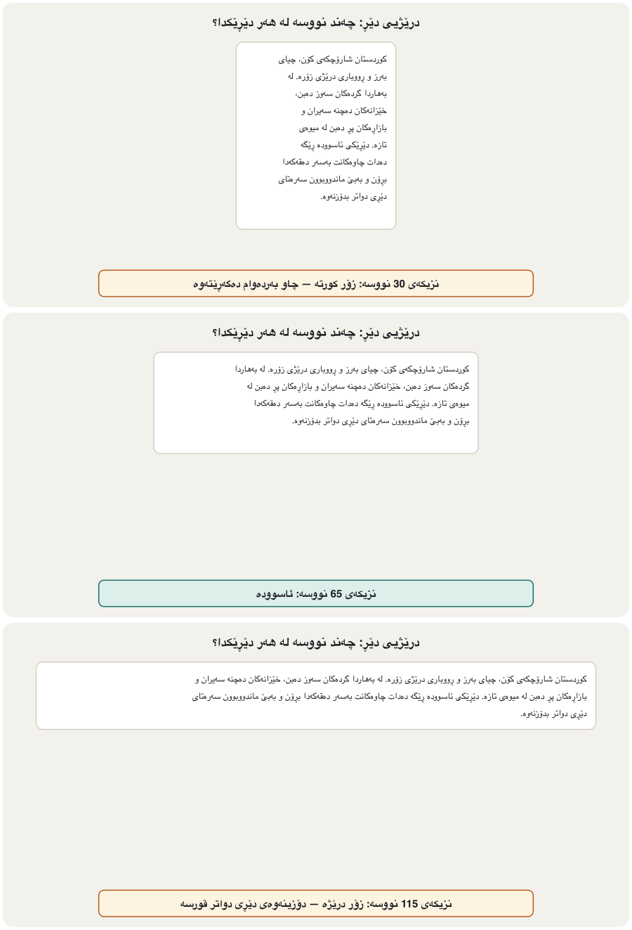
Long lines tire the eyes, and the reader loses the start of the next line; very short lines chop the text into pieces. About 45 to 75 characters per line is comfortable, and about 66 is often called ideal (Bringhurst's rule, as given on webtypography.net); WCAG's highest level asks for at most 80 (1.4.8). The ch unit makes this easy: max-width: 65ch (More units for sizes).
دێڕی درێژ چاو ماندوو دەکات و خوێنەر سەرەتای دێڕی دواتر ون دەکات؛ دێڕی زۆر کورتیش دەقەکە پارچە پارچە دەکات. نزیکەی 45 تا 75 لە هەر دێڕێکدا ئاسوودەیە و نزیکەی 66 زۆرجار بە باشترین دادەنرێت (یاسای Bringhurst، وەک لە webtypography.net هاتووە)؛ بەرزترین ئاستی زۆرترین 80 داوا دەکات (1.4.8). یەکەی ch ئەمە ئاسان دەکات: max-width: 65ch (یەکەی زیاتر بۆ قەبارە).
Align body text to the start: left in English, right in Kurdish (text-align: start). Avoid justify on screens: the gaps between words change from line to line and form white "rivers", worst in narrow phone columns. For short headings, text-wrap: balance makes the lines about equal (all major browsers since 2024).
دەقی ئاسایی بەرەو سەرەتا ڕێک بخە: چەپ لە ئینگلیزیدا و ڕاست لە کوردیدا (text-align: start). لەسەر شاشە justify بەکار مەهێنە: بۆشایی نێوان وشەکان لە دێڕێکەوە بۆ دێڕێکی تر دەگۆڕێت و «ڕووباری» سپی دروست دەکات، بەتایبەتی لە ستوونی تەسکی مۆبایلدا. بۆ کورت، text-wrap: balance دێڕەکان نزیکەی یەکسان دەکات (لە 2024ـەوە لە هەموو گەورەکاندا).
article {
  max-width: 65ch;        /* 45–75 characters per line */
  margin: 0 auto;         /* centre the column */
}
article p  { text-align: start; }
h1, h2     { text-wrap: balance; }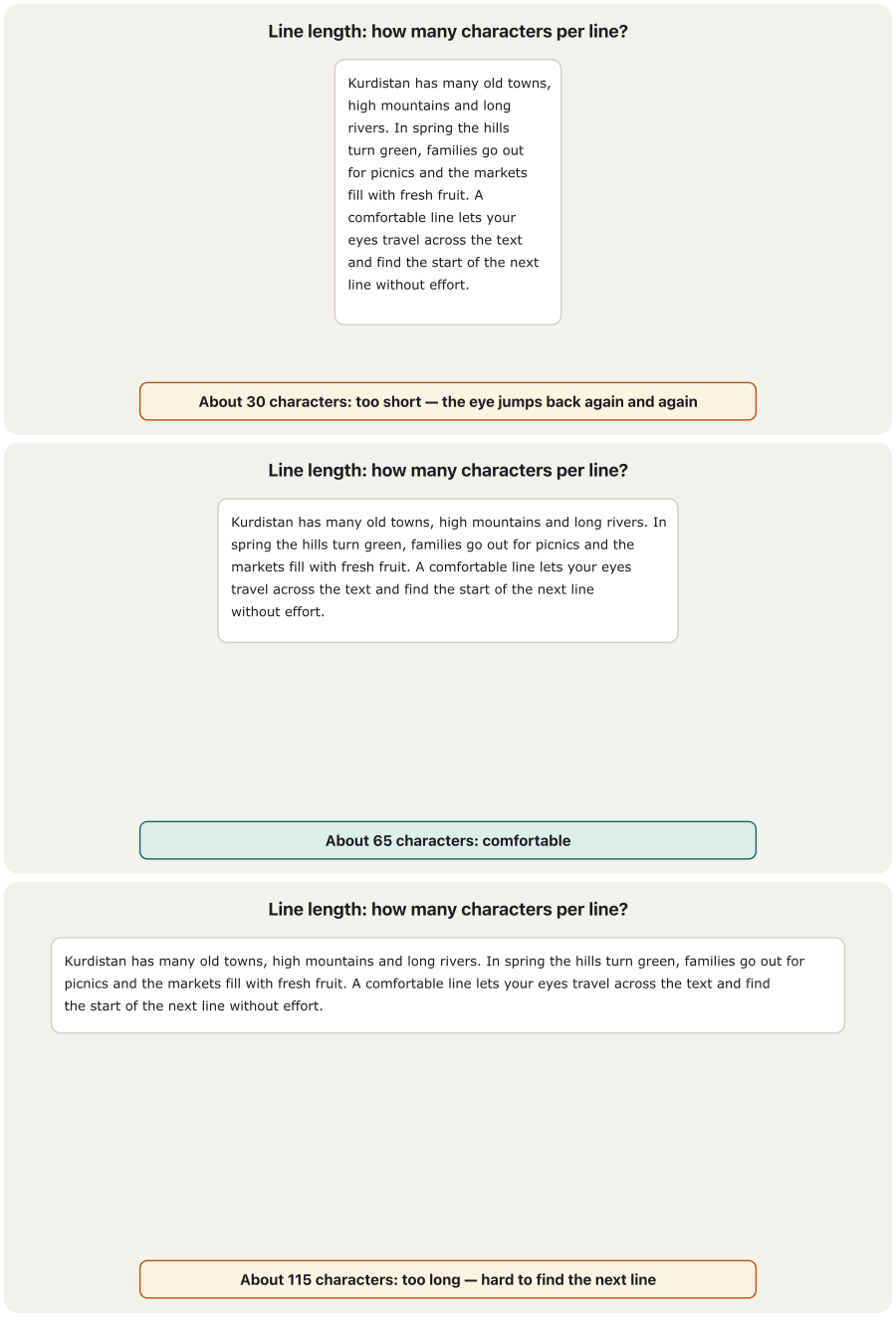
A type scale: sizes that belong togetherپەیژەی قەبارەی فۆنت: قەبارەگەلێک کە پێکەوە دەگونجێن
Random sizes — 17 px here, 23 px there — look messy. A type scale multiplies a base size by one ratio again and again: with 1rem and 1.25 you get 1, 1.25, 1.563, 1.953 and 2.441rem (16, 20, 25, 31.25 and about 39 px). Size is one tool of visual hierarchy — the reader sees at once what is a heading and what belongs together; weight, colour and space are the others (Visual hierarchy).
قەبارەی هەڕەمەکی — لێرە 17 px و لەوێ 23 px — ناڕێک دەردەکەون. قەبارەیەکی بنەڕەت دووپاتە و دووپاتە لە یەک ڕێژە دەدات: بە 1rem و 1.25 دەگەیتە 1، 1.25، 1.563، 1.953 و 2.441rem (16، 20، 25، 31.25 و نزیکەی 39 px). قەبارە یەکێکە لە ئامرازەکانی — خوێنەر دەستبەجێ دەبینێت چی و چی پێکەوەیە؛ ئەستووری، ڕەنگ و بۆشایی ئامرازەکانی ترن (پلەبەندیی بینراو).
:root {
  --step-0: 1rem;      /* body: 16 px */
  --step-1: 1.25rem;   /* 20 px */
  --step-2: 1.563rem;  /* 25 px */
  --step-3: 1.953rem;  /* 31 px */
  --step-4: 2.441rem;  /* 39 px */
}
body { font-size: var(--step-0); line-height: 1.6; }
h1   { font-size: var(--step-4); line-height: 1.2; }
h2   { font-size: var(--step-3); line-height: 1.25; }
h3 { font-size: var(--step-2); line-height: 1.3; }HTML sent to the browserئەو HTMLـەی دەنێردرێت بۆ تۆڕگەڕ
<!DOCTYPE html>
<html lang="en">
<head>
<meta charset="utf-8">
<title>Type scale</title>
<style>
:root {
  --step-0: 1rem;      /* body: 16 px */
  --step-1: 1.25rem;   /* 20 px */
  --step-2: 1.563rem;  /* 25 px */
  --step-3: 1.953rem;  /* 31 px */
  --step-4: 2.441rem;  /* 39 px */
}
body { font-size: var(--step-0); line-height: 1.6; }
h1   { font-size: var(--step-4); line-height: 1.2; }
h2   { font-size: var(--step-3); line-height: 1.25; }
h3   { font-size: var(--step-2); line-height: 1.3; }
body { font-family: system-ui, sans-serif; margin: 12px; }
h1, h2, h3 { margin: 0.4em 0; }
</style>
</head>
<body>
<h1>Erbil Book Fair</h1>
<h2>Programme for Friday</h2>
<h3>Children's corner</h3>
<p>Reading hour with stories in Kurdish and English, from 10:00 to 12:00.</p>
</body>
</html>
Explain the codeڕوونکردنەوەی کۆدەکە
- Lineدێڕی 1-7
--step-0…--step-4are custom properties: values with a name, written once and used withvar(). Change the ratio once and every heading follows (A palette in CSS custom properties uses the same idea for colours).--step-0…--step-4: بە ناوەوە، یەک جار دەنووسرێن و بەvar()بەکار دەهێنرێن. ڕێژەکە یەک جار بگۆڕە و هەموو دوای دەکەون (پالێتی ڕەنگ لە تایبەتمەندییە دڵخوازەکاندا هەمان بیرۆکە بۆ ڕەنگ بەکار دەهێنێت).- Lineدێڕی 9-11
Big text needs a smaller line height than body text.
دەقی گەورە بچووکتری لە دەقی ئاسایی پێویستە.
@font-face: bringing your own font@font-face: هێنانی فۆنتی خۆت
A visitor's device has only a few fonts. A web font is downloaded with the page, so everyone sees the typeface you chose. You declare it with @font-face and then use its name in font-family. Use WOFF2: every modern browser supports it, and it is already compressed (MDN). Each weight and style is usually a separate file, so load only what you use — on the median mobile home page in 2025, fonts already weighed 122 KB (HTTP Archive).
ئامێری سەردانیکەر تەنیا چەند هەیە. لەگەڵ لاپەڕەکەدا دابار دەکرێت، بۆیە هەمووان ئەو دەبینن کە تۆ هەڵتبژاردووە. بە @font-face دەیناسێنیت و پاشان ناوەکەی لە font-familyـدا بەکار دەهێنیت. WOFF2 بەکاربهێنە: هەموو نوێ پشتگیری دەکات و پێشتر پەستێنراوە (MDN). هەر ئەستووری و شێوازێک زۆرجار جیایە، بۆیە تەنیا ئەوە بار بکە کە بەکاری دەهێنیت — لە لە مۆبایلدا لە 2025، بە تەنیا 122 KB بوون (HTTP Archive).
@font-face {
  font-family: "Vazirmatn";
  src: url("fonts/vazirmatn-regular.woff2") format("woff2");
  font-weight: 400;
  font-style: normal;
  font-display: swap;
}
@font-face {
  font-family: "Vazirmatn";
  src: url("fonts/vazirmatn-bold.woff2") format("woff2");
  font-weight: 700;
  font-style: normal;
  font-display: swap;
}
body { font-family: "Vazirmatn", "Noto Sans Arabic", sans-serif; }
Explain the codeڕوونکردنەوەی کۆدەکە
- Lineدێڕی 2-3
The name you choose, and the file.
format("woff2")lets a browser skip formats it cannot use.ئەو ناوەی هەڵیدەبژێریت، هەروەها .
format("woff2")ڕێگە بە دەدات هەر تێپەڕێنێت کە ناتوانێت بەکاری بهێنێت.- Lineدێڕی 4, 11
Same family name, different
font-weight: the browser knows which file is the bold one.هەمان ناوی خێزان،
font-weightـی جیاواز: دەزانێت کام تۆخەکەیە.- Lineدێڕی 6, 13
font-displaydecides what visitors see while the file downloads (next screen).font-displayبڕیار دەدات سەردانیکەران لە کاتی چی دەبینن (شاشەی دواتر).
font-display: what visitors see while a font loadsfont-display: سەردانیکەران لە کاتی بارکردنی فۆنتدا چی دەبینن
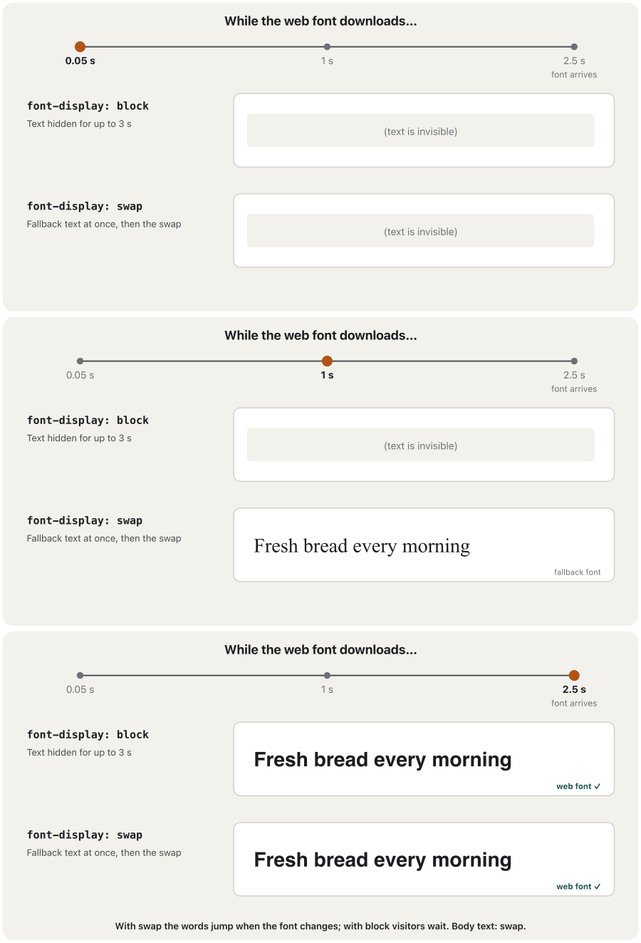
Until the font file arrives, the browser must decide what to show. The CSS Fonts specification describes three periods — first the text is invisible, then a fallback font is shown, then the browser gives up — and font-display sets their length:
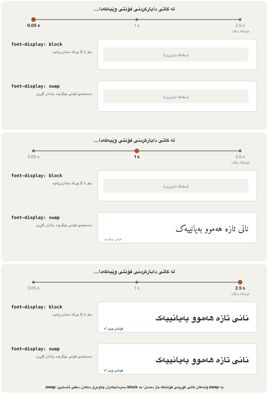
تا دەگات، دەبێت بڕیار بدات چی پیشان بدات. ڕێنمایی CSS Fonts سێ ماوە باس دەکات — سەرەتا دەقەکە نابینرێت، پاشان جێگرەوە پیشان دەدرێت، پاشان وازی لێ دەهێنێت — و font-display درێژییان دیاری دەکات:
| Value | At firstسەرەتا | Laterدواتر |
|---|---|---|
block | Text invisible, about 3 sدەق نابینرێت، نزیکەی 3 چرکە | Fallback, then the web font when it arrivesجێگرەوە، پاشان کاتێک دەگات |
swap | Fallback text almost at once (≤ 100 ms)دەق بە جێگرەوە نزیکەی دەستبەجێ (≤ 100 ms) | Swaps to the web font whenever it arrivesهەر کاتێک بگات دەیگۆڕێت |
fallback | About 100 ms invisible, then fallbackنزیکەی 100 ms نابینرێت، پاشان جێگرەوە | Swaps only if the font comes within about 3 sتەنیا ئەگەر لە ماوەی نزیکەی 3 چرکەدا بگات دەیگۆڕێت |
optional | About 100 ms, then fallbackنزیکەی 100 ms، پاشان جێگرەوە | Uses the font only if it is almost instant (for example from the cache)تەنیا ئەگەر نزیکەی دەستبەجێ بێت بەکاری دەهێنێت (بۆ نموونە لە ) |
auto | The browser decides بڕیار دەدات | — |
For body text use swap, or optional when speed matters most: readers can start at once. The swap may move the words a little (a ); a fallback font of a similar size keeps the jump small. Google Fonts adds &display=swap to its link for this reason.
بۆ دەقی ئاسایی swap بەکاربهێنە، یان optional کاتێک خێرایی لە هەموو شتێک گرنگترە: خوێنەران دەتوانن دەستبەجێ دەست پێ بکەن. گۆڕینەکە لەوانەیە وشەکان کەمێک بجووڵێنێت ()؛ جێگرەوەی هاوقەبارە بازدانەکە بچووک دەهێڵێتەوە. Google Fonts بەم هۆیەوە &display=swap دەخاتە سەر .
Font services and self-hostingخزمەتگوزاریی فۆنت و هۆستکردنی خۆیی
A font service such as Google Fonts gives you <link> elements; its servers send the CSS and the font files:
خزمەتگوزارییەکی وەک Google Fonts چەند <link>ـت دەداتێ؛ پاشان خزمەتگوزارییەکە CSS و دەنێرن:
<link rel="preconnect" href="https://fonts.googleapis.com">
<link rel="preconnect" href="https://fonts.gstatic.com" crossorigin>
<link rel="stylesheet"
      href="https://fonts.googleapis.com/css2?family=Vazirmatn:wght@400;700&display=swap">
Explain the codeڕوونکردنەوەی کۆدەکە
- Lineدێڕی 1-2
preconnectopens the connections to the two font servers early.preconnectپەیوەندییەکان بە هەردوو زوو دەکاتەوە.
- Privacy. Every visitor's browser now contacts two more servers, which see the visitor's IP address. In 2022 a German court (Munich Regional Court, case 3 O 17493/20) ruled that a website broke data-protection law by sending visitors' IP addresses to Google Fonts without consent, because the fonts could be served from the site itself.
- Speed. The old argument "the visitor already has this font in the cache" is gone: today every major browser keeps a separate cache for each website (Chrome since version 86, in 2020).
- Self-hosting. Download the WOFF2 files with their licence, put them in your site folder and write
@font-faceyourself (previous screens). Nothing goes to a third party, and it also works on an intranet. This lesson site self-hosts Vazirmatn and Inter.
- . هەموو سەردانیکەرێک ئێستا پەیوەندی بە دوو ترەوە دەکات کە سەردانیکەرەکە دەبینن. لە 2022 دادگایەکی ئەڵمانی (دادگای هەرێمیی میونشن، دۆسیەی 3 O 17493/20) بڕیاری دا کە یاسای پاراستنی شکاندووە، چونکە بەبێ ڕەزامەندی سەردانیکەرانی بۆ Google Fonts ناردووە، لە کاتێکدا دەکرا لە خودی بنێردرێن.
- خێرایی. بەڵگە کۆنەکەی «سەردانیکەر پێشتر ئەم لە هەیە» نەماوە: ئەمڕۆ هەموو گەورەکان بۆ هەر جیا دەهێڵنەوە (Chrome لە وەشانی 86ـەوە، لە 2020).
- هۆستکردنی خۆیی. WOFF2 لەگەڵ مۆڵەتەکەیان دابار بکە، بیانخەرە ناو و
@font-faceخۆت بنووسە (شاشەکانی پێشوو). هیچ شتێک ناچێت بۆ لایەنی سێیەم. لە کار دەکات. ئەم وانە Vazirmatn و Inter لەسەر خۆی دادەنێت.
Font services and self-hostingخزمەتگوزاریی فۆنت و هۆستکردنی خۆیی
Font licencesمۆڵەتی فۆنت
Fonts are software, and they come with a licence (Software licences). Vazirmatn and the Noto fonts use the SIL Open Font License (OFL): you may use them on any website, also a commercial one, change them and share them; you may not sell the font file on its own, and a changed version may need a new name. Fonts that came with your computer or a design program are often not licensed for putting on a website — check before you upload one.
و مۆڵەتیان لەگەڵدایە (مۆڵەتەکانی بەکارهێنان). Vazirmatn و Noto SIL Open Font License (OFL) بەکار دەهێنن: بۆت هەیە لەسەر هەر بەکاریان بهێنیت، تەنانەت بازرگانیش، بیانگۆڕیت و هاوبەشیان بکەیت؛ بۆت نییە بە تەنیا بفرۆشیت. وەشانێکی گۆڕاو لەوانەیە ناوێکی نوێی پێویست بێت. ئەو لەگەڵ یان دیزایندا هاتوون زۆرجار مۆڵەتی دانانیان لەسەر نییە — پێش بیپشکنە.
Variable fontsفۆنتە گۆڕاوەکان
A variable font holds a whole range of a typeface in one file: every weight from thin to black, sometimes widths and slants too. You declare the range in @font-face and then use any number in it, not only 400 and 700. One file instead of six saves requests. This site works this way: Vazirmatn arrives as one variable WOFF2 file — 45 KB for the Kurdish letters, in every weight from 100 to 900.
هەموو مەودایەکی لە یەک هەڵدەگرێت: هەموو ئەستوورییەک لە باریکەوە بۆ زۆر ئەستوور، هەندێک جاریش پانی و لاری. مەوداکە لە @font-faceـدا دەناسێنیت و پاشان هەر ژمارەیەکی ناوی بەکار دەهێنیت، نەک تەنیا 400 و 700. یەک لەبری شەش ، کەم دەکاتەوە. ئەم بەم شێوەیە کار دەکات: Vazirmatn وەک یەک WOFF2ـی گۆڕاو دەگات — 45 KB بۆ پیتە کوردییەکان، بە هەموو ئەستوورییەک لە 100 تا 900.
@font-face {
  font-family: "Vazirmatn";
  src: url("fonts/vazirmatn-variable.woff2") format("woff2");
  font-weight: 100 900;      /* the range this one file covers */
  font-display: swap;
}
h1    { font-weight: 800; }
.lead { font-weight: 350; } /* any number in the range */Fluid headings with clamp()سەردێڕەکانی ڕەوان بە clamp()
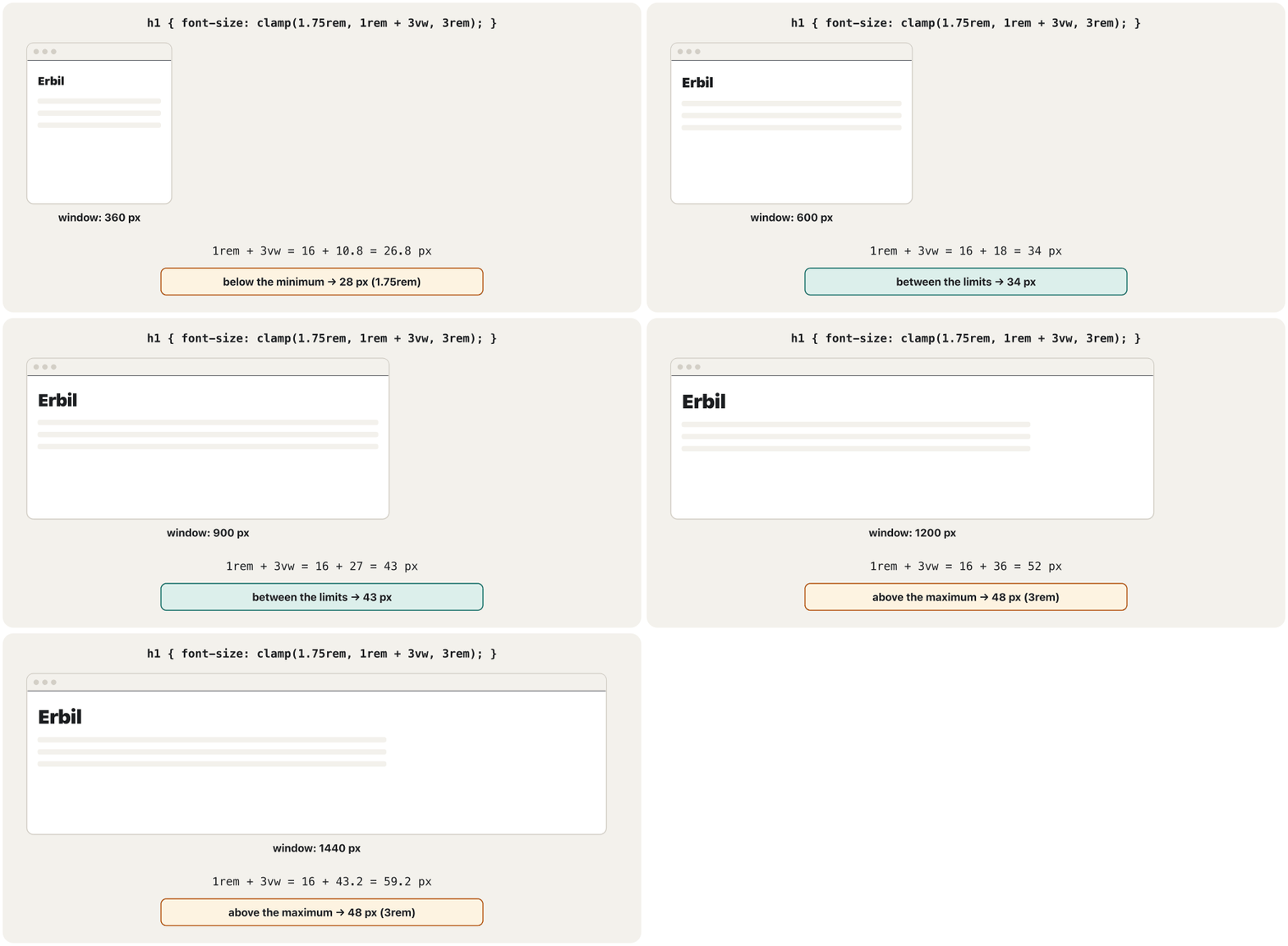
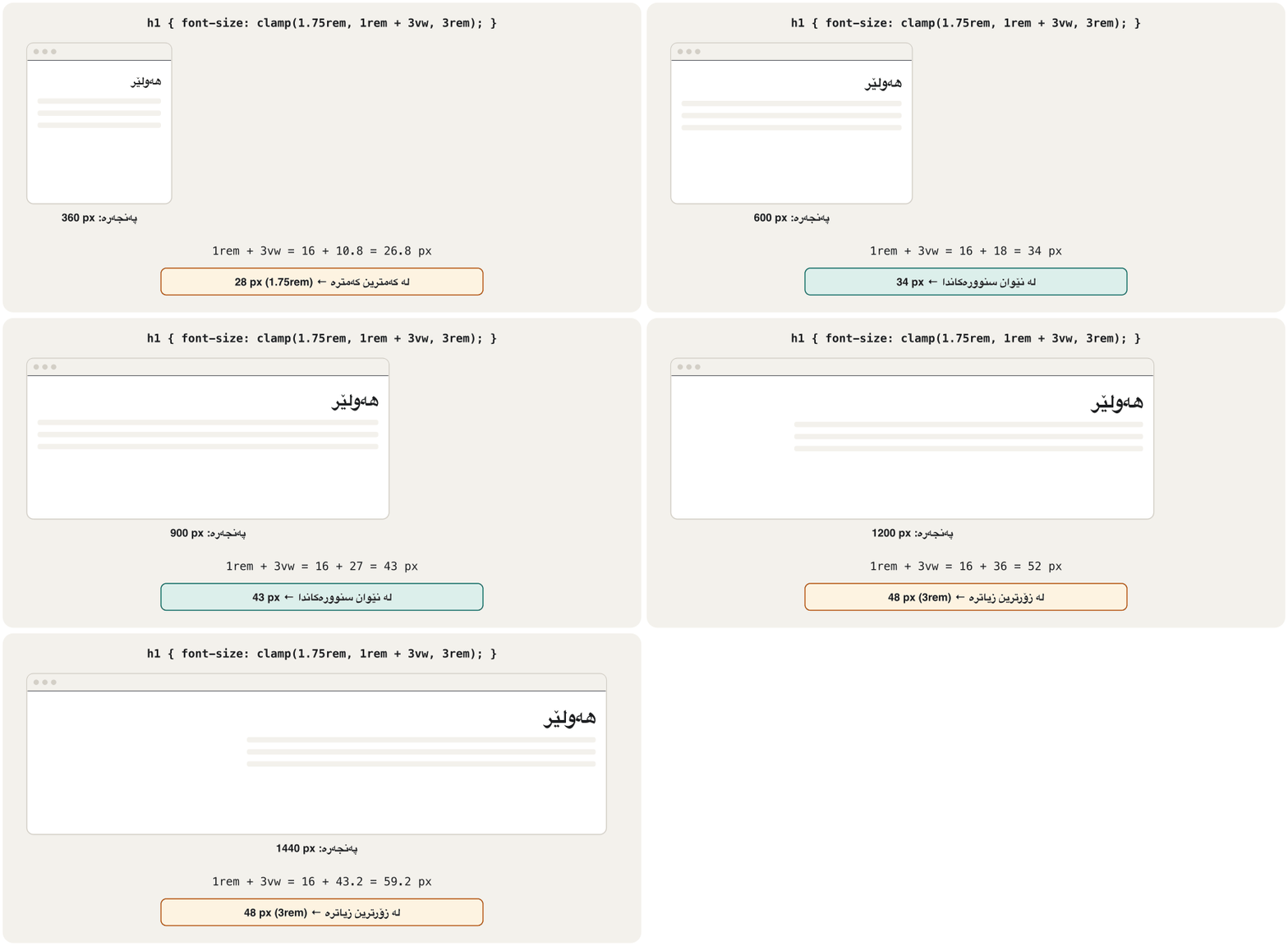
A heading that fits a laptop can be too big for a phone. The unit vw (1 % of the window's width) makes text grow with the window — but never use vw alone: zooming does not change the window, so such text would not grow when a visitor zooms in (MDN). Add vw to a rem value, and keep the result between limits with clamp(minimum, preferred, maximum):
کە لە جێی دەبێتەوە لەوانەیە بۆ مۆبایل زۆر گەورە بێت. یەکەی vw (1 %ـی پانیی پەنجەرەکە) دەق لەگەڵ پەنجەرەکەدا گەورە دەکات — بەڵام هەرگیز vw بە تەنیا بەکار مەهێنە: پەنجەرەکە ناگۆڕێت، بۆیە ئەو دەقە کاتێک سەردانیکەر دەکات گەورە نابێت (MDN). vw بخەرە سەر rem و ئەنجامەکە بە clamp(کەمترین، پێشنیارکراو، زۆرترین) لە نێوان سنووراندا بهێڵەوە:
h1 { font-size: clamp(1.75rem, 1rem + 3vw, 3rem); }| Windowپەنجەرە | 1rem + 3vw | Heading |
|---|---|---|
| 360 px | px | 28 px (the minimum)28 px (کەمترین) |
| 600 px | px | 34 px |
| 900 px | px | 43 px |
| 1200 px | px | 48 px (the maximum)48 px (زۆرترین) |
Kurdish and English on one pageکوردی و ئینگلیزی لە یەک لاپەڕەدا
A font stack is used letter by letter: for each character the browser takes the first font in the list that has it (web.dev). With font-family: "Inter", "Vazirmatn", sans-serif; Latin letters come from Inter and Kurdish letters from Vazirmatn, because Inter has no Kurdish letters. With font-family: Vazirmatn, sans-serif; everything comes from Vazirmatn, which has Latin letters too. Every font in the list that has Arabic letters must also have the Kurdish ones — ڕ ڵ ێ ۆ ە — or a word is drawn in two fonts and its joins break.
ڕیزی پیت بە پیت بەکار دێت: بۆ هەر ، یەکەم لیستەکە وەردەگرێت کە ئەو پیتەی هەبێت (web.dev). بە font-family: "Inter", "Vazirmatn", sans-serif; پیتە لاتینییەکان لە Interـەوە دێن و پیتە کوردییەکان لە Vazirmatnـەوە، چونکە Inter پیتی کوردیی نییە. بە font-family: Vazirmatn, sans-serif; هەموو شتێک لە Vazirmatnـەوە دێت کە پیتی لاتینیشی هەیە. هەر لیستەکە کە پیتی عەرەبیی هەبێت دەبێت پیتە کوردییەکانیشی هەبێت — ڕ ڵ ێ ۆ ە — دەنا وشەیەک بە دوو دەکێشرێت و لکانەکانی دەشکێن.
unicode-rangein@font-facetells the browser which characters a file covers, so a page without Kurdish never downloads the Kurdish file (MDN). This site's Kurdish file coversU+0600-06FFand other Arabic-script ranges.- No
letter-spacingand nouppercaseon Kurdish (Text properties on Kurdish text); line height 1.7–1.9;text-align: start;lang="ckb" dir="rtl"in the HTML (lang and dir). - Digits. Kurdish text often uses the Arabic-Indic digits ٠١٢٣٤٥٦٧٨٩ (U+0660–0669). The Persian digits ۴ ۵ ۶ (U+06F4–06F6) are different characters, so do not mix them: choose one style for the whole site.
unicode-rangeلە@font-faceـدا بە دەڵێت کام دەگرێتەوە، بۆیە لاپەڕەیەکی بێ کوردی هەرگیز کوردییەکە دابار ناکات (MDN). کوردییەکەی ئەمU+0600-06FFو مەودای تری ئەلفوبێی عەرەبی دەگرێتەوە.- بێ
letter-spacingو بێuppercaseلەسەر کوردی (تایبەتمەندییەکانی دەق لەسەر دەقی کوردی)؛ 1.7–1.9؛text-align: start؛lang="ckb" dir="rtl"لە HTMLـدا (lang و dir). - ژمارەکان. دەقی کوردی زۆرجار ژمارە هیندی-عەرەبییەکانی ٠١٢٣٤٥٦٧٨٩ بەکار دەهێنێت (U+0660–0669). ژمارە فارسییەکانی ۴ ۵ ۶ (U+06F4–06F6) جیاوازن، بۆیە تێکەڵیان مەکە: یەک شێواز بۆ هەموو هەڵبژێرە.
Common mistakesهەڵە باوەکان
- Body text below 16 px, or in
pxonly. Useremand at least1rem. line-heightwith a unit (line-height: 20px): it does not grow with the text. Use a plain number.- Lines across the whole laptop screen. Limit paragraphs with
max-widthinch. justifyin narrow columns,letter-spacingoruppercaseon Kurdish.- Six font files for six weights. Use a variable font, or only the two weights you need.
- No
font-display. On a slow connection the browser may hide the text for a few seconds; addswap. font-sizeinvwalone. The text no longer grows when visitors zoom; useclamp()withrem.- A font without the right licence, for example one copied from your computer's font folder.
- دەقی ئاسایی کەمتر لە 16 px، یان تەنیا بە
px.remو لانیکەم1remبەکاربهێنە. line-heightبە یەکەوە (line-height: 20px): لەگەڵ دەقەکەدا گەورە نابێت. ژمارەیەکی سادە بەکاربهێنە.- دێڕ بە درێژایی هەموو شاشەی . بڕگەکان بە
max-widthـیchسنووردار بکە. justifyلە ستوونی تەسکدا،letter-spacingیانuppercaseلەسەر کوردی.- شەش بۆ شەش ئەستووری. بەکاربهێنە، یان تەنیا ئەو دوو ئەستوورییەی پێویستن.
- بێ
font-display. لە پەیوەندیی هێواشدا لەوانەیە چەند چرکەیەک دەقەکە بشارێتەوە؛swapزیاد بکە. font-sizeتەنیا بەvw. دەقەکە ئیتر کاتێک سەردانیکەران دەکەن گەورە نابێت؛clamp()لەگەڵremبەکاربهێنە.- بێ مۆڵەتی دروست، بۆ نموونە کە لە کۆپی کرابێت.
Exercisesڕاهێنانەکان
Set the type of a Kurdish news article: a Kurdish font stack, body text of 18 px in rem, a line height for Kurdish, about 60 characters per line, start alignment and a fluid, balanced heading.
پیتی وتارێکی هەواڵی کوردی ڕێک بخە: ڕیزێکی کوردی، دەقی ئاسایی 18 px بە rem، بۆ کوردی، نزیکەی 60 لە هەر دێڕێکدا، ڕێکخستن بەرەو سەرەتا و ڕەوان و هاوسەنگ.
Show answerوەڵامەکە پیشان بدە
body {
  font-family: Vazirmatn, "Noto Sans Arabic", sans-serif;
  font-size: 1.125rem;
  line-height: 1.8;
  margin: 0;
}
article { max-width: 60ch; margin: 0 auto; padding: 1rem; }
h1 { font-size: clamp(1.6rem, 1rem + 2.5vw, 2.4rem); line-height: 1.3; text-wrap: balance; }
p { margin: 0 0 1em; text-align: start; }HTML sent to the browserئەو HTMLـەی دەنێردرێت بۆ تۆڕگەڕ
<!DOCTYPE html>
<html lang="ckb" dir="rtl">
<head>
<meta charset="utf-8">
<meta name="viewport" content="width=device-width, initial-scale=1">
<title>پێشانگای کتێبی هەولێر</title>
<style>
body {
  font-family: Vazirmatn, "Noto Sans Arabic", sans-serif;
  font-size: 1.125rem;
  line-height: 1.8;
  margin: 0;
}
article { max-width: 60ch; margin: 0 auto; padding: 1rem; }
h1 { font-size: clamp(1.6rem, 1rem + 2.5vw, 2.4rem); line-height: 1.3; text-wrap: balance; }
p  { margin: 0 0 1em; text-align: start; }
</style>
</head>
<body>
<article>
<h1>پێشانگای کتێبی هەولێر بۆ منداڵان گۆشەیەکی نوێ دەکاتەوە</h1>
<p>کوردی بە پیتی عەرەبی دەنووسرێت. خاڵ و نیشانەکانی سەرەوە و خوارەوەی پیتەکان بۆشاییان پێویستە، بۆیە دێڕەکان لە یەکتر دوور بخەرەوە.</p>
<p>کوردی بە پیتی عەرەبی دەنووسرێت. خاڵ و نیشانەکانی سەرەوە و خوارەوەی پیتەکان بۆشاییان پێویستە، بۆیە دێڕەکان لە یەکتر دوور بخەرەوە.</p>
</article>
</body>
</html>
The preview uses Vazirmatn only if your device has it.
پێشبینینەکە تەنیا ئەگەر Vazirmatn لە ئامێرەکەتدا هەبێت بەکاری دەهێنێت.
Build a type scale with the ratio 1.2 from 1rem: write four steps in rem and in px (rounded to two decimals).
بە ڕێژەی 1.2 لە 1remـەوە دروست بکە: چوار هەنگاو بە rem و بە px بنووسە (تا دوو ژمارەی دوای خاڵ).
Show answerوەڵامەکە پیشان بدە
| Stepهەنگاو | rem | px |
|---|---|---|
| 1 | 1.2rem | 19.2 |
| 2 | 1.44rem | 23.04 |
| 3 | 1.728rem | 27.65 |
| 4 | 2.074rem | 33.18 |
Multiply each step by 1.2 to get the next one, and multiply the rem value by 16 to get px.
هەر هەنگاوێک لە 1.2 بدە بۆ ئەوەی هەنگاوی دواتر بدۆزیتەوە و rem لە 16 بدە بۆ ئەوەی px بدۆزیتەوە.
Self-host a web font: put the regular and bold WOFF2 files of an OFL font in fonts/, write the two @font-face rules with font-display: swap, use the font for the body, then open the developer tools → Network → Font and check that only the files you use are downloaded.
لەسەر خۆت دابنێ: WOFF2ـی ئاسایی و تۆخی OFL بخەرە fonts/، دوو ڕێسای @font-face بە font-display: swap بنووسە، بۆ body بەکاربهێنە، پاشان بکەرەوە، بچۆ بۆ Network و پاشان Font و بپشکنە کە تەنیا ئەو دابار دەکرێن کە بەکاریان دەهێنیت.
Show answerوەڵامەکە پیشان بدە
Use the two rules of the @font-face screen with your own file names. In Network you should see one .woff2 request for each weight that the page really uses; a weight no text uses is never downloaded.
دوو ڕێساکەی شاشەی @font-face بە ناوی خۆتەوە بەکاربهێنە. لە Networkـدا دەبێت بۆ هەر ئەستوورییەک کە لاپەڕەکە ڕاستی بەکاری دەهێنێت یەک .woff2 ببینیت؛ ئەستوورییەک کە هیچ دەقێک بەکاری ناهێنێت هەرگیز دابار ناکرێت.
Calculate the heading size of font-size: clamp(2rem, 1.25rem + 2vw, 3.5rem) in a 400 px window and in a 1600 px window.
قەبارەی font-size: clamp(2rem, 1.25rem + 2vw, 3.5rem) لە پەنجەرەیەکی 400 px و پەنجەرەیەکی 1600 pxـدا حساب بکە.
Show answerوەڵامەکە پیشان بدە
1.25rem is 20 px, 2rem is 32 px and 3.5rem is 56 px; 2vw is 2 % of the window. At 400 px the sum is below the minimum, so the heading is 32 px; at 1600 px it is between the limits, so it stays 52 px.
1.25rem دەکاتە 20 px، 2rem دەکاتە 32 px و 3.5rem دەکاتە 56 px؛ 2vw 2 %ـی پانیی پەنجەرەکەیە. لە 400 pxـدا کۆکە لە کەمترین کەمترە، بۆیە 32 pxـە؛ لە 1600 pxـدا لە نێوان سنوورەکاندایە، بۆیە 52 px دەمێنێتەوە.
Summaryپوختە
- A typeface is the design; a font is one weight or style of it.
font-familynames the typeface. - Latin letters: baseline, x-height, ascenders, descenders, serifs. Kurdish: joined letters, four shapes, dots and tails, no capitals.
- Body text at least 1rem; unitless line height (1.5 English, 1.7–1.9 Kurdish); 45–75 characters per line; start alignment.
- A type scale (a base size multiplied again and again by one ratio) in custom properties builds a clear hierarchy.
- Web fonts:
@font-face, WOFF2, few files,font-display: swap; a variable font holds every weight in one file. - Self-hosting keeps visitors' data to yourself; check every font's licence (OFL: free to use, not to sell alone).
- Fluid headings:
clamp(min, rem + vw, max), nevervwalone.
- دیزاینەکەیە؛ یەک ئەستووری یان شێوازی ئەوە.
font-familyناوی دەهێنێت. - پیتی لاتینی: ، ، ، ، . کوردی: پیتی لکاو، چوار شێوە، خاڵ و کلک، بێ پیتی گەورە.
- دەقی ئاسایی لانیکەم 1rem؛ بێ یەکە (1.5 ئینگلیزی، 1.7–1.9 کوردی)؛ 45–75 لە دێڕێکدا؛ ڕێکخستن بەرەو سەرەتا.
- (قەبارەیەکی بنەڕەت کە دووپاتە و دووپاتە لە یەک ڕێژە دەدرێت) لە ڕوون دروست دەکات.
- :
@font-face، WOFF2، کەم،font-display: swap؛ هەموو ئەستوورییەک لە یەک هەڵدەگرێت. - هۆستکردنی خۆیی سەردانیکەران لای خۆت دەهێڵێتەوە؛ مۆڵەتی هەموو بپشکنە (OFL: بەکارهێنانی ئازادە، فرۆشتنی بە تەنیا نا).
- ڕەوان:
clamp(min, rem + vw, max)، هەرگیزvwبە تەنیا نا.
Lesson complete!وانەکە تەواو بوو!
Well done. Review the key terms, then go on to the next lesson.دەستخۆش. سەیرێکی زاراوە سەرەکییەکان بکەرەوە، پاشان بڕۆ بۆ وانەی داهاتوو.
Key termsزاراوە سەرەکییەکان
The CSS Box Model: Margin, Border and Paddingمۆدێلی سندووقی CSS: پەراوێز، سنوور و بۆشایی ناوەوە
Related lecturesوانە پەیوەندیدارەکان
- CSS Basics: Rules, Three Places and Coloursبنەماکانی CSS: ڕێسا، سێ شوێن و ڕەنگ
- The CSS Box Model: Margin, Border and Paddingمۆدێلی سندووقی CSS: پەراوێز، سنوور و بۆشایی ناوەوە
- Kurdish and Bilingual Websites: Right to Leftتۆڕگەکانی کوردی و دووزمانە: ڕاست بۆ چەپ
- Design Principles: Hierarchy, Alignment, Contrast and White Spaceبنەماکانی دیزاین: پلەبەندیی بینراو، ڕێکبوون، کۆنتراست و شوێنی بەتاڵ
- Colour for the Web: Palettes, Contrast and Themesڕەنگ بۆ وێب: پالێتی ڕەنگ، کۆنتراست و تێمەکان
- Responsive Design: Viewport, Media Queries and Mobile-Firstدیزاینی ڕێسپۆنسیڤ: ناوچەی بینین، پرسەکانی میدیا و مۆبایل لە پێشدا
- Application Software and File Typesنەرمەواڵەی بەکارهێنان و جۆرەکانی فایل
- Images for the Web: Formats, Size and Responsive Imagesوێنە بۆ وێب: جۆرەکانی فایل، قەبارە و وێنە ڕێسپۆنسیڤەکان
References and further readingسەرچاوەکان و خوێندنەوەی زیاتر
- MDN: Web fonts
- MDN: Text styling (module)
- MDN: font-display
- W3C: CSS Fonts Module Level 4 — the font-display descriptor
- MDN: Variable fonts guide
- MDN: Responsive design — responsive typography (vw and zoom)
- MDN: Design for developers (syllabus)
- web.dev: Learn CSS — Typography
- The Elements of Typographic Style Applied to the Web: 2.1.2 line length
- Baymard Institute: Readability — the optimal line length
- W3C: WCAG 2.2 — 1.4.4 Resize Text, 1.4.8 Visual Presentation, 1.4.12 Text Spacing
- Can I use: text-wrap: balance
- HTTP Archive Web Almanac 2025: Page weight (fonts)
- Chrome for Developers: Gaining security and privacy by partitioning the cache
- LG München I, judgment of 20 January 2022, 3 O 17493/20 (Google Fonts)
- SIL Open Font License — official text
- Vazirmatn (GitHub, OFL 1.1)
- Noto Arabic fonts (GitHub, OFL 1.1)
- W3Schools: CSS Fonts and Web Fonts (topic checklist)
This lecture is a first edition. The Kurdish text and terminology are waiting for review by Kurdish IT teachers.ئەم وانەیە چاپی یەکەمە. دەقە کوردییەکە و زاراوەکانی چاوەڕێی پێداچوونەوەی مامۆستایانی کوردی بواری IT ن.