Chapterبەش 2 · Lectureوانە 2.5
Images for the Web: Formats, Size and Responsive Imagesوێنە بۆ وێب: جۆرەکانی فایل، قەبارە و وێنە ڕێسپۆنسیڤەکان
Make pictures light and sharp: why images are the heaviest part of a page, raster or SVG, choosing JPEG, PNG, WebP, AVIF or SVG, exporting and compressing (a measured test), width and height against layout shift, srcset and sizes, the picture element for art direction and new formats, lazy loading, object-fit and aspect-ratio, and which pictures you may publish.
وێنەکان سووک و ڕوون بکە: بۆچی وێنە قورسترین بەشی لاپەڕەیە، یان ، هەڵبژاردنی JPEG، PNG، WebP، AVIF یان SVG، دەرهێنان و پەستاندن (تاقیکردنەوەیەکی پێوراو)، width و height دژی ، srcset و sizes، picture بۆ بڕاوی جیاواز و نوێ، ، object-fit و aspect-ratio، هەروەها چ وێنەیەک بۆت هەیە بڵاوی بکەیتەوە.
What you will learnچی فێر دەبیت
- Explain why pictures decide how fast a page loads, and export them at the size they are shown.
- Choose the right format: SVG for drawings and icons, AVIF or WebP with a JPEG fallback for photos, PNG for sharp screenshots.
- Give every picture width and height so the page does not jump.
- Write srcset and sizes, and use picture for art direction and new formats.
- Lazy-load pictures below the first screen, and fit pictures into boxes with aspect-ratio and object-fit.
- Publish only pictures you may use, as your own copy with a credit line, and explain why hotlinking hurts a page.
- ڕوونی بکەیتەوە بۆچی وێنەکان خێرایی بارکردنی لاپەڕە دیاری دەکەن و بە ئەو قەبارەیەی پیشان دەدرێن دەریانبهێنیت.
- دروست هەڵبژێریت: بۆ وێنەی کێشراو و ، AVIF یان WebP لەگەڵ جێگرەوەی JPEG بۆ فۆتۆ، PNG بۆ ڕوون.
widthوheightبدەیتە هەموو وێنەیەک بۆ ئەوەی لاپەڕەکە باز نەدات.srcsetوsizesبنووسیت وpictureبۆ بڕاوی جیاواز و نوێ بەکاربهێنیت.- وێنەکانی خوار شاشەی یەکەم دوابخەیت و بە
aspect-ratioوobject-fitوێنەکان لەناو سندووقدا ڕێک بخەیت. - تەنیا ئەو وێنانە بڵاو بکەیتەوە کە بۆت هەیە بەکاریان بهێنیت، (کۆپییەکی خۆت بە دێڕی ناوهێنانەوە) و ڕوونی بکەیتەوە بۆچی بەستنەوەی ڕاستەوخۆ زیان بە لاپەڕە دەگەیەنێت.
Pictures: the heaviest part of a pageوێنە: قورسترین بەشی لاپەڕە
You can already put a picture on a page with <img>, alt, width and height (Images). This lesson is about the file behind the tag: its format, its size and which version each screen should get.
دەزانیت چۆن بە <img>، alt، width و height وێنەیەک دەخەیتە سەر (وێنەکان). ئەم وانەیە باسی ئەو دەکات کە لە پشت : ، قەبارەکەی و ئەوەی هەر شاشەیەک کام وەشانی وەربگرێت.
Pictures are usually the heaviest part of a page. In July 2025 the median mobile home page weighed about 2.6 MB, and about 0.9 MB of it was images — more than its JavaScript or its fonts. Every picture is also one more request to the server (One request for every file). On a phone with weak mobile data, heavy pictures mean a slow page and a bigger bill.
زۆرجار وێنەکان قورسترین بەشی لاپەڕەن. لە تەممووزی 2025، قەبارەی لە مۆبایلدا نزیکەی 2.6 MB بوو و نزیکەی 0.9 MBـی ئەو قەبارەیە وێنە بوو — زیاتر لە و . هەر وێنەیەکیش ترە بۆ (بۆ هەر فایلێک داواکارییەک). لە مۆبایلێکدا کە لاوازە، وێنەی قورس واتە لاپەڕەیەکی هێواش و پارەی زیاتر.
Pictures: the heaviest part of a pageوێنە: قورسترین بەشی لاپەڕە
Export at the size you showبە ئەو قەبارەیە دەریبهێنە کە پیشانی دەدەیت
A photo straight from a camera is huge. The original file of the Gali Ali Beg waterfall photo on Wikimedia Commons is 6240 × 4160 pixels and 18.7 MB — about seven times a whole median mobile page. A web page never shows it that big: in an article column it may be 600 CSS pixels wide.
وێنەیەک کە ڕاستەوخۆ لە کامێراوە دێت زۆر گەورەیە. ئەسڵییەکەی وێنەی تاڤگەی گەلی عەلی بەگ لە Wikimedia Commons 6240 × 4160 و 18.7 MBـە — نزیکەی حەوت ئەوەندەی هەموو لاپەڕەیەکی ئاسایی مۆبایل. هەرگیز ئەوەندە گەورە پیشانی نادات: لە ستوونی وتارێکدا لەوانەیە پانییەکەی 600 CSS بێت.
Find the largest width the picture is shown at, for example 600 CSS pixels.
گەورەترین پانییەک بدۆزەرەوە کە وێنەکە پێی پیشان دەدرێت، بۆ نموونە 600 CSS.
Export it at that width and at double width (600 and 1200 px). The double one is for phones and laptops with sharp screens, which have 2 or more device pixels in every CSS pixel (their ).
بە ئەو پانییە و بە دوو ئەوەندە دەریبهێنە (600 و 1200 px). دووەمیان بۆ ئەو ئامێرانەیە کە شاشەی وردیان هەیە، وەک زۆربەی مۆبایلەکان و هەندێک : لە هەر CSSـدا 2 یان زیاتری ئامێرەکەیان هەیە ().
Compress it (the next screens show how much this saves). Image editors have an Export command; the free Squoosh app (squoosh.app) does it in your browser and does not upload your picture.
بیپەستێنە (شاشەکانی داهاتوو پیشان دەدەن چەندە پاشەکەوت دەکات). فەرمانی Exportیان هەیە؛ ئەپی بێبەرانبەری Squoosh (squoosh.app) لەناو ئەم کارە دەکات و وێنەکەت هەڵبار ناکات بۆ هیچ شوێنێک.
Raster or vector: when SVG winsگرافیکی پیکسڵی یان گرافیکی ڤێکتەری: کەی SVG باشترە
Pictures come in two kinds (Images: raster and vector). A raster picture is a grid of pixels: photos, screenshots. A vector picture is a list of shapes — lines, curves, colours — that the browser draws at any size. SVG is the web's vector format. It is plain text, so a logo or an icon is often only a few kilobytes; it stays sharp on every screen and zoom level; and CSS can change its colours. The diagrams in CêIT lessons are SVG: that is how they follow the dark theme.
وێنە دوو جۆرە (وێنە: پیکسڵی و ڤێکتەری). تۆڕێکە لە : فۆتۆ و . لیستێکە لە شێوە — هێڵ، کەوانە، ڕەنگ — کە بە هەر قەبارەیەک دەیکێشێت. وێبە. دەقێکی سادەیە، بۆیە لۆگۆ یان زۆرجار تەنیا چەند ؛ لە هەموو شاشەیەک و هەموو ڕوون دەمێنێتەوە؛ دەتوانێت ڕەنگەکانی بگۆڕێت. هێڵکارییەکانی وانەکانی CêIT : بەم شێوەیە لەگەڵ ڕووکاری تاریکدا دەگۆڕێن.
<!-- 1. As an image file, like any other picture -->
<img src="images/logo.svg" alt="Shilan's Bakery" width="160" height="48">

<!-- 2. Inline: the SVG code inside the HTML -->
<button type="button">
  <svg aria-hidden="true" width="20" height="20" viewBox="0 0 20 20">
    <path d="M3 10h14M10 3v14" stroke="currentColor" stroke-width="3"/>
  </svg>
  Add to basket
</button>HTML sent to the browserئەو HTMLـەی دەنێردرێت بۆ تۆڕگەڕ
<img src="data:image/svg+xml,%3Csvg%20xmlns='http://www.w3.org/2000/svg'%20width='160'%20height='48'%20viewBox='0%200%20160%2048'%3E%3Crect%20width='160'%20height='48'%20rx='10'%20fill='%23b4530f'/%3E%3Ccircle%20cx='26'%20cy='24'%20r='12'%20fill='%23fdf3e1'/%3E%3Ctext%20x='44'%20y='29'%20font-family='sans-serif'%20font-size='13'%20font-weight='700'%20fill='%23ffffff'%3EShilan's%20Bakery%3C/text%3E%3C/svg%3E" alt="Shilan's Bakery" width="160" height="48">
<p><button type="button" style="font:inherit;padding:6px 12px">
  <svg aria-hidden="true" width="20" height="20" viewBox="0 0 20 20" style="vertical-align:-4px">
    <path d="M3 10h14M10 3v14" stroke="currentColor" stroke-width="3"/>
  </svg>
  Add to basket
</button></p>
In the preview the logo is a drawing embedded in the page; on your computer, save your own logo as images/logo.svg.
لە پێشبینینەکەدا لۆگۆکە وێنەیەکی کێشراوە کە لەناو لاپەڕەکەدا دانراوە؛ لە لۆگۆی خۆت بە ناوی images/logo.svg پاشەکەوت بکە.
Explain the codeڕوونکردنەوەی کۆدەکە
- Lineدێڕی 2
An SVG file in
<img>needsaltlike every picture.SVG لەناو
<img>ـدا وەک هەموو وێنەیەکaltـی پێویستە.- Lineدێڕی 6-8
A decorative icon beside a visible word:
aria-hidden="true"hides it from screen readers, andcurrentColorpaints it in the text colour.ڕازاندنەوە لە تەنیشت وشەیەکی دیار:
aria-hidden="true"لە دەیشارێتەوە وcurrentColorبە ڕەنگی دەقەکە ڕەنگی دەکات.
Which format: JPEG, PNG, GIF, WebP, AVIF or SVG?کام جۆری فایل: JPEG، PNG، GIF، WebP، AVIF یان SVG؟
Each format packs pixels in its own way. Lossy formats throw away details people hardly notice (); lossless ones keep every pixel () — see Formats and compression and File extensions.
هەر بە شێوەی خۆی دەپەستێنێت. هەندێکیان ئەو وردەکارییانە فڕێ دەدەن کە خەڵک بە زەحمەت هەستی پێ دەکەن ()؛ هەندێکیشیان هەموو دەهێڵنەوە () — بڕوانە Formats and compression و پاشگری فایل.
| Format | Best forباشترینە بۆ | Compressionپەستاندن | Transparency / animationڕوونی / جووڵە |
|---|---|---|---|
| JPEG (.jpg) | Photos; the safe fallbackفۆتۆ؛ جێگرەوەی متمانەپێکراو | no / noنا / نا | |
| PNG | Screenshots, drawings with text, sharp edges، وێنەی کێشراو بە دەقەوە، لێواری تیژ | yes / noبەڵێ / نا | |
| GIF | Very old: only 256 colours. Use video, WebP or AVIF for motionزۆر کۆنە: تەنیا 256 ڕەنگ. بۆ جووڵە ڤیدیۆ، WebP یان AVIF بەکاربهێنە | lossless (few colours)lossless (ڕەنگی کەم) | yes / yesبەڵێ / بەڵێ |
| WebP | Photos and graphics; every browser since 2020فۆتۆ و گرافیک؛ لە هەموو لە 2020ـەوە | lossy or losslesslossy یان lossless | yes / yesبەڵێ / بەڵێ |
| AVIF | Photos: usually the smallest files; all major browsers since January 2024 (Baseline widely available since July 2026)فۆتۆ: زۆرجار بچووکترین ؛ هەموو گەورەکان لە کانوونی دووەمی 2024ـەوە (: بە فراوانی بەردەست لە تەممووزی 2026ـەوە) | lossy or losslesslossy یان lossless | yes / yesبەڵێ / بەڵێ |
| SVG | Logos, icons, diagrams, chartsلۆگۆ، ، دیاگرام، | vector (text)ڤێکتەری (دەق) | yes / yesبەڵێ / بەڵێ |
What JPEG does to a photo: it keeps what our eyes notice and throws away fine detail they hardly see, so a 46 MB picture becomes about 4 MB.
JPEG چی بە وێنەیەک دەکات: ئەوەی چاومان هەستی پێدەکات دەیهێڵێتەوە و ئەو وردەکارییانەی بە زەحمەت دەیانبینین لا دەبات، بۆیە وێنەیەکی 46 MB دەبێتە نزیکەی 4 MB. ئەمە .
Watch 0:00–4:06: what JPEG does and its steps in short; the rest of the video goes deep into the maths.
لە 0:00 تا 4:06 سەیر بکە: JPEG چی دەکات و هەنگاوەکانی بە کورتی؛ بەشەکەی دیکەی ڤیدیۆکە زۆر قووڵ دەچێتە ناو بیرکارییەکەوە.
Which format: JPEG, PNG, GIF, WebP, AVIF or SVG?کام جۆری فایل: JPEG، PNG، GIF، WebP، AVIF یان SVG؟
One photo, five filesیەک وێنە، پێنج فایل
We exported one photo — the first web server at CERN (Tim Berners-Lee and the first server) — at 1200 × 852 pixels in four formats and measured the files (CêIT, 2026). The picture shows the same 440 × 260 pixel part of each file at real size.
یەک وێنەمان — یەکەم لە CERN (Tim Berners-Lee و یەکەم ڕاژەکار) — بە 1200 × 852 و بە چوار دەرهێنا و پێوا (CêIT، 2026). وێنەکە هەمان بەشی 440 × 260 هەر بە قەبارەی ڕاستەقینە پیشان دەدات.
- PNG: 1,299 KB. Lossless: every pixel is kept, so photos become huge.
- JPEG at quality 80: 101 KB. Looks the same, 13 times smaller.
- WebP at quality 80: 47 KB and AVIF at quality 60: 30 KB. Still the same to the eye.
- JPEG at quality 10: 16 KB. Too much: blocks and smudged colours appear.
- PNG: 1,299 KB. lossless: هەموو دەمێنێتەوە، بۆیە فۆتۆ زۆر گەورە دەبێت.
- JPEG بە جۆرایەتیی 80: 101 KB. هەمان شێوەیە و 13 جار بچووکترە.
- WebP بە جۆرایەتیی 80: 47 KB و AVIF بە جۆرایەتیی 60: 30 KB. بۆ چاو هێشتا وەک یەکن.
- JPEG بە جۆرایەتیی 10: 16 KB. زیادەڕۆییە: چوارگۆشە و ڕەنگی تێکچوو دەردەکەون.
The quality numbers are not the same scale in every format, so compare by eye: zoom in to 100 % and lower the quality until you just start to see damage, then go one step back.
ژمارەکانی جۆرایەتی لە هەموو هەمان پێوەر نین، بۆیە بە چاو بەراوردیان بکە: بۆ 100 % بکە و جۆرایەتییەکە کەم بکەرەوە تا تازە زیان دەبینیت، پاشان هەنگاوێک بگەڕێوە.
Width and height: stop the page from jumpingwidth و height: ڕێگری لە بازدانی لاپەڕە بکە
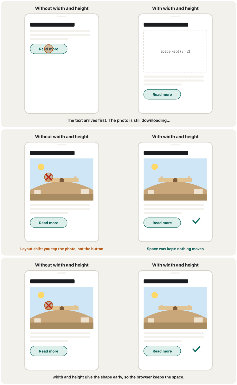
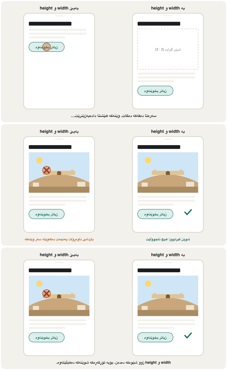
You know that width and height keep space for a picture (Width, height and the old align and border). Here is why that matters. Without them, the browser cannot know how tall the picture will be until the file arrives. It draws the text first; then the picture pushes everything down. You lose your place, or tap the wrong thing. This jump is a layout shift.
دەزانیت width و height شوێن بۆ وێنە دەهێڵنەوە (Width، height و align و borderـی کۆن). ئەمە بۆچی گرنگە؟ بەبێ ئەوان، نازانێت وێنەکە چەند بەرز دەبێت تا دەگات. سەرەتا دەقەکە دەکێشێت؛ پاشان وێنەکە هەموو شتێک بەرەو خوارەوە پاڵ دەنێت. شوێنی خوێندنەوەکەت ون دەکەیت، یان پەنجە لە شتێکی هەڵە دەدەیت. ئەم بازدانە ـە.
With both attributes, the browser knows the shape (width ÷ height) before it downloads anything, and keeps a box of that shape. CSS can still make the picture smaller: max-width: 100%; height: auto; (Pictures that shrink) keeps the same shape.
بە بوونی هەردوو ، پێش هەر شتێک شێوەکە دەزانێت (پانی ÷ بەرزی) و سندووقێک بەو شێوەیە دەهێڵێتەوە. هێشتا دەتوانێت وێنەکە بچووکتر بکات: max-width: 100%; height: auto; (وێنەی بچووکبوو) هەمان شێوە دەپارێزێت.
srcset: let the browser choose the filesrcset: با تۆڕگەڕەکە فایلەکە هەڵبژێرێت
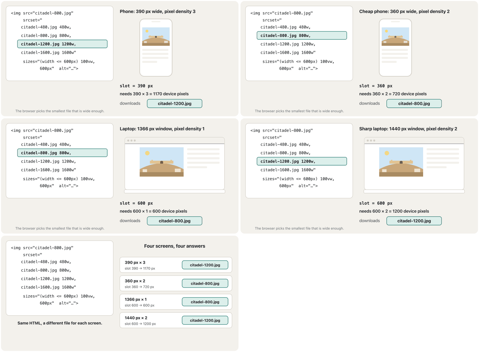
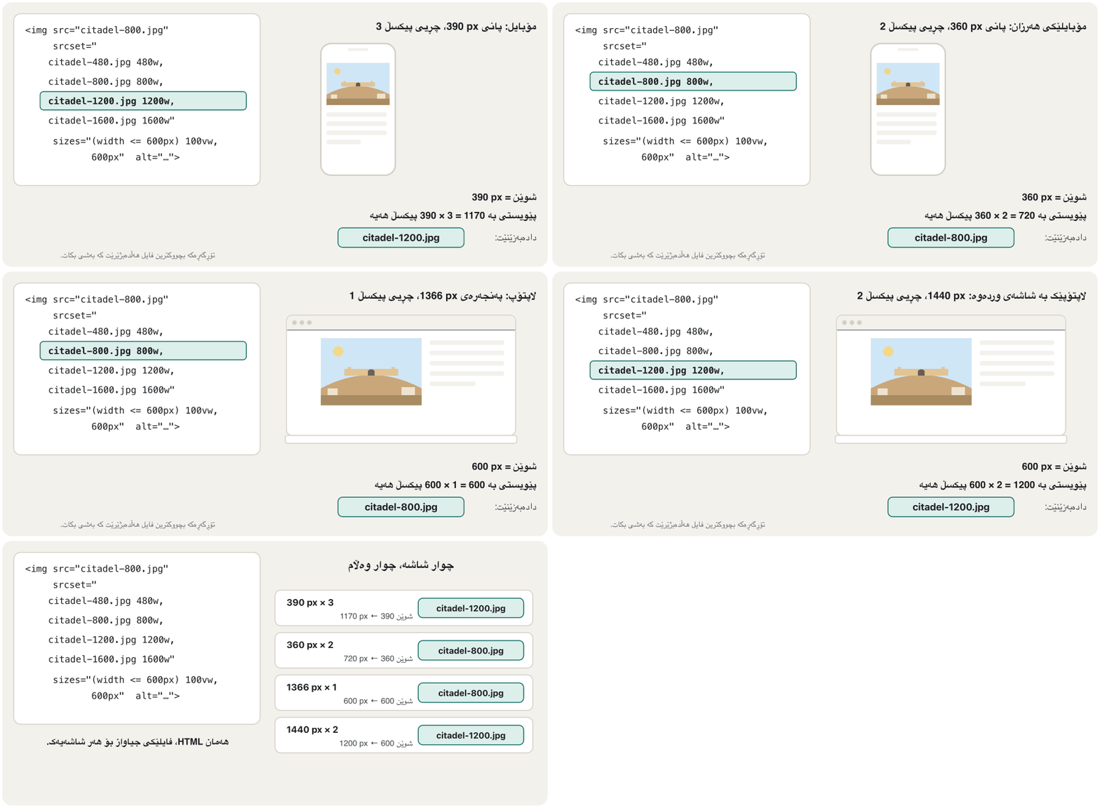
With one src, every visitor downloads the same file: too big for a small phone, or too blurry for a sharp laptop screen. With srcset you list several widths of the same picture; the number with w after each file is its real width in pixels. sizes tells the browser how wide the picture will be on the page (its slot). The browser works out how many pixels it needs — slot width × the screen's pixel density — and downloads the smallest file that is wide enough. This is a responsive image.
بە یەک src، هەموو سەردانیکەرێک هەمان دابار دەکات: بۆ مۆبایلێکی بچووک زۆر گەورەیە و بۆ شاشەی وردی لێڵە. بە srcset چەند پانییەکی هەمان وێنە لیست دەکەیت؛ ئەو ژمارەیەی wـی لە دواوەیە پانیی ڕاستەقینەی بە . sizes بە دەڵێت وێنەکە لە لاپەڕەکەدا چەند پان دەبێت (شوێنەکەی). حساب دەکات چەند پێویستە — پانیی شوێن × شاشەکە — و بچووکترین دابار دەکات کە بەسە. ئەمە .
<img src="citadel-800.jpg"
     srcset="citadel-480.jpg 480w,
             citadel-800.jpg 800w,
             citadel-1200.jpg 1200w,
             citadel-1600.jpg 1600w"
     sizes="(width <= 600px) 100vw, 600px"
     width="1600" height="1067"
     alt="Erbil Citadel on its hill above the city">
Explain the codeڕوونکردنەوەی کۆدەکە
- Lineدێڕی 1
srcis for very old browsers that do not knowsrcset.srcبۆ زۆر کۆنە کەsrcsetناناسێت.- Lineدێڕی 2-5
The same picture at four widths: 480, 800, 1200 and 1600 pixels.
هەمان وێنە بە چوار پانی: 480، 800، 1200 و 1600 .
- Lineدێڕی 6
On screens up to 600 px wide the picture fills the window (
100vw); on wider screens its slot is 600 px.لە شاشەی تا 600 px پاندا وێنەکە پەنجەرەکە پڕ دەکاتەوە (
100vw)؛ لە شاشەی پانتردا شوێنەکەی 600 pxـە.- Lineدێڕی 7
widthandheightof the largest file give the shape, so no layout shift.widthوheightـی گەورەترین شێوەکە دەدەن، بۆیە نییە.
srcset: let the browser choose the filesrcset: با تۆڕگەڕەکە فایلەکە هەڵبژێرێت
Writing sizesنووسینی sizes
sizes is a list of media condition + slot width. The browser uses the first condition that is true; the last width has no condition and is the default. Widths are in px, em, vw or calc() — never %. Without sizes, the browser assumes 100vw, the whole window, and may download a much bigger file than the slot needs; the Nu checker also reports a missing sizes as an error.
sizes لیستێکە لە میدیا + پانیی شوێن. یەکەم بەکار دەهێنێت کە ڕاستە؛ دوا پانی نییە و بنەڕەتە. پانییەکان بە px، em، vw یان calc()ـن — هەرگیز % نا. بەبێ sizes، وا دادەنێت 100vwـە (هەموو پەنجەرەکە) و لەوانەیە زۆر گەورەتر لەوەی شوێنەکە پێویستیەتی دابار بکات؛ پشکنەری Nu نەبوونی sizes وەک ڕاپۆرت دەکات.
A gallery has one column on phones, two from 600 px and three from 1000 px. So the widest condition comes first:
لە مۆبایلدا یەک ستوونی هەیە، لە 600 pxـەوە دوو و لە 1000 pxـەوە سێ. بۆیە پانترین یەکەم دێت:
<img src="photo-800.jpg"
     srcset="photo-480.jpg 480w, photo-800.jpg 800w,
             photo-1200.jpg 1200w, photo-1600.jpg 1600w"
     sizes="(width >= 1000px) 33vw, (width >= 600px) 50vw, 100vw"
width="1600" height="1067" alt="…">The picture element: a different crop for each screenتوخمی picture: بڕاوێکی جیاواز بۆ هەر شاشەیەک
srcset changes only the size of one picture. Sometimes a phone needs a different picture: a wide view of a waterfall is tiny on a phone, so a tall, close crop works better. Choosing the picture for each screen is called art direction. <picture> holds <source> elements and one <img>. The browser takes the first <source> whose media condition is true; if none matches, it uses the <img>. The <img> is always needed: it shows the chosen picture and carries alt.
srcset تەنیا قەبارەی یەک وێنە دەگۆڕێت. هەندێک جار مۆبایل پێویستی بە وێنەیەکی جیاواز هەیە: دیمەنێکی پانی تاڤگەیەک لە مۆبایلدا زۆر بچووک دەبێت، بۆیە بڕاوێکی درێژ و نزیک باشترە. هەڵبژاردنی وێنە بۆ هەر شاشەیەک پێی دەوترێت art direction. <picture> چەند <source>ـێک و یەک <img> لەخۆ دەگرێت. یەکەم <source> وەردەگرێت کە mediaـەکەی ڕاستە؛ ئەگەر هیچیان نەگونجان، <img> بەکار دەهێنێت. <img> هەمیشە پێویستە: وێنە هەڵبژێردراوەکە پیشان دەدات و alt هەڵدەگرێت.
<picture>
  <source media="(width < 700px)"
          srcset="falls-tall-600.jpg 600w, falls-tall-1200.jpg 1200w"
          sizes="100vw"
          width="1200" height="1500">
  <img src="falls-wide-1600.jpg"
       srcset="falls-wide-800.jpg 800w, falls-wide-1600.jpg 1600w"
       sizes="100vw"
       width="1600" height="700"
       alt="Gali Ali Beg waterfall between rocky mountain walls">
</picture>HTML sent to the browserئەو HTMLـەی دەنێردرێت بۆ تۆڕگەڕ
<style>img{max-width:100%;height:auto}</style>
<picture>
  <source media="(width < 700px)"
          srcset="data:image/svg+xml,%3Csvg%20xmlns='http://www.w3.org/2000/svg'%20width='1200'%20height='1500'%20viewBox='0%200%201200%201500'%3E%3Crect%20width='1200'%20height='1500'%20fill='%239aa9b8'/%3E%3Cpath%20d='M0,0%20L300,0%20L300,1500%20L0,1500%20Z%20M900,0%20L1200,0%20L1200,1500%20L900,1500%20Z'%20fill='%237d6a58'/%3E%3Cpath%20d='M300,0%20L900,0%20L900,1500%20L300,1500%20Z'%20fill='%235b8f5a'/%3E%3Cpath%20d='M420,0%20L780,0%20L810,1250%20L390,1250%20Z'%20fill='%23e8f6ff'/%3E%3Ctext%20x='600'%20y='700'%20font-family='sans-serif'%20font-size='120'%20font-weight='700'%20text-anchor='middle'%20fill='%231b1d20'%3Etall%20crop%3C/text%3E%3C/svg%3E 1200w"
          sizes="100vw"
          width="1200" height="1500">
  <img src="data:image/svg+xml,%3Csvg%20xmlns='http://www.w3.org/2000/svg'%20width='1600'%20height='700'%20viewBox='0%200%201600%20700'%3E%3Crect%20width='1600'%20height='700'%20fill='%23bfe1f5'/%3E%3Cpath%20d='M0,320%20L300,160%20L600,300%20L900,120%20L1200,280%20L1600,160%20L1600,700%20L0,700%20Z'%20fill='%239aa9b8'/%3E%3Cpath%20d='M0,420%20L520,300%20L700,420%20L700,700%20L0,700%20Z'%20fill='%237d6a58'/%3E%3Cpath%20d='M900,420%20L1100,300%20L1600,430%20L1600,700%20L900,700%20Z'%20fill='%237d6a58'/%3E%3Cpath%20d='M700,420%20L900,420%20L900,700%20L700,700%20Z'%20fill='%235b8f5a'/%3E%3Cpath%20d='M740,420%20L860,420%20L870,620%20L730,620%20Z'%20fill='%23e8f6ff'/%3E%3Ctext%20x='800'%20y='120'%20font-family='sans-serif'%20font-size='90'%20font-weight='700'%20text-anchor='middle'%20fill='%231b1d20'%3Ewide%3C/text%3E%3C/svg%3E"
       srcset="data:image/svg+xml,%3Csvg%20xmlns='http://www.w3.org/2000/svg'%20width='1600'%20height='700'%20viewBox='0%200%201600%20700'%3E%3Crect%20width='1600'%20height='700'%20fill='%23bfe1f5'/%3E%3Cpath%20d='M0,320%20L300,160%20L600,300%20L900,120%20L1200,280%20L1600,160%20L1600,700%20L0,700%20Z'%20fill='%239aa9b8'/%3E%3Cpath%20d='M0,420%20L520,300%20L700,420%20L700,700%20L0,700%20Z'%20fill='%237d6a58'/%3E%3Cpath%20d='M900,420%20L1100,300%20L1600,430%20L1600,700%20L900,700%20Z'%20fill='%237d6a58'/%3E%3Cpath%20d='M700,420%20L900,420%20L900,700%20L700,700%20Z'%20fill='%235b8f5a'/%3E%3Cpath%20d='M740,420%20L860,420%20L870,620%20L730,620%20Z'%20fill='%23e8f6ff'/%3E%3Ctext%20x='800'%20y='120'%20font-family='sans-serif'%20font-size='90'%20font-weight='700'%20text-anchor='middle'%20fill='%231b1d20'%3Ewide%3C/text%3E%3C/svg%3E 1600w"
       sizes="100vw"
       width="1600" height="700"
       alt="Gali Ali Beg waterfall between rocky mountain walls">
</picture>
This preview is a narrow or a wide frame depending on your screen: below 700 px you see the 'tall crop' drawing.
ئەم پێشبینینە بەپێی شاشەکەت تەسک یان پانە: خوار 700 px وێنەی «tall crop» دەبینیت.
Explain the codeڕوونکردنەوەی کۆدەکە
- Lineدێڕی 2-5
Below 700 px: the tall crop. Each crop has its own shape, so the
<source>gets its ownwidthandheight.خوار 700 px: بڕاوە درێژەکە. هەر بڕاوێک شێوەی خۆی هەیە، بۆیە
<source>widthوheightـی خۆی وەردەگرێت.- Lineدێڕی 6-10
Otherwise: the wide photo.
sizes="100vw"says the picture fills the whole window — right for a banner.ئەگەر نا: فۆتۆ پانەکە.
sizes="100vw"دەڵێت وێنەکە هەموو پەنجەرەکە پڕ دەکاتەوە — بۆ بانەرێک دروستە.
The picture element: a different crop for each screenتوخمی picture: بڕاوێکی جیاواز بۆ هەر شاشەیەک
New formats with a safe fallbackجۆری فایلی نوێ بە جێگرەوەیەکی دڵنیاوە
<source type> offers AVIF and WebP and keeps JPEG for any browser that cannot show them. The browser skips every <source> whose type it does not support and takes the first one it can show. Only one file is downloaded.
<source type> AVIF و WebP پێشکەش دەکات و JPEG بۆ هەر دەهێڵێتەوە کە نەتوانێت پیشانیان بدات. هەموو <source>ـێک تێدەپەڕێنێت کە typeـەکەی ناناسێت و یەکەمیان وەردەگرێت کە دەتوانێت پیشانی بدات. تەنیا یەک دابار دەکرێت.
<picture>
  <source srcset="bread.avif" type="image/avif">
  <source srcset="bread.webp" type="image/webp">
  <img src="bread.jpg" width="800" height="533"
       alt="Fresh kulicha on a baking tray">
</picture>
Explain the codeڕوونکردنەوەی کۆدەکە
- Lineدێڕی 2-3
Each
<source>can also havesrcsetwithwandsizes, so formats and sizes work together.هەر
<source>ـێک دەتوانێتsrcsetـیwـدار وsizesـیشی هەبێت، بۆیە و قەبارە پێکەوە کار دەکەن.
Lazy loading: download pictures when they are neededبارکردنی دواخراو: وێنە کاتێک دابار بکە کە پێویستە
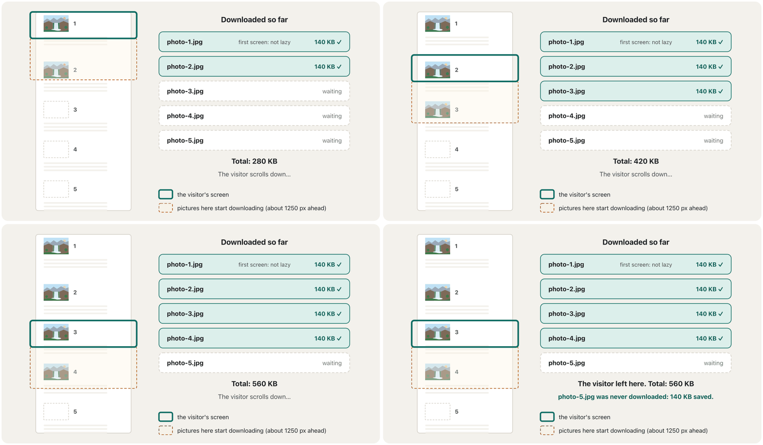
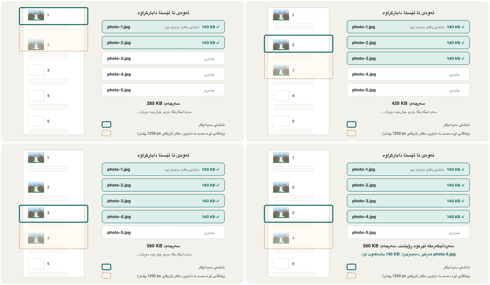
A long page may have 30 pictures, but at first the visitor sees only the top, and many never scroll to the end. loading="lazy" tells the browser to wait: it downloads such a picture only when the visitor comes near it. Chrome starts about 1250 px before the picture reaches the screen on fast connections, and 2500 px on slow ones, so the picture is usually ready in time (web.dev).
لەوانەیە لاپەڕەیەکی درێژ 30 وێنەی هەبێت، بەڵام سەرەتا سەردانیکەر تەنیا سەرەوە دەبینێت و زۆرێکیش هەرگیز ناگەنە کۆتایی. loading="lazy" بە دەڵێت چاوەڕێ بکات: ئەو جۆرە وێنەیە تەنیا کاتێک دابار دەکات کە سەردانیکەر لێی نزیک دەبێتەوە. Chrome لە پەیوەندیی خێرادا نزیکەی 1250 px پێش گەیشتنی وێنەکە بە شاشە دەست پێ دەکات و لە پەیوەندیی هێواشدا 2500 px، بۆیە وێنەکە زۆرجار لە کاتی خۆیدا ئامادەیە (web.dev).
<!-- The first, large picture: load it at once -->
<img src="hero.jpg" width="1600" height="900" fetchpriority="high"
     alt="Fresh bread on the shelves of Shilan's Bakery">

<!-- Pictures further down: wait until the visitor comes near -->
<img src="gallery/bread-07.jpg" loading="lazy" width="600" height="400"
alt="A tray of kulicha">- Use
loading="lazy"for pictures below the first screen. Never on the first big picture: it is often the largest thing on the first screen (Google calls its loading time LCP), so delaying it makes the page feel slow. Give that onefetchpriority="high"instead. - Always give lazy pictures
widthandheight. Without them they are 0 × 0 before loading, so the browser may think they all fit on the screen and download them all. - It works in all major browsers (Baseline: widely available) and only when JavaScript is on — a protection against tracking how far you scroll. The same attribute works on
<iframe>(Embedding other pages).
loading="lazy"بۆ ئەو وێنانە بەکاربهێنە کە لە خوار شاشەی یەکەمەوەن. هەرگیز بۆ یەکەم وێنەی گەورە نا: زۆرجار گەورەترین شتی شاشەی یەکەمە (Google کاتی بارکردنی ناو دەنێت LCP)، بۆیە دواخستنی ئەو وێنەیە وا دەکات لاپەڕەکە هێواش دەربکەوێت. لەبری ئەوەfetchpriority="high"ـی پێ بدە.- هەمیشە
widthوheightبدە بە وێنە دواخراوەکان. بەبێ ئەوان پێش بارکردن 0 × 0ـن، بۆیە لەوانەیە وا بزانێت هەموویان لە شاشەکەدا جێیان دەبێتەوە و هەموویان دابار بکات. - لە هەموو گەورەکاندا کار دەکات (: بە فراوانی بەردەست) و تەنیا کاتێک کار دەکات — پارێزگارییەک دژی چاودێریکردنی ئەوەی چەندە بەرەو خوارەوە ڕۆیشتوویت. هەمان لەسەر
<iframe>ـیش کار دەکات (تێخستنی لاپەڕەی تر).
object-fit and aspect-ratio: pictures in boxesobject-fit و aspect-ratio: وێنە لەناو سندووقدا
Cards, avatars and galleries need pictures of one shape, but photos come in many shapes. aspect-ratio gives the box its shape (). object-fit says how the picture fills the box: fill (the default) stretches it, contain shows the whole picture with empty bands, cover fills the box and cuts off the edges. object-position chooses which part stays visible.
، وێنەی پرۆفایل و پێویستیان بە وێنەی یەک شێوە هەیە، بەڵام فۆتۆکان بە شێوەی جیاواز دێن. aspect-ratio شێوە دەداتە سندووقەکە (). object-fit دەڵێت وێنەکە چۆن سندووقەکە پڕ دەکاتەوە: fill (بنەڕەت) ڕایدەکێشێت، contain هەموو وێنەکە بە بەشی بەتاڵەوە پیشان دەدات، cover سندووقەکە پڕ دەکاتەوە و لێوارەکان دەبڕێت. object-position هەڵدەبژێرێت کام بەش دیار بمێنێتەوە.
.card img {
  width: 100%;
  aspect-ratio: 4 / 3;     /* every card picture has the same shape */
  object-fit: cover;       /* fill the box, cut off the edges */
}
.avatar {
  width: 96px;
  aspect-ratio: 1;         /* a square */
  object-fit: cover;
  object-position: top;    /* keep the top: faces */
  border-radius: 50%;      /* show the square as a circle */
}HTML sent to the browserئەو HTMLـەی دەنێردرێت بۆ تۆڕگەڕ
<!DOCTYPE html>
<html lang="en">
<head>
<meta charset="utf-8">
<title>object-fit</title>
<style>
body{font:15px/1.4 system-ui,sans-serif;margin:12px}
.row{display:flex;gap:14px;flex-wrap:wrap}
.row figure{margin:0;width:150px}
.row img{width:150px;height:150px;border:2px dashed #888;background:#fff}
figcaption{font-family:monospace;font-size:13px}
.avatar{width:96px;aspect-ratio:1;object-fit:cover;object-position:top;border-radius:50%}
</style>
</head>
<body>
<div class="row">
<figure><img src="data:image/svg+xml,%3Csvg%20xmlns='http://www.w3.org/2000/svg'%20width='600'%20height='400'%20viewBox='0%200%20300%20200'%3E%3Crect%20width='300'%20height='200'%20fill='%23cfe6f6'/%3E%3Ccircle%20cx='52'%20cy='40'%20r='15'%20fill='%23ffd866'/%3E%3Cpath%20d='M0,150%20Q150,70%20300,150%20L300,200%20L0,200%20Z'%20fill='%23c9a77a'/%3E%3Cpath%20d='M70,112%20L70,92%20L80,92%20L80,86%20L90,86%20L90,92%20L210,92%20L210,86%20L220,86%20L220,92%20L230,92%20L230,112%20Z'%20fill='%23e2c493'/%3E%3Cpath%20d='M140,112%20L140,98%20Q150,88%20160,98%20L160,112%20Z'%20fill='%237d5a3a'/%3E%3Cpath%20d='M0,170%20L300,170%20L300,200%20L0,200%20Z'%20fill='%23a98b62'/%3E%3C/svg%3E" alt="" style="object-fit:fill"><figcaption>fill</figcaption></figure>
<figure><img src="data:image/svg+xml,%3Csvg%20xmlns='http://www.w3.org/2000/svg'%20width='600'%20height='400'%20viewBox='0%200%20300%20200'%3E%3Crect%20width='300'%20height='200'%20fill='%23cfe6f6'/%3E%3Ccircle%20cx='52'%20cy='40'%20r='15'%20fill='%23ffd866'/%3E%3Cpath%20d='M0,150%20Q150,70%20300,150%20L300,200%20L0,200%20Z'%20fill='%23c9a77a'/%3E%3Cpath%20d='M70,112%20L70,92%20L80,92%20L80,86%20L90,86%20L90,92%20L210,92%20L210,86%20L220,86%20L220,92%20L230,92%20L230,112%20Z'%20fill='%23e2c493'/%3E%3Cpath%20d='M140,112%20L140,98%20Q150,88%20160,98%20L160,112%20Z'%20fill='%237d5a3a'/%3E%3Cpath%20d='M0,170%20L300,170%20L300,200%20L0,200%20Z'%20fill='%23a98b62'/%3E%3C/svg%3E" alt="" style="object-fit:contain"><figcaption>contain</figcaption></figure>
<figure><img src="data:image/svg+xml,%3Csvg%20xmlns='http://www.w3.org/2000/svg'%20width='600'%20height='400'%20viewBox='0%200%20300%20200'%3E%3Crect%20width='300'%20height='200'%20fill='%23cfe6f6'/%3E%3Ccircle%20cx='52'%20cy='40'%20r='15'%20fill='%23ffd866'/%3E%3Cpath%20d='M0,150%20Q150,70%20300,150%20L300,200%20L0,200%20Z'%20fill='%23c9a77a'/%3E%3Cpath%20d='M70,112%20L70,92%20L80,92%20L80,86%20L90,86%20L90,92%20L210,92%20L210,86%20L220,86%20L220,92%20L230,92%20L230,112%20Z'%20fill='%23e2c493'/%3E%3Cpath%20d='M140,112%20L140,98%20Q150,88%20160,98%20L160,112%20Z'%20fill='%237d5a3a'/%3E%3Cpath%20d='M0,170%20L300,170%20L300,200%20L0,200%20Z'%20fill='%23a98b62'/%3E%3C/svg%3E" alt="" style="object-fit:cover"><figcaption>cover</figcaption></figure>
<figure><img class="avatar" src="data:image/svg+xml,%3Csvg%20xmlns='http://www.w3.org/2000/svg'%20width='600'%20height='400'%20viewBox='0%200%20300%20200'%3E%3Crect%20width='300'%20height='200'%20fill='%23cfe6f6'/%3E%3Ccircle%20cx='52'%20cy='40'%20r='15'%20fill='%23ffd866'/%3E%3Cpath%20d='M0,150%20Q150,70%20300,150%20L300,200%20L0,200%20Z'%20fill='%23c9a77a'/%3E%3Cpath%20d='M70,112%20L70,92%20L80,92%20L80,86%20L90,86%20L90,92%20L210,92%20L210,86%20L220,86%20L220,92%20L230,92%20L230,112%20Z'%20fill='%23e2c493'/%3E%3Cpath%20d='M140,112%20L140,98%20Q150,88%20160,98%20L160,112%20Z'%20fill='%237d5a3a'/%3E%3Cpath%20d='M0,170%20L300,170%20L300,200%20L0,200%20Z'%20fill='%23a98b62'/%3E%3C/svg%3E" alt="" style="border:0"><figcaption>.avatar</figcaption></figure>
</div>
</body>
</html>
Each 150 × 150 box holds the same 3 : 2 drawing; the last one uses the .avatar rule.
هەر سندووقێکی 150 × 150 هەمان وێنەی 3 : 2 لەخۆ دەگرێت؛ دواییان ڕێسای .avatar بەکار دەهێنێت.
Pictures you may useئەو وێنانەی بۆت هەیە بەکاریان بهێنیت
Finding a picture with a search engine does not mean you may publish it: pictures belong to the people who made them (Copyright). Safe sources are your own photos and drawings, and pictures with a free licence — public domain, CC0, CC BY or CC BY-SA (The six CC licences, CC0 and the public domain) — from places that show the licence clearly, such as Wikimedia Commons (Finding pictures you may use).
دۆزینەوەی وێنەیەک بە واتای ئەوە نییە کە بۆت هەیە بڵاوی بکەیتەوە: وێنەکان هی ئەو کەسانەن کە دروستیان کردوون (مافی لەبەرگرتنەوە). سەرچاوە دڵنیاکان فۆتۆ و وێنە کێشراوەکانی خۆتن، هەروەها ئەو وێنانەی ئازادیان هەیە — ، CC0، CC BY یان CC BY-SA (شەش مۆڵەتەکەی CC، CC0 و موڵکی گشتی) — لەو شوێنانەوە کە مۆڵەتەکە بە ڕوونی پیشان دەدەن، وەک Wikimedia Commons (دۆزینەوەی ئەو وێنانەی بۆت هەیە بەکاریان بهێنیت).
Under the picture, write a credit line — subject, author, source and licence (Writing a credit line) — usually in <figcaption>:
لە ژێر وێنەکەدا دێڕێکی ناوهێنان بنووسە — بابەت، خاوەن، سەرچاوە و مۆڵەت (نووسینی دێڕی ناوهێنان) — زۆرجار لەناو <figcaption>ـدا:
<figure>
  <img src="images/citadel-panorama.jpg" width="1200" height="473"
       alt="Panorama of Erbil Citadel on its hill above the city">
  <figcaption>
    Erbil Citadel. Photo: Osama Shukir Muhammed Amin,
    <a href="https://commons.wikimedia.org/wiki/File:Panorama_view_of_the_Erbil_Citadel,_Erbil_Governorate,_Iraqi_Kurdistan.jpg">Wikimedia Commons</a>,
    <a href="https://creativecommons.org/licenses/by-sa/4.0/">CC BY-SA 4.0</a>
  </figcaption>
</figure>HTML sent to the browserئەو HTMLـەی دەنێردرێت بۆ تۆڕگەڕ
<style>img{max-width:100%;height:auto}figure{margin:0}figcaption{font-size:14px;color:#444}</style>
<figure>
  <img src="data:image/svg+xml,%3Csvg%20xmlns='http://www.w3.org/2000/svg'%20width='600'%20height='400'%20viewBox='0%200%20300%20200'%3E%3Crect%20width='300'%20height='200'%20fill='%23cfe6f6'/%3E%3Ccircle%20cx='52'%20cy='40'%20r='15'%20fill='%23ffd866'/%3E%3Cpath%20d='M0,150%20Q150,70%20300,150%20L300,200%20L0,200%20Z'%20fill='%23c9a77a'/%3E%3Cpath%20d='M70,112%20L70,92%20L80,92%20L80,86%20L90,86%20L90,92%20L210,92%20L210,86%20L220,86%20L220,92%20L230,92%20L230,112%20Z'%20fill='%23e2c493'/%3E%3Cpath%20d='M140,112%20L140,98%20Q150,88%20160,98%20L160,112%20Z'%20fill='%237d5a3a'/%3E%3Cpath%20d='M0,170%20L300,170%20L300,200%20L0,200%20Z'%20fill='%23a98b62'/%3E%3C/svg%3E" width="1200" height="473" alt="Panorama of Erbil Citadel on its hill above the city" style="object-fit:cover">
  <figcaption>
    Erbil Citadel. Photo: Osama Shukir Muhammed Amin,
    <a href="https://commons.wikimedia.org/wiki/File:Panorama_view_of_the_Erbil_Citadel,_Erbil_Governorate,_Iraqi_Kurdistan.jpg">Wikimedia Commons</a>,
    <a href="https://creativecommons.org/licenses/by-sa/4.0/">CC BY-SA 4.0</a>
  </figcaption>
</figure>
In the preview the pictures are small drawings embedded in the page; on your computer, use your own image files with these names next to the page.
لە پێشبینینەکەدا وێنەکان وێنەی بچووکی کێشراون کە لەناو لاپەڕەکەدا دانراون؛ لە وێنەی خۆت بەم ناوانە لە تەنیشت لاپەڕەکە دابنێ.
Pictures you may useئەو وێنانەی بۆت هەیە بەکاریان بهێنیت
Hotlinking: keep your own copyبەستنەوەی ڕاستەوخۆ: کۆپییەکی خۆت هەڵبگرە
Hotlinking means showing a picture straight from another website's address: <img src="https://their-site.example/citadel.jpg">. The file stays on their server. A link never gives you permission (Linking or re-hosting a picture is no shortcut), and it also hurts your page:
بەستنەوەی ڕاستەوخۆ (hotlinking) واتە پیشاندانی وێنەیەک ڕاستەوخۆ لە ناونیشانی ترەوە: <img src="https://their-site.example/citadel.jpg">. لەسەر ئەوان دەمێنێتەوە. هەرگیز مۆڵەتت پێ نادات (بەستنەوە یان دووپاتە هەڵگرتنی وێنە ڕێگای کورت نییە)، هەروەها زیان بە لاپەڕەکەت دەگەیەنێت:
- Slow: the browser connects to one more server and gets their file as it is, often a huge original. You cannot export it at your size, compress it or offer AVIF, WebP and
srcset, and their server decides how long browsers keep it in their . - Fragile: if they rename, move or delete the file, your page shows a broken picture. Many servers also use hotlink protection: they read the
Refererheader, which names the page that asked, and refuse other sites or send them a different picture. - Unfair and less private: they pay for your visitors' downloads, and their server sees every visitor's IP address, the same reason to host fonts yourself (Font services and self-hosting).
- هێواش: پەیوەندی بە زیاترەوە دەکات و ئەوان وەک خۆی وەردەگرێت، کە زۆرجار ئەسڵێکی زۆر گەورەیە. ناتوانیت بە قەبارەی خۆت دەریبهێنیت، بیپەستێنیت یان AVIF، WebP و
srcsetپێشکەش بکەیت؛ هەروەها ئەوان بڕیار دەدات چەند لە بیهێڵنەوە. - ناسەقامگیر: ئەگەر ناوی بگۆڕن، بیگوازنەوە یان بیسڕنەوە، لاپەڕەکەت وێنەیەکی شکاو پیشان دەدات. زۆر پاراستنی دژی بەستنەوەی ڕاستەوخۆشیان هەیە:
Refererدەخوێننەوە (ناوی ئەو لاپەڕەیەی داواکەی کردووە) و تر ڕەت دەکەنەوە یان وێنەیەکی جیاوازیان بۆ دەنێرن. - نادادپەروەرانە و کەمتر تایبەت: ئەوان پارەی سەردانکەرانی تۆ دەدەن و هەموو سەردانکەرێک دەبینێت؛ هەمان هۆکاری هۆستکردنی لای خۆت (خزمەتگوزاریی فۆنت و هۆستکردنی خۆیی).
So save a picture you may use in your site's own images/ folder, and export and compress it as this lesson shows. Keep its credit line too. Load a picture from the owner's server only when the owner asks for that: Unsplash's API, for example, requires apps to use the photo addresses it returns, so that each view counts for the photographer.
بۆیە وێنەیەک کە بۆت هەیە بەکاری بهێنیت لە images/ـی خۆتدا هەڵبگرە و وەک ئەم وانەیە پیشانی دەدات دەریبهێنە و بیپەستێنە. دێڕی ناوهێنانەکەشی بپارێزە. تەنیا کاتێک وێنەیەک لە خاوەنەکەیەوە بار بکە کە خاوەنەکە خۆی داوای ئەوە بکات: بۆ نموونە Unsplash داوا لە دەکات ئەو ناونیشانانەی وێنە بەکاربهێنن کە خۆی دەیانگەڕێنێتەوە، تا هەموو بینینێک بۆ وێنەگرەکە بژمێردرێت.
Common mistakesهەڵە باوەکان
- Uploading the camera original (6000 px, 10 MB or more). Export at the shown width and twice that width.
- PNG for photos. Use AVIF or WebP with a JPEG fallback; keep PNG for screenshots and sharp drawings.
- No
widthandheight. The page jumps when the picture arrives. loading="lazy"on the first big picture. It makes the first screen slower; lazy-load only what is further down.srcsetwithwbut nosizes. The browser assumes100vwand downloads big files for small slots, and the HTML is invalid.<picture>without an<img>, oralton<picture>. The<img>is required and carriesalt.- Content pictures as CSS backgrounds. A
background-imagehas noalt; use it only for decoration. - Hotlinking pictures from other sites. Save a picture you may use in your own
images/folder, export it, compress it and credit it.
- ئەسڵەکەی کامێرا (6000 px، 10 MB یان زیاتر). بە پانیی پیشاندراو و دوو ئەوەندەی دەریبهێنە.
- PNG بۆ فۆتۆ. AVIF یان WebP لەگەڵ جێگرەوەی JPEG بەکاربهێنە؛ PNG بۆ و وێنەی تیژ بهێڵەوە.
- بێ
widthوheight. کاتێک وێنەکە دەگات، لاپەڕەکە باز دەدات. loading="lazy"لەسەر یەکەم وێنەی گەورە. شاشەی یەکەم هێواشتر دەکات؛ تەنیا ئەوەی خوارترە دوابخە.srcsetـیwـدار بەبێsizes. وا دادەنێت100vwـە و گەورە بۆ شوێنی بچووک دابار دەکات؛ نادروستە.<picture>بەبێ<img>، یانaltلەسەر<picture>.<img>پێویستە وaltهەڵدەگرێت.- وێنەی ناوەڕۆک وەک باکگراوندی CSS.
background-imagealtـی نییە؛ تەنیا بۆ ڕازاندنەوە بەکاری بهێنە. - بەستنەوەی ڕاستەوخۆی وێنە لە ترەوە. وێنەیەک کە بۆت هەیە بەکاری بهێنیت لە
images/ـی خۆتدا هەڵبگرە، دەریبهێنە، بیپەستێنە و ناوی خاوەنەکەی بهێنە.
Exercisesڕاهێنانەکان
Choose a format for each picture: (a) the school logo, (b) a photo of the football team, (c) a screenshot of an error message, (d) a small loading animation, (e) a product photo with a transparent background, (f) a hand-drawn map of the campus with labels.
بۆ هەر وێنەیەک هەڵبژێرە: (a) لۆگۆی قوتابخانە، (b) فۆتۆی تیپی تۆپی پێ، (c) نامەیەکی ، (d) بچووکی چاوەڕوانی، (e) فۆتۆی بەرهەمێک بە باکگراوندی ڕوونەوە، (f) نەخشەیەکی دەستکێشراوی زانکۆ بە ناوەکانەوە.
Show answerوەڵامەکە پیشان بدە
| Pictureوێنە | Format | Whyبۆچی |
|---|---|---|
| (a) | SVG | Flat shapes and colours; sharp at every sizeشێوە و ڕەنگی ساکار؛ لە هەموو قەبارەیەکدا ڕوون |
| (b) | AVIF or WebP + JPEGAVIF یان WebP + JPEG | A photo: lossy compression, small fileفۆتۆیە: پەستاندنی lossy، بچووک |
| (c) | PNG (or lossless WebP)PNG (یان WebPـی lossless) | Text must stay sharpدەقەکە دەبێت ڕوون بمێنێتەوە |
| (d) | SVG, or a muted looping videoSVG، یان ڤیدیۆیەکی بێدەنگی دووپاتەبوو | Not GIF: much bigger and only 256 coloursنەک GIF: زۆر گەورەترە و تەنیا 256 ڕەنگە |
| (e) | AVIF or WebP (PNG fallback)AVIF یان WebP (جێگرەوەی PNG) | JPEG has no transparencyJPEG ڕوونیی نییە |
| (f) | SVG if redrawn; PNG if it is a scanSVG ئەگەر دووپاتە بکێشرێتەوە؛ PNG ئەگەر سکان بێت | Lines and labels must stay sharpهێڵ و ناوەکان دەبێت ڕوون بمێننەوە |
A news card always shows its picture 300 CSS px wide. Write the <img> with srcset for normal and double-density screens, width, height (the files are 3 : 2) and alt.
هەواڵ هەمیشە وێنەکەی بە پانیی 300 CSS پیشان دەدات. <img>ـەکە بنووسە بە srcset بۆ شاشەی ئاسایی و دوو چڕی، width، height ( 3 : 2ـن) و alt.
Hintئاماژە
Use 1x and 2x.
1x و 2x بەکاربهێنە.
Show answerوەڵامەکە پیشان بدە
<img src="news-300.jpg"
     srcset="news-300.jpg 1x, news-600.jpg 2x"
     width="300" height="200"
     alt="Students planting trees at the university">
A fixed size needs only x descriptors, no sizes. 300 × 2 ÷ 3 = 200 px tall.
قەبارەی جێگیر تەنیا xـی پێویستە، sizesـی ناوێت. 300 × 2 ÷ 3 = 200 px بەرزی.
Build a photo gallery page: pictures in a grid that is one column on phones, two from 480 px and three from 720 px; every picture has srcset and sizes, width and height, alt, the same 4 : 3 shape with object-fit: cover, and all pictures except the first are lazy. (The grid lines are explained in CSS Grid.)
لاپەڕەیەکی دروست بکە: وێنەکان لە تۆڕێکدا کە لە مۆبایلدا یەک ستوونە، لە 480 pxـەوە دوو و لە 720 pxـەوە سێ؛ هەموو وێنەیەک srcset و sizes، width و height و altـی هەیە، هەمان شێوەی 4 : 3 بە object-fit: cover. هەموو وێنەکان جگە لە یەکەمیان دواخراون. ( لە CSS Grid ڕوون کراونەتەوە.)
Show answerوەڵامەکە پیشان بدە
<!DOCTYPE html>
<html lang="en">
<head>
  <meta charset="utf-8">
  <meta name="viewport" content="width=device-width, initial-scale=1">
  <title>Gallery</title>
  <style>
    .gallery { display: grid; gap: 12px; }
    @media (width >= 480px) { .gallery { grid-template-columns: repeat(2, 1fr); } }
    @media (width >= 720px) { .gallery { grid-template-columns: repeat(3, 1fr); } }
    .gallery img { width: 100%; height: auto;
                   aspect-ratio: 4 / 3; object-fit: cover; }
  </style>
</head>
<body>
  <h1>Kurdistan in pictures</h1>
  <div class="gallery">
    <img src="falls-800.jpg"
         srcset="falls-400.jpg 400w, falls-800.jpg 800w"
         sizes="(width >= 720px) 33vw, (width >= 480px) 50vw, 100vw"
         width="800" height="600" alt="Gali Ali Beg waterfall">
    <img src="citadel-800.jpg" loading="lazy"
         srcset="citadel-400.jpg 400w, citadel-800.jpg 800w"
         sizes="(width >= 720px) 33vw, (width >= 480px) 50vw, 100vw"
         width="800" height="600" alt="Erbil Citadel on its hill">
    <!-- more pictures, all with loading="lazy" -->
  </div>
</body>
</html>HTML sent to the browserئەو HTMLـەی دەنێردرێت بۆ تۆڕگەڕ
<!DOCTYPE html>
<html lang="en">
<head>
  <meta charset="utf-8">
  <meta name="viewport" content="width=device-width, initial-scale=1">
  <title>Gallery</title>
  <style>
    .gallery { display: grid; gap: 12px; }
    @media (width >= 480px) { .gallery { grid-template-columns: repeat(2, 1fr); } }
    @media (width >= 720px) { .gallery { grid-template-columns: repeat(3, 1fr); } }
    .gallery img { width: 100%; height: auto;
                   aspect-ratio: 4 / 3; object-fit: cover; }
  </style>
</head>
<body>
  <h1>Kurdistan in pictures</h1>
  <div class="gallery">
    <img src="data:image/svg+xml,%3Csvg%20xmlns='http://www.w3.org/2000/svg'%20width='600'%20height='400'%20viewBox='0%200%20300%20200'%3E%3Crect%20width='300'%20height='200'%20fill='%23bfe1f5'/%3E%3Ccircle%20cx='250'%20cy='38'%20r='16'%20fill='%23ffd866'/%3E%3Cpath%20d='M0,70%20L40,40%20L80,62%20L120,30%20L160,58%20L210,26%20L260,54%20L300,40%20L300,200%20L0,200%20Z'%20fill='%239aa9b8'/%3E%3Cpath%20d='M0,95%20L60,70%20L110,92%20L110,200%20L0,200%20Z'%20fill='%237d6a58'/%3E%3Cpath%20d='M190,92%20L240,70%20L300,96%20L300,200%20L190,200%20Z'%20fill='%237d6a58'/%3E%3Cpath%20d='M110,92%20L190,92%20L190,200%20L110,200%20Z'%20fill='%235b8f5a'/%3E%3Cpath%20d='M128,92%20L172,92%20L176,170%20L124,170%20Z'%20fill='%23e8f6ff'/%3E%3Cpath%20d='M136,92%20L136,168%20M148,92%20L148,170%20M160,92%20L160,168'%20stroke='%23a9d4ef'%20stroke-width='3'/%3E%3Cellipse%20cx='150'%20cy='176'%20rx='60'%20ry='12'%20fill='%23e8f6ff'/%3E%3Cpath%20d='M0,180%20Q75,165%20150,185%20T300,178%20L300,200%20L0,200%20Z'%20fill='%233f7a49'/%3E%3Ccircle%20cx='35'%20cy='150'%20r='16'%20fill='%233f7a49'/%3E%3Ccircle%20cx='268'%20cy='146'%20r='18'%20fill='%233f7a49'/%3E%3C/svg%3E"
         srcset="data:image/svg+xml,%3Csvg%20xmlns='http://www.w3.org/2000/svg'%20width='600'%20height='400'%20viewBox='0%200%20300%20200'%3E%3Crect%20width='300'%20height='200'%20fill='%23bfe1f5'/%3E%3Ccircle%20cx='250'%20cy='38'%20r='16'%20fill='%23ffd866'/%3E%3Cpath%20d='M0,70%20L40,40%20L80,62%20L120,30%20L160,58%20L210,26%20L260,54%20L300,40%20L300,200%20L0,200%20Z'%20fill='%239aa9b8'/%3E%3Cpath%20d='M0,95%20L60,70%20L110,92%20L110,200%20L0,200%20Z'%20fill='%237d6a58'/%3E%3Cpath%20d='M190,92%20L240,70%20L300,96%20L300,200%20L190,200%20Z'%20fill='%237d6a58'/%3E%3Cpath%20d='M110,92%20L190,92%20L190,200%20L110,200%20Z'%20fill='%235b8f5a'/%3E%3Cpath%20d='M128,92%20L172,92%20L176,170%20L124,170%20Z'%20fill='%23e8f6ff'/%3E%3Cpath%20d='M136,92%20L136,168%20M148,92%20L148,170%20M160,92%20L160,168'%20stroke='%23a9d4ef'%20stroke-width='3'/%3E%3Cellipse%20cx='150'%20cy='176'%20rx='60'%20ry='12'%20fill='%23e8f6ff'/%3E%3Cpath%20d='M0,180%20Q75,165%20150,185%20T300,178%20L300,200%20L0,200%20Z'%20fill='%233f7a49'/%3E%3Ccircle%20cx='35'%20cy='150'%20r='16'%20fill='%233f7a49'/%3E%3Ccircle%20cx='268'%20cy='146'%20r='18'%20fill='%233f7a49'/%3E%3C/svg%3E 800w"
         sizes="(width >= 720px) 33vw, (width >= 480px) 50vw, 100vw"
         width="800" height="600" alt="Gali Ali Beg waterfall">
    <img src="data:image/svg+xml,%3Csvg%20xmlns='http://www.w3.org/2000/svg'%20width='600'%20height='400'%20viewBox='0%200%20300%20200'%3E%3Crect%20width='300'%20height='200'%20fill='%23cfe6f6'/%3E%3Ccircle%20cx='52'%20cy='40'%20r='15'%20fill='%23ffd866'/%3E%3Cpath%20d='M0,150%20Q150,70%20300,150%20L300,200%20L0,200%20Z'%20fill='%23c9a77a'/%3E%3Cpath%20d='M70,112%20L70,92%20L80,92%20L80,86%20L90,86%20L90,92%20L210,92%20L210,86%20L220,86%20L220,92%20L230,92%20L230,112%20Z'%20fill='%23e2c493'/%3E%3Cpath%20d='M140,112%20L140,98%20Q150,88%20160,98%20L160,112%20Z'%20fill='%237d5a3a'/%3E%3Cpath%20d='M0,170%20L300,170%20L300,200%20L0,200%20Z'%20fill='%23a98b62'/%3E%3C/svg%3E" loading="lazy"
         srcset="data:image/svg+xml,%3Csvg%20xmlns='http://www.w3.org/2000/svg'%20width='600'%20height='400'%20viewBox='0%200%20300%20200'%3E%3Crect%20width='300'%20height='200'%20fill='%23cfe6f6'/%3E%3Ccircle%20cx='52'%20cy='40'%20r='15'%20fill='%23ffd866'/%3E%3Cpath%20d='M0,150%20Q150,70%20300,150%20L300,200%20L0,200%20Z'%20fill='%23c9a77a'/%3E%3Cpath%20d='M70,112%20L70,92%20L80,92%20L80,86%20L90,86%20L90,92%20L210,92%20L210,86%20L220,86%20L220,92%20L230,92%20L230,112%20Z'%20fill='%23e2c493'/%3E%3Cpath%20d='M140,112%20L140,98%20Q150,88%20160,98%20L160,112%20Z'%20fill='%237d5a3a'/%3E%3Cpath%20d='M0,170%20L300,170%20L300,200%20L0,200%20Z'%20fill='%23a98b62'/%3E%3C/svg%3E 800w"
         sizes="(width >= 720px) 33vw, (width >= 480px) 50vw, 100vw"
         width="800" height="600" alt="Erbil Citadel on its hill">
    <!-- more pictures, all with loading="lazy" -->
  </div>
</body>
</html>
In the preview the pictures are small drawings embedded in the page; on your computer, use your own image files with these names next to the page.
لە پێشبینینەکەدا وێنەکان وێنەی بچووکی کێشراون کە لەناو لاپەڕەکەدا دانراون؛ لە وێنەی خۆت بەم ناوانە لە تەنیشت لاپەڕەکە دابنێ.
Explain the codeڕوونکردنەوەی کۆدەکە
- Lineدێڕی 8-10
One column on phones, two from 480 px and three from 720 px: the same widths as in
sizes.یەک ستوون لە مۆبایلدا، دوو لە 480 pxـەوە و سێ لە 720 pxـەوە: هەمان پانییەکانی ناو
sizes.- Lineدێڕی 11-12
Same 4 : 3 shape for every picture, edges cut off.
هەمان شێوەی 4 : 3 بۆ هەموو وێنەیەک، لێوارەکان دەبڕێن.
- Lineدێڕی 18-21
The first picture is not lazy: it is on the first screen.
وێنەی یەکەم دواخراو نییە: لە شاشەی یەکەمدایە.
Your gallery uses three pictures: a CC BY-SA 4.0 photo of Erbil Citadel from Wikimedia Commons that you cropped, a public-domain NASA photo of the Earth, and a logo you drew yourself. (a) Give the citadel photo a credit behind a small ⓘ button with <details> (details and summary). (b) Make a credits.html page with a table of every picture (picture, author, source, licence, changes), and link it from the footer of every page. (c) Why is a credit inside an HTML comment not enough?
گەلەرییەکەت سێ وێنە بەکاردەهێنێت: فۆتۆیەکی CC BY-SA 4.0ـی قەڵای هەولێر لە Wikimedia Commonsـەوە کە بڕیوتە، فۆتۆیەکی NASA بۆ زەوی () و لۆگۆیەک کە خۆت کێشاوتە. (a) بۆ فۆتۆی قەڵاکە ناوهێنانێک لە پشت دوگمەیەکی بچووکی ⓘ دابنێ بە <details> (details و summary). (b) لاپەڕەیەکی credits.html دروست بکە بە بۆ هەموو وێنەیەک (وێنە، خاوەن، سەرچاوە، مۆڵەت، گۆڕانکاری) و لە بەشی خوارەوەی هەموو لاپەڕەیەکەوە بۆ دابنێ. (c) بۆچی ناوهێنان لەناو HTMLـدا بەس نییە؟
Hintئاماژە
Visitors must be able to find the credit if they look for it.
سەردانکەران دەبێت بتوانن ناوهێنانەکە بدۆزنەوە ئەگەر بەدوایدا بگەڕێن.
Show answerوەڵامەکە پیشان بدە
<figure>
  <img src="images/citadel-800.jpg" width="800" height="533"
       alt="Erbil Citadel on its hill above the city">
  <details>
    <summary>ⓘ Credit</summary>
    Photo: Osama Shukir Muhammed Amin, Wikimedia Commons,
    CC BY-SA 4.0 (cropped)
  </details>
</figure>

<footer><a href="credits.html">Credits</a></footer><h1>Credits</h1>
<table>
<tr><th>Picture</th><th>Author</th><th>Source</th><th>Licence</th><th>Changes</th></tr>
<tr><td>Erbil Citadel</td><td>Osama Shukir Muhammed Amin</td>
<td><a href="https://commons.wikimedia.org/wiki/File:Panorama_view_of_the_Erbil_Citadel,_Erbil_Governorate,_Iraqi_Kurdistan.jpg">Wikimedia Commons</a></td>
<td><a href="https://creativecommons.org/licenses/by-sa/4.0/">CC BY-SA 4.0</a></td><td>cropped</td></tr>
<tr><td>The Earth from Apollo 17</td><td>NASA</td>
<td><a href="https://commons.wikimedia.org/wiki/File:The_Earth_seen_from_Apollo_17.jpg">Wikimedia Commons</a></td>
<td>Public domain</td><td>resized</td></tr>
<tr><td>School logo</td><td>our team</td><td>own drawing</td><td>our own</td><td>none</td></tr>
</table>HTML sent to the browserئەو HTMLـەی دەنێردرێت بۆ تۆڕگەڕ
<style>table{border-collapse:collapse;font-size:14px}th,td{border:1px solid #ccc;padding:4px 8px;text-align:left}</style>
<h1 style="font-size:20px">Credits</h1>
<table>
  <tr><th>Picture</th><th>Author</th><th>Source</th><th>Licence</th><th>Changes</th></tr>
  <tr><td>Erbil Citadel</td><td>Osama Shukir Muhammed Amin</td><td><a href="https://commons.wikimedia.org/wiki/File:Panorama_view_of_the_Erbil_Citadel,_Erbil_Governorate,_Iraqi_Kurdistan.jpg">Wikimedia Commons</a></td><td><a href="https://creativecommons.org/licenses/by-sa/4.0/">CC BY-SA 4.0</a></td><td>cropped</td></tr>
  <tr><td>The Earth from Apollo 17</td><td>NASA</td><td><a href="https://commons.wikimedia.org/wiki/File:The_Earth_seen_from_Apollo_17.jpg">Wikimedia Commons</a></td><td>Public domain</td><td>resized</td></tr>
  <tr><td>School logo</td><td>our team</td><td>own drawing</td><td>our own</td><td>none</td></tr>
</table>
(c) A comment is never shown on the page, so visitors cannot see the credit; a credit that only sits in the file's metadata is just as hidden (Where credits go). Keep the same table in your project files while you work: it is your record of where every picture came from.
(c) هەرگیز لەسەر لاپەڕەکە پیشان نادرێت، بۆیە سەردانکەران ناوهێنانەکە نابینن؛ ناوهێنانێک کە تەنیا لە بێت بە هەمان شێوە شاراوەیە (ناوهێنان لە کوێ دادەنرێت). لە کاتی کارکردندا هەمان لەناو پڕۆژەکەتدا بهێڵەوە: تۆماری ئەوەیە کە هەر وێنەیەک لە کوێوە هاتووە.
Summaryپوختە
- Pictures are the heaviest part of most pages: export at the shown width and double it, and compress.
- SVG for logos, icons and diagrams; AVIF or WebP (+ JPEG) for photos; PNG for screenshots; video instead of GIF.
widthandheighton every<img>stop layout shift.srcset+sizeslet the browser pick a file: slot width × pixel density.<picture>gives each screen its own crop and offers new formats with a fallback; the<img>inside is required.loading="lazy"below the first screen, never on the first big picture.aspect-ratio+object-fit: covergive pictures one shape without squashing.- Publish only your own pictures or freely licensed ones, with a credit line, from your own folder: never hotlink them.
- وێنە قورسترین بەشی زۆربەی لاپەڕەکانە: بە پانیی پیشاندراو و دوو ئەوەندەی دەریبهێنە و بیپەستێنە.
- بۆ لۆگۆ، و دیاگرام؛ AVIF یان WebP (+ JPEG) بۆ فۆتۆ؛ PNG بۆ ؛ ڤیدیۆ لەبری GIF.
widthوheightلەسەر هەموو<img>ـێک ڕێگری لە دەکەن.srcset+sizesڕێگە دەدەن هەڵبژێرێت: پانیی شوێن × .<picture>بڕاوی تایبەت بە هەر شاشەیەک دەدات و نوێ بە جێگرەوەوە پێشکەش دەکات؛<img>ـی ناوەوە پێویستە.loading="lazy"لە خوار شاشەی یەکەمەوە، هەرگیز لەسەر یەکەم وێنەی گەورە نا.aspect-ratio+object-fit: coverشێوەیەکی یەکسان دەدەنە وێنەکان بەبێ شێواندن.- تەنیا وێنەی خۆت یان وێنەی بە مۆڵەتی ئازاد بڵاو بکەرەوە، بە دێڕی ناوهێنانەوە و لە خۆتەوە: هەرگیز ڕاستەوخۆ مەیانبەستەوە.
Lesson complete!وانەکە تەواو بوو!
Well done. Review the key terms, then go on to the next lesson.دەستخۆش. سەیرێکی زاراوە سەرەکییەکان بکەرەوە، پاشان بڕۆ بۆ وانەی داهاتوو.
Key termsزاراوە سەرەکییەکان
Audio, Video and Embedded Contentدەنگ، ڤیدیۆ و ناوەڕۆکی چەسپێنراو
Related lecturesوانە پەیوەندیدارەکان
- Multimediaفرەمیدیا
- Application Software and File Typesنەرمەواڵەی بەکارهێنان و جۆرەکانی فایل
- HTTP and the Request–Response CycleHTTP و سووڕی داواکاری و وەڵام
- Responsive Design: Viewport, Media Queries and Mobile-Firstدیزاینی ڕێسپۆنسیڤ: ناوچەی بینین، پرسەکانی میدیا و مۆبایل لە پێشدا
- Audio, Video and Embedded Contentدەنگ، ڤیدیۆ و ناوەڕۆکی چەسپێنراو
- Intellectual Property, Plagiarism and Software Licencesموڵکی هزری، دزیی زانستی و مۆڵەتەکانی بەکارهێنان
- Typography and Web Fontsتایپۆگرافی و فۆنتەکانی وێب
References and further readingسەرچاوەکان و خوێندنەوەی زیاتر
- web.dev: Learn Images
- web.dev Learn Images: AVIF
- MDN: Using responsive images in HTML
- MDN: <img> element (loading, sizes, fetchpriority, width and height)
- MDN: <picture> element
- MDN: <source> element (width and height in picture)
- MDN: Image file type and format guide
- Can I use: AVIF image format
- Can I use: JPEG XL image format
- web.dev: Browser-level image lazy loading for the web
- web.dev: Cumulative Layout Shift (CLS)
- HTTP Archive Web Almanac 2025: Page weight
- Creative Commons FAQ: rights other than copyright (publicity, privacy, trademarks)
- Squoosh (GoogleChromeLabs/squoosh on GitHub)
- Apple Personal Safety User Guide: Manage location metadata in Photos
- W3Schools: HTML Images and the picture element (topic checklist)
- Unsplash Help: API guideline, hotlinking images
- Cloudflare Docs: Hotlink Protection
- MDN: Referer header
This lecture is a first edition. The Kurdish text and terminology are waiting for review by Kurdish IT teachers.ئەم وانەیە چاپی یەکەمە. دەقە کوردییەکە و زاراوەکانی چاوەڕێی پێداچوونەوەی مامۆستایانی کوردی بواری IT ن.