Chapterبەش 5 · Lectureوانە 5.1
Design Principles: Hierarchy, Alignment, Contrast and White Spaceبنەماکانی دیزاین: پلەبەندیی بینراو، ڕێکبوون، کۆنتراست و شوێنی بەتاڵ
How to make a page easy to scan and pleasant to use: visual hierarchy and the squint test, how people scan (F- and Z-patterns, mirrored on Kurdish pages), alignment and column grids, grouping with the Gestalt principles, contrast and repetition, white space with a spacing scale, balance, pictures that inform, and a worked redesign of a bakery page.
چۆن چاوخشاندن بە لاپەڕەیەکدا ئاسان بێت و بەکارهێنانی خۆش بێت: و تاقیکردنەوەی چاوقووچاندن، خەڵک چۆن چاو بە لاپەڕەدا دەخشێنن ( و ، کە لە لاپەڕەی کوردیدا ئاوێنەیی دەبنەوە)، ڕێکبوون و ستوونەکانی grid، گرووپکردن بە ، کۆنتراست و دووپاتەبوونەوە، بە ، ، وێنەی زانیاریبەخش، هەروەها دیزاینکردنەوەی لاپەڕەی نانەواخانەیەک هەنگاو بە هەنگاو.
What you will learnچی فێر دەبیت
- Explain what visual design is for and build a clear visual hierarchy with size, weight, colour, position and space.
- Check a page with the squint test and plan for F- and Z-pattern scanning, mirrored on right-to-left pages.
- Line things up on one start edge and a column grid, and group related things with the Gestalt principles.
- Use contrast, repetition, white space (a spacing scale in custom properties) and balance on purpose.
- Critique a page with a checklist and redesign it step by step.
- ڕوون بکەیتەوە دیزاینی بینراو بۆ چییە و ڕوون بە قەبارە، ئەستووری، ڕەنگ، شوێن و بۆشایی دروست بکەیت.
- لاپەڕەیەک بە تاقیکردنەوەی چاوقووچاندن بپشکنیت و بۆ و پلان دابنێیت، کە لە لاپەڕەی ئاوێنەیی دەبنەوە.
- شتەکان لەسەر یەک لێواری سەرەتا و ستوونەکانی grid ڕیز بکەیت و شتە پەیوەندیدارەکان بە گرووپ بکەیت.
- کۆنتراست، دووپاتەبوونەوە، ( لە ) و هاوسەنگی بە مەبەست بەکاربهێنیت.
- لاپەڕەیەک بە لیستێکی پشکنین هەڵبسەنگێنیت و هەنگاو بە هەنگاو دیزاینی بکەیتەوە.
What visual design doesدیزاینی بینراو چی دەکات؟
A page is well designed when its look helps people find, read and act. Before anyone reads a word, the eye has already judged the page in a fraction of a second: is it calm or crowded, what is the main thing, where do I click? Good visual design answers these questions without words. It is not decoration — the look follows the purpose.
لاپەڕەیەک دیزاینێکی باشی هەیە کاتێک ڕووخسارەکەی یارمەتی خەڵک دەدات بدۆزنەوە، بخوێننەوە و کار بکەن. پێش ئەوەی کەس وشەیەک بخوێنێتەوە، چاو لە بەشێکی بچووکی چرکەیەکدا حوکمی لەسەر لاپەڕەکە داوە: ئارامە یان قەرەباڵغ، شتی سەرەکی چییە، لە کوێ کلیک بکەم؟ دیزاینی بینراوی باش بەبێ وشە وەڵامی ئەم پرسیارانە دەداتەوە. ڕازاندنەوە نییە — ڕووخسار بەدوای مەبەستدا دێت.
This lesson follows one example from start to end: the home page of Shilan's Bakery in Erbil. The picture marks six principles on the finished page; each one has its own screen below. They work on Kurdish pages exactly as on English ones — only the direction flips. (The words for judging a website are in What makes a good website?.)
ئەم وانەیە لە سەرەتاوە تا کۆتایی یەک نموونە پەیڕەو دەکات: نانەواخانەی شیلان لە هەولێر. وێنەکە شەش بنەما لەسەر لاپەڕە تەواوکراوەکە نیشانە دەکات؛ هەریەکەیان لە خوارەوە شاشەی خۆی هەیە. لە لاپەڕەی کوردیدا وەک لاپەڕەی ئینگلیزی کار دەکەن — تەنیا ئاڕاستەکە پێچەوانە دەبێتەوە. (بۆ وشەکانی هەڵسەنگاندنی بڕوانە چی تۆڕگەیەک باش دەکات؟.)
Visual hierarchy: what to see firstپلەبەندیی بینراو: چی سەرەتا ببینرێت
Arranging the parts of a page so that people see the most important thing first and then the next, with size, weight, colour, contrast, position and space. A blurry “squint test” shows whether the hierarchy works.
ڕێکخستنی بەشەکانی لاپەڕەیە بە شێوەیەک کە خەڵک سەرەتا گرنگترین شت ببینن و پاشان ئەوەی دوای ئەو، بە قەبارە، ئەستووری، ڕەنگ، جیاوازی، شوێن و بۆشایی. «تاقیکردنەوەی چاوقووچاندن» — سەیرکردنی لاپەڕەکە بە چاوی نیوەداخراو — پیشان دەدات کە پلەبەندییەکە کار دەکات یان نا.
You build a hierarchy with five tools. Use few sizes — about three clear steps are enough (Nielsen Norman Group) — so that the differences are obvious:
بە پێنج ئامراز دروست دەکەیت. قەبارەی کەم بەکاربهێنە — نزیکەی سێ پلەی ڕوون بەسە (Nielsen Norman Group) — بۆ ئەوەی جیاوازییەکان ئاشکرا بن:
- Size: bigger means more important — the heading, then subheadings, then text (A type scale).
- Weight: bold pulls the eye, so keep it for a few words.
- Colour and contrast: one strong colour stands out among calm ones.
- Position: the top and the start side are seen first (the start is the left in English and the right in Kurdish).
- Space: an element with empty space around it stands out.
- قەبارە: گەورەتر واتە گرنگتر — ، پاشان لاوەکی، پاشان دەق (پەیژەی قەبارەی فۆنت).
- ئەستووری: دەقی تۆخ چاو ڕادەکێشێت، بۆیە بۆ چەند وشەیەکی کەم بیهێڵەرەوە.
- ڕەنگ و کۆنتراست: یەک ڕەنگی بەهێز لە نێو ڕەنگە ئارامەکاندا دیار دەبێت.
- شوێن: سەرەوە و لای سەرەتا یەکەم جار دەبینرێن (سەرەتا لە ئینگلیزیدا چەپە و لە کوردیدا ڕاست).
- بۆشایی: کە بۆشایی بەتاڵی لە دەوردایە دیار دەبێت.
Give each screen one main action — a such as “Order for tomorrow” — and make it the strongest button on the screen. If everything is big and bold, nothing stands out.
هەر شاشەیەک یەک کاری سەرەکی پێ بدە — وەک «بۆ سبەی داوا بکە» — و بیکە بە بەهێزترین لەسەر شاشەکە. ئەگەر هەموو شتێک گەورە و تۆخ بێت، هیچ شتێک دیار نابێت.
Visual hierarchy: what to see firstپلەبەندیی بینراو: چی سەرەتا ببینرێت
The squint testتاقیکردنەوەی چاوقووچاندن
Step back, half-close your eyes or blur a screenshot. The details disappear and only the strong shapes remain. If you still see the heading and the main button, the hierarchy works; if the page turns into equal grey blocks, it does not. You can try it on any page in the browser's developer tools by adding filter: blur(4px) to the body (filters are explained in Effects).
دوور بکەوەرەوە، چاوەکانت نیوە دابخە یان لێڵ بکە. وردەکارییەکان ون دەبن و تەنیا شێوە بەهێزەکان دەمێننەوە. ئەگەر هێشتا و سەرەکییەکە ببینیت، کار دەکات؛ ئەگەر لاپەڕەکە ببێتە چەند بلۆکێکی خۆڵەمێشیی یەکسان، کار ناکات. دەتوانیت لە لەسەر هەر لاپەڕەیەک تاقی بکەیتەوە: filter: blur(4px) بۆ body زیاد بکە ( لە کاریگەرییەکان ڕوون کراونەتەوە).
How people scan: F, Z and the mirror for Kurdishخەڵک چۆن چاو بە لاپەڕەدا دەخشێنن: F، Z و ئاوێنەکەیان بۆ کوردی
Most visitors scan before they read. Eyetracking studies by the Nielsen Norman Group (2006, checked again in 2017) found the on pages of plain text: a line across the top, a shorter line lower down, then down the start edge. It happens when the text has no headings or bold words and the reader is in a hurry — and such readers miss what is on the far side. On right-to-left pages the F is mirrored: in Arabic, and so in Kurdish, the eyes run from the right and down the right-hand edge.
زۆربەی سەردانکەران پێش خوێندنەوە چاو بە لاپەڕەکەدا دەخشێنن. لێکۆڵینەوەکانی شوێنکەوتنی جووڵەی چاوی Nielsen Norman Group (2006، لە 2017 دووپاتە پشکنرایەوە) ـیان لە لاپەڕەی دەقی سادەدا دۆزییەوە: هێڵێک بە درێژایی سەرەوە، هێڵێکی کورتتر لە خوارتر، پاشان بە لێواری سەرەتادا بەرەو خوارەوە. ئەمە ڕوودەدات کاتێک دەقەکە یان وشەی تۆخی تێدا نییە و خوێنەر پەلەیەتی — ئەم خوێنەرانە ئەوەی لە لای دوورەوەیە نایبینن. لە لاپەڕەی F ئاوێنەیی دەبێت: لە عەرەبیدا، بۆیە لە کوردیشدا، چاو لە ڕاستەوە دەڕوات و بە لێواری ڕاستدا دێتە خوارەوە.
Do not design for the F — design against it: headings and subheadings that start with the words that matter, short paragraphs, lists, bold key words and the most important point in the first lines. The is a rule of thumb for simple pages with little text, such as a landing page: logo → menu → down across the picture → the main button. It has much less research behind it than the F, so treat it as a starting idea only.
بۆ F دیزاین مەکە — دژی دیزاین بکە: و لاوەکی کە بە وشە گرنگەکان دەست پێدەکەن، بڕگەی کورت، لیست، وشەی سەرەکیی تۆخ و گرنگترین خاڵ لە یەکەم دێڕەکاندا. یاسایەکی ئەزموونییە بۆ لاپەڕەی سادە و کەمدەق، وەک لاپەڕەی ناساندنی بەرهەمێک: لۆگۆ ← ← بە سەر وێنەکەدا بەرەو خوارەوە ← سەرەکییەکە. لێکۆڵینەوەی زۆر کەمتری لە پشتە بە بەراورد لەگەڵ F، بۆیە تەنیا وەک بیرۆکەیەکی سەرەتایی سەیری بکە.
Alignment: one start lineڕێکبوون: یەک هێڵی سەرەتا
Every element should line up with something else. Invisible lines tie the page together; a block that starts a few pixels off looks like a mistake. Use few alignment lines and keep long text aligned to the start — left in English, right in Kurdish (text-align: start, see Line length and alignment). Centre only short things such as a heading or a single button: centred paragraphs have a ragged start edge that is hard to read.
هەر دەبێت لەگەڵ شتێکی تردا لەسەر هێڵێک بێت. هێڵە نەبینراوەکان لاپەڕەکە پێکەوە دەبەستنەوە؛ بلۆکێک کە چەند لە شوێنی خۆی لای داوە وەک هەڵە دەردەکەوێت. هێڵی ڕێکبوونی کەم بەکاربهێنە و دەقی درێژ بەرەو سەرەتا ڕێک بخە — چەپ لە ئینگلیزیدا و ڕاست لە کوردیدا (text-align: start، بڕوانە درێژیی دێڕ و ڕێکخستن). تەنیا شتی کورت لە ناوەڕاست دابنێ، وەک یان تاکە : بڕگەی ناوەڕاستکراو لێواری سەرەتای ناڕێکە و خوێندنەوەی قورسە.
.hero, .cards {
  max-width: 40rem;
  margin-inline: auto;        /* the same column edges for every block */
  padding-inline: 1.5rem;
}
.hero p { text-align: start; } /* left in English, right in Kurdish */HTML sent to the browserئەو HTMLـەی دەنێردرێت بۆ تۆڕگەڕ
<!DOCTYPE html>
<html lang="ckb" dir="rtl">
<head>
<meta charset="utf-8">
<meta name="viewport" content="width=device-width, initial-scale=1">
<title>Alignment</title>
<style>
body { margin: 0; font-family: system-ui, sans-serif; background: #fffaf3; color: #2b2118; }
.hero, .cards {
  max-width: 40rem;
  margin-inline: auto;        /* the same column edges for every block */
  padding-inline: 1.5rem;
}
.hero p { text-align: start; } /* left in English, right in Kurdish */
.cards { display: flex; gap: 1rem; }
.cards div { flex: 1; background: #fff; border: 1px solid #e2d8ca; padding: 1rem; }
</style>
</head>
<body>
<section class="hero">
  <h1>نانەکانمان</h1>
  <p>هەموو بەشێک لە هەمان هێڵەوە دەست پێدەکات، بۆیە لاپەڕەکە ئارام و پلاندار دەردەکەوێت.</p>
</section>
<div class="cards"><div>تەنوور</div><div>سەموون</div><div>کلێچە</div></div>
</body>
</html>
The preview is a Kurdish page (dir="rtl"): the same CSS lines everything up on the right.
پێشبینینەکە لاپەڕەیەکی کوردییە (dir="rtl"): هەمان هەموو شتێک لە لای ڕاست ڕیز دەکات.
Alignment: one start lineڕێکبوون: یەک هێڵی سەرەتا
Column grids and guttersستوونەکانی grid و بۆشایی نێوان
Designers line up whole pages on a column grid: often 12 columns on a computer and 4 on a phone, with gaps called gutters. Each block spans a number of columns, so every edge falls on a column line. CSS Grid builds exactly this, and on a Kurdish page column 1 is on the right (CSS Grid, line 1 is on the right).
دیزاینەران هەموو لاپەڕەکە لەسەر ستوونەکانی grid ڕیز دەکەن: زۆرجار ١٢ ستوون لەسەر کۆمپیوتەر و ٤ ستوون لەسەر مۆبایل، لەگەڵ لە نێوان ستوونەکاندا. هەر بلۆکێک ژمارەیەک ستوون دەگرێتەوە، بۆیە هەموو لێوارێک دەکەوێتە سەر هێڵی ستوونێک. ڕێک ئەمە دروست دەکات و لە لاپەڕەی کوردیدا ستوونی ١ لە لای ڕاستە (CSS Grid، هێڵی ١ لە ڕاستە).
.page {
  display: grid;
  grid-template-columns: repeat(4, 1fr);   /* phone: 4 columns */
  gap: 1rem;                               /* the gutter */
}
.page > * { grid-column: 1 / -1; }         /* every block spans all 4 */

@media (width >= 40rem) {
  .page { grid-template-columns: repeat(12, 1fr); gap: 1.5rem; }
  .hero-text  { grid-column: span 7; }
  .hero-photo { grid-column: span 5; }
  .card       { grid-column: span 4; }
}HTML sent to the browserئەو HTMLـەی دەنێردرێت بۆ تۆڕگەڕ
<!DOCTYPE html>
<html lang="en">
<head>
<meta charset="utf-8">
<meta name="viewport" content="width=device-width, initial-scale=1">
<title>Column grid</title>
<style>
.page {
  display: grid;
  grid-template-columns: repeat(4, 1fr);   /* phone: 4 columns */
  gap: 1rem;                               /* the gutter */
}
.page > * { grid-column: 1 / -1; }         /* every block spans all 4 */

@media (width >= 40rem) {
  .page { grid-template-columns: repeat(12, 1fr); gap: 1.5rem; }
  .hero-text  { grid-column: span 7; }
  .hero-photo { grid-column: span 5; }
  .card       { grid-column: span 4; }
}

body { margin: 0; padding: 1rem; font-family: system-ui, sans-serif; background: #fffaf3; }
.page > * { background: #eaf1fb; border: 2px solid #2b5ea8; border-radius: 6px; padding: 0.75rem; }
.hero-text { background: #fdf3e1; border-color: #b4530f; }
.hero-photo { background: #dcefeb; border-color: #0d6b62; }
</style>
</head>
<body>
<div class="page">
  <div class="hero-text">hero text (span 7)</div>
  <div class="hero-photo">photo (span 5)</div>
  <div class="card">card (span 4)</div>
  <div class="card">card (span 4)</div>
  <div class="card">card (span 4)</div>
</div>
</body>
</html>
Make the preview wider than 40rem (640 px) to see the 12-column layout.
پێشبینینەکە لە 40rem (640 ) پانتر بکە بۆ بینینی ١٢ ستوونی.
Proximity and the Gestalt principlesنزیکی و یاساکانی گێشتاڵت
Our eyes group things before we think. The — named after a school of German psychologists of the early 20th century — describe how. Four matter most on web pages:
چاومان پێش ئەوەی بیر بکەینەوە شتەکان گرووپ دەکات. — بە ناوی قوتابخانەیەکی دەروونناسانی ئەڵمانیی سەرەتای سەدەی بیستەم — وەسفی چۆنیەتییەکەی دەکەن. چواریان لە لاپەڕەی وێبدا گرنگترینن:
- Proximity: things that are close together belong together.
- Similarity: things that look alike (colour, shape, size) belong together — so all links should look alike.
- Common region: a shared box or background makes a group — a card.
- Continuation: the eye follows lines and curves, so a row of items is read as one line.
- نزیکی: ئەو شتانەی لە یەکەوە نزیکن پێکەوەن.
- لێکچوون: ئەو شتانەی لە یەک دەچن (ڕەنگ، شێوە، قەبارە) پێکەوەن — بۆیە هەموو دەبێت وەک یەک بن.
- ناوچەی هاوبەش: چوارچێوە یان پاشبنەمایەکی هاوبەش گرووپێک دروست دەکات — وەک .
- بەردەوامی: چاو بەدوای هێڵ و کەوانەدا دەڕوات، بۆیە ڕیزێک لە شتەکان وەک یەک هێڵ دەخوێنرێتەوە.
Nielsen Norman Group also lists closure, figure and ground, and symmetry and order. On a page the first rule is the most useful: put a heading closer to the text it introduces than to the text above it — more space above a heading than below it.
Nielsen Norman Group هەروەها تەواوکردن، شێوە و پاشبنەما، هەروەها هاوتایی و ڕیزبەندی لیست دەکات. لە لاپەڕەدا یاسای یەکەم بەسوودترینە: لەو دەقەوە نزیکتر دابنێ کە دەیناسێنێت وەک لە دەقی سەرەوەی — بۆشایی سەرەوەی زیاتر بێت لە بۆشایی خوارەوەی.
Proximity and the Gestalt principlesنزیکی و یاساکانی گێشتاڵت
Grouping in forms and cardsگرووپکردن لە فۆرم و کارتدا
Forms show proximity at its clearest. When the gap between a label and its own field is the same as the gap to the next label, readers have to guess which goes with which. Put each label right on its field and leave a bigger gap between the pairs; fields that belong together (street, city, postcode) can also share a <fieldset> box — common region. More in Form design.
نزیکی بە ڕوونترین شێوە پیشان دەدەن. کاتێک بۆشایی نێوان و خانەکەی خۆی بە قەد بۆشایی نێوان ئەو و دواتر بێت، خوێنەر ناچار دەبێت مەزەندە بکات کامیان هی کامیانە. هەر ڕاستەوخۆ لەسەر خانەکەی خۆی دابنێ و بۆشاییەکی گەورەتر لە نێوان جووتەکاندا بهێڵەرەوە؛ ئەو خانانەی پێکەوەن (شەقام، شار، کۆدی پۆستە) دەتوانن چوارچێوەیەکی <fieldset>ـی هاوبەشیان هەبێت — ناوچەی هاوبەش. زیاتر لە دیزاینی فۆرم.
.field { margin-block-end: 1.5rem; }        /* a big gap between pairs */
.field label {
  display: block;
  margin-block-end: 0.25rem;                /* a small gap to its own input */
  font-weight: 600;
}HTML sent to the browserئەو HTMLـەی دەنێردرێت بۆ تۆڕگەڕ
<!DOCTYPE html>
<html lang="en">
<head>
<meta charset="utf-8">
<meta name="viewport" content="width=device-width, initial-scale=1">
<title>Grouped form</title>
<style>
.field { margin-block-end: 1.5rem; }        /* a big gap between pairs */
.field label {
  display: block;
  margin-block-end: 0.25rem;                /* a small gap to its own input */
  font-weight: 600;
}

body { font-family: system-ui, sans-serif; padding: 1rem; max-width: 22rem; }
input { width: 100%; box-sizing: border-box; padding: 0.5rem; border: 1px solid #767676; border-radius: 4px; font: inherit; }
</style>
</head>
<body>
<form action="#" method="post">
  <div class="field"><label for="name">Name</label><input id="name" name="name" autocomplete="name"></div>
  <div class="field"><label for="phone">Phone</label><input id="phone" name="phone" type="tel" autocomplete="tel"></div>
  <div class="field"><label for="address">Address</label><input id="address" name="address" autocomplete="address-line1"></div>
</form>
</body>
</html>Contrast and repetition: a small design systemکۆنتراست و دووپاتەبوونەوە: سیستەمێکی دیزاینی بچووک
Contrast: things with different jobs should look clearly different, not almost the same. A main button and a second button that differ only a little look like a mistake. Repetition: things with the same job should look exactly the same on every page — the same button style, the same heading sizes, the same link colour. Readers learn the pattern once and then trust it.
کۆنتراست: ئەو شتانەی ئەرکی جیاوازیان هەیە دەبێت بە ڕوونی جیاواز دەربکەون، نەک نزیکەی وەک یەک. سەرەکی و دووەم کە تەنیا کەمێک جیاوازن وەک هەڵە دەردەکەون. دووپاتەبوونەوە: ئەو شتانەی ئەرکی وەک یەکیان هەیە دەبێت لە هەموو لاپەڕەیەکدا ڕێک وەک یەک بن — هەمان شێوەی ، هەمان قەبارەی ، هەمان ڕەنگی . خوێنەر یەکجار فێری شێوەکە دەبێت و پاشان متمانەی پێ دەکات.
Write the repeated styles down once, as classes and : a primary button, a secondary button, a link. Such a set of shared rules and parts for a whole site is a . Contrast between text and background is a separate thing that you can measure (Colour for the web).
شێوە دووپاتەکان یەکجار بنووسە، وەک کلاس و : سەرەکی، دووەم، . کۆمەڵێکی وا لە ڕێسا و پارچەی هاوبەش بۆ تەواوی پێی دەوترێت . کۆنتراستی نێوان دەق و پاشبنەما شتێکی ترە کە دەتوانیت بیپێویت (ڕەنگ بۆ وێب).
:root { --brand: #1f5f99; }
.btn {
  font: inherit; font-weight: 700;
  padding: 0.6rem 1.2rem;
  border: 2px solid var(--brand);
  border-radius: 0.5rem;
}
.btn-primary   { background: var(--brand); color: #fff; }   /* the main action */
.btn-secondary { background: transparent; color: var(--brand); }
a { color: var(--brand); text-decoration: underline; } /* links look like links */HTML sent to the browserئەو HTMLـەی دەنێردرێت بۆ تۆڕگەڕ
<!DOCTYPE html>
<html lang="en">
<head>
<meta charset="utf-8">
<meta name="viewport" content="width=device-width, initial-scale=1">
<title>Buttons</title>
<style>
:root { --brand: #1f5f99; }
.btn {
  font: inherit; font-weight: 700;
  padding: 0.6rem 1.2rem;
  border: 2px solid var(--brand);
  border-radius: 0.5rem;
}
.btn-primary   { background: var(--brand); color: #fff; }   /* the main action */
.btn-secondary { background: transparent; color: var(--brand); }
a { color: var(--brand); text-decoration: underline; }      /* links look like links */

body { font-family: system-ui, sans-serif; padding: 1rem; }
.card { border: 1px solid #d8d0c4; border-radius: 0.5rem; padding: 1rem; margin-block-end: 1rem; max-width: 24rem; }
.card h2 { margin: 0 0 0.75rem; font-size: 1.15rem; }
.card a { margin-inline-start: 0.75rem; }
</style>
</head>
<body>
<div class="card"><h2>Samoon</h2><button class="btn btn-primary" type="button">Buy</button> <button class="btn btn-secondary" type="button">Details</button><a href="#more">More</a></div>
<div class="card"><h2>Kulicha</h2><button class="btn btn-primary" type="button">Buy</button> <button class="btn btn-secondary" type="button">Details</button><a href="#more">More</a></div>
</body>
</html>White space and a spacing scaleشوێنی بەتاڵ و پەیژەی بۆشایی
is the empty space between and around things: margins, padding, gaps and the space between lines. It does not have to be white. It rests the eye, makes text easier to read and — through proximity — shows what belongs together. A crowded page feels cheap and stressful; the same content with more room feels calm and trustworthy.
ئەو بۆشاییە بەتاڵەیە کە لە نێوان و دەوری شتەکاندایە: ، ، و ئەو بۆشاییەی لە نێوان دێڕەکاندایە. پێویست ناکات سپی بێت. پشوو بە چاو دەدات، خوێندنەوەی دەق ئاسانتر دەکات و — لە ڕێگەی نزیکییەوە — پیشان دەدات چی لەگەڵ چییە. لاپەڕەی قەرەباڵغ هەستی هەرزانی و فشار دەدات؛ هەمان ناوەڕۆک بە بۆشایی زیاترەوە ئارام و جێی متمانە دەردەکەوێت.
Choose a few sizes and use only those: a , for example 4, 8, 16, 24, 32 and 48 px, written in rem so that it grows with the reader's text size. Keep the steps in (explained in Colour for the web) next to your type scale (A type scale). Small steps go inside a group, big steps between groups; margin and padding themselves are in The box model.
چەند قەبارەیەک هەڵبژێرە و تەنیا ئەوانە بەکاربهێنە: ، بۆ نموونە ٤، ٨، ١٦، ٢٤، ٣٢ و ٤٨ ، بە rem نووسراو بۆ ئەوەی لەگەڵ قەبارەی دەقی خوێنەردا گەورە ببێت. پلەکان لە هەڵبگرە (لە ڕەنگ بۆ وێب ڕوون کراونەتەوە) لە تەنیشت (پەیژەی قەبارەی فۆنت). پلەی بچووک بۆ ناو گرووپێک، پلەی گەورە بۆ نێوان گرووپەکان؛ و خۆیان لە مۆدێلی سندووقـدان.
:root {
  --space-1: 0.25rem;  /*  4 px */
  --space-2: 0.5rem;   /*  8 px */
  --space-3: 1rem;     /* 16 px */
  --space-4: 1.5rem;   /* 24 px */
  --space-5: 2rem;     /* 32 px */
  --space-6: 3rem;     /* 48 px */
}
.card          { padding: var(--space-4); }
.card h2       { margin-block: 0 var(--space-2); }    /* title close to its text */
.card + .card { margin-block-start: var(--space-5); } /* cards far apart */HTML sent to the browserئەو HTMLـەی دەنێردرێت بۆ تۆڕگەڕ
<!DOCTYPE html>
<html lang="en">
<head>
<meta charset="utf-8">
<meta name="viewport" content="width=device-width, initial-scale=1">
<title>Spacing scale</title>
<style>
:root {
  --space-1: 0.25rem;  /*  4 px */
  --space-2: 0.5rem;   /*  8 px */
  --space-3: 1rem;     /* 16 px */
  --space-4: 1.5rem;   /* 24 px */
  --space-5: 2rem;     /* 32 px */
  --space-6: 3rem;     /* 48 px */
}
.card          { padding: var(--space-4); }
.card h2       { margin-block: 0 var(--space-2); }    /* title close to its text */
.card + .card  { margin-block-start: var(--space-5); } /* cards far apart */

body { font-family: system-ui, sans-serif; padding: 1rem; background: #fffaf3; max-width: 26rem; }
.card { background: #fff; border: 1px solid #c9c2b6; border-radius: 0.6rem; }
.card p { margin: 0; color: #6b5a4a; }
</style>
</head>
<body>
<div class="card"><h2>Tandoor bread</h2><p>Baked in a clay oven every morning.</p></div>
<div class="card"><h2>Samoon</h2><p>The diamond-shaped bread of every sandwich shop.</p></div>
</body>
</html>Balance and visual weightهاوسەنگیی بینراو و کێشی بینراو
Every element has visual weight: big, dark, strongly coloured, busy or isolated things feel heavy. is how that weight is spread around the middle of the page. A symmetric layout mirrors both halves — calm and formal, like an invitation card. An asymmetric layout puts different things on each side that still weigh about the same — for example a big, light photo against a short heading and one strong button. It feels more lively and is common on modern sites. Nielsen Norman Group also names radial balance, where things spread out from a centre.
هەموو کێشی بینراوی هەیە: شتی گەورە، تاریک، بە ڕەنگی بەهێز، قەرەباڵغ یان جیاکراوە قورس دەردەکەون. ئەوەیە کە ئەم کێشە چۆن بە دەوری ناوەڕاستی لاپەڕەکەدا دابەش دەبێت. هاوتا هەردوو نیوەکە وەک ئاوێنەی یەکتر دەکات — ئارام و فەرمی، وەک کارتی بانگهێشت. ناهاوتا شتی جیاواز لە هەر لایەک دادەنێت کە هێشتا نزیکەی هاوکێشن — بۆ نموونە وێنەیەکی گەورە و کاڵ بەرامبەر کورت و یەک بەهێز. زیندووتر دەردەکەوێت و لە نوێدا باوە. Nielsen Norman Group هەروەها هاوسەنگیی تیشکی ناو دەبات، کە شتەکان لە ناوەندێکەوە بڵاو دەبنەوە.
On a Kurdish page the whole layout is mirrored, so the balance stays the same — the photo simply changes sides (what flips by itself).
لە لاپەڕەی کوردیدا هەموو ئاوێنەیی دەبێتەوە، بۆیە هاوسەنگییەکە وەک خۆی دەمێنێتەوە — وێنەکە تەنیا لای خۆی دەگۆڕێت (چی خۆی پێچەوانە دەبێتەوە).
Pictures that informوێنەی زانیاریبەخش
Pictures are the heaviest parts of a page, both in visual weight and in kilobytes, so each one should earn its place:
وێنەکان قورسترین بەشی لاپەڕەن، هەم لە کێشی بینراودا و هەم لە کیلۆبایتدا، بۆیە هەر وێنەیەک دەبێت شایەنی شوێنەکەی بێت:
- Show the real thing — the actual bread, the real shop, a map — not stock photos of smiling strangers. Diagrams that explain beat decoration.
- Give pictures in a row the same shape:
aspect-ratioandobject-fit: cover(pictures in boxes), so the grid stays calm. - Every picture that informs needs ; a decoration gets
alt=""(alt text). - Keep text out of pictures: real text can be read aloud, translated, zoomed and found by search engines.
- شتی ڕاستەقینە پیشان بدە — نانە ڕاستەقینەکە، دوکانە ڕاستەقینەکە، نەخشەیەک — نەک وێنەی ئامادەی خەڵکی نەناسراوی بزەدار. دایاگرامی ڕوونکەرەوە لە ڕازاندنەوە باشترە.
- وێنەکانی یەک ڕیز هەمان شێوە بدە:
aspect-ratioوobject-fit: cover(وێنە لە ناو سندووقدا)، بۆ ئەوەی gridـەکە ئارام بمێنێتەوە. - هەر وێنەیەک کە زانیاری دەدات پێویستی بە هەیە؛ وێنەی ڕازاندنەوە
alt=""وەردەگرێت (دەقی جێگرەوە). - دەق لە ناو وێنەدا دامەنێ: دەقی ڕاستەقینە دەتوانرێت بە دەنگی بەرز بخوێنرێتەوە، وەربگێڕدرێت، بکرێت و بیدۆزنەوە.
Worked example: redesigning a crowded pageنموونەی کارپێکراو: دیزاینکردنەوەی لاپەڕەیەکی قەرەباڵغ
The first version of Shilan's page had every mistake at once: things scattered, equal gaps everywhere, a heading no bigger than the text, five colours and three button shapes, and no room to breathe. The animation fixes it in five steps — the order in which designers usually work.
یەکەم وەشانی لاپەڕەکەی شیلان هەموو هەڵەکانی پێکەوە تێدا بوو: شتی بڵاو، بۆشایی یەکسان لە هەموو شوێنێک، کە لە دەقەکە گەورەتر نەبوو، پێنج ڕەنگ و سێ شێوەی ، هەروەها هیچ جێگەیەک بۆ هەناسەدان. لە پێنج هەنگاودا چاکی دەکات — بەو ڕیزبەندییەی دیزاینەران زۆرجار کار دەکەن.
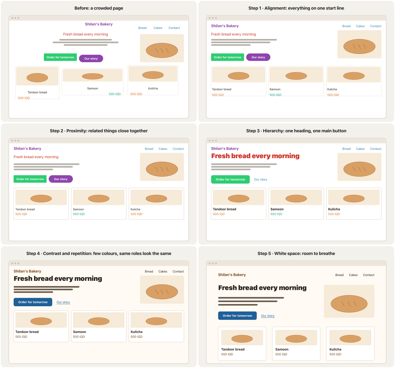
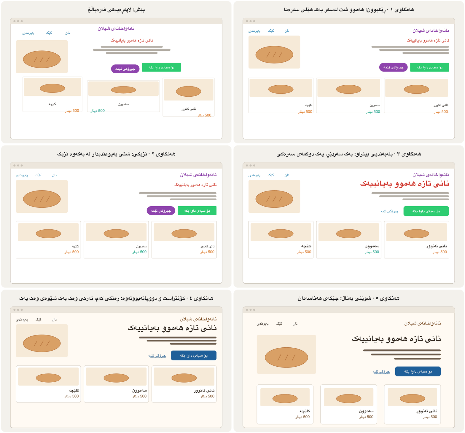
- Alignmentڕێکبوون
One start line and the same column edges for the header, the hero and the cards.
یەک هێڵی سەرەتا و هەمان لێواری ستوون بۆ ، بەشی سەرەکی و .
- Proximityنزیکی
Logo and menu in one row; heading, text and buttons as one group; each card holds its own name and price.
لۆگۆ و لە یەک ڕیزدا؛ ، دەق و وەک یەک گرووپ؛ هەر ناو و نرخی خۆی لەخۆ دەگرێت.
- Hierarchyپلەبەندیی بینراو
One big heading from the type scale and one main button: the call to action.
یەک گەورە لە و یەک سەرەکی: .
- Contrast and repetitionکۆنتراست و دووپاتەبوونەوە
Two brand colours plus neutrals, one button style, links underlined, every card alike.
دوو ڕەنگی براند لەگەڵ ڕەنگی بێلایەن، یەک شێوەی ، هێڵبەژێرکراو، هەموو وەک یەک.
- White spaceشوێنی بەتاڵ
Padding and gaps from the spacing scale: small inside groups, big between sections.
و بۆشایی لە : بچووک لە ناو گرووپەکاندا، گەورە لە نێوان بەشەکاندا.
<!DOCTYPE html>
<html lang="en">
<head>
<meta charset="utf-8">
<meta name="viewport" content="width=device-width, initial-scale=1">
<title>Shilan's Bakery</title>
<style>
:root {
  --ink: #2b2118; --muted: #6b5a4a; --brand: #7a4a21; --accent: #1f5f99; --bg: #fffaf3;
  --space-2: 0.5rem; --space-3: 1rem; --space-4: 1.5rem; --space-5: 2rem; --space-6: 3rem;
}
body { margin: 0; font-family: system-ui, sans-serif; color: var(--ink); background: var(--bg); line-height: 1.5; }
.wrap { max-width: 56rem; margin-inline: auto; padding: var(--space-5) var(--space-4); }
header { display: flex; align-items: baseline; gap: var(--space-4); margin-block-end: var(--space-6); }
.logo { color: var(--brand); font-weight: 700; font-size: 1.25rem; margin-inline-end: auto; }
nav a { color: var(--ink); margin-inline-start: var(--space-3); }
h1 { font-size: 2.441rem; line-height: 1.15; margin: 0 0 var(--space-3); }
.lead { color: var(--muted); max-width: 32rem; margin: 0 0 var(--space-4); }
.btn { display: inline-block; padding: 0.6rem 1.2rem; border-radius: 0.5rem; background: var(--accent); color: #fff; font-weight: 700; text-decoration: none; }
.more { color: var(--accent); margin-inline-start: var(--space-3); }
.cards { display: grid; grid-template-columns: repeat(auto-fit, minmax(12rem, 1fr)); gap: var(--space-4); margin-block-start: var(--space-6); }
.card { background: #fff; border: 1px solid #e2d8ca; border-radius: 0.5rem; padding: var(--space-4); }
.card h2 { font-size: 1.25rem; margin: 0 0 var(--space-2); }
.card p { margin: 0; color: var(--brand); }
</style>
</head>
<body>
<div class="wrap">
  <header>
    <span class="logo">Shilan's Bakery</span>
    <nav><a href="#bread">Bread</a><a href="#cakes">Cakes</a><a href="#contact">Contact</a></nav>
  </header>
  <main>
    <h1>Fresh bread every morning</h1>
    <p class="lead">Tandoor bread, samoon and kulicha, baked before sunrise in Erbil.</p>
    <a class="btn" href="#order">Order for tomorrow</a><a class="more" href="#story">Our story</a>
    <div class="cards" id="bread">
      <article class="card"><h2>Tandoor bread</h2><p>500 IQD</p></article>
      <article class="card"><h2>Samoon</h2><p>250 IQD</p></article>
      <article class="card"><h2>Kulicha</h2><p>1,000 IQD</p></article>
    </div>
  </main>
</div>
</body>
</html>HTML sent to the browserئەو HTMLـەی دەنێردرێت بۆ تۆڕگەڕ
<!DOCTYPE html>
<html lang="en">
<head>
<meta charset="utf-8">
<meta name="viewport" content="width=device-width, initial-scale=1">
<title>Shilan's Bakery</title>
<style>
:root {
  --ink: #2b2118; --muted: #6b5a4a; --brand: #7a4a21; --accent: #1f5f99; --bg: #fffaf3;
  --space-2: 0.5rem; --space-3: 1rem; --space-4: 1.5rem; --space-5: 2rem; --space-6: 3rem;
}
body { margin: 0; font-family: system-ui, sans-serif; color: var(--ink); background: var(--bg); line-height: 1.5; }
.wrap { max-width: 56rem; margin-inline: auto; padding: var(--space-5) var(--space-4); }
header { display: flex; align-items: baseline; gap: var(--space-4); margin-block-end: var(--space-6); }
.logo { color: var(--brand); font-weight: 700; font-size: 1.25rem; margin-inline-end: auto; }
nav a { color: var(--ink); margin-inline-start: var(--space-3); }
h1 { font-size: 2.441rem; line-height: 1.15; margin: 0 0 var(--space-3); }
.lead { color: var(--muted); max-width: 32rem; margin: 0 0 var(--space-4); }
.btn { display: inline-block; padding: 0.6rem 1.2rem; border-radius: 0.5rem; background: var(--accent); color: #fff; font-weight: 700; text-decoration: none; }
.more { color: var(--accent); margin-inline-start: var(--space-3); }
.cards { display: grid; grid-template-columns: repeat(auto-fit, minmax(12rem, 1fr)); gap: var(--space-4); margin-block-start: var(--space-6); }
.card { background: #fff; border: 1px solid #e2d8ca; border-radius: 0.5rem; padding: var(--space-4); }
.card h2 { font-size: 1.25rem; margin: 0 0 var(--space-2); }
.card p { margin: 0; color: var(--brand); }
</style>
</head>
<body>
<div class="wrap">
  <header>
    <span class="logo">Shilan's Bakery</span>
    <nav><a href="#bread">Bread</a><a href="#cakes">Cakes</a><a href="#contact">Contact</a></nav>
  </header>
  <main>
    <h1>Fresh bread every morning</h1>
    <p class="lead">Tandoor bread, samoon and kulicha, baked before sunrise in Erbil.</p>
    <a class="btn" href="#order">Order for tomorrow</a><a class="more" href="#story">Our story</a>
    <div class="cards" id="bread">
      <article class="card"><h2>Tandoor bread</h2><p>500 IQD</p></article>
      <article class="card"><h2>Samoon</h2><p>250 IQD</p></article>
      <article class="card"><h2>Kulicha</h2><p>1,000 IQD</p></article>
    </div>
  </main>
</div>
</body>
</html>Common mistakesهەڵە باوەکان
| Mistakeهەڵە | Fixچارەسەر |
|---|---|
| Many fonts and many sizesچەندین و چەندین قەبارە | One or two font families and a type scale (type scale)یەک یان دوو خێزانی و (پەیژەی قەبارەی فۆنت) |
| A rainbow of coloursپەلکەزێڕینەیەک ڕەنگ | A small palette: neutrals plus one accent (colour schemes) بچووک: ڕەنگی بێلایەن لەگەڵ یەک ڕەنگی سەرنجڕاکێش (پلانەکانی ڕەنگ) |
| Everything bold, big or redهەموو شت تۆخ، گەورە یان سوور | One main thing per screen; the rest calmerیەک شتی سەرەکی بۆ هەر شاشەیەک؛ ئەوانی تر ئارامتر |
| Long text centredدەقی درێژ لە ناوەڕاست | Align body text to the startدەقی ئاسایی بەرەو سەرەتا ڕێک بخە |
| The same gap everywhereهەمان بۆشایی لە هەموو شوێنێک | Small gaps inside groups, big gaps between themبۆشایی بچووک لە ناو گرووپدا، گەورە لە نێوانیاندا |
| Text pressed against edgesدەق بە لێوارەوە نووساو | Padding from the spacing scale لە |
| A different style for every buttonشێوەیەکی جیاواز بۆ هەر | A primary, a secondary and a link style, repeatedشێوەیەکی سەرەکی، دووەم و ، دووپاتەکراو |
| Text inside picturesدەق لە ناو وێنەدا | Real HTML text over or next to the pictureدەقی ڕاستەقینەی لەسەر یان لە تەنیشت وێنەکە |
| Walls of text without headingsدیواری دەق بەبێ | Headings that start with the key words, short paragraphs, lists کە بە وشە سەرەکییەکان دەست پێدەکەن، بڕگەی کورت، لیست |
Exercisesڕاهێنانەکان
Open the home page of a local shop, your faculty or a news site. Answer these eight questions in a few words each: (1) Squint: what do you see first? (2) Is there one main action? (3) How many start lines? (4) Are related things grouped? (5) How many text sizes? (6) How many colours? (7) Is the spacing even or random? (8) Do the pictures inform, and do they have alt text?
دوکانێکی ناوچەکەت، کۆلێژەکەت یان ماڵپەڕێکی هەواڵ بکەرەوە. بە چەند وشەیەک وەڵامی ئەم هەشت پرسیارە بدەرەوە: (١) چاوقووچاندن: یەکەم جار چی دەبینیت؟ (٢) یەک کاری سەرەکی هەیە؟ (٣) چەند هێڵی سەرەتا هەیە؟ (٤) شتە پەیوەندیدارەکان گرووپ کراون؟ (٥) چەند قەبارەی دەق هەیە؟ (٦) چەند ڕەنگ هەیە؟ (٧) بۆشاییەکان ڕێکن یان هەڕەمەکی؟ (٨) وێنەکان زانیاری دەدەن و بۆیان نووسراوە؟
Hintئاماژە
Start with the squint test; it shows the biggest problem first.
بە تاقیکردنەوەی چاوقووچاندن دەست پێبکە؛ گەورەترین کێشە یەکەم جار پیشان دەدات.
Show answerوەڵامەکە پیشان بدە
A sample critique of a phone-shop page: (1) a moving banner, three offers and a chat bubble all compete — nothing comes first; (2) four buttons of the same strength; (3) at least five start lines; (4) prices sit far from their phones; (5) seven text sizes; (6) red, orange, green, blue and purple; (7) random gaps; (8) the offers are pictures of text without alt text. Fixes: one main offer and button, one start line and a grid, prices inside the cards, a type scale with three sizes, neutrals plus one accent, a spacing scale, and real text with alt text for the photos.
هەڵسەنگاندنێکی نموونەیی بۆ لاپەڕەی دوکانێکی مۆبایل: (١) بانەرێکی جووڵاو، سێ ئۆفەر و بڵقێکی چات هەموویان کێبڕکێ دەکەن — هیچ شتێک یەکەم نییە؛ (٢) چوار بە هەمان هێز؛ (٣) لانیکەم پێنج هێڵی سەرەتا؛ (٤) نرخەکان لە مۆبایلەکانیانەوە دوورن؛ (٥) حەوت قەبارەی دەق؛ (٦) سوور، پرتەقاڵی، سەوز، شین و مۆر؛ (٧) بۆشایی هەڕەمەکی؛ (٨) ئۆفەرەکان وێنەی دەقن بەبێ . چارەسەر: یەک ئۆفەری سەرەکی و یەک ، یەک هێڵی سەرەتا و gridـێک، نرخەکان لە ناو ، بە سێ قەبارە، ڕەنگی بێلایەن لەگەڵ یەک ڕەنگی سەرنجڕاکێش، ، هەروەها دەقی ڕاستەقینە و بۆ وێنەکان.
This card breaks five principles. Rewrite its CSS with alignment, proximity, hierarchy, contrast and repetition, and white space. Keep the HTML.
ئەم پێنج بنەما دەشکێنێت. بە ڕێکبوون، نزیکی، ، کۆنتراست و دووپاتەبوونەوە، هەروەها دووپاتە بنووسەوە. وەک خۆی بهێڵەرەوە.
.product { width: 18rem; border: 3px dashed #8e44ad; padding: 4px; text-align: center; }
.product h2 { font-size: 1rem; color: #d0342c; margin: 12px; }
.product .price { font-size: 1rem; color: #16a085; margin: 12px; }
.product p { color: #aaaaaa; margin: 12px; }
.product button { background: #2ecc71; color: #fff; border: 0; border-radius: 0; margin: 12px; }
.product a { color: #e67e22; text-decoration: none; margin: 12px; }HTML sent to the browserئەو HTMLـەی دەنێردرێت بۆ تۆڕگەڕ
<!DOCTYPE html>
<html lang="en">
<head>
<meta charset="utf-8">
<meta name="viewport" content="width=device-width, initial-scale=1">
<title>Kulicha box</title>
<style>
body { font-family: system-ui, sans-serif; padding: 1rem; }

.product { width: 18rem; border: 3px dashed #8e44ad; padding: 4px; text-align: center; }
.product h2 { font-size: 1rem; color: #d0342c; margin: 12px; }
.product .price { font-size: 1rem; color: #16a085; margin: 12px; }
.product p { color: #aaaaaa; margin: 12px; }
.product button { background: #2ecc71; color: #fff; border: 0; border-radius: 0; margin: 12px; }
.product a { color: #e67e22; text-decoration: none; margin: 12px; }
</style>
</head>
<body>
<div class="product">
  <h2>Kulicha box</h2>
  <p class="price">6,000 IQD</p>
  <p>Twelve walnut and date kulicha, baked for Newroz.</p>
  <button type="button">Add to basket</button>
  <a href="#details">Details</a>
</div>
</body>
</html>Hintئاماژە
Fix one principle at a time, in the order of the redesign animation.
هەر جارێک یەک بنەما چاک بکە، بە ڕیزبەندیی دیزاینکردنەوەکە.
Show answerوەڵامەکە پیشان بدە
:root { --ink: #2b2118; --muted: #6b5a4a; --accent: #1f5f99;
        --space-2: 0.5rem; --space-3: 1rem; --space-4: 1.5rem; }
.product {
  width: 18rem; padding: var(--space-4);
  border: 1px solid #d8d0c4; border-radius: 0.75rem;
  text-align: start;                          /* alignment */
}
.product h2     { font-size: 1.5rem; color: var(--ink); margin: 0; }          /* hierarchy */
.product .price { font-weight: 700; color: var(--ink); margin: 0 0 var(--space-3); } /* proximity */
.product p      { color: var(--muted); margin: 0 0 var(--space-4); }           /* readable grey */
.product button {
  font: inherit; font-weight: 700; color: #fff; background: var(--accent);
  border: 0; border-radius: 0.5rem; padding: 0.6rem 1.2rem;                   /* one main action */
}
.product a { color: var(--accent); margin-inline-start: var(--space-3); } /* underlined link */HTML sent to the browserئەو HTMLـەی دەنێردرێت بۆ تۆڕگەڕ
<!DOCTYPE html>
<html lang="en">
<head>
<meta charset="utf-8">
<meta name="viewport" content="width=device-width, initial-scale=1">
<title>Kulicha box</title>
<style>
:root { --ink: #2b2118; --muted: #6b5a4a; --accent: #1f5f99;
        --space-2: 0.5rem; --space-3: 1rem; --space-4: 1.5rem; }
.product {
  width: 18rem; padding: var(--space-4);
  border: 1px solid #d8d0c4; border-radius: 0.75rem;
  text-align: start;                          /* alignment */
}
.product h2     { font-size: 1.5rem; color: var(--ink); margin: 0; }          /* hierarchy */
.product .price { font-weight: 700; color: var(--ink); margin: 0 0 var(--space-3); } /* proximity */
.product p      { color: var(--muted); margin: 0 0 var(--space-4); }           /* readable grey */
.product button {
  font: inherit; font-weight: 700; color: #fff; background: var(--accent);
  border: 0; border-radius: 0.5rem; padding: 0.6rem 1.2rem;                   /* one main action */
}
.product a { color: var(--accent); margin-inline-start: var(--space-3); }      /* underlined link */

body { font-family: system-ui, sans-serif; padding: 1rem; }
</style>
</head>
<body>
<div class="product">
  <h2>Kulicha box</h2>
  <p class="price">6,000 IQD</p>
  <p>Twelve walnut and date kulicha, baked for Newroz.</p>
  <button type="button">Add to basket</button>
  <a href="#details">Details</a>
</div>
</body>
</html>
What changed: one start edge instead of centring; the name and price close together, the description further away; a bigger name and one strong button; two colours plus neutrals and an underlined link; padding and gaps from the scale instead of 12 px everywhere. The pale grey text (#aaaaaa, 2.32 : 1) became #6b5a4a (6.59 : 1).
چی گۆڕا: یەک لێواری سەرەتا لە جیاتی ناوەڕاستکردن؛ ناو و نرخ لە یەکەوە نزیک، ڕوونکردنەوەکە دوورتر؛ ناوێکی گەورەتر و یەک بەهێز؛ دوو ڕەنگ لەگەڵ ڕەنگی بێلایەن و هێڵبەژێرکراو؛ و بۆشایی لە پەیژەکەوە لە جیاتی ١٢ لە هەموو شوێنێک. دەقە خۆڵەمێشییە کاڵەکە (#aaaaaa، 2.32 : 1) بوو بە #6b5a4a (6.59 : 1).
Put your redesigned card into a Kurdish page (<html lang="ckb" dir="rtl">) and translate its text. What changes by itself, and what would you have to fix if you had used text-align: left and margin-left?
دیزاینکراوەکەت بخەرە ناو لاپەڕەیەکی کوردی (<html lang="ckb" dir="rtl">) و دەقەکەی وەربگێڕە. چی خۆی دەگۆڕێت و ئەگەر text-align: left و margin-leftـت بەکار هێنابا، چیت دەبوو چاک بکەیت؟
Show answerوەڵامەکە پیشان بدە
With text-align: start and margin-inline-start nothing needs fixing: the start edge, the link gap and the reading order all move to the right by themselves. With text-align: left the Kurdish text would stick to the wrong side, and margin-left would put the gap on the wrong side of the link. Logical properties are explained in Logical properties.
بە text-align: start و margin-inline-start هیچ شتێک پێویستی بە چاککردن نییە: لێواری سەرەتا، بۆشایی و ڕیزبەندیی خوێندنەوە هەموویان خۆیان دەچنە لای ڕاست. بە text-align: left دەقە کوردییەکە دەچێتە لای هەڵە و margin-left بۆشاییەکە دەخاتە لای هەڵەی . لە تایبەتمەندییە لۆجیکییەکان ڕوون کراونەتەوە.
Summaryپوختە
- Design helps people find, read and act; the look follows the purpose.
- Hierarchy: size, weight, colour, position and space decide what is seen first; one main action per screen; check it with the squint test.
- People scan in an F on text pages and roughly a Z on simple pages — both mirrored on Kurdish pages; write headings that start with the key words.
- Alignment: one start line and a column grid; centre only short things.
- Proximity and the other Gestalt principles: close, alike or boxed things belong together.
- Contrast and repetition: different jobs look different, the same job always looks the same — a small design system.
- White space from a spacing scale in rem: small gaps inside groups, big gaps between them.
- Balance: symmetric or asymmetric, the visual weight should feel even.
- Pictures should inform, share one shape and have alt text.
- دیزاین یارمەتی خەڵک دەدات بدۆزنەوە، بخوێننەوە و کار بکەن؛ ڕووخسار بەدوای مەبەستدا دێت.
- : قەبارە، ئەستووری، ڕەنگ، شوێن و بۆشایی بڕیار دەدەن چی یەکەم جار ببینرێت؛ یەک کاری سەرەکی بۆ هەر شاشەیەک؛ بە تاقیکردنەوەی چاوقووچاندن بیپشکنە.
- خەڵک لە لاپەڕەی پڕدەقدا بە شێوەی F و لە لاپەڕەی سادەدا نزیکەی بە شێوەی Z چاو بە لاپەڕەدا دەخشێنن — هەردووکیان لە لاپەڕەی کوردیدا ئاوێنەیی دەبنەوە؛ بە شێوەیەک بنووسە کە بە وشە سەرەکییەکان دەست پێبکەن.
- ڕێکبوون: یەک هێڵی سەرەتا و ستوونەکانی grid؛ تەنیا شتی کورت لە ناوەڕاست دابنێ.
- نزیکی و تر: شتی نزیک، لێکچوو یان لە یەک چوارچێوەدا پێکەوەن.
- کۆنتراست و دووپاتەبوونەوە: ئەرکی جیاواز شێوەی جیاوازە، ئەرکی وەک یەک هەمیشە هەمان شێوەیە — بچووک.
- بە بە rem: بۆشایی بچووک لە ناو گرووپدا، گەورە لە نێوانیاندا.
- هاوسەنگی: هاوتا یان ناهاوتا، کێشی بینراو دەبێت یەکسان دەربکەوێت.
- وێنەکان دەبێت زانیاری بدەن، هەمان شێوەیان هەبێت و بۆیان بنووسرێت.
Lesson complete!وانەکە تەواو بوو!
Well done. Review the key terms, then go on to the next lesson.دەستخۆش. سەیرێکی زاراوە سەرەکییەکان بکەرەوە، پاشان بڕۆ بۆ وانەی داهاتوو.
Key termsزاراوە سەرەکییەکان
Colour for the Web: Palettes, Contrast and Themesڕەنگ بۆ وێب: پالێتی ڕەنگ، کۆنتراست و تێمەکان
Related lecturesوانە پەیوەندیدارەکان
- Colour for the Web: Palettes, Contrast and Themesڕەنگ بۆ وێب: پالێتی ڕەنگ، کۆنتراست و تێمەکان
- Effects, Transitions and Animationsکاریگەرییەکان، گۆڕانە نەرمەکان و ئەنیمەیشنەکان
- CSS Grid: Rows and Columns TogetherCSS Grid: ڕیز و ستوون پێکەوە
- Flexbox: Layout in One DirectionFlexbox: ڕێکخستن بە یەک ئاڕاستە
- Responsive Design: Viewport, Media Queries and Mobile-Firstدیزاینی ڕێسپۆنسیڤ: ناوچەی بینین، پرسەکانی میدیا و مۆبایل لە پێشدا
- Kurdish and Bilingual Websites: Right to Leftتۆڕگەکانی کوردی و دووزمانە: ڕاست بۆ چەپ
- Images for the Web: Formats, Size and Responsive Imagesوێنە بۆ وێب: جۆرەکانی فایل، قەبارە و وێنە ڕێسپۆنسیڤەکان
- Websites and Web Developmentتۆڕگەکان و دروستکردنیان
- User Experience: Users, Wireframes and Prototypesئەزموونی بەکارهێنەر: بەکارهێنەران، وایەرفرەیمەکان و نموونە سەرەتاییەکان
- Web Accessibility: WCAG 2.2 in Practiceدەستڕاگەیشتنی وێب: WCAG 2.2 لە کرداردا
References and further readingسەرچاوەکان و خوێندنەوەی زیاتر
This lecture is a first edition. The Kurdish text and terminology are waiting for review by Kurdish IT teachers.ئەم وانەیە چاپی یەکەمە. دەقە کوردییەکە و زاراوەکانی چاوەڕێی پێداچوونەوەی مامۆستایانی کوردی بواری IT ن.