Chapterبەش 6 · Lectureوانە 6.2
Web Accessibility: WCAG 2.2 in Practiceدەستڕاگەیشتنی وێب: WCAG 2.2 لە کرداردا
Who web accessibility is for and how people use the web with assistive technology; WCAG 2.2 — POUR, success criteria, the levels A, AA and AAA and the new criteria — ISO/IEC 40500:2025 and the WCAG 3 draft; the laws that ask for it; native HTML before ARIA; the keyboard and the focus; checks for every page and for forms; testing with tools, the keyboard and a screen reader; and an accessibility statement.
بۆ کێیە و خەڵک چۆن بە وێب بەکاردەهێنن؛ 2.2 — POUR، ، ئاستەکانی A، AA و AAA و پێوەرە نوێیەکان — ISO/IEC 40500:2025 و ڕەشنووسی 3؛ ئەو یاسایانەی داوای دەکەن؛ ڕەسەن پێش ARIA؛ و ؛ پشکنین بۆ هەموو لاپەڕەیەک و بۆ ؛ تاقیکردنەوە بە ئامراز، و ؛ هەروەها .
What you will learnچی فێر دەبیت
- Explain who web accessibility helps — permanent, temporary and situational limits — and name common assistive technologies.
- Describe WCAG 2.2: the four POUR principles, success criteria, the levels A, AA and AAA, and what 2.2 added.
- Name the main laws that require accessible websites and say why AA is the usual target.
- Prefer native HTML to ARIA and use the few ARIA attributes a beginner needs.
- Make every page work with the keyboard, with a visible focus in a logical order.
- Check a page with automated tools, the W3C Easy Checks, the keyboard and a screen reader, and publish an accessibility statement.
- ڕوونی بکەیتەوە یارمەتی کێ دەدات — سنووری هەمیشەیی، کاتی و بارودۆخی — و ناوی باوەکان بهێنیت.
- 2.2 وەسف بکەیت: چوار ، ، ئاستەکانی A، AA و AAA و ئەوەی 2.2 زیادی کرد.
- ناوی یاسا سەرەکییەکان بهێنیت کە داوای لە دەکەن و بڵێیت بۆچی AA ئامانجی باوە.
- ڕەسەن بە باشتر لە ARIA بزانیت و ئەو چەند خەسڵەتەی ARIA بەکاربهێنیت کە سەرەتاییەک پێویستی پێیانە.
- هەموو لاپەڕەیەک وا لێبکەیت بە کار بکات، بە دیار و ڕیزبەندییەکی لۆجیکی.
- لاپەڕەیەک بە ئامرازی خۆکار، پشکنینە ئاسانەکانی W3C، و بپشکنیت و بڵاو بکەیتەوە.
What web accessibility is, and who it is forدەستڕاگەیشتنی وێب چییە و بۆ کێیە
Designing so that everyone can use them, including people who cannot see, hear or use a well: clear text, good colour contrast, for images and pages that work with the .
دیزاینکردنی بە شێوەیەک کە هەموو کەس بتوانێت بەکاریان بهێنێت، لەوانەش ئەو کەسانەی ناتوانن بە باشی ببینن، ببیستن یان بەکاربهێنن: دەقی ڕوون، جیاوازیی ڕەنگی باش، بۆ وێنەکان و لاپەڕەی وا کە بە کار بکات.
On an accessible site, people with disabilities can perceive, understand, navigate and interact with the content, and contribute to it (W3C). That covers visual, hearing, physical, speech, cognitive and neurological disabilities. The World Health Organization estimates that about 1.3 billion people — 1 in 6 — live with a significant disability (fact sheet of 2023), and the number grows as people live longer.
لە کە تێدا ڕەچاو کراوە، کەسانی خاوەن دەتوانن هەست بە ناوەڕۆکەکە بکەن، تێی بگەن، تێیدا بگەڕێن، بەکاری بهێنن و بەشداری تێدا بکەن (W3C). ئەمەش بینین، بیستن، جووڵە، قسەکردن، تێگەیشتن و دەماری لەخۆ دەگرێت. ڕێکخراوی تەندروستیی جیهانی (WHO) دەخەمڵێنێت کە نزیکەی ١.٣ ملیار کەس — ١ لە ٦ — بەرچاویان هەیە (ڕاپۆرتی ساڵی 2023)، ژمارەکەش زیاد دەکات چونکە خەڵک تەمەنیان درێژتر دەبێت.
Limits are not only permanent. A broken arm is a temporary limit; bright sun on a phone, a noisy bus or a baby in one arm are situational limits. Captions, keyboard access, strong contrast and clear words help all of these people — and everyone else.
سنوورەکان تەنیا هەمیشەیی نین. باسکێکی شکاو سنوورێکی کاتییە؛ تیشکی بەهێزی خۆر لەسەر مۆبایل، پاسێکی پڕ لە دەنگەدەنگ یان منداڵێک لە باوەشدا سنووری بارودۆخین. ، کارکردن بە ، کۆنتراستی بەهێز و وشەی ڕوون یارمەتی هەموو ئەم کەسانە دەدەن — و هەموو کەسێکی تریش.
Assistive technology: how people use the webتەکنەلۆژیای یارمەتیدەر: خەڵک چۆن وێب بەکاردەهێنن
Devices and software that help people with disabilities use computers, such as , screen magnifiers, voice control, Braille displays and printers, and head pointers.
ئامێر و کە یارمەتی کەسانی خاوەن پێداویستیی تایبەت دەدەن بۆ بەکارهێنانی کۆمپیوتەر، وەک ، ، کۆنترۆڵ بە دەنگ، شاشە و چاپەری برەیل و نیشاندەری سەر.
- Screen readers read the page aloud or send it to a refreshable braille display: NVDA (free, Windows), JAWS (paid, Windows), Narrator (built into Windows), VoiceOver (built into iPhone, iPad and Mac), TalkBack (built into Android).
- Screen magnifiers and browser zoom make everything bigger.
- Keyboard and switch users move with Tab and the arrow keys, or with one or two big buttons that step through the page.
- Voice control (speech recognition): “click Order” — so the visible text of a button must be in its name.
- Captions and transcripts for people who cannot hear the sound.
- لاپەڕەکە بە دەنگی بەرز دەخوێننەوە یان دەینێرن بۆ شاشەیەکی بریلی گۆڕاو: NVDA (بێبەرانبەر، Windows)، JAWS (بە پارە، Windows)، Narrator (لە ناو Windowsـدا)، VoiceOver (لە ناو iPhone، iPad و Macـدا)، TalkBack (لە ناو Androidـدا).
- و هەموو شتێک گەورەتر دەکەن.
- بەکارهێنەرانی و سویچ بە Tab و دوگمە تیرەکان دەجووڵێن، یان بە یەک یان دوو دوگمەی گەورە کە هەنگاو بە هەنگاو بە ناو لاپەڕەکەدا دەڕۆن.
- کۆنترۆڵ بە دەنگ (): «click Order» — بۆیە دەقی دیاری دەبێت لە ناوەکەیدا بێت.
- و بۆ ئەو کەسانەی ناتوانن دەنگەکە ببیستن.
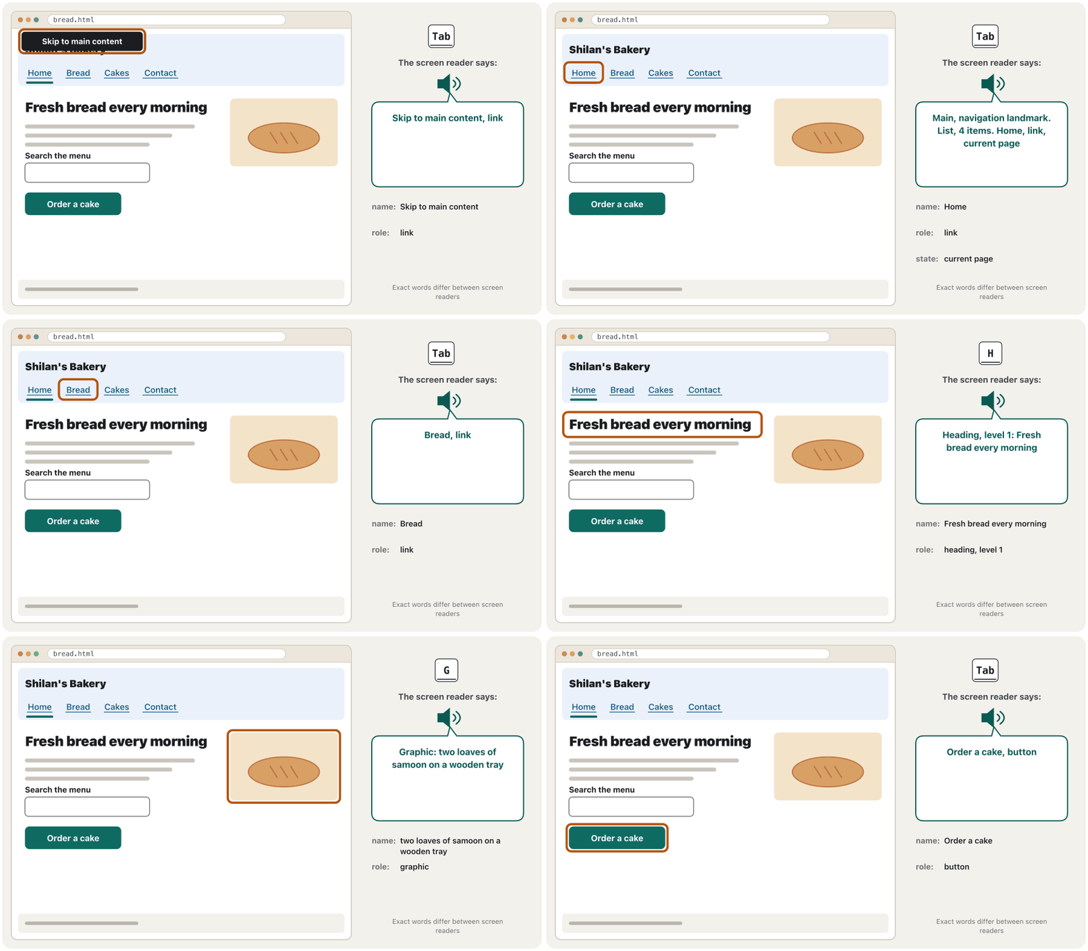
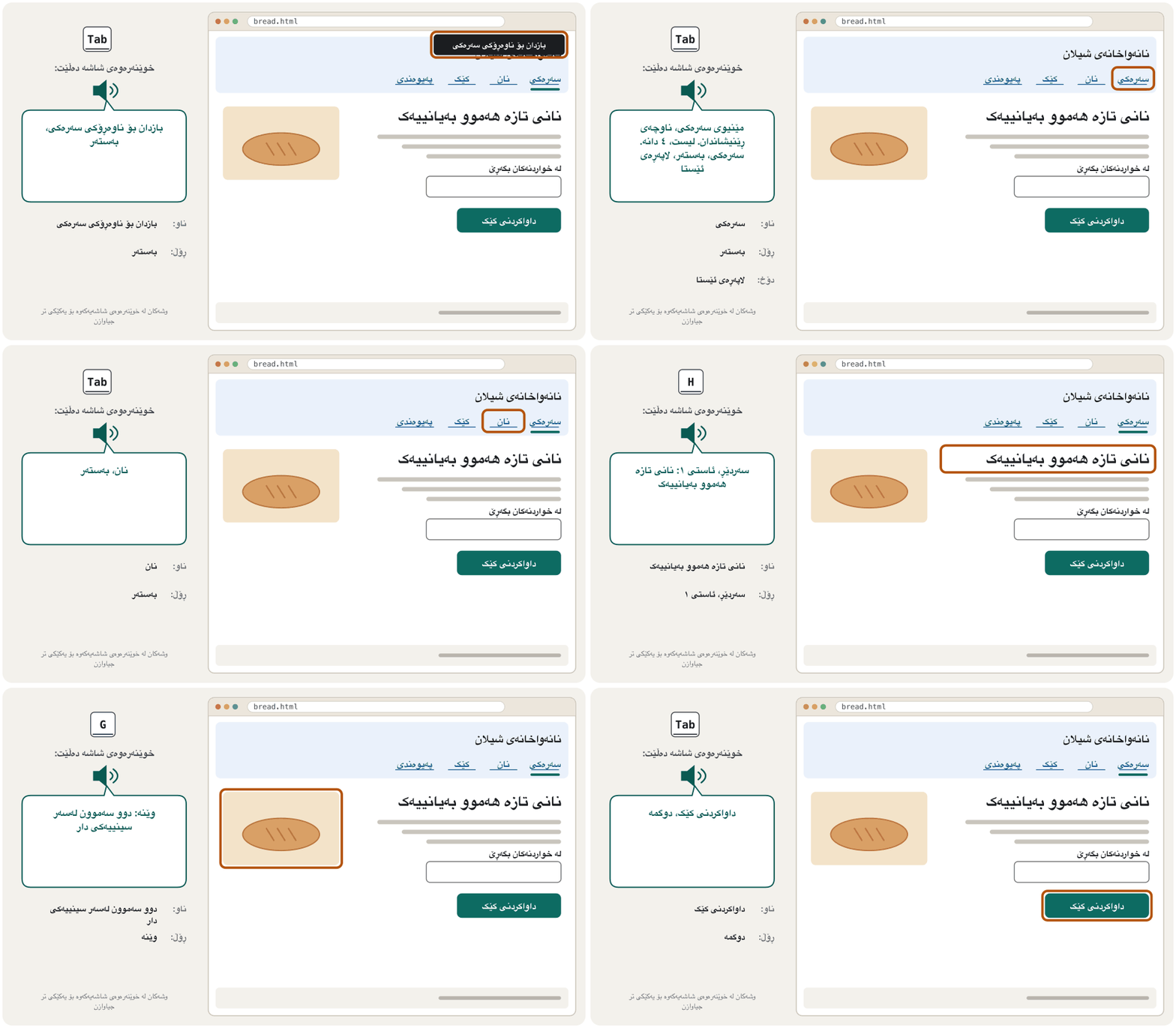
For every element a screen reader announces a name (“Order a cake”), a role (“button”) and sometimes a state (“current page”). The browser takes them from your HTML (See the page as a screen reader does). PowerPoint checks the same ideas with its Accessibility Checker.
بۆ هەموو توخمێک ناوێک («داواکردنی کێک»)، ڕۆڵێک («») و هەندێک جار دۆخێک («لاپەڕەی ئێستا») ڕادەگەیەنێت. ئەمانە لە وەردەگرێت (لاپەڕەکە وەک خوێنەرەوەی شاشە ببینە). PowerPoint هەمان بیرۆکە بە پشکنەری دەستڕاگەیشتن دەپشکنێت.
WCAG 2.2: four principlesWCAG 2.2: چوار بنەما
The W3C's international guidelines for accessible web content. WCAG 2.2 (2023, also the standard ISO/IEC 40500:2025) has four principles (perceivable, operable, understandable, robust), 13 guidelines and testable at levels A, AA and AAA; laws usually ask for level AA.
ڕێنماییە نێودەوڵەتییەکانی بۆ ئەوەی ناوەڕۆکی وێب بۆ هەمووان بەکارهێنراو بێت. WCAG 2.2 (2023، هەروەها ستانداردی ISO/IEC 40500:2025) چوار بنەما (هەستپێکراو، بەکارهێنراو، تێگەیشتراو، پتەو)، ١٣ ڕێنمایی و لە ئاستەکانی A، AA و AAAـدا لەخۆ دەگرێت کە دەتوانرێت تاقی بکرێنەوە؛ یاساکان زۆرجار ئاستی AA داوا دەکەن.
WCAG 2.2 became a W3C Recommendation on 5 October 2023; the current edition is of 12 December 2024. In October 2025 it was also approved as the international standard ISO/IEC 40500:2025, which ISO offers free of charge, so more countries can adopt it. It is built in layers: 4 principles → 13 guidelines → 86 testable success criteria.
2.2 لە ٥ی ئۆکتۆبەری 2023دا بوو بە ڕاسپاردەی W3C؛ دوایین چاپی هی ١٢ی دیسەمبەری 2024ـە. لە ئۆکتۆبەری 2025یشدا وەک ستانداردی نێودەوڵەتیی ISO/IEC 40500:2025 پەسەند کرا، کە ISO بە بێبەرانبەری دەیدات، بۆ ئەوەی وڵاتانی زیاتر بیگرنەبەر. بە چین دروست کراوە: ٤ بنەما ← ١٣ ڕێنمایی ← ٨٦ تاقیکراوە.
The four principles spell POUR: content must be Perceivable (people can see or hear it in some way), Operable (every control can be used, also with a keyboard), Understandable (clear words, predictable behaviour) and Robust (it works with browsers and assistive technology, today and tomorrow).
چوار بنەماکە دەبنە POUR: ناوەڕۆک دەبێت هەستپێکراو بێت (Perceivable: خەڵک بە شێوەیەک بتوانن بیبینن یان بیبیستن)، بەکارهێنراو بێت (Operable: هەموو کۆنترۆڵێک بەکاربێت، بە )، تێگەیشتراو بێت (Understandable: وشەی ڕوون، ڕەفتاری چاوەڕوانکراو) و پتەو بێت (Robust: لەگەڵ و کار بکات، ئەمڕۆ و سبەی).
WCAG 2.2: four principlesWCAG 2.2: چوار بنەما
Success criteria and the levels A, AA and AAAپێوەرەکانی سەرکەوتن و ئاستەکانی A، AA و AAA
One testable rule of with a number, a name and a level, for example 1.1.1 Non-text Content (A) or 2.5.8 Target Size (Minimum) (AA). A page either passes it or fails it.
یەک ڕێسای تاقیکراوەی بە ژمارە، ناو و ئاستێکەوە، بۆ نموونە 1.1.1 Non-text Content (A) یان 2.5.8 Target Size (Minimum) (AA). لاپەڕەیەک یان تێیدا سەردەکەوێت یان سەرناکەوێت.
Every success criterion is a testable sentence with a number, a name and a conformance level. For example, 1.4.3 Contrast (Minimum), level AA, asks for a contrast ratio of at least 4.5 : 1 for normal text (The contrast ratio, step by step).
هەموو ڕستەیەکی تاقیکراوەیە بە ژمارە، ناو و . بۆ نموونە، 1.4.3 Contrast (Minimum)، ئاستی AA، بۆ دەقی ئاسایی ڕێژەی لانیکەم داوا دەکات (ڕێژەی کۆنتراستی ڕەنگ، هەنگاو بە هەنگاو).
- A — the basics: without them some people cannot use the page at all (keyboard access, alt text).
- AA — removes the most common barriers (contrast, text that can grow, visible focus). AA means every A and every AA criterion, and it is the level laws and contracts usually ask for.
- AAA — the highest level; not required for whole sites, because some content cannot meet it, but use what you can.
- A — سەرەتاییەکان: بەبێ ئەوان هەندێک کەس هەرگیز ناتوانن لاپەڕەکە بەکاربهێنن (کارکردن بە ، ).
- AA — باوترین ڕێگرەکان لادەبات (کۆنتراست، دەقێک کە گەورە بکرێت، دیار). AA واتە هەموو پێوەرێکی A و هەموو پێوەرێکی AA، هەر ئەم ئاستەشە کە یاسا و گرێبەستەکان زۆرجار داوای دەکەن.
- AAA — بەرزترین ئاست؛ بۆ هەموو پێویست نییە، چونکە هەندێک ناوەڕۆک ناتوانێت پێی بگات، بەڵام ئەوەی دەتوانیت بەکاری بهێنە.
Conformance counts for whole pages and complete processes: a shop whose payment step fails does not conform, even if every other page passes.
پابەندبوون بۆ هەموو لاپەڕەکە و هەموو پرۆسەکە دەژمێردرێت: فرۆشگایەک کە هەنگاوی پارەدانی سەرنەکەوتوو بێت پابەند نییە، تەنانەت ئەگەر هەموو لاپەڕەکانی تری سەرکەوتوو بن.
WCAG 2.2: four principlesWCAG 2.2: چوار بنەما
What WCAG 2.2 addedWCAG 2.2 چی زیاد کرد
WCAG 2.2 kept everything of 2.1 except 4.1.1 Parsing, which was removed because today's browsers and assistive technology handle the problems it was about. It added nine criteria; the six at levels A and AA are:
2.2 هەموو شتێکی 2.1ـی هێشتەوە جگە لە 4.1.1 Parsing، کە لابرا چونکە و ئەمڕۆ ئەو کێشانە چارەسەر دەکەن کە باسی دەکردن. نۆ پێوەری زیاد کرد؛ ئەو شەشەی لە ئاستەکانی A و AAـدان ئەمانەن:
| Criterionپێوەر | Levelئاست | What it asksچی داوا دەکات |
|---|---|---|
| 2.4.11 Focus Not Obscured (Minimum) | AA | The focused item is never completely hidden, for example under a sticky header or a cookie banner.ئەو توخمەی لەسەرە هەرگیز بە تەواوی ناشاردرێتەوە، بۆ نموونە لە ژێر چەسپاو یان شریتی . |
| 2.5.7 Dragging Movements | AA | Anything done by dragging can also be done with simple taps or clicks (for example ▲▼ buttons).هەر شتێک بە ڕاکێشان دەکرێت بە دەستلێدان یان کلیکی سادەش دەکرێت (بۆ نموونە ▲▼). |
| 2.5.8 Target Size (Minimum) | AA | Targets are at least 24 × 24 CSS pixels, or have enough space around them. لانیکەم CSSـن، یان بۆشایی بەسیان لە دەورە. |
| 3.2.6 Consistent Help | A | Help — contact details, a chat, a help link — stays in the same place on every page.یارمەتی — زانیاریی پەیوەندی، چات، یارمەتی — لە هەموو لاپەڕەیەکدا لە هەمان شوێندا دەمێنێتەوە. |
| 3.3.7 Redundant Entry | A | Do not ask for the same information twice in one process: fill it in or offer it to choose.لە یەک پرۆسەدا دوو جار داوای هەمان زانیاری مەکە: خۆت پڕی بکەرەوە یان بۆ هەڵبژاردن پێشکەشی بکە. |
| 3.3.8 Accessible Authentication (Minimum) | AA | Logging in must not depend on remembering, copying by hand or solving puzzles — allow paste and password managers. نابێت پشت بە لەبەرکردن، نووسینەوەی دەستی یان چارەسەرکردنی مەتەڵ ببەستێت — ڕێگە بە و بدە. |
The three AAA additions are 2.4.12 Focus Not Obscured (Enhanced), 2.4.13 Focus Appearance and 3.3.9 Accessible Authentication (Enhanced).
سێ زیادکراوەکەی AAA ئەمانەن: 2.4.12 Focus Not Obscured (Enhanced)، 2.4.13 Focus Appearance و 3.3.9 Accessible Authentication (Enhanced).
The law: where accessibility is requiredیاسا: لە کوێ دەستڕاگەیشتن پێویستە
Many countries turn WCAG into law, usually at level AA. As of November 2026:
زۆر وڵات دەکەنە یاسا، زۆرجار لە ئاستی AAـدا. تا نۆڤەمبەری 2026:
- European Union: the European Accessibility Act has applied since 28 June 2025 to products and services sold to consumers — e-commerce, banking, e-books, passenger transport, phones and computers among them; public-sector sites follow the Web Accessibility Directive. Both use the European standard EN 301 549: its version 4.1.1 (September 2026) points to WCAG 2.2 AA and is expected to become the legal reference on 16 December 2026; until then version 3.2.1 (WCAG 2.1) is used.
- یەکێتیی ئەورووپا: یاسای ئەورووپا لە ٢٨ی حوزەیرانی 2025ەوە بەسەر ئەو بەرهەم و خزمەتگوزارییانەدا جێبەجێ دەکرێت کە بە بەکاربەران دەفرۆشرێن — لەوانە ، بانک، کتێبی ئەلیکترۆنی، گواستنەوەی گەشتیاران، مۆبایل و کۆمپیوتەر؛ کەرتی گشتیش پەیڕەوی ڕێنماییەکی تایبەت دەکەن. هەردووکیان ستانداردی ئەورووپیی EN 301 549 بەکاردەهێنن: وەشانی 4.1.1ـی (سێپتەمبەری 2026) ئاماژە بە 2.2 AA دەکات و چاوەڕوان دەکرێت لە ١٦ی دیسەمبەری 2026دا ببێتە سەرچاوەی یاسایی؛ تا ئەو کاتە وەشانی 3.2.1 ( 2.1) بەکاردێت.
The law: where accessibility is requiredیاسا: لە کوێ دەستڕاگەیشتن پێویستە
The USA, the UK and Iraqئەمریکا، بەریتانیا و عێراق
- USA: Section 508 covers the federal government (in line with WCAG 2.0 since 2017); a 2024 rule under the ADA asks state and local governments for WCAG 2.1 AA — by April 2027 for large ones and April 2028 for smaller ones (an April 2026 rule moved both dates one year later).
- United Kingdom: public-sector sites must meet WCAG 2.2 AA and publish an accessibility statement.
- Iraq joined the UN Convention on the Rights of Persons with Disabilities in 2013; the W3C notes that the Convention treats access to information and communication technology, including the web, as a basic human right.
- ئەمریکا: Section 508 حکوومەتی فیدراڵی دەگرێتەوە (لە 2017ەوە لەگەڵ 2.0 گونجێنراوە)؛ ڕێسایەکی ساڵی 2024 لە ژێر یاسای ADAـدا 2.1 AA لە حکوومەتە ناوخۆییەکان داوا دەکات — بۆ گەورەکان تا نیسانی 2027 و بۆ بچووکەکان تا نیسانی 2028 (ڕێسایەکی نیسانی 2026 هەردوو ڕێکەوتەکەی ساڵێک دواخست).
- بەریتانیا: کەرتی گشتی دەبێت 2.2 AA جێبەجێ بکەن و بڵاو بکەنەوە.
- عێراق لە ساڵی 2013دا بەشداری لە ڕێککەوتننامەی نەتەوە یەکگرتووەکان بۆ مافەکانی کەسانی خاوەن کرد؛ W3C دەڵێت ئەم ڕێککەوتننامەیە دەستگەیشتن بە تەکنەلۆجیای زانیاری و پەیوەندی، لەوانە وێب، بە مافێکی بنەڕەتیی مرۆڤ دادەنێت.
Rules depend on where your users live. For a real project, read the official pages of those countries or ask a lawyer.
ڕێساکان بەپێی ئەو شوێنە دەگۆڕێن کە بەکارهێنەرەکانت تێیدا دەژین. بۆ پرۆژەیەکی ڕاستەقینە، لاپەڕە فەرمییەکانی ئەو وڵاتانە بخوێنەرەوە یان پرسیار لە پارێزەرێک بکە.
Native HTML firstسەرەتا HTMLـی ڕەسەن
Real HTML elements come with accessibility built in. A <button> can be reached with Tab, pressed with Enter or Space, and is announced as “button”; <nav>, <main>, headings, lists and <label> give the page its map (Landmarks). A <div> styled to look like a button has none of this: it looks right, but keyboard and screen-reader users cannot use it.
توخمە ڕاستەقینەکانی تێدا دروستکراوە. <button> بە Tab پێی دەگەیت، بە Enter یان Space دادەگیرێت و وەک «» ڕادەگەیەنرێت؛ <nav>، <main>، ، لیستەکان و <label> نەخشەی لاپەڕەکە دەدەن (ناوچە نیشانەدارەکان). <div>ـێک کە شێوەی پێدرابێت هیچ لەمانەی نییە: ڕاست دەردەکەوێت، بەڵام بەکارهێنەرانی و ناتوانن بەکاری بهێنن.
Native HTML firstسەرەتا HTMLـی ڕەسەن
ARIA: only when HTML has no answerARIA: تەنیا کاتێک HTML وەڵامی نییە
A W3C set of HTML attributes — role and aria-* attributes such as aria-label, aria-expanded and aria-current — that tell what a custom control is and what state it is in. Use native HTML first: “no ARIA is better than bad ARIA”.
کۆمەڵێک لە — role و خەسڵەتەکانی aria-* وەک aria-label، aria-expanded و aria-current — کە بە دەڵێن کۆنترۆڵێکی تایبەت چییە و لە چ دۆخێکدایە. سەرەتا ڕەسەن بەکاربهێنە: «بێ ARIA باشترە لە ARIAـی خراپ».
ARIA attributes add names, roles and states for assistive technology — but they change only what is announced, not how anything behaves. Hence the W3C's rules: if a native HTML element does the job, use it, and no ARIA is better than bad ARIA. In WebAIM's 2026 test of the top million home pages, pages with ARIA had more detected errors on average (59.1 against 42); the report warns that this does not prove ARIA causes them, but misused ARIA is common. Five attributes you will meet first:
خەسڵەتەکانی ARIA ناو، ڕۆڵ و دۆخ بۆ زیاد دەکەن — بەڵام تەنیا ئەوە دەگۆڕن کە ڕادەگەیەنرێت، نەک ئەوەی شتەکان چۆن ڕەفتار دەکەن. بۆیە ڕێساکانی W3C دەڵێن: ئەگەر توخمێکی ڕەسەنی کارەکە دەکات، ئەوە بەکاربهێنە و بێ ARIA باشترە لە ARIAـی خراپ. لە تاقیکردنەوەی WebAIMـدا لە ساڵی 2026 بۆ ملیۆن یەکەم، ئەو لاپەڕانەی ARIAـیان تێدا بوو بە تێکڕا هەڵەی زیاتریان تێدا دۆزرایەوە (59.1 بەرامبەر 42)؛ ڕاپۆرتەکە ئاگادار دەکاتەوە کە ئەمە ئەوە ناسەلمێنێت ARIA هۆکاری هەڵەکانە، بەڵام ARIAـی هەڵە بەکارهاتوو باوە. پێنج خەسڵەت کە یەکەم جار دەیانبینیت:
aria-label— a name for a control with no visible text, such as an icon button.aria-current="page"— the current page in a menu.aria-describedby— links a field to its hint or error message.aria-live="polite"— new text in this area is read out, such as “2 cakes in your basket”.aria-expanded— whether a menu button's menu is open; JavaScript switches it (The phone menu button).
aria-label— ناوێک بۆ کۆنترۆڵێک کە دەقی دیاری نییە، وەک .aria-current="page"— لاپەڕەی ئێستا لە .aria-describedby— خانەیەک بە ڕێنمایی یان دەبەستێتەوە.aria-live="polite"— دەقی نوێ لەم ناوچەیەدا دەخوێنرێتەوە، وەک «٢ کێک لە سەبەتەکەتدایە».aria-expanded— ئایا کراوەیە؛ دەیگۆڕێت (دوگمەی مێنیو لە مۆبایلدا).
<nav aria-label="Main">
  <a href="index.html" aria-current="page">Home</a>
  <a href="bread.html">Bread</a>
  <a href="cakes.html">Cakes</a>
</nav>

<button type="button" aria-label="Search">
  <svg aria-hidden="true" width="20" height="20" viewBox="0 0 20 20">
    <circle cx="8" cy="8" r="6" fill="none" stroke="currentColor" stroke-width="2"/>
    <line x1="12.5" y1="12.5" x2="18" y2="18" stroke="currentColor" stroke-width="2"/>
  </svg>
</button>

<label for="phone">Phone</label>
<input id="phone" name="phone" type="tel" aria-describedby="phone-hint">
<p id="phone-hint">11 digits, starting with 07</p>

<p aria-live="polite">2 cakes in your basket</p>HTML sent to the browserئەو HTMLـەی دەنێردرێت بۆ تۆڕگەڕ
<!DOCTYPE html>
<html lang="en">
<head>
<meta charset="utf-8">
<meta name="viewport" content="width=device-width, initial-scale=1">
<title>Four small ARIA jobs</title>
<style>
body { font-family: system-ui, sans-serif; margin: 1rem; max-width: 26rem; }
nav { display: flex; gap: 1rem; margin-block-end: 1rem; }
a[aria-current="page"] { font-weight: 700; text-decoration-thickness: 3px; }
button { min-width: 44px; min-height: 44px; display: inline-grid; place-items: center; margin-block-end: 1rem; }
label { display: block; font-weight: 600; }
input { font: inherit; padding: 0.4rem; }
#phone-hint { color: #595959; margin-block-start: 0.25rem; }
:focus-visible { outline: 3px solid #b4530f; outline-offset: 2px; }
</style>
</head>
<body>
<nav aria-label="Main">
  <a href="index.html" aria-current="page">Home</a>
  <a href="bread.html">Bread</a>
  <a href="cakes.html">Cakes</a>
</nav>

<button type="button" aria-label="Search">
  <svg aria-hidden="true" width="20" height="20" viewBox="0 0 20 20">
    <circle cx="8" cy="8" r="6" fill="none" stroke="currentColor" stroke-width="2"/>
    <line x1="12.5" y1="12.5" x2="18" y2="18" stroke="currentColor" stroke-width="2"/>
  </svg>
</button>

<label for="phone">Phone</label>
<input id="phone" name="phone" type="tel" aria-describedby="phone-hint">
<p id="phone-hint">11 digits, starting with 07</p>

<p aria-live="polite">2 cakes in your basket</p>
</body>
</html>
The search button has no visible text, so aria-label names it; the picture inside is hidden with aria-hidden so it is not read twice.
گەڕان دەقی دیاری نییە، بۆیە aria-label ناوی لێدەنێت؛ وێنەکەی ناوی بە aria-hidden شاردراوەتەوە بۆ ئەوەی دوو جار نەخوێنرێتەوە.
Explain the codeڕوونکردنەوەی کۆدەکە
- Lineدێڕی 2
The current page in the menu.
لاپەڕەی ئێستا لە .
- Lineدێڕی 7
A name for a button that shows only an icon.
ناوێک بۆ کە تەنیا پیشان دەدات.
- Lineدێڕی 15
The hint is read together with the field.
ڕێنماییەکە لەگەڵ خانەکەدا دەخوێنرێتەوە.
- Lineدێڕی 18
New text here is announced without moving the focus.
دەقی نوێ لێرە بێ جووڵاندنی ڕادەگەیەنرێت.
Everything with the keyboardهەموو شتێک بە کیبۆرد
Put the mouse away and try your page. Tab moves forward through links, buttons and fields, Shift+Tab moves back, Enter follows a link or presses a button, Space presses a button or ticks a box, the arrow keys move inside radio groups and menus, and Esc closes a dialog. Four rules (WCAG 2.1.1, 2.1.2, 2.4.3, 2.4.7, 2.4.11):
لاببە و لاپەڕەکەت تاقی بکەرەوە. Tab بە ناو ، و خانەکاندا بۆ پێشەوە دەڕوات، Shift+Tab بۆ دواوە دەگەڕێتەوە، Enter دەکاتەوە یان دادەگرێت، Space دادەگرێت یان نیشانە دەکات، دوگمە تیرەکان لە ناو کۆمەڵە و دەجووڵێن و Esc دادەخات. چوار ڕێسا ( 2.1.1، 2.1.2، 2.4.3، 2.4.7، 2.4.11):
- Everything that works with a mouse works with the keyboard.
- The focus never gets stuck: people can always move on with the keyboard alone.
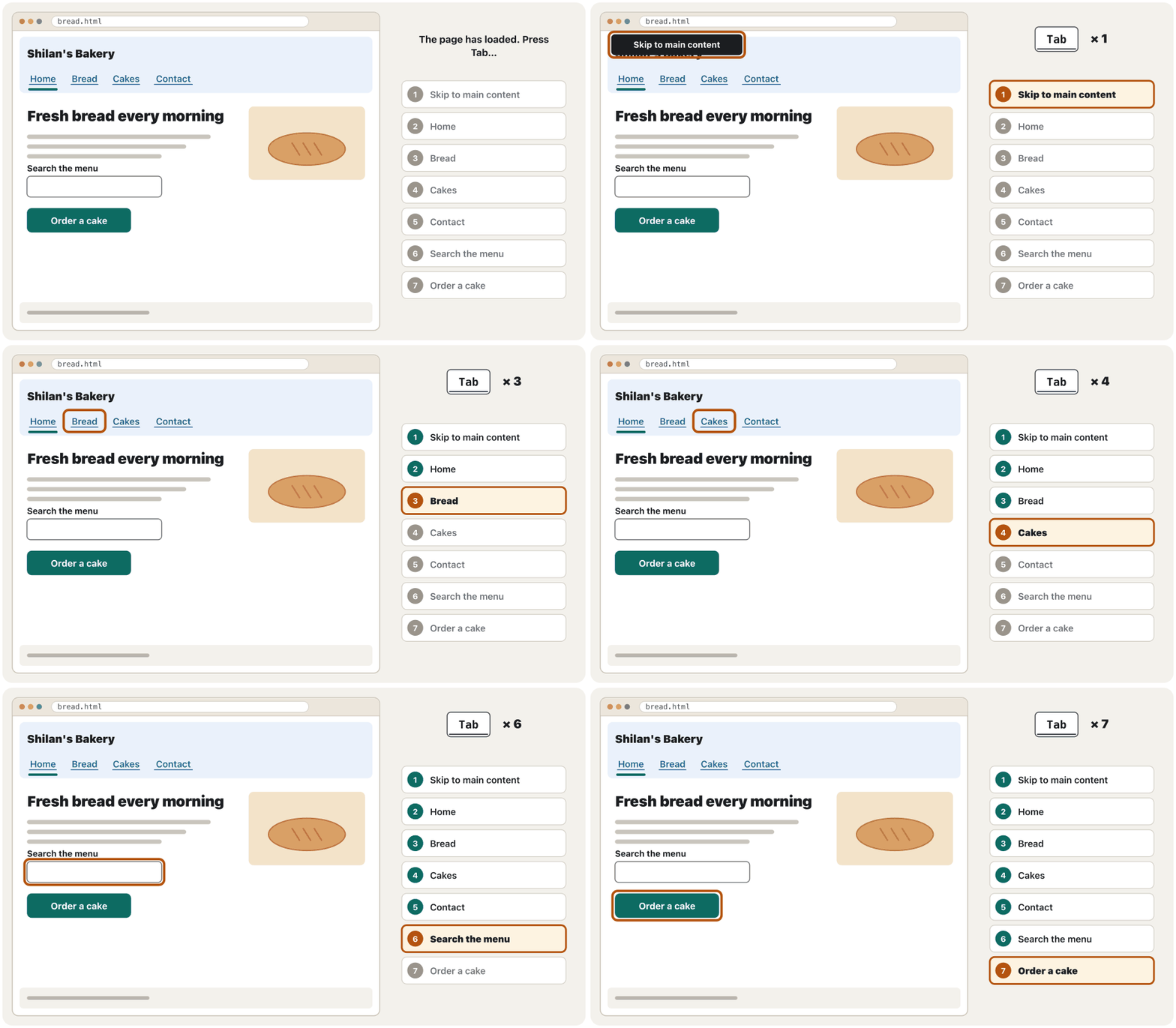
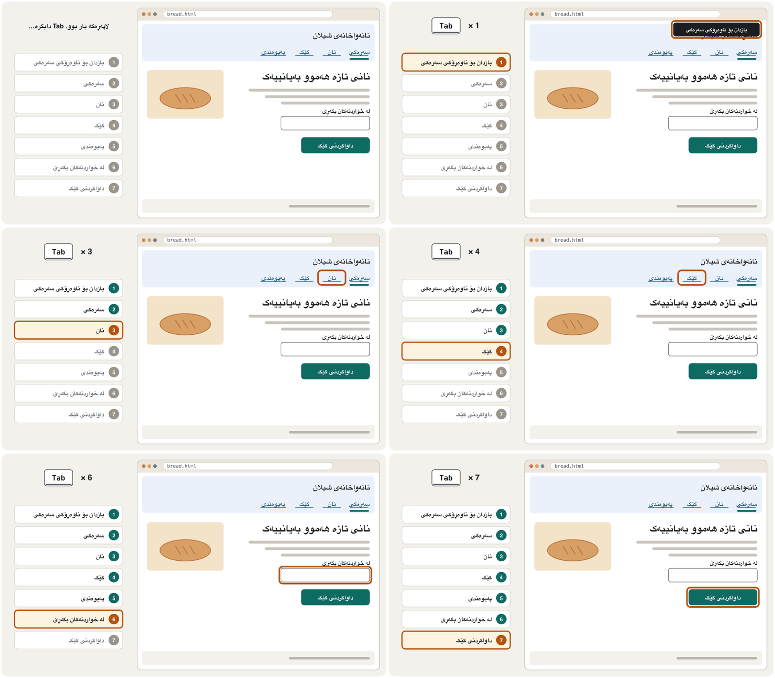
- The focus moves in a logical order (Focus order follows the HTML), and the first Tab can reach a skip link.
- The focus is always visible: never
outline: nonewithout a better style (:focus for keyboard users), and nothing such as a sticky header hides the focused item —scroll-padding-topkeeps it clear, asscroll-margin-topdoes for jump links (When a sticky header hides the target).
- هەموو شتێک کە بە کار دەکات بە کار دەکات.
- هەرگیز گیر ناخوات: خەڵک هەمیشە دەتوانن تەنیا بە بەردەوام بن.
- بە ڕیزبەندییەکی لۆجیکی دەجووڵێت (ڕیزبەندیی فۆکەس شوێن HTML دەکەوێت) و یەکەم Tab دەتوانێت بگاتە بەستەری بازدانێک.
- هەمیشە دیارە: هەرگیز
outline: noneبێ شێوازێکی باشتر مەنووسە (:focusبۆ بەکارهێنەرانی کیبۆرد) و هیچ شتێک، وەک چەسپاو، ئەو توخمە ناشارێتەوە کە لەسەرە —scroll-padding-topبۆشایی بۆ دەهێڵێتەوە، وەک ئەوەیscroll-margin-topبۆ بازدان دەیکات (کاتێک سەرپەڕەیەکی چەسپاو ئامانجەکە دەشارێتەوە).
Everything with the keyboardهەموو شتێک بە کیبۆرد
Focus order follows the HTMLڕیزبەندیی فۆکەس شوێن HTML دەکەوێت
The order in which the Tab key moves the through a page. It follows the order of the HTML source, so a visual order made with CSS (order, flex-direction: row-reverse, grid placement) should not differ from it.
ئەو ڕیزبەندییەیە کە دوگمەی Tab بەپێی ئەو لە دەباتە سەر یەکێکی تر. شوێن ڕیزبەندیی کۆدی دەکەوێت، بۆیە ڕیزبەندیی بینراو کە بە دروست دەکرێت (order، flex-direction: row-reverse، شوێنی ناو grid) نابێت لێی جیاواز بێت.
The Tab key follows the order of the HTML, not the order on the screen. CSS that moves things around — flexbox order, row-reverse, grid placement, absolute positioning — can make the focus jump back and forth (Changing the order with order). Write the HTML in reading order, and never use tabindex values above 0: they make a second order that nobody can predict. tabindex="0" (make a custom element focusable) and tabindex="-1" (focus it only from a script) are the two safe values.
دوگمەی Tab شوێن ڕیزبەندیی دەکەوێت، نەک ڕیزبەندیی سەر شاشە. ئەو شتەکان دەجووڵێنێت — orderـی ، row-reverse، شوێندانان لە grid، position: absolute — دەتوانێت وا بکات بۆ پێشەوە و دواوە باز بدات (گۆڕینی ڕیزبەندی بە order). بە ڕیزبەندیی خوێندنەوە بنووسە و هەرگیز نرخی tabindex لە 0 گەورەتر بەکارمەهێنە: ڕیزبەندییەکی دووەم دروست دەکەن کە کەس ناتوانێت پێشبینی بکات. tabindex="0" (توخمێکی تایبەت دەکاتە فۆکەسپێکراو) و tabindex="-1" (تەنیا لە فۆکەسی دەدرێتێ) دوو نرخە سەلامەتەکەن.
Checks for every pageپشکنین بۆ هەموو لاپەڕەیەک
Most barriers come from a short list. WebAIM found detectable WCAG failures on 95.9 % of the top one million home pages in 2026; the six most common were low-contrast text, images without alt text, fields without labels, empty links, empty buttons and a missing page language. Check these on every page:
زۆربەی ڕێگرەکان لە لیستێکی کورتەوە دێن. WebAIM لە ساڵی 2026دا لە ٩٥.٩٪ـی ملیۆن یەکەمدا هەڵەی دۆزییەوە؛ شەش هەڵە باوەکە ئەمانە بوون: دەقی کۆنتراست نزم، وێنەی بێ ، خانەی بێ ، بەتاڵ، بەتاڵ و نەبوونی زمانی لاپەڕە. ئەمانە لە هەموو لاپەڕەیەکدا بپشکنە:
- Text alternatives for pictures — 1.1.1 (Alt text)
- A page title that says what the page is — 2.4.2
- Headings in order, like a table of contents — 1.3.1 (Headings and sections)
- The page language,
<html lang="ckb" dir="rtl">— 3.1.1 (lang and dir) - Link text that makes sense alone — 2.4.4 (Link text)
- Contrast 4.5 : 1 for text, 3 : 1 for icons and borders, and never colour alone — 1.4.3, 1.4.11, 1.4.1 (Never colour alone)
- Zoom to 200 % and a 320 px width with nothing lost — 1.4.4, 1.4.10 (Testing)
- Captions and transcripts — 1.2.2, 1.2.1 (Captions)
- Motion that can be paused or reduced — 2.2.2 (Respect reduced motion)
- بۆ وێنەکان — 1.1.1 (دەقی جێگرەوە)
- ناونیشانێکی لاپەڕە کە بڵێت لاپەڕەکە چییە — 2.4.2
- بە ڕیز، وەک — 1.3.1 (سەردێڕەکان و بەشەکان)
- زمانی لاپەڕەکە،
<html lang="ckb" dir="rtl">— 3.1.1 (lang و dir) - دەقی کە بە تەنیا مانای هەبێت — 2.4.4 (دەقی بەستەر)
- کۆنتراستی بۆ دەق، بۆ و چوارچێوە، هەرگیز تەنیا ڕەنگ نا — 1.4.3، 1.4.11، 1.4.1 (هەرگیز تەنیا ڕەنگ نا)
- تا و پانیی 320 بێ ئەوەی هیچ لەدەست بچێت — 1.4.4، 1.4.10 (تاقیکردنەوە)
- و — 1.2.2، 1.2.1 (ژێرنووسی دەنگ)
- جووڵەیەک کە ڕابگیرێت یان کەم بکرێتەوە — 2.2.2 (ڕێز لە جووڵەی کەمکراو بگرە)
Checks for every pageپشکنین بۆ هەموو لاپەڕەیەک
Targets big enough to hitئامانجی بەس گەورە بۆ لێدان
The area of a link, button or field that reacts to a tap or a click. WCAG 2.2 asks for at least 24 × 24 CSS pixels, or enough space around a smaller target; design guides for phones advise about 44–48 pixels, because a finger is less exact than a mouse.
ئەو ناوچەیەی ، یان خانەیەکە کە بە دەستلێدان یان کلیک وەڵام دەداتەوە. 2.2 لانیکەم ٢٤ × ٢٤ CSS داوا دەکات، یان بۆشایی بەس لە دەوری ناوچەیەکی بچووکتردا؛ ڕێنماییەکانی دیزاینی مۆبایل نزیکەی ٤٤–٤٨ پێشنیار دەکەن، چونکە پەنجە لە کەمتر وردە.
WCAG 2.5.8 (AA, new in 2.2) asks that targets are at least 24 × 24 CSS pixels. A smaller target still passes if a 24-pixel circle drawn around its centre does not touch another target or its circle — so small icons need space between them. Links inside a sentence, browser-drawn controls you have not restyled and targets that must be small (pins on a map) are exceptions. For important buttons aim higher: 44 × 44 is the AAA level (2.5.5), and web.dev advises about 48 px on phones (Fingers and mice).
2.5.8 (ئاستی AA، نوێ لە 2.2) داوا دەکات ، واتە ئەو ئامانجانەی کلیکیان لێدەکرێت یان دەستیان لێدەدرێت، لانیکەم CSS بن. ئامانجێکی بچووکتر هێشتا سەردەکەوێت ئەگەر بازنەیەکی ٢٤ کە بە دەوری ناوەڕاستەکەیدا دەکێشرێت بەر ئامانجێکی تر یان بازنەکەی نەکەوێت — بۆیە بچووکەکان پێویستیان بە بۆشایی لە نێوانیاندا هەیە. لە ناو ڕستەیەکدا، ئەو کۆنترۆڵانەی خۆی دەیانکێشێت و شێوەت نەگۆڕیون و ئەو ئامانجانەی دەبێت بچووک بن (نیشانەکانی سەر نەخشە) بەدەرن. بۆ گرنگەکان بەرزتر بیر بکەرەوە: ئاستی AAAـیە (2.5.5) و web.dev نزیکەی ٤٨ بۆ مۆبایل پێشنیار دەکات (پەنجە و ماوس).
Forms that everyone can fill inفۆرمەکان کە هەموو کەس بتوانێت پڕیان بکاتەوە
Forms hide many barriers: WebAIM found fields without labels on half of the home pages it tested. The WCAG rules in short:
زۆر ڕێگر دەشارنەوە: WebAIM تاقی کردەوە و لە نیوەیاندا خانەی بێ دۆزییەوە. ڕێساکانی بە کورتی:
- Every field has a visible label tied to it with
<label for>— a placeholder is not a label (3.3.2, 1.3.1). - Instructions come before the field: the format, the length, what is required.
- Errors are described in text next to the field, linked to it with
aria-describedby, and say how to fix them (3.3.1, 3.3.3) — not only a red border (1.4.1). - Fields for personal details carry
autocompletetokens (1.3.5), and one process never asks twice for the same thing (3.3.7). - Logging in allows paste and password managers and needs no puzzle (3.3.8).
- هەموو خانەیەک دیاری هەیە کە بە
<label for>پێیەوە بەستراوە — نییە (3.3.2، 1.3.1). - ڕێنمایی پێش خانەکە دێت: شێوە، درێژی، چی پێویستە.
- بە دەق لە تەنیشت خانەکەوە وەسف دەکرێن، بە
aria-describedbyپێیەوە دەبەسترێن و دەڵێن چۆن چاک دەکرێنەوە (3.3.1، 3.3.3) — نەک تەنیا چوارچێوەیەکی سوور (1.4.1). - خانەکانی زانیاریی کەسی تۆکنی
autocompleteـیان هەیە (1.3.5) و یەک پرۆسە هەرگیز دوو جار داوای هەمان شت ناکات (3.3.7). - ڕێگە بە و دەدات و پێویستی بە مەتەڵ نییە (3.3.8).
How to design all of this — labels, hints, keyboards, error messages and log-in — is the next lesson: Designing Usable Forms.
چۆنیەتیی دیزاینکردنی هەموو ئەمانە — ، ڕێنمایی، ، و — وانەی داهاتووە: دیزاینکردنی فۆرمی ئاسان بۆ پڕکردنەوە.
Testing: tools, keyboard, screen reader, peopleتاقیکردنەوە: ئامراز، کیبۆرد، خوێنەرەوەی شاشە، خەڵک
- Automated toolsئامرازی خۆکار
Lighthouse in Chrome's developer tools (F12 → Lighthouse), and free browser extensions such as WAVE (WebAIM), axe DevTools (Deque) and Accessibility Insights for Web (Microsoft). They find missing alt text, labels and low contrast in seconds — but only what a machine can see: “no errors found” does not mean “accessible”.
Lighthouse لە Chromeـدا (F12 → Lighthouse)، هەروەها پێوەکراوە بێبەرانبەرەکانی وەک WAVE (WebAIM)، axe DevTools (Deque) و Accessibility Insights for Web (Microsoft). لە چەند چرکەیەکدا ، و کۆنتراستی نزم دەدۆزنەوە — بەڵام تەنیا ئەوەی ئامێرێک دەتوانێت ببینێت: «هیچ هەڵەیەک نەدۆزرایەوە» واتای «بۆ هەمووان بەکاردێت» نییە.
- The W3C Easy Checksپشکنینە ئاسانەکانی W3C
13 quick manual checks: page title, alt text, headings, contrast, skip link, visible focus, language, zoom, captions, transcripts, audio description, form labels and required fields.
١٣ پشکنینی دەستیی خێرا: ناونیشانی لاپەڕە، ، ، کۆنتراست، ، دیار، زمان، ، ، ، ، و .
- A keyboard passتاقیکردنەوە بە کیبۆرد
Do the whole task without a mouse.
هەموو کارەکە بێ بکە.
- A screen-reader passتاقیکردنەوە بە خوێنەرەوەی شاشە
NVDA on Windows (H jumps by headings, D by landmarks, Tab by controls), VoiceOver on a Mac or an iPhone, TalkBack on Android.
NVDA لەسەر Windows (دوگمەی H بە باز دەدات، D بە و Tab بە کۆنترۆڵەکاندا)، VoiceOver لەسەر Mac یان iPhone، TalkBack لەسەر Android.
- Peopleخەڵک
Include disabled people in your usability tests (Usability testing).
کەسانی خاوەن لە تاقیکردنەوەکانی بەشدار بکە (تاقیکردنەوەی ئاسانیی بەکارهێنان).
An accessibility statement and a checklistڕاگەیەندراوی دەستڕاگەیشتن و لیستی پشکنین
Link an accessibility statement from every page's footer. Say what you aim for (for example WCAG 2.2 AA), which parts do not work yet and when you will fix them, and how people can contact you when something does not work — then answer them. The W3C offers a free statement generator, and UK public-sector sites must publish one. Before each new page goes online, use the checklist below.
لە هەموو لاپەڕەیەکەوە بۆ دابنێ. بڵێ ئامانجت چییە (بۆ نموونە 2.2 AA)، کام بەش هێشتا کار ناکات و کەی چاکی دەکەیتەوە، هەروەها خەڵک چۆن دەتوانن پەیوەندیت پێوە بکەن کاتێک شتێک کار ناکات — پاشان وەڵامیان بدەرەوە. W3C ئامرازێکی بێبەرانبەر بۆ دروستکردنی ڕاگەیەندراو پێشکەش دەکات و کەرتی گشتیی بەریتانیا دەبێت یەکێک بڵاو بکەنەوە. پێش ئەوەی هەر لاپەڕەیەکی نوێ بخەیتە سەر ، ئەم لیستەی خوارەوە بەکاربهێنە.
Common mistakesهەڵە باوەکان
| Mistakeهەڵە | Fixچارەسەر |
|---|---|
<div> or <span> “buttons” and links«» و دروستکراو لە <div> یان <span> | <button> to do something, <a href> to go somewhere<button> بۆ کردنی شتێک، <a href> بۆ چوون بۆ شوێنێک |
| A placeholder instead of a label لەجیاتی | A visible <label><label>ـێکی دیار |
outline: none on focusoutline: none لەسەر | A clear :focus-visible styleشێوازێکی ڕوونی :focus-visible |
| Text inside picturesدەق لە ناو وێنەدا | Real text styled with CSSدەقی ڕاستەقینە کە بە شێوەی پێدراوە |
| Video or sound that starts by itselfڤیدیۆ یان دەنگ کە خۆی دەست پێدەکات | No autoplay with sound; controls and captions بە دەنگەوە نا؛ کۆنترۆڵ و |
| Errors shown only in red تەنیا بە سوور پیشان دەدرێن | Words, an icon and aria-describedbyوشە، و aria-describedby |
tabindex="5" to “fix” the ordertabindex="5" بۆ «چاککردنی» ڕیزبەندی | Fix the order of the HTMLڕیزبەندیی چاک بکەرەوە |
| An “overlay” widget that promises one-click accessibilityویجێتێکی «داپۆشەر» کە بەڵێنی بە یەک کلیک دەدات | Fix the code itself. In 2025 the US Federal Trade Commission ordered one overlay company to pay $1 million because its widget did not make sites WCAG-compliant as it claimedخودی کۆدەکە چاک بکەرەوە. لە ساڵی 2025دا کۆمیسیۆنی بازرگانیی فیدراڵیی ئەمریکا فەرمانی بە کۆمپانیایەکی ویجێتی داپۆشەر کرد یەک ملیۆن دۆلار بدات، چونکە ویجێتەکەی وەک ئەوەی دەیگوت پابەندی نەدەکرد |
| Testing only with an automated toolتاقیکردنەوە تەنیا بە ئامرازێکی خۆکار | Add the keyboard, a screen reader and real users، و بەکارهێنەرانی ڕاستەقینەش زیاد بکە |
Exercisesڕاهێنانەکان
Check this page with the W3C Easy Checks and the keyboard. Find at least ten problems, then write a fixed version. (The page is valid HTML — the checker warns only about the missing lang — but it is far from accessible.)
ئەم لاپەڕەیە بە پشکنینە ئاسانەکانی W3C و بە بپشکنە. لانیکەم دە کێشە بدۆزەرەوە، پاشان وەشانێکی چاککراو بنووسە. (لاپەڕەکە دروستە — پشکنەرەکە تەنیا لەسەر نەبوونی lang ئاگادار دەکاتەوە — بەڵام زۆر دوورە لەوەی بۆ هەمووان بەکاربێت.)
<!DOCTYPE html>
<html>
<head>
<meta charset="utf-8">
<meta name="viewport" content="width=device-width, initial-scale=1">
<title>Page</title>
<style>
body { font-family: system-ui, sans-serif; margin: 1rem; color: #222222; }
.title { font-size: 2rem; font-weight: bold; }
.note { color: #aaaaaa; }
.btn { display: inline-block; background: #0d6b62; color: #ffffff; padding: 0.5rem 1rem; border-radius: 6px; cursor: pointer; }
*:focus { outline: none; }
input.error { border: 2px solid red; }
.icons a { display: inline-block; width: 16px; height: 16px; }
.icons img { width: 16px; height: 16px; }
</style>
</head>
<body>
<div class="title">Shilan's Bakery</div>
<p class="note">Fresh bread every morning from 6:00.</p>
<img src="bread.jpg" alt="IMG_2041.jpg" width="300" height="200">
<p>To see our prices, <a href="prices.html">click here</a>.</p>
<form action="#" method="post">
  <input type="email" name="email" placeholder="Email" class="error">
  <div class="btn" onclick="this.closest('form').submit()">Send</div>
</form>
<div class="icons">
  <a href="https://example.com/social"><img src="social.png" alt=""></a><a href="https://example.org/photos"><img src="photos.png" alt=""></a>
</div>
</body>
</html>HTML sent to the browserئەو HTMLـەی دەنێردرێت بۆ تۆڕگەڕ
<!DOCTYPE html>
<html>
<head>
<meta charset="utf-8">
<meta name="viewport" content="width=device-width, initial-scale=1">
<title>Page</title>
<style>
body { font-family: system-ui, sans-serif; margin: 1rem; color: #222222; }
.title { font-size: 2rem; font-weight: bold; }
.note { color: #aaaaaa; }
.btn { display: inline-block; background: #0d6b62; color: #ffffff; padding: 0.5rem 1rem; border-radius: 6px; cursor: pointer; }
*:focus { outline: none; }
input.error { border: 2px solid red; }
.icons a { display: inline-block; width: 16px; height: 16px; }
.icons img { width: 16px; height: 16px; }
</style>
</head>
<body>
<div class="title">Shilan's Bakery</div>
<p class="note">Fresh bread every morning from 6:00.</p>
<img src="bread.jpg" alt="IMG_2041.jpg" width="300" height="200">
<p>To see our prices, <a href="prices.html">click here</a>.</p>
<form action="#" method="post">
  <input type="email" name="email" placeholder="Email" class="error">
  <div class="btn" onclick="this.closest('form').submit()">Send</div>
</form>
<div class="icons">
  <a href="https://example.com/social"><img src="social.png" alt=""></a><a href="https://example.org/photos"><img src="photos.png" alt=""></a>
</div>
</body>
</html>Hintئاماژە
Go through the 13 Easy Checks one by one, then try the whole page with Tab only.
یەک بە یەک ١٣ پشکنینە ئاسانەکە بکە، پاشان هەموو لاپەڕەکە تەنیا بە Tab تاقی بکەرەوە.
Show answerوەڵامەکە پیشان بدە
1 no lang; 2 the title “Page” says nothing; 3 the site name is a styled <div>, so there is no heading at all; 4 grey #aaaaaa text on white is only 2.32 : 1; 5 alt="IMG_2041.jpg" describes nothing; 6 “click here” makes no sense in a list of links; 7 the email field has only a placeholder; 8 the error is shown only by a red border, with no message; 9 “Send” is a <div>: Tab cannot reach it and Enter does nothing; 10 *:focus { outline: none; } hides the focus; 11 the two icon links have empty alt text, so their names are empty, and they are only 16 px, side by side; 12 no <main> landmark.
١ lang نییە؛ ٢ ناونیشانی «Page» هیچ ناڵێت؛ ٣ ناوی <div>ـێکی شێوەپێدراوە، بۆیە هیچ نییە؛ ٤ دەقی خۆڵەمێشیی #aaaaaa لەسەر سپی تەنیا ـە؛ ٥ alt="IMG_2041.jpg" هیچ وەسف ناکات؛ ٦ «click here» لە لیستێکی مانای نییە؛ ٧ خانەی ئیمەیڵ تەنیا هەیە؛ ٨ تەنیا بە چوارچێوەیەکی سوور پیشان دەدرێت، بێ پەیام؛ ٩ «Send» <div>ـە: Tab پێی ناگات و Enter هیچ ناکات؛ ١٠ *:focus { outline: none; } دەشارێتەوە؛ ١١ دوو بەتاڵیان هەیە، بۆیە ناوەکانیان بەتاڵە و تەنیا ١٦ و بەریەک دەکەون؛ ١٢ <main> نییە.
<!DOCTYPE html>
<html lang="en">
<head>
<meta charset="utf-8">
<meta name="viewport" content="width=device-width, initial-scale=1">
<title>Fresh bread – Shilan's Bakery</title>
<style>
body { font-family: system-ui, sans-serif; margin: 1rem; color: #222222; }
.note { color: #595959; }
:focus-visible { outline: 3px solid #b4530f; outline-offset: 2px; }
label { display: block; font-weight: 600; }
input { font: inherit; padding: 0.5rem; border: 1px solid #767676; border-radius: 6px; }
input[aria-invalid="true"] { border: 2px solid #b3261e; }
.error { color: #b3261e; font-weight: 600; }
button { font: inherit; background: #0d6b62; color: #ffffff; border: 0; padding: 0.6rem 1.2rem; border-radius: 6px; }
.icons { display: flex; gap: 0.5rem; }
.icons a { display: inline-grid; place-items: center; min-width: 44px; min-height: 44px; }
</style>
</head>
<body>
<header><h1>Shilan's Bakery</h1></header>
<main>
  <p class="note">Fresh bread every morning from 6:00.</p>
  <img src="bread.jpg" alt="Two loaves of samoon on a wooden tray" width="300" height="200">
  <p>See our <a href="prices.html">bread price list</a>.</p>
  <form action="#" method="post">
    <label for="email">Email</label>
    <input id="email" type="email" name="email" autocomplete="email" aria-invalid="true" aria-describedby="email-error">
    <p class="error" id="email-error">Error: enter an email address, like name@example.com.</p>
    <button type="submit">Send</button>
  </form>
</main>
<footer class="icons">
  <a href="https://example.com/social"><img src="social.png" alt="Our social page" width="24" height="24"></a>
  <a href="https://example.org/photos"><img src="photos.png" alt="Our photos" width="24" height="24"></a>
</footer>
</body>
</html>HTML sent to the browserئەو HTMLـەی دەنێردرێت بۆ تۆڕگەڕ
<!DOCTYPE html>
<html lang="en">
<head>
<meta charset="utf-8">
<meta name="viewport" content="width=device-width, initial-scale=1">
<title>Fresh bread – Shilan's Bakery</title>
<style>
body { font-family: system-ui, sans-serif; margin: 1rem; color: #222222; }
.note { color: #595959; }
:focus-visible { outline: 3px solid #b4530f; outline-offset: 2px; }
label { display: block; font-weight: 600; }
input { font: inherit; padding: 0.5rem; border: 1px solid #767676; border-radius: 6px; }
input[aria-invalid="true"] { border: 2px solid #b3261e; }
.error { color: #b3261e; font-weight: 600; }
button { font: inherit; background: #0d6b62; color: #ffffff; border: 0; padding: 0.6rem 1.2rem; border-radius: 6px; }
.icons { display: flex; gap: 0.5rem; }
.icons a { display: inline-grid; place-items: center; min-width: 44px; min-height: 44px; }
</style>
</head>
<body>
<header><h1>Shilan's Bakery</h1></header>
<main>
  <p class="note">Fresh bread every morning from 6:00.</p>
  <img src="bread.jpg" alt="Two loaves of samoon on a wooden tray" width="300" height="200">
  <p>See our <a href="prices.html">bread price list</a>.</p>
  <form action="#" method="post">
    <label for="email">Email</label>
    <input id="email" type="email" name="email" autocomplete="email" aria-invalid="true" aria-describedby="email-error">
    <p class="error" id="email-error">Error: enter an email address, like name@example.com.</p>
    <button type="submit">Send</button>
  </form>
</main>
<footer class="icons">
  <a href="https://example.com/social"><img src="social.png" alt="Our social page" width="24" height="24"></a>
  <a href="https://example.org/photos"><img src="photos.png" alt="Our photos" width="24" height="24"></a>
</footer>
</body>
</html>
Explain the codeڕوونکردنەوەی کۆدەکە
- Lineدێڕی 2
The page language.
زمانی لاپەڕەکە.
- Lineدێڕی 6
A title that says what the page is.
ناونیشانێک کە بڵێت لاپەڕەکە چییە.
- Lineدێڕی 9
Grey that still has 7 : 1 contrast on white.
خۆڵەمێشییەک کە هێشتا کۆنتراستی ـی لەسەر سپی هەیە.
- Lineدێڕی 10
A clear focus ring instead of none.
ڕوون لەجیاتی هیچ.
- Lineدێڕی 21
A real heading in a header landmark.
ڕاستەقینە لە header.
- Lineدێڕی 29-31
A visible label, autocomplete, and an error in words tied with aria-describedby.
دیار،
autocompleteو بە وشە کە بەaria-describedbyبەستراوە.- Lineدێڕی 32
A real button: Tab, Enter and Space work.
ڕاستەقینە: Tab، Enter و Space کار دەکەن.
Write a short accessibility statement for Shilan's Bakery: the aim, one known problem with a date, and a contact.
ڕاگەیەندراوێکی کورتی بۆ نانەواخانەی شیلان بنووسە: ئامانج، یەک کێشەی ناسراو بە ڕێکەوتێکەوە و ڕێگەیەکی پەیوەندی.
Show answerوەڵامەکە پیشان بدە
“Shilan's Bakery wants everyone to be able to order bread online. We aim to meet WCAG 2.2 at level AA. Known problem: our older menu PDFs are not accessible; we will replace them with web pages by March 2027. If something does not work for you, write to access@shilan-bakery.example or call 0750 000 0000 — we answer within two working days. Last checked: 4 November 2026.”
«نانەواخانەی شیلان دەیەوێت هەموو کەس بتوانێت بە ئۆنلاین نان داوا بکات. ئامانجمان جێبەجێکردنی 2.2ـە لە ئاستی AAـدا. کێشەی ناسراو: PDFـە کۆنەکانی لیستی خواردنمان بۆ هەمووان بەکارنایەن؛ تا ئازاری 2027 بە لاپەڕەی وێب دەیانگۆڕین. ئەگەر شتێک بۆ تۆ کار ناکات، بنووسە بۆ access@shilan-bakery.example یان پەیوەندی بکە بە 0750 000 0000 — لە ماوەی دوو ڕۆژی کاردا وەڵام دەدەینەوە. دوایین پشکنین: ٤ی نۆڤەمبەری 2026.»
When you Tab down a long page, the focused link slides under a sticky header 4rem tall. Which WCAG 2.2 criterion is broken, and which one line of CSS fixes it?
کاتێک بە Tab بە لاپەڕەیەکی درێژدا دەچیتە خوارەوە، ئەو لەسەرە دەچێتە ژێر چەسپاوی 4rem بەرز. کام پێوەری 2.2 شکاوە و کام یەک دێڕی چاکی دەکاتەوە؟
Show answerوەڵامەکە پیشان بدە
2.4.11 Focus Not Obscured (Minimum). Give the scrolling area padding at the top, so the browser scrolls focused items below the header:
2.4.11 Focus Not Obscured (Minimum). بۆشایی بدە بە سەرەوەی ناوچەی جووڵاندنەکە، بۆ ئەوەی ئەو توخمانەی وەردەگرن ببات بۆ ژێر :
header { position: sticky; top: 0; height: 4rem; }
html { scroll-padding-top: 5rem; } /* room above any element that gets the focus */HTML sent to the browserئەو HTMLـەی دەنێردرێت بۆ تۆڕگەڕ
<!DOCTYPE html>
<html lang="en">
<head>
<meta charset="utf-8">
<meta name="viewport" content="width=device-width, initial-scale=1">
<title>Sticky header and focus</title>
<style>
header { position: sticky; top: 0; height: 4rem; }
html { scroll-padding-top: 5rem; }   /* room above any element that gets the focus */

body { margin: 0; font-family: system-ui, sans-serif; }
header { background: #0d6b62; color: #ffffff; display: flex; align-items: center; padding-inline: 1rem; }
main { padding: 1rem; }
p { margin-block: 0 1.5rem; }
a:focus-visible { outline: 3px solid #b4530f; outline-offset: 2px; }
</style>
</head>
<body>
<header>Shilan's Bakery</header>
<main>
  <p><a href="#a">Link 1</a></p><p><a href="#b">Link 2</a></p><p><a href="#c">Link 3</a></p>
  <p><a href="#d">Link 4</a></p><p><a href="#e">Link 5</a></p><p><a href="#f">Link 6</a></p>
  <p><a href="#g">Link 7</a></p><p><a href="#h">Link 8</a></p><p><a href="#i">Link 9</a></p>
  <p><a href="#j">Link 10</a></p><p><a href="#k">Link 11</a></p><p><a href="#l">Link 12</a></p>
</main>
</body>
</html>
Click into the preview and press Tab: each focused link stays below the green header.
کلیک لە ناو پێشبینینەکەدا بکە و Tab دابگرە: هەموو فۆکەسکراو لە ژێر سەوزەکەدا دەمێنێتەوە.
Summaryپوختە
- Web accessibility lets people with disabilities — about 1 in 6 people (WHO) — use the web; it also helps temporary and situational limits.
- Assistive technology — screen readers, magnifiers, keyboards and switches, voice control — reads the name, role and state that HTML provides.
- WCAG 2.2 (= ISO/IEC 40500:2025): POUR → 13 guidelines → 86 success criteria at A, AA, AAA; AA is the usual target; WCAG 3 is still a draft.
- New in 2.2: focus not obscured, dragging alternatives, 24 px targets, consistent help, no redundant entry, accessible log-in.
- Laws: the European Accessibility Act (since 28 June 2025), Section 508 and the ADA rule in the USA, UK public-sector regulations — check the rules where your users live.
- Native HTML first; ARIA only where HTML has no answer, and never without the keyboard behaviour.
- Everything works with the keyboard, in HTML order, with a visible focus that nothing hides.
- Test in layers: tools, Easy Checks, keyboard, screen reader, people — and publish an accessibility statement.
- ڕێگە بە کەسانی خاوەن دەدات — نزیکەی ١ لە ٦ـی خەڵک (WHO) — وێب بەکاربهێنن؛ یارمەتی سنووری کاتی و بارودۆخیش دەدات.
- — ، ، و سویچ، کۆنترۆڵ بە دەنگ — ئەو ناو، ڕۆڵ و دۆخە دەخوێنێتەوە کە دەیدات.
- 2.2 (= ISO/IEC 40500:2025): POUR ← ١٣ ڕێنمایی ← ٨٦ لە A، AA، AAA؛ AA ئامانجی باوە؛ 3 هێشتا ڕەشنووسە.
- نوێ لە 2.2: ناشاردرێتەوە، جێگرەوە بۆ ڕاکێشان، ئامانجی ٢٤ ، یارمەتیی یەکدەست، نووسینی دووپاتە نا، بۆ هەمووان.
- یاساکان: یاسای ئەورووپا (لە ٢٨ی حوزەیرانی 2025ەوە)، Section 508 و ڕێسای ADA لە ئەمریکا، ڕێساکانی کەرتی گشتیی بەریتانیا — ڕێساکانی ئەو شوێنە بپشکنە کە بەکارهێنەرەکانت تێیدا دەژین.
- سەرەتا ڕەسەن؛ ARIA تەنیا لەو شوێنەی وەڵامی نییە و هەرگیز بێ ڕەفتاری .
- هەموو شتێک بە کار دەکات، بە ڕیزبەندیی و بە دیار کە هیچ شتێک نایشارێتەوە.
- بە چین تاقی بکەرەوە: ئامراز، پشکنینە ئاسانەکان، ، ، خەڵک — و بڵاو بکەرەوە.
Lesson complete!وانەکە تەواو بوو!
Well done. Review the key terms, then go on to the next lesson.دەستخۆش. سەیرێکی زاراوە سەرەکییەکان بکەرەوە، پاشان بڕۆ بۆ وانەی داهاتوو.
Key termsزاراوە سەرەکییەکان
Designing Usable Formsدیزاینکردنی فۆرمی ئاسان بۆ پڕکردنەوە
Related lecturesوانە پەیوەندیدارەکان
- Links and Navigation Menusبەستەرەکان و لیستە ڕێنیشاندەرەکان
- HTML Text, Images and Listsدەق، وێنە و لیست لە HTMLـدا
- Audio, Video and Embedded Contentدەنگ، ڤیدیۆ و ناوەڕۆکی چەسپێنراو
- Colour for the Web: Palettes, Contrast and Themesڕەنگ بۆ وێب: پالێتی ڕەنگ، کۆنتراست و تێمەکان
- Effects, Transitions and Animationsکاریگەرییەکان، گۆڕانە نەرمەکان و ئەنیمەیشنەکان
- Responsive Design: Viewport, Media Queries and Mobile-Firstدیزاینی ڕێسپۆنسیڤ: ناوچەی بینین، پرسەکانی میدیا و مۆبایل لە پێشدا
- Kurdish and Bilingual Websites: Right to Leftتۆڕگەکانی کوردی و دووزمانە: ڕاست بۆ چەپ
- Designing Usable Formsدیزاینکردنی فۆرمی ئاسان بۆ پڕکردنەوە
- User Experience: Users, Wireframes and Prototypesئەزموونی بەکارهێنەر: بەکارهێنەران، وایەرفرەیمەکان و نموونە سەرەتاییەکان
- Spelling, Thesaurus and Accessibilityڕێنووس، فەرهەنگی هاوواتا و دەستڕاگەیشتن
References and further readingسەرچاوەکان و خوێندنەوەی زیاتر
- W3C WAI: Introduction to Web Accessibility
- World Health Organization: Disability (fact sheet)
- MDN: What is accessibility?
- W3C: Web Content Accessibility Guidelines (WCAG) 2.2
- W3C WAI: What's New in WCAG 2.2
- W3C: Understanding SC 2.5.8 Target Size (Minimum)
- W3C: Understanding SC 2.4.11 Focus Not Obscured (Minimum)
- W3C: Understanding SC 2.5.7 Dragging Movements
- W3C: Understanding SC 3.3.8 Accessible Authentication (Minimum)
- W3C WAI news: WCAG 2.2 is now ISO/IEC 40500:2025 (21 October 2025)
- W3C WAI: WCAG 3 Introduction
- European Commission: European Accessibility Act
- AccessibleEU (European Commission): The EAA comes into effect in June 2025
- National Disability Authority (Ireland): EN 301 549 V4.1.1 published
- ADA.gov: Fact sheet — the Title II web and mobile app rule
- Section508.gov: Laws and policies
- GOV.UK: Understanding accessibility requirements for public sector bodies
- UN Treaty Collection: Convention on the Rights of Persons with Disabilities — status
- W3C WAI-ARIA Authoring Practices: Read Me First
- W3C: Using ARIA (the rules of ARIA use)
- WebAIM: The WebAIM Million (2026)
- W3C WAI: Easy Checks — A First Review of Web Accessibility
- Chrome for Developers: Lighthouse accessibility scoring
- WebAIM: WAVE browser extensions
- Deque: axe DevTools browser extension
- Accessibility Insights for Web
- NV Access: About NVDA
- W3C WAI: Developing an Accessibility Statement
- US Federal Trade Commission: FTC approves final order requiring accessiBe to pay $1 million (22 April 2025)
This lecture is a first edition. The Kurdish text and terminology are waiting for review by Kurdish IT teachers.ئەم وانەیە چاپی یەکەمە. دەقە کوردییەکە و زاراوەکانی چاوەڕێی پێداچوونەوەی مامۆستایانی کوردی بواری IT ن.